
Go to the websites of your three favorite brands and try to analyze what emotions they evoke. Whether it’s clothing or shoes, cars or electronics, cosmetics or accessories, every company has a secret: they want to be part of your life.
The emotions that these things evoke, the lifestyle they are associated with are an integral part of branding.
When you open a company’s website for the first time, you do not yet know its history, product quality and prices. You see the information, but you have not yet had the time to read it. However, associations have already arisen, and the reason for this is the font used by the brand.
Why choosing a suitable font is important
The font is the voice of the brand. As with the voice, words convey information, but emotions are caused by how exactly and with what intonation the interlocutor pronounces them, or, in the case of the font, what typeface these words are set in.
People learn how to use their voice professionally to make the right impression on others and influence their perception of what is said, brands use typefaces for this. Budget or expensive, modern or classic, eco-friendly or technological – the font will convey this.
Choosing the right font helps win over an interested audience before they get to know the company’s products. However, if you choose the wrong typeface, you can evoke conflicting emotions that will lead to no brand engagement.
It’s like when a person tries to confidently talk about themselves or their achievements, but you feel confused, as if you are being deceived. Perhaps what gives them away is that their voice trembles or intonations are inappropriate.
For a font to convey the necessary associations and harmonize with the brand’s position, it is important to pay due attention to the choice of the appropriate typeface.

Most important serif facts
Contemporary typography provides a lot of fonts for designers to choose from, but they all fall into several basic categories. The most popular ones are serifs and sans serifs – they are used by most modern brands, including the largest ones.
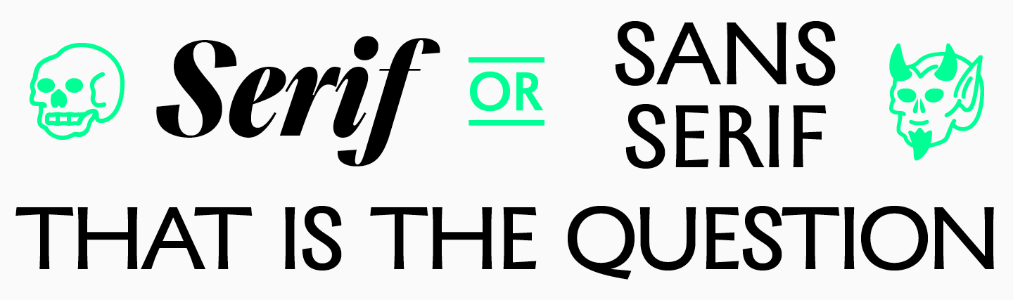
It is quite easy to spot serif fonts – these are the fonts in which letters have serifs.
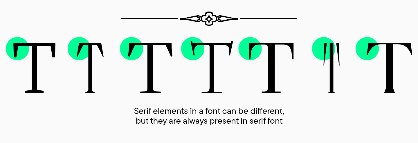
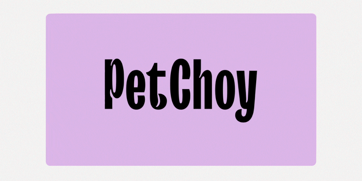
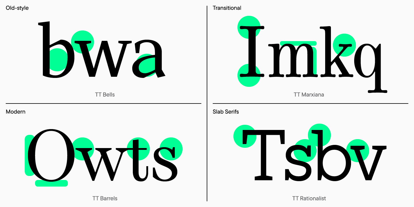
Serif is a broad category of fonts, which in turn is divided into subcategories. Basically, there are four types of serif fonts: old-style, transitional, new-style and slab serifs. They differ from each other in the shape of the serifs, the contrast, and the slope of the ovals.
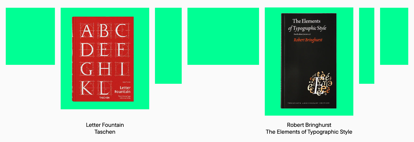
You can read more about typefaces in Robert Bringhurst’s Elements of Typographic Style or have a look at a more modern and concise classification of fonts in Letter Fountain by Taschen.
When to choose a serif
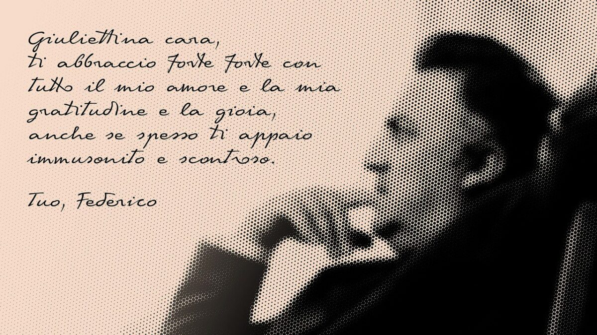
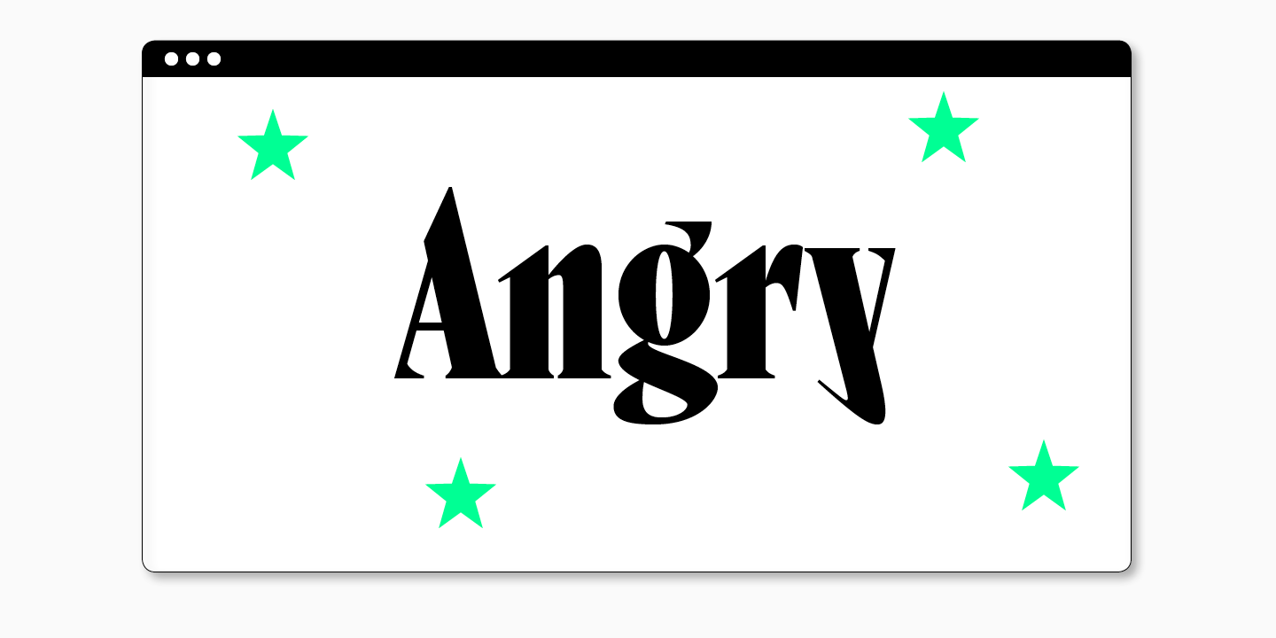
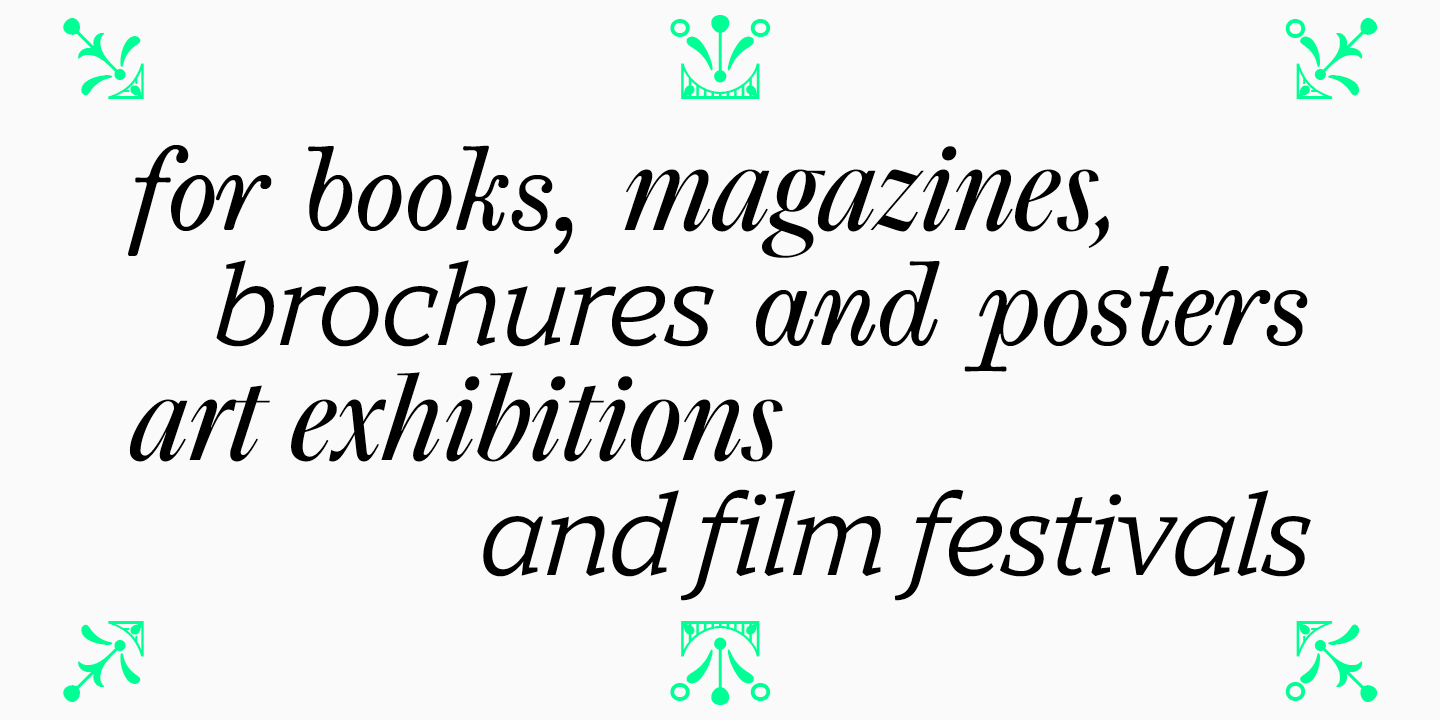
One can safely say that the printing industry is the widest area of use for serif fonts. Most of books and magazines, brochures and posters are set in serifs. Such typefaces are eye-catching and can look elegant and graceful, which is why they are often used by those associated with the arts, such as organizers of exhibitions and film festivals.
Serif fonts can be quite versatile given the variety of typefaces. However, you should choose a serif carefully, carefully analyzing what emotions the font evokes.
It is worth noting that such fonts are often produced as broad families, that is, several styles and even categories are included in one font. Most frequently, in one typeface there is a display serif with a more expressive character and a text serif with more neutral characteristics.
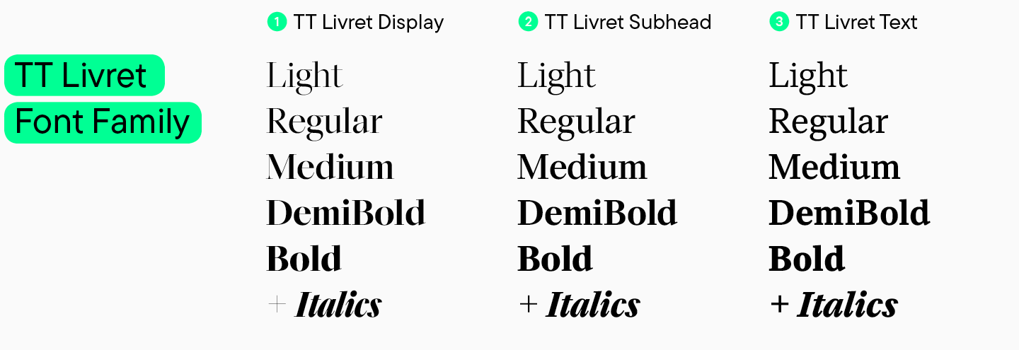
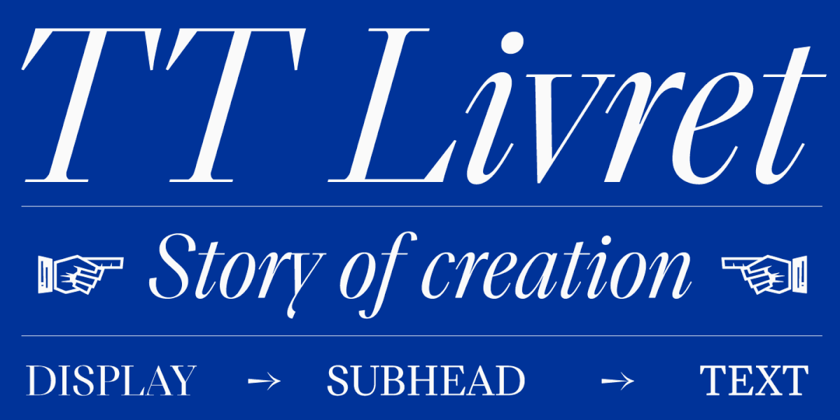
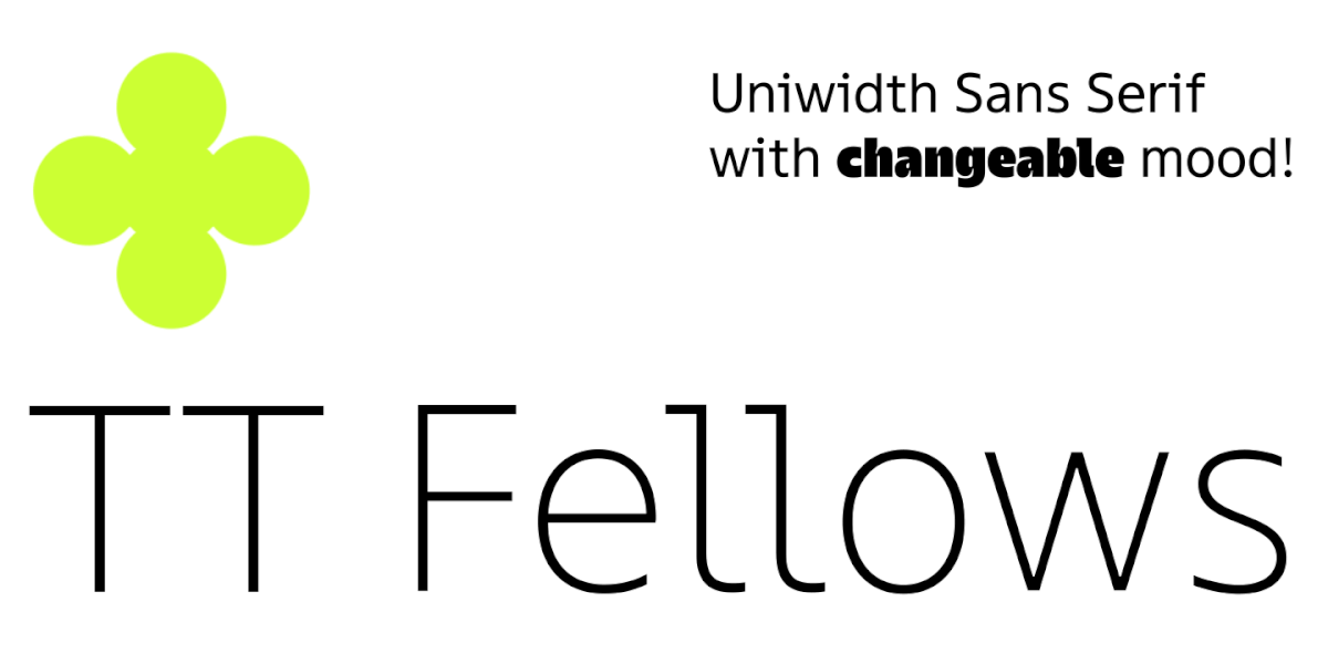
A display serif is suitable for use in headings or large inscriptions, so its character is more readable and decorative elements are more visible. A text serif is paired with a display one, it can be used to set large text arrays, because such a font has good readability and a more neutral character. There may be more subfamilies, depending on the scope of the font. For example, in TT Livret from TypeType studio there are three subfamilies: display, text, and subtitle. By expanding the number of fonts, studios make it possible to use one typeface for different tasks.
What a serif font can convey about a brand
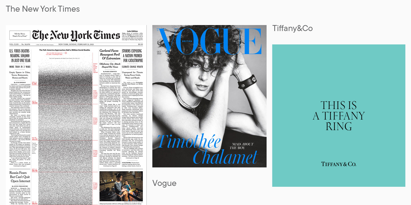
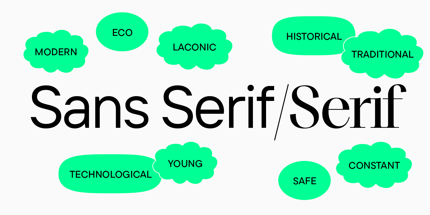
Serifs are more often chosen by brands whose principles are based on respect for traditions and history. Serif fonts are more likely to evoke the feeling of a classic and calm brand, but can also signal status and elegance.
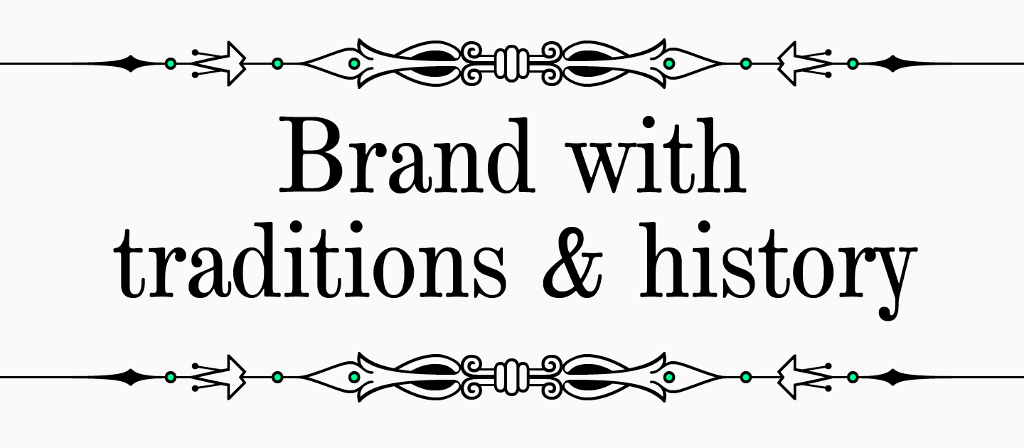
Traditional media, high fashion magazines and luxury brands often turn to serifs. They are ideal for companies that take pride in nurturing and developing their brand over the years, improving quality while maintaining the core principles. Serifs evoke a feeling of reliability and security, so they can be used in banking or medical fields.
Serif design examples
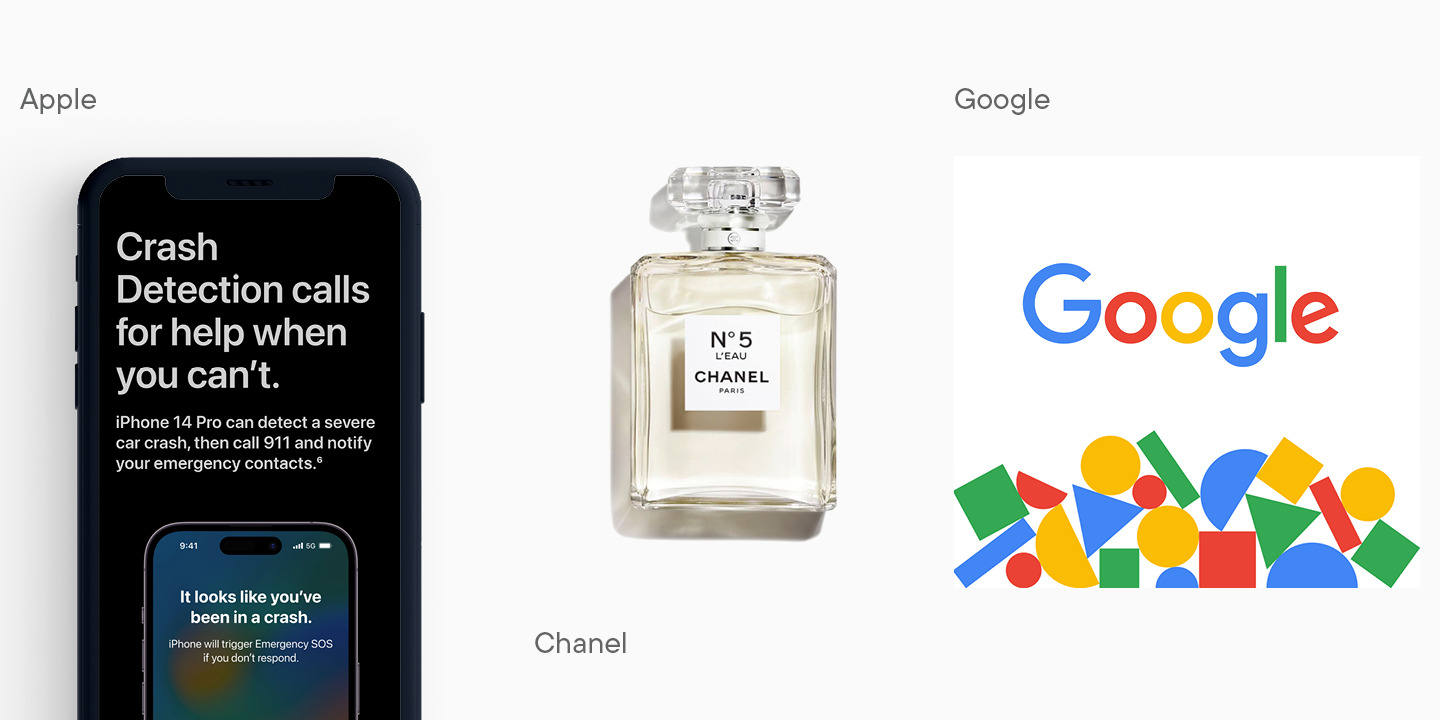
To better understand associations that serifs evoke, let’s turn to famous brands that chose serif fonts.
Most important sans serif facts
Sans serifs are in many ways the exact opposite of serifs. If a serif font is easy to identify by serifs, then the sans serifs are easily identified by their absence. These are concise fonts with a wide use scope. Rest assured that most of the sites you view use sans serifs. Moreover, in the course of rebranding, global brands are more likely to replace their old typeface with a sans serif.
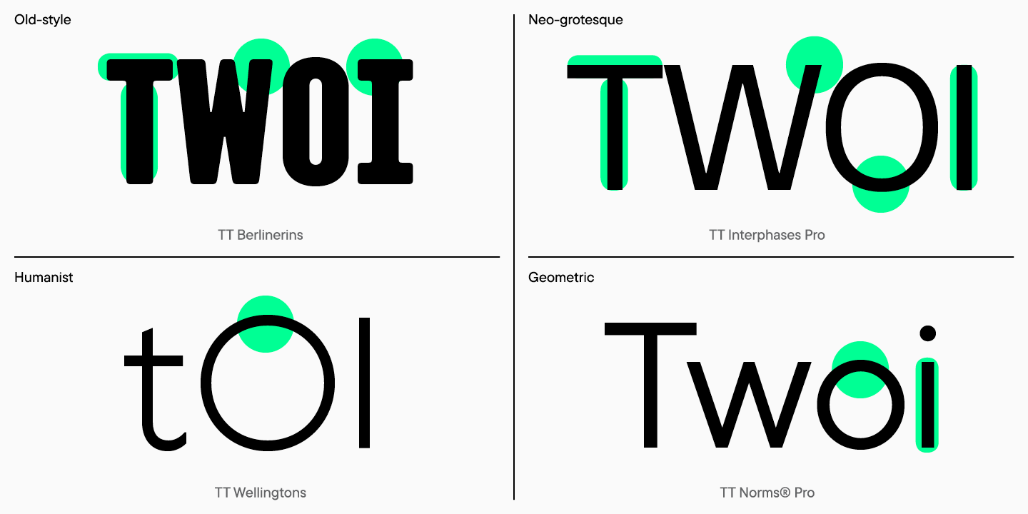
Sans serifs look simple and neat, which is why they are considered universal fonts in typography. Like serifs, sans serifs are divided into subcategories. These are the old, neo-grotesque, humanist, and geometric sans serifs.
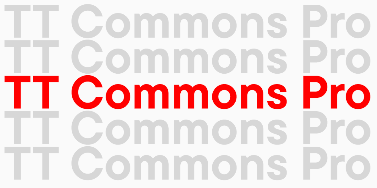
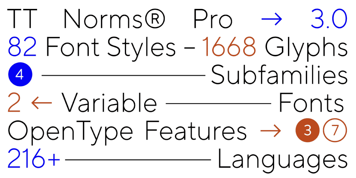
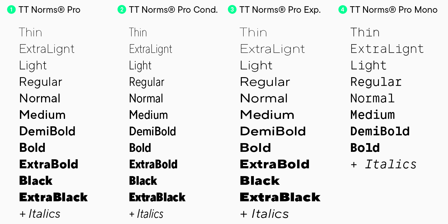
Like serifs, sans serifs can be produced in broad families including display and text fonts. Often, families are expanded after the release of the font, supplemented by new subfamilies. For example, TT Norms® and TT Commons™, two of TypeType’s best-selling fonts, have already had several expansions. In addition to text and display fonts, the families were replenished with Condensed and Expanded versions and even monospaced fonts.
When to choose a sans serif
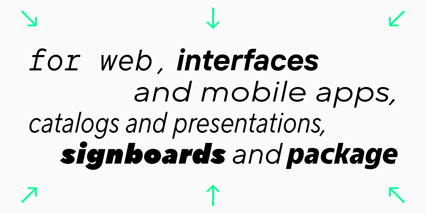
Sans serifs can be used almost everywhere thanks to their neutrality and conciseness. Websites, e-catalogs, presentations, and mobile applications are often set in sans serifs. You can find them on the signs of shops and restaurants, in printed materials and in packaging design.
Of course, sans serifs are the favorite of most modern designers.
What a sans serif font can convey about a brand
Modernity, lightness, understanding of trends and openness to connection – this is what most people read when they see a sans serif on the site of their favorite brand.
When developing sans serifs, type designers refuse to use serifs, and when choosing sans serifs, brands bring down extra walls in communication with the audience. Brands that choose sans-serif fonts want to be closer to their consumers, harmoniously becoming a part of their lives.
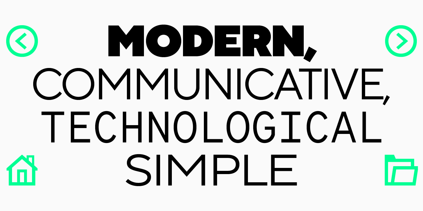
Technological prowess and experimentalism, rejection of unnecessary conventions, enjoyment of the moment – these are the messages that sans serifs also add to brand positioning.
Sans serif design examples
Get to know sans serifs better by having a look at the examples of use of sans serif fonts in contemporary designs.
Main differences between serifs and sans serifs
The most obvious differences between serifs and sans serifs are the serif elements. They are a must for serif fonts, and they must be abscent in sans serifs. But only this difference is not enough to understand in which section to look for a font for your project.
The visual differences between these typefaces can be noticed even without focusing on the serifs. Sans serifs look more concise and neater also thanks to the low contrast in font thickness. In serifs, the thinnest areas may be drastically different from thick ones, which is especially noticeable in display serifs.
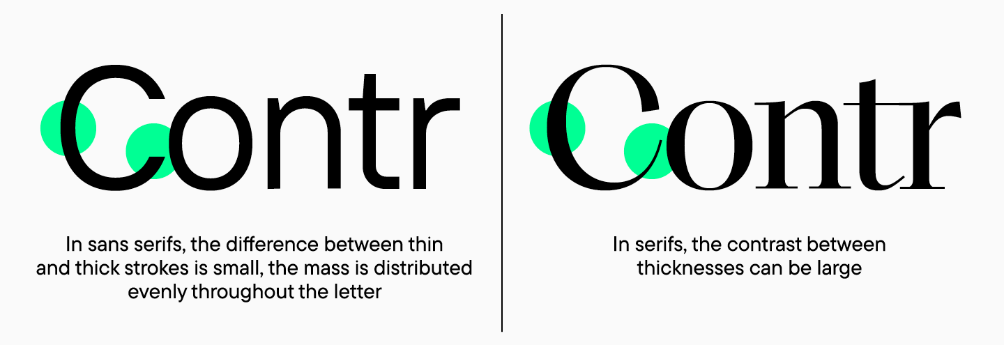
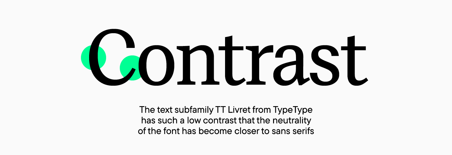
The contrast between uppercase and lowercase characters also differs. It is minimal in sans serifs, due to which a printed text looks neutral, while in serifs, the contrast might be much higher. However, modern text serifs might be low contrast.
Associations that serifs and sans serifs evoke are also different. Serif fonts are more often described as classical, refined, or stern, while sans serifs are called minimalist, simple, and neat.
How to decide on a font
To find a font that reflects brand values, you need to define what you want to convey to your audience. Given all the diversity of modern typography, your choice might be surprising. Increasingly more often, font studios release fairly neutral serifs or sans serifs with pronounced character.
To have a better idea of what font might be suitable for a project, try studying the examples of other companies and paying attention to the associations that a font evokes. For example, modern young brands emphasising ecological aspects and technology might find a sans serif with its concise properties more suitable. A serif will look fitting in companies emphasising their long history and traditions or targeting the feeling of reliability and stability.
Simultaneous use of serifs and sans serifs
Sometimes when choosing a font, designers have an idea of using several fonts at once, one of which may be a sans serif and another one a serif. In reality, this choice rarely occurs, especially if the fonts have different natures.
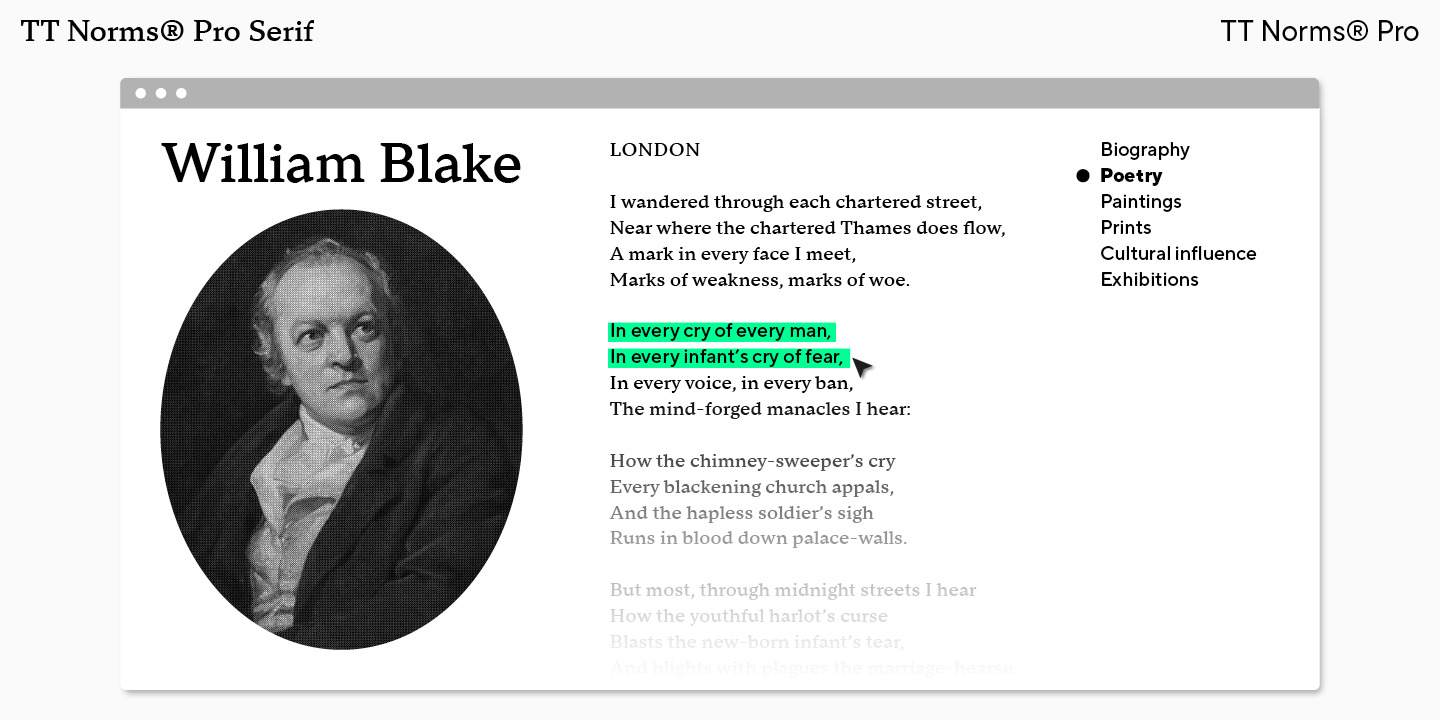
It is safest to use a serif and a sans serif from the same typeface because these faces are created as a font pair. For example, in the TypeType catalog you can choose TT Norms® Serif, which was developed as a part of the large family TT Norms®, a geometric serif with a neutral character.
Stereotypes about serifs and sans serifs
“A sans serif is a boring font associated with dull office presenations, and a serif can’t be modern and will make the brand feel outdated” – these are the stereotypes which are still present today.
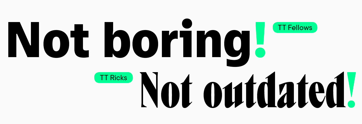
However, font designers work hard to bust these myths and release modern beautiful serifs and stylish sans serifs with malleable nature. The most important thing is to find the one and only font that fits the brand perfectly among the multitude of all fonts.
Final choice
Typography is developing and makes designers happy with the huge number of fonts released. Sometimes the most difficult thing is to not get lost in this abundance and to understand what the right choice is.
We hope this article will become a guide and make the search for a font clearer and more exciting.
FAQ
What is the main difference between serif and sans serif fonts?
Serif (Antiqua) refers to fonts with small decorative strokes at the ends of letters (serifs). Sans Serif (Grotesque) refers to fonts without these strokes; in comparison, they often look more concise and neutral.
Which fonts are considered serif and which are sans serif?
Serifs are fonts with “feet” that look classic and traditional. Sans Serifs are fonts without these details, characterized by a modern and strict look. The main visual difference is the presence or absence of small strokes at the ends of the letters.
When is it better to use serif fonts vs sans serif fonts?
Serifs are often used for print: books, magazines, posters; they can be elegant and noticeable. Sans Serifs often work in the digital environment—most websites use them.
How do serif and sans serif fonts affect brand perception?
Serifs are usually read as classic, traditional, status-oriented, and elegant, sometimes conveying reliability and safety. Sans Serifs are more often perceived as minimalist, simple, and neat.
Can serif and sans serif fonts be used together in one design?
You can, but it is a rare scenario to pull off well, especially if the fonts have different characters. It is safer to take a Serif and Sans Serif created as a pair within one family, for example, TT Norms® Pro and TT Norms® Pro Serif.
What are common misconceptions about serif and sans serif fonts?
There is a myth that Sans Serif is «boring and corporate,» while Serif «cannot be modern» and makes a brand look outdated. However, the designer’s task is not to believe labels, but to find the typeface that fits the brand precisely.
Which fonts are easiest to read in print and on screen?
Most often, Serifs are used in print (books, magazines), and Sans Serifs on screens (most websites). But the specific typeface decides: contrast and the general “neutrality” of the text are important.
Are serif fonts better for formal documents?
For official documents, serif fonts (like Times New Roman, Georgia) look traditional and academic, especially in print. However, modern standards increasingly allow strict sans serifs (Arial, Calibri) for better readability in digital formats. The key rule is to follow the established corporate template or style guide.
What are some examples of popular serif and sans serif fonts?
Popular fonts include TypeType typefaces: Serifs—TT Livret, TT Bells, TT Regins; Sans Serifs—TT Norms® Pro, TT Commons™ Pro, TT Turns. As a neat pair in one style, you can use TT Norms® Pro and TT Norms® Pro Serif.
How do I choose the right font for my project?
First, consider what values and associations should be read from your project, and check examples in similar projects. Then choose between a concise Sans Serif and a «historic» Serif based on the required mood and appropriateness.