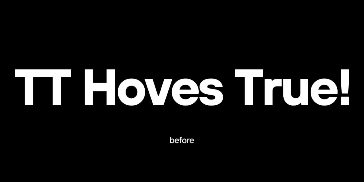
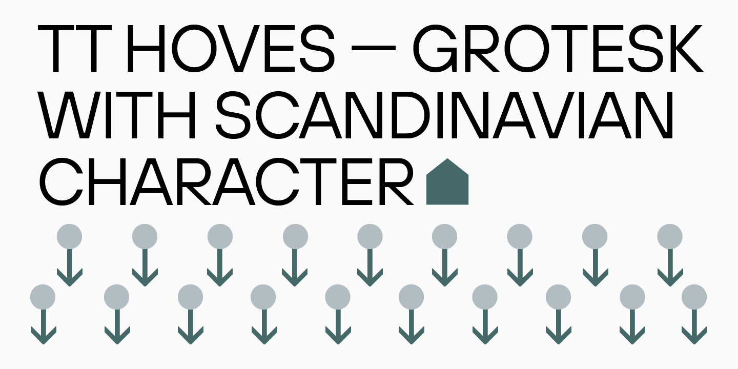
TT Hoves is the youngest font in the collection of universal geometric sans serifs. It forms a functional trio with TT Norms® and TT Commons™, yet has its own recognizable character.
The TT Hoves font has managed to win the sympathy of designers from all over the world. The font family has been among the studio’s bestsellers since its release on marketplaces, and yet it’s time to update the typeface!
Luckily for those who love the character of TT Hoves, the visuals of the new font are largely unchanged, although the new font differs in many ways from the first version. We have added new widths, corrected the shape of terminals and ascenders and descenders, and added new technical content. This is thanks to the fact that over the past four years, the TypeType studio’s skills and font knowledge have increased, and we applied them to the creation of TT Hoves Pro, making the font even more modern and convenient.
Creation of TT Hoves
The idea to create a Scandinavian sans serif, which later received the name TT Hoves, came to TypeType in 2018. We wanted the new typeface to be simple, yet recognizable and original. At that time, the studio had already released the universal TT Norms® and TT Commons™, so the studio’s plans included a typeface that could expand to the collection of functional sans serifs. The name TT Hoves is formed from two words, horizontals and verticals, to emphasize the predominance of vertical and horizontal strokes in the font design. TT Hoves is a sans serif that lacks pronounced contrast.
The first sketches were a visual embodiment of thoughts about a neutral sans serif that could become a convenient tool for designers. The first character set was drawn in 2018 using Adobe Illustrator. Despite the fact that many details changed after further iterations, the nature of the future typeface was already discernible. In the first version, the glyphs’ uppercase character height was 700 points, and the lowercase character height was 500 font points.
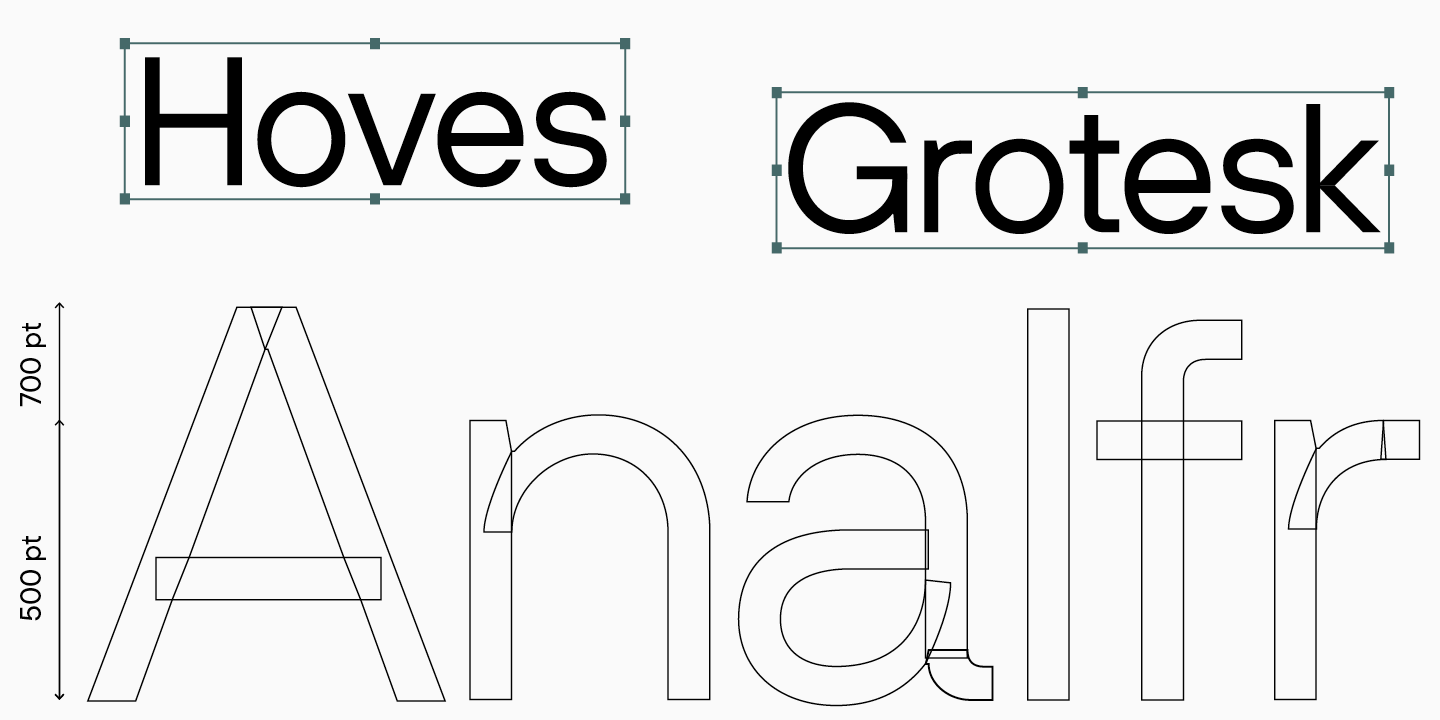
The work began with the Regular and Black styles, on which we tested the set making adjustments. For example, we increased the initial height settings for lowercase glyphs by 20 points, resulting in a height of 520 points. We also increased the thickness of the stems to make the font look harmonious, and changed the shape of some glyphs.
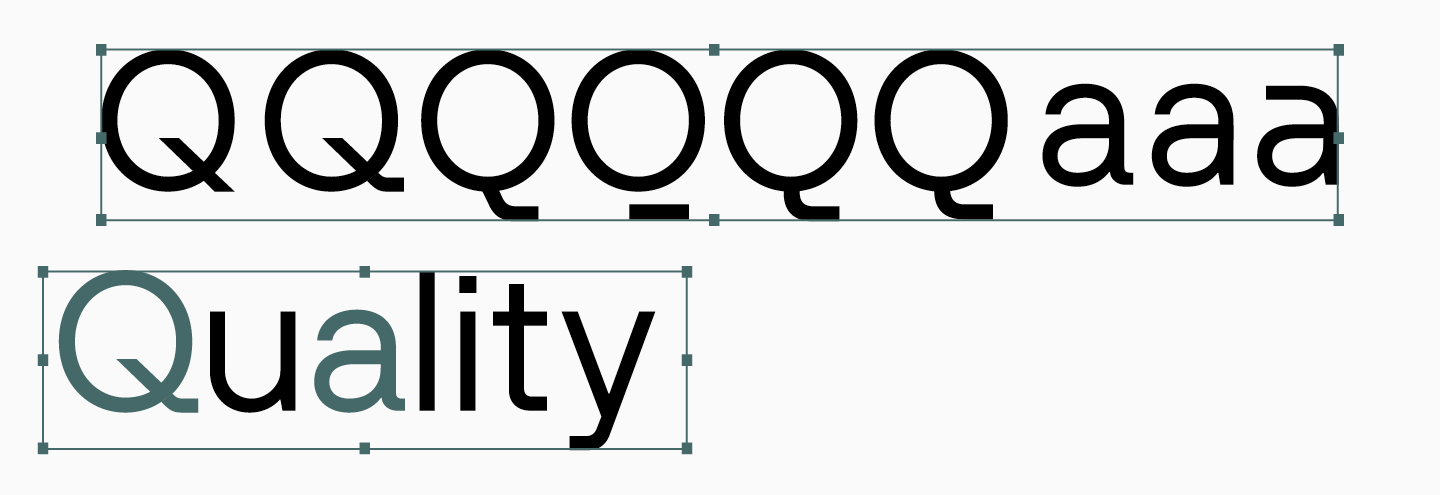
- In the first iterations, we experimented with alternative shapes of characters, for example, Q and a.
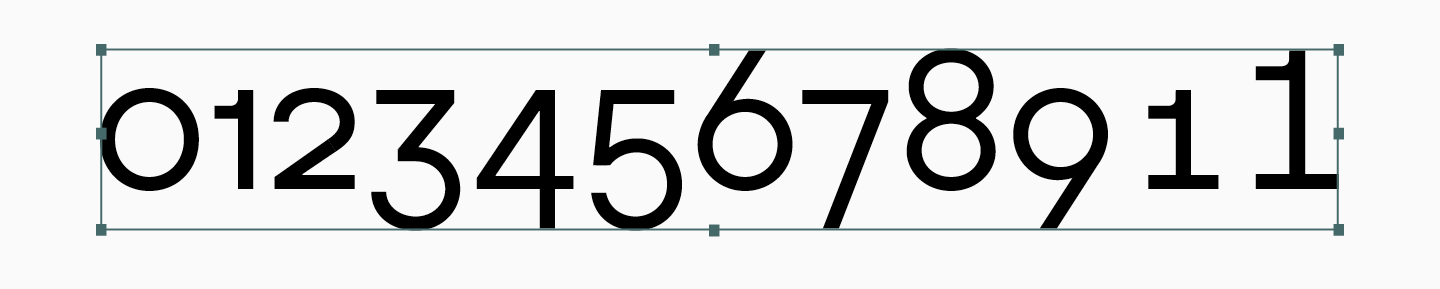
- We added a set of minuscule figures.
- We continued working on the Black bold face, making stems even thicker. This was a necessary step for expansion of the family because if Black was less thick, the intermediate faces might have looked not quite right from the interpolation point of view.
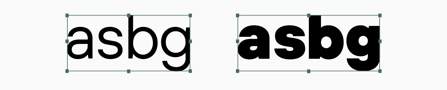
- We changed shapes of some glyphs, for instance, characters a, g, s, and b. This way, we achieved the right character of the font, intuitively moving toward the right associations.
The process of creating TT Hoves was slow, sometimes we took a break to rethink the shape of the characters or to refine the visual flaws. At that time, we worked with all fonts in the FontLab software, where we transferred ready-made characters from Adobe Illustrator. The experience of developing past typefaces, including TT Norms® and TT Commons™, has shown what errors may occur when converting from one program to another, and we took this into account when creating TT Hoves.
After analyzing the first versions of TT Hoves, we continued to work on its improvement. On the one hand, we expanded the set of Regular and Black styles, on the other hand, we improved the character of the font.
- Our task was to preserve the glyph shapes in Black keeping the minimum stroke contrast.
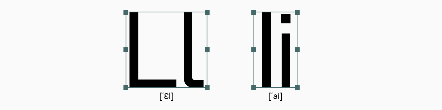
- In the Latin L, a tail appeared that supported the horizontal line of the font and allowed to tell it apart from the capital I.
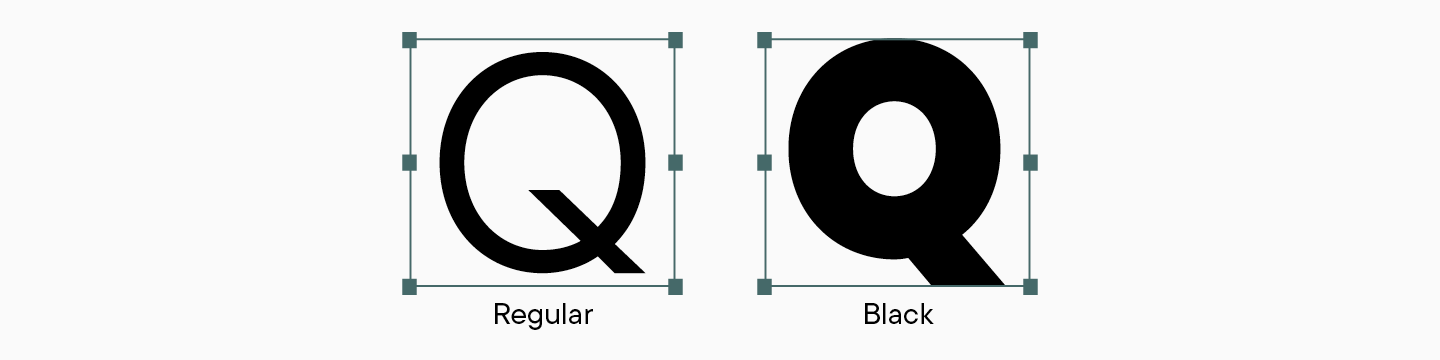
- The uppercase Q in the regular face has a diagonal tail which is partially cut off in Black to prevent the space between the letters to become too narrow. We decided to use this solution in bold faces, starting with Bold.
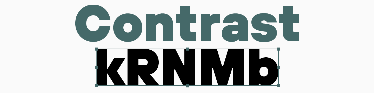
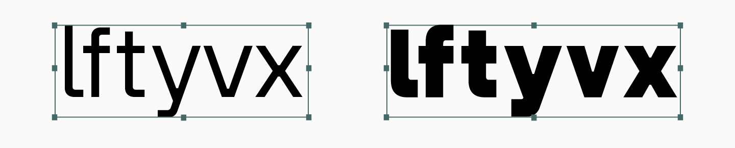
- We worked on creating a more authentic drawing of the font. The character shifted towards being more geometric and angular. For example in the letters f, l, and t, the turns have become sharper, and the glyphs with diagonal stroke crossings, like x, v, and y, became more squared.
After making new changes, we started working on expanding the family by thicknesses. We settled on the following faces: Thin, ExtraLight, Light, Regular, Medium, DemiBold, Bold, ExtraBold, Black. At this stage, the font has already been transferred from Adobe Illustrator to FontLab, and the character contours have been adjusted. Despite our efforts to reduce errors, some of the contours were still not transferred correctly, so we had to correct them manually.
After these edits, we began to expand the family. The peculiarity of working in FontLab 5 was that absolutely all styles were manually drawn by the team, like reference masters. Because of this, the work was carried out in parallel, by several designers at once. The rendered styles were corrected, after which we expanded the character set, testing the setting and making adjustments.
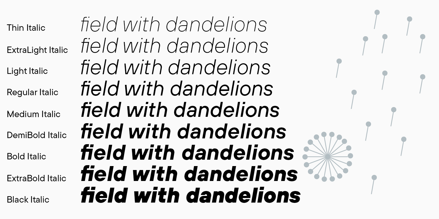
For TT Hoves, we drew small capitals, and the work on creating italics for upright styles began. By the way, TT Hoves was the first project in which we started using the instruction written to create italic fonts for the main weights: for thin, medium and bold. Since several designers were involved in working on italics, it helped to carry out the work on italics within certain values for each style. The instructions described the necessary steps and parameters to help avoid errors in further work. For example, it specified how to italicize characters with diacritics. Most often, these characters are composed of components: the parent character is italicized manually, and the diacritical component automatically. The instruction helped to avoid doubling work and described how to tilt such characters so that all diacritical elements were in the correct places. The instruction contained steps for working with round and straight characters, as well as peculiarities specific to each style.
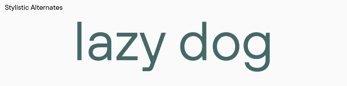
When all styles were created, and the character set was expanded, we started working on alternative sets. Some characters swapped places, and we run tests, finding optimal solutions.
As a result, the last edits were made at this stage of the work: alternative forms of glyphs appeared in the Latin characters a, y, l, g, G, Q, and in Cyrillic а, у, ч, Ч.
In 2019, work on TT Hoves was fully completed, the font was assembled, tested and released on platforms.

TT Hoves 2.0
As time went on, TT Hoves became one of the studio’s bestsellers. Despite the functionality and visual appeal of the font, after the release of the first version, the skills of our team improved, including the technical ones, and we decided to update the font.
As we said, the first version of the font was created in the FontLab program, and all the styles were drawn by hand. In 2020, we almost completely switched to a new program, Glyphs, and had gained experience transferring fonts from one editor to another. After working with TT Norms® Pro, which has already been updated and rebuilt in Glyphs, our team created an instruction describing possible problems, errors and other nuances that arise when exporting fonts to the new program.
We won’t go into much detail of these processes, but will outline the main stages that received our attention.
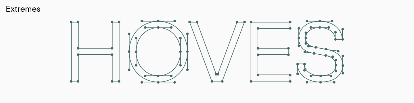
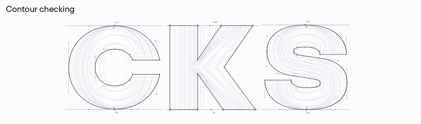
- We made sure extrema points were set everywhere necessary. Extrema points are the points on the vertical and horizontal axes. The curves, that is, the lines departing from the contour points, should not be the same as the extrema points. All this helps to interpolate correctly, so we checked these issues with help of special scripts and corrected all points that had shortcomings. This might look complicated but it was an important part of the work so that in the future we could expand the font family without technical problems.
- While transfering, we changed the thicknesses of some faces. The updated TT Hoves is slightly different from the first version as the thin faces of the font became a little bolder. This solution allowed to make the font visually more beautiful and convenient in use.
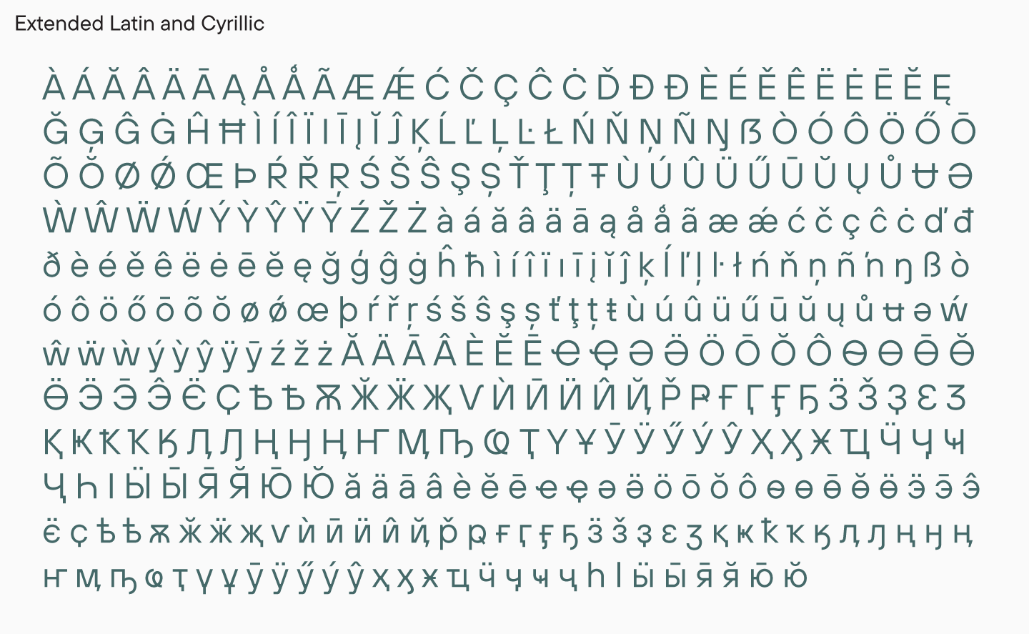
- We reviewed the character set and corrected some of the glyphs. Over the two years since the release of the font, in addition to gaining technical skills, we also improved the graphic component of the work. Although the character set was not drastically changed, we improved the characters in extended Latin and Cyrillic, the visuals of Bulgarian Cyrillic glyphs, and edited the ascenders and descenders in small capitals. We made the contours more uniform, reworked the roundings in the glyphs, and checked the thicknesses in all faces. Some of the characters were improved with help of small edits, others we had to redraw.
After this iteration, we got an updated version of TT Hoves, technically and graphically more correct and modern. It is worth noting that we transferred all styles to Glyphs, that is, all hand-drawn styles remained masters. We additionally created a variable font and updated kerning and hinting.
TT Hoves Pro
We were not going to stop there, and almost immediately after updating the font in 2020, we thought about expanding the family. We wanted to give designers a more functional tool to work with, with improved variable fonts and more expressive options.
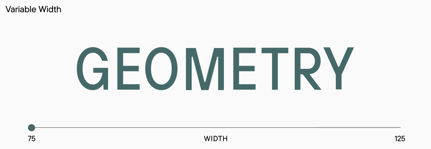
TT Hoves Pro, released in 2022, has a recognizable neutral character, but surpasses previous versions in terms of convenience.First, it has two additional widths: Condensed, which is a narrower version, and Expanded, which is wider. Each width has 10 upright and 10 oblique styles.
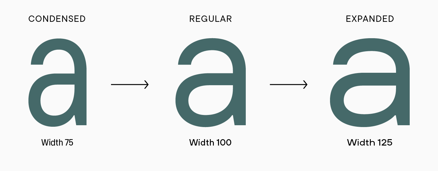
Before starting to create new fonts, we did some research to determine the required values. We selected sans serifs, which included Condensed and Expanded, and studied how and by what parameters the proportions of glyphs change. We measured the width of the character by straight and round characters in lowercase and uppercase, then compared these with the parameters in the classical style. It turned out that in Condensed, the characters are about 70% of the original width, and in Expanded — about 120%. We are talking about approximate values not because we could not calculate the exact percentages, but because these values change for different glyph shapes, and there is no universal parameter.
We measured other parameters as well, after starting to create Condensed and Expanded in TT Hoves Pro. It happened like this: first we applied automatic deformation of characters divided into groups, and then we looked at and edited the glyphs manually. In addition to the width of characters themselves, the thickness of the stems and the thickness of the contour lines changed, and the overhangs and metrics changed, too. At each stage, we checked the drawing by typing test words and looking at the resulting font in the set. Of course, we weren’t just checking the glyphs inside Condensed or Expanded, we were also comparing them to standard font characters, since all three widths are part of the same TT Hoves Pro font family.
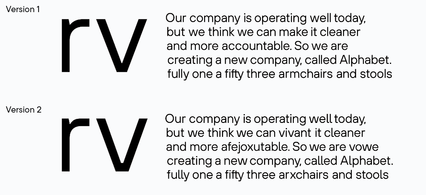
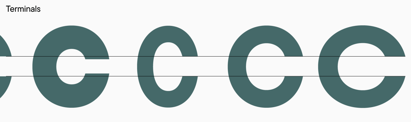
In TT Hoves Pro, we’ve brought terminals to a more consistent look improving the visual experience of the font. To be honest, the idea with terminals that are on the same level came to us at the stage of creating the first version of TT Hoves, but then we decided to do it at some point in the future. In the Pro version, we decided to try this approach.
Of course, all terminals cannot be exactly at the same level, so we started by checking the terminals in the classic version to determine what we can change. It turned out that in the set, we had characters in which the length of the terminals differed by two or three typographic points, although these values can be made the same. In a small size, a designer can spot such details intuitively rather than see them, but in large sizes, such a solution will be noticeable. We decided that this update would allow the font to look more stylish and coherent, and began long-term work on improving the terminals. Now we can say for sure that terminals in glyphs look great, and it’s especially the case when working with a variable font.
In TT Hoves Pro, we have moved on to work with reference masters. We mentioned for a reason that all hand-drawn masters were transferred to Glyphs. The fact is that at this point, in our studio we work with reference masters, on the basis of which the rest are interpolated, that is, automatically generated. Simply put, we manually draw about 3–4 masters per subfamily, and the remaining faces are only corrected and finalized by hand. This solution helped us improve the quality of fonts, make them more correct, and make variable styles lighter in weight and, as a result, more convenient to use.
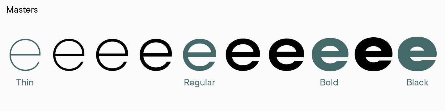
When we thought about the number of reference masters for TT Hoves Pro, we initially wanted to stop at three, but later a fourth master was added. Classical masters are thin, regular and the boldest faces. However, sometimes an additional support weight between regular and bold is needed to avoid excessive contrast in characters or incorrect outlines, as was the case with TT Hoves Pro. By the way, when generating intermediate faces using reference masters, you need to make sure in advance that all contours and points match each other, otherwise the interpolation will be lumpy, and the resulting fonts will be visually wrong.
In TT Hoves Pro, as in our other fonts, we work following the «matryoshka principle». At least that’s what we call it. The idea is that everything small in a font should fit into everything big, especially when it comes to large subfamilies. On the example of TT Hoves Pro, you can see how it works.
We add all the weights, from the lightest to the boldest, and see that everything comes together in each glyph. For example, the letter c in the narrow font Condensed fits all the narrow c’s, and the same happens in wide and standard widths. Horizontals, terminals, overhangs of glyphs should fit harmoniously. It is important to pay attention to diacritical elements, which should be located above the letter in the same place.
After visual tests and technical verification, TT Hoves Pro got new kerning and hinting.
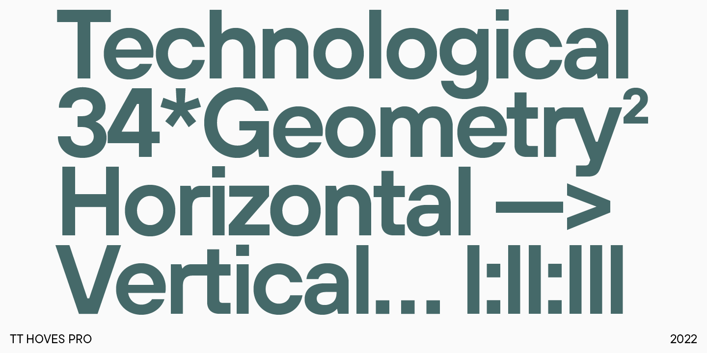
The updated font is more convenient to use and looks more solid visually. The good news for designers is that the TT Hoves Pro has completely retained the graphic design of the familiar TT Hoves, becoming more functional and modern thanks to the new widths and improved technical content.
Project team:
Ivan Gladkikh—head of the project
Pavel Emelyanov—art director, designer of the basic font
Yulia Gonina—art director
Marina Khodak—lead type designer, technical project manager
Vika Usmanova—type designer
Antonina Zhulkova—type designer
Olexa Volochay—type designer
Kseniya Karataeva—type designer
Nadyr Rakhimov—type designer
Nadezhda Polomoshnova—type designer
Yuri Nakonechny—mastering
Anastasia Pogorelova—mastering
Victor Rubenko—hinting specialist