About font family
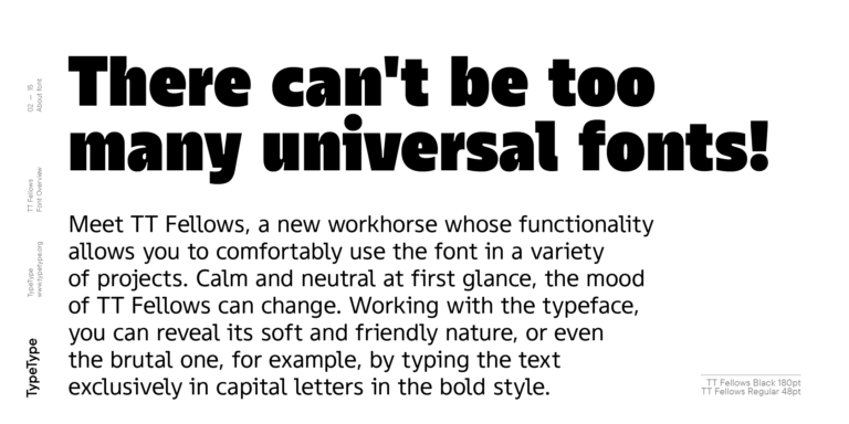
There is no such thing as too many versatile fonts! Introducing TT Fellows—a workhorse with abundant functionality to use conveniently in a variety of projects.
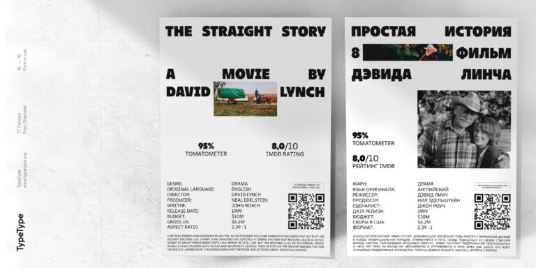
Calm and neutral at first glance, the mood of TT Fellows can be transformed dramatically. While exploring the possibilities of this typeface, you can encounter its soft and friendly nature as well as its surprisingly brutal trait, for example, by choosing only bold uppercase letters for your text.
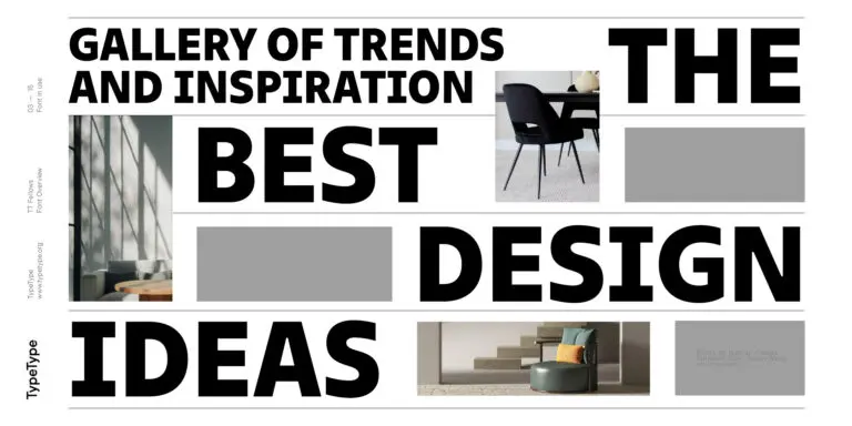
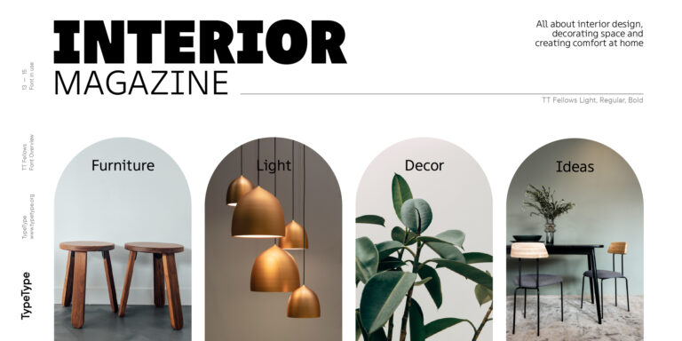
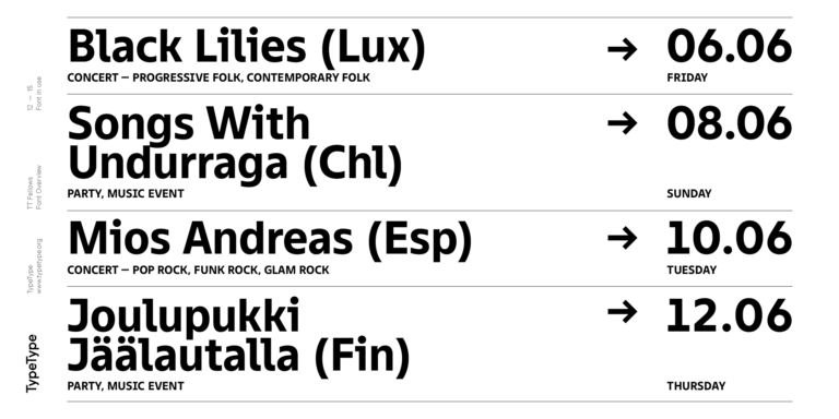
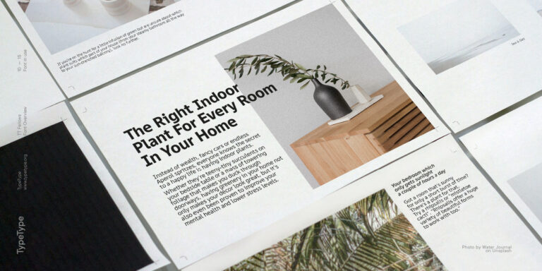
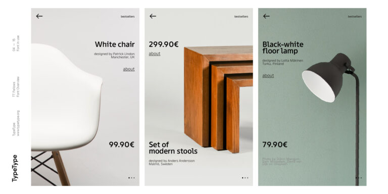
TT Fellows is easy to use and perfect for setting large text blocks. Due to its adaptiveness, the font is an excellent choice for both websites and periodicals. Bold font styles will create a harmonious look in headlines and serve well as accents in print or on packaging.
TT Fellows is a Humanist sans serif with a mechanical touch. Its open forms, friendly and neutral thin weights, and even softer bold font styles give TT Fellows a distinct mood that differs from the more classic sans serif like TT Norms® Pro и TT Commons™Pro. However, TT Fellows boasts the same ample functionality as these multifunctional typefaces! There are both calmer regular font styles and contrasting, intentionally expressive display bold styles.
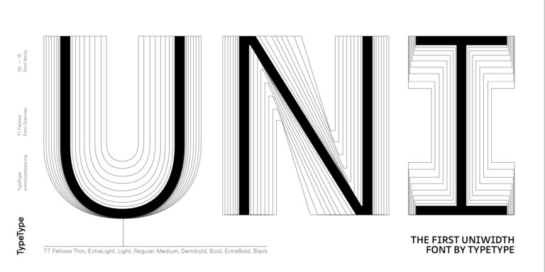
By the way, TT Fellows is a uniwidth typeface. It was essential for us to allow users to change font styles and be sure that the mockup layout would stay intact. The typeface features equal-width proportions, open apertures, and slightly squared ovals, evoking associations with other popular modern fonts.
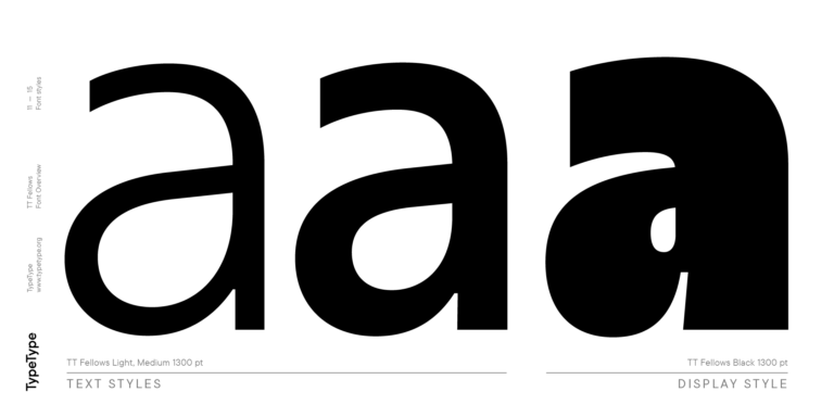
Since the idea of the font was focused around its equal-width proportions, we had to make Bold font styles fit the em-spaces of the Regular ones, which led to unique graphic solutions particularly noticeable, for example, in the k and ж characters, where the branches are cut directly into the stems.
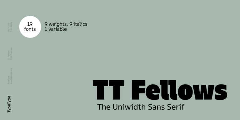
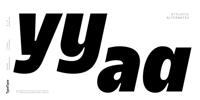
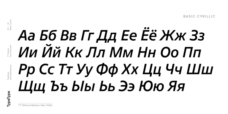
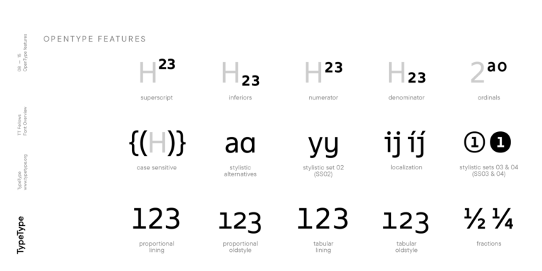
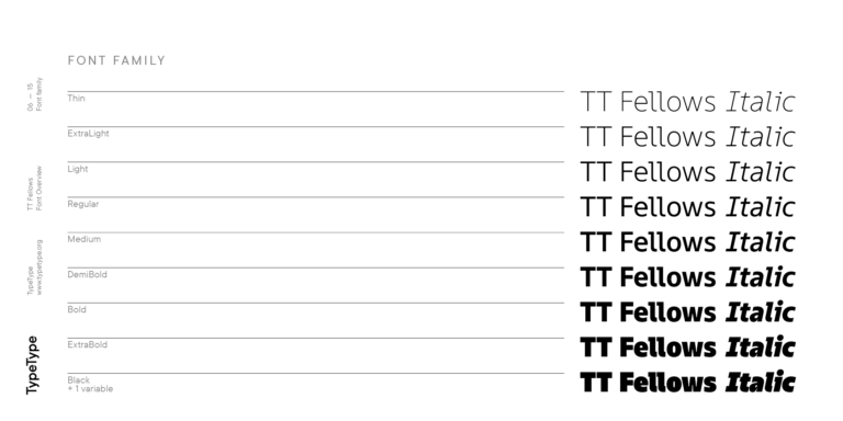
TT Fellows consists of 19 font styles: 9 roman, 9 italic, and 1 variable font, each consisting of over 700 glyphs. The typeface has 26 useful OpenType features. For example, there is a switch to single-story versions of letters a and y, fractions, tabular characters, case versions of punctuation, and localized character options for different languages. The font is also characterized by high quality spacing—the designers even solved the overlap issue of the letters f and l by crafting a fl ligature.

