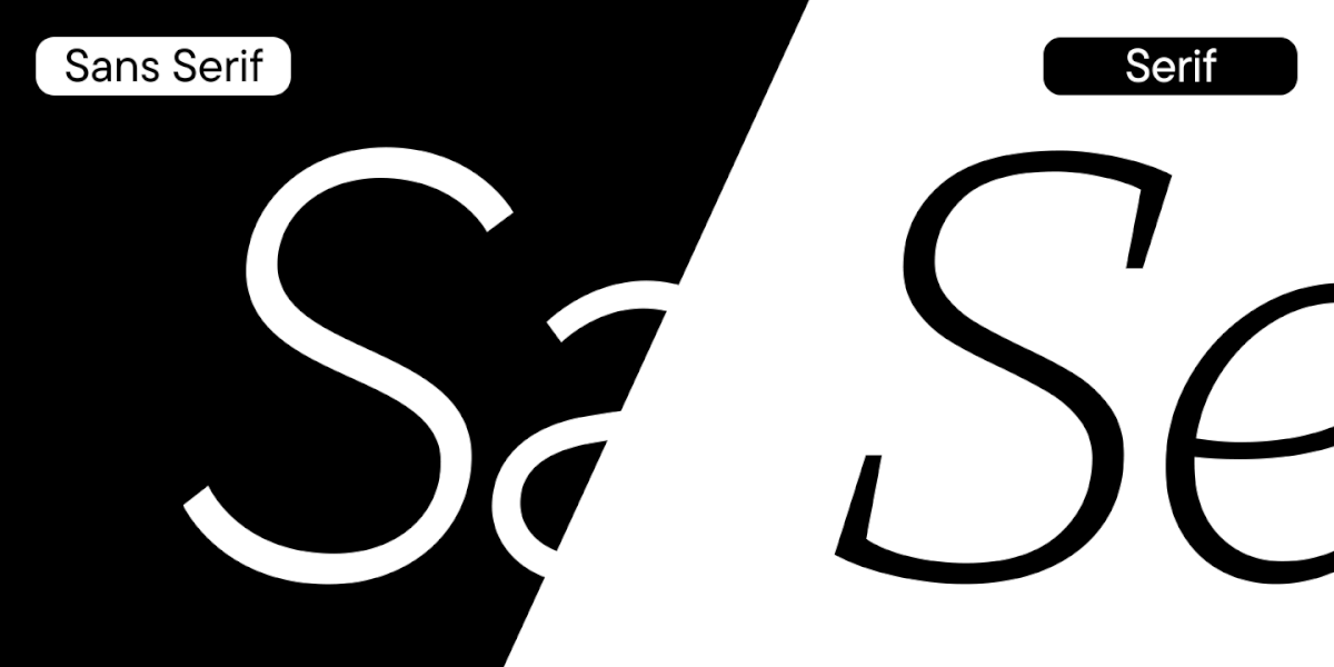
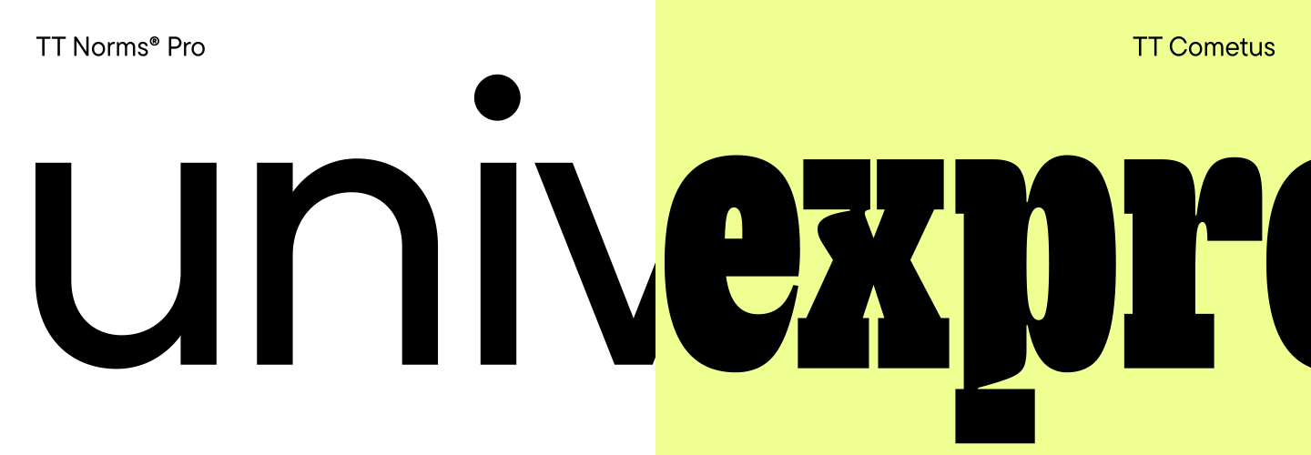
We talk a lot about universal «workhorses». These are the popular fonts, their character is often neutral, and the character set is extensive. One such font, such as TT Norms® Pro, can be used in thousands of projects with different themes and look unique in each.
Universal fonts are in high demand. But what to use to make an emphasis on something? You can also use «workhorses», but when you need to convey a strong emotion, it is better to look for an option with a more expressive character.
Today we will talk about these options: graceful and daring, friendly and brutal, dynamic and stable. These are display fonts. They are different in character and expressiveness, but always attract attention when used properly.
What kinds of display fonts there are
There can not be too many decorative fonts. An experienced designer’s collection may contain over 400 such typefaces, and this is far from the limit. The need to actively expand the collection of display fonts is due to the fact that they need to be selected more carefully.
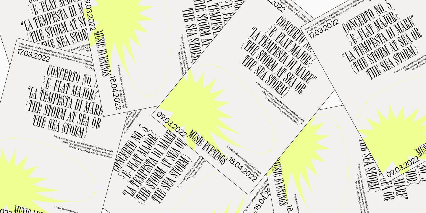
A decorative font should fit the project flawlessly, because it is in the headings, logo and other large inscriptions that the emotional messages that the audience will perceive are embedded.
These are fonts that attract attention. Even a novice designer understands that a large array of text and a title should not be set in the same font and size. Emphases and highlights are important in the text. The interest of the reader depends on how the designer arranges them.
The task of a typeface for setting is not to distract attention from reading, and that of a display font is to attract it. In order for the viewer to reach the body of text, the headline and other accents must hold attention and spur a desire to read the article, open the book, or take another action.
Decorative fonts are a broad group that includes many styles and types. You can easily distinguish them from other fonts, because they make you look at them, especially when the text is set in large size.
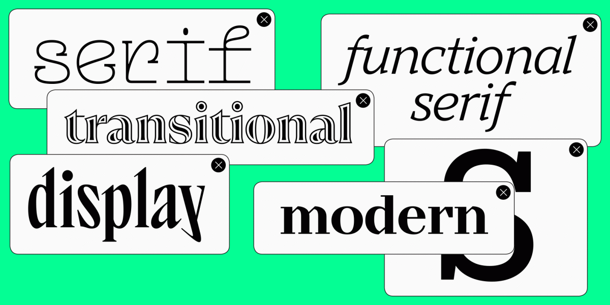
In this article, we will talk about three categories of fonts: display, headline, and decorative.

Display fonts
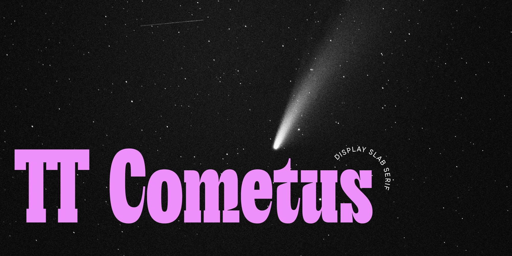
This article was inspired by TT Cometus, which we released in January 2023. This is a stylish and expressive font with a memorable character.
TT Cometus is the perfect example of a display or, to use a different name, a decorative font. It is difficult to imagine it being used in a text array, but it looks harmonious in headings and large inscriptions.
Display fonts are a broad category. It includes all fonts that are designed to make an emphasis and are not used in text typesetting.
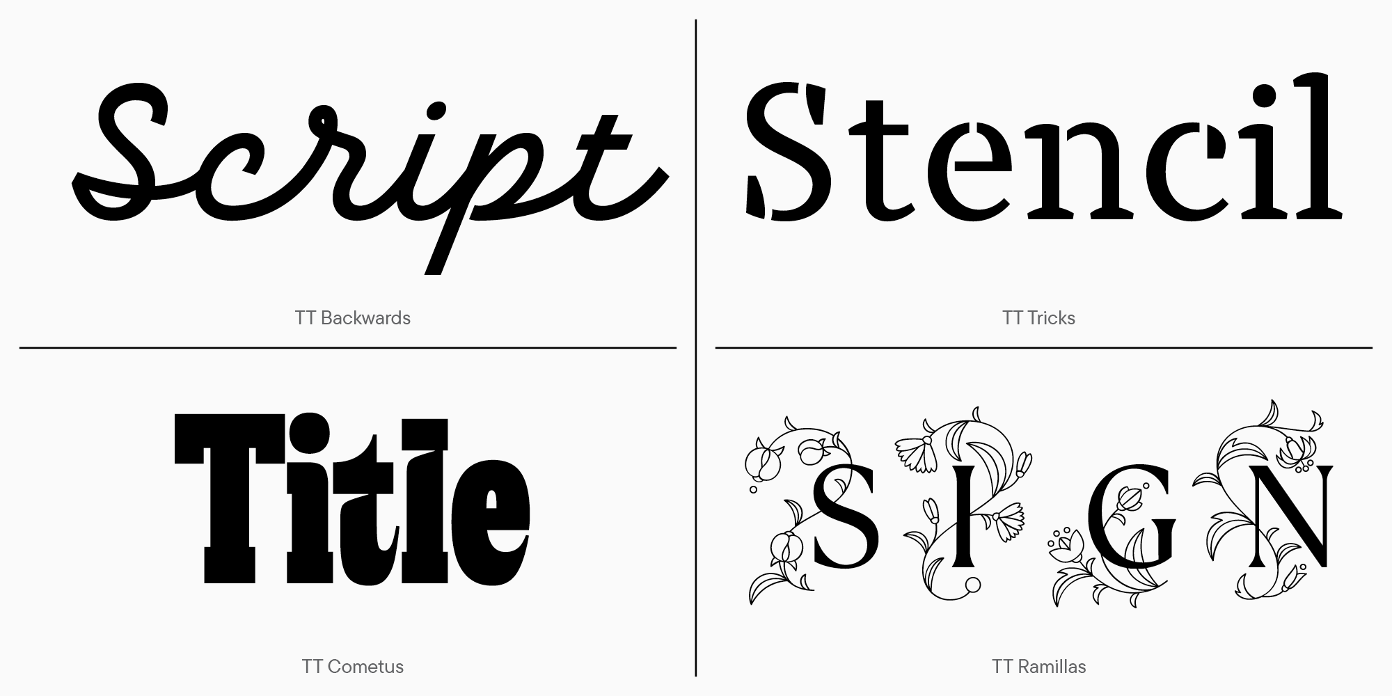
These may be:
- handwritten fonts;
- stencil fonts;
- heading fonts;
- fonts with decorations or patterns.
Display fonts are sometimes called decorative fonts. They are used to set headings and logos, or design small phrases or quotes in an array of text. The level of expressiveness of decorative fonts varies. The less expressive the character of the font, the longer the phrase set in it can be.
For example, TT Cometus is a font with a pronounced character. It looks best in a small array of text typed in large size.
At the same time, the font combines several styles. It has references to calligraphy, powerful serifs typical for slab fonts, as well as smoothness and plasticity of forms that make it feel friendly. This combination is typical for many display fonts. To get the right degree of expressiveness and make the character unique, designers can use different techniques and styles. In display fonts, there is a space for the creative idea of the author.
Such fonts are often an original project of one designer. To convey emotion through typeface, it is important to find inspiration in your work. If you’d like, you may even find it in the name of the font.
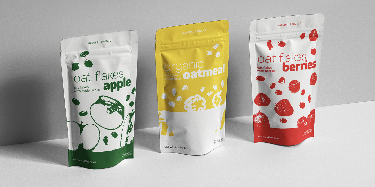
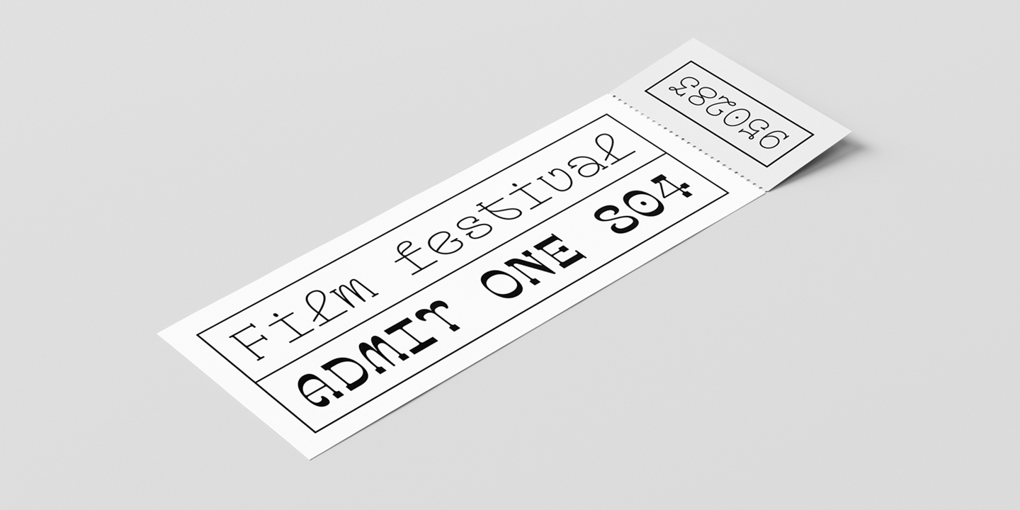
Display fonts are often used for logos and packaging designs. Sometimes commercial fonts are customized to make the font look more unique.
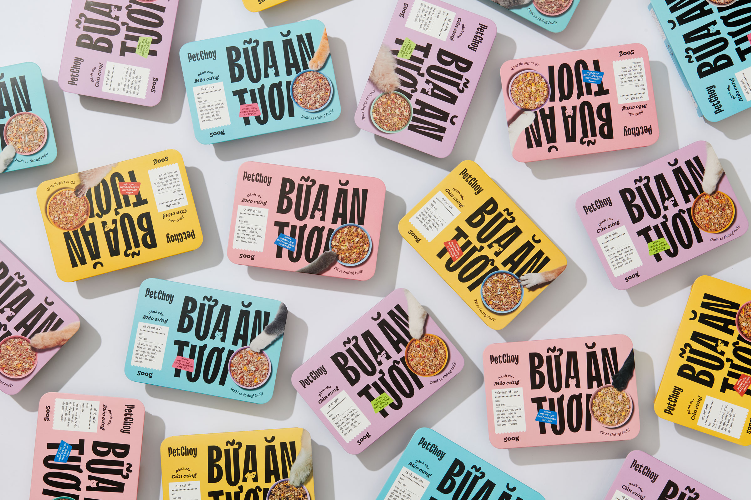
For example, for the PetChoy brand, we customized the narrow display sans serif TT Trailers. Silhouettes of cats and dogs have been added to some of the characters. This not only made the font more memorable, but also added a direct reference to the pet food brand.
We wrote an article about this customization project.
The TypeType collection of display fonts features many fonts that are different in nature.
You have already seen the prominent examples, TT Cometus and TT Trailers.
We present to you other stylish fonts from the category.
Those looking for a display font with simple text shapes will love TT Bluescreens. Its proportions are narrow, like those of TT Trailers, but the character allows the font to be used as both text and display.
If you’re looking for a decorative typeface with a softer feel, check out TT Rounds Neue. Although it is a display font, this rounded sans serif is even suitable for text arrays.
TT Travels Next, unlike the text TT Travels, is a decorative font. The fonts are similar in character, but TT Travels Next has a more pronounced character.
Among the display fonts, TT Ricks and TT Globs stand out. They are suitable for large inscriptions and will definitely attract attention. TT Globs has a variable face so its character can be controlled.
An interesting example of a display variable font is TT Alientz. On one axis, this variable font is a sans serif, and on the other, a serif. Thanks to the variable style, the nature of the font is controllable.
Stylish and expressive serif TT Espina is an elegant typeface with sharp serifs for large inscriptions. Curiously, the shape of the ovals in the font is dynamic and changes from style to style.
We also suggest adding TT Geekette, a typeface with flowy and movable shapes, to the collection. In the variable font, you can change the character by increasing the contrast. At the same time, visual changes are fascinating and open up opportunities for use in different projects.
Display fonts are a broad category that includes other types of fonts. For example, heading fonts.
Headline fonts
Headline fonts are needed for large inscriptions. They are used for setting in sizes from 25 point and above. Most often, headline subfamilies are created to match text subfamilies.
These fonts are used by many major brands. This is convenient: use the text subfamily for the site and communications, and use the headline subfamily to design headings on the web and in print.
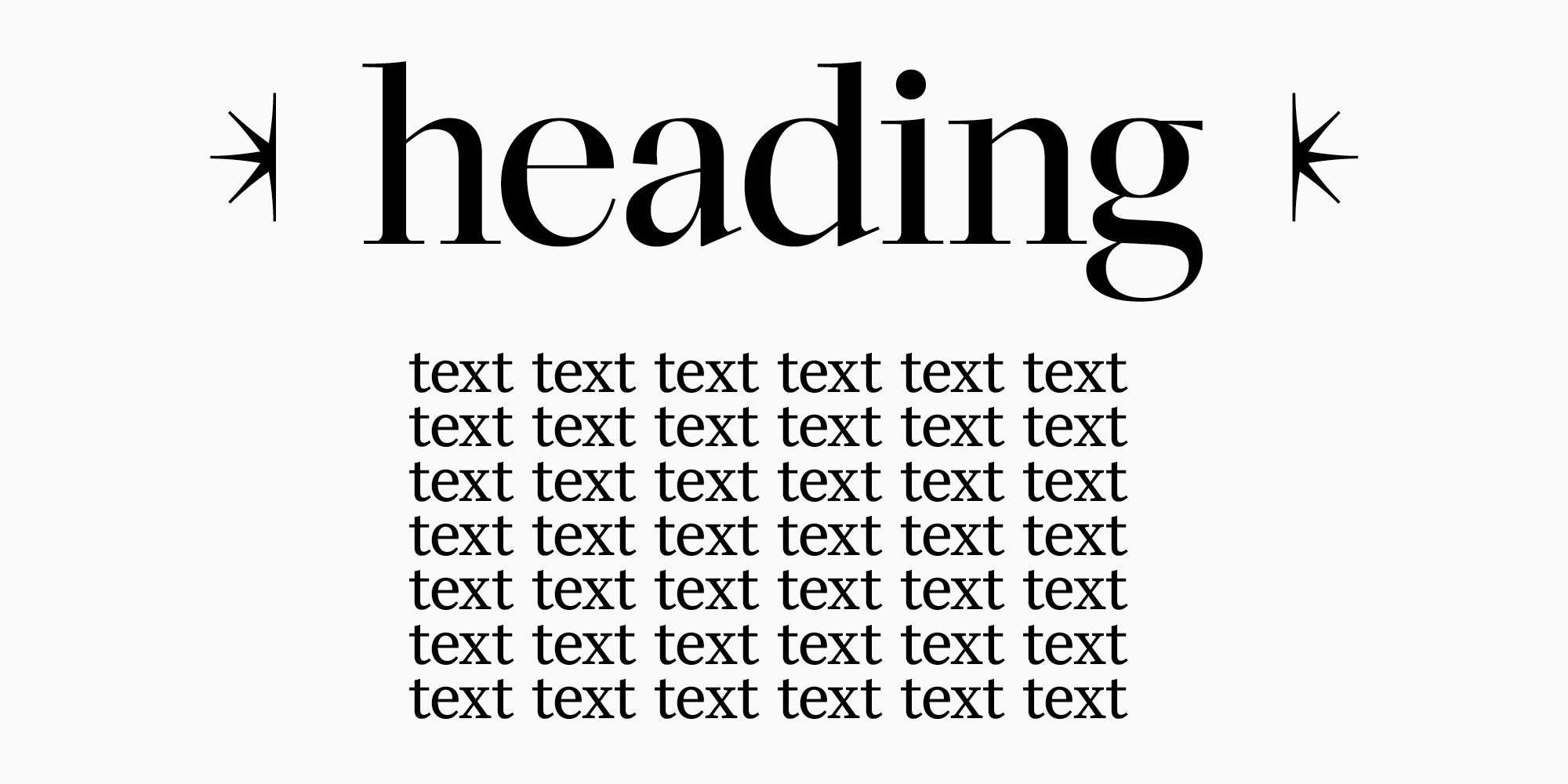
Due to their use in large sizes, headline typefaces have technical characteristics that make them easy to distinguish from other display fonts.
1. High contrast.
If a headline font is paired with a text font, it will have high contrast. This is true for both serifs and sans serifs.
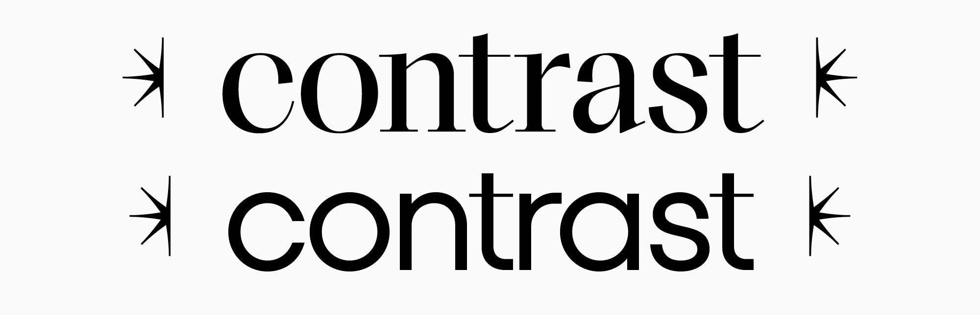
As the contrast increases, the horizontal stroke in the font becomes thinner, while the vertical remains the same. Such changes are related to visual beauty. In large size, high contrast looks attractive, revealing the nature of the font.
2. Character fits become smaller
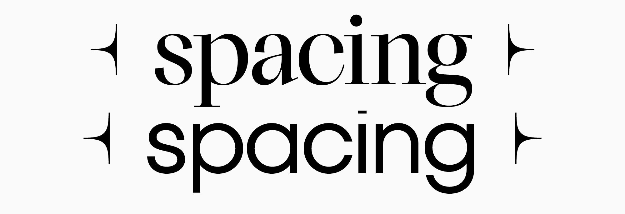
Headline fonts are easy to recognize by denser text set. You can experiment: take a text font and increase the point size to 30. The spacing between letters will become huge, and the text will become poorly readable. For this reason, in headline fonts, character fit, that is, the distance between characters in the font, is reduced. The set becomes denser, and the text is readable.
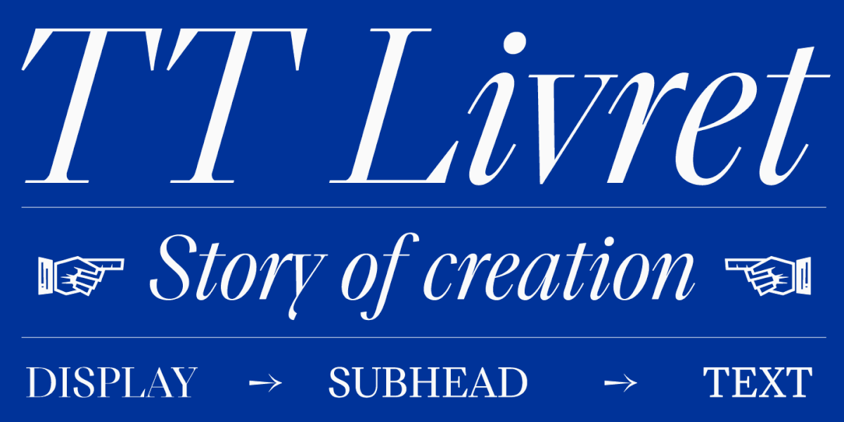
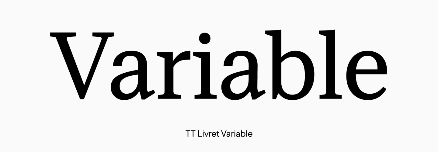
The most popular TypeType headline font is TT Livret Display. It is part of the TT Livret family, which consists of three fonts: text TT Livret Text, headline TT Livret Display and subheading TT Livret Subhead. The headline subfamily has high contrast and elegant thin serifs, while the variable style allows you to find the optimal parameters for contrast and expressiveness of the font.
Geometric sans serif TT Fors also has a heading version. In addition to reducing character fits and increasing contrast, the TT Fors Display headline subfamily has a more pronounced character.
Headline fonts are great for large headlines, posters, logos, and signage.
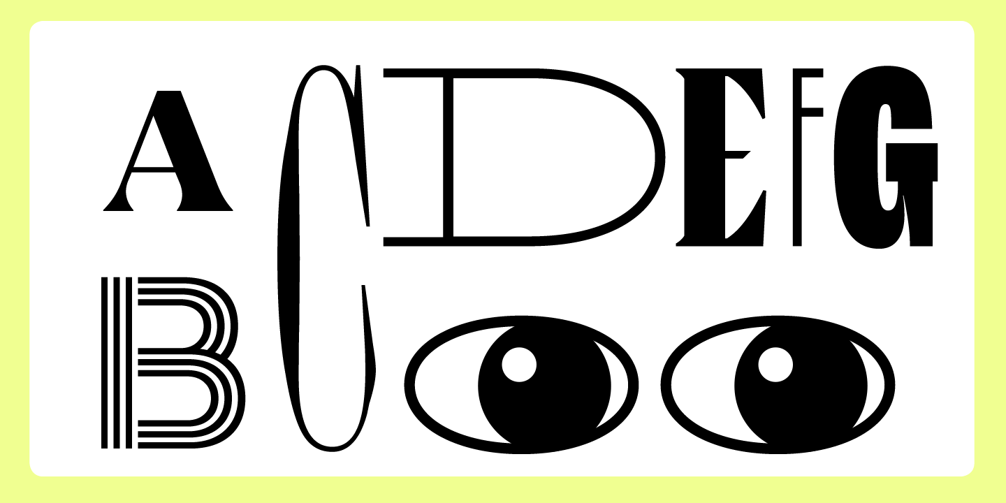
Decorative fonts
Decorative fonts are mentioned in some classifications, although they are not always recognized as a separate category. They are part of display fonts, but stand out with their more pronounced character.
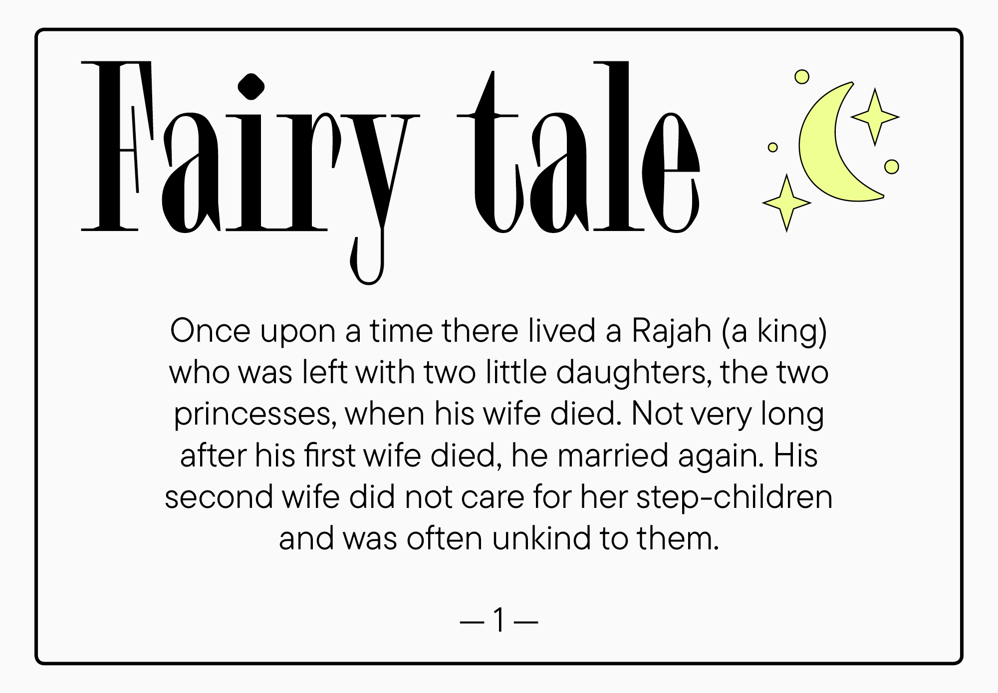
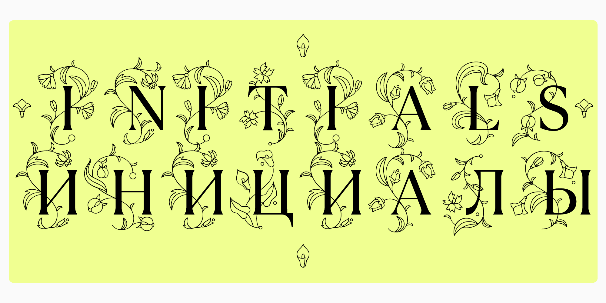
Such fonts may contain ornaments, patterns and other noticeable display details. A good example of the use of such fonts is children’s fairy tales. We are talking about the initial cap — a large capital letter, which is the first in the chapter. This letter is much larger than the others and is usually decorated with additional elements.
In decorative fonts, the details are noticeable and exaggerated. Such fonts should be used carefully, in short text phrases. A decorative font that suits the project will have a strong effect on the audience.
There are 3 decorative fonts in the TypeType collection: TT Ramillas Initials, TT Marxiana Elzevir, and TT Smalls.
TT Ramillas Initials is a decorated face of the high-contrast TT Ramillas serif. Suitable for bright accent lettering, it can be used as a modern version of the initial cap in catalogs and magazines. The capital characters of this style are decorated with elegant ornamentation.
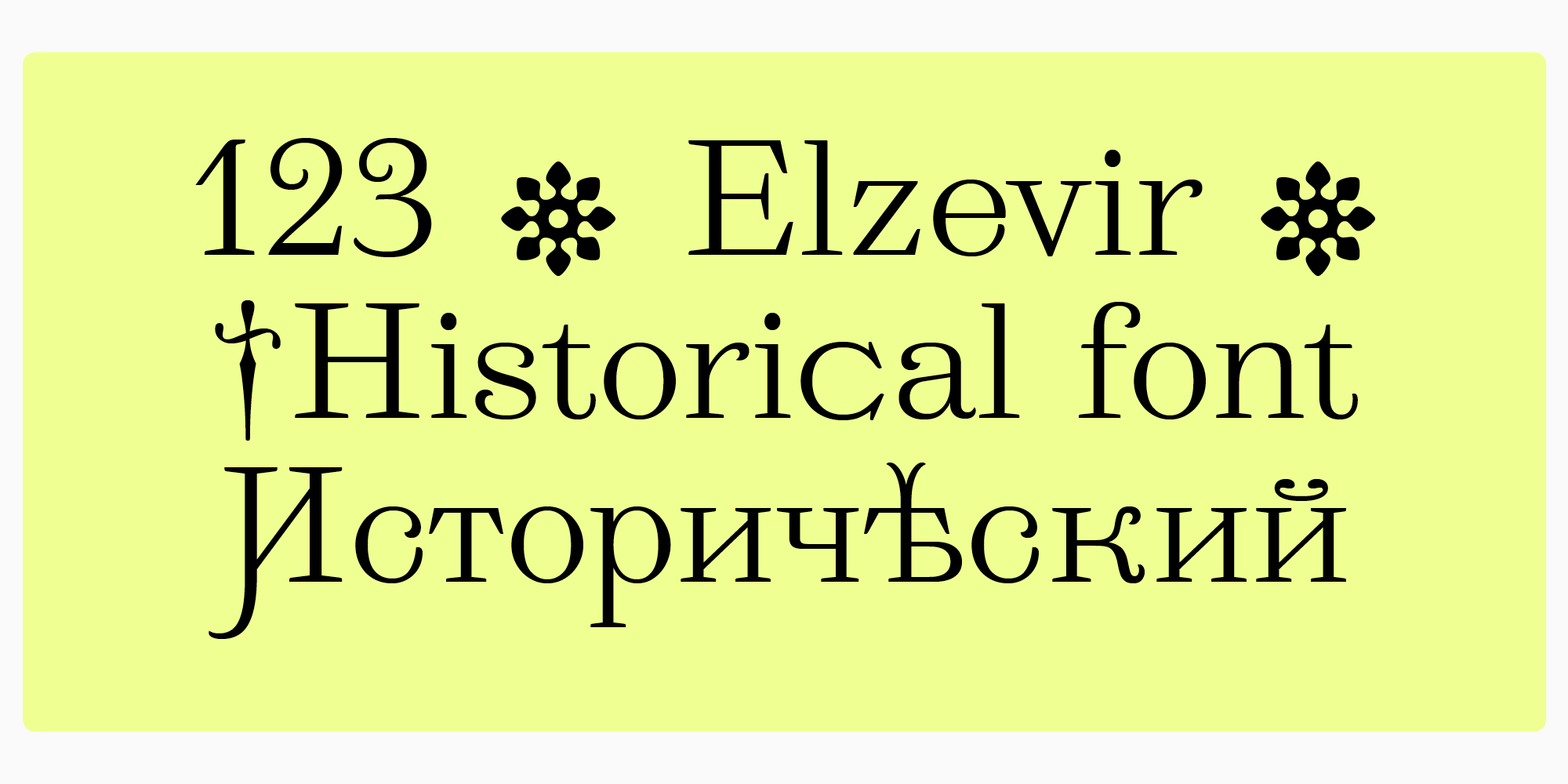
TT Marxiana Elzevir is one of the TT Marxiana typefaces, drawn from a historical example. It includes a set of characters with flourishes and display elements. This font is suitable for headings or for cover design.
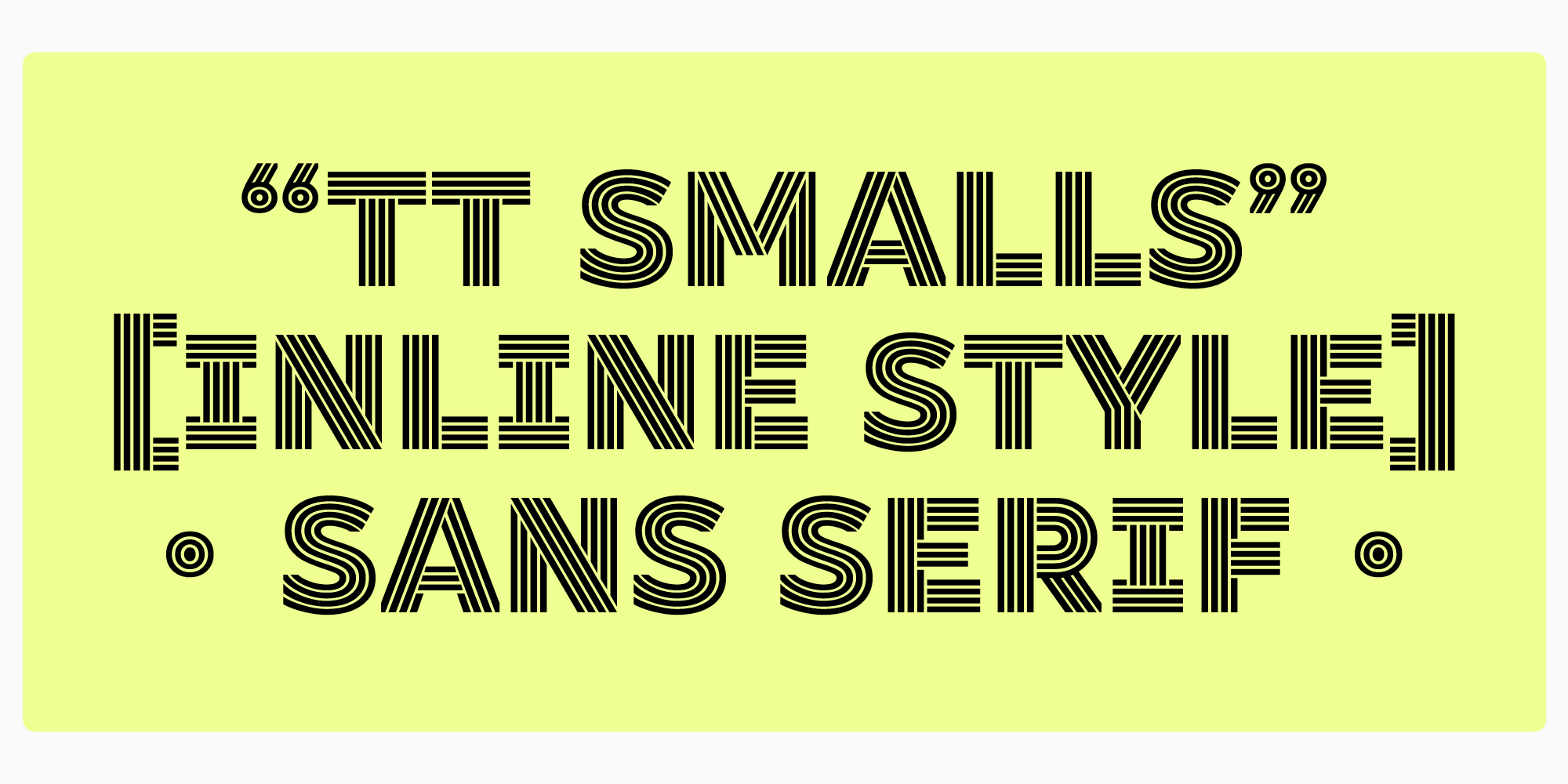
TT Smalls is a modern typeface consisting of uppercase characters in an inline version. Despite the fact that the letter designs are based on geometric sans serif, the font has a pronounced character. The number of strokes inside characters changes with increasing boldness.
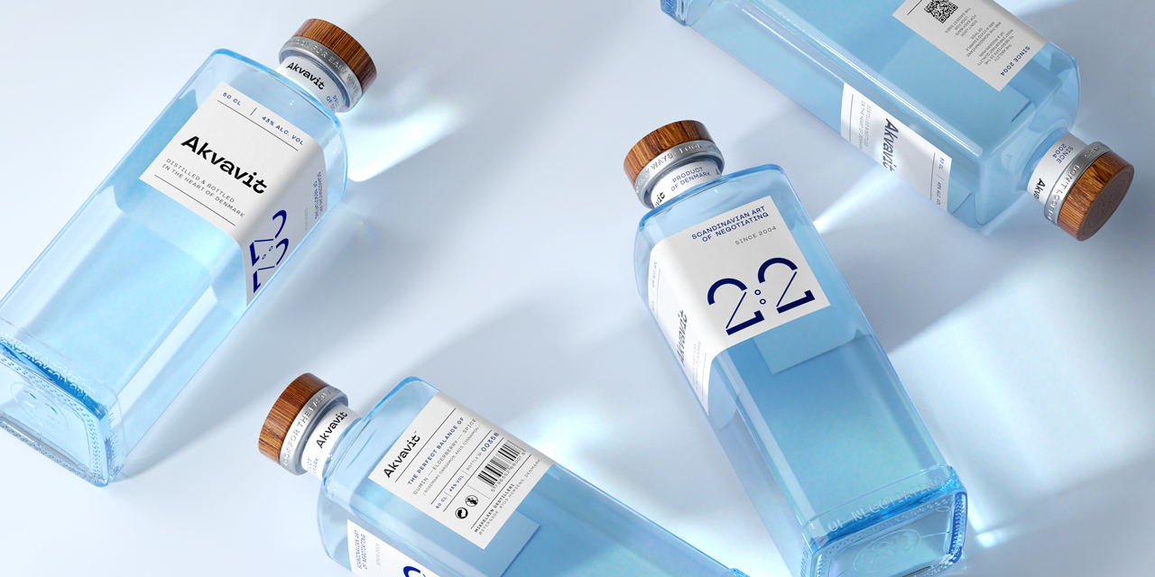
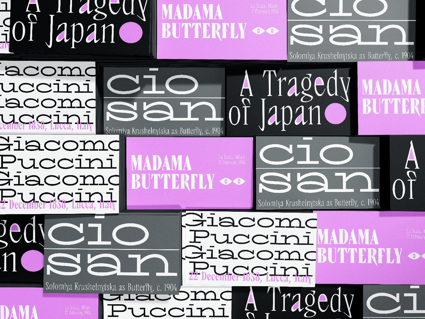
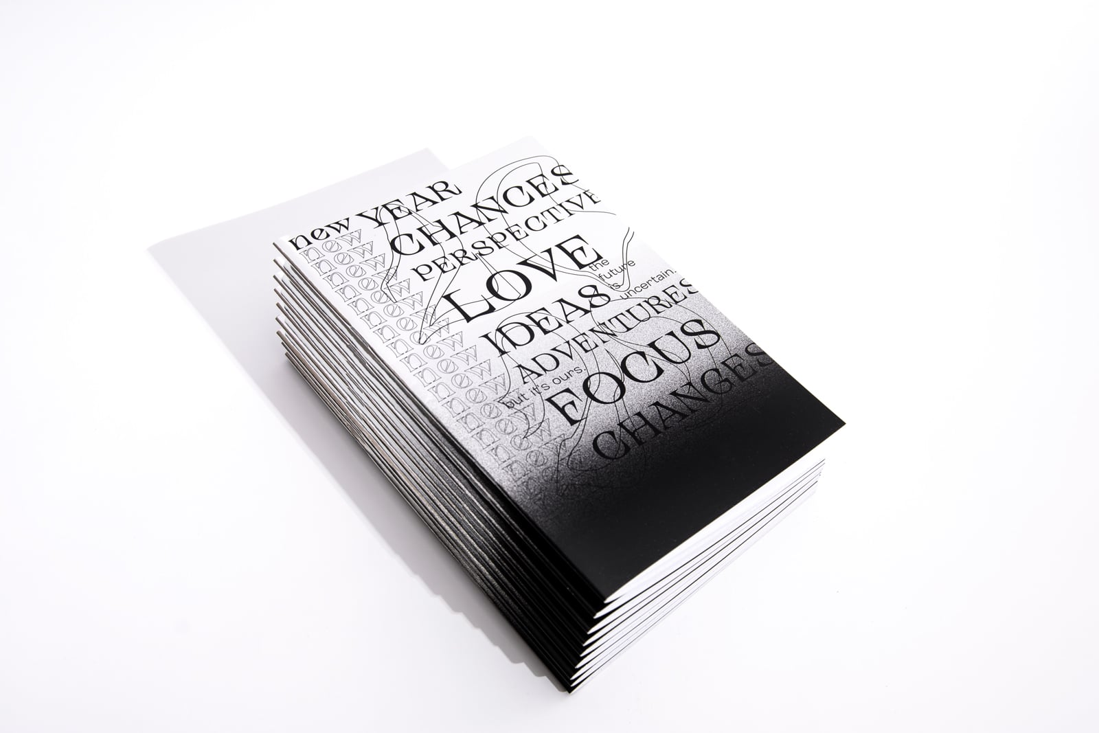
Display fonts attract attention, help to place accents and feel emotions from what you read. They are used everywhere. In the digital space, you see them in logos, website and app titles. In the offline world, such fonts can be found on signs and banners, in menu design, on posters, product packaging and book covers.
To find a perfectly fitting decorative font, theoretical knowledge will not be enough. Visual experience and your own feelings will help you make the right choice of font.