Creating your first font is most difficult because the designer does not yet know all the details of development, does not have enough visual intuition and experience. When developing a font for the first time, you have to learn a lot in the process, transferring theoretical knowledge about type design to practice, which is always difficult.

However, it is with the first font that the path of a type specialist begins. To become an experienced designer, you need to make your first font, then the second, then the third, while learning what shortcomings of the first stages need to be corrected.
Later, when the specialist gains experience, the first works will seem incorrect, naive, and yet cause warm nostalgia, because it was with them that the professional path began.
In this article, we will tell you how to start developing your first font, what software you will need for work, and what you need to pay more attention to.
Theoretical background
Before you start the actual work, stock up on knowledge. This path is similar to the university approach: first a lecture, only then practical application in seminars. However, this is not a strict rule, because it is easier for some to gain knowledge in the process, taking up work right away and studying specific issues that arise in creation. Choose the path that suits you.
Among the resources that will help you create a font, you can also choose the ones that suit you. We recommend focusing on different sources: books, Internet portals, and specialist broadcasts.
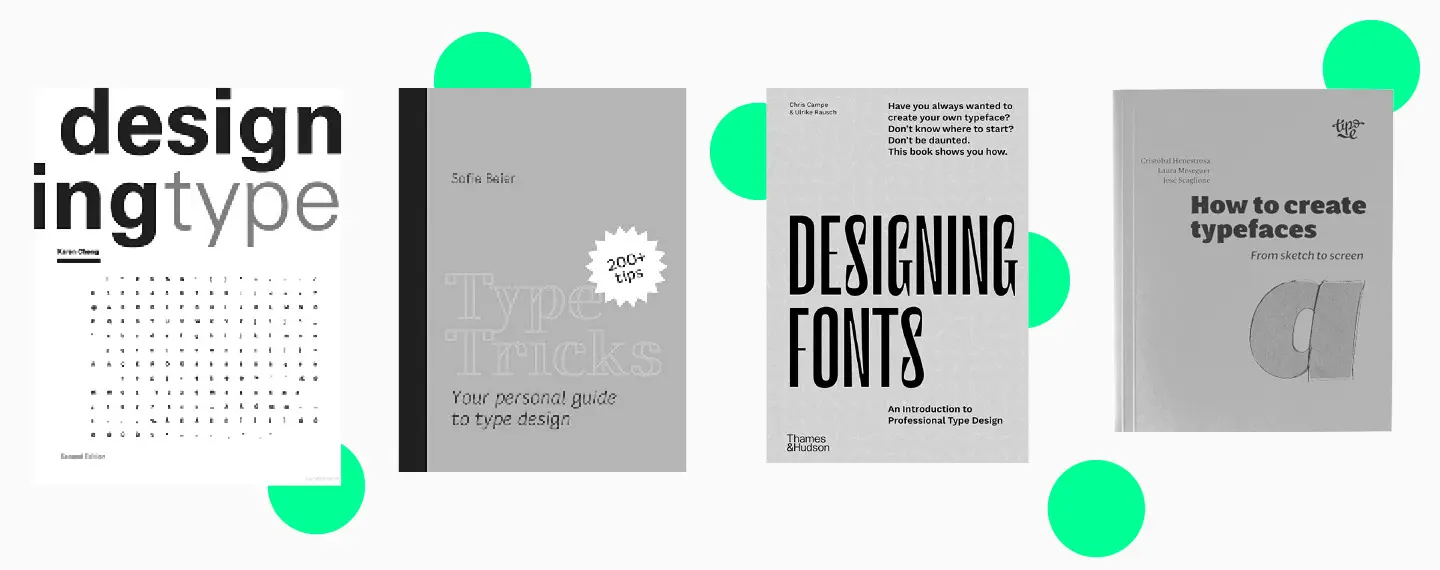
These are the books worth keeping on your work desk:
- Designing Type by Karen Cheng;
- Type Tricks: Your Personal Guide to Type Design by Sofie Beier;
- Designing Fonts: An Introduction to Professional Type Design (ed. Thames and Hudson);
- How to create typefaces. From sketch to screen by Cristobal Henestrosa, Laura Meseguer, Jose Scaglione.
It’s also worth following type designers on social media, especially if they’re streaming and sharing type design tips. For example, every month, TypeType studio hosts an online lecture on the topic of type design:
The more different sources you find in the initial stages, the better. Later you can sort through them and retain the most favorite and useful.

Stages of creating your own font
So, you are armed with knowledge and ready to get to work. You will need the equipment, i.e. a laptop or a computer, the right software, and the desire to create the most beautiful font in the world.
1. Start by setting the task and determining the set, style, and nature of the font. For the first font, it is better to choose the minimal character set. Answer the following questions in your notepad or a text editor:
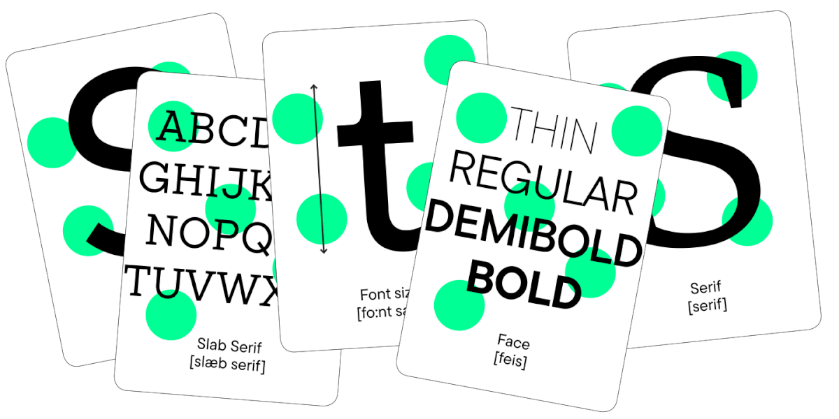
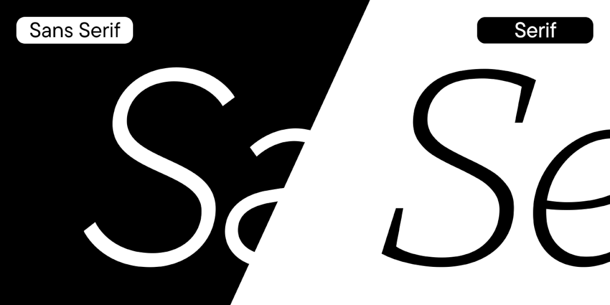
- What font you are creating: sans serif, serif, slab serif;
- Where your font can be used: on the web, in print, in store window design;
- How your font is positioned: ultra-modern font for stylish project, or a classical font with a strict character that evokes a certain historical era or fitting a certain trend;
- In what size and where the font will be used: in heading design, in apps, in posters, or online only.

2. Set deadlines. Even if you’re designing a font for personal use, it’s helpful to develop the habit of working towards deadlines.

3. Do your research. At this stage, it is worth choosing from 3 to 10 typefaces that are close to what you plan to design. Of course, you should not copy them in your project, but it is useful to study the graphic features, sizes and other font parameters in order to understand the construction logic.
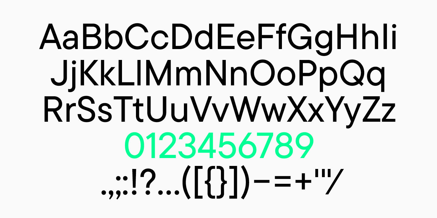
4. Decide on the character set. This should already be done at the first stage, but this time you need to select in detail all the characters that you plan to draw. It can be one language, for example, basic Latin, numbers, and a punctuation set.
5. Work with sketches.
Sketches
When the research is done and the idea of the future font is formed, start sketching. You can use pencil and paper, ink and brush, or a graphic editor for this.
The purpose of sketching is to define the visual shapes of a font.
At the beginning, you can draw some characters to outline the general shapes of the font. When the style and basic shapes are ready, move on to work on specific letters.
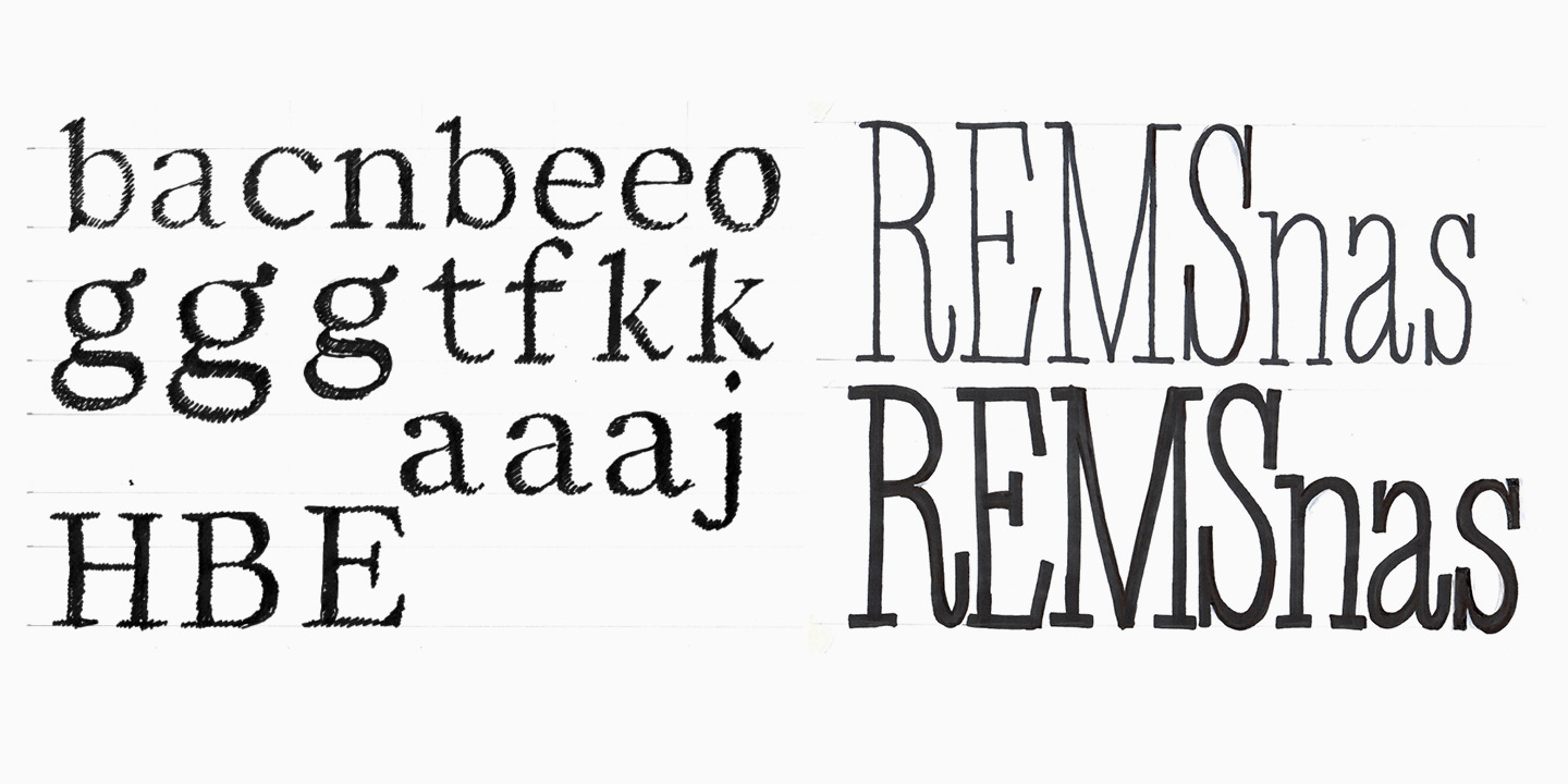
You can turn to sketches when you can’t decide on the shape of a glyph. For example, to choose between two variants of the letter «a», draw several shapes and choose the right one using sketching.
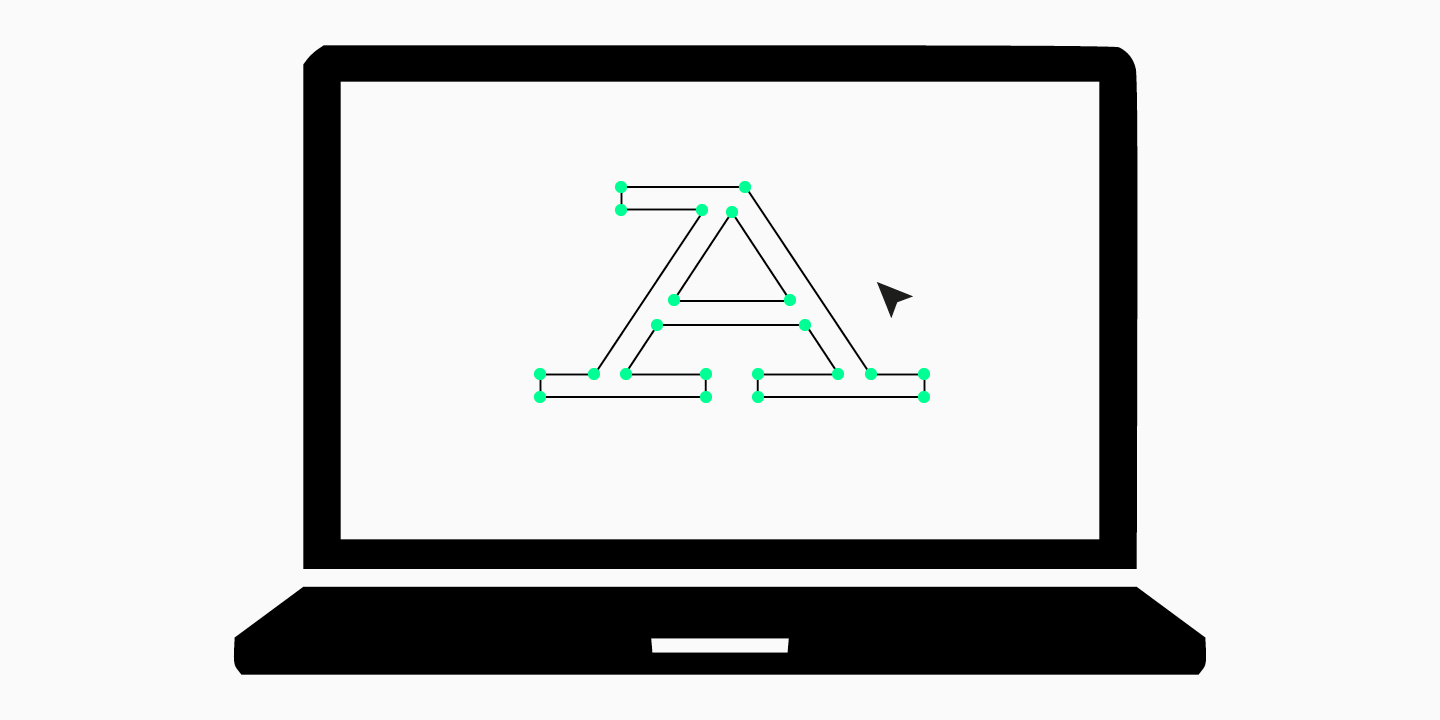
Drawing the character set
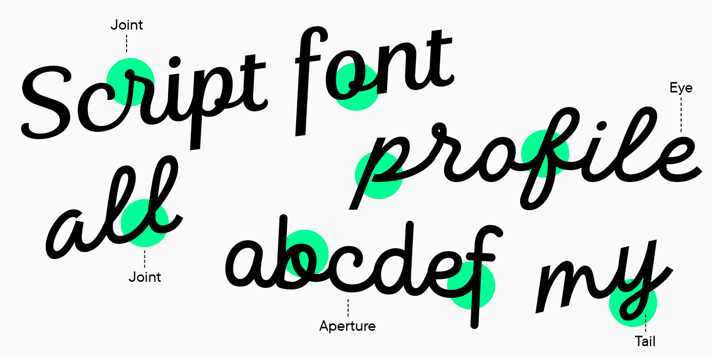
When all the previous steps have been completed, proceed to creating your typeface in a font editor. Remember that a font is not individual letters, but a system of symbols united by a common idea and character. Graphic solutions that make up the font style should be logical and repeated in several characters.
At this stage, you have to draw all the characters of the font: Latin or Cyrillic, punctuation, currencies, fractions, additional characters. As we mentioned earlier, start with the simple and basic composition to finish the font on time, gain experience, and feel the joy of completing the project. In subsequent projects, you will be able to expand the character set.
A font can have several faces, including upright and italic. Start with one, like Regular or Medium, which are the most common and commonly used.

When the drawn character set is ready, start spacing. At this stage, all letters are assigned the correct values for the left and right half-approaches, in other words, this is the work on spacing between characters.

Technical part
A font is not just a set of rendered characters, it is a product that can be used in software.
After the design-centered part of the work, the technical stage begins. It is this stage that determines how well the created font will work. For your first font, you can team up with a more experienced specialist to help with the technical part of the job.
Conventionally, this stage consists of three stages: mastering, kerning and TrueType hinting.
Mastering is the checking and editing of contours, components, diacritics, and other elements of a font. At this stage, OpenType features are created, and meta-information inside the font is filled.

Kerning is the process in which the spacing between letters is brought to perfection. Simply put, at this time, the instances in which there is too much white space between the letters are corrected. This stage occurs after the spacing work is completed.

Hinting is the visual markup of a font for the correct display of small sizes in various operating systems.

Tools and software for creating fonts
There is a lot of software for working with fonts. Here are the ones often used by type designers:
- Glyphs;
- Fontlab;
- Robofont;
- FontForge;
- Fontographer.
Perhaps Glyphs and Fontlab can be singled out from this list, since most specialists use them. This is due to the convenience of the interface, a variety of tools, and adaptability to the user. The TypeType studio prefers Glyphs, although the studio’s work was previously done in Fontlab.
We recommend that you get acquainted with 2-3 different softwares, study their functionality and understand which is most comfortable to work in. Many provide a trial period, so it won’t require a lot of resources.
Later, you should choose one software and work in it, increasing your experience and improving your type design skills.
Conclusion
Creating a typeface for the first time can cause fear of the unknown, as many beginners feel like they can’t do it and creating a typeface is very difficult.
Dare to create your first font, because in the future you will remember it with warm nostalgia. Make mistakes, experiment, create imperfect typefaces and make changes to them — over time, you will understand in which direction to continue.
FAQ
What are the main stages of creating a font?
The font creation process consists of several key stages:
– Concept and Sketching: Defining the style and hand-drawing the key characters.
– Digitization: Transferring the drawings into a vector editor.
– Full Character Set Creation: Developing lowercase and uppercase letters, numbers, and punctuation.
– Metrics and Spacing: Setting the sidebearings and kerning pairs for balanced text.
– Generating the Font File: Assembling the final file in a format like OTF or TTF.
– Metrics and Spacing: Setting the sidebearings and kerning pairs for balanced text.
– Generating the Font File: Assembling the final file format like OTF or TTF.
What software is used to create fonts?
Different software is used for different stages. For drawing the vector glyphs, Adobe Illustrator and Glyphs are popular. For the complete process of building the font file and setting its metrics, specialized programs like Glyphs, FontLab, or the free FontForge are used.
What are font metrics and why are they important?
Font metrics are the system of spacing and distances between characters. This includes:
– Sidebearings: The space to the left and right of each character.
– Kerning: Adjusting the space between specific pairs of characters (like “”A”” and “”V””).
Proper metrics ensure that text is even, balanced, and easy to read.
What are vector outlines?
Vector outlines are the mathematical curves (called Bézier curves) that define the shape of each character. They are crucial because they allow a font to be scaled to any size without losing quality, which is an essential requirement for modern typography.
What books can I read about creating fonts?
Here are some books worth reading before you start the font creation process:
– Designing Type by Karen Cheng
– Type Tricks: Your Personal Guide to Type Design by Sofie Beier
– Designing Fonts: An Introduction to Professional Type Design by Thames & Hudson
– How to Create Typefaces: From Sketch to Screen by Cristóbal Henestrosa, Laura Meseguer, and José Scaglione
What does the technical side of font creation involve?
Broadly speaking, the technical part consists of three main stages: mastering, kerning, and TrueType hinting.