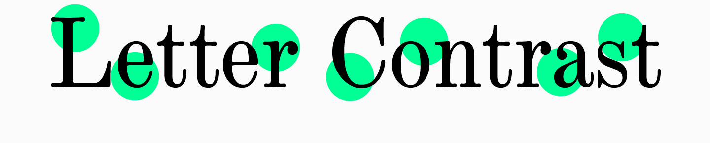
A harmoniously selected font not only conveys information to the audience, but also visually complements the project. A mistake in choosing a font can spoil the impression and alienate the viewer from the product, whether it be a poster, a sign for a store or cafe, product packaging, a website or an app.
The ability to intuitively choose fonts for projects is a dream for beginners and an ordinary task for professional designers. To get from the first category to the second, you need years of training and study of typography, lots of observation and theoretical knowledge about fonts.
Modern typography provides the designer with thousands of typefaces to choose from. We tell you how to navigate in the first stages in order to find a suitable font.
Basic typographic concepts
Apertures, serifs, faces, stems, arches, inflows — the terms used in typography can make your head spin. It is especially dangerous to dive into terminology for those who are just starting to get acquainted with fonts.
Take a breath: many of the words used by type designers can be bypassed in the early stages of design. However, some of the terms are useful to know: this way, it will be easier to understand what criteria to look at when choosing a font.
We have compiled a mini-dictionary of typography terms.
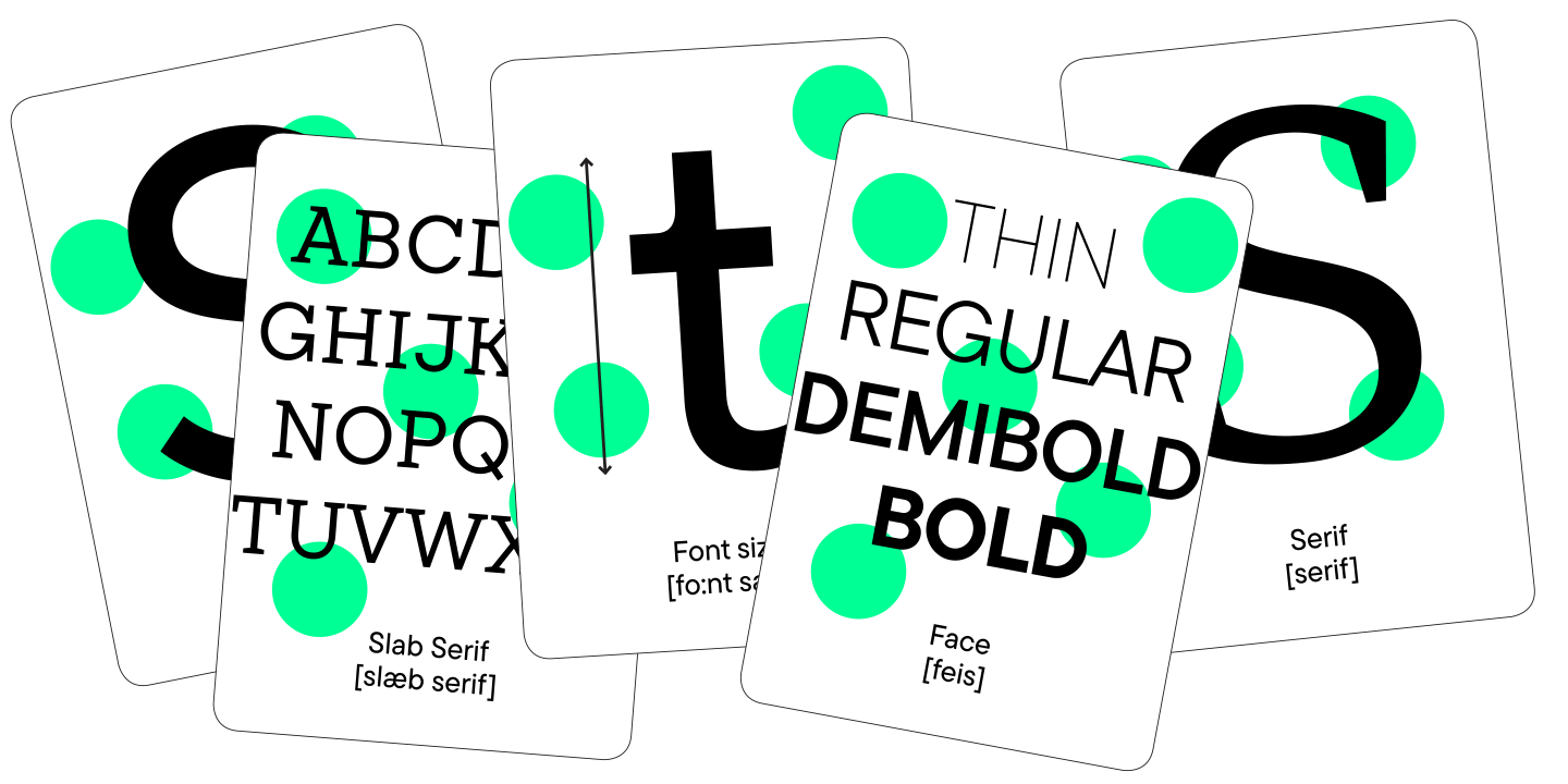
- A font family is a set of different fonts in the same typeface. A font family can include fonts that differ by purpose, weight, and even style.
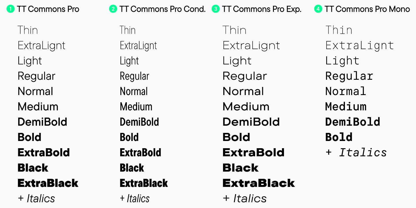
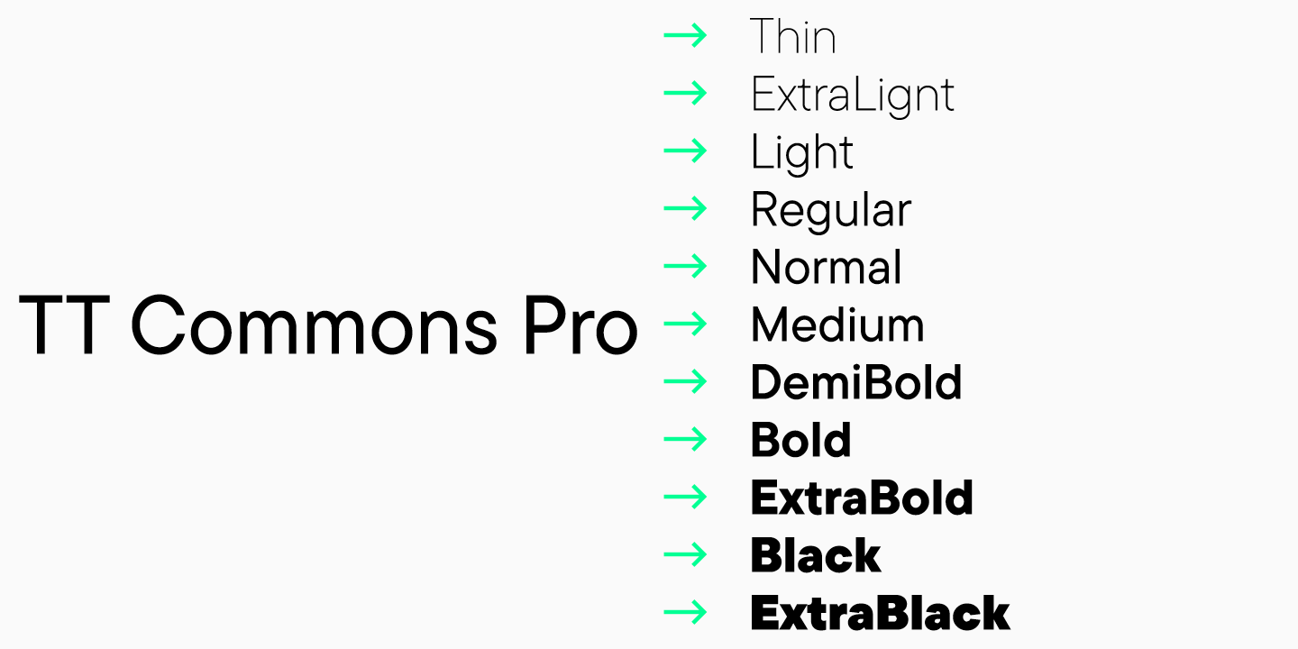
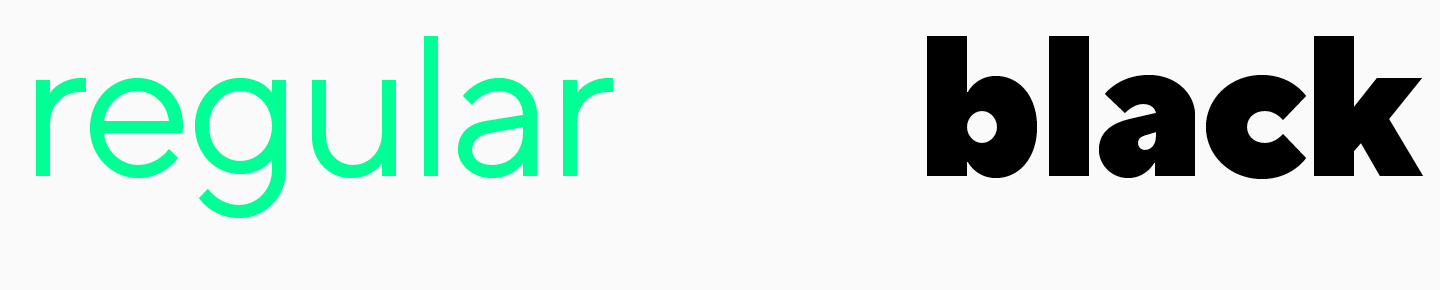
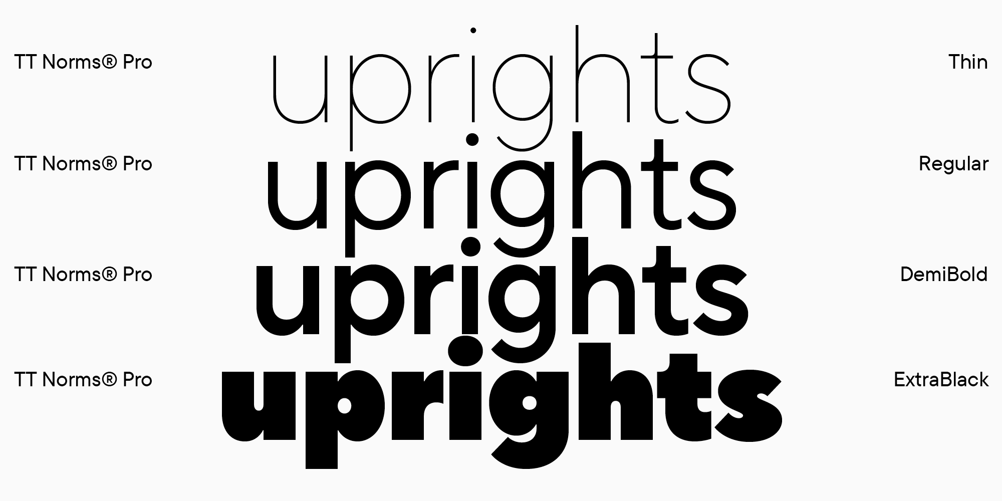
- A face is the font in a single weight. A typeface can have either 3 or 9 weights, from the thinnest to the boldest. Common faces: Thin, Regular, DemiBold, Bold.
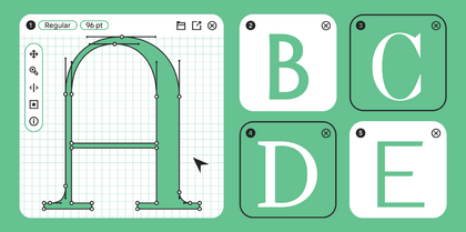
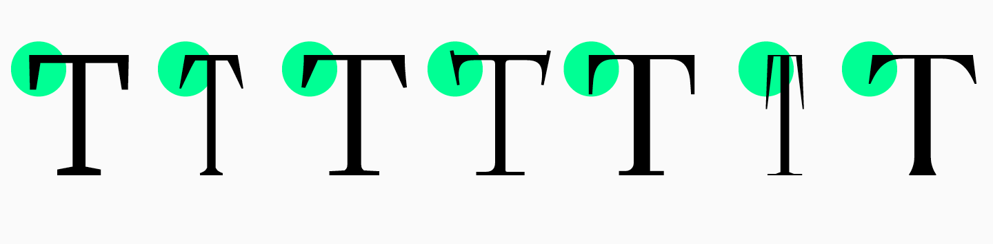
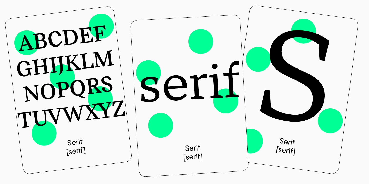
- Serifs are short perpendicular strokes at the ends of the basic elements of a character.
- Type size — this is the height of the font characters, that is, the vertical size.

What fonts there are (classification)
There is no single type classification that all designers use.
Fonts can be divided according to the historical eras in which they appeared, their visual form, and purpose. Let’s have a closer look at the types of fonts the knowledge of which will definitely come in handy in modern typography.
Classified according to their purpose, fonts can be display and text.
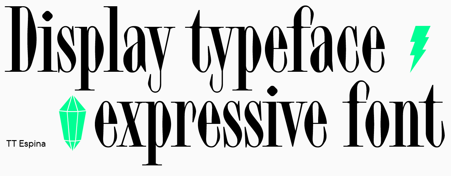
Display fonts are sometimes called heading fonts, as they are used to design headings or highlight catchy inscriptions. These are expressive fonts that catch the eye of the viewer.
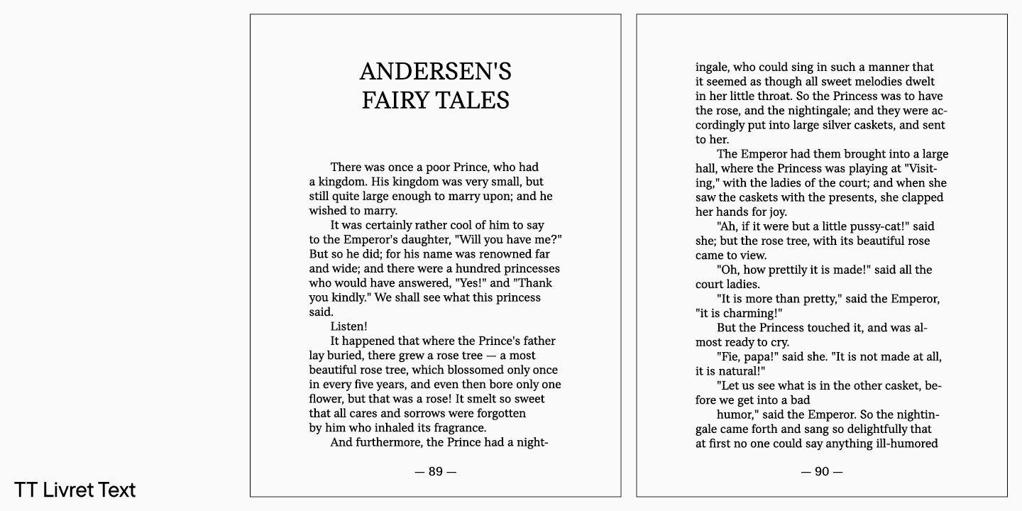
Text fonts are fonts for typing, they may also be called typesetting fonts. These are fonts with a calmer character, with high readability even in small sizes. A good text font does not distract from reading, looks solid and pleasant.
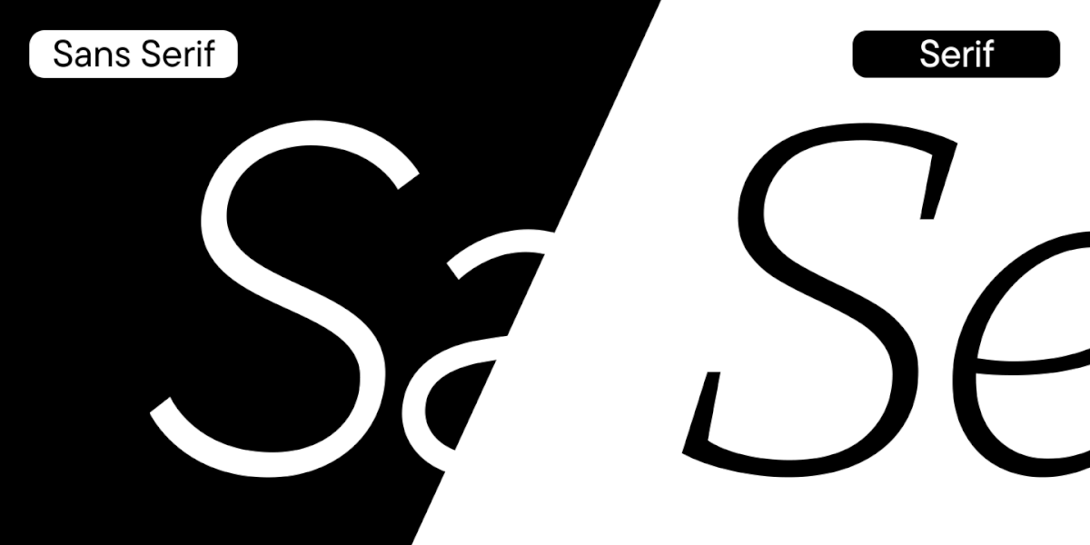
There are many font styles, and we will look at the most common ones: sans serifs, serifs, and slab fonts.
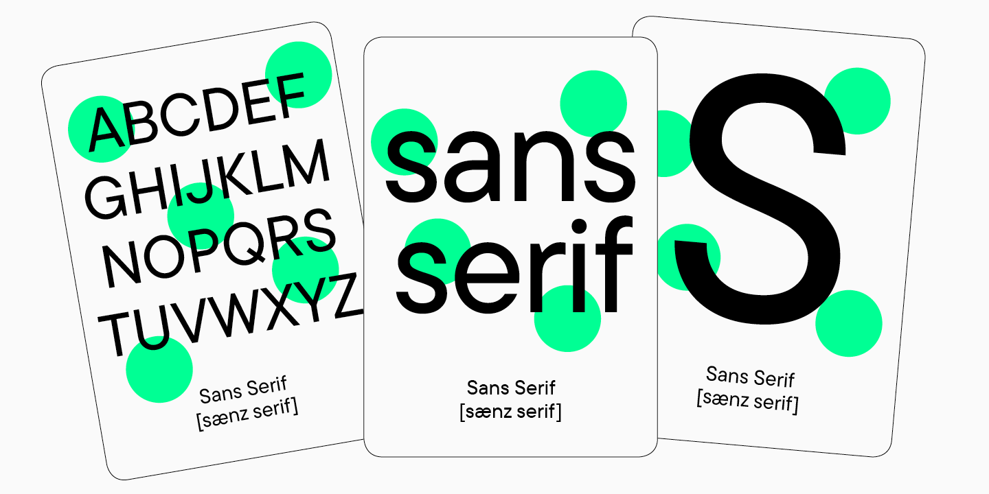
Sans serifs are the group of fonts without serifs. These are universal fonts, functional and usually calm.
Serifs are the group of fonts with serifs. These are fonts of a classic, elegant, or traditional nature.
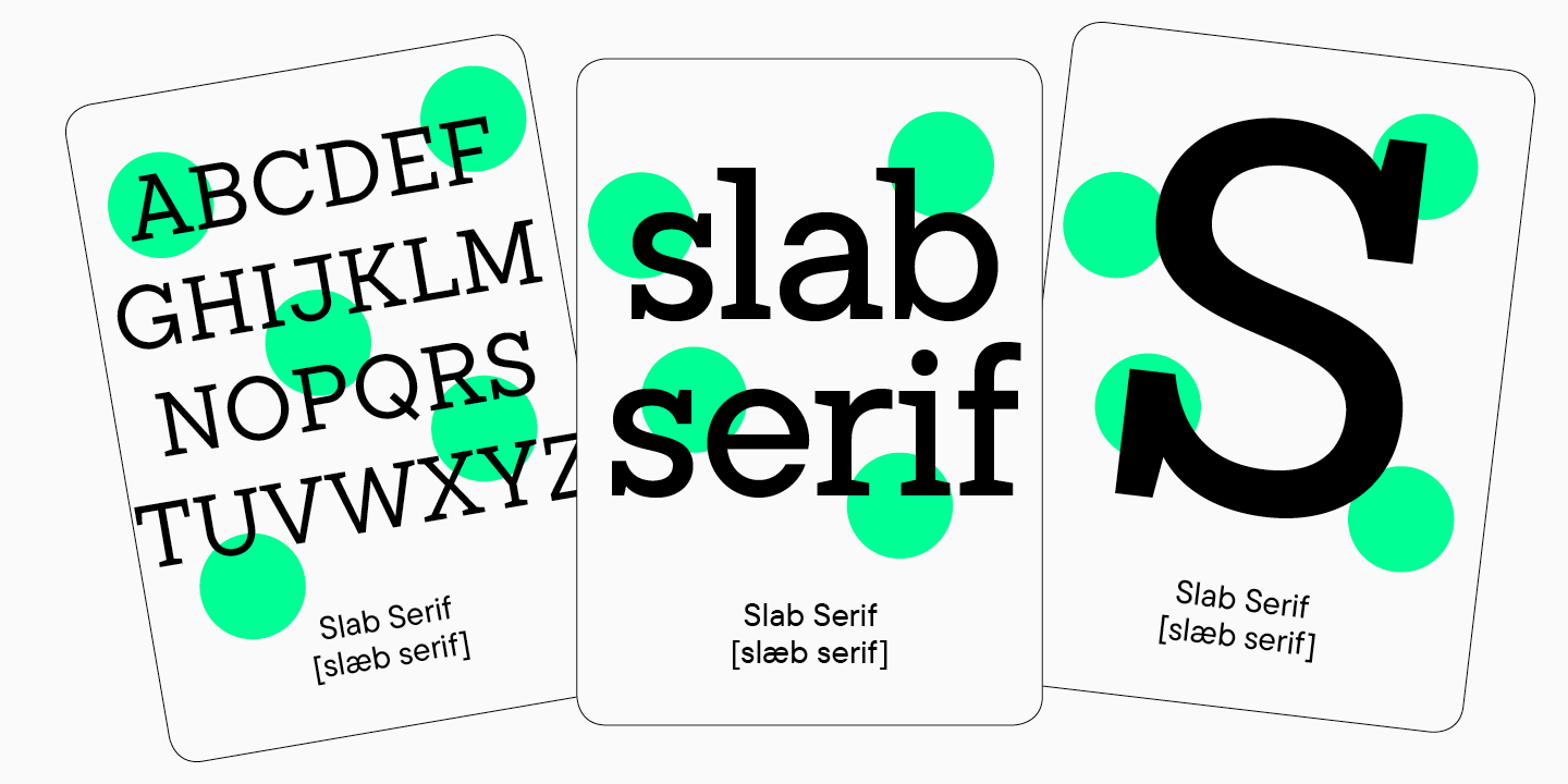
Slab fonts are fonts with large brutal serifs.
Many fonts do not fit any specific group and are at the intersection of styles.
Font properties
Not everything is defined by the font’s purpose or style. Each font has its particular character.
The character of a font is what sets it apart among the others. This could be its visual peculiarities, proportions, or noticeable graphics.
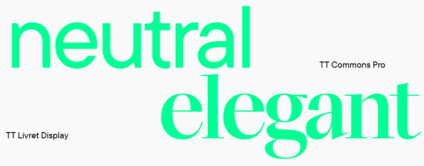
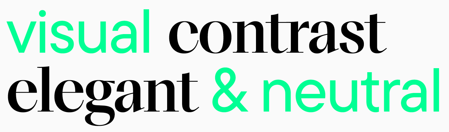
TypeType Studio, for example, uses simple descriptions to help designers choose the right scope for a font. A font can be neutral in character, then its scope of application will be quite broad, or it can have an expressive character: brutal, technological, elegant.
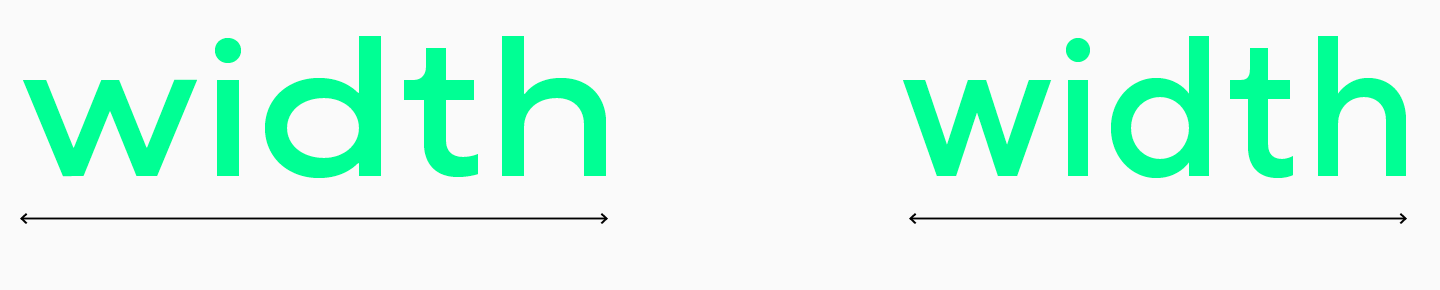
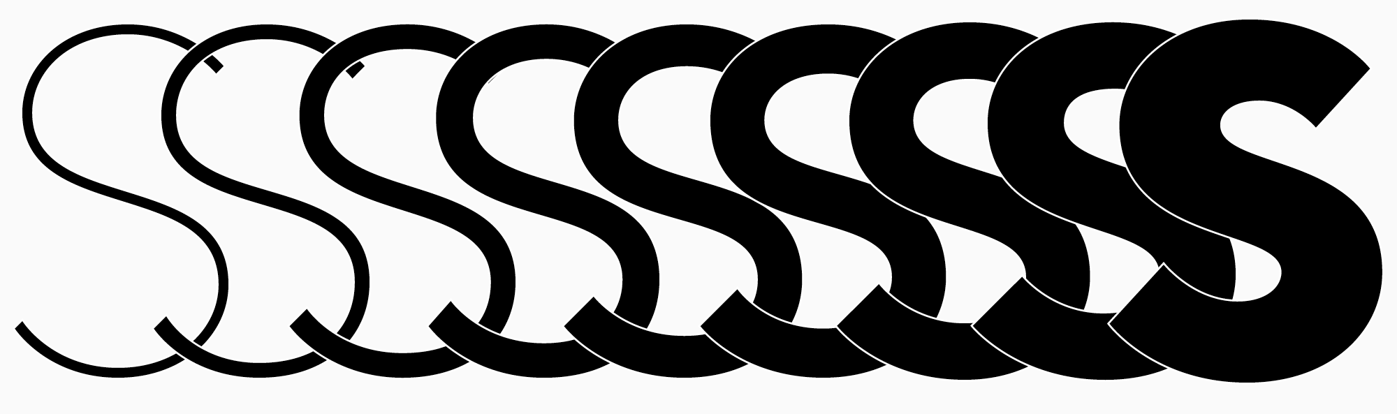
There are also other characteristics, in which fonts can differ: in width, stroke or letter contrast, or saturation.
Contrast is the difference in thickness of thin and thick strokes in characters. TT Marxiana is a high contrast font
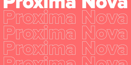
Font styles
Each font family or subfamily consists of a certain number of styles. Depending on the style and type of font, this value may be different.
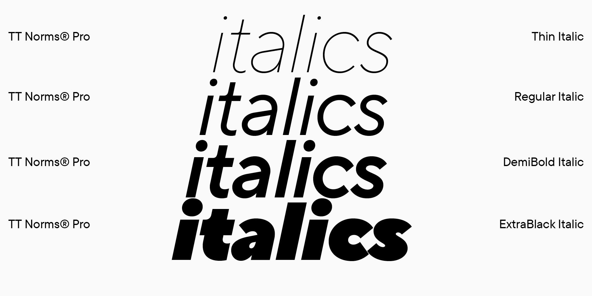
As we wrote earlier, a style is a single-weight font. Usually styles are differentiated by slope and thickness. A single font can include both upright and italic styles.
Upright styles are the main ones. Such fonts are used more often, so almost all typefaces have them.
Slanted, or italic, styles are fonts in which characters are placed at an angle relative to upright styles. These fonts can be used to highlight text, or to style headings and quotes. Typically, italics are created to match upright styles.
Some fonts may only have upright faces, such as some decorative fonts with an expressive character. There are also fonts in which there are only italic styles. Handwritten fonts are a prime example, as handwriting that such typefaces imitate often implies slanted characters.
As a rule, fonts have the same set of upright and italic styles, that is, the boldness of italic styles corresponds to the boldness of upright styles.
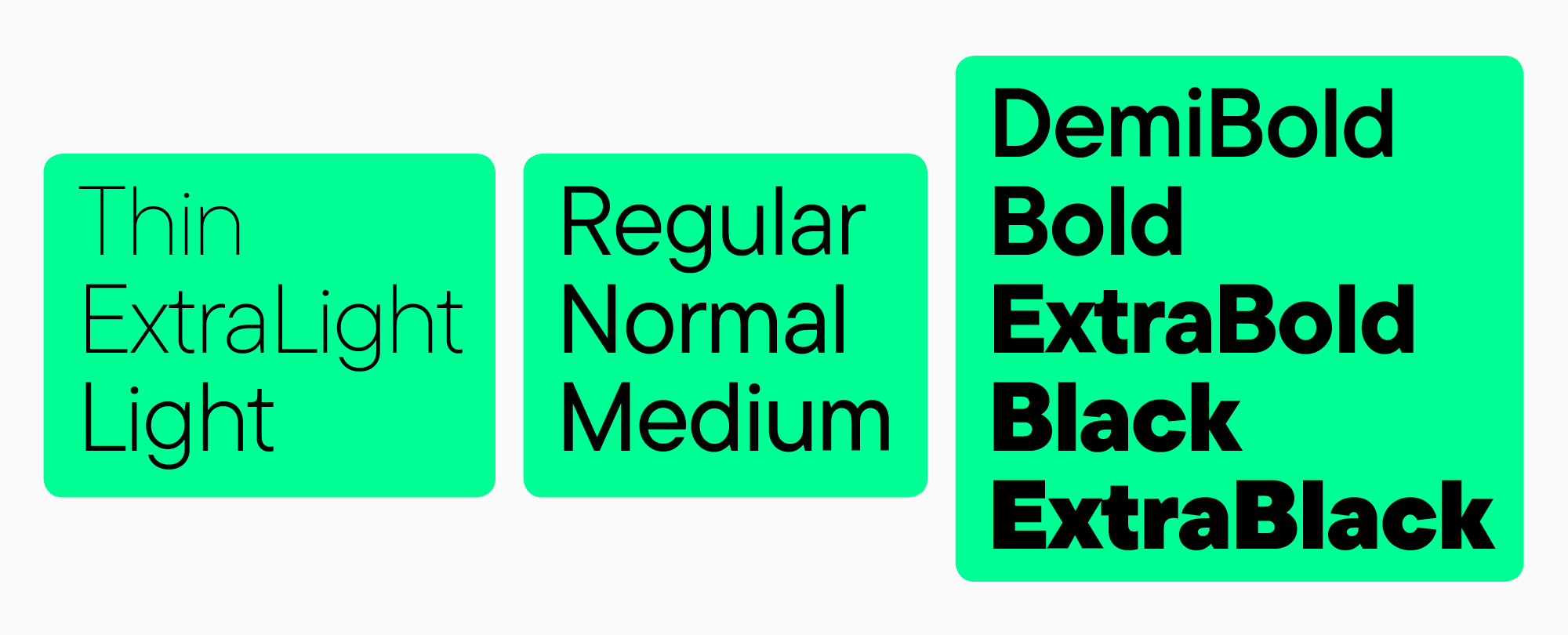
The boldness of a font may vary.
The following groups of styles can be distinguished:
- thin: Thin, ExtraLight, Light;
- normal: Regular, Normal, Medium;
- demi-bold and bold: DemiBold, Bold, ExtraBold, Black, ExtraBlack.
The choice of style depends on the task and scope. For printing large materials, especially posters, bold fonts can be used as they look better in large size. The choice of a font for a logo depends on the corporate identity of the company, but for typing a text array on a website or in periodicals, standard styles are often chosen, for example, Regular or Normal.
How to tell if a font is good
A good font is a typeface that suits the project in terms of character, associations, and visual character. Any font can be suitable if used correctly.
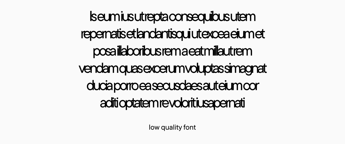
There are no bad fonts, only low quality ones. It is difficult to work with such fonts since the set in such a font will look inharmonious, the letters may run into each other or, conversely, be too far away. It is impossible to work with such fonts, so before purchasing a font, check its quality. This can be done by downloading the free version — many studios provide this opportunity.
How to choose fonts
It is difficult to give a universal guide to choosing a typeface because designers spend years learning how to choose the right font without spending weeks.
However, there are guidelines to help you choose the right one.
1. Carefully study the nature of the font comparing it to the positioning of the project. For example, if a font is described as «soft, flowing, and airy,» it might be a better choice for companies with the same positioning, such as a brand of clothing made from natural fabrics. Such a font is hardly suitable for an IT brand, it is better to choose something technological, and for a bank or a medical company, look for a more classic, traditional font with a calm character.
2. Test! For example, TypeType Studio provides trial, that is, free, versions of the fonts so that the designer can try out the font for their project and decide whether to buy a license. Check with the company that made the font you like about this option — many large studios provide free test versions to their customers.

How to choose the font size
The font should fulfill its purpose, that is, it should be readable in the case of a text array, and attract attention in the case of headings.
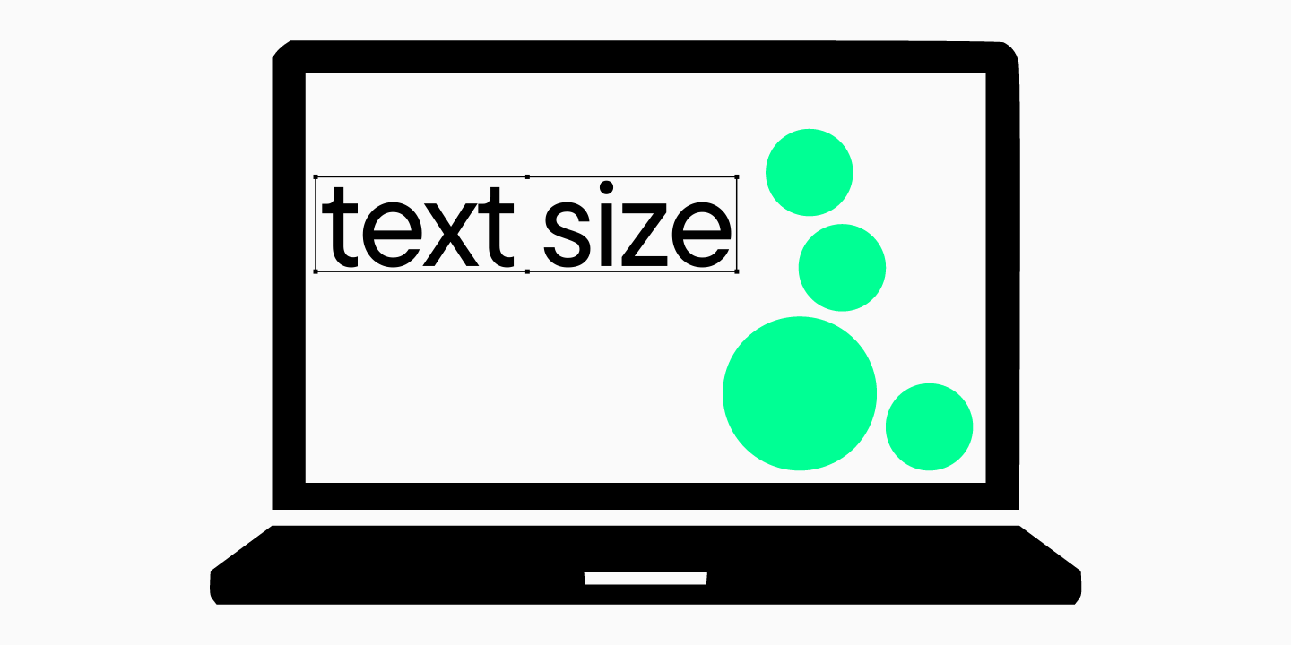
In practice, it is better to test several sizes in order to choose the most convenient one. It all depends on where the font is used: on the web or in printed products, in posters or in an app, in a book or on a store sign.
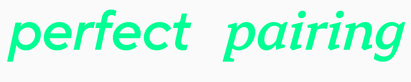
Font combinations (font pairs)
For each project, it is best to use no more than two fonts — this is an unspoken rule of typography. Of course, there may be exceptions, but it is better to use font pairs in the design.
A font pair is two fonts that pair flawlessly with each other. They can look great because of the similarity of character, or, conversely, be appealing because of the visual contrast.
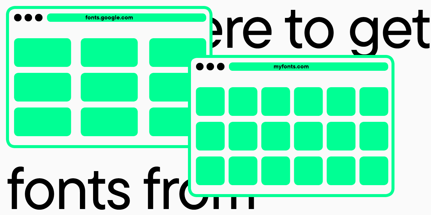
Overview of popular fonts. Where to get fonts from (free, commercial)?
New fonts are released every month, and the ratings of popular fonts are regularly updated. Free fonts can be found on GoogleFonts, and a large collection of fonts is presented on the MyFonts site, where ratings of the most popular typefaces are also published. You can purchase fonts directly from studios whose typefaces attract your attention. For example, the TypeType font collection is regularly updated, and those who purchase fonts directly receive personal discounts: https://typetype.org/fonts/
Font and text editing software
Almost all modern graphic, text, and video editors support fonts.
Useful links: What to read about typography?
You can learn about font classifications on the website or in the book Letter Fountain, Taschen.
To find out how typefaces are created and the logic behind the formation of typefaces of different styles, read Gerrit Noordzij’s book The Stroke: Theory of Writing. This is a classic edition that will be useful not only for type designers, but also for those who want to better understand typography.
Conclusion
Typography may seem complicated, but only from a distance. The more you immerse yourself in the study of fonts, the better you will understand how and which fonts are best suited for your projects.
Start the path of acquaintance with fonts gradually, constantly replenishing knowledge and applying it in practice.
FAQ
How do font classifications differ between traditional typography and modern digital design?
In traditional typography, fonts are more often classified by origin and letterform, while in digital design the use case matters more: interfaces, long-form reading, screen sizes, and language support. As a result, the same typeface may be evaluated differently because the tasks and constraints of the medium are different.
What is the difference between font style, weight, and typeface category?
A category refers to the broader type family, such as serif or sans serif. Weight describes how thick the strokes are, from thin to bold. Style is a variation in form, such as upright or italic, and can also reflect the overall character, for example neutral or display-oriented.
How do variable fonts change the way we classify font types?
Variable fonts blur the boundaries between styles: instead of a set of separate files, you get a continuous range across axes such as width and weight. That is why it becomes more useful to think not only in categories, but also in adjustable parameters that can be adapted to the context.
Can one typeface belong to multiple font categories?
Yes, many typefaces sit at the intersection of several styles and combine features from different categories, and that is perfectly normal. What matters is not the label, but how well the font solves the task: readability, character, and compatibility with other fonts.
How do font characteristics influence brand perception and user trust?
Proportions, contrast, stroke shape, and letter details all set the tone: strict, friendly, technological, or classic. When a font is easy to read and looks coherent, users are more likely to trust the product and perceive the brand as polished and well thought out.
What are the most common mistakes when combining different font categories?
The most common mistake is mixing fonts that are too similar, so the contrast is barely visible but the details start to clash. The opposite extreme is combining fonts with overly conflicting personalities and no clear logic, which breaks the hierarchy and rhythm of the text.
How do licensing restrictions vary between font types?
Restrictions depend not on the font category, but on how the font is used: print, web, apps, advertising, or broadcasting. Before launching a project, it is useful to check the rules and choose the appropriate license type on the Licensing page.
Are certain font categories more suitable for accessibility compliance?
In most cases, accessibility requirements are easier to meet with a neutral font that has no unnecessary decoration, open shapes, and stable spacing. More important than the category itself are the specific characteristics: how easily similar letters can be distinguished, stroke thickness, and rendering quality.
How do cultural differences influence font style preferences?
People get used to the visual norms of their own writing systems and contexts: in some places strict geometry feels more appropriate, while in others a more handwritten character works better. That is why the same style can feel official in one culture and too cold in another.
How can AI tools assist in choosing the right font category for a project?
AI-based tools can speed up the search for suitable options: they can suggest font pairings, filter by mood, and analyze similar solutions. But the final choice should still be checked manually on your actual texts, sizes, languages, and media.