
- A full lowercase set has been added (the small capital letterforms from the previous version can now be found in a small capital set)
- Numerals (0-9) and currency symbols have been added for minuscule and minuscule tabular figures
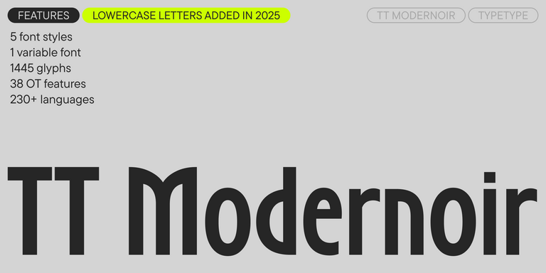
- The total glyph count per style has increased from 1,341 to 1,445
- New stylistic sets have been added: SS04—Alternative Straight Forms, SS05—Alternative Rounded Forms, SS06—Alternative r, SS07—Alternative l, SS17—Serbian localization.
- New OpenType features have been added, increasing the count from 31 to 38
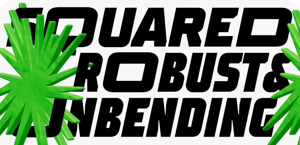
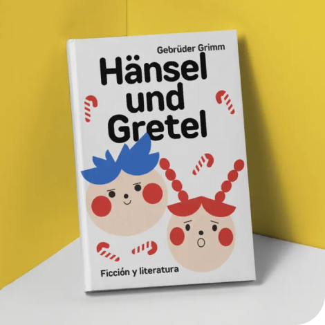
Straight Line Fonts
If you’re searching for the Straight Line Fonts to complement your design, TypeType studio is the one to provide a wide range of typefaces suitable for commercial purposes. The specific styles and the complete font families can be found on our page online: you may choose from a variety of well-made and technically verified fonts, use them for free, and leave a request to buy a suitable license type. TypeType gives an opportunity to download the trial versions of all Straight Line Fonts for you to use in your projects, as well as to get advice from design or client care teams. Feel free to contact us by our form on the website.
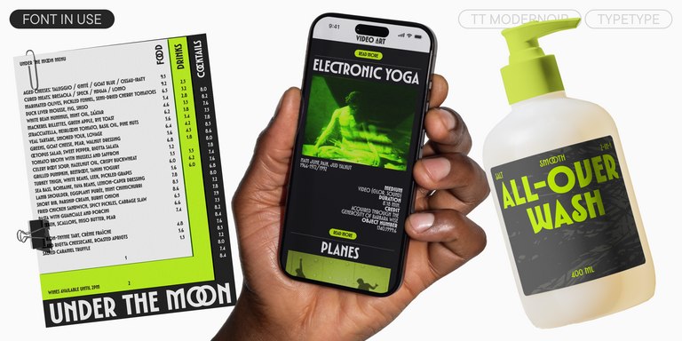
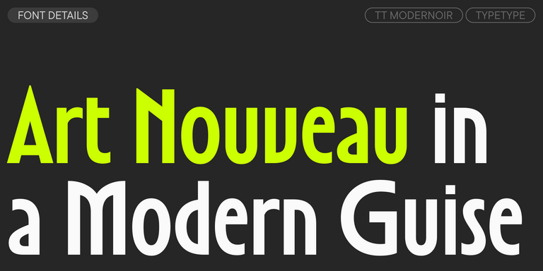
TT Modernoir is a display sans serif with dynamic proportions. Fluid lines and delicate Art Nouveau forms in this typeface blend seamlessly with the rhythmic flow and improvisational freedom of jazz.
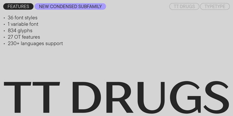
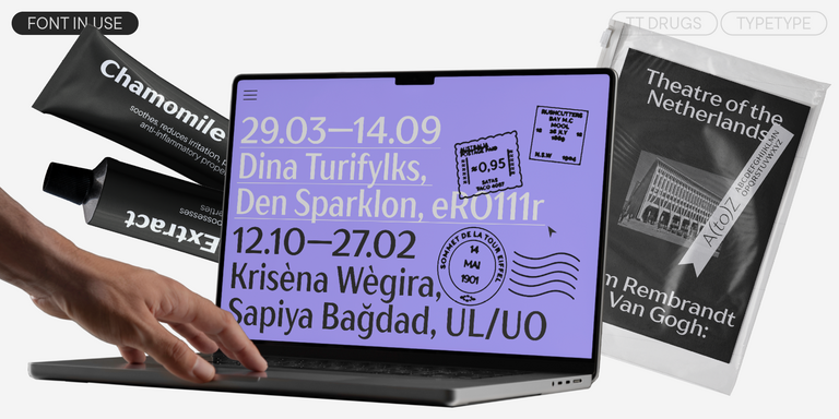
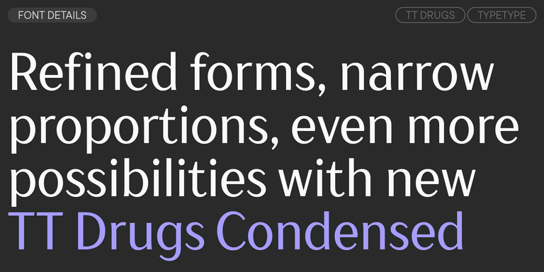
TT Drugs is a typeface that doesn’t feature serifs but stands out for its high contrast.
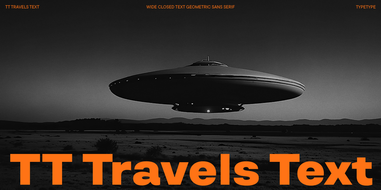
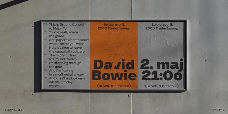
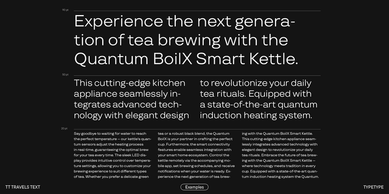
TT Travels Text is a geometric grotesque with wide proportions and specific shapes of circles and fillets, which includes two stylistic sets with completely different natures.
Our bestsellers
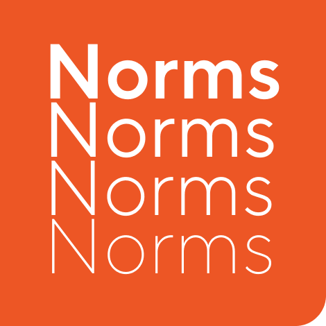
TT Norms® Pro
TT Norms® Pro is a typographic legend embraced by world-renowned brands. Evolved through multiple iterations, it has conquered MyFonts and redefined typographic versatility. A design workhorse that transforms from a humble tool to an essential creative companion.
- from $42 . 99
Our bestsellers
TT Commons™ Pro
TT Commons™ Pro is the studio’s typographic powerhouse. A font so versatile it defies categorization, seamlessly bridging style and function. For designers seeking a universal foundation that elevates every project, this is the definitive choice.
- from $42 . 99
Our bestsellers
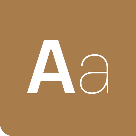
TT Hoves Pro
TT Hoves Pro is a Scandinavian sans serif that whispers minimalist elegance. Simultaneously understated and distinctive, it’s a designer’s secret weapon that transforms complex challenges into visual poetry with effortless precision.
- from $42 . 99
Our bestsellers
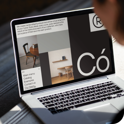
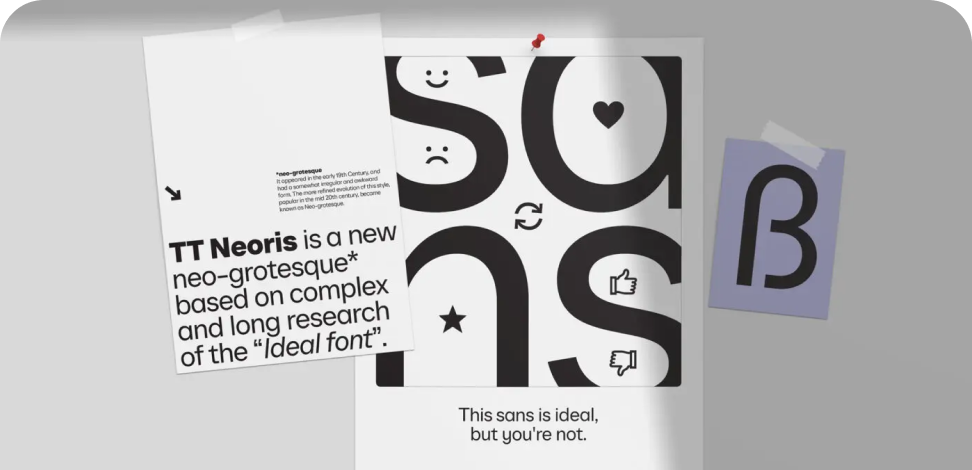
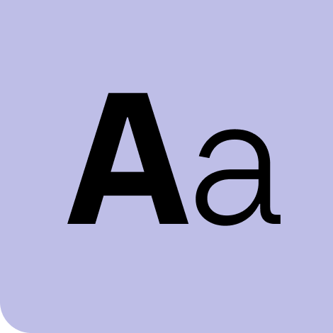
TT Neoris
TT Neoris is a true shape-shifting font that seamlessly adapts to your tasks and preferences. We developed it for two and a half years to make it perfect in everything: from design to functionality. A Muse and Indigo award-winner that redefines typographic potential.
- from $59 . 99
Our bestsellers
TT Supermolot Neue
TT Supermolot Neue is a game-changer in visual communication! An advanced, modular sans serif that captures the pulse of technological innovation, bringing electrifying vision to everything from immersive game interfaces to bold visual narratives.
- from $42 . 99
Our bestsellers
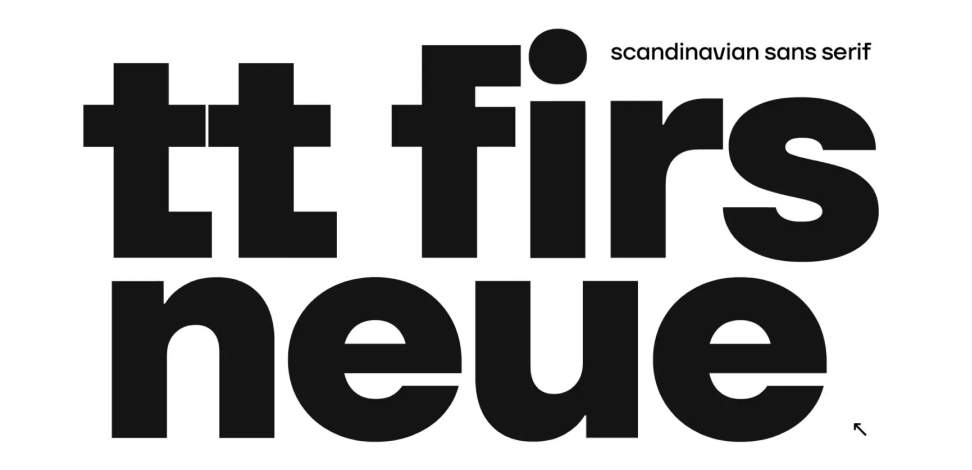
TT Firs Neue
TT Firs Neue is a balanced sans serif infused with Scandinavian design philosophy. Elegant and versatile, polished through two deliberate revisions to achieve typographic perfection.
- from $42 . 99
Our bestsellers
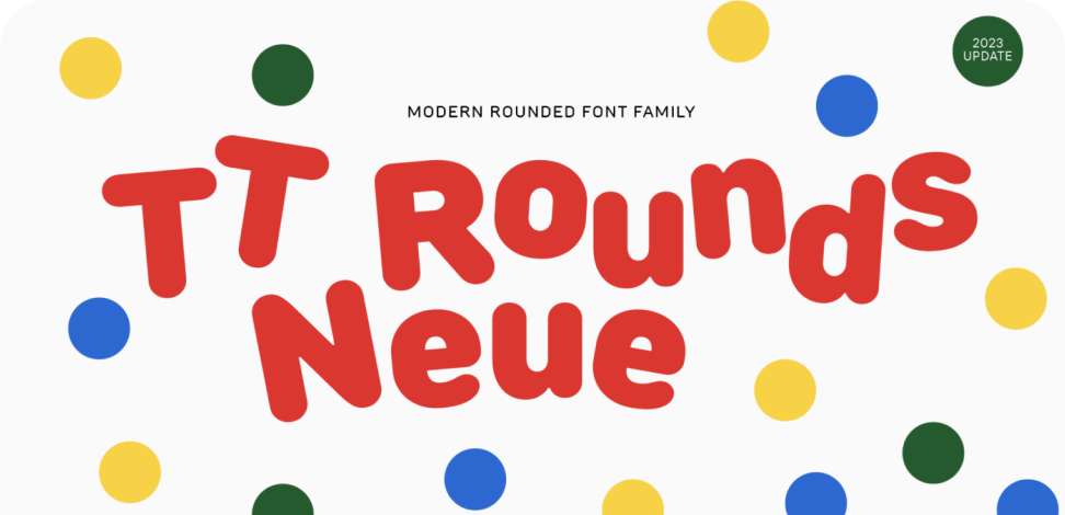
TT Rounds Neue
TT Rounds Neue is a soft and friendly font that knows how to be different. In lighter font styles it looks minimalist and neutral. The bold font styles make it puff up and achieve maximum roundness, exuding childlike charm.
- from $42 . 99
Our bestsellers
TT Fors
TT Fors is a design Swiss Army knife of typography. This geometric sans serif delivers pure versatility through clean, refined proportions. It can be used for defining interfaces or crafting visual accents.
- from $42 . 99
Our bestsellers
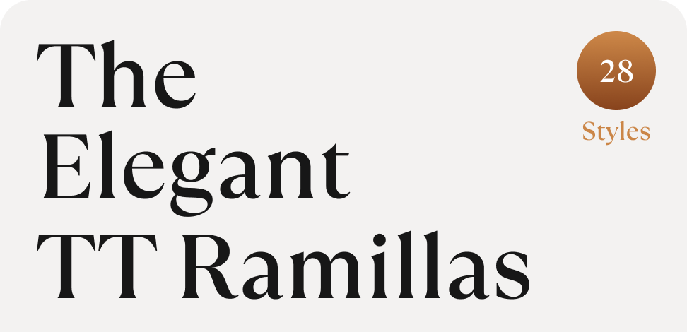
TT Ramillas
TT Ramillas is a stylish and contemporary serif that elevates design to an art form. Characterized by its unique decorative styles and initials with a floral ornament, it crafts visual experiences that are truly one-of-a-kind. Already adorning over 3000 websites globally, it’s a Modern Cyrillic award-winner that redefines typographic sophistication.
- from $42 . 99
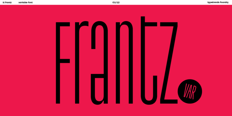
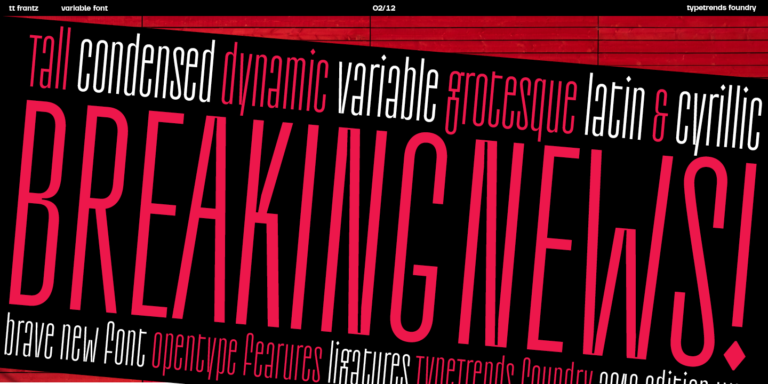
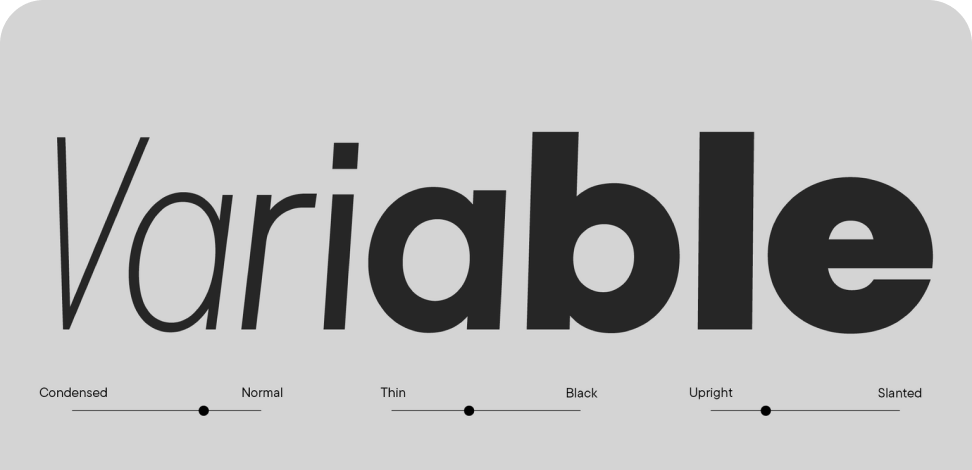
TT FRANTZ IS AN EXPERIMENTAL VARIABLE FONT, DISTINGUISHED BY ITS SLIMNESS AND LIGHTNESS. THE VARIATION IN THE FONT AFFECTS THE CHANGE IN THE HEIGHT OF THE MEAN LINE—BY MOVING THE AXIS ADJUSTMENT SLIDER YOU CAN EASILY RAISE OR LOWER THE MEAN LINE OF THE FONT.
from $29 . 99
Buy font