The TypeType studio works with fonts every day—from selecting typefaces for interfaces to developing custom font families for branding. Therefore, in this article, we will break down the Avenir font completely: how Avenir versions differ, what styles it has, where it is best used, how to pick a font pairing, and what worthy alternatives exist—including options from TypeType.
What Is Avenir? Overview of the Avenir Font Family
Avenir (pronounced “Ah-ven-eer”, meaning “future” in French) is a geometric sans serif with humanist traits. It looks modern and clean, but doesn’t feel cold. It has a soft rhythm and excellent readability. This is exactly why it is so frequently chosen for digital interfaces, branding, and layout designs.
Below is a quick map of the family and terms.

Avenir, Avenir Next, Avenir LT Pro, and Avenir LT Std
Avenir (original version)—the base family built on the idea of “geometry with a human face.”
Avenir Next—an evolution of the family: more often seen in modern systems, better suited for interface tasks and large brand systems. We will return to a detailed breakdown of how it differs from the original Avenir later.
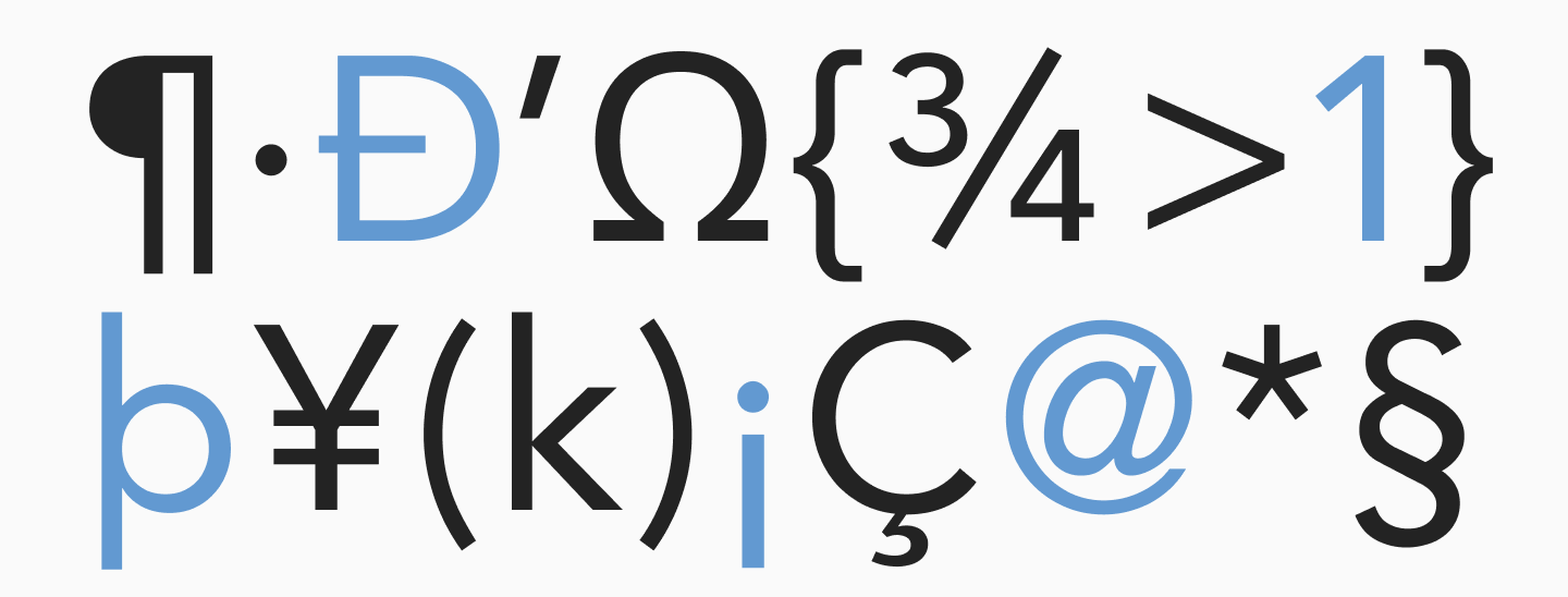
Avenir LT Std (ltstd) and Avenir LT Pro differ in their character set and OpenType options. Before you purchase, you need to check which languages, stylistic sets, and extra characters are included in the version.
Avenir Font Styles
The typeface includes a wide range of weights—from thin to thick.
Here is how to use them in design:
- Light / Ultra Light—use carefully for large sizes, display headlines, and UI accents, but it might get lost on a light background in a small size;
- Book / Roman / Regular—the workhorses for text and interfaces, especially if you need a calm, neutral tone;
- Medium / Demibold—for subheadings, buttons, and navigation to strengthen hierarchy;
- Bold / Heavy / Black—for headlines, advertising blocks, poster typography, and strong accents.
The font family also includes Condensed and Rounded versions.
They solve different tasks:
- Condensed helps fit more characters in a line when necessary, and adds style. We talked about how to use fonts with condensed proportions in design here;
- Rounded makes the character friendlier, adding playfulness and a touch of “infantility.”
Avenir Font License: How to Buy and Use Legally
Avenir is a commercial typeface. To use it, you must select the appropriate license and pay for it. The terms are determined by the copyright holder, and the price may depend on the platform where you buy the font (for example, MyFonts and other services). Always carefully read the licensing conditions and contact platform support if you have any questions.
We discussed how font licensing works and the risks of using a font without a license in our article here.
Can I Download Avenir for Free?
No, there is no free version of the font provided for commercial use, and you cannot legally install it just by downloading a file from the internet. If you need a free font similar to Avenir, it makes more sense to look at free alternatives (for example, on Google Fonts). We will select the closest alternatives below.
Avenir Font History: Who Designed It and Why It Matters
The creator of Avenir is Adrian Frutiger (1928-2015), a famous Swiss type designer. His philosophy of typography always relied on a balance of functionality and “human” plasticity.
The idea of Avenir is readable right in its name: translated from French, it means “future”. This font is an attempt to rethink the geometric sans so that it remains strict and rational, yet doesn’t lose reading comfort. Hence the combination of geometry with humanist traits: softer forms, a more natural rhythm, and a friendly typesetting feel.
Avenir Next was released as an update to meet the demands of modern design: more systematic, better thought-out styles, convenience for UI, and scalable design systems. Ultimately, this version is often chosen for projects when a versatile font is needed for all occasions.
Today, Avenir is one of the incredibly popular versatile sans serifs that have become everyday typography classics.
Avenir Font Characteristics and Typography Features
To understand why Avenir is chosen so often, it is helpful to look at each parameter individually.
Geometry
Avenir has a noticeable geometric base: clean outlines, neat construction logic, and an even “engineering” character. This helps the font remain stable in grids, tables, cards, and interfaces.
Humanist Traits
At the same time, Avenir doesn’t feel “rigid” like some geometric grotesques. The softness of its forms and more natural proportions make it friendlier and livelier.
Rhythm
The rhythm of Avenir is even and calm: the text doesn’t “jump” and looks uniform. This is especially noticeable in large text blocks on websites, in mobile apps, and in editorial materials.
Readability
High readability is one of the reasons for the font’s popularity. Thanks to its clean forms and lack of unnecessary decoration, it does not distract from reading.
Character
The character of Avenir is balanced: it can look corporate, creative, or premium—if you place it in the right context and carefully pick a font pairing.
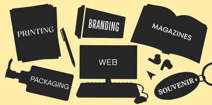
Where to Use Avenir: Best Applications and Design Contexts
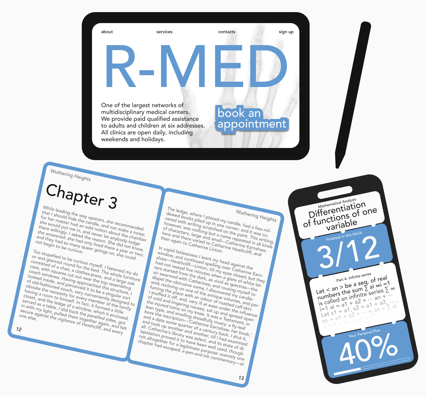
Digital Interfaces
Avenir works incredibly well in UI due to its even rhythm, neutral character, and good readability. The variety of weights allows for building a convenient hierarchy.
Branding
In branding, Avenir is often chosen when a modern, clean, tech-savvy font is needed, but without aggressive technicality or angularity. The Condensed and Rounded versions can help add character.
Print Publications
In print, Avenir provides neat, “composed” typesetting. For long texts, conciseness and clear outlines are especially important to ensure high quality printing.
Editorial Design
Here, Avenir is great as the base of the system (large text blocks). For headlines and accents, you can choose a more characterful font to pair with it. We discussed the principles of selecting font combinations in this article.
International Projects
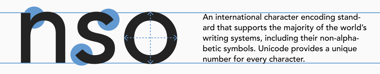
Avenir is frequently found in large corporate systems and brand communications—places where a unified style and broad language support (such as Avenir Next World) are essential.
Famous Examples of Avenir in Use
The font is used by major companies, universities, aviation, fashion brands, and corporate systems. Here are a few examples:
- Apple: The company used Avenir (and Avenir Next) in the Maps app and some Siri screens in iOS 6;
- Snapchat: Has used Avenir as its primary app font since 2016;
- Spotify: Also uses this font in its branding.
Best Font Pairings with Avenir
Combinations with Serif Fonts
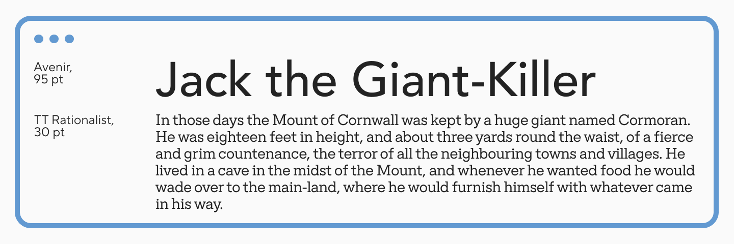
Headline — Avenir, Text — TT Rationalist
A universal combination for different tasks. TT Rationalist is a functional and original slab serif with a contemporary design. Both fonts are geometric and calm. TT Rationalist is stricter and uni-width, so it lays down well in text, while the geometry of Avenir can shine quite brightly in bold styles at a large size.
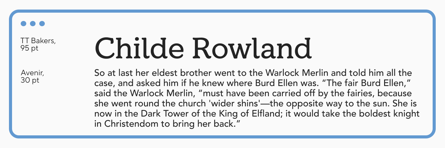
Headline — TT Bakers, Text — Avenir
TT Bakers is a plastic serif with a delicate, warm, and lively character. This combination is perfect when you need to add softness and an “appetizing” feel to the design. The pair looks especially harmonious in the branding of bakeries and baked goods brands.
Headline — Archer, Text — Avenir
A versatile combination that will look particularly harmonious in print materials and online publications.
Combinations with Sans Serifs
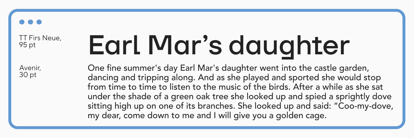
Headline — TT Firs Neue, Text — Avenir
TT Firs Neue is a balanced sans serif with Scandinavian motifs. The fonts are similar in their geometric nature and dynamic proportions, but TT Firs Neue is more vibrant, while Avenir is calm. This combination is universally applicable.
Headline — Gill Sans, Text — Avenir
A functional combination with a calm “classic” sound.
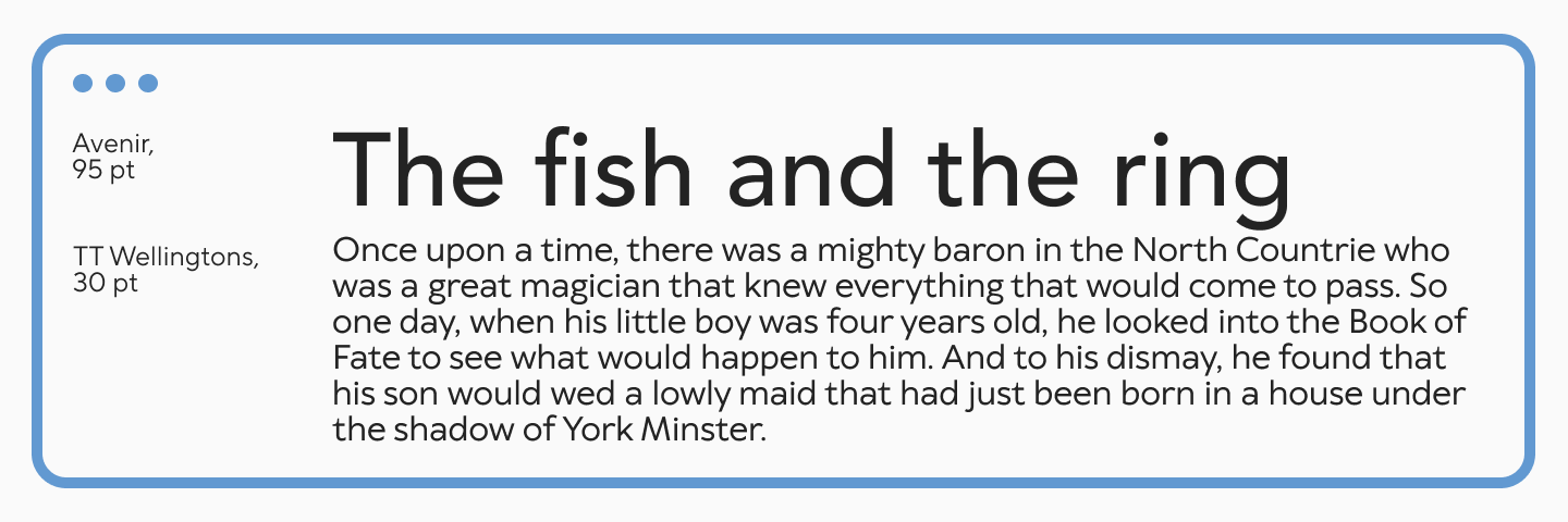
Headline — Avenir, Text — TT Wellingtons
TT Wellingtons is a humanist sans serif with plastic lines and historical references. Combined with Avenir, it adds aesthetics and expressiveness to the design. The pair is suitable for the web industry or print materials, video titles, signage, and much more.
Combinations with Display Fonts
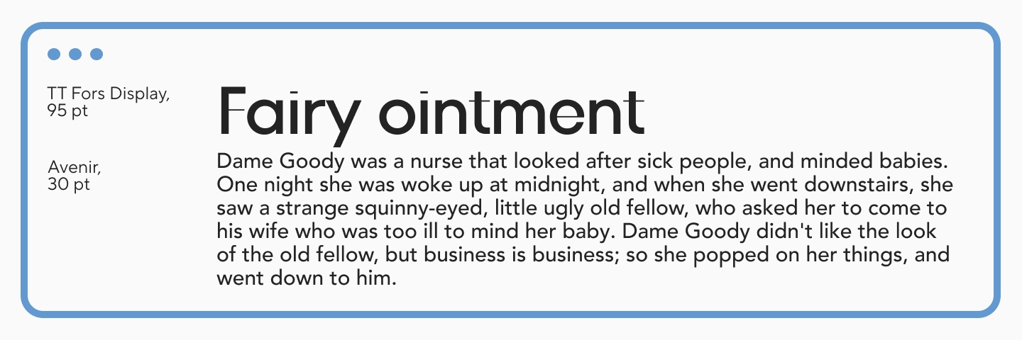
Headline — TT Fors Display, Text — Avenir
TT Fors Display is an aesthetic and clean geometric sans, close in spirit to Avenir. Combined, they will look very harmonious, as they share a geometric foundation but have different degrees of expressiveness. This allows you to smoothly and correctly create accents and hierarchy in the design.
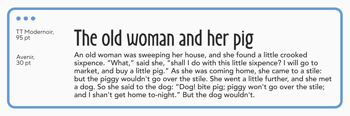
Headline — TT Modernoir, Text — Avenir
TT Modernoir is an experimental display sans with Art Nouveau elements. It opens up best in large sizes and will add character to the neutral Avenir. Event posters, packaging design, restaurant menus—this pair is suitable for these and other fields.
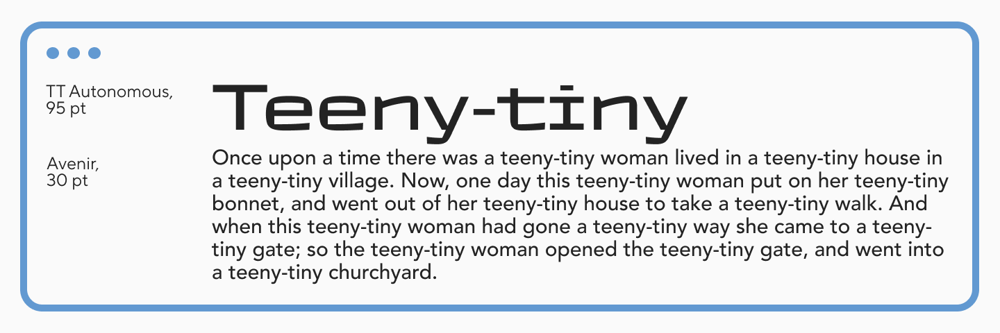
Headline — TT Autonomous, Text — Avenir
TT Autonomous is a brutal technological sans with squared forms. It is similar to Avenir in geometry, but more expressive and vibrant. The pair will work perfectly in the tech industry or video games.
UI-Friendly Pairings
Because Avenir is not a classic “cold” geometric sans, but rather friendlier, it can also pair with certain humanist-type fonts.
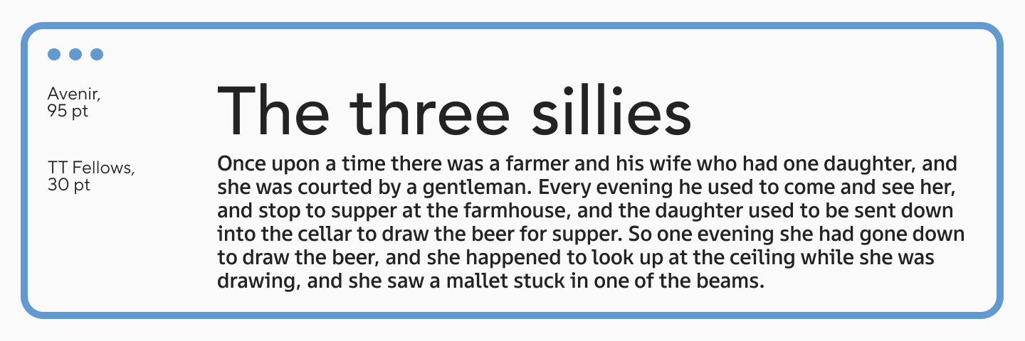
Headline — Avenir, Text — TT Fellows
TT Fellows is an open humanist sans, but with mechanistic traits. This combination makes it restrained and neutral, so it can be paired with many fonts. Moreover, it is perfectly suited for interfaces due to many characteristics, including one of its main features—uni-width (a font property where all characters have the same width, mostly used in code, tables, and interfaces).
Headline — Avenir, Text — TT Commons™ Pro
TT Commons™ Pro is a versatile geometric sans serif that pairs perfectly with any font. It is even more neutral than Avenir, so pairing them adds functionality and a modern sound.
Headline — TT Travels Next, Text — Avenir
TT Travels Next is an ultra-trendy wide sans with an edgy character. It will add impact to any project, harmoniously complementing Avenir.
Pairings for Professional Branding
All the font combinations described above are suitable for professional branding. You can also choose other brighter fonts for accents to pair with the calm Avenir.
Here are a few successful combinations:
- Headline — TT Bluescreens Pro, Text — Avenir;
- Headline — TT Biersal, Text — Avenir;
- Headline — TT Drugs, Text — Avenir.
To see how the typography will look in mockups or on a sample image, you can download a free sample of any font from the TypeType collection on this page.
Alternatives to Avenir: Free and Commercial Options
- Google Fonts similar to Avenir: Kumbh Sans, Raleway, Geologica;
- Adobe Alternatives: Gibson, Europa, Objektiv;
- Microsoft Alternatives: Futura, Corbel, Segoe UI;
- Avenir Alternatives from TypeType: The closest relative to this font from our collection is TT Chocolates, and it can also be substituted by TT Turns and TT Norms® Pro.
Avenir vs Other Popular Fonts
Avenir vs Avenir Next
Avenir is the original typeface, created in 1988 by Adrian Frutiger. Avenir Next was released in 2004 in collaboration with type designer Akira Kobayashi (Linotype company) and became a continuation of the family. It increased the number of weights and widths, added true italics, and expanded OpenType options. The character forms remained practically unchanged, but the weight of the styles changed slightly as the family expanded.
Avenir vs Futura
Futura was created in the early 20th century and became one of the first cult geometric sans serifs. Avenir has references to this font, but it looks different. It has all the characteristics of a geometric sans, but its character is significantly warmer and more human. Futura is more dynamic, geometrically strict, and sharper than Avenir, which has already discarded the details of older grotesques.
Avenir vs Helvetica
Helvetica (and Helvetica Neue) belongs to another type of sans serif—neo-grotesques, while Avenir is a geometric sans. Helvetica is a static, closed, more squared, dry, and impersonal font. Avenir is more dynamic and open, its ovals lean toward a geometric circle. It is also quite neutral, but more “alive.”
Avenir vs Montserrat
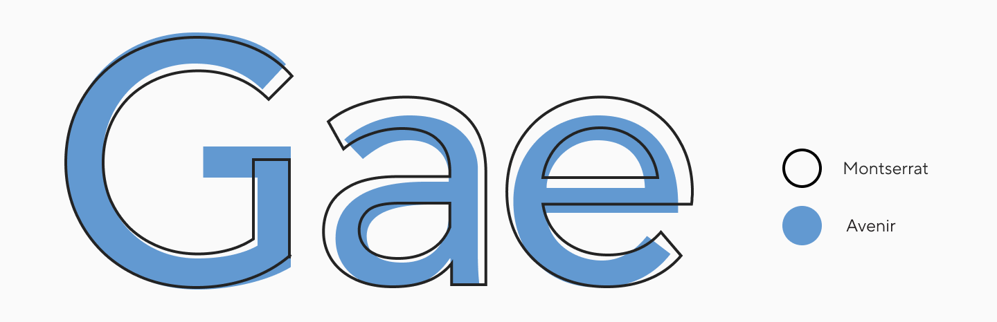
These two fonts are very similar in details: apertures, terminals, and the forms of certain characters (“a”, “g”, “G”). But in broader characteristics, Montserrat is softer, more rounded, and has wider proportions.
Avenir vs TT Norms® Pro
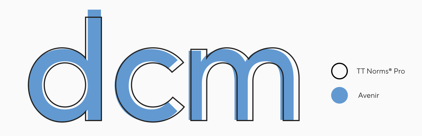
These fonts are similar in proportions and details, but TT Norms® Pro is more geometric and stricter in character.
Should You Use Avenir in 2026? Expert Verdict
Avenir is a typography classic that still looks relevant today. In 2026, there are many modern alternatives with similar styling but greater functionality. It’s important to choose a font based on your goals: study the character set, supported languages, OpenType options, stylistic sets, and other functions you need.
FAQ
How does Avenir differ from Avenir Next?
Avenir (1988) is the original Adrian Frutiger typeface. Avenir Next (2004-2007) is a rework and expansion of the family done by Frutiger with Akira Kobayashi (Linotype): it features more weights and widths, true italics, and expanded OpenType capabilities (e.g., small caps, different types of figures, etc.).
Does Avenir support Cyrillic?
The regular Avenir (classic release) most often does not include Cyrillic (it is generally absent in standard sets). In the Avenir Next lineup, Cyrillic support is found in specific expanded versions.
Are there free alternatives to Avenir?
Yes, for free fonts similar to Avenir, designers often use Google Fonts:
- Montserrat
- Kumbh Sans;
- Raleway;
- Geologica.
Can I use Avenir on the web?
Yes, but under a webfont license (usually an woff or woff2 file), provided you actually embed the font file on the website via @font-face. Marketplaces like MyFonts clearly separate the “image/logo” (desktop) and “embedding a file on a site” (web) scenarios.
Is Avenir good for long text?
Overall, yes, it often fits perfectly, especially in interfaces and calm typography: Avenir was designed to balance geometry and readability (it is not pure geometry in the spirit of Futura).
Why do designers choose Avenir?
Most often for the combination of:
- A modern geometric character paired with a soft, non-cold plasticity;
- The versatility of the family: many styles/weights in Avenir Next;
- Excellent performance in branding and digital applications.
Which brands use Avenir?
A few confirmed examples:
- The City of Amsterdam used Avenir as its primary brand font;
- CFPB (Consumer Financial Protection Bureau) uses Avenir Next as its main brand font;
- Avenir / Avenir Next is found as a system/pre-installed font in the Apple ecosystem;
- Dublin Airport uses Avenir for its navigation system.
Is Avenir a geometric or humanist sans serif?
Avenir is a geometric sans serif with humanist (optical) traits, meaning it “humanizes” the geometry and is not strictly geometric.
What fonts are closest to Avenir?
Kumbh Sans, Raleway, Geologica, Gibson, Europa, Objektiv, Futura, Corbel, Segoe UI, TT Chocolates, TT Turns, TT Norms® Pro.
Can I embed Avenir in a mobile app?
Technically, yes, but legally this almost always requires a separate app license because you are embedding the font file directly into the application’s code. MyFonts states this explicitly in their licensing description.