Printed T-shirts are everywhere: they regularly appear in sports and fashion brand collections, are used as part of corporate identity, or are created by hand as a means of self-expression. We can say that T-shirts with inscriptions are always relevant, but not every print will look advantageous. The font and quality typography play a crucial role here.
How do you choose the right fonts for T-shirts, and why is it important? We explain in this article and have selected 10+ of the best fonts for prints from the TypeType collection.
Why is it Important to Choose the Right Font for a T-Shirt?
The font is the first thing a person sees when looking at a T-shirt with lettering. The viewer subconsciously perceives the character and mood of the font even before reading the text itself and understanding the meaning of the phrase. Therefore, it is the font that shapes the style and visual image of a printed T-shirt.
The same inscription can be perceived as ironic, serious, or dreamy depending on the font it’s written in. The font is the intonation with which you “speak” the phrase printed on the T-shirt.
Furthermore, not every font will behave well on fabric, and you need to be aware of nuances that are important to consider. We’ll discuss these in more detail below.

How to Choose the Right Font for T-Shirt Design: Best Tips
1. Formulate the Main Idea
What mood and style will your T-shirt have? What is the concept of the print? Once you’ve decided on a direction, you can significantly narrow down your choice of fonts and search for the right one among the stylistic categories that suit you: bold or calm, strict or cheerful, unusual or neutral, and so on. These initial ideas are key.
2. Determine the Level of Display
If you want your phrase to be read easily and quickly, or if you plan to write not just a few words but a whole text, choose more concise text fonts with high readability. We talked about how to choose such a font here.
If your phrase consists of one or several words and it’s important for you to emphasize the visual component, choose more display-oriented (accent) fonts with decorative details. With their help, you can create a bright and unusual print or logo even without adding additional graphic elements. By the way, we discussed fonts for logos separately here.
3. Consider Material Properties and Printing Limitations
Fonts that look great on screen can get lost on fabric. Remember that printing on textiles introduces its own peculiarities: details that are too small or lines that are too thin can blur slightly.
Consequently, you shouldn’t choose overly thin or high-contrast fonts, nor fonts with complex outlines or small sizes. Always test your chosen font on mockups in actual sizes. This is a crucial step for tshirt printing.
4. Match the Font to the T-Shirt Style and Follow Trends
A minimalist print will pair perfectly with concise geometric sans-serifs, while a vintage style will be supported by a handwritten or serif font. Moreover, it’s worth choosing modern fonts—after all, trends in clothing and trends in typography intersect. Fonts, like clothing styles, can be fashionable or outdated.
5. Remember Contrast When Choosing Font and T-Shirt Colors
On a white T-shirt, a black font or other dark shades (dark blue, dark green, etc.) will look best. On a black T-shirt, conversely, a white font or other light shades will be ideal. The main thing is that the colors are sufficiently contrasting. You can use a special service to check color contrasts in RGB and HSL models.
6. Don’t Be Afraid to Combine Several Fonts
Sometimes, combining two contrasting fonts can make a print more expressive. For example, a large, prominent headline can be set in a more characterful font, while the main text can be calm and concise. The main thing is to maintain balance. We discussed how to correctly combine fonts in this article. Good designs often use this technique.
7. Test Different Options
Create several mockups with different fonts and ask for opinions from friends, colleagues, or your target audience. Often, an outside perspective helps identify flaws that are difficult to notice during the work process. This is one of the best ideas for refining your design.
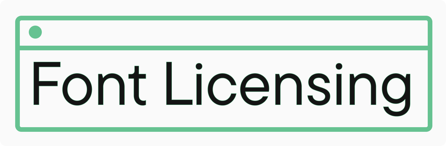
8. Pay Attention to Font Licensing
Even if you’ve chosen a free font, make sure the license allows its use in printed products. We’ve covered font licensing in detail here. This is vital for all shirt designs.
Best Fonts for T-Shirts with Bright Designs
Below, we’ve gathered trendy and popular fonts for T-shirts from the TypeType collection. In this selection, you’ll find the most different options and styles: from unusual to minimalist. All of them are perfectly suited for printing on fabric and meet other criteria necessary for creating a quality print. These are some of the best tshirt fonts available.
Display Fonts for Striking Typography
TT Cometus

TT Cometus is a modern slab serif font for contemporary typography. It’s an impressive and solid, yet energetic and dynamic font with an interesting design. The sharpened terminals resemble comet tails, and the figured inflows of arches and semi-ovals give the font plasticity. It’s best used in a large size on its own. A good option for creating bright, accent lettering.
TT Paplane

TT Paplane is a custom display sans serif with interesting graphics. In the Regular font style, the typeface looks as if its letters are folded from paper tape. In Thin font style, a strong reverse contrast appears, making the font’s design resemble a barcode when set. This cool and unusual font is perfect for youth brands. It can be used in both large and small sizes for your tee shirt designs.
TT Carvist

TT Carvist is a modern experimental sans serif with ultra-narrow proportions. The characteristic features of this font are its geometricity and brutality. Inscriptions set in it turn into a pattern—exactly what’s needed for textiles! In the bold font style, its design resembles an impassable labyrinth, and in light—a weightless lace. At the same time, in Latin, the font acquires a gothic mood, and in Cyrillic, it becomes similar to the ancient decorative lettering. It’s a great font for t shirts aiming for an edgy style.
TT Bluescreens

TT Bluescreens is a stylish neo-grotesque with narrow proportions. This font has a calm yet memorable character. It looks fashionable and original, especially in saturated weights. The font can be used for both large and small inscriptions, making it a versatile choice for tshirt designs.
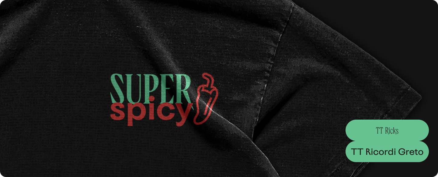
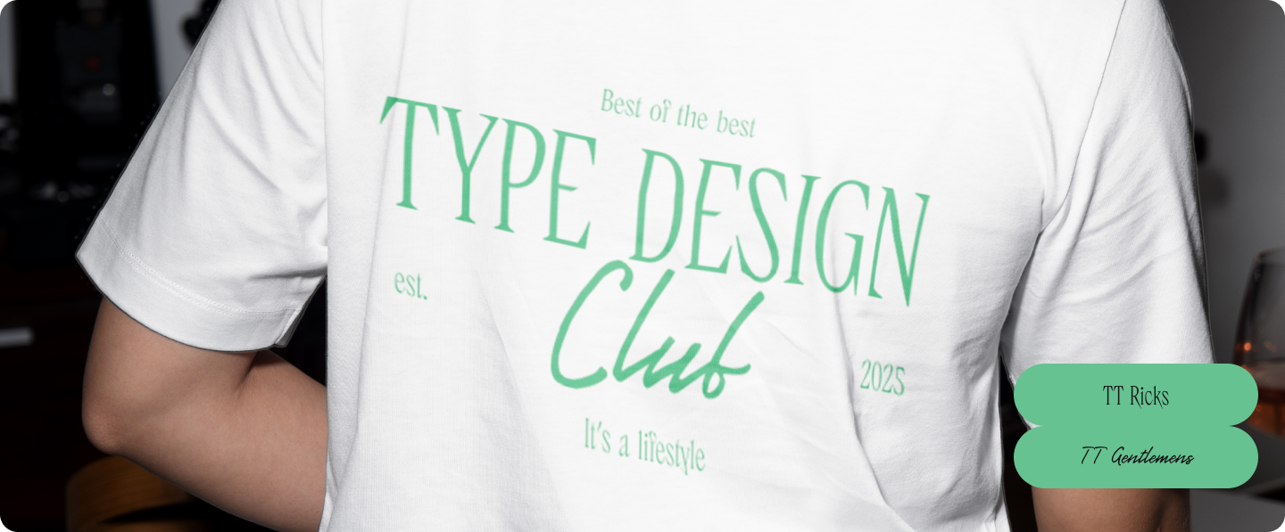
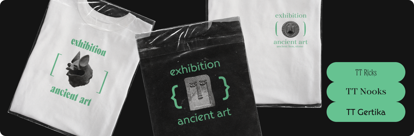
TT Ricordi Greto

TT Ricordi Greto is a custom Florentine sans serif, inspired by an old inscription on a plaque found in Italy. Despite its connection to history, this font looks very modern and even daring, making it a great choice for youth brands. Moreover, the typeface includes a large set of stylish icons that can be used in combination with the font as illustrations for your shirt print.
TT Autonomous

TT Autonomous is a brutal sans serif with a technological mood. The characters in the font are distinguished by their squaredness and angular internal counters. It can be used for both large and small inscriptions and is especially well-suited for T-shirt prints with sports or technology themes. It’s a cool font for t shirts needing a strong, modern design.
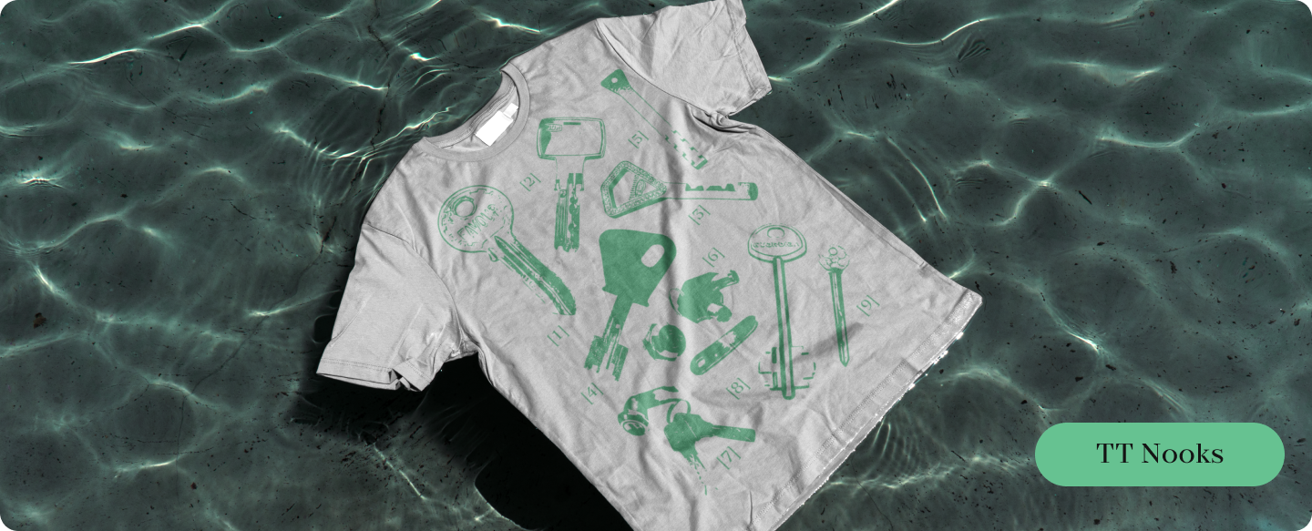
TT Nooks Script

TT Nooks Script is an unusual serif font with unique forms and high contrast. This font has a bright character with a slight touch of egocentricity. It will look most advantageous in medium and large inscriptions. If you need to create an informal, creative print, this is an excellent option!
TT Runs

TT Runs is a wide sans serif with unusual broad proportions and a dynamic character. This font was created specifically for the sports industry. However, it’s suitable not only for sportswear but also for creating prints that need to convey a sense of speed and expression. The font will particularly shine in medium and large-sized lettering.
Versatile Fonts for Concise Design
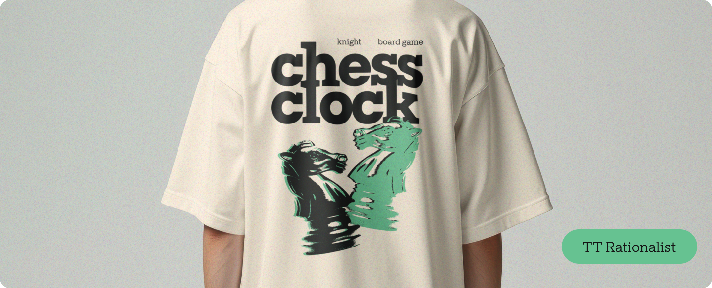
TT Rationalist

TT Rationalist is a stylish slab font, the quintessence of minimalism and balanced design. Thanks to its large serifs and “clean” forms, it’s suitable for use in both small and large point sizes. The typeface also includes very beautiful italics that will help add elegance to your print. A truly good font for t shirts requiring a simple yet strong look.
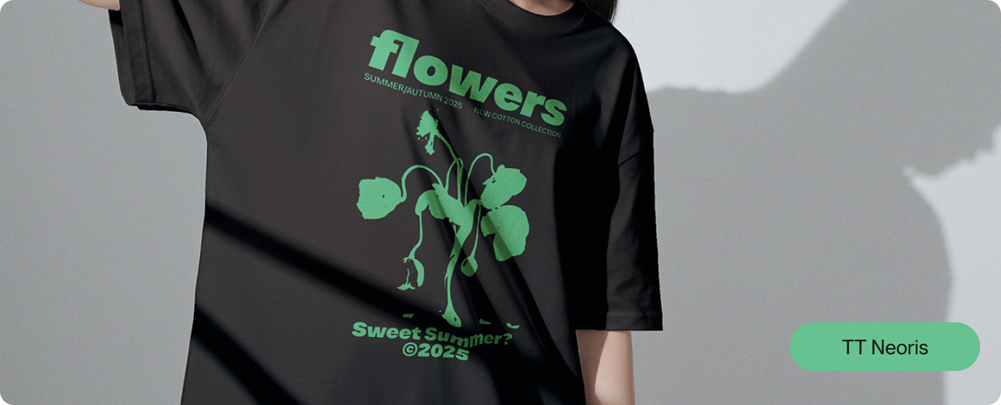
TT Neoris

TT Neoris is a current alternative to well-known and popular neo-grotesques like Montserrat. It’s a concise, basic font that nevertheless looks fresh and original. It can be used in any size, both in solo inscriptions and in combination with other font elements for your t shirt designs.
TT Chocolates

TT Chocolates is an elegant sans serif with dense setting and balanced proportions. This font has a pleasant, friendly character that is intuitively perceived as something familiar. Due to its open forms, it reads excellently at any size, making it one of the best fonts for printing on t shirts.
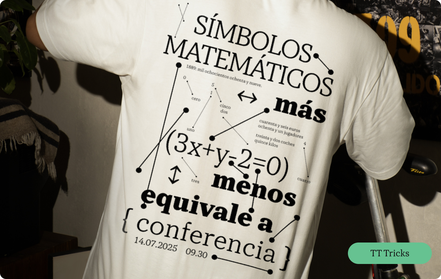
TT Tricks

TT Tricks is a modern serif font with a calm and elegant character. There’s nothing superfluous in this font; it reads excellently and prints well on fabric. This is a classic font that always looks current and appropriate. Almost any T-shirt will “make friends” with it!
TT Hoves Pro

TT Hoves Pro is a Scandinavian sans serif for fans of minimalism. Horizontal and vertical lines predominate in the design of this font’s characters, making the font look “clean” and concise. It’s suitable for use in any size and is very versatile in terms of theme. A great option for simple but effective shirt designs.
Handwritten Fonts for a Romantic Print
TT Polls Script

TT Polls Script is a beautiful handwritten font, inspired by American sports graphics. It’s perfect for lettering on sportswear, whether it’s a baseball jersey or a tennis cap. This font will fit particularly well into the “old money” style. It’s a cool script font for t shirts.
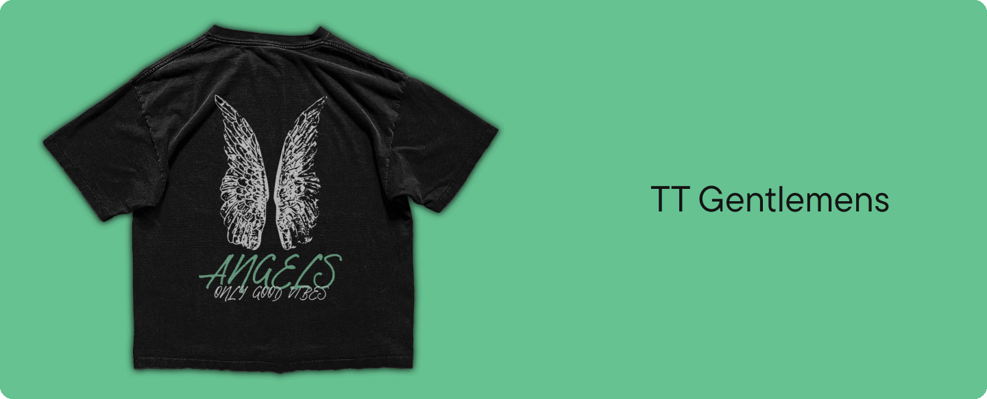
TT Gentlemens

TT Gentlemens is a dynamic handwritten font that combines the seriousness and clarity of writing with elegance and sophistication. It will help create an individual and expressive print. It can be used solo or in combination with neutral fonts. This is a good lettering font style for t shirts.
Conclusion
Choosing a font for a T-shirt is a task no less important than selecting the cut or fabric composition. The success of the entire project depends on the right decision: visual appeal, clarity of the idea, and emotional perception. We hope that in our selection, you’ll find the best font for your print to create your unique design! These font ideas should help designers make great choices. Whether you need fonts for t shirts printing or fonts for a tee shirt logo, careful selection is key.