Graffiti-inspired types live in that sweet spot between lettering culture and practical design. It takes cues from tags, throw-ups, and wall pieces, then turns that energy into fonts you can actually use for logos, posters, tattoo sketches, YouTube banners, and social media visuals. At TypeType, we regularly work with designers who run into the same balancing act: keeping the street attitude while staying readable, versatile, and safe to use in commercial work.
In this guide, we’ll define what graffiti fonts are, break down major graffiti lettering styles, and review more than 10 strong options—from premium TypeType families with free trials to reliable free graffiti fonts found on Google and other platforms. You’ll also get usage ideas, a quick licensing reality-check, and practical tips for working with graffiti-style fonts in Canva, Adobe Photoshop, Illustrator, and other tools.
What Are Graffiti Fonts?
Graffiti fonts are digital typefaces that echo street lettering—think chunky shapes, expressive curves, tight spacing, and sometimes rough, hand-made textures. Depending on the design, they can resemble bubble letters, dense wildstyle constructions with interwoven strokes, fast tag-like signatures, blocky 3D forms, or script styles with a calligraphic vibe.
At the heart of it, graffiti style fonts are about personality. They broadcast motion, attitude, and “voice” far more strongly than a neutral sans. Many graffiti letter fonts push contrast, add drips or splatters, or bend the letterforms so the whole alphabet feels like one cohesive piece. That’s why designers reach for them in music and streetwear branding, gaming, sports graphics, youth campaigns, and other culture-forward projects.
Choosing the right graffiti lettering font is all about trade-offs. Go too complex and your headline becomes a puzzle. Go too minimal and the street flavor disappears. The best choice is the one that fits your mood, setting, and readability needs.

Top 10 Best Graffiti Fonts for 2025
Here’s a refreshed selection of 10 standout graffiti-ready fonts from the TypeType collection. They aren’t “spray-can alphabets” in the literal sense, but once you add color, texture, outlines, and effects in Photoshop, Canva, or Illustrator, they translate beautifully into graffiti style. Together, they cover a wide range of graffiti font types: bubbly shapes, tag-like scripts, experimental display grotesques, and clean-but-urban sans serifs.
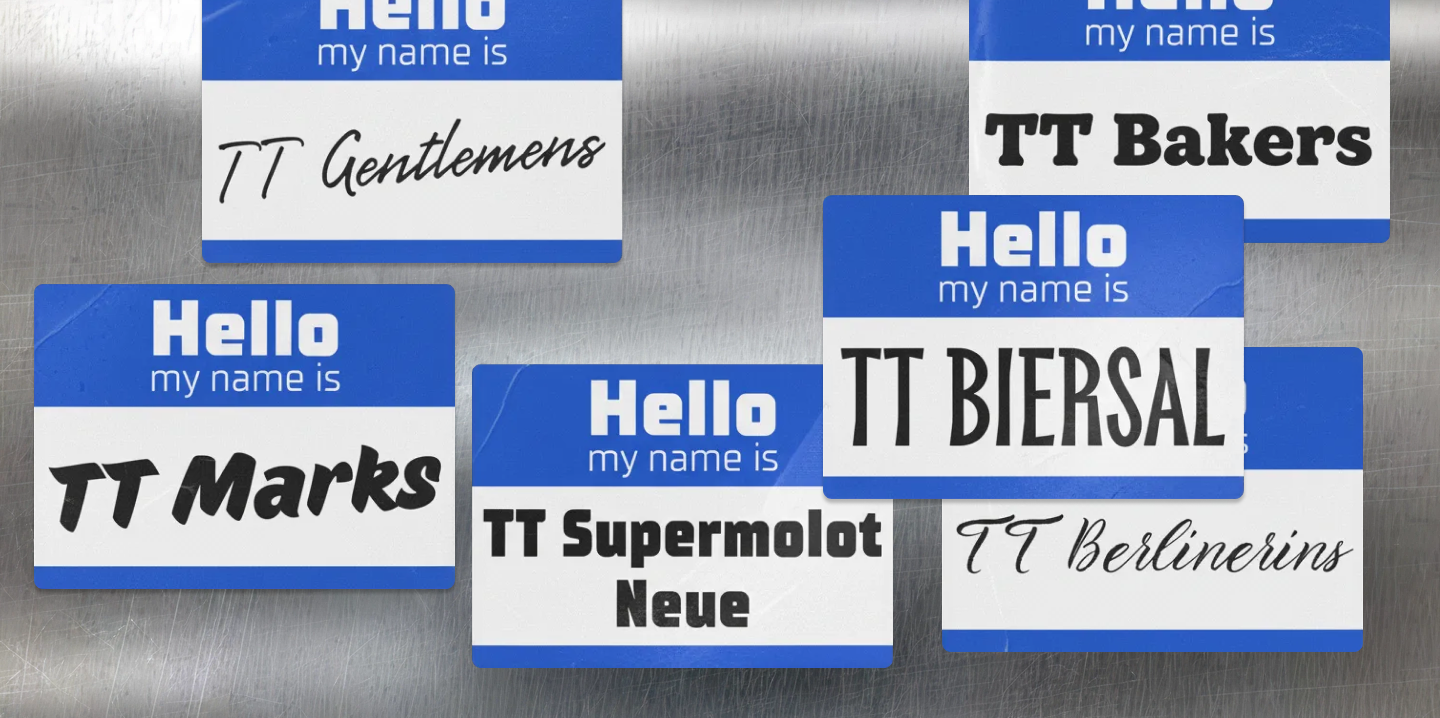
1. TT Berlinerins — Contrast Pair with Retro Street Charm
Type: contrast pair (elegant script + grotesque)
Best for: retro street posters, calligraphy graffiti letters, logo wordmarks
TT Berlinerins is a two-part system: a characterful script plus a supporting sans inspired by early 20th-century poster lettering. The script can easily stand in for calligraphy graffiti fonts—fluid strokes, confident curves, and a big personality. The sans brings an old-school signage feel that works отлично for dates, prices, and secondary info. Use the script as the “tag,” and let the sans do the organizing.
Paid or free? Premium font family with free trial fonts for testing layouts
2. TT Marks — Vintage Sign-Painting Script for Urban Lettering
Type: decorative handwritten script
Best for: street food logos, shopfronts, tattoo-inspired lettering, posters
TT Marks draws on classic American sign painting and looks like it was brushed onto a wall or painted on a truck panel. You can “see” the tool in the rhythm of the strokes, which makes it a natural fit for street-culture visuals. It’s a strong pick when you want handcrafted energy without sacrificing legibility from a distance. (In classification terms, a script/handwritten font imitates handwriting or calligraphic strokes.)
Paid or free? Premium family with trial fonts
3. TT Biersal — Playful Display Sans with Poster Vibes
Type: expressive display sans serif
Best for: festival posters, drink labels, streetwear drops
TT Biersal is a bold display sans with a lively, slightly unruly spirit—perfect for punchy headlines and branded moments that need flair. Once you add outlines, shadows, or drip-like accents, it becomes a convincing graffiti type font while staying clean enough for commercial design systems.
Paid or free? Premium with free trial download
4. TT Supermolot Neue — Futuristic Urban Grotesque for 3D Pieces
Type: modular sans serif, techno/industrial
Best for: 3D graffiti fonts, gaming, urban tech branding
TT Supermolot Neue is all about modular strength: squared shapes, sharp cuts, and a tech-forward presence. If your project leans toward “digital street” rather than classic bubble graffiti fonts, this one shines—especially with 3D extrusions, glitch treatments, or neon edges. Great for posters, album art, UI titles, and street-tech aesthetics.
Paid or free? Premium family with trial fonts for layout tests
5. TT Disruptors — Marker Script for Tags and Throw-Ups
Type: marker-drawn handwritten script
Best for: graffiti tag fonts, throw-up style logos, album art
TT Disruptors feels like fast marker lettering: energetic, slightly rough, and emotionally direct—exactly what you want for tag-inspired typography. It’s messy in the right way, but still structured enough to hold up in logos and short phrases. If you want a related vibe with a more polished, pen-like elegance, TT Gentlemens is a close cousin in mood.
Visual idea: set one bold word in TT Disruptors, add a thick outline plus subtle drips in Photoshop, and you’ll get a quick “throw” look that reads instantly.
Paid or free? Premium with free trial
6. TT Rounds Neue — Rounded Sans for Bubble Graffiti Effects
Type: soft rounded sans serif
Best for: bubble graffiti fonts, kids’ brands, playful street designs
TT Rounds Neue is friendly and smooth in lighter weights—but push it to Bold/Black and it starts to feel inflated and bouncy. That makes it a great foundation for bubbly graffiti fonts: add a thick stroke, highlights, and a drop shadow, and you’ve got soft “bubble” letterforms that stay readable on posters and event graphics.
Paid or free? Premium family with many styles and a trial
7. TT Bakers — Warm Serif with Soft Street Attitude
Type: fluid serif (text + display)
Best for: editorial street projects, retro logos, “old school” graffiti titles
TT Bakers is a flexible display serif with a gentle personality that can swing from classy to gritty depending on treatment. In heavier styles, it can play surprisingly well as an “old school” graffiti headline—especially with texture overlays, high-contrast palettes, and bold layout decisions.
Paid or free? Premium text+display family with trial fonts
8. TT Geekette — Experimental Slab for Crazy Display Lettering
Type: experimental slab serif / display serif
Best for: crazy graffiti fonts, experimental street posters, bold branding
TT Geekette is quirky, decorative, and a little weird—in the best way. It’s ideal when you want a graffiti-adjacent look that’s not “handwritten tag,” but still feels expressive and unconventional. Great for bold brand statements, oddball poster design, and projects that want to feel artsy and street-smart.
Paid or free? Premium display family with trial
9. TT Frantz — Slim Experimental Grotesque with Wild Details
Type: experimental variable grotesque
Best for: narrow graffiti letters, poster headlines, digital art
TT Frantz is narrow, playful, and variable—so you can literally tune its behavior. With its adjustable axis (including mean line control), you can create “off-kilter” headline energy that feels urban and contemporary. Pair it with spray textures or hard color blocks for a fresh street poster vibe without copying classic tag tropes.
Paid or free? Premium variable font with free trial
10. TT Paplane — Squared Display Sans for Modern Street Art
Type: squared display sans serif
Best for: modern street art fonts, number-heavy layouts, clean graffiti logos
TT Paplane has a geometric, airy construction inspired by paper planes, which makes it feel playful-but-precise. It’s a strong option when you want modern street art fonts that look clean, contemporary, and logo-friendly rather than gritty. Use it for punchy titles, numeric-heavy compositions, and crisp urban identities.
Paid or free? Premium display family with trial fonts
Together, these ten TypeType choices give you a broad toolkit: scripts for tag energy, rounded shapes for bubble effects, condensed and experimental sans fonts for edgy urban moods, and display serifs for bold poster work. Start with the free trials, test them in your layouts, and move to the right license once the direction is approved.
Different Types of Graffiti Fonts
Graffiti art fonts come in a lot of flavors. Knowing the main categories helps you pick intentionally instead of scrolling through endless options and hoping for the best.
Bubble Graffiti Fonts
Bubble graffiti fonts use inflated, rounded forms—like balloon letters with thick outlines, soft counters, and frequent overlaps. Designers use them for fun, friendly street visuals: kids’ events, playful festivals, upbeat merch, and music posters that shouldn’t feel aggressive.
To build a bubble effect, start with a rounded font like TT Rounds Neue, then add bold outlines, shadows, and simple highlights. A few splashes or drip touches can push it into “bubbly graffiti” territory while keeping the word readable from across the room.
Wildstyle Graffiti Fonts
Wildstyle graffiti fonts mimic the complex wall pieces: arrows, layered outlines, interlocking structures, and lots of visual movement. Digital fonts rarely go as dense as real wildstyle, but you’ll still see twisted connections, stretched strokes, and unexpected angles.
They’re great for album covers, street-culture branding, and poster headlines where maximum attitude matters more than long-form readability. A smart move: keep the wildstyle for the main title, and pair it with a clean sans serif for supporting details.
Graffiti Tag Fonts
Tag fonts imitate fast signatures—often cursive, marker-like, and written in one continuous motion. They usually work best in short bursts: brand names, wordmarks, and punchy phrases.
Fonts like TT Disruptors and Permanent Marker nail that tag feeling: spontaneous energy, but with controlled shapes so letters and numbers don’t fall apart. Avoid setting long paragraphs in tag fonts—your reader shouldn’t have to decode your message.
3D Graffiti Fonts
3D graffiti fonts are less about a specific font file and more about how you style it. Wide, blocky faces—like TT Travels Next—are great bases for extrusions, gradients, highlights, and cast shadows in Photoshop or Illustrator.
This style is a favorite for posters, gaming interfaces, and YouTube thumbnails. Just keep an eye on small-size clarity: once you pile on depth, tiny details can turn into visual noise.
Old School & Urban Graffiti Fonts
Old school graffiti fonts reference early subway-era lettering: bold, often condensed, sometimes with simple drips or classic outlines. “Urban graffiti fonts” is a wider bucket—anything that feels city-coded, from heavy sans faces like Peace Sans to industrial tech shapes like TT Supermolot Neue.
Use old school styles for throwback hip-hop branding, retro events, and projects that nod to graffiti history. Use urban styles when you want a street mood, but need cleaner typography that still feels brand-safe.
How to Use Graffiti Fonts Effectively
Graffiti fonts are character-first, so they shine in short, high-impact text—logos, posters, cover art, and strong headings. Here are practical ways to use them well.
- Match font and context
For streetwear and youth fashion, go bold and distinctive. For tattoo shops, lean into calligraphy graffiti fonts like TT Gentlemens or TT Marks for a more timeless, crafted feel. For gaming/tech, modular faces like TT Supermolot Neue deliver “urban edge” without turning into cartoon graffiti. - Combine with neutral companions
Most graffiti style fonts are display-first. Pair them with a clean sans or a calm serif for body text so your design stays readable. Use the expressive font for the “voice,” and let the neutral font handle information. - Use them in Canva, Adobe, and more
Many fonts can be uploaded into Canva as brand assets, while web-available options like Rubik Spray Paint or Permanent Marker can often be used directly in Canva and Google Docs. In Adobe apps (Photoshop/Illustrator), TypeType fonts work normally once installed (or synced via your font management workflow). - Play with effects, but don’t kill readability
Graffiti typography loves effects—just keep control. Try:
- Outlines and drop shadows for depth
- Drip/spray/glow layer styles in Photoshop
- Hand-drawn extras (arrows, splashes, crowns) around the text
5. Think like a letterer: the name, the shapes, the rhythm of strokes, and the way details connect. Push the style—without turning the word into a blur.
6. Check contrast and hierarchy
If your background is busy (photos, textures, walls), boost contrast with solid color blocks, overlays, or strokes. Build a clear hierarchy: one loud graffiti headline, then simpler secondary typography that guides the eye.
Free vs. Paid Graffiti Fonts
You can find free graffiti fonts in several common places:
- Google Fonts — generally safe for web and many print uses, with clear licensing.
- Canva — includes free and Pro fonts inside the platform.
- Marketplaces / creative libraries — some offer graffiti cool fonts for specific needs.
But “free” doesn’t automatically mean “commercially safe.” Some fonts are personal-use only, others require attribution, and some come with limitations that matter in client work. Always read the license terms before using a font in paid projects.
TypeType also explains a wide range of license types (desktop, web, app, digital ads, video, ebook, server, unlimited, and more) in its guides and FAQ. Trial fonts are meant for testing and mockups—not for publishing final commercial materials.
Paid fonts from professional studios are typically more robust: broader language coverage, larger character sets, better spacing/kerning, and more consistent behavior across platforms. That reliability matters for brand systems, campaigns, and long-term design work.
Inspiring Graffiti Font Examples
Here are a few real-world directions designers often take. These aren’t strict formulas—more like creative starting points.
Streetwear logo
- Use TT Disruptors or Permanent Marker for the main mark.
- Pair with a neutral sans for small text (season, drop name, size runs).
- Add a subtle spray texture behind the letters to suggest a wall or canvas.
Music or YouTube channel cover
- Mix wildstyle-inspired lettering or 3D effects with an urban photo background.
- Use drips or stylized numerals for episode counts and dates.
- Keep subtitles in a clean sans so they remain readable on small screens.
Tattoo flash sheet
- Set phrases in calligraphy graffiti fonts like TT Gentlemens, then fine-tune spacing manually.
- Trace and redraw for a custom feel—using the font as a consistent foundation even if you’re not a full-time letterer.
Event poster or festival program
- Choose a strong urban font like Peace Sans or TT Supermolot Neue for the title.
- Build contrast with bold color blocks and high-impact layout.
- Keep logistics (time/place/tickets) in a simple, legible companion font.
Digital illustration or graffiti fonts drawing practice
- Start by setting an alphabet in a graffiti type font, print it, then trace and transform.
- Practice different approaches—bubble, tag, 3D, cursive—so you learn how structure changes across styles.
Conclusion
Graffiti fonts aren’t just “cool letters that look street.” They’re storytelling tools: a fast way to capture a city mood, a music scene’s energy, or a brand’s personality in a few characters. The strongest graffiti fonts keep their attitude while remaining readable—and they come with licensing you can trust, so your work stays both striking and compliant.
TypeType offers a wide range of expressive display and script fonts—from marker-driven options like TT Disruptors to rounded sans families like TT Rounds Neue—that adapt beautifully to graffiti-inspired projects. With free trials and a dedicated Free Fonts section, it’s easy to experiment, test, and then commit to the right typeface for final production.
When you want to explore further, browse the TypeType font catalogue and check the blog for more on display fonts, licensing, and typography craft—so every piece you make, from quick tags to polished 3D titles, looks great and stays legally solid.
FAQ
What are graffiti fonts, and how are they different from regular fonts?
Graffiti fonts are usually decorative/display typefaces that borrow from street lettering—tags, bubble shapes, wildstyle connections, and hand-drawn imperfection. Unlike everyday text fonts, they’re built for impact and mood (headlines and accents), not long-form reading.
Can graffiti fonts be used in commercial projects?
Yes—if you have the appropriate commercial license for the way you’re using them (logo, web, print, app, etc.). Trial versions are for testing only and shouldn’t be used in final commercial outputs.
Where can you safely download free graffiti fonts?
Stick to official sources and reputable libraries. TypeType has a Free Fonts page, and those fonts are distributed under SIL Open Font License (OFL) 1.1.
What’s the difference between paid graffiti fonts and free options?
Paid fonts typically come with clearer legal coverage for specific use cases and more professional engineering (language support, features, testing). With TypeType, trial fonts match the commercial fonts technically (same characters/features), but they’re restricted to evaluation use.
Which programs can you use graffiti fonts in (Photoshop, Illustrator, Figma, etc.)?
If the font is installed on your system, you can use it in most apps that support system fonts, including design tools and document editors. A desktop license generally covers using fonts on a computer for layouts and graphics.
Can you install graffiti fonts on Windows and macOS?
Yes—installation works like any other font. Just follow the license terms, and remember desktop licensing is usually tied to the number of workstations where the font is installed.
Are graffiti fonts suitable for logos and brand identity?
Yes, if you choose a legible option (especially for a short name or mark) and secure the rights with the correct license. The Logo license is perfect for this—it allows you to use the logo with your chosen font in public spaces.