The Cricut machine remains one of the most popular tools for creators in 2026. Crafters use it to design and cut stickers, cards, decor, and so much more. It allows you to work with a variety of materials—for example, vinyl, cardstock, fabric, leather, or wood.
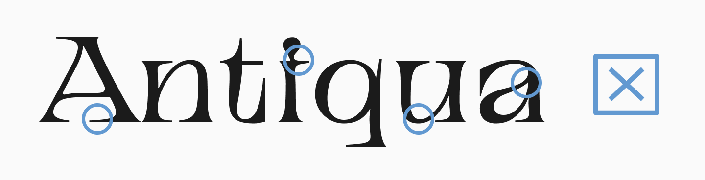
It’s important to choose your font for a Cricut project carefully—an unsuitable choice can complicate cutting, make the text unreadable, and ruin the entire design. In this article, we’ll explore how to choose the best fonts for Cricut and how to use them correctly in the Cricut Design Space app. Plus, a curated list of suitable fonts from the TypeType collection awaits you.
What to Look for When Choosing a Cricut Font
Fonts for Cricut Design Space must meet a number of criteria given the specific nature of their use.
1. Compatibility with Cricut Design Space
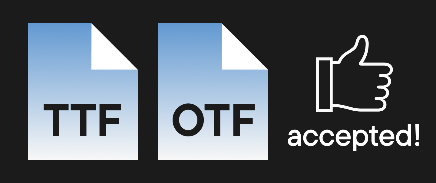
Not all fonts work equally well in the app. It’s best to choose TTF (TrueType Font) or OTF (OpenType Font) formats, as these are supported by the Cricut app.
2. Easy to Cut
So, what makes a font easy to cut and subsequently weed from various materials? Here are the most important factors:
- Clean outlines are the key to success. Fonts with small, intricate details can cut poorly, especially in a tiny size.
- Line thickness is just as important. Thin details can tear or break when working with certain materials.
- Spacing between letters matters. Spacing that’s too tight will complicate cutting, as letters can merge, and you’ll end up with shapes that have extra, unwanted pieces.
3. Font Types
Not all font styles are equally well-suited for Cricut projects, so it’s a good idea to narrow down your choices from the start.
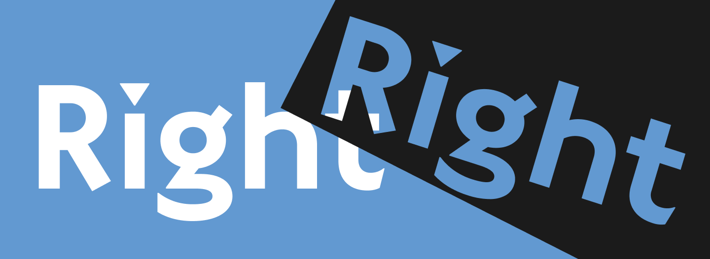
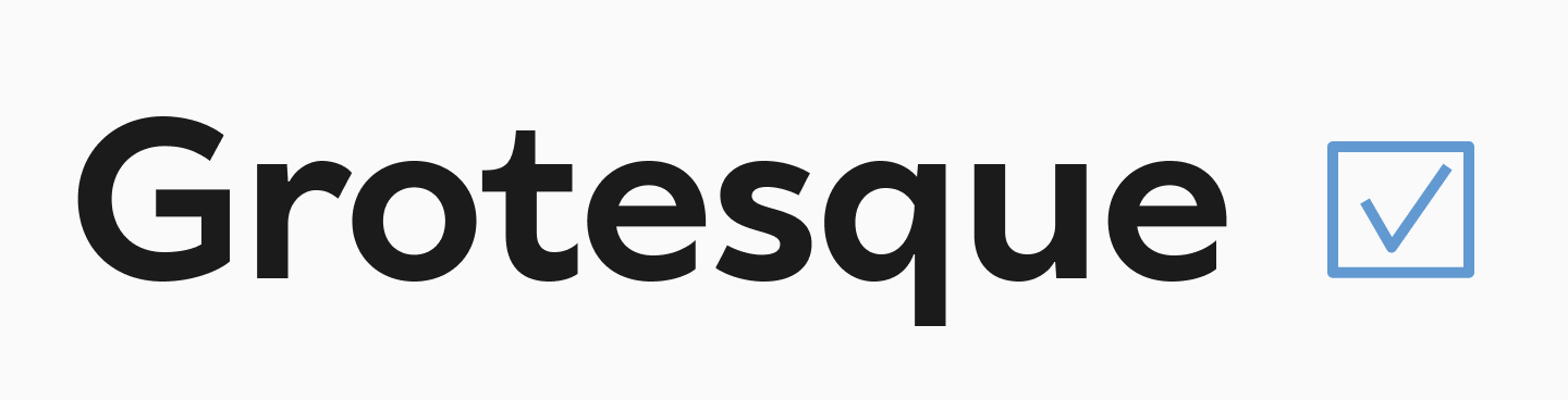
Sans serif fonts are usually the best for cutting. They have simple, clean shapes, no significant contrast (which means no super-thin lines), and no extra details.
Serif fonts with high contrast and thin serifs can create problems during cutting. However, more robust slab serif fonts can be a great replacement.
If you’re looking for the best cursive fonts for Cricut, be careful and pay attention to the factors listed above. It will be even more challenging to work with handwritten or script fonts that have an abundance of flourishes and other elements, especially if they are based on complex custom calligraphy—try to avoid those for intricate projects.

4. Commercial License
If you’re selling items made with a font, make sure you have the rights for commercial use. We explained how to choose a font license here.

TOP 10 Best Fonts for Cricut in 2026
In this collection, you’ll find suitable fonts for Cricut Design Space from the TypeType collection that won’t let you down, no matter what material you decide to work with. We think you’ll love these options!
TT Phobos Stencil
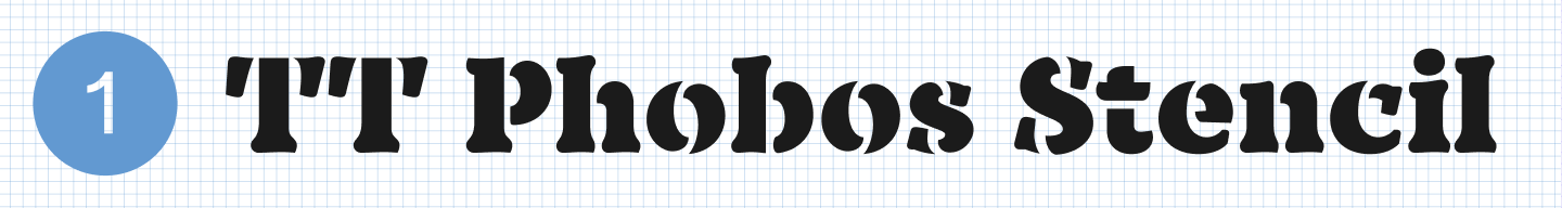
TT Phobos Stencil is a stencil font, which is a very popular style for cutting—they are perfectly suited for this purpose and look very impressive. Thanks to its unique cuts, TT Phobos Stencil looks particularly interesting and expressive, while the rounded incisions add even more visual style to the font.
TT Milks
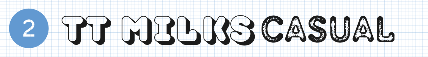
If you’re looking for a font for a unique and playful design, check out TT Milks. It’s a rounded font with a soft, gentle, and sweet character. The family also includes styles with distressed and shadow effects that can help you diversify your project. It’s a pretty font that’s great for kids’ items or fun decor.
TT Autonomous
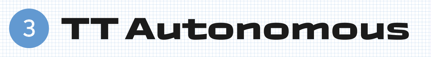
On the other hand, TT Autonomous is a font with a completely opposite mood: squared-off, angular, brutal, and futuristic. The family also includes two outline styles, which are even better suited for cutting projects.
TT Smalls
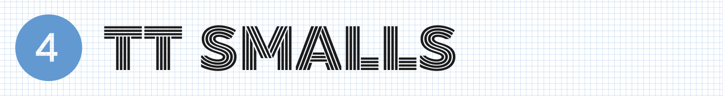
TT Smalls is a vibrant decorative font that is sure to grab attention. It’s an inline font based on the structure of a geometric sans serif. This makes the font look unique, yet it’s still easy to work with in Cricut thanks to its simple forms.
TT Rounds Neue
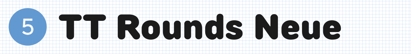
TT Rounds Neue is a font with rounded shapes and a “bubbly” effect. It’s a popular option for projects with a children’s theme or a fun, lighthearted mood. And because it lacks thin elements, it will be easy to work with in any material.
TT Paplane
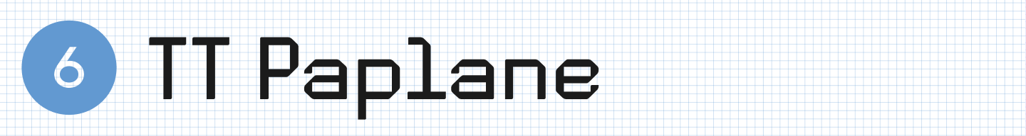
TT Paplane is an experimental squared-off sans serif. It’s a modern and striking font where the letterforms are designed as if they were folded from a paper ribbon. It’s almost as if it was made to be cut!
TT Gertika
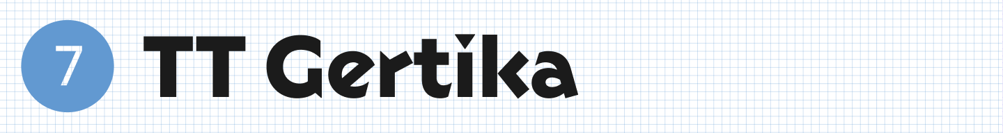
TT Gertika is another font with a unique design, with an idea that originated from the lettering on an American poster from the late 1930s. It looks very stylish, combining modernity with a vintage feel, and is ideal for projects related to history and art.
TT Carvist
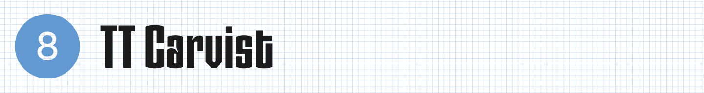
TT Carvist is a distinctive experimental font with a bold character. In Cyrillic, it resembles ancient decorative lettering, while in Latin it takes on a gothic mood. It’s convenient to use in layouts, and the result is guaranteed to be spectacular!
TT Wellingtons
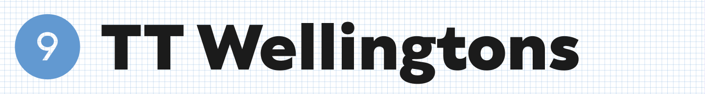
If you need a calmer, more classic font, a good option is TT Wellingtons. It’s a humanist sans serif whose forms allude to the movement of a broad-nib pen. It looks neutral, yet stylish and modern.
TT Polls
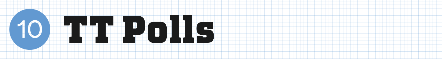
To create a special mood, try TT Polls, inspired by vintage American sports graphics. It’s a slab serif font that looks confident and solid. It’s quite versatile and suitable not only for sports-themed projects.
Tips for Using Fonts in Cricut Design Space
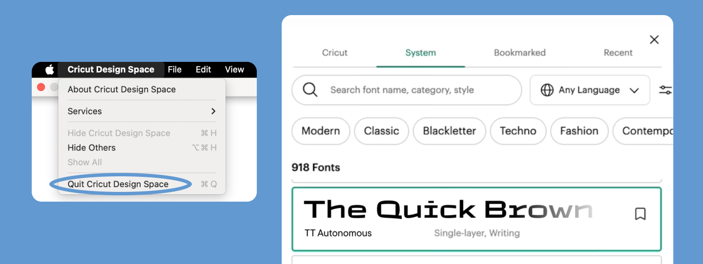
1. How to Upload Third-Party Fonts
- Download the font file (TTF/OTF).
- Install it on your computer (PC: Right-click → “Install”; Mac: Font Book → “Add”).
- Restart Cricut Design Space—the font will appear in your font list.
2. Working with Fonts in the App
- Use Curve: If your text needs to be placed in a circle, the Curve tool will help you bend it.
- The Weld tool combines letters into a single, continuous shape to avoid unwanted cuts between them. This is essential for the best cricut cursive fonts.
- Attach helps you lock your text in place on your design canvas, ensuring the Cricut machine cuts it in the correct spot.

3. Preparing to Cut
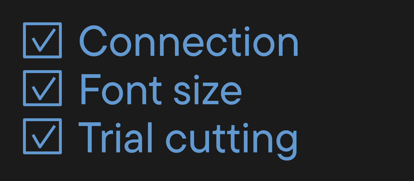
- Check that all letters connect properly (especially important for script fonts).
- Increase the size if the font is too thin.
- Do a test cut on a cheaper material first.
Free vs. Paid Fonts for Cricut: Which is Better?
So, let’s look at the pros and cons of using free vs. paid fonts to figure out which option is best for your Cricut project.
Free Fonts
Pros:
- Instantly available (you can find them on places like Google Fonts)
- Great for personal projects.
Cons:
- The quality of the outlines isn’t always good.
- Limited license (many cannot be used for commercial purposes).
Paid Fonts
Pros:
- Unique design.
- High quality, clean paths for cutting.
- Can be used for commercial purposes.
Cons:
- Require an investment.
Summary
If you’re creating projects in Cricut for commercial purposes, it’s best to invest in a high-quality paid font. For personal use or creative experiments, you can get by with free options.
Conclusion
As you can see, your choice of font affects a lot when using a Cricut—ease of use, the quality of your project, and the ability to commercialize it. We hope our tips help you choose the best option. Happy crafting!
FAQ
What are the best fonts to use for Cricut projects?
The best fonts are those that cut cleanly: simple contours, minimal fine details, and adequate stroke thickness. For small text, choose heavier weights.
What fonts come with Cricut Design Space for free?
Design Space has a basic set of free fonts; the rest depend on your subscription or purchases. You can also add your own fonts if the license permits.
Which script fonts work best for Cricut cutting projects?
For cutting handwritten styles, choose fonts with wide connections and without swirls or thin terminals. For example, TT Milks, TT Smalls, or TT Rounds Neue work well.
What fonts are easiest to cut and weed on Cricut projects?
Frequent use requires stable shapes. Choose fonts without micro-elements and with even internal counters (gaps), such as TT Paplane or TT Polls. This reduces the risk of tearing and deformation during transfer.
How do I choose the right font for my Cricut project?
To choose the right font, check 4 points: the size of the smallest detail, stroke thickness, letter spacing (kerning), and the license. Always perform a test cut on scrap material.
Can I use Dafont or Google Fonts with Cricut?
Yes, fonts from DaFont or Google Fonts can be used in Cricut if they are installed on your system and available in OTF/TTF format.
Important: DaFont often lists various licenses—commercial use must be checked separately.
What fonts are best for cutting small letters on Cricut?
Fonts with simple, open shapes and no thin bridges are suitable for small letters. If the letters “crumble,” increase the point size or use a bolder weight.
How do I upload new fonts to Cricut Design Space?
To upload a new font, install the font on your system (OTF/TTF), then restart Design Space—it will appear in the list. If it doesn’t appear, check that the font is installed correctly and not damaged.
Are paid Cricut fonts worth it compared to free fonts?
Paid Cricut fonts are often better for two reasons: contour quality (crucial for cutting) and clear usage rights. Free fonts are fine for personal tasks but may restrict commercial use.
How can I combine multiple fonts in one Cricut project?
To successfully combine fonts, maintain contrast in their roles: use one font for the header/accent and another for the caption.
Ensure both have comparable complexity; handwritten fonts pair best with a neutral sans serif.