Wide and narrow fonts are among the newest trends in typography, graphic design, and web design. At first glance, some may seem odd and awkward, but when thoughtfully applied, they can infuse a project with freshness, boldness, relevance, and strength.
What are narrow and wide fonts, what variations do they come in, and where are they used? Let’s explore this together in this article.
Narrow fonts
Narrow fonts are quite popular in the modern world. However, their active use started in the early 20th century.
The most well-known example is the FF DIN font crafted by a Dutch designer, Albert-Jan Pool, in 1995. The font family was based on the DIN 1451 typeface standard developed by the German Institute for Standardisation (Deutsches Institut für Normung) in 1931.

DIN 1451 was a collection of documents and regulations defining the graphics of the characters in engineering and technical blueprints. It was later established as a standard for designing various navigational signs, informational boards, and street signs. Over time, DIN 1451 became even more popular: people started using it on signage, packaging, and even in commercials.

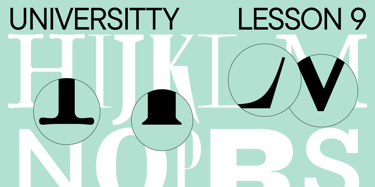
It’s only natural that narrow fonts look rather neutral and familiar to us, even though they still catch the eye. Today, multiple different narrow fonts exist: entirely condensed font families and narrow versions of the «standard» fonts within typefaces.

Types of narrow fonts
Narrow font styles
Narrow fonts within a typeface are typically the styles that are more condensed than the «standard» or «basic.» They feature their own hierarchy as well.
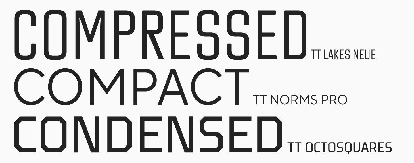
So, among the narrow font styles are Compressed, Condensed, and Compact, where Compressed is the narrowest variety, and Compact is the widest (similar to «normal»). The Condensed font style is the one that is most often used in design.
In our typeface collection, many sans serifs feature narrow font styles.
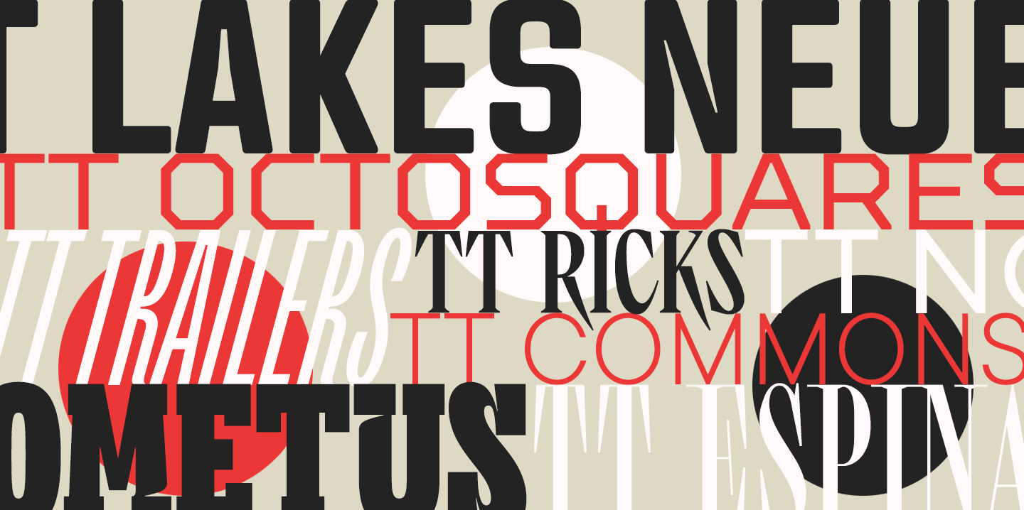
For example, you can find a Compressed font style in TT Lakes Neue, TT Octosquares, and TT Rounds Neue.

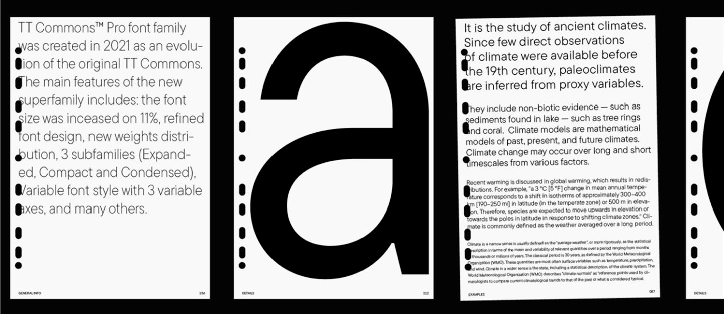
The Compact subfamily is included in our bestsellers: TT Commons™ Pro, TT Norms® Pro, and TT Hoves Pro.
Condensed is available in many of TypeType’s typefaces.
Fonts with narrow proportions
Besides being included as styles in font families, narrow fonts can stand alone as independent typefaces. Condensed proportions in such fonts are featured in all font styles, including the basic, which is one of the key features of their design.
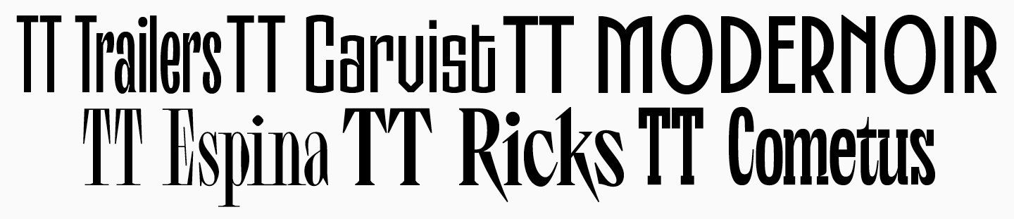
The TypeType collection offers both serifs and sans serifs with narrow proportions. Among sans serifs, we have TT Trailers, TT Carvist, and TT Modernoir (with the SS01 OpenType feature — Condensed Ovals). Serifs include TT Espina, TT Ricks, and TT Cometus.
Where do narrow typefaces find applications?
The application range of such fonts is broad: navigation signs, posters, banners, packaging, branding, web design, and even more. Narrow sans serifs are so widespread in design because of their form: they are more compact than familiar average-width fonts. This makes it possible to fit larger portions of text into small spaces.
In addition to the practical advantages, narrow fonts stand out for certain aesthetic qualities. They are capable of looking more eye-catching and expressive than basic-width fonts while remaining readable and neutral. That’s why these fonts are often used for headings, especially on websites and in apps.
Using narrow fonts is a global practice with guaranteed positive results: such fonts look modern, and it’s easy to find a matching style for specific tasks.
The visual identity of a Croatian company LED Elektronika features a Condensed version of TT Supermolot Neue. Here, this choice makes the design look serious and technologically advanced while maintaining a neutral feel.

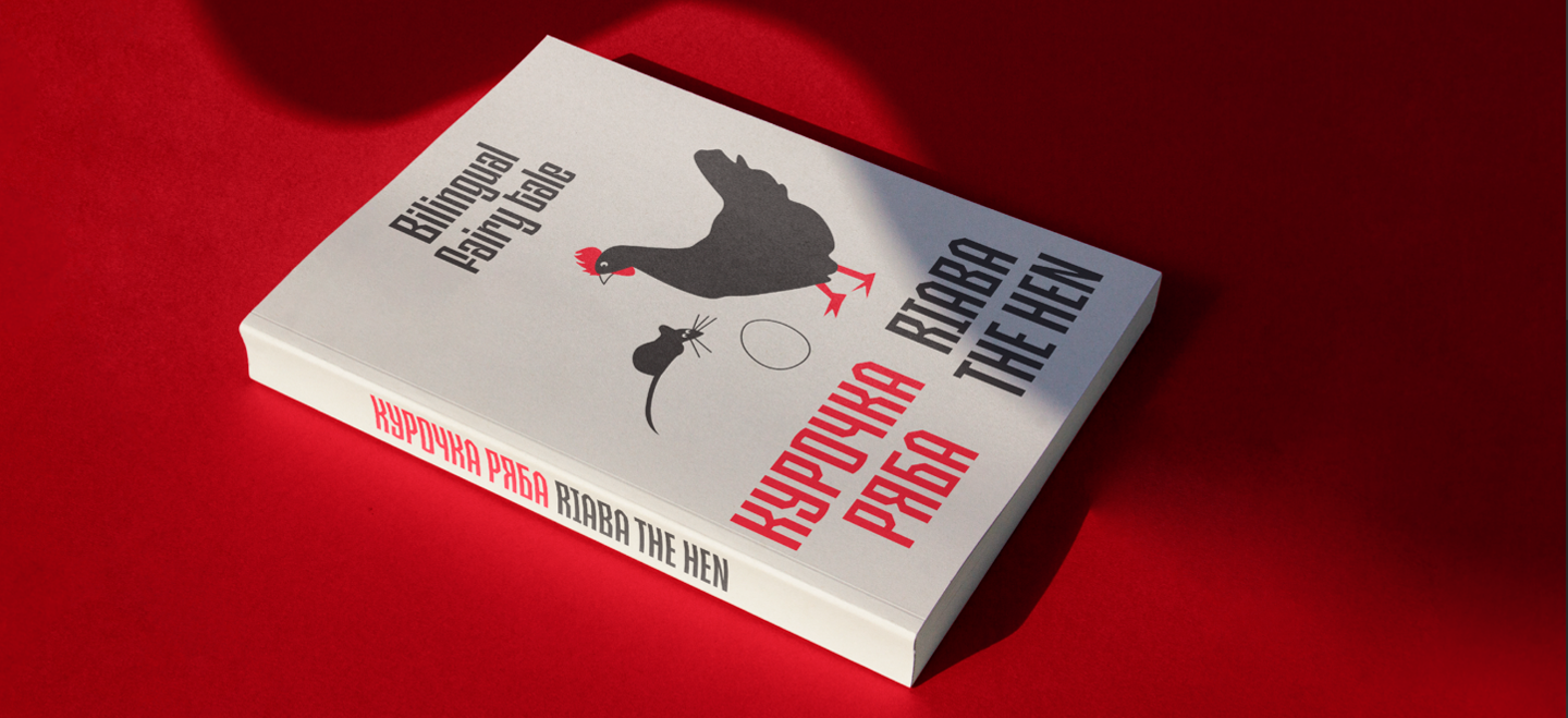
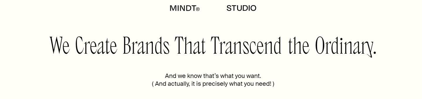
When it comes to inherently narrow fonts, take a look at the visual identity of the banding studio Mindt, featuring our narrow-proportioned serif TT Ricks in its thin style. This design looks modern, bold, and even daring.
Another similar example is the Festival Summer Plovdiv 2023 visual style, where our expressive TT Trailers is used. This font also stands out for its narrow proportions. It infuses the design with a vibrant, unusual, and carefree feel.

Wide fonts
At the other end of the spectrum, there are wide fonts. They are used more rarely in the design than narrow fonts and only serve aesthetic purposes—they are more difficult to read and use in mockups or web design because of their wide proportions. However, this is also their advantage for a variety of tasks.
So, wide and ultra-wide font styles dramatically transform text perception. In such fonts, letterforms change, and more horizontal strokes appear. Wide fonts make even short words more difficult to read; however, this adds significance and distinctiveness to every word. Everything around the texts looks more prominent and impressive this way.
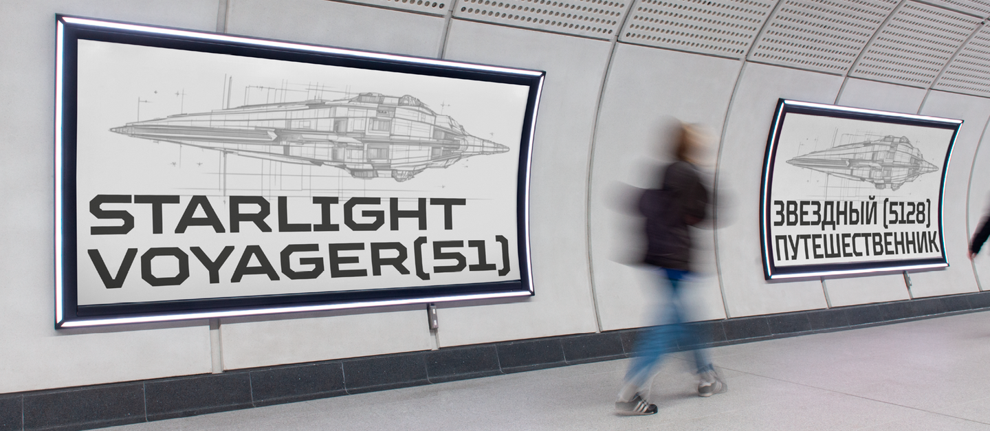
Wide font styles have better readability when angled, as proportions are compensated by perspective. That’s why these fonts are often used by car, aircraft, and sports equipment manufacturers.
Wide fonts in use
Wide fonts are a noticeable trend in web design and branding. They infuse projects with a bold and daring feel by looking unusual, appealing, and captivating. A wide, heavy block of text instantly attracts attention and becomes a visible design unit, giving the project an ultra-modern appearance.
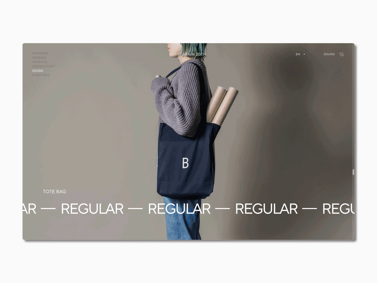
Sometimes, glyph proportions can be so wide that the font loses its meaningful context and becomes a graphic object. This example is well-illustrated in the SHIFTBRAIN 20th project created to celebrate the 20th anniversary of the marketing company SHIFTBRAIN. The company’s website features a font called SHIFTBRAIN Norms Variable, a customized version of our bestseller TT Norms® Pro. In this case, the font’s proportions are stretched to the maximum.
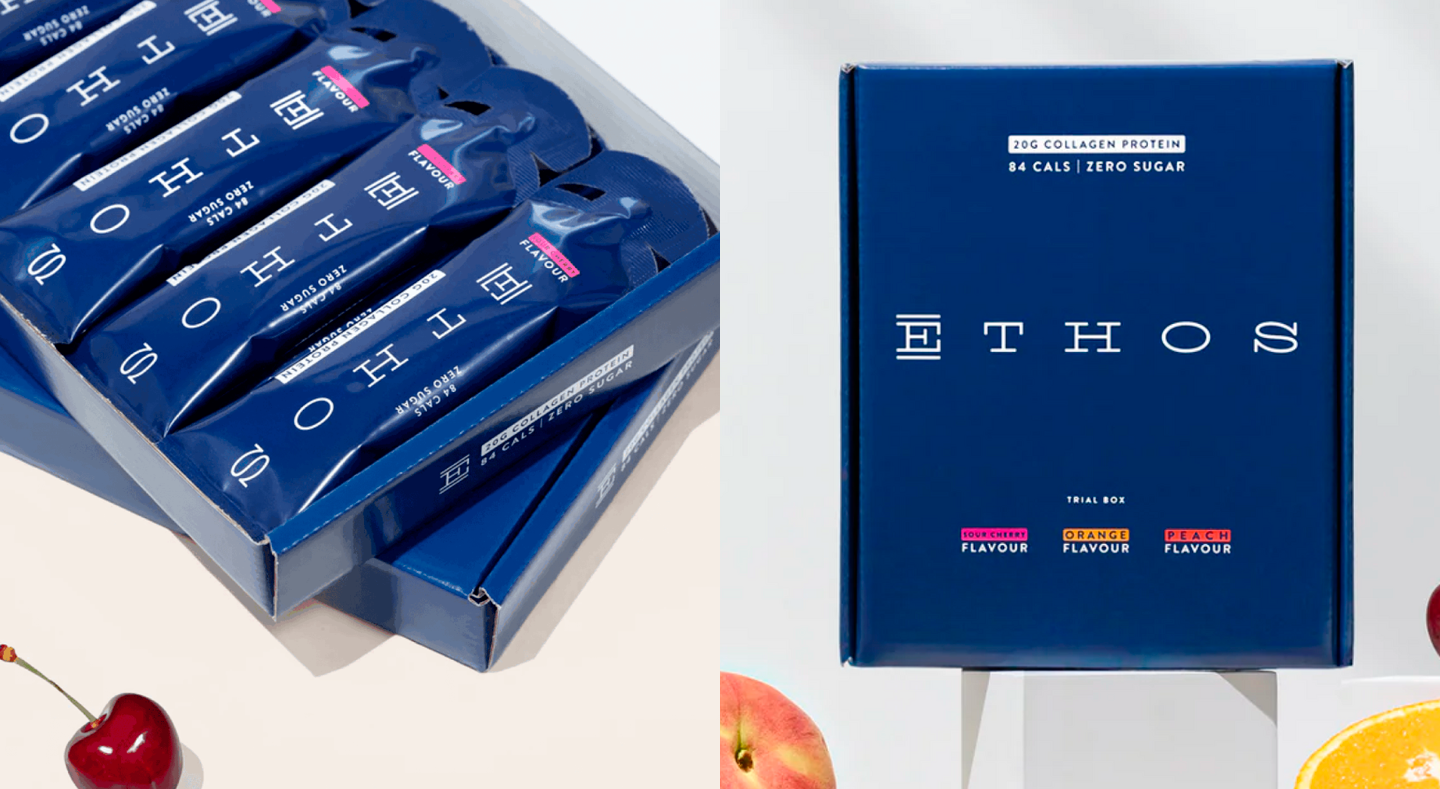
Another use case is the visual identity of the collagen supplement manufacturer called Ethos. The brand uses our stylish designer font TT Globs with wide proportions. To maximize the effect, the letter spacing was made bigger here.
A less extravagant «stretching» can be seen in the design of the Teze Bazar market, featuring the geometric sans serif TT Travels as a signature font. In comparison to the previous example, character width here seems almost «standard.» However, wide proportions still infuse the design with a certain charm.

Types of wide fonts
Wide font styles
Several terms apply to wide fonts: Expanded, Extended, and Wide. Unlike narrow fonts, these ones do not have a clear hierarchy. Within font families, the wider subfamilies in relation to the standard may contain any of these three terms in the name.
Wide-proportioned fonts
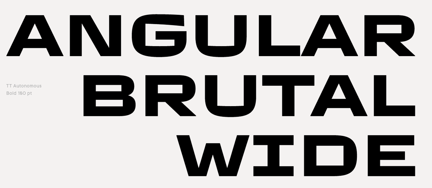
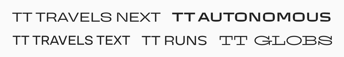
Similar to narrow fonts, there are wide typefaces with expanded proportions in their standard form, driven by a creative idea. In our collection, for instance, these are TT Travels Next and TT Travels Text, TT Runs, TT Autonomous, and TT Globs.
Narrow and wide fonts in one typeface: Benefits
It’s highly convenient to have both narrow and wide font options within one single font family. This allows you to create well-balanced font pairs as fonts of varying widths, united by one typeface, will have a uniform graphic system and a very similar glyph design. By selecting different widths, you can place the necessary conceptual and visual accents.
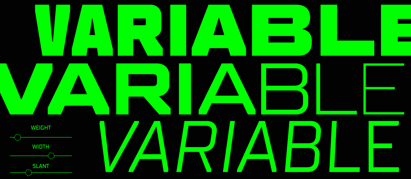
This is the reason why variable fonts with a width variation axis are unmatched for use in design—you can choose any width value for the exact accent you need. Learn more about variable fonts and how to use them in our article.
Besides a standard subfamily, TypeType’s superfamilies, such as TT Commons™ Pro, TT Norms® Pro, TT Hoves Pro, TT Octosquares, TT Supermolot Neue, TT Lakes Neue, and more, contain the Condensed, Compact, and Expanded subfamilies, plus a variable font with three axes of variation (including width). This allows for dramatic text transformations and infinite potential for design experiments while helping designers maintain the font’s style.
Important details
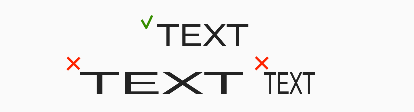
It is essential to keep an eye on character readability when using narrow and wide fonts. Both narrow and wide fonts do not suit well enough reading large running texts—they are much more helpful for precise use, such as accent placement. Besides, they work best in medium and large point sizes because letters stick together in small point sizes.
We recommend avoiding «mechanical» font shrinking or stretching in graphic and text editors. This method distorts letters and breaks the font’s visual concept. The optimal way is to use fonts that already have narrow or wide styles included.
Conclusion
In the TypeType collection, many sans serifs feature narrow and wide versions. We make them because we understand that, in the reality of constantly transforming and evolving trends, designers are always looking for new fonts. Narrow and wide versions of «standard» sans serifs allow them to solve most of their problems. As we have already mentioned, various font styles within one typeface significantly amplify the potential for experimentation.
Expanded or narrow subfamilies blend seamlessly with other widths included in the typeface. You can easily use both variable version and static font styles in your ideas. All fonts in the typeface have a uniform character, similar letterform concept, and the same technical settings and OpenType features. And the best part is that we know how exactly to shrink or stretch your favorite sans serif to make it perfect for you. In addition, our collection includes unusual display fonts with narrow and wide proportions that can make your project look unique and original.
Experiment with various font proportions and discover new dimensions in your design!