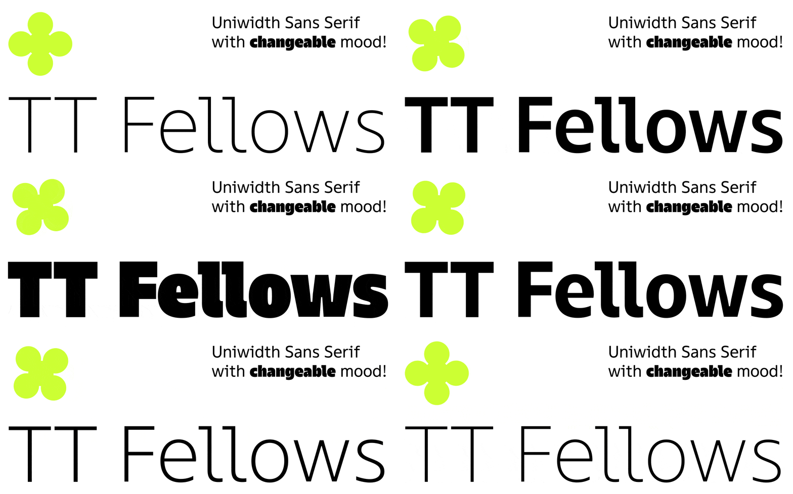
In January 2022, a new TypeType font TT Fellows was released on sales platforms. Almost immediately, it attracted the attention of designers from all over the world, which is not surprising, because this versatile, concise, and functional typeface is suitable for most modern projects.
This is a font that will not ruin the layout if you want to change the thickness in the process. It’s graphically friendly and intuitive to use. Using TT Fellows is safe and enjoyable. There is nothing superfluous in the character composition, and it has extensive support for languages, which are enough for wide use in a variety of tasks. There are useful features and functional ligatures.
Despite its neutral nature, depending on the purpose, the font family can show a completely different mood: it can be soft and calm, as well as bright or even brutal.
Add to this the fact that TT Fellows is the first uniwidth typeface in the TypeType collection, and it becomes clear that such a font had no chance of going unnoticed.
Are you intrigued? Let’s talk about the new font in more detail.
Uniwidth
When the new font was at the idea stage, we only knew one thing: the TypeType collection of typefaces needed another neutral sans serif. It should be like TT Norms® Pro, TT Commons™ Pro or TT Hoves, that is, functional and covering the broadest application scope. Such fonts are popular and convenient, modern and practical.
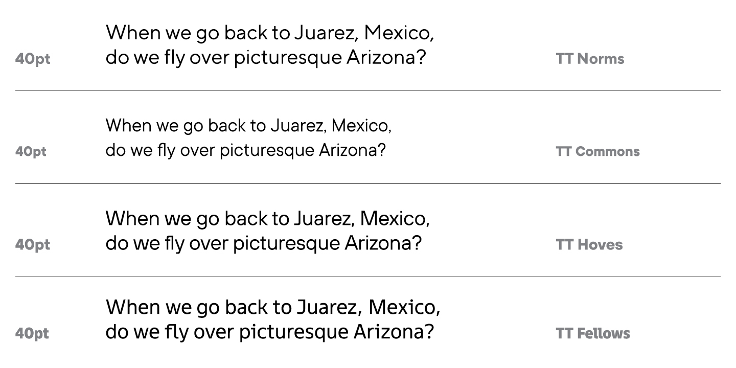
However, embarking on a project to create a font similar to already released ones seemed not the most interesting task. All of the above typefaces are geometric sans serifs, so we decided to change the style of the new typeface. Geometry is still in demand and aesthetic, we thought, but we had practically no humanist fonts in our arsenal, which means it was time to fix it.
In general, geometric and humanist sans serifs are similar in their neutrality and universality of use. The difference is that geometric sans serifs do not usually have a noticeable spirit, the shapes of characters in these fonts consist of simple geometric shapes. Usually these are low-contrast fonts with different widths, while humanist fonts are high-contrast fonts with different widths. In humanist sans serifs, the characters acquire softness, and references to serifs emerge.
It is difficult to call TT Fellows completely humanist: it has soft features, but at the same time it has mechanistic motifs, and in regular weights the font can be compared to neo-grotesques. It turned out to be something in between, because from each style we took the features that seemed attractive to us within the framework of the new project.
To create a neutral sans serif that would not be like the main bestsellers of the studio, but that at the same time would be able to keep them company in the user’s arsenal—this is, approximately, how one can formulate our first thoughts on the font family. Of course, we also did not want to limit the scope of the font, rather, on the contrary, there was a desire to make it almost limitless.
Uniwidth fonts are a rather interesting and attractive, but not the most common category in the font world. In such typefaces, the em square does not change its width from style to style, that is, even with an increase in boldness, the font does not become wider, but remains in the same place.
In classic font families, it works like this: the thicker the style, the wider the font becomes. This is logical, because bold styles require more space, but this can create difficulties for the user.
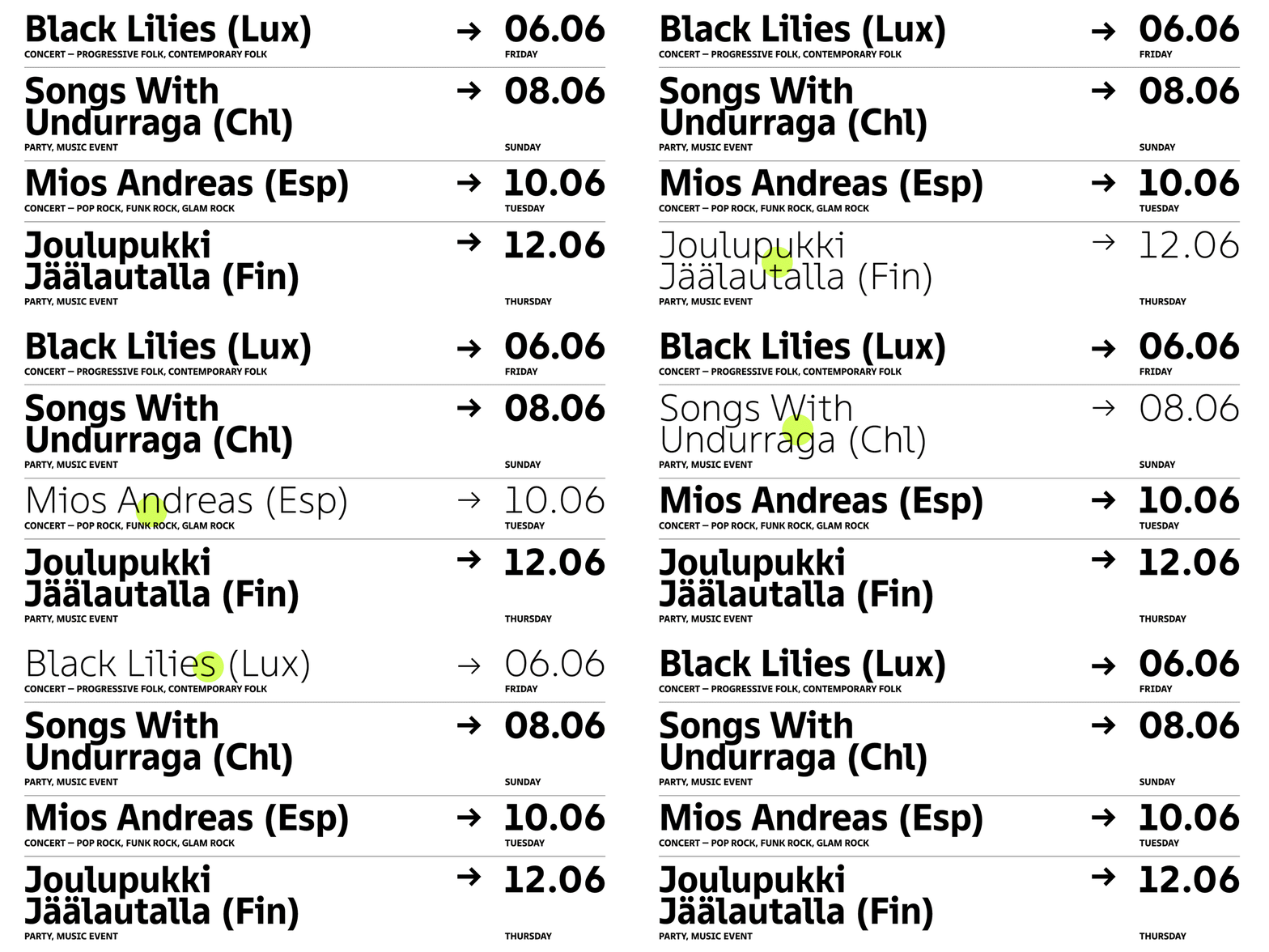
Let’s say a designer is typing a text in a layout and wants to change the style as they go. Alas, after such manipulations, the layout will have to be changed and adjusted to the new width, because the set will inevitably be corrupted. This also applies to working in web design. Websites often use buttons that, when hovered over, change the font style, becoming bolder. This is how the site visitor understands that they hover over a certain button, but in the design you have to adjust the button container to the new text width.
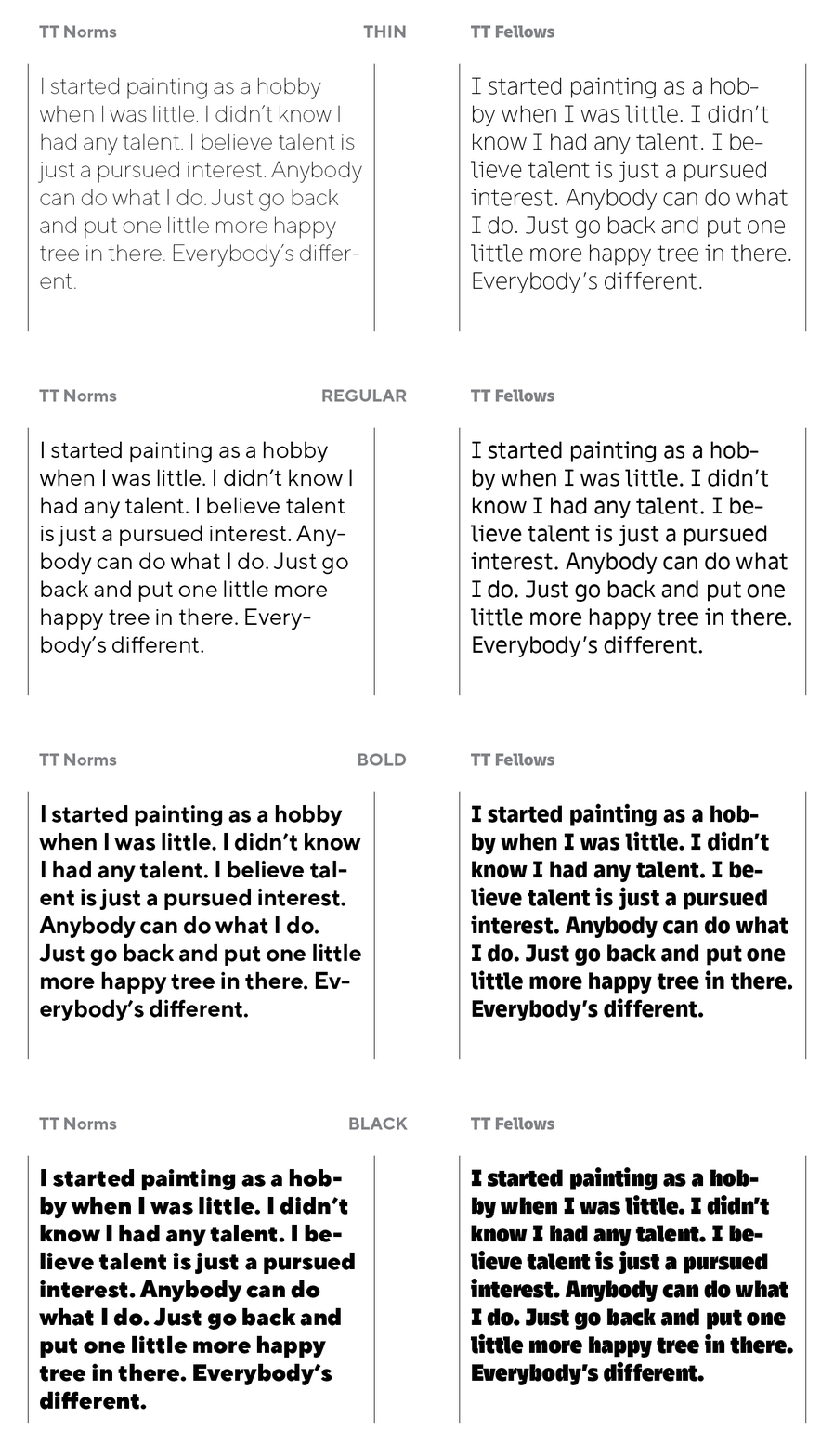
With a uniwidth font, there will be no such problems. The font stays the same even if you change the weight from the thinnest to the boldest. The text will be within its limits and will not change its location, and the designer can easily change the style right in the layout, and the web designer can set the necessary style parameters for any buttons without worrying about the size of the container.
For designers and typesetters, a uniwidth font is a lifesaver and a godsend, but in type design, such a typeface creates certain problems that require compromise solutions. We will talk about them later.
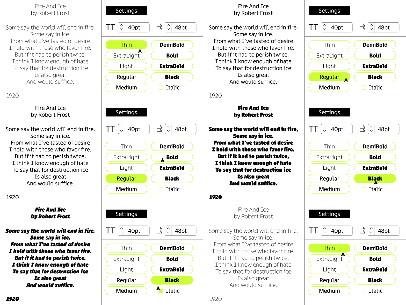
So, the concept of the future font has been formed: a uniwidth sans serif, universal and neutral. By the way, TT Fellows became the first uniwidth font for the team, so the project became a point of professional growth. We challenged ourselves.
Research
We were in no hurry to dive into the development, because before plunging into the new area, you need to research the topic in detail. The uniwidth font idea was no longer an idea, so we had to study the peculiarities in detail before designing the font.
For our research, we selected modern uniwidth fonts by various font foundries that exist on the market. It turned out that there are not too many of them out there.
By the way, in type design, there is such a category as monospace fonts, in which all glyphs are placed in one point size. Because of this, letters have to be heavily modified when developing a font, and, for example, an i will become quite wide, and an m—narrow.
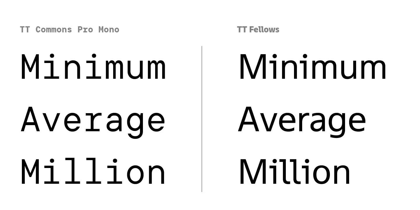
A uniwidth font is different in that within the same style, letters can still be located on different em squares, so the font looks familiar and not as specific as in monospace fonts. With proper development, the user will not notice anything unusual in the shape of characters, while within different styles, identical letters will remain within the same em sqaure. Thus, a uniwidth font is a cross between a monospace and a classic font.
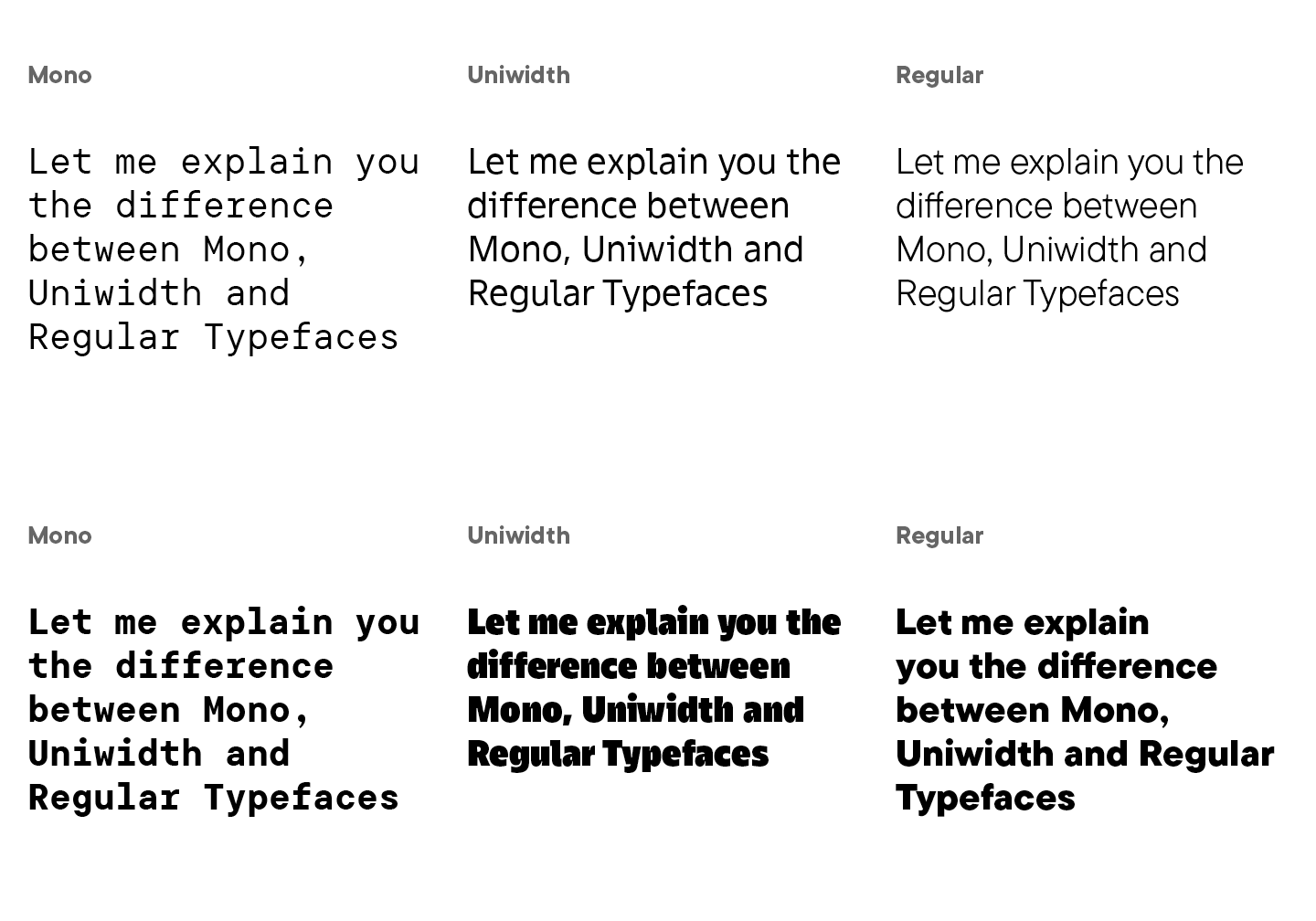
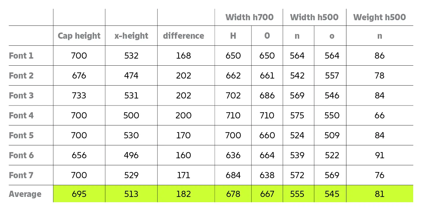
Our research was to show the future challenges to be faced and graphical solutions to compensate for the limitations of uniwidth.
We wanted to immediately outline the graphical patterns of uniwidth fonts and capture the visual solutions for certain glyphs. After studying various examples, we have identified the main points.
- Uniwidth font families are small. Of course, some font foundries added a large number of styles, but these are still exceptional cases. The limited number of styles can be explained logically, because it is not easy to fit the thinnest and the boldest letter in the same em square, while maintaining a common visual character. You will have to make difficult compromises, sacrifice some things, and come up with unusual graphic solutions.
- We measured the main proportions of the characters, that is, the parameters for thicknesses and widths, in order to determine the average values. In all fonts, character proportions tend to be equal in width and are not very wide. For example, in TT Norms® Pro, round characters tend to a circle, and n tends to a rectangle. In uniwidth fonts, the proportions of round letters will tend towards an oval or square oval, and letters similar to n will take on similar features. There is an explanation for this: with an increase in weight, round characters can be greatly distorted, it will be difficult to place them in the same em square in wide styles so that they match thin ones. If you initially narrow down the round signs, such a problem can be avoided. Squareness adds more white space to bold fonts, however, it is not a prerequisite for designing uniwidth fonts.
- Letters that have only one stem, such as i or l, cannot be left without a serif, otherwise thin faces will have too much white, and bold ones too little. The shape of such letters needs to be compensated by adding serifs or changing the shape.
This is where our research on uniwidth fonts ended, we figured out the main points for future work and proceeded to the sketches.
Faces
We didn’t just stop at uniform width as a key feature of the TT Fellows font. The idea to add another feature to the font arose naturally at the initial stages.
There is an important nuance in type design: if a typeface consists of a large number of styles, the character of the drawing slightly changes from thin to bold. The TypeType studio is very fond of making large or very large families, so we have been familiar with this problem for a long time. When a font becomes very bold, its character will become noticeable or change, even if the typeface was originally neutral. For example, the well-known TT Norms® Pro, which does not have a pronounced character in regular styles, at some moments can show both softness and brutality.
You can consider this a problem or a challenge, and you can artificially suppress the character with different graphic solutions or use it to your advantage and make it a key feature of the font. This is what we decided to do with TT Fellows.
As we learned at the research stage, a variety of faces in uniwidth fonts is rare, more often font foundries produce them in limited quantities. We mentioned that this is due to the fact that it can be difficult to fit one glyph into the same em square in different weights. However, we are not normally looking for an easy way out, and we decided to create 9 styles—and we are talking only about upright ones!
Frankly, this is kind of classic for TypeType fonts. Be that as it may, TT Fellows is a uniwidth font and so it was difficult to determine the exact number of styles from the very beginning. When working with TT Fellows, there were 8 styles in the primary plan. This was primarily due to the fear that a weight bolder than ExtraBold would not look harmonious and would be too narrow. However, another bolder style was added to ExtraBold later. We will discuss this in more detail in another chapter, but for now it is enough to know that the same em square in all fonts did not prevent us from making 18 styles and 1 variable font.
We did not want to reduce the number of faces, but it seemed to us an interesting challenge to consciously control the spirit of the font in various weights. You might think that it was only our enthusiasm that contributed to this, but in fact, we were primarily thinking about the designers and other users of the future typeface. Finding the right typeface for your headings that at the same time works well with your text font, can be a daunting task. But it is something else when an already familiar font can adapt to the task and become both a neutral text and an expressive display font.
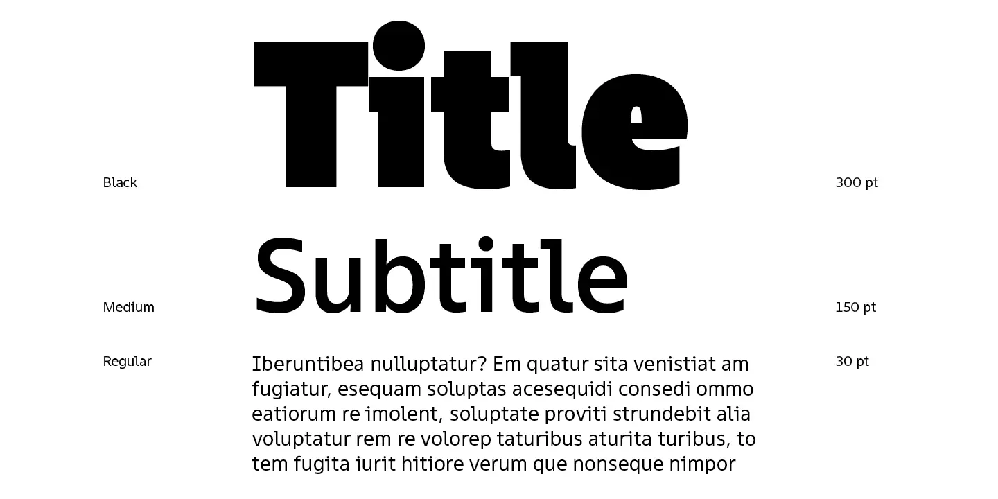
Quite frankly, very bold weights like Black, ExtraBlack and ExtraBold take on a display vibe, even if it wasn’t originally intended. For arrays of small text, using such styles is not very practical. Actually, the concept of working on TT Fellows was to immediately consider this feature and create the boldest faces as display ones. This was achieved by making the graphics and graphic compensations more expressive and adding various features when working on such styles. In thin and medium weights, the font still had to be neutral, but display styles were designed for work with large text sizes and headings, so its character could take on some expressiveness.
Having studied the features of creating a uniwidth font and having approved the idea of different faces, we took the typeface into development. Our ideas inspired us to conquer the heights of type creation, but at the same time brought many professional challenges.
First challenge: Uniwidth
We formed the general features of TT Fellows at the initial stages, although from the first to the last sketch the font graphics changed noticeably. Of the surviving features, one can note the shape of ovals and arches, which have not changed much. The ovals ended up narrower, midway between rounded and squared. The arches are harmoniously combined with ovals, having rather calm forms.
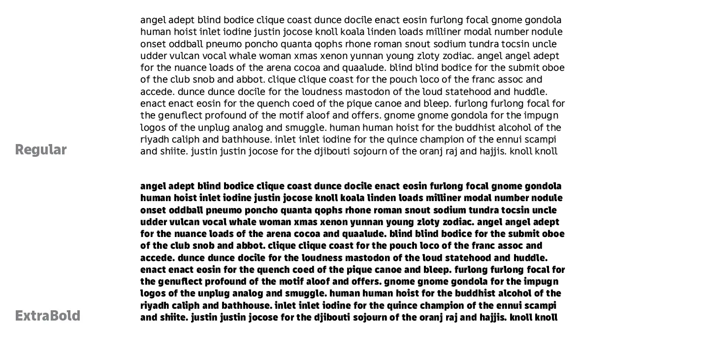
The main thing when creating a uniwidth font is working with proportions. Thin, the thinnest face, should not look too extraordinary, all characters are supposed to have a neutral character, without excessively wide or narrow forms. Putting all the letters of different styles in the same em square so that everything looks harmonious is the main goal, which is achieved in detailed and painstaking work.
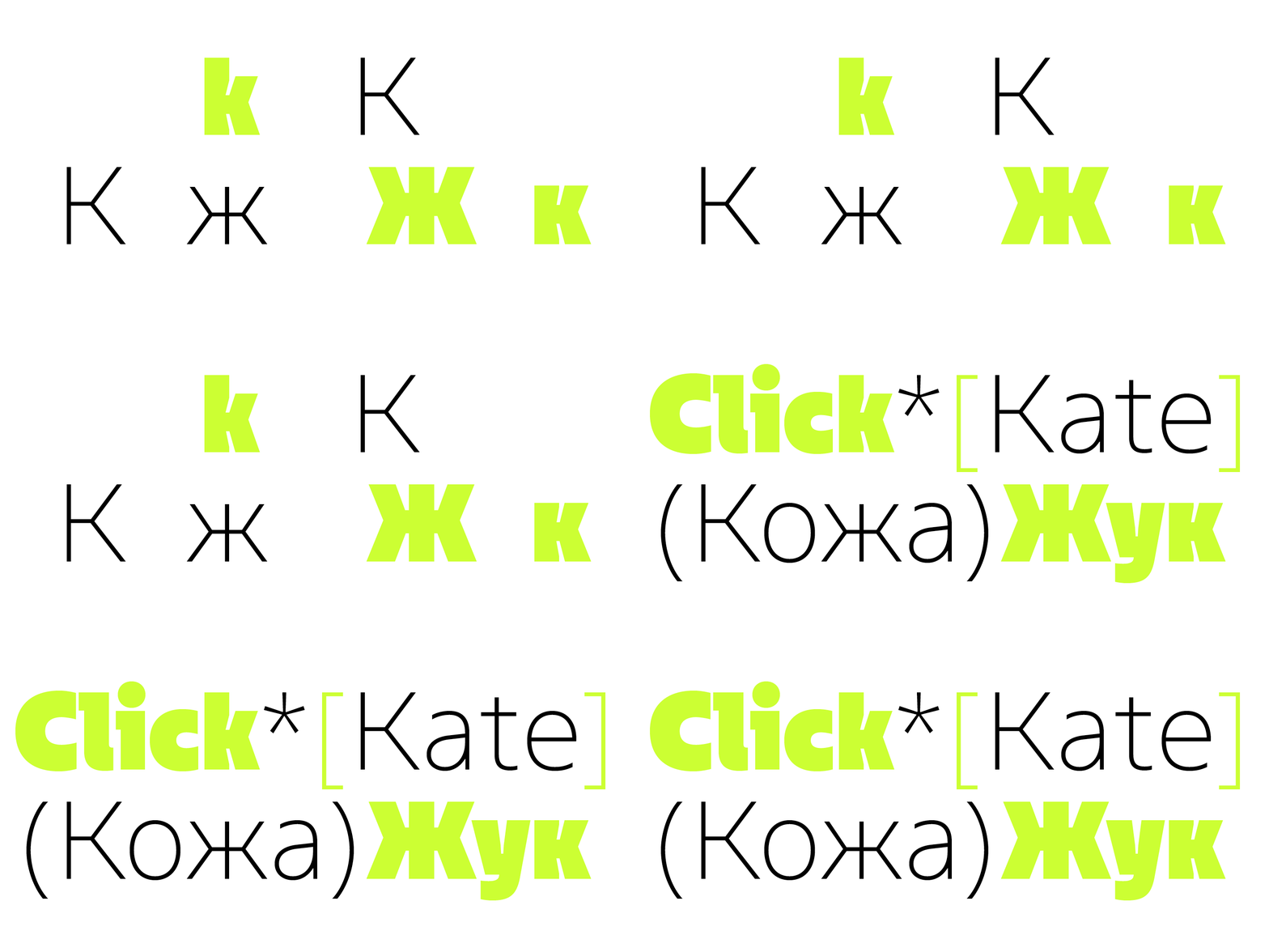
First of all, difficulties were caused by the letters that have a diagonal. In Latin, the most attention was paid to k. The most important thing about this glyph is its width. In normal fonts, the width of these characters is significantly different in Black and Regular styles. In order for k in them to look the same in width, the em square must vary greatly in size.
In TT Fellows, the width has already been set. In thin styles, it was impossible to allow a huge white space to appear in the place where a diagonal branch is attached to the stem, all while the k should not look like a display font letter. We worked for a long time with the point of attachment of the diagonals, until the letter acquired a harmonious form in all styles. After all, while in thin faces we tried to prevent the excessive white space, in the bold faces, on the contrary, we tried to avoid the lack of white space.
In the final version, k in thin weights looks wider than usual, but this is not striking unless you look closely. The same can be said about bold styles: despite the limited width of the em square, the letter looks harmonious and, more importantly, reads well in the text due to the even distribution of white. In the bold weights for k, we made cuts into the stems, which look unusual and expressive. Taking into account that the extreme bold styles were originally planned as display ones, we were completely satisfied with the shape of the letter.
With the Cyrillic к and ж, the work was carried out similarly. It was important to make the letters harmonious and readable in all styles, and for this we transferred all the characteristic features from k. In all characters with a diagonal, we fought for width, because with an increase in boldness, glyphs gained too much of it. As a result, such letters had to look not too wide in narrow styles and not too narrow in bold. We would solve this task all along the development of the font.
Interesting work lay ahead with the Latin characters i, l, y, and v. The peculiarity of working with i and l was determined at the research stage and consisted in the fact that these letters could not be drawn as a separate stem without a bottom pad, otherwise too much white space would appear in thin styles.
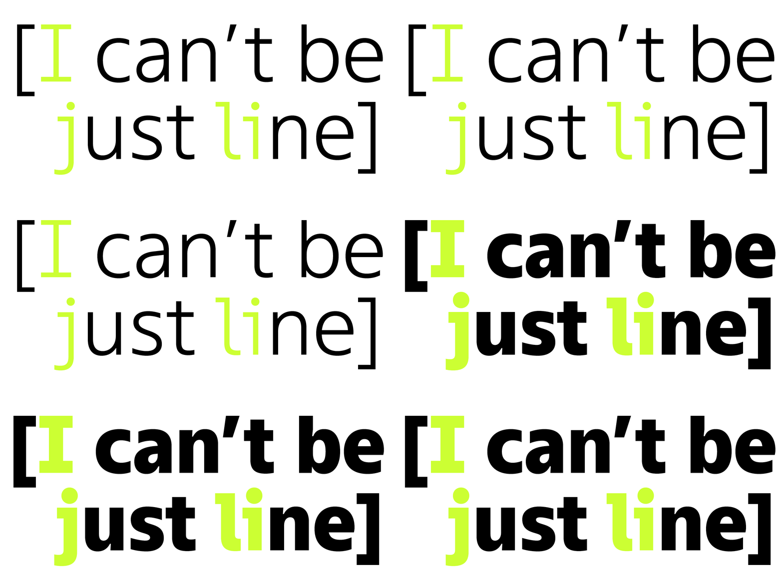
The graphic solutions in TT Fellows appeared largely due to limitations, because working with a uniwidth font is a search for a visually appealing yet practical compromise. The shapes of the letters i and l were determined by the peculiarities of the font, but they turned out to be quite harmonious, and that in all faces.
The letters y and v were drawn based on the same restrictions, and they ended up having not quite a classical shape. In bold weights, these glyphs had to be quite narrow, but still look natural, not deformed. From here, a graphic solution appeared, which is quite popular now—a step at the junction of the strokes. It can be seen in all styles, from Regular to Black, but not in thin. The latter is due to the fact that in Thin the lines are quite thin and refined, and the step interfered with readability rather than created aesthetics, so we decided to remove it.
Work on the Cyrillic alphabet was carried out in the same way as with Latin letters. Some characters have a similar construction logic, so we applied the already chosen graphic techniques to them. For example, у is similar to the Latin y. In general, all professional challenges were similar: you need to fit the glyphs of bold styles into the em square of thin ones. At the same time, the characters should not be too narrow in bold faces and not too wide in thin ones. Some characters have strong compensators, for example, in ф. You can see that in bold styles the stem is quite thin, although in the same regular style it is usual and fairly standard.
Despite the fact that the challenge with the above characters was difficult and unusual for us, since we had not worked with uniwidth fonts before, the final form turned out to be interesting. We ‘calmed’ the signs on both ends in search of a harmonious solution in all faces.
There are only 2 ligatures in TT Fellows, which are purely practical. This matches the concept of the font: convenient, practical and without unnecessary elements.
In Latin, this is the classic combination of f and l, for which we almost always make a ligature, because in some styles these letters, located together, create an unpleasant imbalance that the eye stumbles over. The ligature fixes this.
In Cyrillic, there is also one ligature, for the Ukrainian language. It was necessary so that when the letters ї and ї are combined, the dots would not crawl on top of each other in bold styles. In the ligature, there are three dots evenly distributed over the stems, so visually it looks more attractive. This ligature is also often used in our fonts.

After drawing the main character composition, we started creating figures, special characters, punctuation, and arrows.
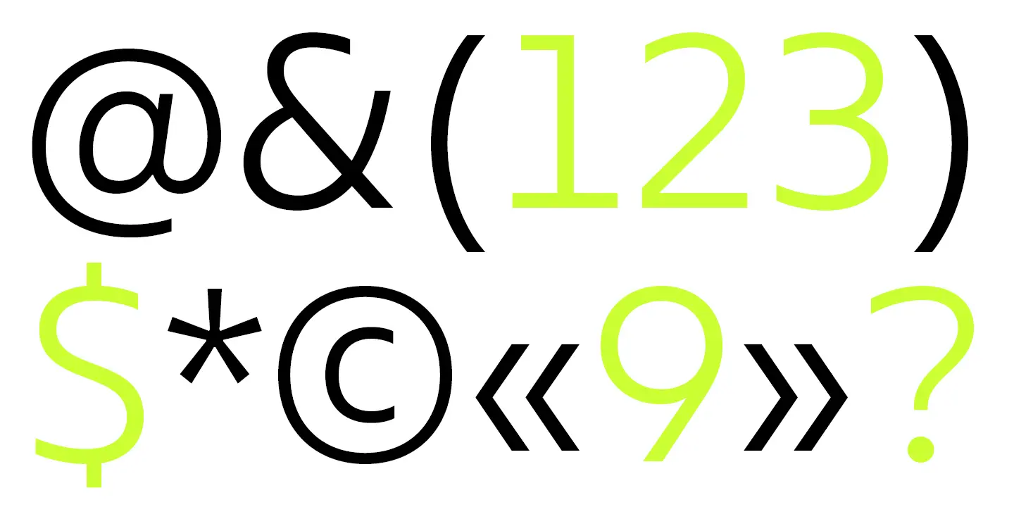
With the figures, we had to transfer all the graphical features of the rendered glyphs, but at the same time keep the familiar look of numbers. It is important that the typed numbers fit well with the letters in both headings and text arrays. As peculiarities, it should be noted that 1 could not be a separate stem, otherwise there would be too much white in thin styles, so 1 has received a platform at the bottom. All other figures are similar to those familiar to us, while the character of TT Fellows has been preserved.
The main difficulty in creating punctuation was with round brackets, because in bold faces such brackets could take too much white, and in thin ones, on the contrary, they could add too much white. As a result, the brackets received a new shape, curved, but close to a straight line.
At this point, the main issues of work related to the uniform width of the font ended. However, TT Fellows had other challenges as well, which we are happy to share.
Second challenge: From text to display face
Working on the font, it was difficult from the very beginning to accurately determine the number of masters, that is, the hand-drawn faces. Based on them, the rest of the faces are interpolated, and given that the boldest styles acquired a display character, it was necessary to carefully choose the masters. Looking ahead, there were 4 masters for upright faces and 4 for italics.
In terms of character, we initially understood that the regular face would be neutral, and the boldest would be more expressive. They became masters. In the process of work, 2 more were added to them: Thin and Bold.
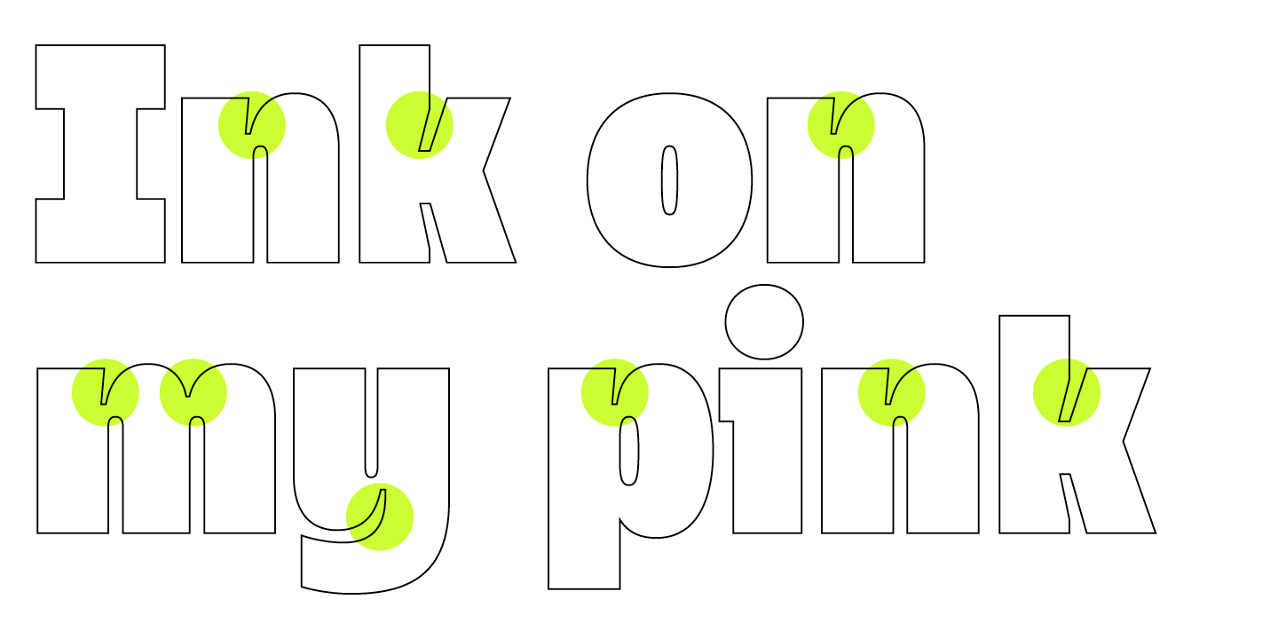
In the process of working on ExtraBold, which was originally the last master in terms of thickness, we developed graphic solutions that give the face a display character. We opted for ink traps, which are currently a quite popular compensation in type design. In the first sketches, they looked deliberate and even somewhat brutal, but they clearly gave an understanding of how to proceed.
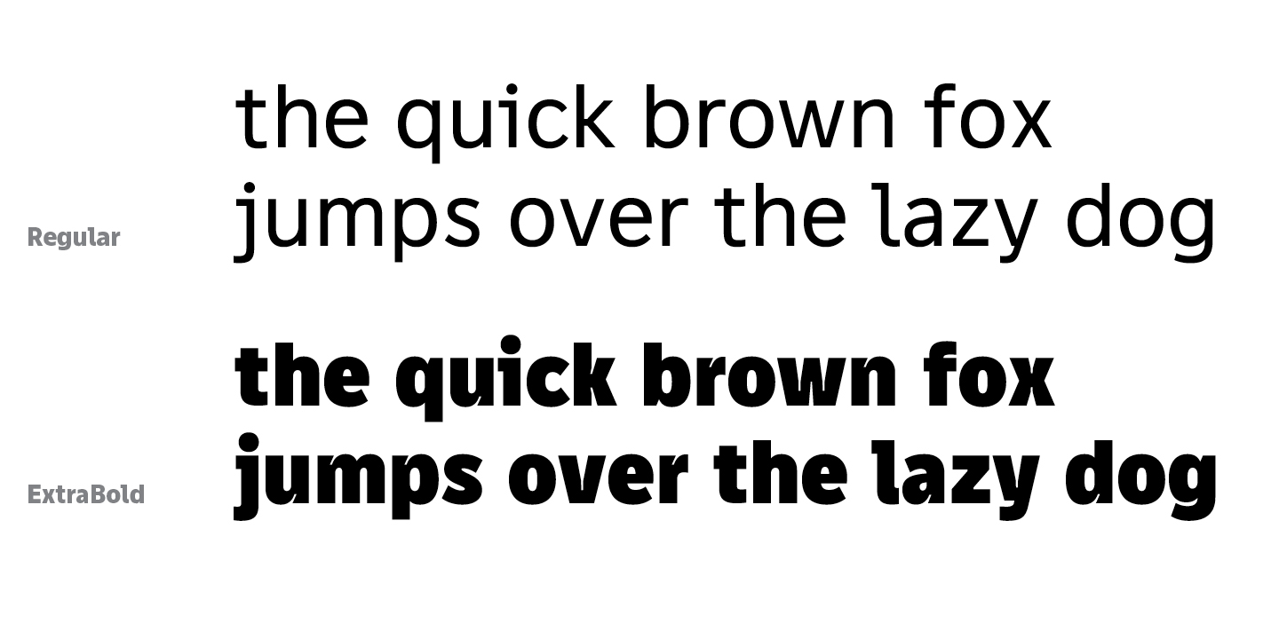
There was one thing we disliked: only one face was a display face. It seemed to us that this would be too little for future users, so we started experimenting looking for a bolder style. We were happy when we created sketches for Black, which not only fit into the given em squares but also looked aesthetically pleasing. Now, there were already 2 styles suitable for use in headings and large sizes.
However, the ink traps looked too deliberate, so the graphic elements had to be carefully worked on. We added and removed various compensations as we tried to figure out what to keep in Black, which became the master instead of ExtraBold. Graphic elements had to look cool, but at the same time not create problems when interpolating ExtraBold, that is, when generating this face. Had we had to make another master, it would have taken us much more time to develop the font, and would have required much more effort from the employees.
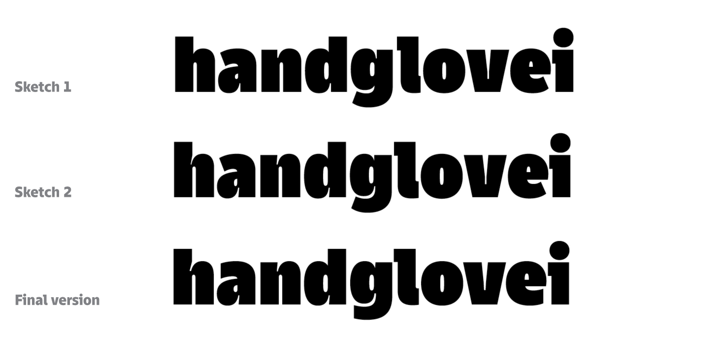
Fortunately, we love to overcome any difficulties and find optimal solutions. For example, deliberate stem joints were present in the first version, in the second they were not present at all, and in the last version there was a compromise: there were joints, but they were small. Of course, the graphics changed as we worked on, but there were no large-scale changes.
The cuts in the first sketches of TT Fellows are almost the same as in TT Norms® Pro, that is, perpendicular to the strokes. In the final version, all cuts were vertical, which made the font more humanist and reduced the amount of unnecessary white space. In bold styles, the white space was quite tricky because of the terminals where the cuts were perpendicular to the strokes, so we decided to cut the terminals vertically. Where the shape of the characters was more intricate, straight cuts removed excess noise, making the font more harmonious.
After drawing the basic Latin alphabet in the masters, we started expanding the character composition. The upright styles consisted of Thin, ExtraLight, Light, Regular, Medium, DemiBold, Bold, ExtraBold, and Black. Only the two boldest ones, ExtraBold and Black, became display faces, whil Bold was a text face. That is why, after we generated it from two masters, we had to carefully refine the font and remove excess contrasts. For example, in Black the horizontal lines are quite thin, while in Regular they are the same. We didn’t want to make Bold too contrasting, so we had to balance between glyph shapes.
There were no problems in uppercase characters, but lowercase ones had to be given more attention, because in the generated style the ink traps were much larger than we wanted. We planned to keep the shape and add white compensators, but still not turn this face into a display font retaining the text character. At the same time, all graphic features are noticeable, so the font can be safely used for headings or large sizes.
Interesting work was done with the thinnest shape. At first glance, Thin looks pretty classic and neutral, it looks like a regular face, but in the first iterations, the thin face looked different. When generated, the glyphs in Thin had strange shapes, as if the letters were blown apart a little in different directions. This happened due to graphic compensation and thin horizontal lines, including in the Black master. We had to carefully work on proportions so that narrow characters did not become wide in a thin style, and vice versa. The final version of Thin has a calm character, but only at a cursory glance. A closer look reveals interesting solutions in proportions, and in large sizes, the font can become an original solution for headings. It draws attention to itself and is attractive, while not looking pretentious or too catchy.
Fitting glyphs of different weights in the same em square was fun, but managing the character of the font, varying it from neutral-humanist to friendly-bright, was also quite interesting, it was a professional challenge.
For example, in Black, there is a difference between uppercase and lowercase characters. Classically, ink traps, if used, are added to both uppercase and lowercase characters. However, when working with TT Fellows, a situation arose that there was enough white in uppercase letters and we decided to let go of compensation there, although it was present in lowercase letters. It is also worth noting that uppercase letters are more technologically advanced than lowercase ones, which is revealed in the boldest styles. Lowercase, on the contrary, are softer. At the same time, of course, it was important for us to maintain harmony between all characters in each font of the 9 upright faces with 4 reference masters.
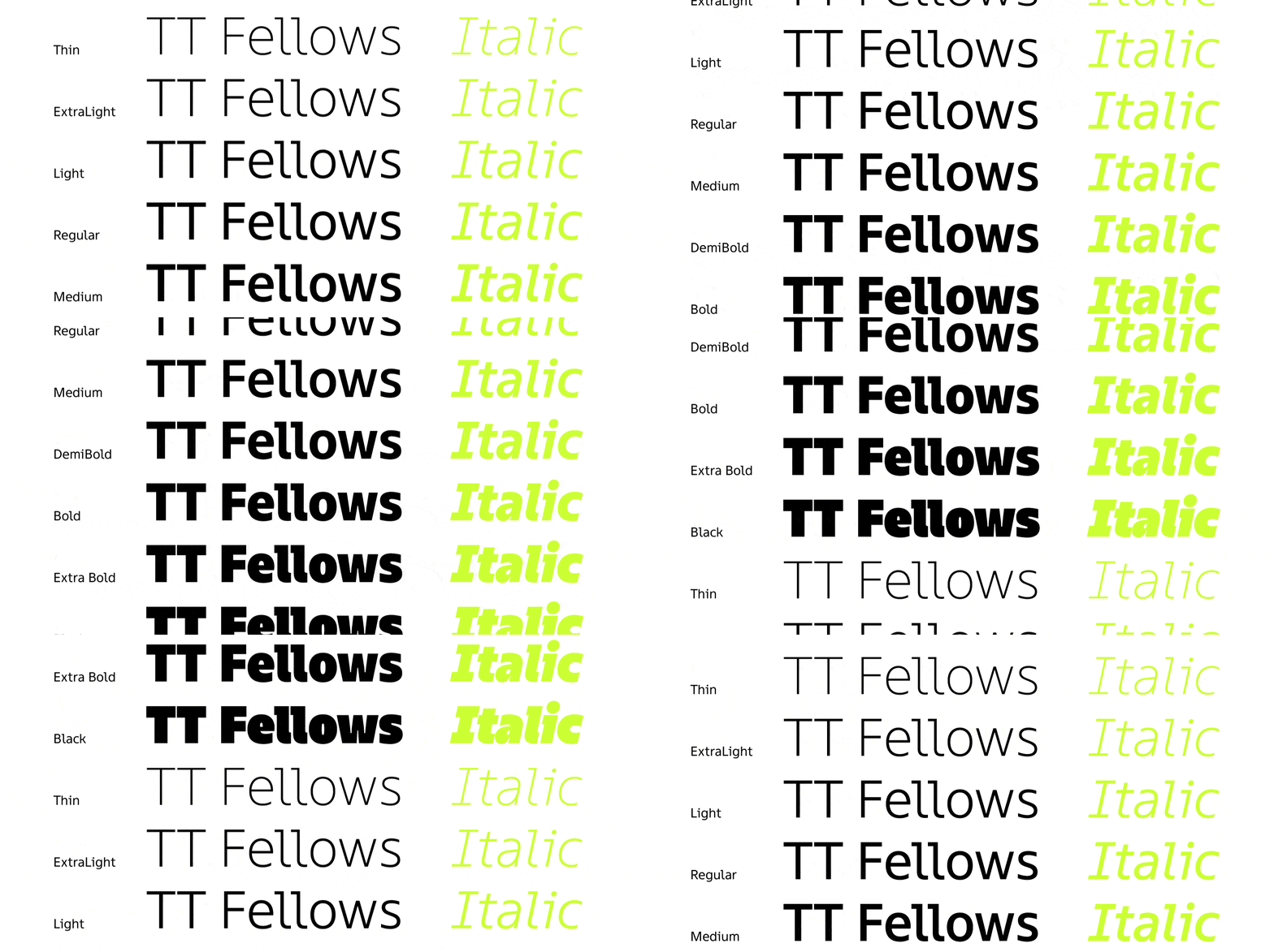
However, in addition to the 9 upright faces, there was the same number of italics. In TT Fellows, we did not create true italics, but obliques. This means that the original characters from upright faces are tilted practically without changing their shape. With straight characters like H, it’s simple: we tilt the shape. Things are more complicated with round characters, because the shape changes and leans through half-tilt and half-turn, otherwise there is a risk of getting unbalanced and strangely shaped glyphs. The purpose of italics is to replicate the features of upright shapes, so sometimes you have to change the shape in order to keep it. It sounds paradoxical, but the human eye reads geometric shapes in a rather specific way, and when designing fonts, one has to adapt to visual perception.
In regular fonts, when creating italics, the terminals rarely need to be further edited, but sometimes they can look too straight, and then the terminals are corrected manually. We focus on the form, carefully peering into it until the result seems flawless. This was also the case with TT Fellows. Among other features of creating italics, it can be noted that in the bold style, we had to work on cuts, achieving their visual parallelism, correcting the shape. It was necessary to balance both because of the different nature of the extreme styles, and because of the uniform width of the font: in some places, we made the compensations in standard for glyphs less pronounced, because they had to stay within the same em square.

After the final drawing of all the upright and italic faces, we had to compile all the fonts into a single file and send it to the next exciting stage—mastering, to the technical department.
Third challenge: Kerning
Font mastering for TypeType is a systematized and polished part of creating a font family. Very rarely in the technical part there are unusual moments that challenge us.
However, TT Fellows had just that. As we have already said, TT Fellows is a uniwidth font, which required certain adjustments to the work of the studio’s technical department. Most of all, this affected kerning, about which we will talk in more detail.
To begin with, there are 2 categories of fonts associated with the work on TT Fellows: sans serifs and monospace fonts. The approaches to kerning of these fonts are literally opposite. Sans serifs require meticulous and detailed compensation of individual pairs, while kerning is not required at all in monospaced fonts, because all the sizes of the em squares are the same.
A uniwidth font is a rare and complex story that happened for the first time at TypeType. In fact, this type of font in terms of kerning is somewhere in the middle between a sans serif and monospaced font. The em squares are equal, but only within the same glyph in different fonts, and in the same style, the size of the letters is still different. Therefore, the kerning of TT Fellows consisted of finding suitable compromises so that the font pattern in the combination of pairs was harmonious and the uniformity was preserved.
For a standard typeface, we take a medium weight, for example, Regular, and for it we select all the values of kerning pairs. Almost invariably, these parameters are transferred to other faces, both thinner and bolder ones. For bold faces, a number of exceptions are added, mainly affecting punctuation and individual pairs of uppercase characters with lowercase characters, and characters with upper diacritics or with descenders. This way we avoid sticking glyphs, which will happen if we transfer the default values from regular to the boldest style.
However, in a uni-width font, kerning values must be identical in all faces, otherwise there will be shifts and changes in the layout when changing faces, which contradicts the very concept of a uniwidth font. Of course, in such a situation, it is impossible to carefully work out one pair of regular styles, ignoring the rest, and you also have to find a balance between what you want and what is possible to achieve.
We tried to make a choice of values that would not make us sacrifice the visual aesthetics. In other words, we tried inflicting minimal damage to all styles.
For TT Fellows, kerning had to be done on 3 faces at once: the thinnest, medium, and the boldest. Initially, we were looking for values for Black, so we could provide standard exceptions for specific pairs to avoid sticking glyphs from the very beginning. After that, the values were transferred to thin and medium, looked at and corrected in detail. And then we repeated the cycle again: they transferred it to bold, checked, and corrected something. In the process of work, the four masters emerged: Thin, Regular, Bold, Black.

The drawing of the font, which changes character from Regular to Black, made the job a little more difficult. There were no problems with Thin and Regular, we were able to successfully match the overall values with little or no compromise. As for Black, due to the greater closeness and less internal white in the glyphs, the overall rhythm contrasted strongly with what was in the thin styles. We had to look for harmonious values for all weights so that the kerning pairs would not look too dense in Black and not too sparse in Thin.
When the main values were selected, there was cosmetic work left to find and correct shortcomings. All combinations were checked, after which the kerning was transferred into the main font file in order to complete the final part of the technical work and solemnly release TT Fellows on the platforms.
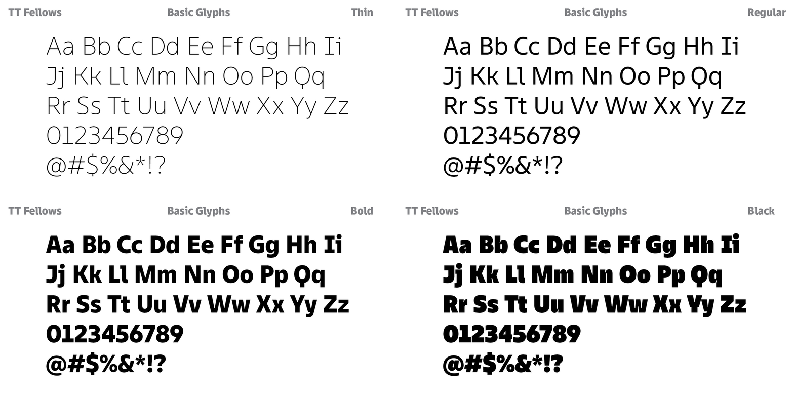
Of course, the work on this font family was very intense and not the easiest. The studio’s first uniwidth typeface, with a changing character of faces, is truly a professional experiment! We approached the task very responsibly, but, more importantly, in the process of work we were able to fall in love with TT Fellows for its pleasant character, aesthetic forms and controlled mood. We have created a sans serif that is visually different from TT Norms® Pro or TT Commons™ Pro, yet is as functional and versatile, with all the necessary features and stylistic sets.
Working on TT Fellows fascinated us so much that we were able to completely create it in 5 months!
Involved in working on the font
Yulia Gonina—author of the main idea, art director
Antonina Zhulkova—lead type designer
Radik Tukhvatullin—designer of italics, figures and symbols
Valera Cherevkov—designer of thin style
Nadyr Rakhimov—designer of italics
Anastasia Pogorelova—mastering
Yuri Nakonechny—mastering
Tasya Petelina—kerning & hinting
Victor Rubenko—hinting
Ivan Gladkikh—technical director

