TT Mussels
A rare type of technological text fonts
You can also find other signs of respect for traditional text fonts in the TT Mussels design, such as the trace of pen movement which is historically typical for antiquas. For example, in the letter M from the Black face, we can first see a thin stroke, then a thick diagonal stroke followed by a thin diagonal stroke, and a finishing bold vertical stroke. As in the case of dynamic contrast, this effect gradually disappears when approaching thin faces.
TT Mussels—a unique font family that stands out from other octagonal typefaces
Dynamic contrast is widely implemented in TT Mussels
official style (1/2=8)
Basic Character Set
TT Mussels
Language support
Acehnese, Afar, Albanian, Alsatian, Aragonese, Arumanian, Asu, Aymara, Banjar, Basque, Belarusian (cyr), Bemba, Bena, Betawi, Bislama, Boholano, Bosnian (cyr), Bosnian (lat), Breton, Bulgarian (cyr), Cebuano, Chamorro, Chiga, Colognian, Cornish, Corsican, Cree, Croatian, Czech, Danish, Embu, English, Erzya, Estonian, Faroese, Fijian, Filipino, Finnish, French, Friulian, Gaelic, Gagauz (lat), Galician, German, Gusii, Haitian Creole, Hawaiian, Hiri Motu, Hungarian, Icelandic, Ilocano, Indonesian, Innu-aimun, Interlingua, Irish, Italian, Javanese, Judaeo-Spanish, Judaeo-Spanish, Kalenjin, Karachay-Balkar (lat), Karaim (lat), Karakalpak (lat), Kashubian, Khasi, Khvarshi, Kinyarwanda, Kirundi, Kongo, Kumyk, Kurdish (lat), Ladin, Latvian, Laz, Leonese, Lithuanian, Luganda, Luo, Luxembourgish, Luyia, Macedonian, Machame, Makhuwa-Meetto, Makonde, Malay, Manx, Maori, Mauritian Creole, Minangkabau, Moldavian (lat), Montenegrin (lat), Mordvin-moksha, Morisyen, Nahuatl, Nauruan, Ndebele, Nias, Nogai, Norwegian, Nyankole, Occitan, Oromo, Palauan, Polish, Portuguese, Quechua, Rheto-Romance, Rohingya, Romanian, Romansh, Rombo, Rundi, Russian, Rusyn, Rwa, Salar, Samburu, Samoan, Sango, Sangu, Scots, Sena, Serbian (cyr), Serbian (lat), Seychellois Creole, Shambala, Shona, Slovak, Slovenian, Soga, Somali, Sorbian, Sotho, Spanish, Sundanese, Swahili, Swazi, Swedish, Swiss German, Swiss German, Tagalog, Tahitian, Taita, Tatar, Tetum, Tok Pisin, Tongan, Tsonga, Tswana, Turkish, Turkmen (lat), Ukrainian, Uyghur, Vepsian, Volapük, Võro, Vunjo, Xhosa, Zaza, Zulu
Team
Ivan Gladkikh—head of the project
Vika Usmanova—lead type designer, designer of basic font
Olexa Volochay—type designer
Dmitriy Greshnev—type designer
Release date
August 14, 2017About font family
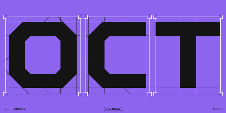
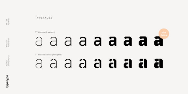
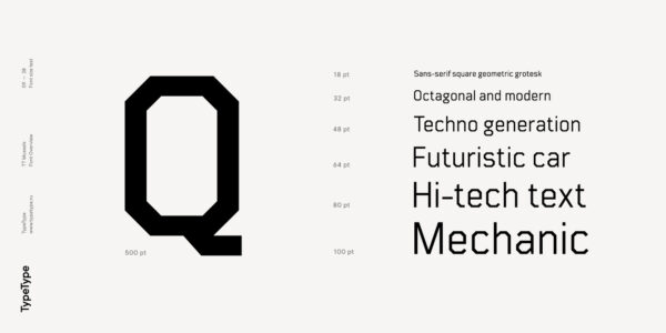
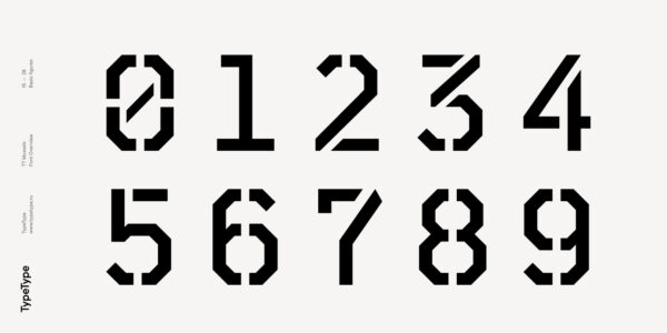
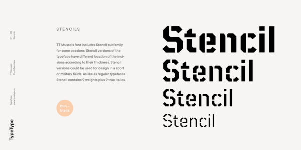
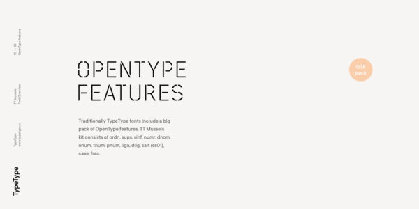
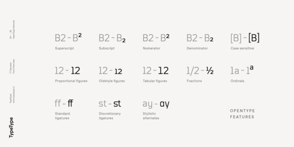
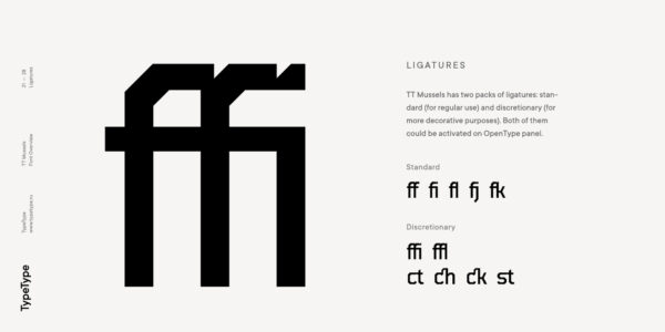
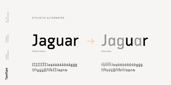
The TT Mussels font family is the successor of such popular fonts as Bender and TT Squares. At the same time, TT Mussels has a number of fundamental differences that make it a unique font family that stands out from other octagonal typefaces. When designing TT Mussels, we paid great attention to the possibility of imposing large arrays of text, and we can responsibly state that TT Mussels is a rare type of technological text fonts. To go along with the rest, we’ve created a stencil version of the typeface, in which the location of the incisions changes according to their thickness. In total, the TT Mussels font family consists of 36 faces, which include among other things stylistic alternatives, ligatures, and also implements a broad support for OpenType features: case, frac, ordn, sups, sinf, numr, dnom, onum, tnum, pnum, liga, dlig, salt (aka ss01).
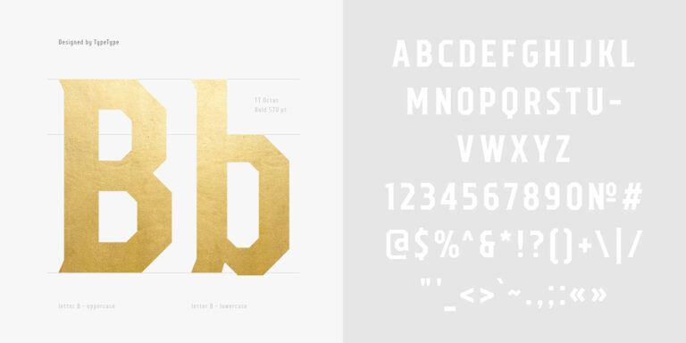
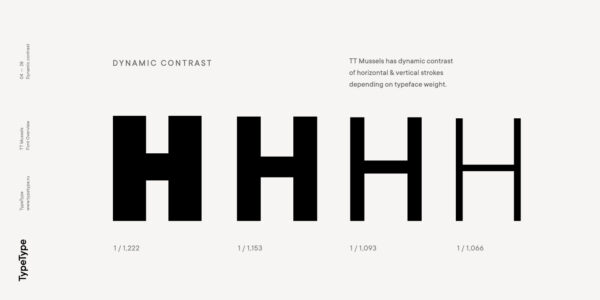
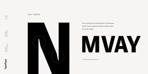
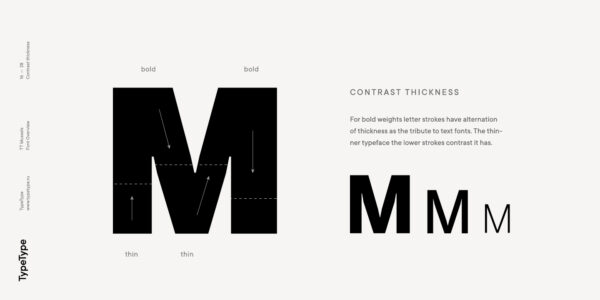
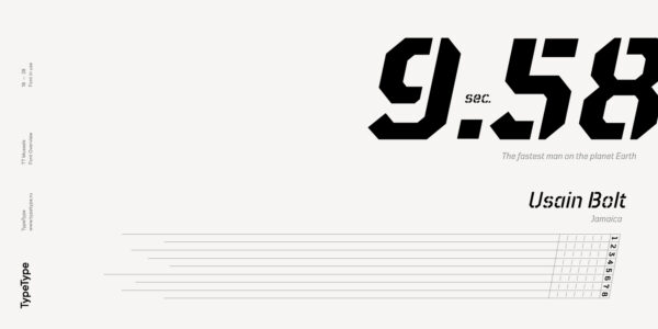
Dynamic contrast is widely implemented in TT Mussels. It is most noticeable in the Black typeface, where the ratio of the thickness of the vertical strokes to the horizontal strokes is approximately two to one. For the Thin typeface, the thickness of the vertical strokes is already consistent with the thickness of the horizontal strokes. You can also find other signs of respect for traditional text fonts in the TT Mussels design, such as the trace of pen movement which is historically typical for antiquas. For example, in the letter M from the Black face, we can first see a thin stroke, then a thick diagonal stroke followed by a thin diagonal stroke, and a finishing bold vertical stroke. As in the case of dynamic contrast, this effect gradually disappears when approaching thin faces. In thick faces, in places such as the «armpits» of the letters MNИ or the junctions of the diagonals of WVvw, there are visual compensators that brighten the bold typefaces. As the thickness of typefaces moves from thick to thin, the dimensions and conceptual values of compensators change, and in thin typefaces they completely disappear.
Additionally
Download font specimen (pdf)
Download trial font
Graphic presentation at Behance
Looking for a custom version of this font?
Similar fonts
TT Octosquares is a fresh, revised, expanded, and significantly improved version of our first commercial font TT Squares & its narrow version.
TT Octas is a narrowly proportioned font family built upon the principle of octagonal forms: all circles in this typeface are actually octagons. Thanks to small serifs, TT Octas has a vintage character to it.