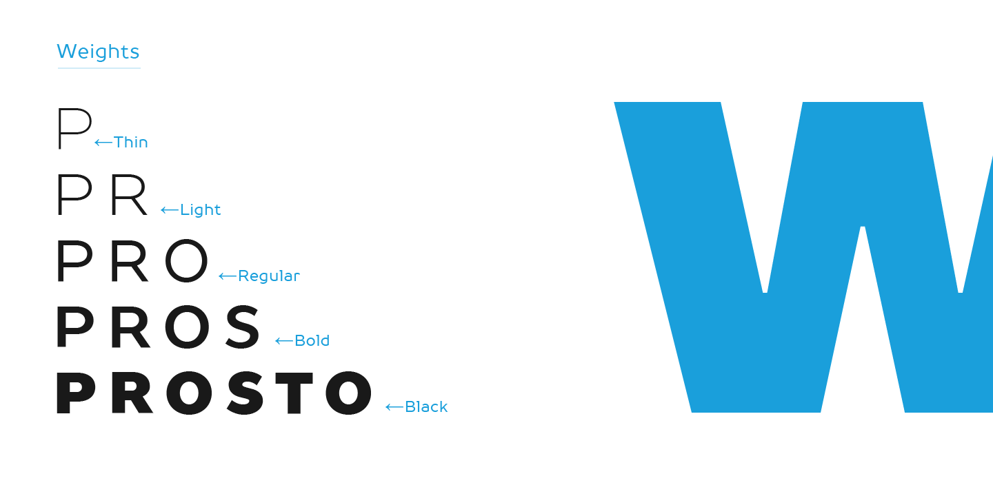
TT Prosto Sans — fontfamily for any occasion. You can use these typefaces almost everywhere. The modern open grotesque forms and classic fontfamily formula: Thin, Light, Regular, Bold, Black and Italics. TT Prosto Sans is your assistant for any projects.
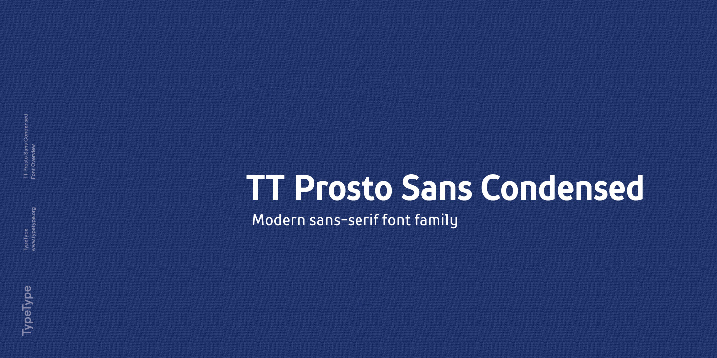
TT Prosto Sans
TT Prosto Sans is a straightforward typeface with clean design. It is a no-nonsense solution for diverse typographic needs.
Single style: from $43.99
Full family: from $299
20 styles


Buying Options
Choose the fonts and licenses you want. Then, press the "Add to Cart" button
Testers
A fontfamily for any occasion
Prosto’ in the name of the font is translated into Russian as «Simply». Each line of this typeface is emotionally neutral and aims to not emphasize the text in its graphic representation, but only to use the text to convey the meaning. Having TT Prosto Sans and TT Prosto Sans Condensed in your collection is like having a universal tool that helps you every day when you need to ‘mend’ or ‘repair’ something.
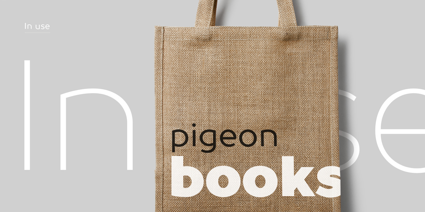
You can use these typefaces almost everywhere
TT Prosto Sans is your assistant for any projects
3/4 cup (18 cm3)
Show more
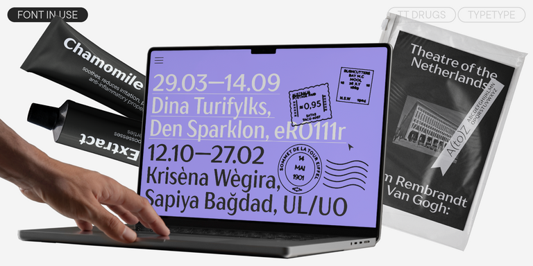
Ideal font pairs with TT Prosto Sans
What is a font pair, and what does it serve for?
A font pair is a combination of two fonts within one text block. Most often, one of the fonts in a pair is a more expressive headline font, and the other one serves to communicate information. Such fonts complement each other and help designers solve various tasks, like highlighting key elements, adding emotional expressiveness to the project, or separating semantic blocks.
How to choose fonts for a project: Several general recommendations
To begin with, establish the project's tone. Choose the fonts that stylistically match the main idea. After that, you need to determine the functions of each font in the project and their hierarchy: which font will complement the design and which one will serve to attract attention as the main element. You need to assess the difference between the fonts and decide what kind of information each of them should convey. First, we recommend choosing the base font you will use most, and then you can find a suitable pair for it.
Core principles of font pairing and recommendations from designers
The main rule you should follow when matching two fonts is that both similarities and differences must be visible between them. You can highlight the coherence of fonts by the following characteristics: contrast, proportions, width, openness of characters, individual letter shapes, and overall tone. Feel free to experiment with different combinations. We also recommend analyzing the projects you like: this way, you can enhance your visual skills, elevate your knowledge base, and gain confidence in dealing with typography.
Description
About font family TT Prosto Sans
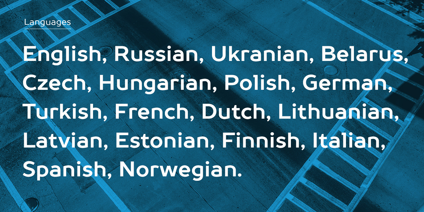
160+ Language support
Team
Ivan Gladkikh
+ TypeType Team
Release date
16 June, 2014
Additionally
Poster Images
Graphic presentation at Behance
Custom version
Looking for a custom version of this font?
+ extended writing system
Show all
Character Set
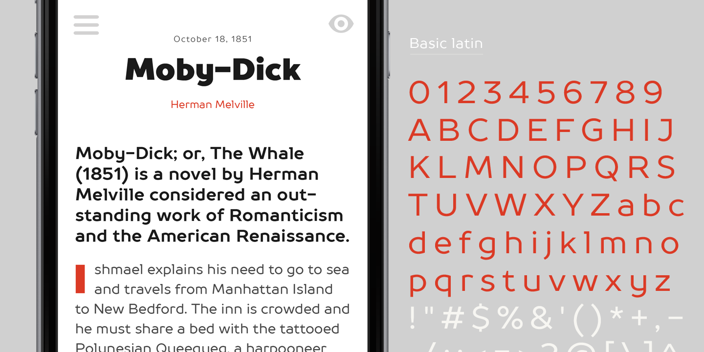
Basic Latin
Basic Cyrillic
Extended Latin
Lining Figures, Currencies
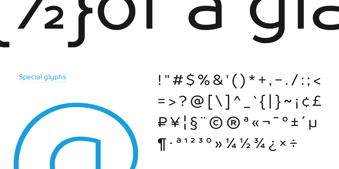
Punctuation, Symbols, Mathematical Symbols, Arrows
A
B
C
D
E
F
G
H
I
J
K
L
M
N
O
P
Q
R
S
T
U
V
W
X
Y
Z
a
b
c
d
e
f
g
h
i
j
k
l
m
n
o
p
q
r
s
t
u
v
w
x
y
z
А
Б
В
Г
Д
Е
Ё
Ж
З
И
Й
К
Л
М
Н
О
П
Р
С
Т
У
Ф
Х
Ц
Ч
Ш
Щ
Ъ
Ы
Ь
Э
Ю
Я
Ѓ
Ґ
Ќ
Є
Ї
Љ
Њ
Ћ
Ђ
Ў
Џ
а
б
в
г
д
е
ё
ж
з
и
й
к
л
м
н
о
п
р
с
т
у
ф
х
ц
ч
ш
щ
ъ
ы
ь
э
ю
я
ѓ
ґ
ќ
є
ї
љ
њ
ћ
ђ
ў
џ
À
Á
Ă
Â
Ä
Ā
Ą
Å
Ã
Æ
Ć
Č
Ç
Ĉ
Ď
Đ
Đ
È
É
Ě
Ê
Ë
Ė
Ē
Ę
Ğ
Ģ
Ì
Í
Î
Ï
I
Ī
Į
Ķ
Ĺ
Ľ
Ļ
Ł
Ń
Ň
Ņ
Ñ
ẞ
Ò
Ó
Ô
Ö
Ő
Ō
Õ
Ø
Œ
Þ
Ŕ
Ř
Ŗ
Ś
Š
Ş
Ș
Ť
Ţ
Ț
Ù
Ú
Û
Ü
Ű
Ū
Ų
Ů
Ý
Ÿ
Ź
Ž
Ż
à
á
ă
â
ä
ā
ą
å
ã
æ
ć
č
ç
ĉ
ď
đ
ð
è
é
ě
ê
ë
ė
ē
ę
ğ
ģ
ì
í
î
ï
ı
ī
į
ķ
ĺ
ľ
ļ
ł
ń
ň
ņ
ñ
ß
ò
ó
ô
ö
ő
ō
õ
ø
œ
þ
ŕ
ř
ŗ
ś
š
ş
ș
ť
ţ
ț
ù
ú
û
ü
ű
ū
ų
ů
ý
ÿ
ź
ž
ż
0
1
2
3
4
5
6
7
8
9
¤
€
$
¥
£
¢
₴
ƒ
!
¡
?
¿
«
»
‹
›
.
,
:
;
‘
’
‚
“
”
„
...
"
'
|
¦
-
–
—
_
/
(
)
[
]
{
}
·
•
*
#
§
©
®
¶
@
&
†
‡
°
^
-
+
<
>
=
~
¬
±
×
÷
%
‰
1⁄2
1⁄4
3⁄4
ao
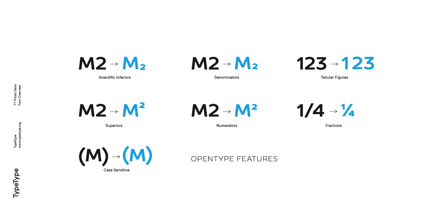
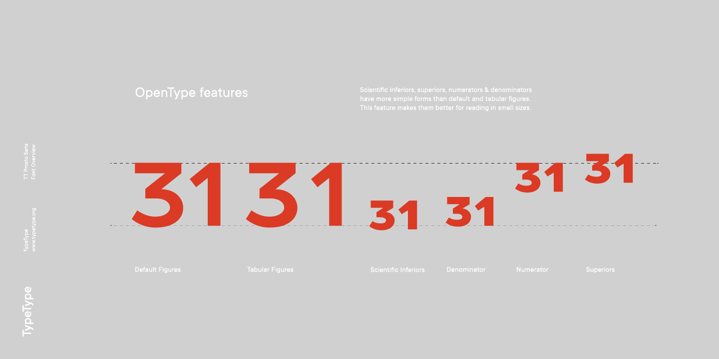
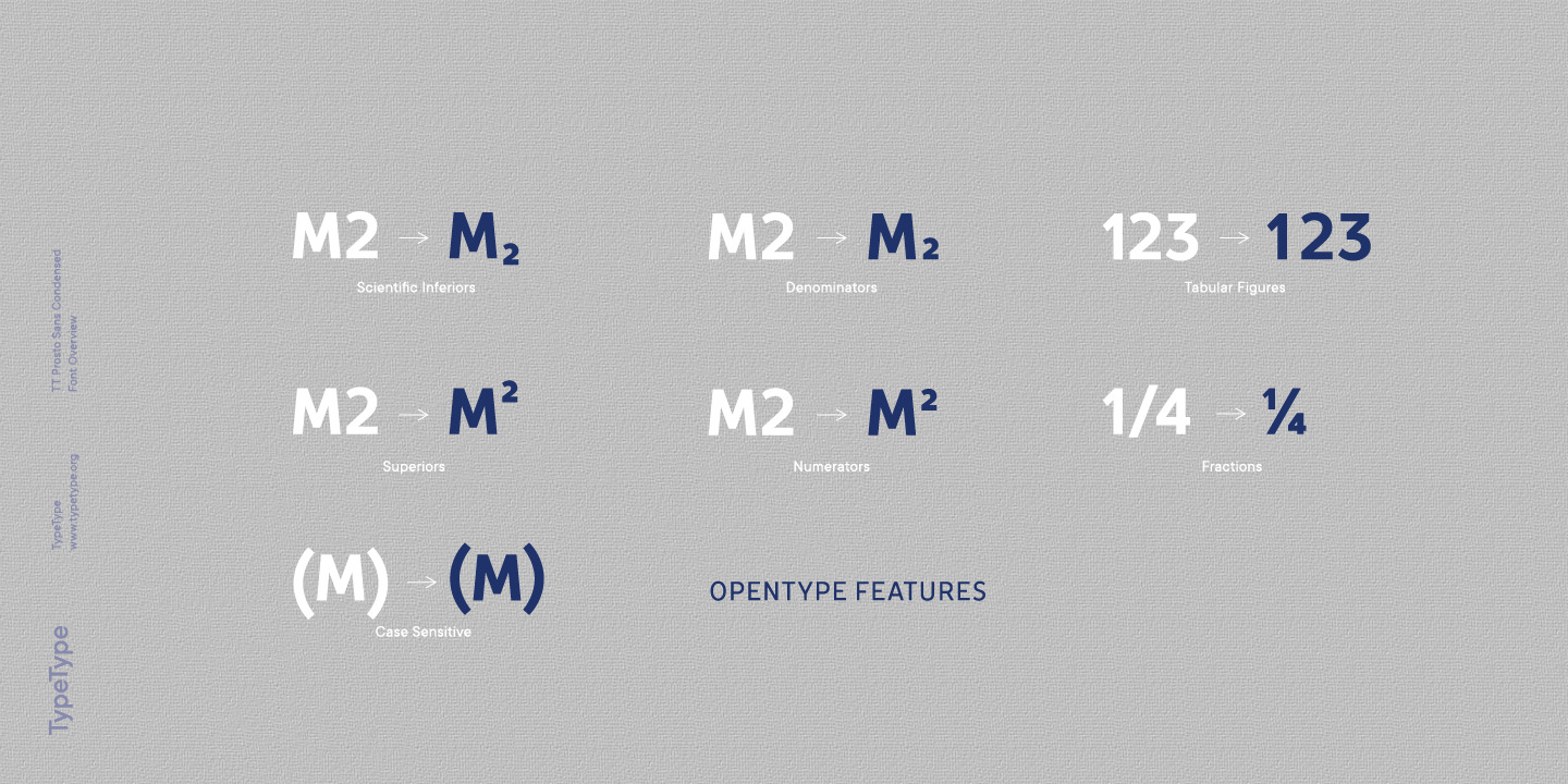
OpenType features
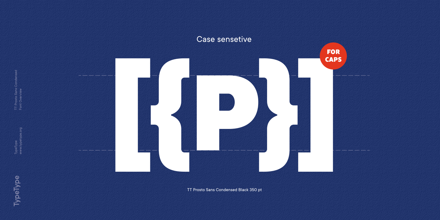
case | Case Sensitive Forms
frac | Fractions
numr | Numerators
dnom | Denomerators