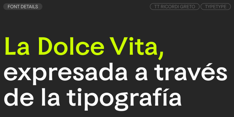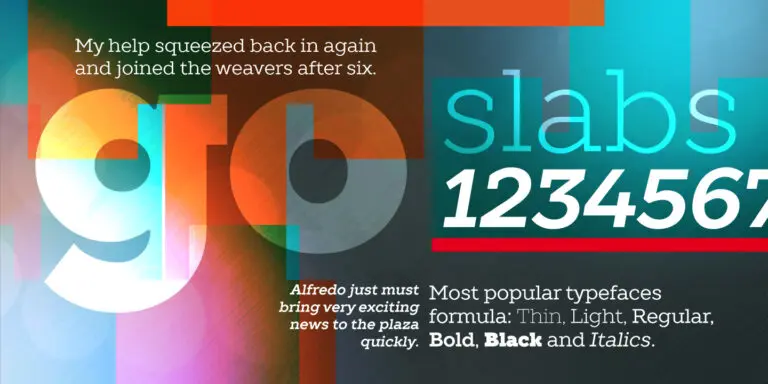
TT Commons™ Pro
Regular
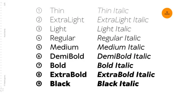
104 de estilo
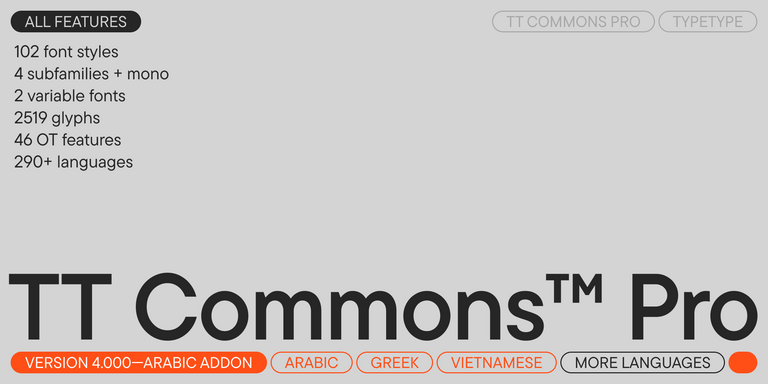


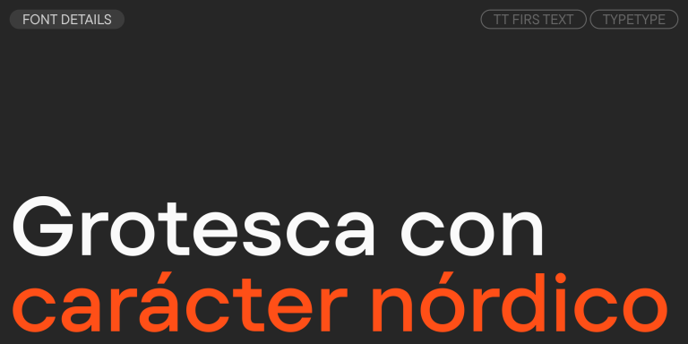
TT Commons™ Pro es una versión completamente rediseñada de la consolidada familia tipográfica clásica TT Commons.