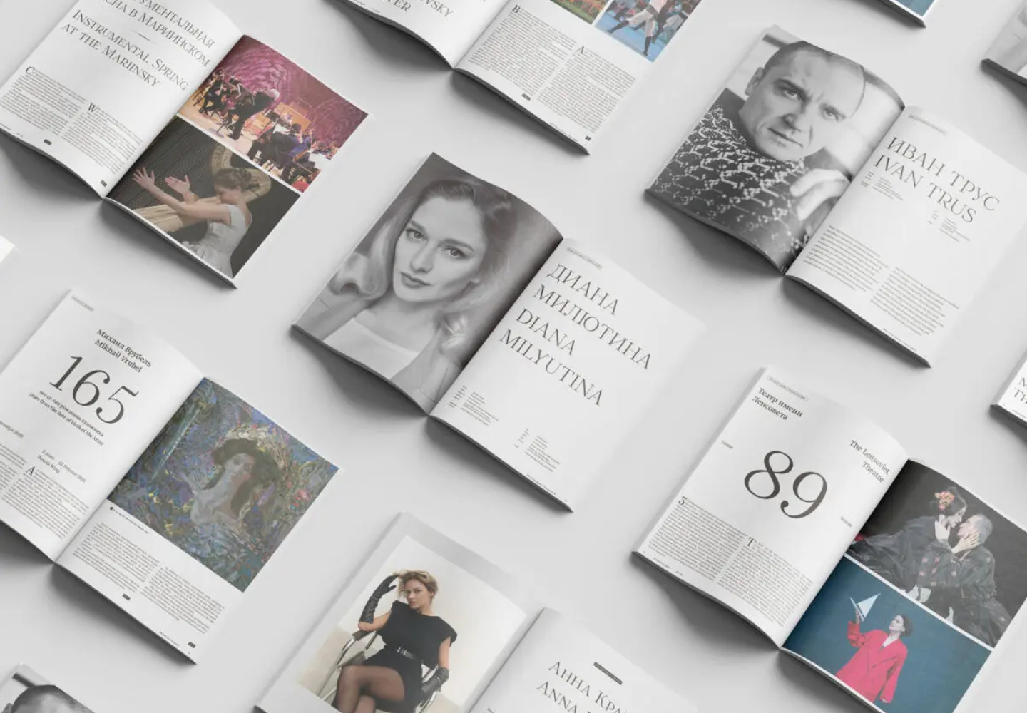
Magazines are a perfect backdrop for typography to express all its dimensions. Fonts, in this case, not only communicate information but also directly influence the design. They deliver the magazine’s message, reflecting its values and ideas. Fonts can make a boring magazine layout emotional and captivating, set the right tone, and infuse the entire design with a distinct atmosphere.
In this article, we discuss how to choose the best magazine font and compile a list of 15 relevant options for editorial designs on various themes.
How do you choose fonts for your magazine?
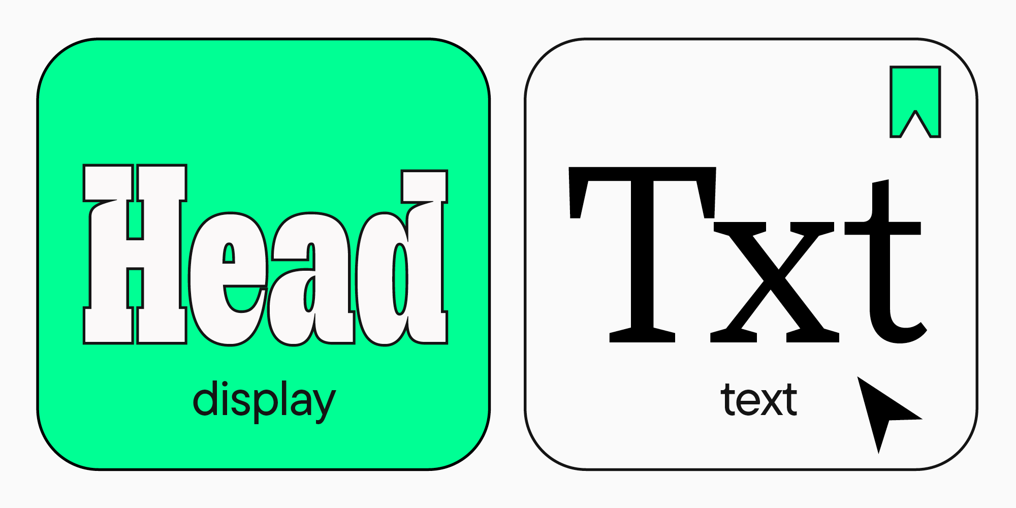
Fonts used in magazine design can be subdivided into two types: fonts for main text and fonts for headings and text on the cover. The two types have different goals and objectives, which determine the criteria for selection. Let’s explore each of the types.

Fonts for magazine main text
First of all, every publication in your magazine should be easy and convenient to read. This is why text fonts are used for typing running text, as they are developed for this specific purpose.
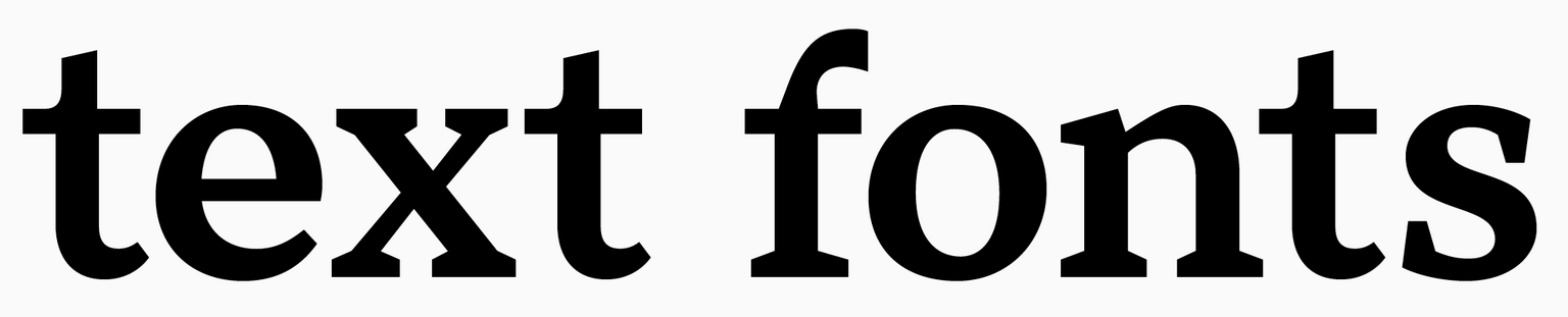
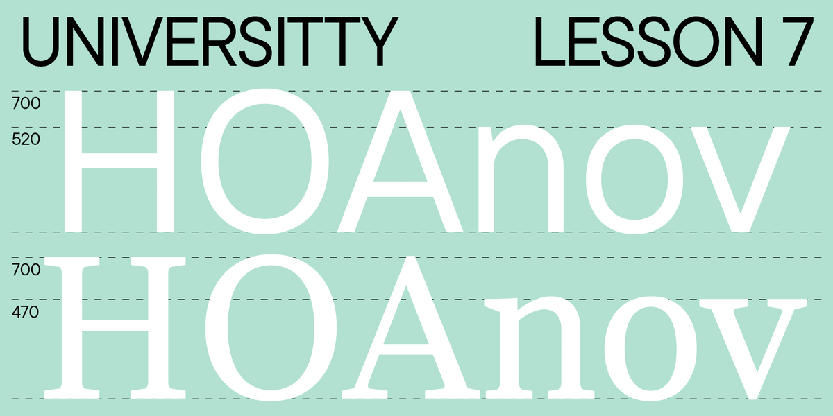
The main distinctive features of text fonts are legibility and readability. Legibility is achieved thanks to the sharpness of the characters and the precision of their design. Readability, in its turn, depends on how all characters communicate with one another.
To be easy to read, the font should be simple and neutral, without any decorative elements. Fonts that provide the best readability have rounded contours, average weight and character width, and standardized tracking.
The font’s quality should also be high enough. When creating an online magazine, make sure that your font is displayed equally well on different screen formats and sizes without losing legibility.
If your magazine is set to be printed, the font’s quality also influences the overall printing quality. Naturally, the printing house plays a role here, too—any font can be poorly printed.
Find more details on how to choose a text font in our article.
Fonts for magazine covers and headlines
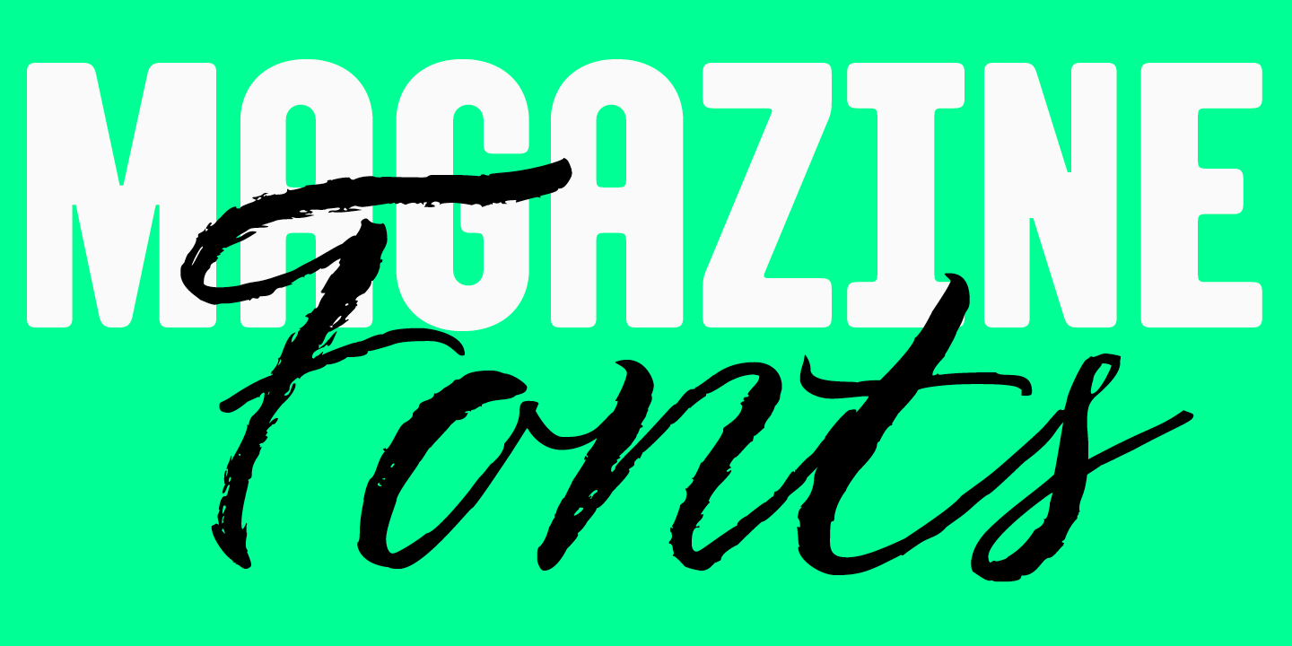
If text font serves to communicate information to the reader through words, the typeface used for the cover and headlines will grab visual attention, set the magazine’s aesthetic, and style the editorial content. It can also be used to design the logo or the magazine’s title. Fonts that serve these purposes are called expressive or display.
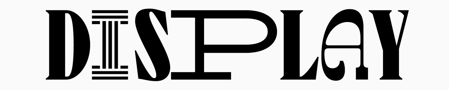
Unlike text fonts, display fonts can look very different: highly detailed, ornate, with unusual forms or proportions. Their main purpose is not ease of reading; they are fascinating to look at because of their distinct character and vibrant style.
Learn more about display fonts here.
Still, many text fonts can also serve as display ones if you want to make a simple and elegant design. In this case, large texts in a minimalistic font will help put these characteristics forward.
To understand what font your magazine design needs, you should determine the audience you have or will have, your message, and the nature of your publication. Then, look for the font with a corresponding mood. For example, reserved and elegant fonts suit business magazines, and young adult magazines need something more modern and creative.
Best fonts for magazines: Our selection
We chose 15 of the best typefaces for magazines featured in the TypeType collection. Among them, you will find magazine body fonts — the ones for running text and the best magazine cover fonts we have to offer to infuse your publication with a particular style. All fonts from the compilation stand out for their high quality and cutting-edge technological features, which make them perform and display perfectly on various online platforms and printed magazines.
A license is required for commercial use of the fonts on the list. Before purchasing a font, you can download its free trial version, which is the exact copy of the paid one.
Versatile fonts for any magazine
This list features minimalist magazine fonts suitable for a variety of different publications. Here, you will find purely text font options and the ones perfect for both running text and shorter expressive text blocks. All these typefaces are highly function-rich and contain variable fonts and useful OpenType features that will help you adapt your mockups to suit different tasks and make the layout design process easier.
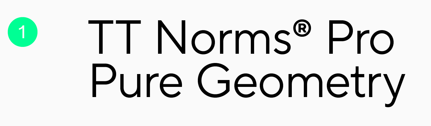
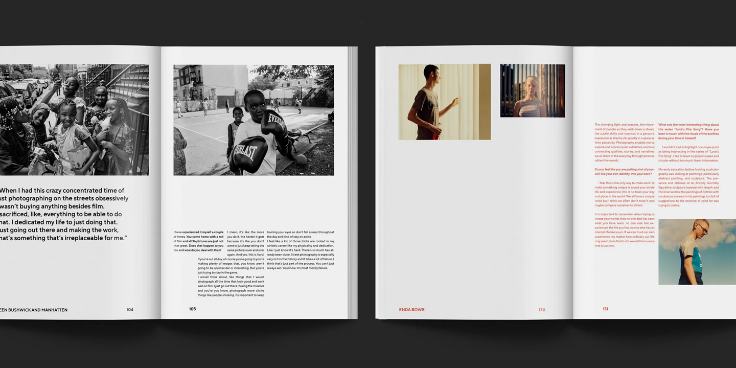
TT Norms® Pro is a versatile geometric sans serif for aesthetic mockups, one of our studio’s most popular fonts. This typeface has a neutral character yet displays eye-catching and trendy traits. This makes it well-suited for any publication, regardless of its theme. In the main text body of a magazine, it will look neutral and easy to read. On covers and in headings, the fonts look elegant, stylish, and reserved. You can see TT Norms® Pro on the pages of the art magazine Hometown Journal: its entire design, both articles and display texts, are set in our font.
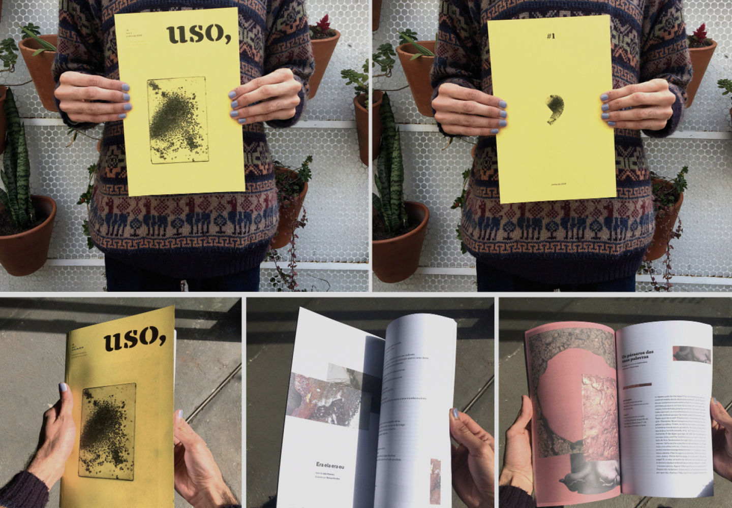
Another example is the Brazilian magazine Revista Uso, which is focused on independent literature and art. Here, TT Norms® Pro complements TT Tricks — one more font from our collection, a display one. TT Norms® Pro Serif is also a perfect match for this sans serif, but you can combine it with other more expressive fonts, too.
If you want to learn more about combining fonts and compiling font pairs, read the article we wrote about it.
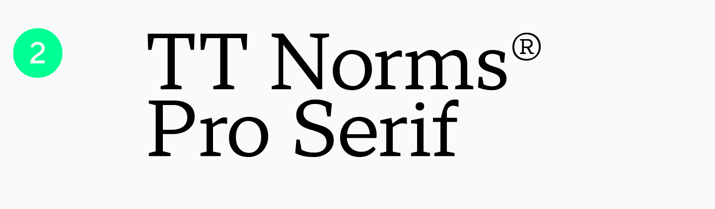
TT Norms® Pro Serif is an elegant yet quite neutral font with serifs. It looks beautiful in large-sized texts while still being easy to read, which is why it can be used for both headlines and running text. The typeface is versatile but shines best in magazines focused on art, architecture, literature, or history, as well as in catalogs of luxury goods (such as perfumes or jewelry). TT Norms® Pro Serif will offer your magazine a feeling of luxury and sophistication. If you are looking for a font pair, we recommend using this serif with TT Norms® Pro.
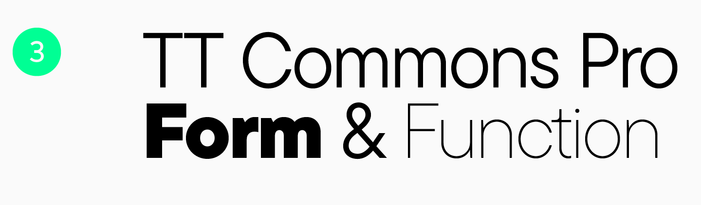
TT Commons™ Pro is a clean-lined font without serifs. This stylish geometric sans serif with a neutral character is one of our studio’s bestsellers. It features precise forms and proportions, making reading highly convenient. Still, the font looks stylish and modern enough to work great in large-sized texts. With just this one typeface, you can create an entire magazine mockup using it for the main article texts and cover and heading designs. TT Commons™ Pro can also be used as a text font with an expressive pair, as it will look well-balanced with almost any display font.
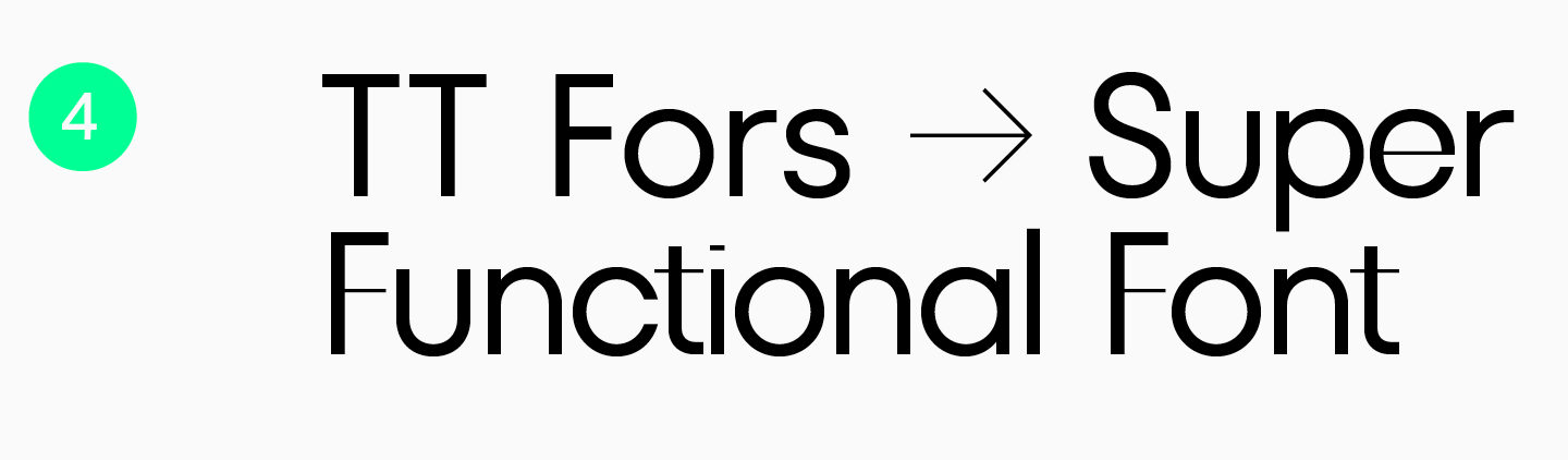
TT Fors is a geometric sans serif with proportions closely resembling basic geometric shapes (circle, triangle, and square). This subtle but still recognizable font looks perfect in large-sized texts and works well for typing text in small point sizes. Moreover, the typeface includes a display subfamily, TT Fors Display. It is a stunning expressive pair for the main subfamily that preserves familiar proportions but has more eye-catching characteristics. A magazine set in TT Fors will look modern and minimalistic, conveying the feeling of cleanliness, precision, and «geometricity.»
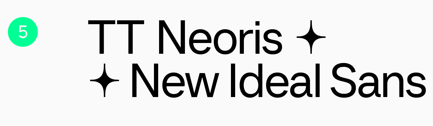
TT Neoris is neat, stylish, and modern Neo-Grotesque. A set of features included in the typeface allows to transform the font’s style and not be bound by only the standard version. This makes this font highly adaptable and well-suited for various magazine themes. The font is easy to read in long magazine articles and works well in large point sizes, uncovering its fascinating details. TT Neoris will look curious combined with other typefaces — audacious, funny, ultra-trendy, or serious. Interestingly, this font had been in development for two and a half years and has extensive research at its core. Learn more about this in our article.
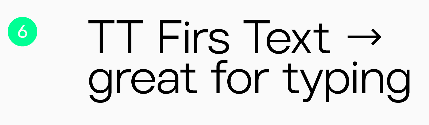
TT Firs Text is a geometric sans serif with a Nordic character. Regardless of its simplicity and elegance, it’s easy to recognize due to its Scandinavian minimalism aesthetics. This typeface is reserved and refined, cold and captivating. That’s why TT Firs Text will look exciting and stylish in both headlines and main text. For better accentuation, we recommend combining it with TT Firs Neue or other display typefaces.
Typical fonts used in magazines of various themes
Below, we compiled a list of fonts with a more expressive character to help your magazine design convey a particular mood. These fonts shine best in cover and headline designs. Most typefaces also include variable fonts and useful features to help you make your mockup genuinely unique, eye-catching, and engaging.
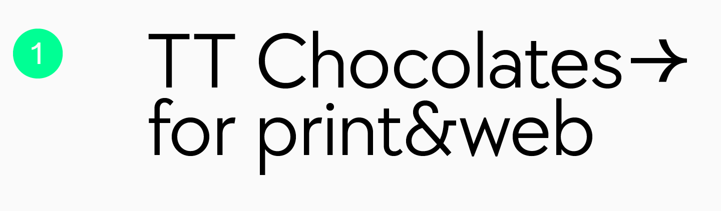
TT Chocolates is an elegant font without serifs that stands out for dense typesetting, well-balanced proportions, and a friendly character. As stated by its name, the font was developed specifically for confectionery. This makes this Humanist sans serif a perfect choice for magazines focused on food, restaurants, and bars. However, there is no need to limit yourself to this theme only—TT Chocolates harmonizes well enough with interior design or lifestyle-themed magazines.
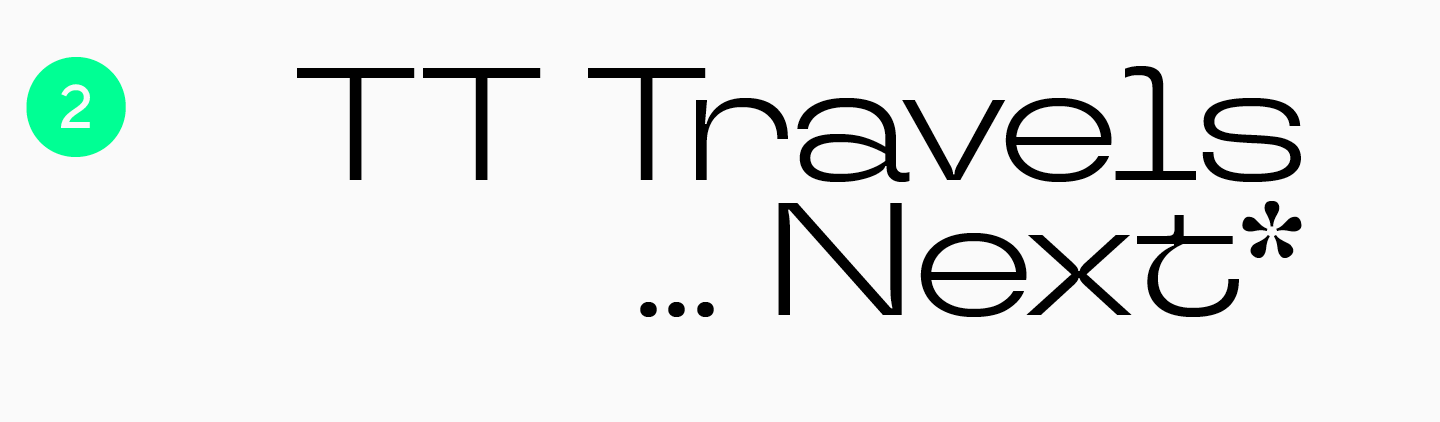
TT Travels Next is an ultra-modern sans serif with wide proportions. This experimental typeface has unusual, attention-grabbing forms. Due to its audacious and daring character, this font is a great addition to young-adult and traveling magazines. TT Travels Next will add a feeling of confidence and nonconformity to your mockup. TT Travels Text makes an ideal font pair for it.
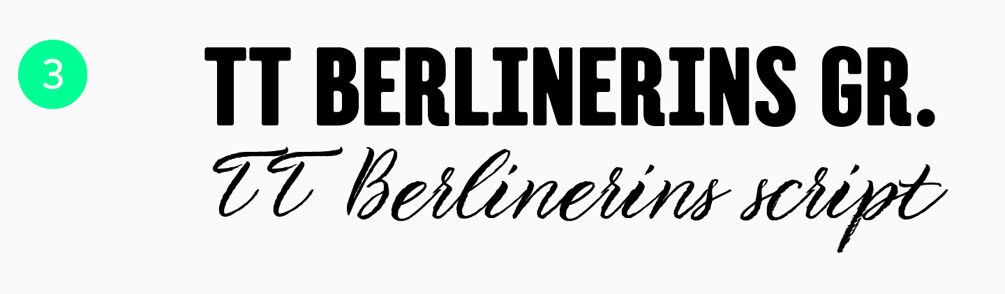
TT Berlinerins is a typeface consisting of a solid sans serif and a romantic handwritten font. They are absolutely different yet go exceptionally well together. This font pair is inspired by Berlin, where historic nature meets modernity, so this typeface will be a perfect match for magazines focused on architecture or big city life.
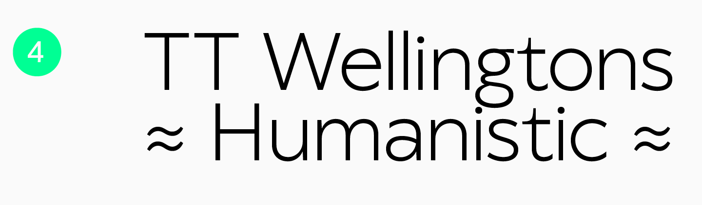
TT Wellingtons is another font referencing a big city. This sans serif is reminiscent of the English Humanist fonts of the XXth century. In its creation, designers drew inspiration from the fonts used in the design of the London transportation system. Elegant yet recognizable due to its unusual details, this font will beautify the pages of magazines about architecture, design, travel, or lifestyle. TT Wellingtons can also perform well as a typeface for a fashionable magazine.
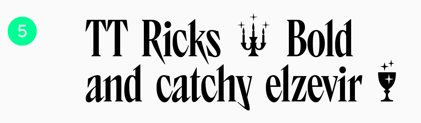
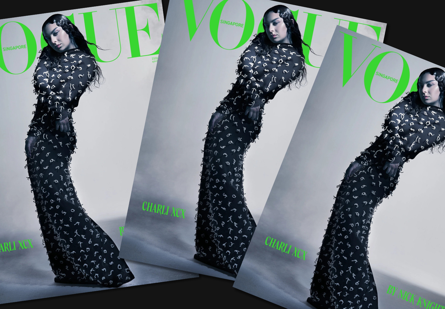
Our expressive, cool, and «angry» TT Ricks is a true gem for everyone who needs an unusual and attention-grabbing font for magazine design. This typeface stands out for its characteristic narrow glyph forms, and its serifs remind of sharp thorns. It will give your mockup a mysterious feel and help you create a vibrant, bold, and maybe even eccentric cover design. TT Ricks is an excellent solution for informal young-adult magazines and zines. You can also use this typeface for a fashion magazine. Look how neat TT Ricks looks on the cover of Vogue Singapore.
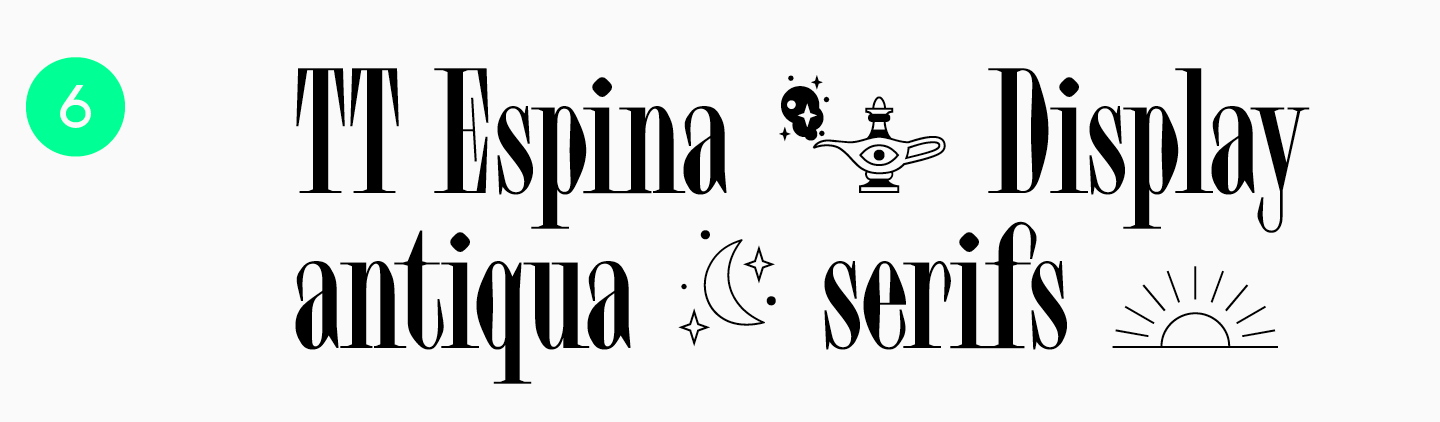
TT Espina is another beautiful font with a mysterious feel. It boasts unusual diamond-like forms, expressive serifs, and narrow glyphs, which add a special aesthetics to the font. This typeface on your magazine cover will surely attract many gazes. It can bring particular charming features to magazines focused on art, music, cinema, esotericism, or fashion.
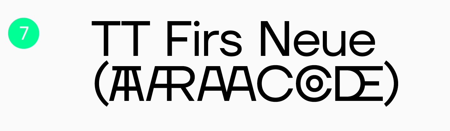
Our Scandinavian sans serif TT Firs Neue is a blend of minimalism and expressiveness. This font will emphasize your magazine’s elegant style while looking modern and not too strict, adding a professional quality to the design. It can be used in technology, science, business, or car magazines. Still, this font is versatile enough to adapt to the differently themed publications. TT Firs Text makes an ideal font pair for it.
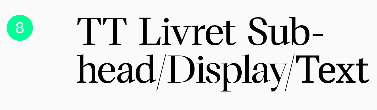
TT Livret is a modern font with serifs. The typeface includes three subfamilies: a calm text one, a more expressive Subhead, and a vibrant display one. This extensive set allows the font to shine in covers, headings, or main text. A fashionable magazine using this font will look expensive and sophisticated. TT Livret is well-suited for magazines about fashion, style, art, and history.
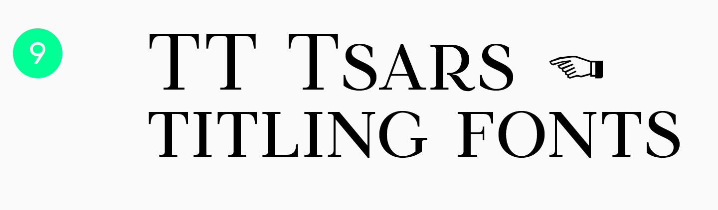
The TT Tsars typeface is a collection of expressive fonts with serifs in the mid- to late XVIIIth-century style. They all look regal and elegant, evoking a feeling of nostalgia and historical value, yet they are fresh and easy to blend into a modern design. This series is a perfect match for the cover of a magazine about art, culture, or history. Look at how stunning TT Tsars looks in the headings of St Petersburg Digest, a periodical covering the cultural life of St. Petersburg.
Conclusion
As you can observe, magazines use a wide variety of fonts in their designs. This means you have all the tools to create an attractive and stylish magazine that is pleasant and easy to read. To uncover and use the full potential of fonts, we recommend following general recommendations without hesitation to think outside the box. Also, remember to always look for inspiring designs made by other professionals.
FAQ
What are the best fonts for magazine design?
Typically, magazine design requires a font pair: a text font for running text and a display font for the cover and headers. The text font should be neutral and readable, while the display font should set the style and attract attention.
What fonts do professional magazines use?
Most often, professional magazines use high-quality typefaces that work equally well in print and on digital devices. An excellent example is TT Norms® Pro: it is suitable for both text and large inscriptions.
What is the best font for magazine headlines?
Display fonts are more suitable for headers and covers: they have a bright character and expressive shapes, like TT Ricks. Their task is to visually «hook» the reader and attract attention.
What fonts work best for magazine body text?
For the main text, use text fonts: simple, neutral, and without decorative elements (for example, TT Neoris).
Are serif or sans-serif fonts better for magazines?
There is no single answer to what is better: the role of the font and the character of the publication are more important. The TypeType library contains both sans serifs and serifs—choose according to the task (text/cover) and the magazine’s mood.
What fonts are most readable for long articles?
Text fonts with high readability are suitable for long-form content: simple shapes, no unnecessary decoration, and precise character drawing. Reading comfort is the key criterion for body copy.
Can I use Google Fonts for magazine layouts?
Yes, you can use Google Fonts for magazine layout. Commercial use may require a license, so always check the terms on the font download page.
Are there free magazine fonts for commercial use?
Yes, there are. However, for commercial purposes, use only those free fonts where the license explicitly permits it. Free fonts often do not guarantee broad language support or device adaptation. For important projects, we recommend fonts from proven studios. TypeType typefaces offer trial downloads for testing before purchase.
What fonts are best for fashion and lifestyle magazines?
It is recommended to start from the audience and the nature of the publication: strict and elegant fonts suit some magazines, while creative and modern ones suit others. A universal solution is TT Norms® Pro—concise and neutral.
How do I choose the right font for an editorial design?
Divide fonts by role: text should be maximally readable, while headers/covers can be more distinctive. Then match the font style with the audience and the magazine’s message.