The font is one of the key design elements. It conveys necessary information to users and can highlight, complement, or even transform your project’s mood by placing accents.
That’s why choosing the right font for a logo or the whole project is a crucial task for designers. So, how do you choose the best font from numerous options? What criteria should you rely on? Let’s explore these questions together in this article!
What should you consider when choosing fonts?
Obviously, there is no all-comprising instruction on how to choose a font. However, we have outlined the basic principles that will help you with choosing the right font for your brand.

Define your project’s idea, goals, and objectives
To understand how to choose a font for your logo or brand design, you must first determine the purpose this font will fulfill in your project and the idea you want it to emphasize. Do you need a font for brand identity, logo, or another design element? Do you want the font to attract attention and place accents or be a neutral «workhorse» that mainly just communicates information? Maybe you need a font pair to handle both of these tasks? Or perhaps your project requires not only one or two, but multiple fonts? Answer these questions before beginning your font search.
By the way, we covered the topic of how to choose the right font for your logo and suggested a selection of options in our article. We recommend taking a look at it as an addition to this material.
Determine the font’s purpose
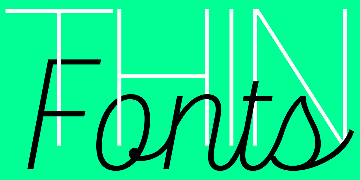
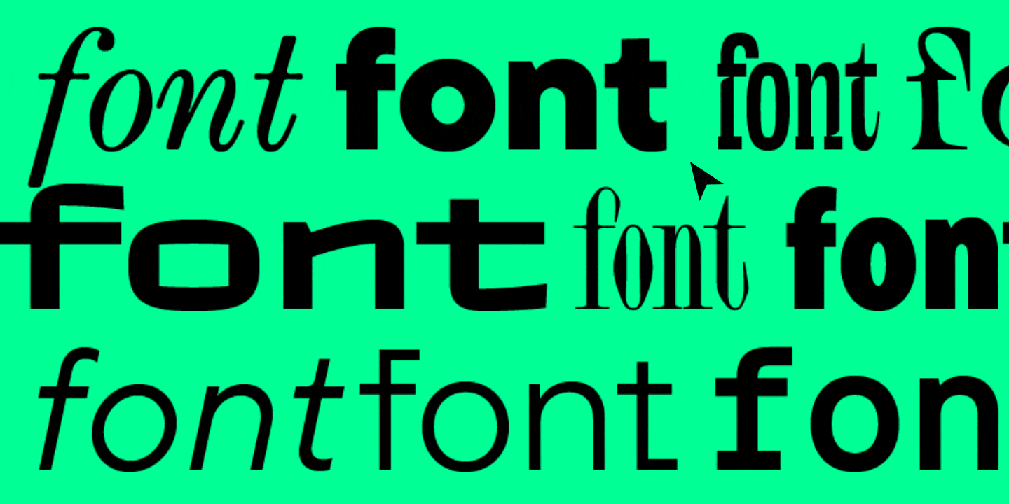
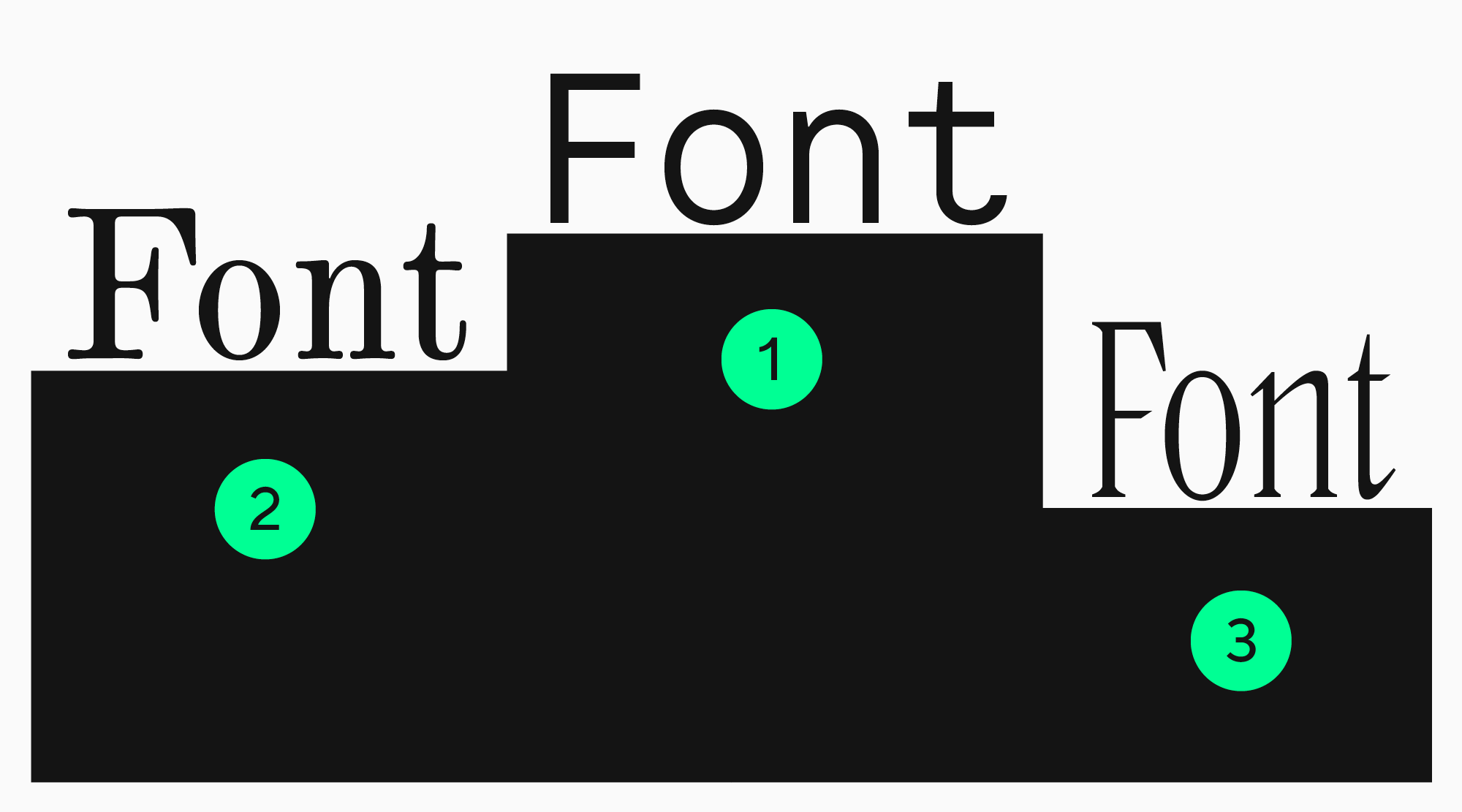
After settling on the goal you want a font to achieve, you can determine the criteria it must comply with. All typefaces can be subdivided into two large groups: display and text. The first group serves to attract attention: such fonts can be used in logos, large, expressive texts, signs, headlines, etc. The second group is primarily used to convey information in running text. However, such fonts can fulfill the above-mentioned purposes as well if your project’s style is elegant and neutral.
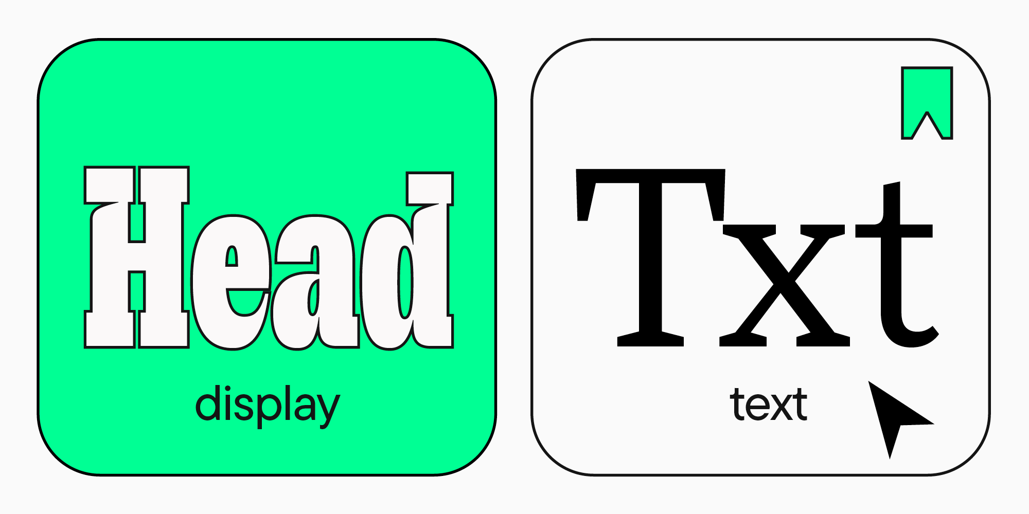
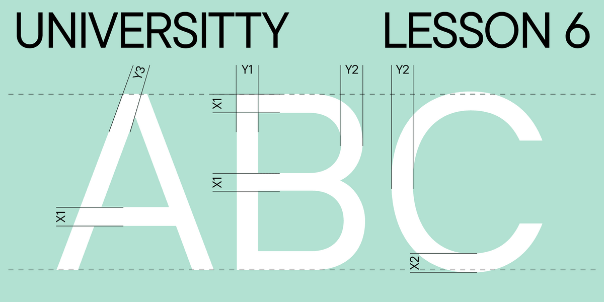
Consequently, the main criterion when choosing text typefaces is readability. Text fonts must be simple and clean, without decorative elements, with neutral proportions, and medium glyph width and line weight. Here, you can learn more about how to choose fonts for reading and what qualities they should possess.
Find your project’s mood and style

To narrow down the search, you need to understand what stylistic category your font must belong to. To do that, you must determine your project’s character and aesthetics. What mood and values will it transmit? Will it make a calm or active impression? Do you want it to look friendly or audacious? Ultra-modern or historical? Settle on the main idea and choose a font that corresponds to it best. Read the description of the typeface you want to purchase: there, you will find out more about its mood and references used in its creation.
Pay attention to the technical characteristics
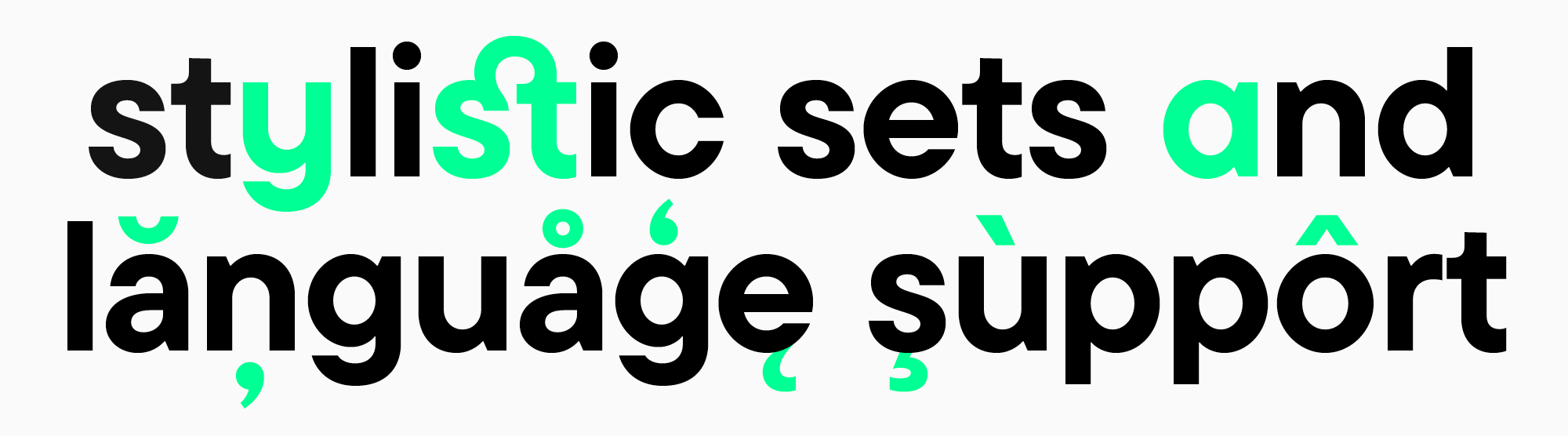
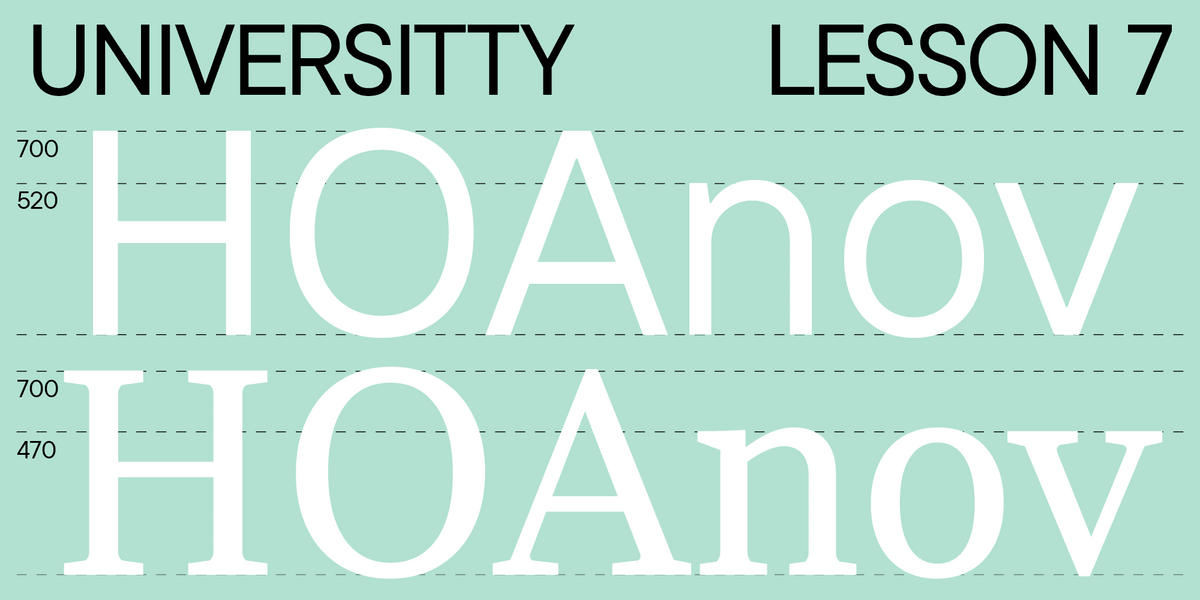
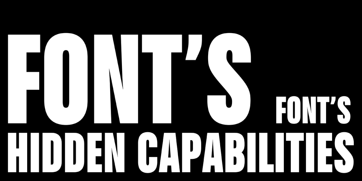
Typefaces can support or not support various functions. Determine which ones you need for your project before choosing a font. For instance, you should understand what languages your project will support and check if the font you like includes them. If you need several fonts, choose typefaces with numerous font styles to fulfill your tasks while remaining within the stylistic framework. You can also choose a font with various stylistic alternates and variability options if you want to transform the font to your liking. Technically advanced, quality fonts will help you add variety to the design and make it truly unique.
Tips for choosing fonts
Below, we have gathered some more tips to help you understand how to choose the best font for your logo or brand design and how to combine different fonts in your project.
Look for inspiration in other projects

This is quite an all-purpose tip: research your colleagues’ and competitors’ projects, analyze which ones are the most successful, and choose the ones you like the most. Find out what fonts are used in top-tier projects and look for them or similar options. Learn how to identify fonts on websites in our article.
Plan your hierarchy
If you want to use several typefaces, determine the function of each of them. Decide which font will attract attention and which should handle the practical functions. First, choose the main font and then search for a complementary font that pairs well with it.
Don’t use too many typefaces in one project
We recommend sticking to one or two (maximum three) font options for one project to avoid overloading the design. Remember the «less is more» rule.
Combine fonts correctly
The main principle of font compatibility is that they must have both similarities and differences. One of the easiest combinations is to use font styles from one typeface: they will differ slightly while maintaining the same style. You can also use classic combinations, like serif plus sans serif.
Find out more about font compatibility in our article.
Steer clear of anachronisms
Don’t use outdated fonts. Not only because they will look stale and shabby. Fonts quickly become outdated in the technical sense, so if a typeface hasn’t been updated in a long time, it’s likely inconvenient to use now.
Avoid clichés
Avoid using fonts that are too popular and trendy to make your product stand out for its uniqueness. Important note: This rule only works for expressive fonts that are in the spotlight of your design. This doesn’t concern basic and neutral fonts with clean and well-defined lines and graphic.
Break the rules
Rules alone can’t generate a truly captivating, vibrant, and distinctive design. Follow the advice of experienced designers, develop your watchfulness, but never forget to experiment. This is the only way to discover your style and create something new.
What criteria should your «ideal» font meet?

To sum up, let’s compile a «profile of the perfect font» based on a series of criteria it must fulfill. You can also rely on them while choosing a font for your design.
Consistency with project goals
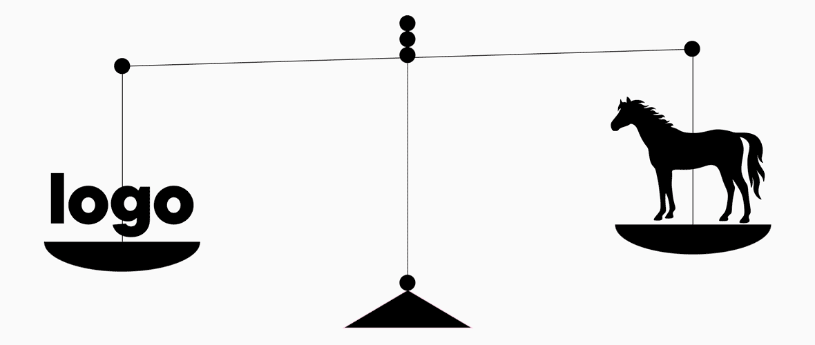
Perfect fonts don’t exist, but there are perfect use options when a font harmonizes exceptionally well with a project. Almost every font is great in its specific context.
Quality
Make sure that the font you chose is high-quality and modern. The font must be displayed equally well across all platforms and devices.
Legibility
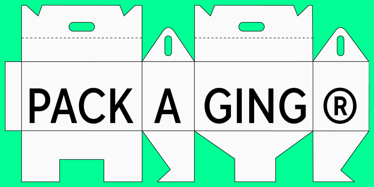
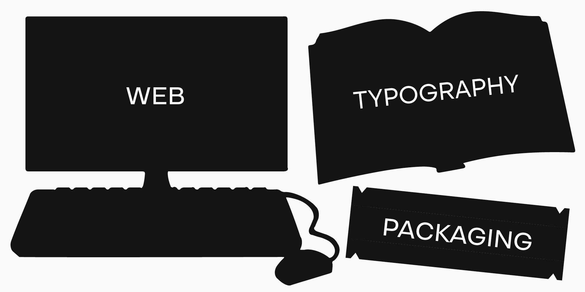
It doesn’t matter what you choose a font for: logos, packaging, branding, placing accents, or communicating information. The main thing is that the font is legible. Even the most stylish, beautiful, and unusual font will be useless if its graphics are too complex and don’t allow for the readability and legibility of individual letters or words.
Technological quality

The technological features make the font flexible and convenient, enabling designers to adapt it to various tasks and situations. Make sure that the typeface you chose for your project includes at least basic font styles: the more font styles it contains, the more possibilities you have. Stylistic alternates and variability options are also a huge advantage. In addition, as we have mentioned earlier, you should always check the font’s language support and align this information with your specific tasks.
Licensing
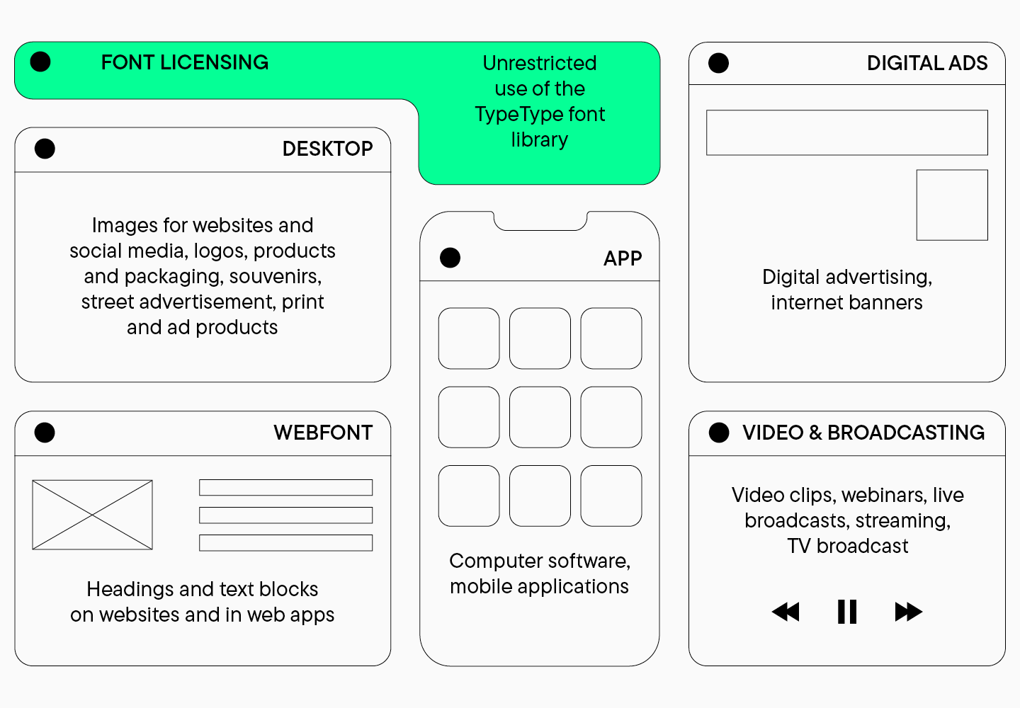
Always double-check licenses and download fonts from official platforms. Remember that fonts are protected by copyright law, so using fonts without licenses can result in unpleasant consequences. TypeType licenses can serve as an excellent example for learning more about this topic. Take a look at them on this page.
Conclusion
Save this article for future reference—we hope our advice will guide you in choosing fonts for different purposes. However, don’t follow our tips blindly. Always look for something new, as the world of design is so diverse and ever-evolving. Don’t be afraid to experiment and make mistakes, as it’s an essential part of the creative process!