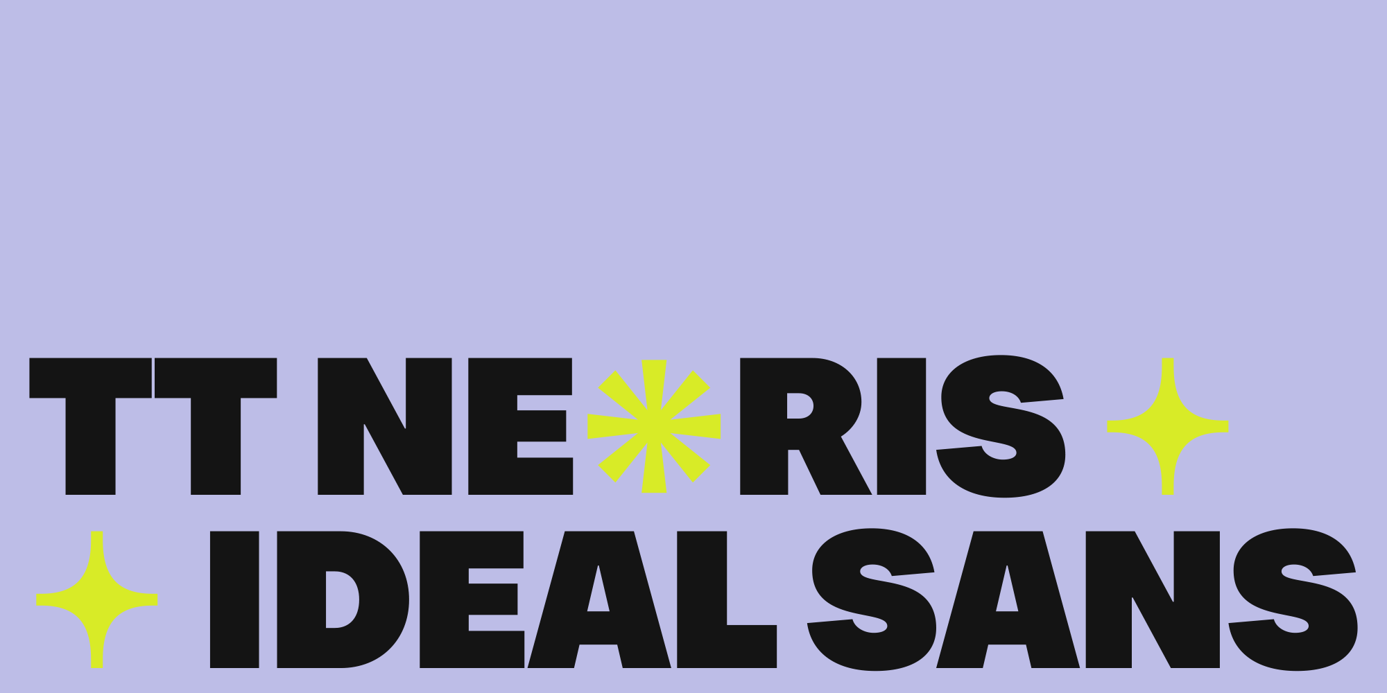
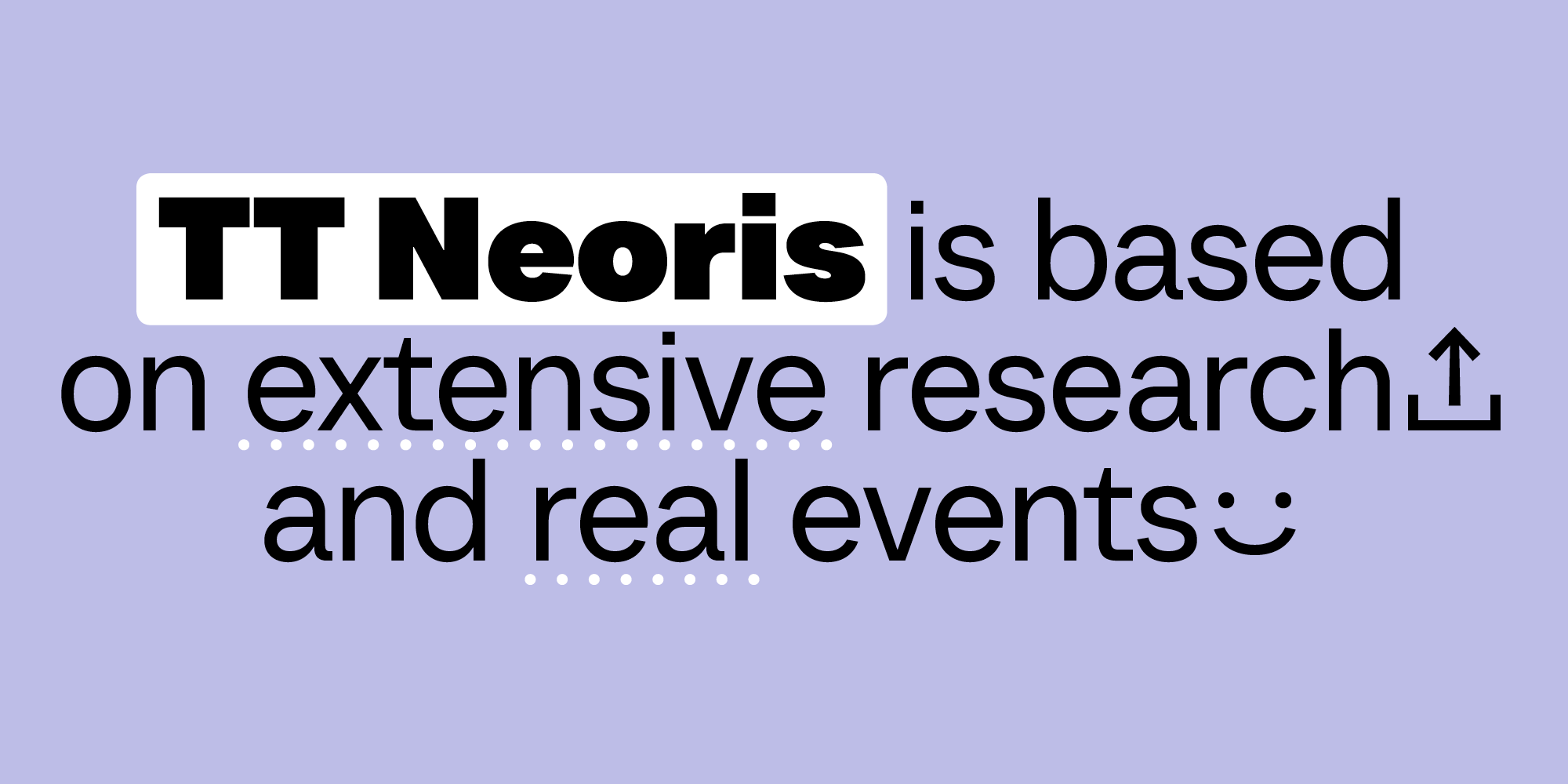
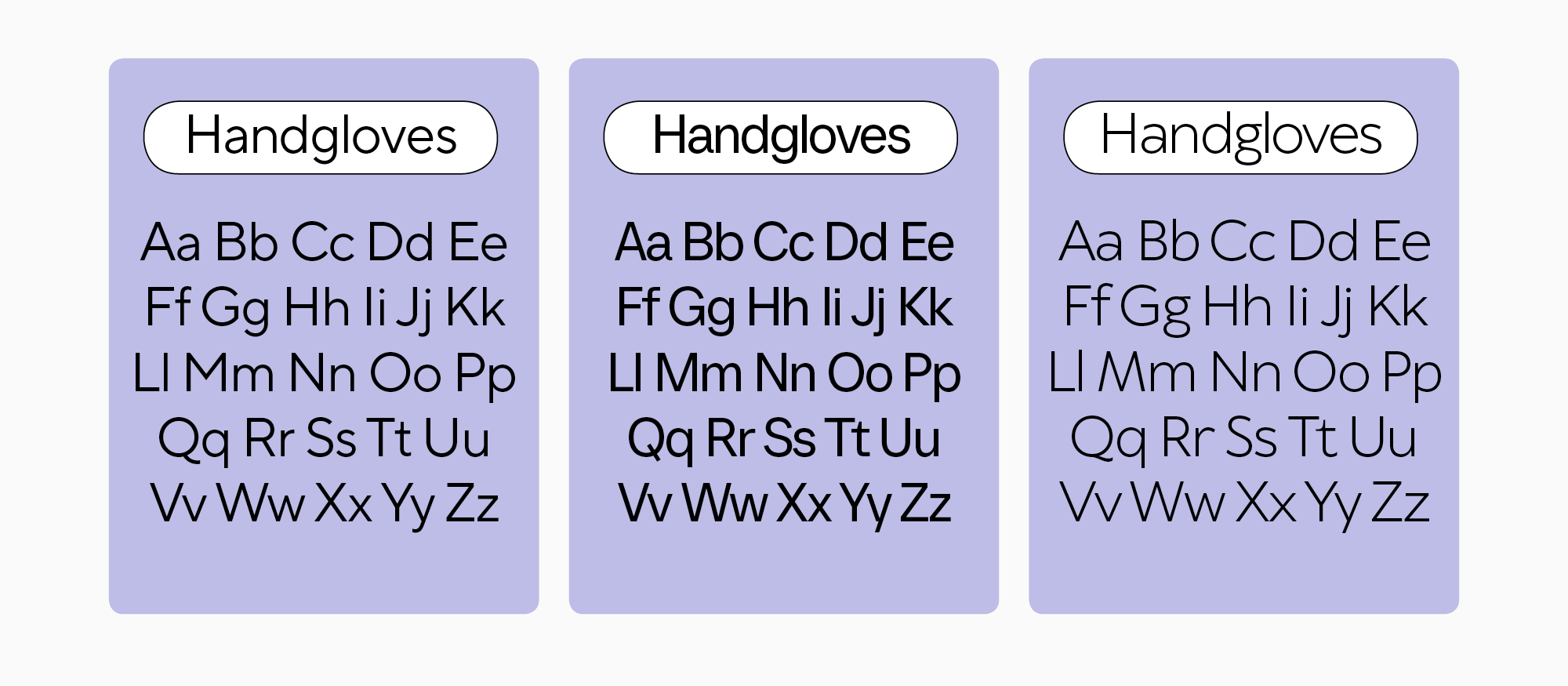
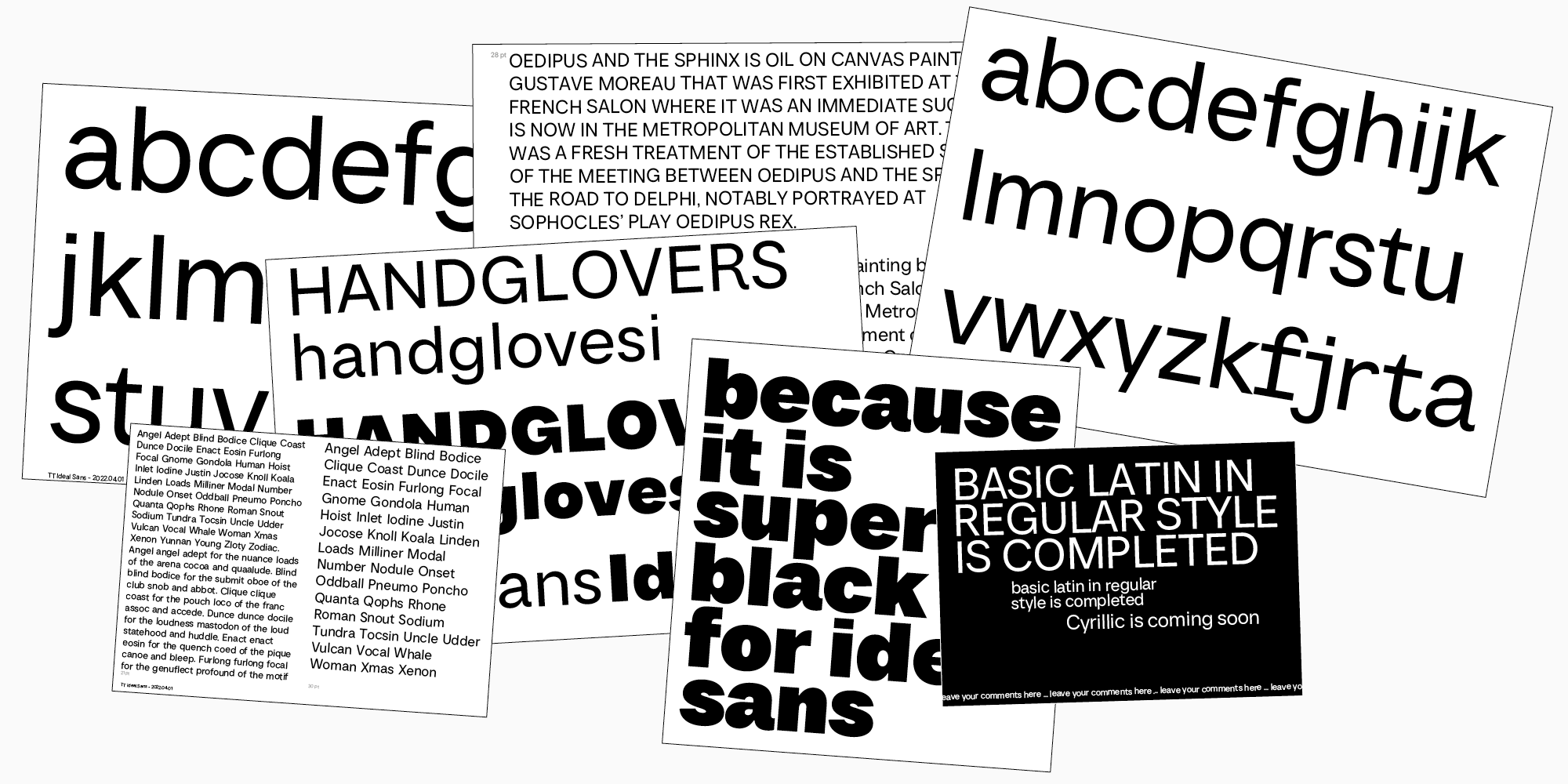
TT Neoris is a TypeType team font released in 2023. Its name is derived from two words: «neo,» which means «new,» and «rise.» We’ve been working meticulously on it for two and a half years. At the moment, TT Neoris is the most ambitious project of the studio: our goal was to create the ideal Neo-Grotesque that would mark a new chapter in the history of typography and become a bestseller.
Labeling our font as «ideal,» we understand there is always space for improvement and no limit to perfection. Nonetheless, we’ve done everything for TT Neoris to be worthy of this bold definition: we thoroughly designed each letterform, gave the font a large character set, and added numerous languages support, paying particular attention to the Cyrillic-based languages. We also added a large set of OpenType features, which allows you to shift the font’s mood dramatically and use only one typeface instead of many.
Every characteristic this font has is there for a reason: we’ve conducted extensive research to analyze the currents in typography development, the trends poised for high demand, and the things users would love to have in existing typefaces.
So, we’re happy to invite you to explore the creation story of TT Neoris, a Neo-Grotesque of the future!
Step one: Market research
To begin with, we will answer a logical question: why did we need to conduct research, and what were its goals and objectives?
The point is that our TypeType team of enthusiastic explorers decided to craft the «formula of love» in the font world and find out if it’s possible to design a bestseller based on detailed calculations. We wanted to try to match the success of the most popular studio fonts: TT Norms Pro and TT Commons Pro. To do this, we needed to understand why they are in such high demand.
It’s worth mentioning that we have done research before. Yet, this research stands out as our deepest and most comprehensive.
«Font popularity is mostly a matter of chance—we have observed it through our own experience. When we released TT Norms Pro and TT Commons Pro, we weren’t ready for these typefaces to become global bestsellers. But this time, we approached the concept of an „ideal font“ creation with greater awareness. Basically, we defined our task and went all-in, beginning our research.»
Ivan Gladkih, CTO, co-founder of TypeType
«We were curious if our research studies really work. Our goal was to create a bestseller, and we did everything to make it happen. But will it work? And is it possible to predict the font’s popularity? We had no idea.»
Antonina Zhulkova, Design Lead at TypeType
As we mentioned before, the research we did was extensive. It included the analysis of various bestselling fonts ranging from iconic names with a historical legacy to the newest hits. The list of our «test subjects» included, for example, typefaces from the Monotype collection as well as fonts made by independent type foundries.
We measured all possible font parameters, took apart almost all characters and constructions, and analyzed fonts’ types and components. In addition, we asked users what fonts they needed and what they thought the existing fonts lacked.
The user survey featured both open-ended and closed-ended questions. In one of the parts, for instance, we gave the respondents the opportunity to provide us with additional suggestions and asked them to list their favorite fonts with small explanations of why they liked them.
During our research, we tackled the following objectives:
- Defined the most popular and desired font groups: geometric, Humanist, or mechanistic, with the last one implying Neo-Grotesques and similar typefaces;
- Determined the historical prototype that lies in the foundation of most of the bestsellers;
- Found out what fonts are considered the most attractive;
— with static or dynamic proportions;
— narrow, regular, or wide;
— with closed, open, or semi-open aperture;
— with high, low, or no contrast;
— with vertical, horizontal, or diagonal cuts;
— with squared, standard, or rounded ovals;
— with simple cursive or authentic italics;
— with brutal, soft, or neutral character;
— with single- or double-story construction of the letters «a» and «g»;
— the letter «l» must be straight or with a hook;
— with or without distinctive graphics; - Asked the users about the features that influence their decision to buy a font, whether the font must have characteristics similar to other fonts, what languages and extra characters they might need, if a variable font must always be included, and what flaws they could name in the existing fonts;
- Analyzed the number of font styles and deconstructed the bestsellers’ character sets.
After completing the research, we had the first starting points for our project. However, there were also questions, like how to interpret the data we received. Which results should we make the foundation? How to implement everything? And a pivotal stage began, where we uncovered the core aspect—the look of our new, currently nameless font.

Step two: Result assessment and conclusions
To begin with, we needed to define the type category of our future font. Two categories reached the finish line: geometric and mechanistic (Neo-Grotesques). The research of the bestsellers featured on the leading font marketplace MyFonts showed that geometric typefaces similar to Futura are the most popular. But the overall picture was different—Neo-Grotesques, like Helvetica, were in the lead.
«According to the research results, it seemed that if we wanted to make a MyFonts bestseller, we had to design a geometric sans serif. However, user and independent font foundry surveys revealed that creating a Neo-Grotesque was the best choice. Besides, our studio lacked representation of Neo-Grotesque fonts. In general, when it comes to the Cyrillic alphabets, there is a shortage of high-quality Neo-Grotesque fonts on the market.»
Antonina Zhulkova, Design Lead at TypeType
That’s how we decided to design a Neo-Grotesque—an original one and one that would set trends, not simply follow them. And it was the same research that led all of us to this thought.
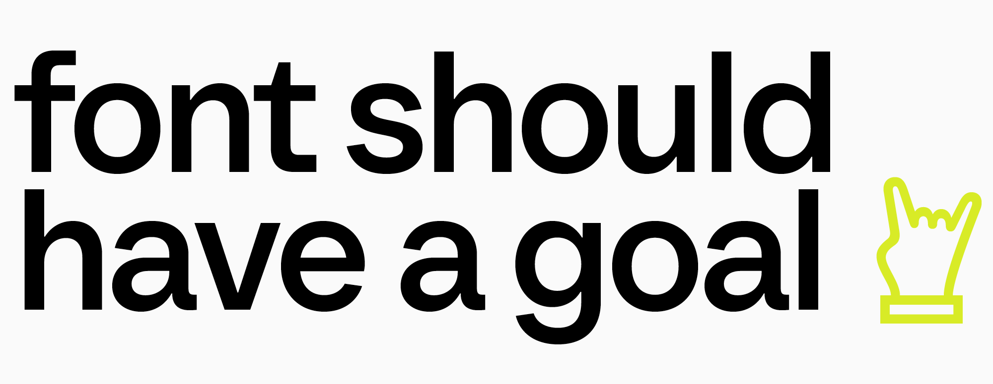
«One of our respondent’s answers set the mood for the entire work process. This answer was: „Font should have a goal.“ And here I realized that we wouldn’t make our Ideal Sans another Helvetica—it was supposed to be an original gaze into the future of Neo-Grotesques.»
Antonina Zhulkova, Design Lead at TypeType
After that, we had to decide what mood our typeface would convey. The research showed that neutral options prevailed, and people preferred softness to brutality. The neutral character became one of the key reference points in our future work. However, we wanted our typeface to have a vibrant personality—unique and fresh.
The survey led us to understand that the most essential criteria for buying a font are its design and a comprehensive font family. Another important feature is functionality: many OpenType features, additional glyphs, and extensive language support—these and other parameters we highlighted in the research results we included in our font.
«This research turned into a demanding technical assignment for us: as if somebody gave you a graph paper to fit your font’s original design. No shift is allowed as there are fonts from other categories nearby. You can’t change any widths or weights, and the grid limits your ability to fully express your creativity. But you must still design a unique and fresh typeface—this was the primary task. This was challenging; that’s why bringing it to life took us quite a lot of time.»
Ivan Gladkih, CTO, co-founder of TypeType
The most exciting part lay ahead: it was time to put all of this into action, unveiling the future of Neo-Grotesques. New challenges and discoveries awaited us!
Step three: Creation of an ideal Neo-Grotesque
Although we left our extensive research stage behind, the search wasn’t over yet. In the process of font development, we carried out a few additional mini-studies as we kept asking ourselves various questions and were tirelessly looking for the answers.
Generally, this project took us 2900 hours to complete: we worked meticulously on every detail and constantly made up new features for the font, for example, a special italic font style and alternate glyph shapes (that we will talk about later in the article). Given that both Cyrillic and Latin character sets are extended in this font, the number of glyphs grew many times. And this indeed added technical challenges for us.
Crafting process: Where every letter matters
The font was crafted following our familiar approach. Initially, designers sketched the core glyphs of the Latin and Cyrillic writing systems in regular, bold, and light font styles. It was crucial to design these styles right away. Firstly, it helped to define the extreme values (masters). Secondly, we needed to precisely match the standardized values for the most frequently used font styles (Regular, DemiBold, and Bold).
«We printed out our font sketches and compared them to the ones of the fonts from our research—we laid everything out on the table and analyzed what suited and what didn’t. It was done to ensure that it was possible to replace any Neo-Grotesque with our font without transforming the layout too much. This helped us make the values resemble the ones already familiar to users.»
Antonina Zhulkova, Design Lead at TypeType
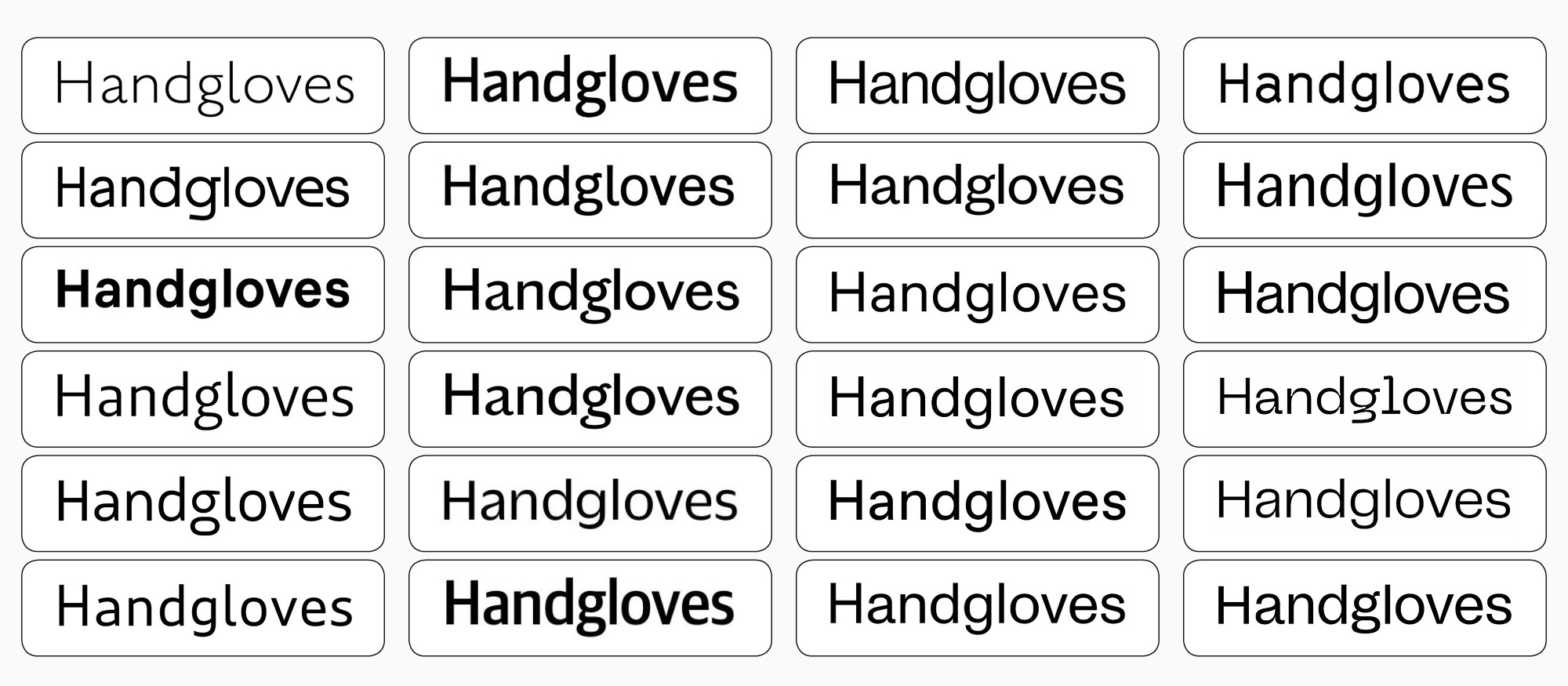
You can easily notice that the boldest font style in TT Neoris (Black) looks as serious as the regular one. It may seem insignificant, but our designers put a lot of effort into creating this effect.
«When we began designing the bold font style, it had a plushy look: because of the proportion transformations, the font was losing its serious mood. So, we had to fight for the font’s solid appearance in bold style and put a lot of effort into making this style’s atmosphere closer to the regular. Now, we can say without doubt that the bold font style looks phenomenal as an independent font, a confident statement, and part of our new typeface.»
Ivan Gladkih, CTO, co-founder of TypeType
Then, when we determined the number of font styles and their looks, we began designing the letters of the Latin and Cyrillic alphabets. We had to pay attention to each letter’s mood to make all the details correspond to the research results: angles of stroke ends, forms, proportions, aproshes, etc. After that, we moved on to expanding the entire type family.
Honestly, it was a challenge to fit everything into one typeface and build the logic behind the OpenType features to make them work properly. For example, designers faced technical limitations while creating alternate shapes of periods and other punctuation marks, along with the diacritical marks that included dots.
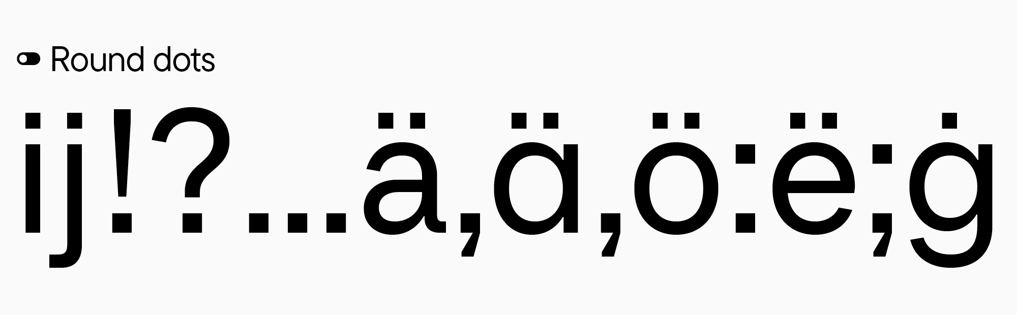
«In our typefaces, it’s possible to change square periods to round ones in the basic character set as well as all the other alternate stylistic sets. That means we designed each character together with an alternate: if a glyph had a dot, it had to have a form with a basic square dot and an alternate with a round one. This raised the character count and made it very difficult to write the features. We had to carefully think through how it would work and create the particular order of the features that would make it possible for a user to, for instance, apply two sets and get, in fact, four forms instead of one.»
Antonina Zhulkova, Design Lead at TypeType
What’s the recipe for the Neo-Grotesque of the future?
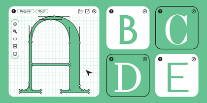
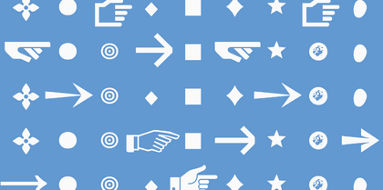
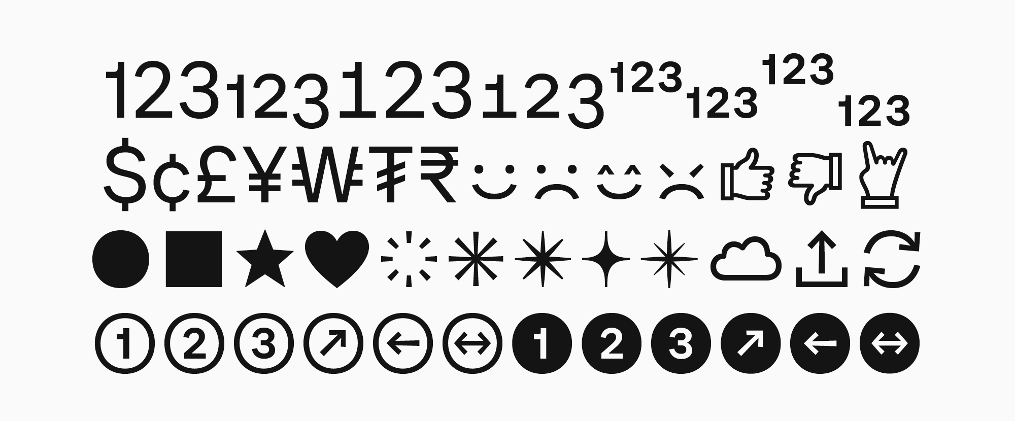
The typeface’s character set is extensive and diverse. The set of specials includes all possible variants of figures, indexes, and currencies, making TT Neoris a font you can use to type anything you want, and it will look stunning and well-balanced. We also added circled numbers and arrows, allowing for mixing them and using their combinations in various designs. Icons became part of TT Neoris as well—we added faces, stars, hearts, and more.
«I really love making additional graphic elements for fonts because they are convenient: designers can use ready-made icons or images that already match with the fonts without having to draw them separately.»
Antonina Zhulkova, Design Lead at TypeType
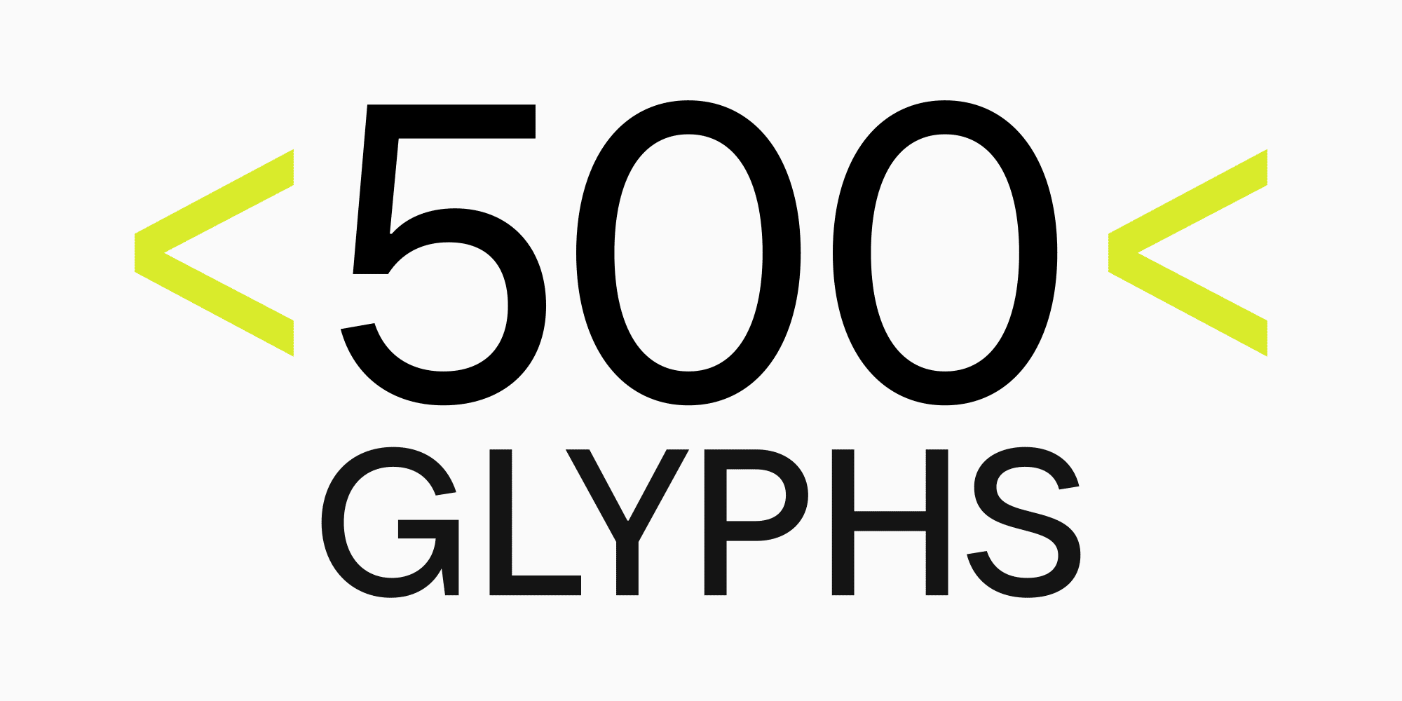
«We are more than sure that with future updates, the number of characters in the set will exceed 2000 glyphs. Compared to other typefaces on the market, only large corporations can usually afford such extensive character sets because it’s a very time-consuming, complex process. First, you design everything. Second, you must make sure that it all functions correctly from a technical point of view. We wanted our typeface to be exemplary in every aspect, so we did our best to make it happen.»
Ivan Gladkih, CTO, co-founder of TypeType
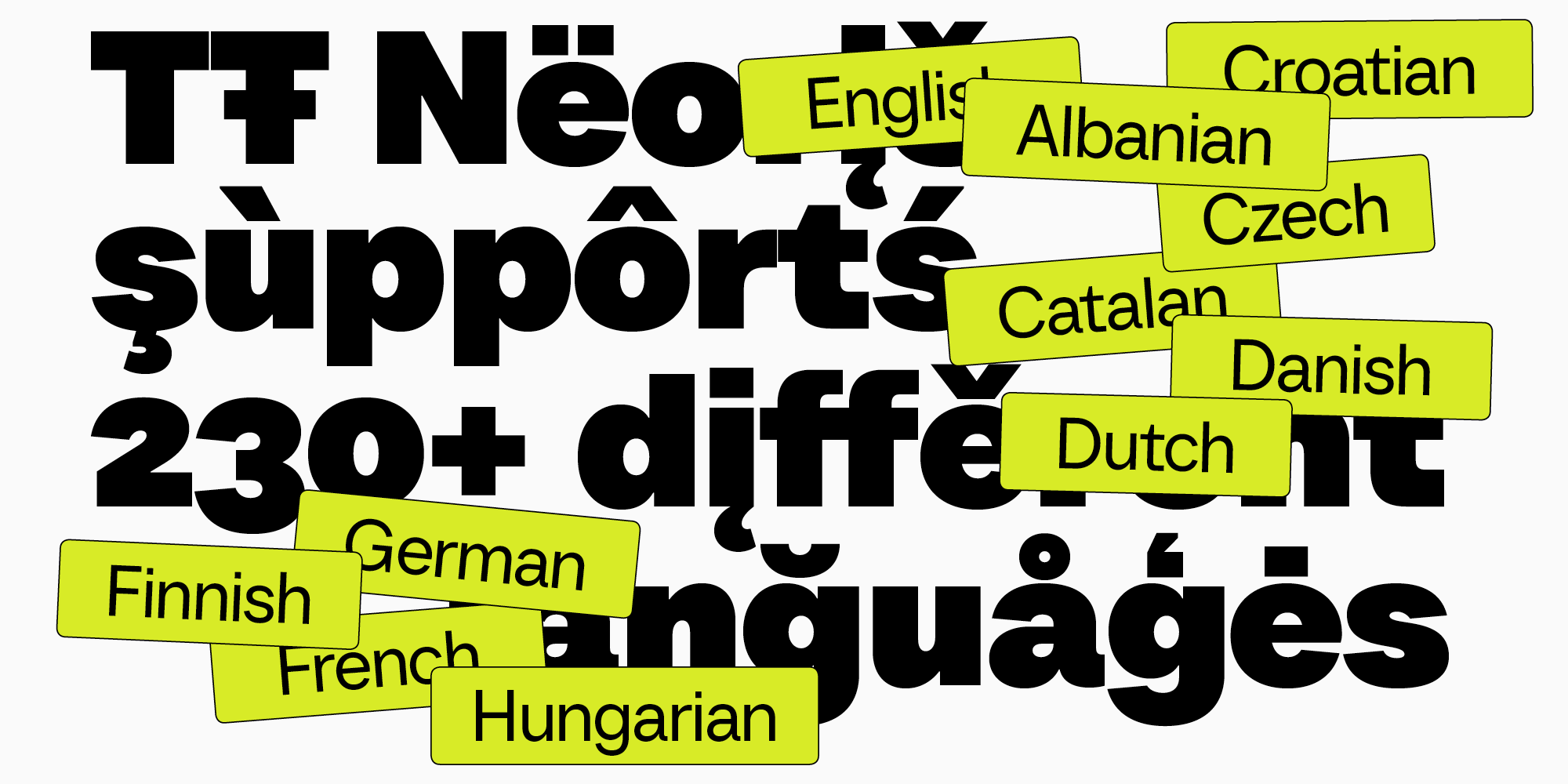
TT Neoris also supports more than 230 languages, including all Cyrillic-based languages with over a million speakers.
«We always try to make everyone happy. In a sense, we feel responsible for the whole ’Cyrillic font world.’»
Ivan Gladkih, CTO, co-founder of TypeType
What’s innovative in TT Neoris?
Our goal was to design a Neo-Grotesque and remain true to the genre, so we tried to keep all the proportions typical for this typeface category while also keeping an eye on the contemporary variations. Besides, we chose a critical approach to each element and re-thought the characteristic forms to make the font look modern.
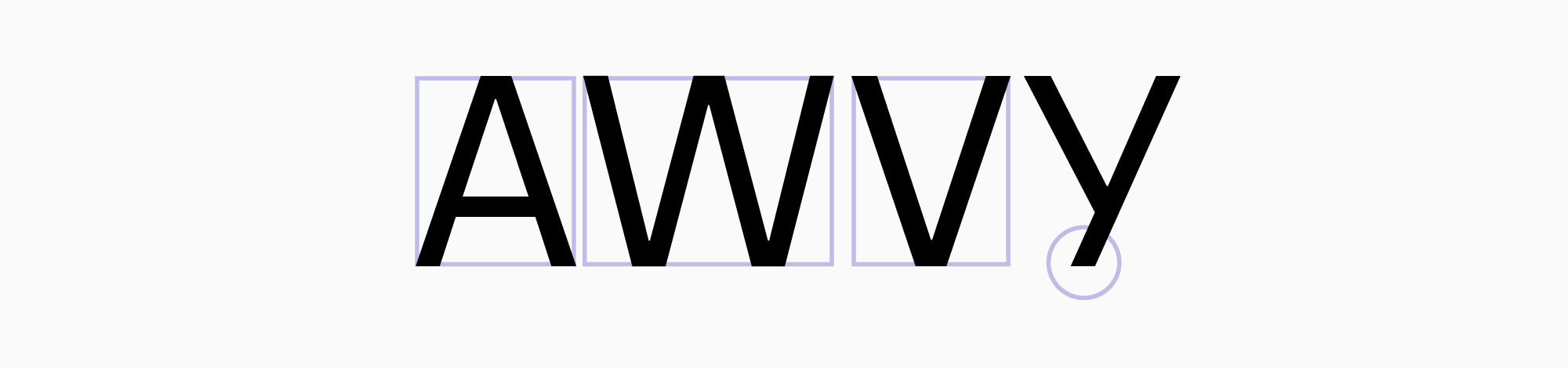
Thus, some of the forms in TT Neoris don’t look very traditional. Triangular characters, like A, V, or W, for example, occupy quite large horizontal apexes. The same goes for the Latin letter y or the Cyrillic У/у—all of them lack terminals.
Another curious thing is that Swiss Neo-Grotesques usually feature noticeably small distances between characters. But our goal was to make the font multifunctional and suitable for use in both large formats (posters, banners, etc.) and practical tasks. That’s why we made sidebearings wider but still narrow enough to conform to the Neo-Grotesque standards.
Multiple personalities of one font
The users we surveyed for the research wrote that they needed a typeface with a neutral and basic character. However, they wanted a product with multiple alternates, allowing the use of the same font for various clients and tasks. This is why we crafted many features to significantly increase font customization options.
TT Neoris is a shape-shifter font. Its neutral character can be slightly adjusted to be softer and more elegant or radically transformed beyond recognition.
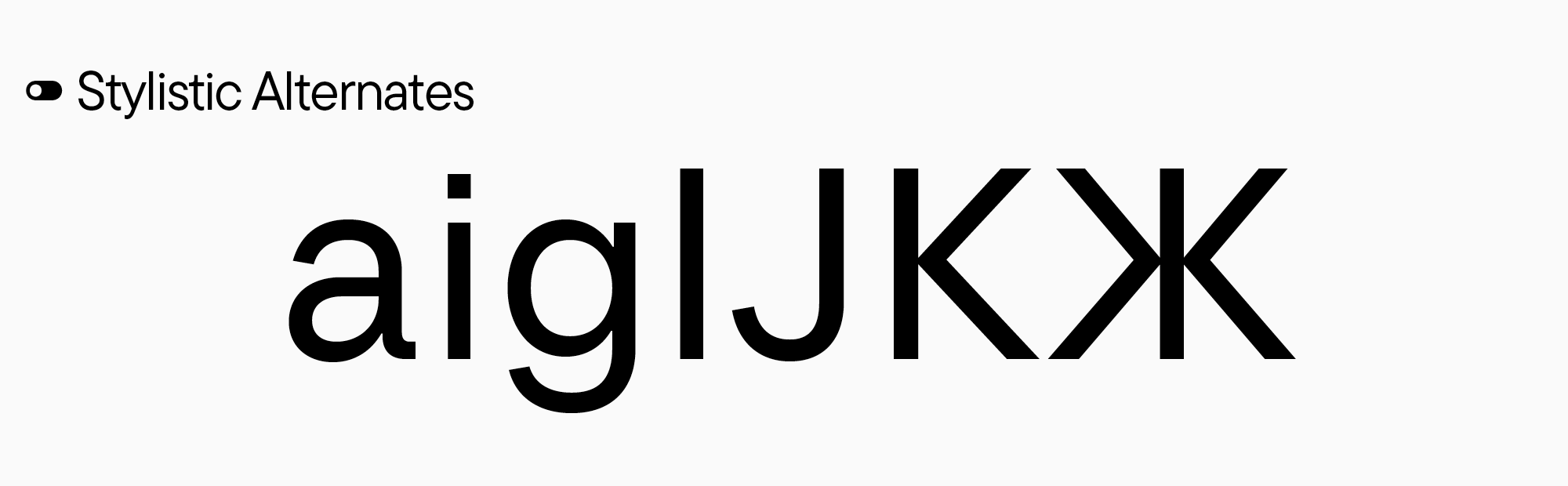
Some of the alternate characters are simply different glyph forms. For instance, the single- and double-story letter a, the forms of the Latin letters i, g, l, J, and the Cyrillic letters К and Ж.
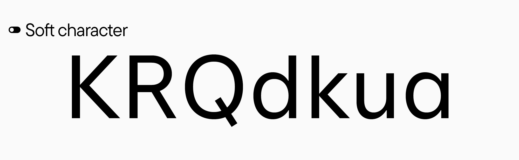
The typeface also has two creative sets: Soft character and Upright cursive. In Soft character, the mood of the font only changes slightly: some glyphs acquire legs and soft elements. In turn, Upright cursive totally transforms glyph shapes.
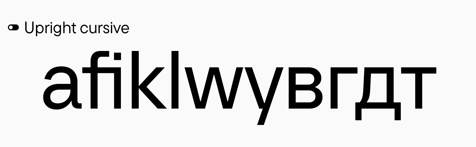
It’s worth noting that the Latin and Cyrillic sets differ from each other: Toma Streltsova, our Senior Type Designer, saw an opportunity to implement traditional calligraphic forms into the modern sans serif.
«It’s curious that for the Cyrillic set, we diverged from the path we followed for the Latin set and designed forms typical of Cyrillic calligraphy. The thing is that upright cursive looks weird in some Cyrillic-based languages because of being too similar to the Bulgarian form of the Cyrillic glyphs. TT Neoris features Bulgarian as well, by the way. However, in some other Cyrillic-based languages, the visual tradition is completely different. So, we chose to pursue a historical path but also reworked everything according to the current requirements and tendencies. It looks amazing in a modern font! I find it exciting that it’s possible to connect a contemporary look, advanced requirements, and historical roots.»
Antonina Zhulkova, Design Lead at TypeType
Italic font styles and upright cursive
Much attention was dedicated to the italic font styles, which we made a little narrow.
«We usually only create slanted versions for sans serifs without changing the glyph forms. Yet, there is a nuance: the way users utilized italic font styles led to them becoming a classic tool for highlighting text fragments to attract attention to them. When letters are just slanted without any changes applied to their forms, the text doesn’t look accentuated. So, from the thinnest to the boldest font styles, we designed slanted forms to be slightly narrowed, like in true italics.
At first, I considered what qualities they should have. I made sketches, determined the slant angle, and narrowed the forms. Interestingly, it didn’t take us much time—we spent just a bit more time crafting the narrow italics compared to the standard slant. It was essential for us because the project itself was very ambitious, so we didn’t have much time left.»
Antonina Zhulkova, Design Lead at TypeType
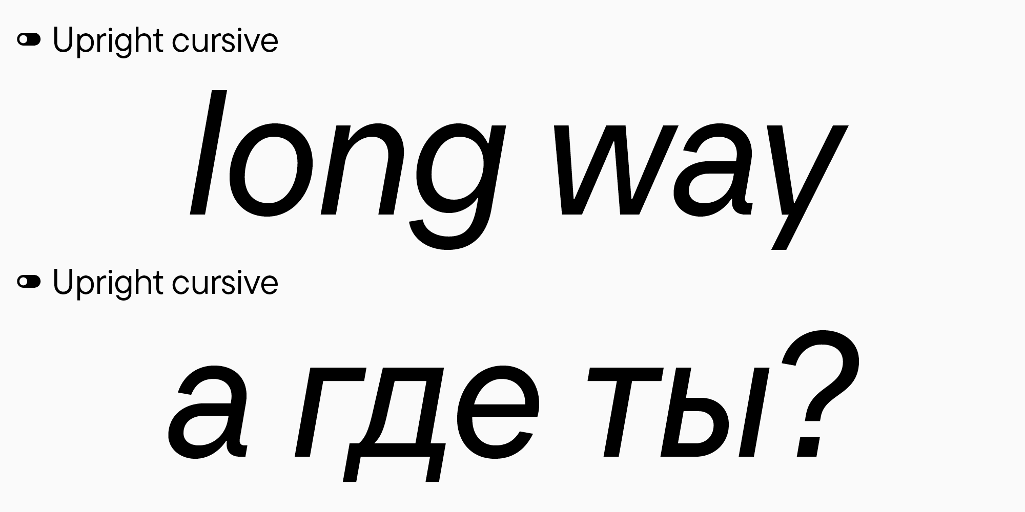
You can use the italic font styles together with the Upright cursive set.
«As far as we understand it, there are no other cursive fonts like this one among sans serifs in the Russian-speaking segment. Thus, it’s both a tribute to tradition and an exploration of forms for future italics. You can use familiar slanted sans serif forms as well as the more historical ones.»
Ivan Gladkih, CTO, co-founder of TypeType
Conclusions
To sum up, we now have an ultra-modern, functional, advanced, and highly adaptable Neo-Grotesque with a versatile character. TT Neoris alone will be enough to replace several different fonts at once.
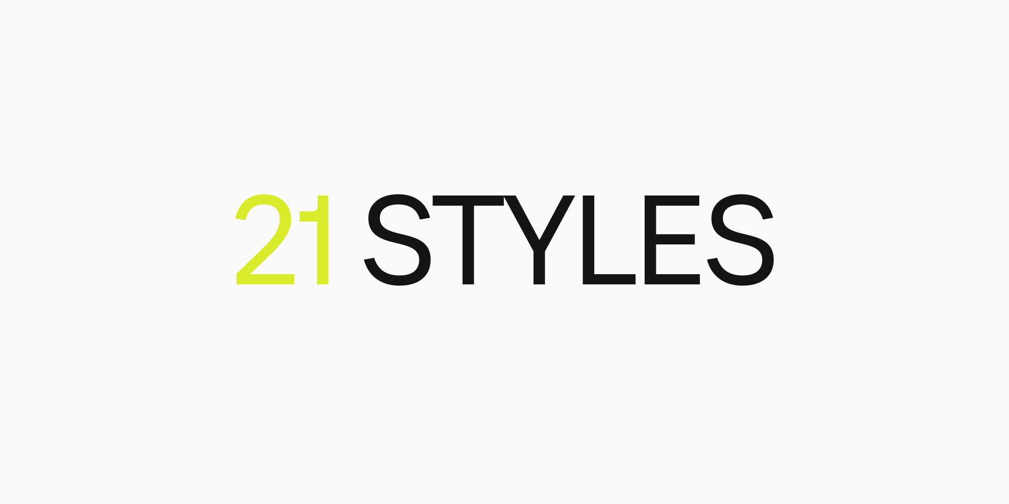
Today’s TT Neoris consists of:
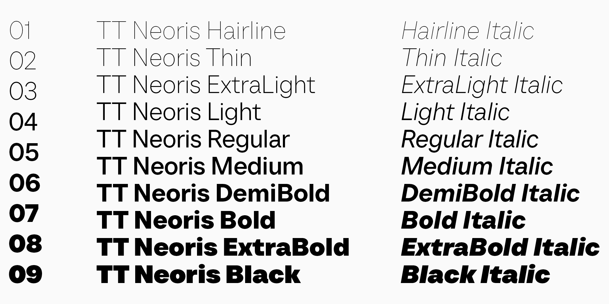
- 21 font styles: 10 upright, 10 italics, and 1 variable font;
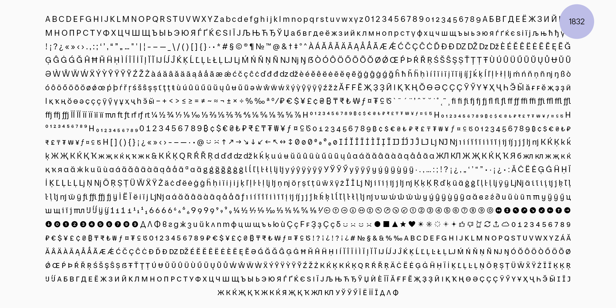
- 1832 characters in each font style, including the extended Latin and Cyrillic character sets and special symbols;
- 41 OpenType features, counting in localization features for various languages, stylistic alternates, small caps, icons, circled figures and arrows;
- 14 stylistic sets with Soft character and Upright cursive in Latin and Cyrillic character sets;
- 230+ languages support, including all languages based on the Cyrillic script with over a million speakers.
- Unique narrow italics that serve to highlight text fragments. They create a soft accent without disrupting the reading process.
«If the typeface is used by a designer who decides not to turn on any special features, they will get a simply great, advanced, and high-quality product with a wide range of font styles, beautiful italics, and more. By digging just a little deeper, the designer can transform the font’s character by using OpenType features and get a unique and powerful font tool for their projects.
We understand that this font is now close to perfection from the point of view of its contour design, fully aligns with the research findings in terms of its character set, and completely satisfies the needs of designers regarding font style content. We consider TT Neoris a cohesive and polished product, and we hope it will be highly appreciated by designers.»
Ivan Gladkih, CTO, co-founder of TypeType