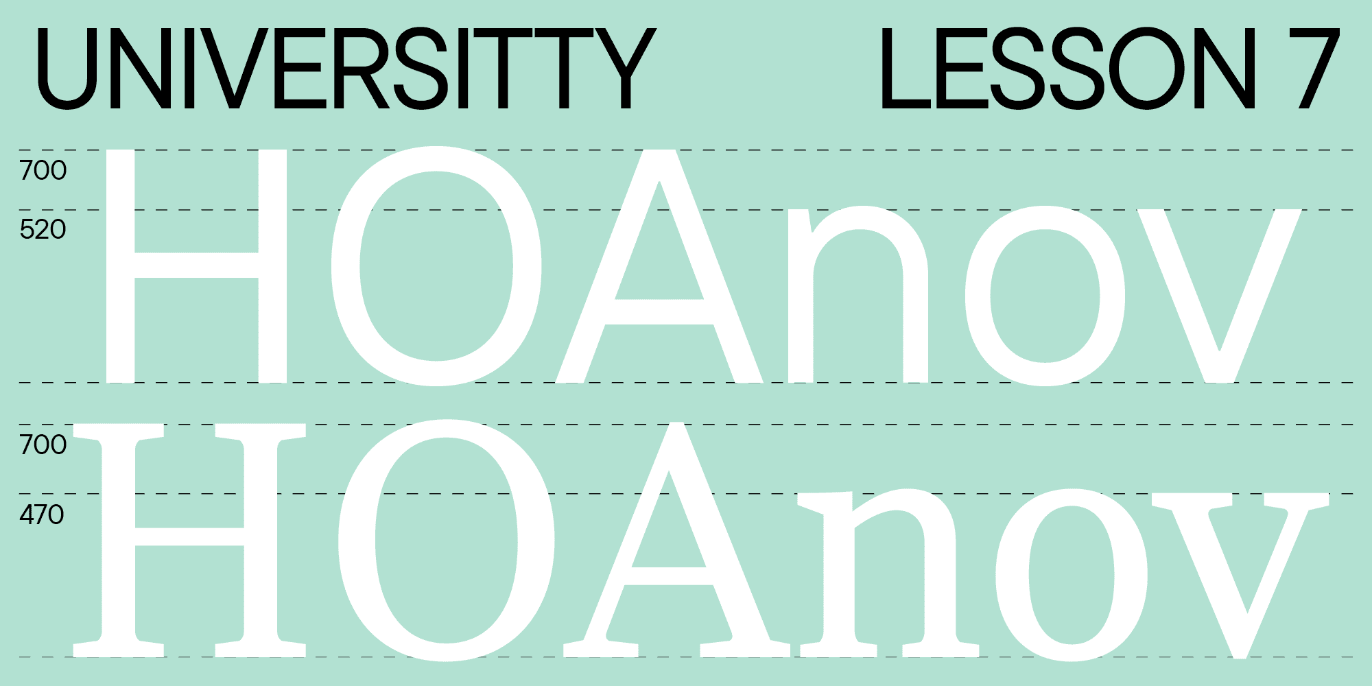
Welcome to the seventh lesson of our «UniversiTTy»! This article continues our fascinating explorations of the font creation process. We suggest going through the earlier articles in the series before diving into this one.
Today, we will continue discussing optical compensations, find out how to determine the heights of uppercase and lowercase characters, and learn more about the essence of contrast. Antonina Zhulkova, Design Lead at TypeType, will tell you all about these processes. Antonina has been working in font design for more than 5 years now. She’s the concept author and lead designer of projects like TT Neoris, TT Ricordi Allegria, TT Globs, and Ivi Sans Display. Also, she participated in creating TT Fellows, TT Fors, TT Interphases Pro, TT Commons, and many other typefaces.
Optical compensations: Character weight and height
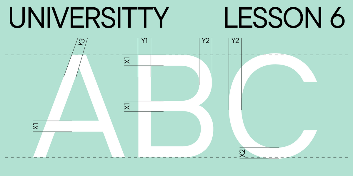
The last thing we focused on in the previous article was that the diagonal strokes of triangular characters should be a little thinner than the primary stem size of the letter H and that each letter should be put between the others for testing. Almost all triangular characters with diagonal strokes have points where such strokes intersect, and these points always seem thicker (it also concerns the letters B, M, N, R, etc.). That’s why they must be balanced by reducing the weight of the intersecting strokes.
Another essential issue you should remember is the visual difference in perception of upstrokes and downstrokes strokes. Ascending strokes are diagonal lines that follow the logical flow from bottom to top (for example, the left stroke of the letter A); descending strokes follow the opposite logic and progress from top to bottom (like the right stroke of the letter A). It can be challenging for novice font designers to remember what type (ascending or descending) each diagonal stroke belongs to. My advice is to draw your letter on a piece of paper with any tool: your natural hand movement will tell you how the strokes should progress.
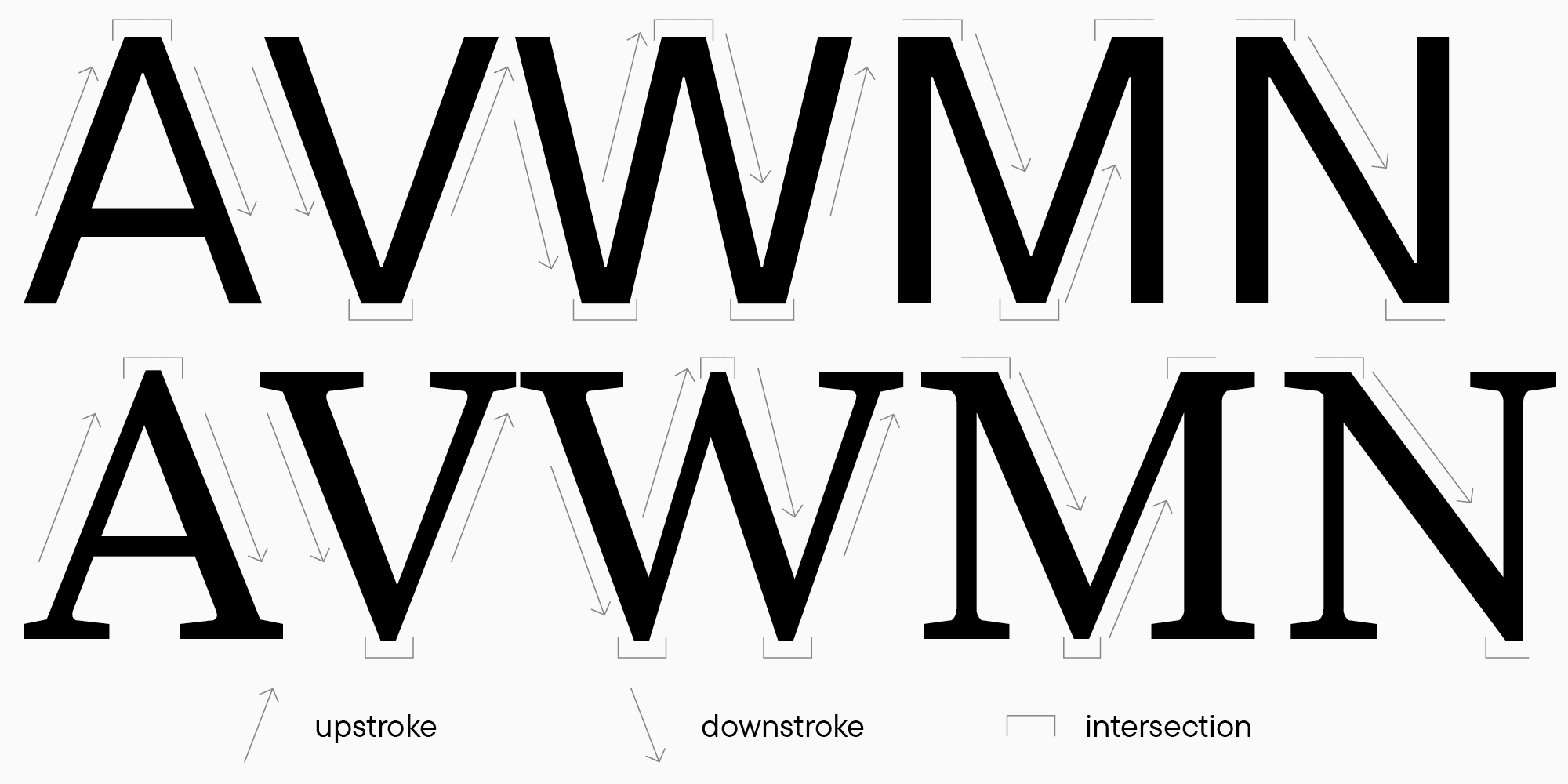
Ascending strokes seem heavier (thicker) due to their visually engaging upward motion. The thing is that we read from left to right, and lines moving in the opposite direction attract more of our attention. That’s why in sans serifs that lack noticeable contrast, descending strokes are always designed a little heavier (thicker) than ascending ones. In serif typefaces, the weights of ascending and descending strokes differ significantly: ascending strokes are almost always thin, and descending ones are heavy. It also depends on the calligraphic tradition.
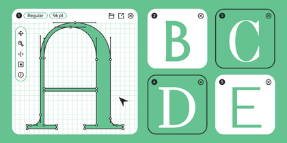
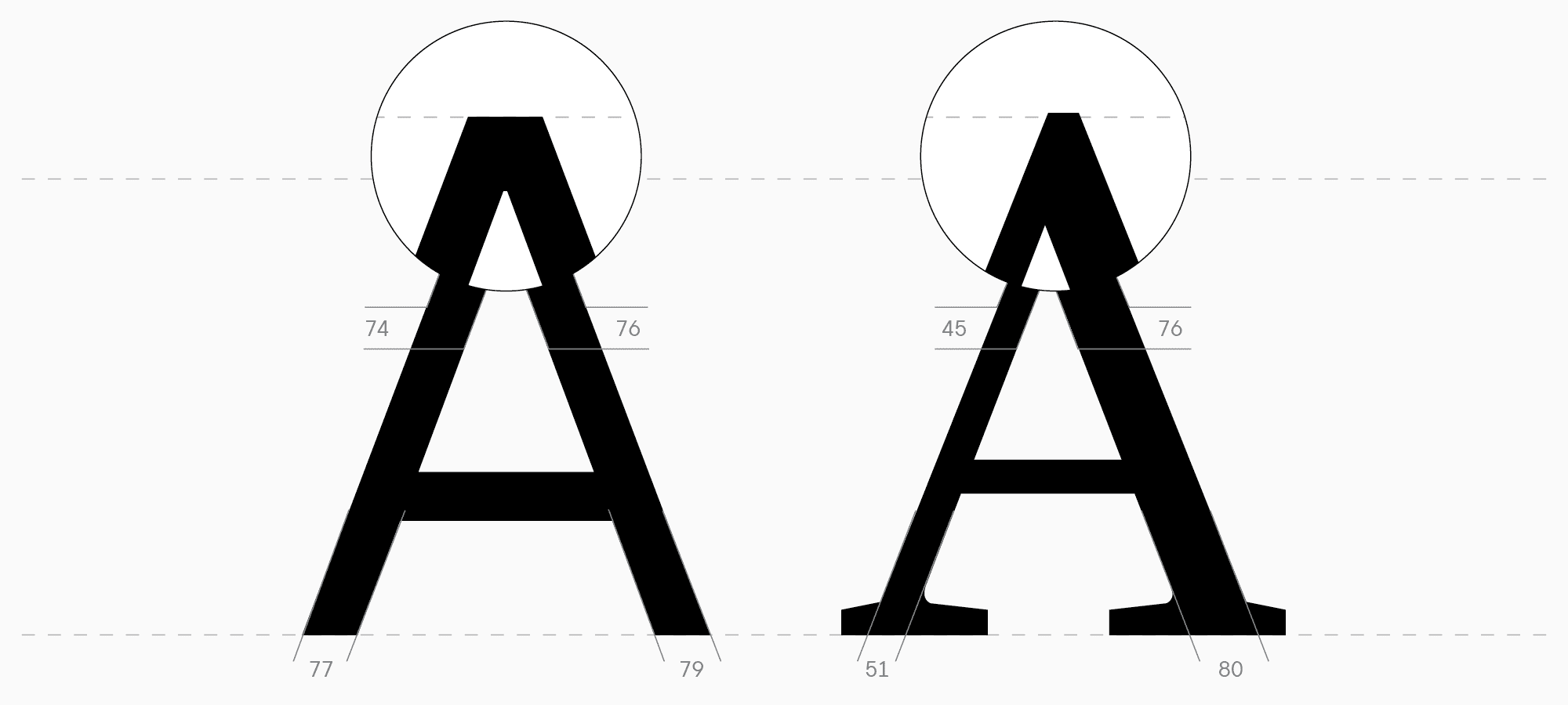
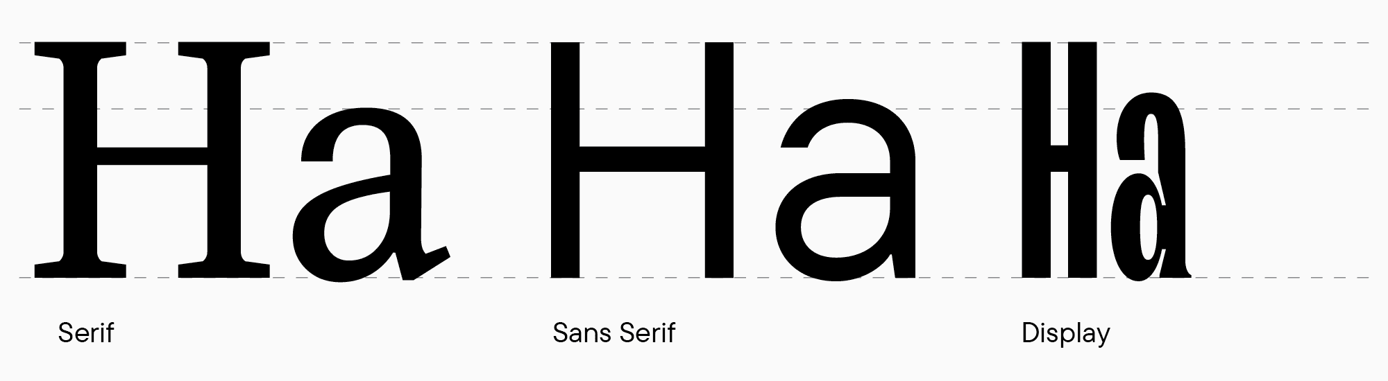
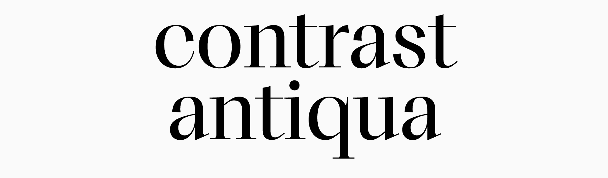
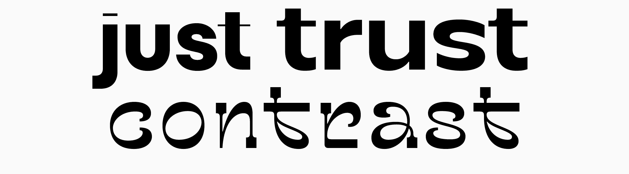
Let’s circle back to our geometric shapes. The height of triangular characters should also be determined in comparison to other forms. The point where horizontal strokes intersect is less black, appearing visually lighter, and the glyph itself seems lower than the others. This can be compensated by using one of the two design tricks. The first one is to make the horizontal cut at the intersection point (cut the top of the triangle). The second trick is to extend the sharp apex or vertex above the height of the upright letters. The sans serif and serif examples clearly demonstrate all the details I mentioned.
When determining weights, you can also use your sketches to decide on the height of uppercase and lowercase characters and the level of visual compensations. As a result, you should get several basic values to use for your design process:
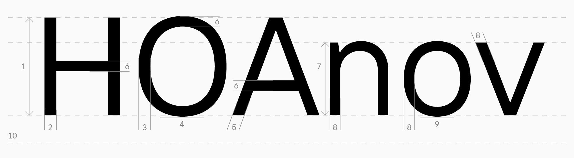
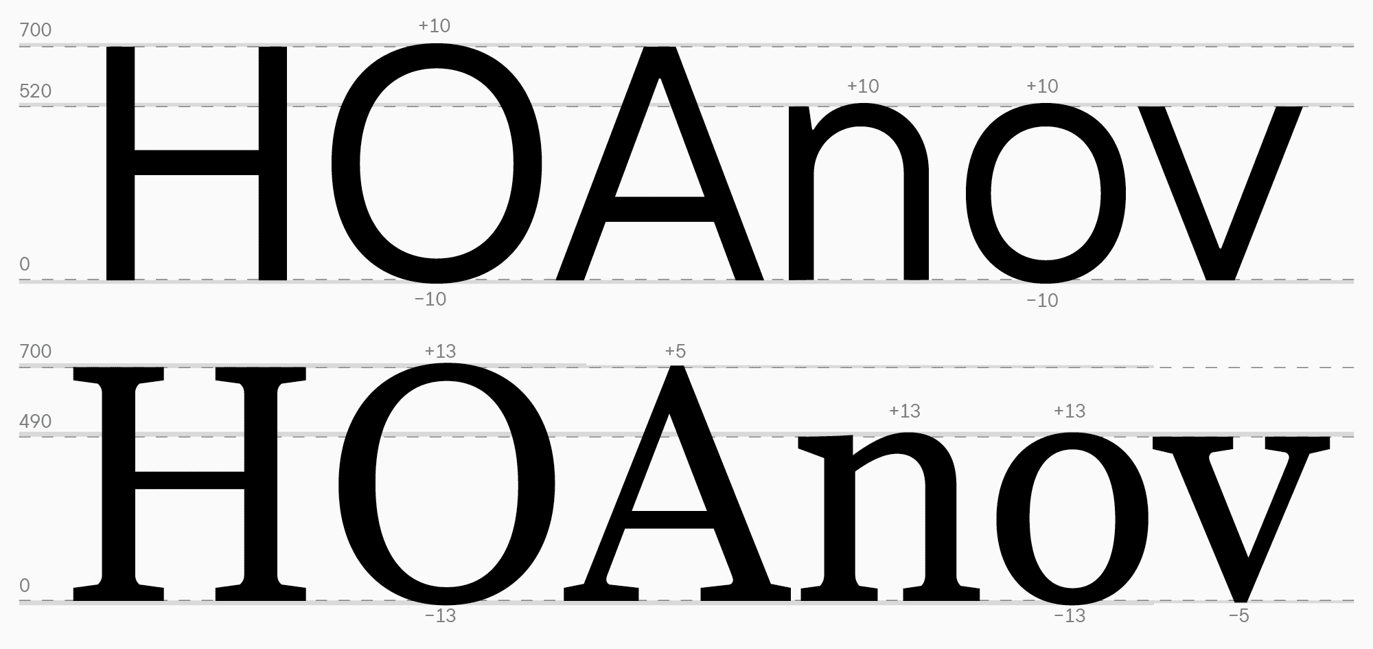
- The height of uppercase characters, which is the height of the letter H. Different font designers use their own logic to determine this size. Still, usually, the height of the uppercase characters ranges from 680 to 730 points. If the font has a specific task (for example, to be used in interfaces), it’s recommended to analyze the competitors to align your font with theirs;
- The stem weight for upright uppercase characters (H);
- The stem weight for rounded characters (O), whether they differ from the stem weight of the letter H, and if so, to what extent. The difference in weights can be determined by testing the glyphs in text. To do that, transfer several glyphs from sketches to font editing software and test them in words and running text, giving them various point sizes to see which parameter difference appears optimal.
- The depth of overhang for the rounded characters;
- The diagonal stroke weights (A);
- The horizontal stroke weights (for H, A, and O), whether they differ from one another, and if so, to what extent;
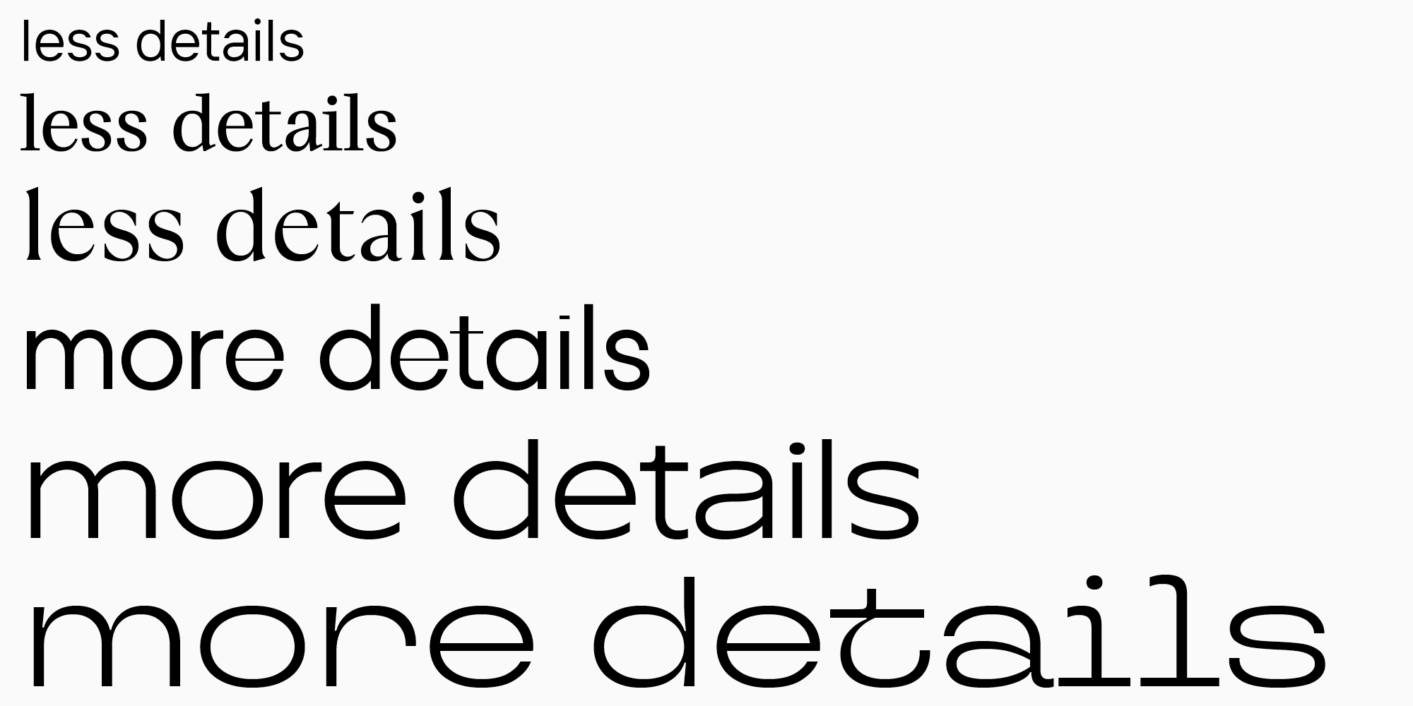
- The lowercase character height, which is the height of the letter n or x (without the arc that is often equal in height to the overhang depth). The standard size for lowercase glyph heights in font editors is 500 points (and 700 points for uppercase glyphs), and this value can be a good foundation for your search. When determining the lowercase glyph height, use your sketches and rely on your font’s place in the classification. For example, lowercase characters are usually relatively short in classic Old Style serifs. In neutral fonts, lowercase letters are designed to be a little larger for better readability, taking into account the size of the ascenders so that they don’t seem too small. In turn, the lowercase character size in display fonts can have any size that better emphasizes the graphic idea;

- The upright (n) and rounded (o) character stem weights and the diagonal stroke weights (v). These parameters must be lighter than the uppercase characters to make the typesetting look smoother. However, they must still correlate with the uppercase glyph values;
- The overhang depth for rounded characters: this value often coincides with the uppercase overhang depth, but some fonts or font styles feature a smaller value for this parameter in lowercase characters. To determine the optimal value, you must test the font and watch the line’s smoothness and consistency.
- The ascender and descender heights. After calculating the main height parameters for the lowercase characters, you should move on to the ascender and descender heights. The best decision for graphics will be to give approximately the same height to ascenders and descenders, where ascenders must not be noticeably higher or shorter than uppercase letters. I will tell you more about the sizes and shapes of ascenders and descenders later in this article.
The values are given based on 1000 units per Em. This is a measurement unit used in typography and font design. It shows the number of points in an Em-square—an abstract space where height indicates the estimated gap between lines of identical font size. This is the grid and the number of points you see when drawing glyphs. The most frequently used is the 1000-point grid, but there are also 1024- and 2048-point grids, and others. This parameter is found in the font file, the Font info tab.
All these values serve as the foundation for us and must be the same in other characters according to the group they belong to: upright, rounded, or triangular. Remember to integrate special compensations into the other glyph weights to balance the black density. The same recommendation applies to characters with many strokes and bold font styles.
Now, it’s time to go back to our neutral sans serif for interfaces and the serif we were creating and see how all these heights are implemented within them.
The main task while working with weights and heights is constantly testing the letters in texts and comparing them to one another. It’s essential to maintain the balance of black and white within the chosen parameters. Your glyphs must not look alien, and the weights must suit the font’s main objective and idea.
When constructing fonts, you should aim to achieve consistency in the black and white density of characters to maintain uniformity in the text’s appearance.

Contrast
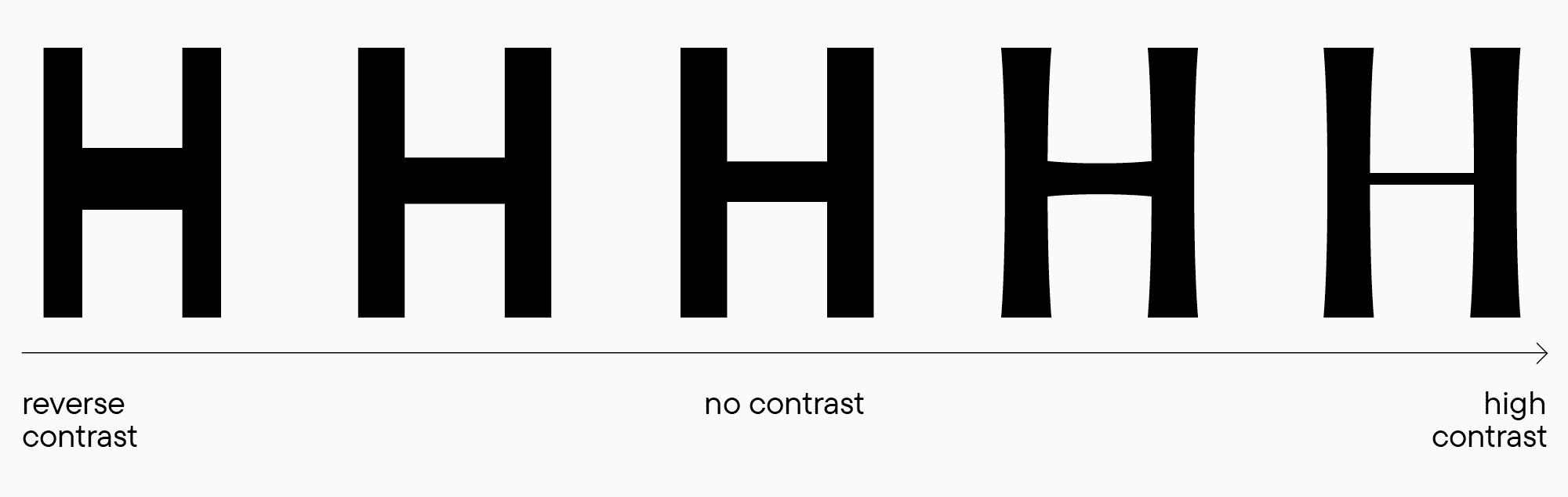
Contrast is an essential visual part of any glyph’s design. Every font has a contrast parameter. By changing this parameter, you can achieve completely different effects in the glyph design. Contrast is the relationship between primary and secondary stroke widths. Most often, this term implies the difference between stems and horizontal strokes.
There are several contrast properties:
- Contrast intensity. Contrast intensity may vary in fonts, from almost no contrast in neutral sans serifs to high contrast in Modern serifs. There is also a reverse contrast;
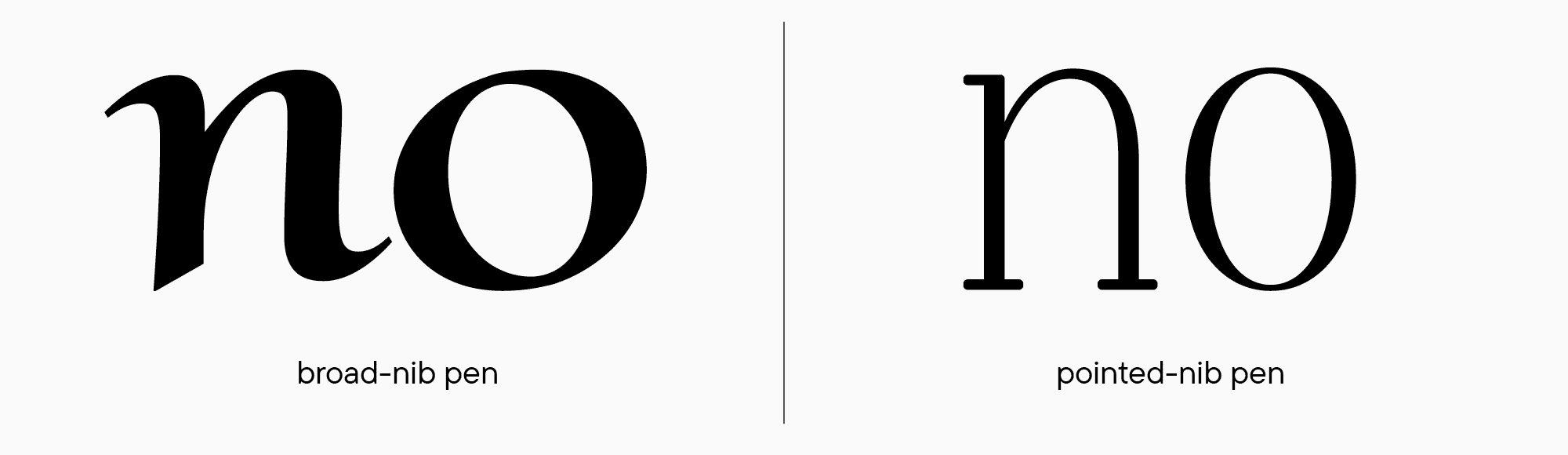
- Contrast type. This property shows which writing tool influences the glyph character. It’s essential for fonts with contrast because the glyph forms depend on the font’s category. The more historical features the font has, the more noticeable the tool’s influence on its forms is. There are three types of contrast: broad-nib-pen contrast, pointed-nib-pen contrast, and transitional contrast, which can be seen in Transitional serifs. The broad-nib-pen contrast implies a high level of contrast, while the pointed-nib-pen contrast suggests the opposite, a low one. The transitional type is logically somewhere in between.
Contrast is especially significant for serif fonts. Following contrast distribution rules is what indicated to us that this specific font falls under the category of serifs, and that’s how we’ll assess it. To design a good serif, I recommend practicing calligraphy, exploring historical references (for example, on https://letterformarchive.org/ or by searching for font specimens on https://archive.org/), analyzing popular modern fonts, and reading books about calligraphy and fonts. To learn more about strokes, contrast, and weights, I recommend the book by Gerrit Noordzij called «The Stroke: Theory of Writing.»
Your font has to look consistent, so you should stick to the chosen contrast parameters, or else the font will lose its integrity and be perceived as a set of different letters, not a system. However, knowing about contrast doesn’t only restrict—it also helps a lot with glyph design. The rules of contrast distribution can be used to manipulate graphics and create eye-catching and unusual fonts. For instance, fonts with reverse contrast never go out of style. Adding contrast selectively to specific characters will add charm to your font, and increasing contrast in different font styles will enhance the font’s application range. Intentional violation of rules infuses fonts with uniqueness and makes contrast one of the most powerful font design tools.
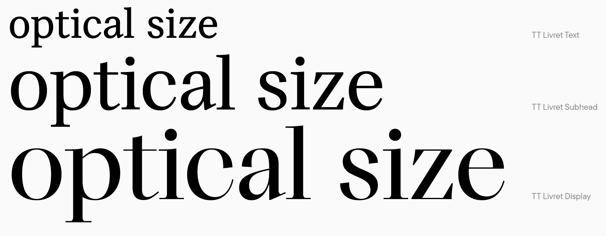
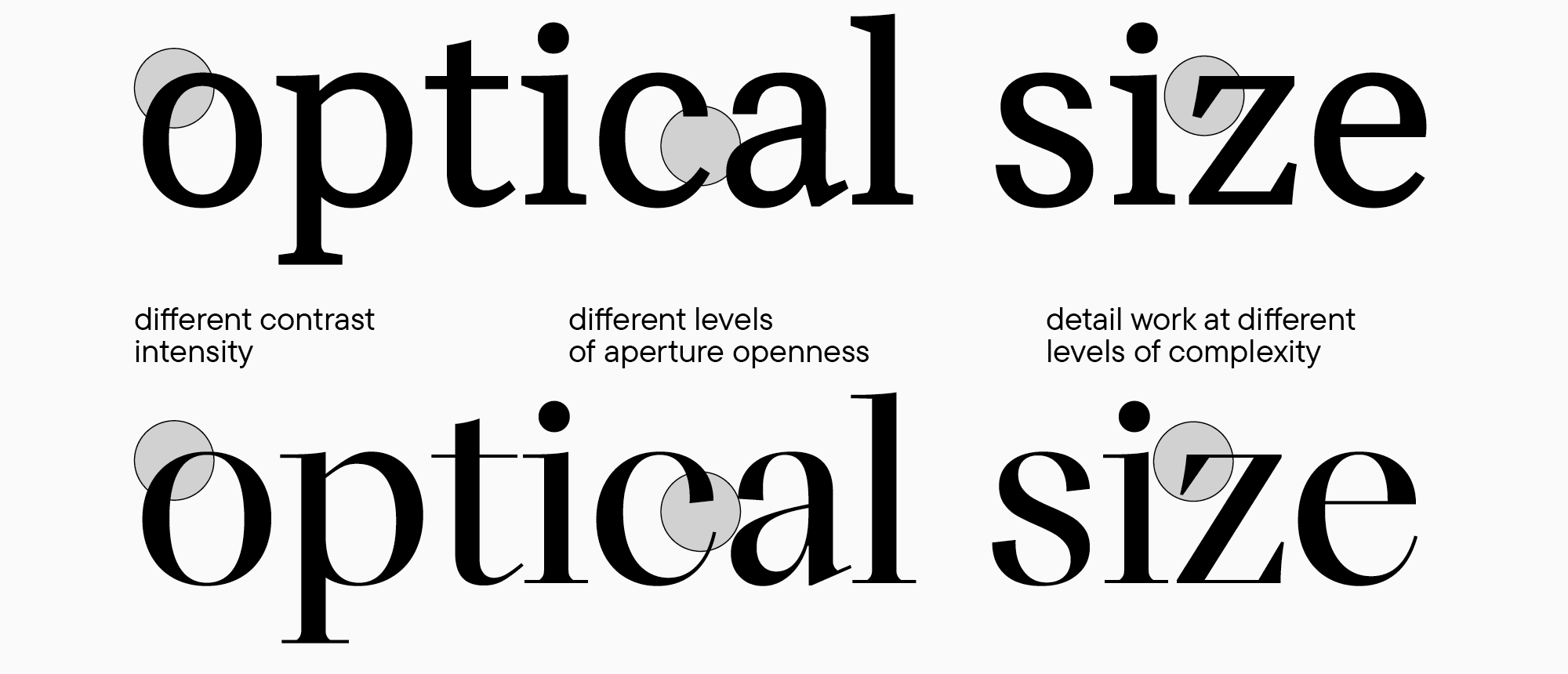
Optical sizes
Before sketching glyphs, it’s crucial to choose the appropriate font size for usage. This parameter impacts the appearance of glyphs. In this article, we cover only the most essential aspects to begin designing a typeface, and in upcoming materials, we will tell you more about optical sizes.
The most frequently used point size determines the visual perception of the contours: as the size of the symbols increases, the contour should become more detailed. This is the main difference between text and display fonts: if the typeface is supposed to be used in small point sizes, the primary task of the glyphs will be to portray the overall picture. In this case, text density and rhythm are more essential than details that won’t be visible enough in a small point size. In display fonts, on the contrary, the graphical elements of each letter are more prominent, and the level of detail comes to the forefront.
Here are some other characteristics that can shape the font’s perception in different optical sizes:
- Contrast in serifs. The higher the contrast level, the larger the point size must be for usage because the thin parts of letters in small point sizes may not render well in print or on screen.
- Glyphs widths. Glyph proportions (wide or narrow) can significantly influence a font’s visual image. For instance, wide letters are easier to perceive and read in small point sizes. This can be expressed as follows: the smaller the point size, the wider the glyphs should be (we’re specifically referring to the standard proportions; this doesn’t apply to intentionally stretched characters);
- Lowercase character size. If your font is supposed to be used in small point sizes, the height of the lowercase characters must be quite large in relation to the uppercase ones for better readability.
- Aperture. Aperture also influences readability because letters with open apertures are easier to read in a text. However, letters with closed aperture look more static, which helps them grab and keep attention on large headings;
- Glyph details and contrast are difficult to perceive in small format and add extra visual noise to a text block. You should keep this aspect in mind when designing letters.
- Spacing. The amount of white space around characters must also change for different point sizes. We will talk about this in upcoming chapters.
You can also learn more about this in the books «Size-specific Adjustments to Type Designs» by the Just Another Foundry studio and «Reading Letters: Designing for Legibility» by Sofie Beier.
Fonts intended for a specific size or size range can be part of the same font family and have similarities in letterforms and concepts as well as differences in details. We already have an example of such a font—it’s our modern serif with text and display font styles.
In our next UniversiTTy article, we will talk about uppercase characters and explore the logic of their design and proportions.