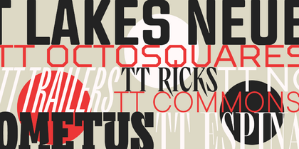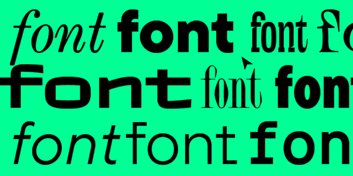
Spacing, kerning, leading and tracking are the settings and tools that font developers or designers can use to adjust the distance between characters, changing the rhythm of the text and influencing its readability.
What’s the difference between these concepts, why are they so essential, and how can they be adjusted in various programs? Let’s explore this together in this article.
What is leading in typography?
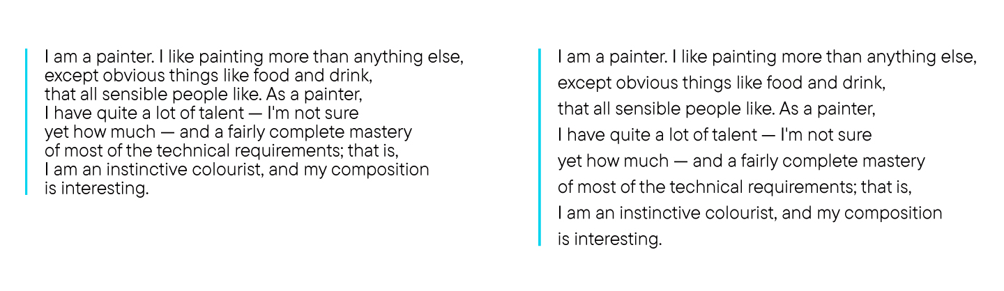
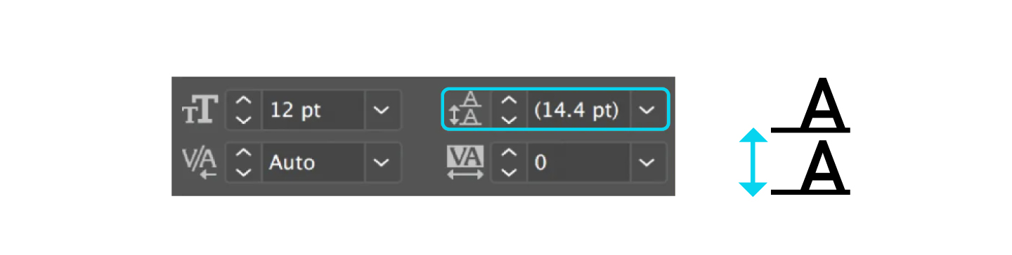
Leading (or line height) is the vertical distance between lines of text. More precisely, the distance between their baselines (from one line’s baseline to the following line’s baseline). In simple words, it is line spacing familiar to almost everybody.
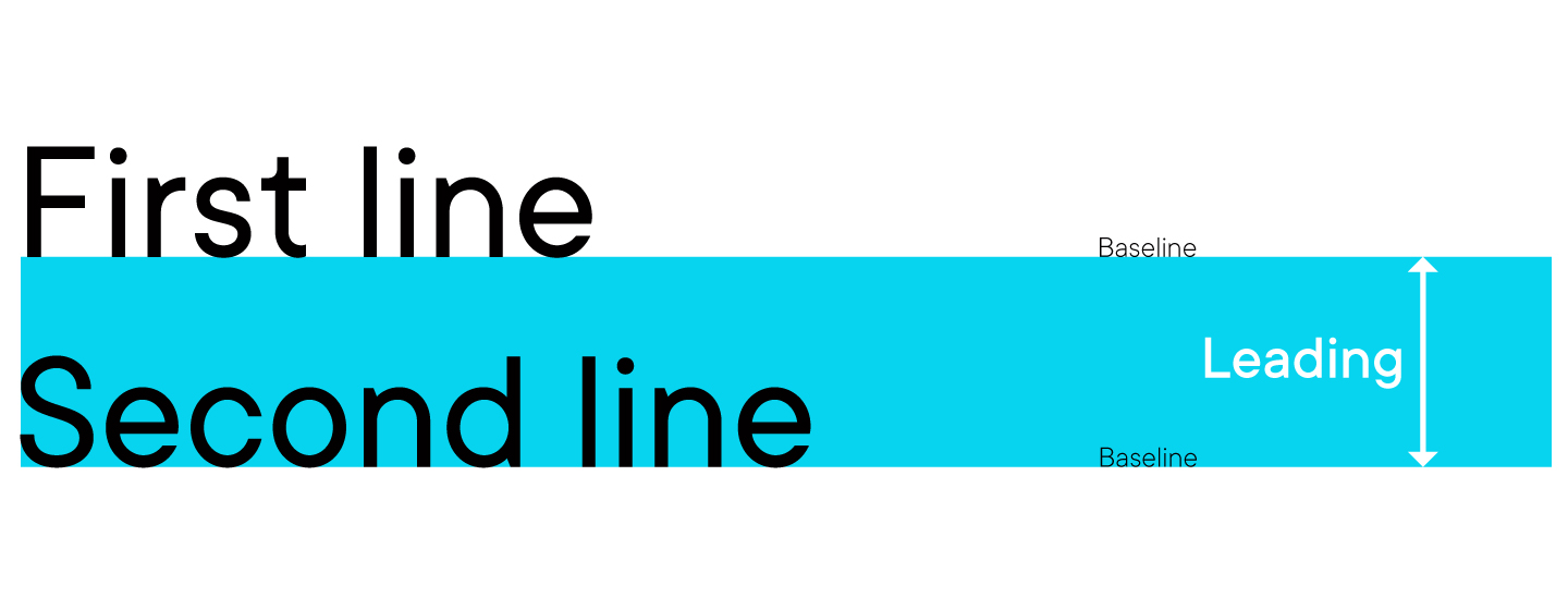
The leading settings are already defined within the font file. Basic line spacing is often used in text editing programs. In Adobe software, the default leading equals 120% of the font size.
Additionally, almost all programs allow users to adjust line spacing to meet the needs of their workflow with a font. Knowing how to adjust leading properly is as essential for typography as for design, as this parameter influences both readability and the text’s visual appeal.
So, correctly configured leading can make the text more legible. When the line spacing is too narrow, it makes the text too dense: the lines stick together, and people’s eyes quickly get tired while reading. However, overly wide line spacing also complicates reading, as the eye has to «jump» from one line to the next every time.
If you wish to learn more about readability, check out our article about the fonts for reading.
The optimal leading setting is thought to be 120% — 20% more than the font size. Remember that this value may vary depending on the field of application, task, and the font’s type.

How to adjust leading?
In general, you don’t need anything specific to adjust leading, as it can be done in various ways within the design or text editing program you use. So, we recommend finding a guide for the particular software you use. In most cases, configuring line spacing is quite easy.
For example, to set leading parameters in Adobe Photoshop, you highlight the necessary text fragment and choose the desired line spacing value on the «Symbol» panel.
What is spacing?
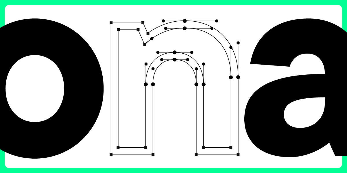
Spacing is the horizontal distance between all characters in the text, factoring in all the additional configurations like kerning and tracking. It is set around each glyph during font development.
The spacing between characters set around each glyph during font development is referred to as aprosh.

How to adjust spacing?
Unlike tracking and leading, which can be adjusted by the user independently, spacing is configured by the font developer in specialized software together with kerning.
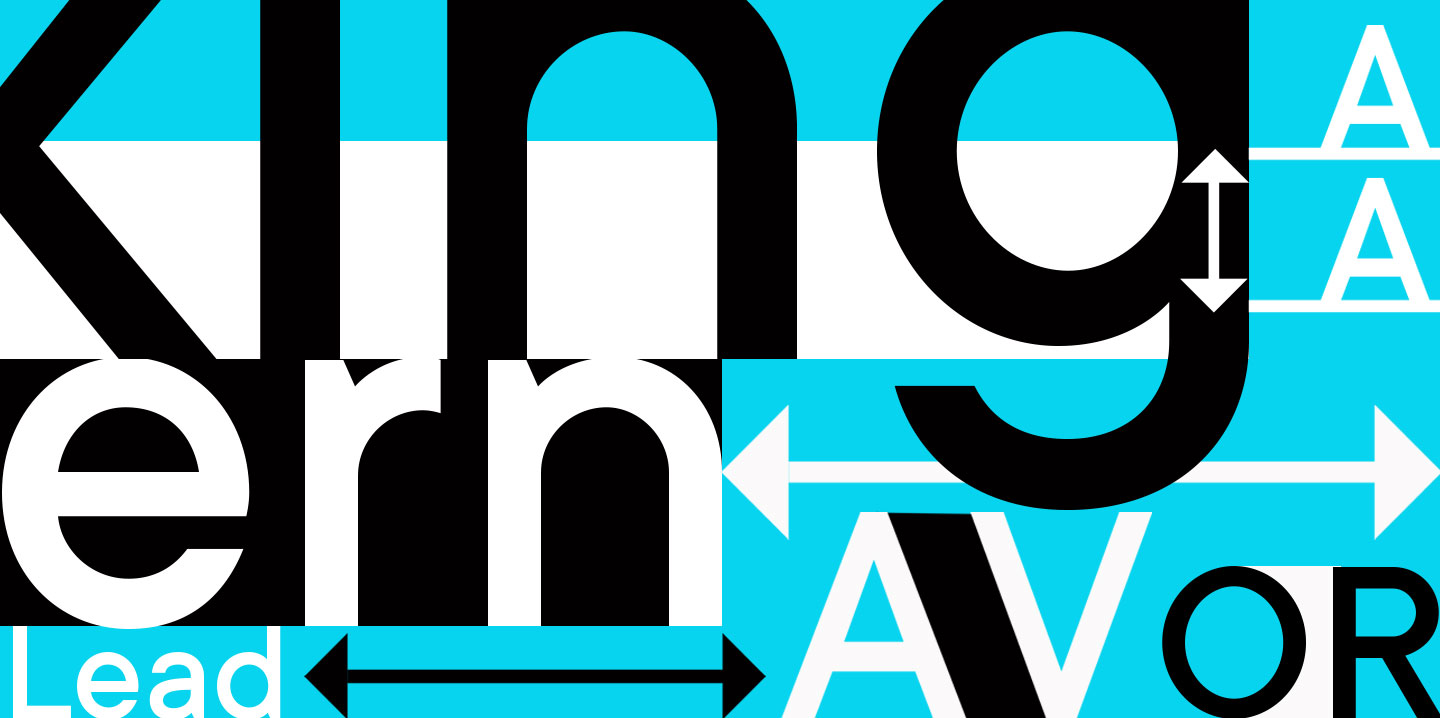
Kerning definition and significance
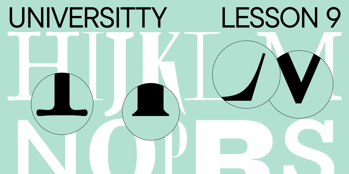
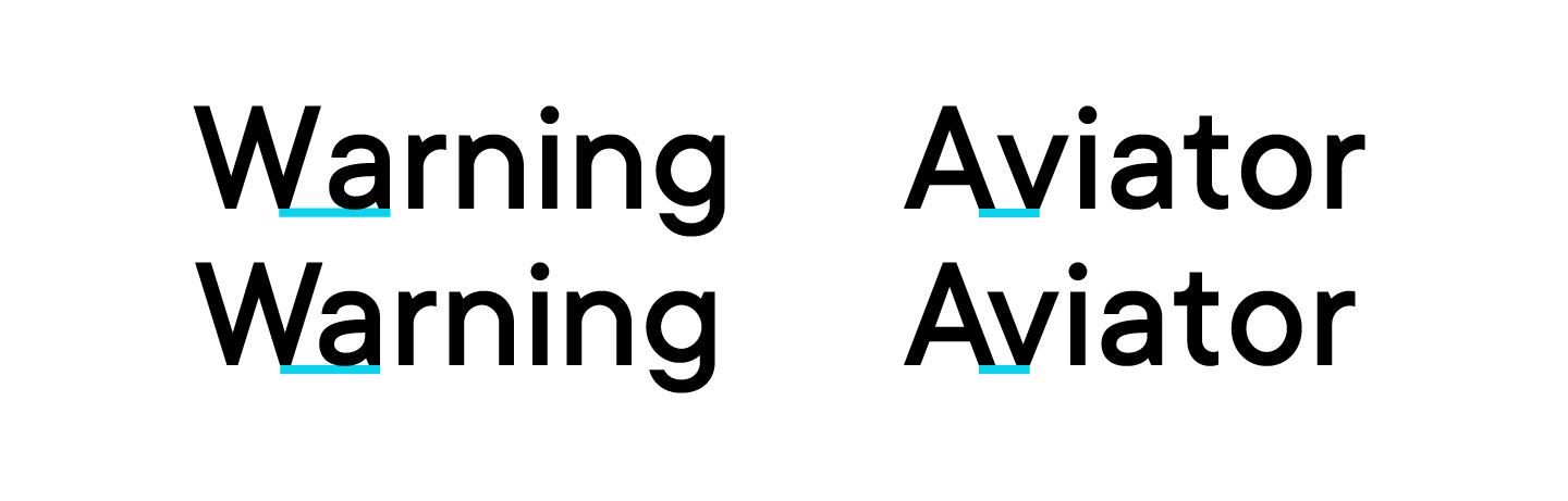
Kerning refers to the selective adjustment of spacing between two characters based on their shapes, aiming to create a visually uniform typesetting.
Kerning is a configuration of the distance between two adjacent symbols (punctuation marks, numbers) or letters. It serves to balance the rhythm of the text and make it evenly formatted. Every font symbol is unique; that’s why when equal spacing is applied between them, the text has an inconsistent look. This visual irregularity can be compensated by adjusting kerning.
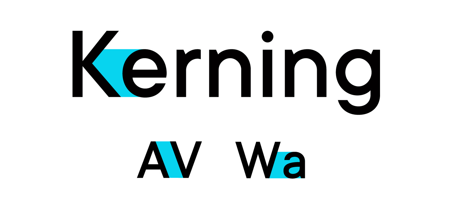
To an ordinary user, small changes in kerning might go unnoticed in the font. However, it influences the visual perception of the text or design where the font is used. Kerning also directly impacts readability. If you take a look at a text block set with a font with kerning and without it, you will see that the second one is not as good.
How to adjust kerning?
Like aprosh, kerning is configured by the font developer at the stage of designing the font. This process is carried out in specialized font editing software, like Fontlab, Glyphs, and more. Users can’t typically adjust kerning after the development process is finished, only with some rare exceptions. For example, Adobe software has this possibility but only for specific pairs of adjacent characters, meaning that if the same character pair exists in several places in the text, the changes from one of them don’t apply to the others.
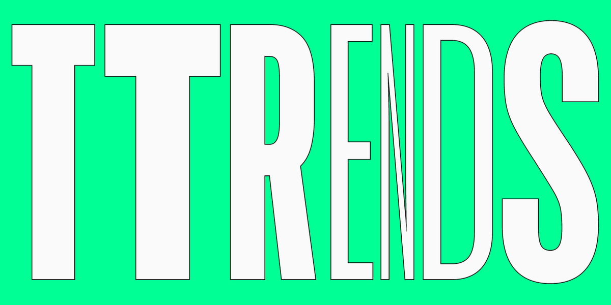
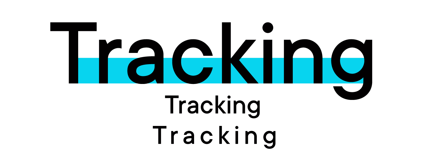
What is tracking (letter spacing)?
Tracking is the distance between all symbols in the font. Tracking allows designers to adjust this spacing evenly, making the intervals between letters larger or smaller. Meanwhile, the text maintains a balanced look thanks to kerning, which makes these two concepts so firmly bound.
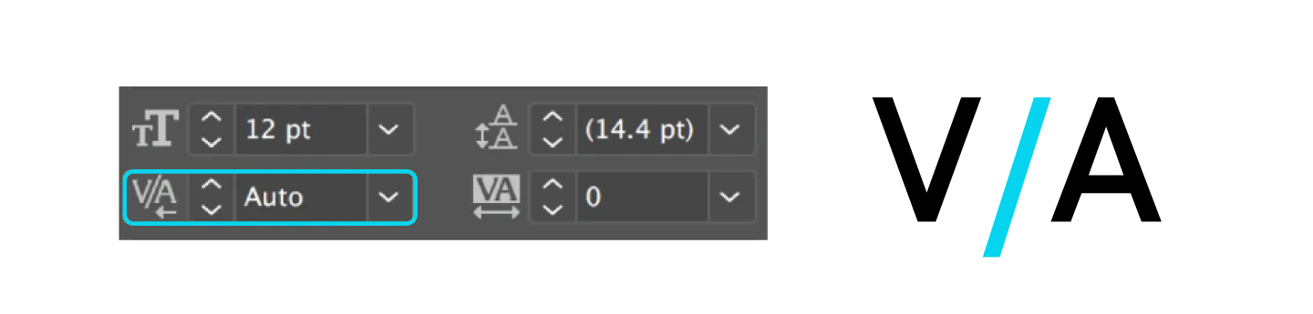
How to adjust tracking?
Type tracking, like leading, is the function that any user can adjust independently while working with the text. This can be done in a variety of design and text editing programs.
For instance, to do this in Adobe Photoshop, you just need to highlight the text block where you want to apply changes. Next, use the «Symbol» or «Control» palette to either manually input or choose the appropriate value for the «Tracking» setting.
Tracking, spacing, kerning and leading: Main differences
To sum up, spacing, kerning tracking and leading are similar concepts united by their connection to transforming distances between characters. The difference is that leading is a vertical interval between lines, kerning allows us to adjust the distance between two specific symbols, spacing is a predefined distance between all glyphs, and tracking is used to change the spacing between all symbols in the text evenly.
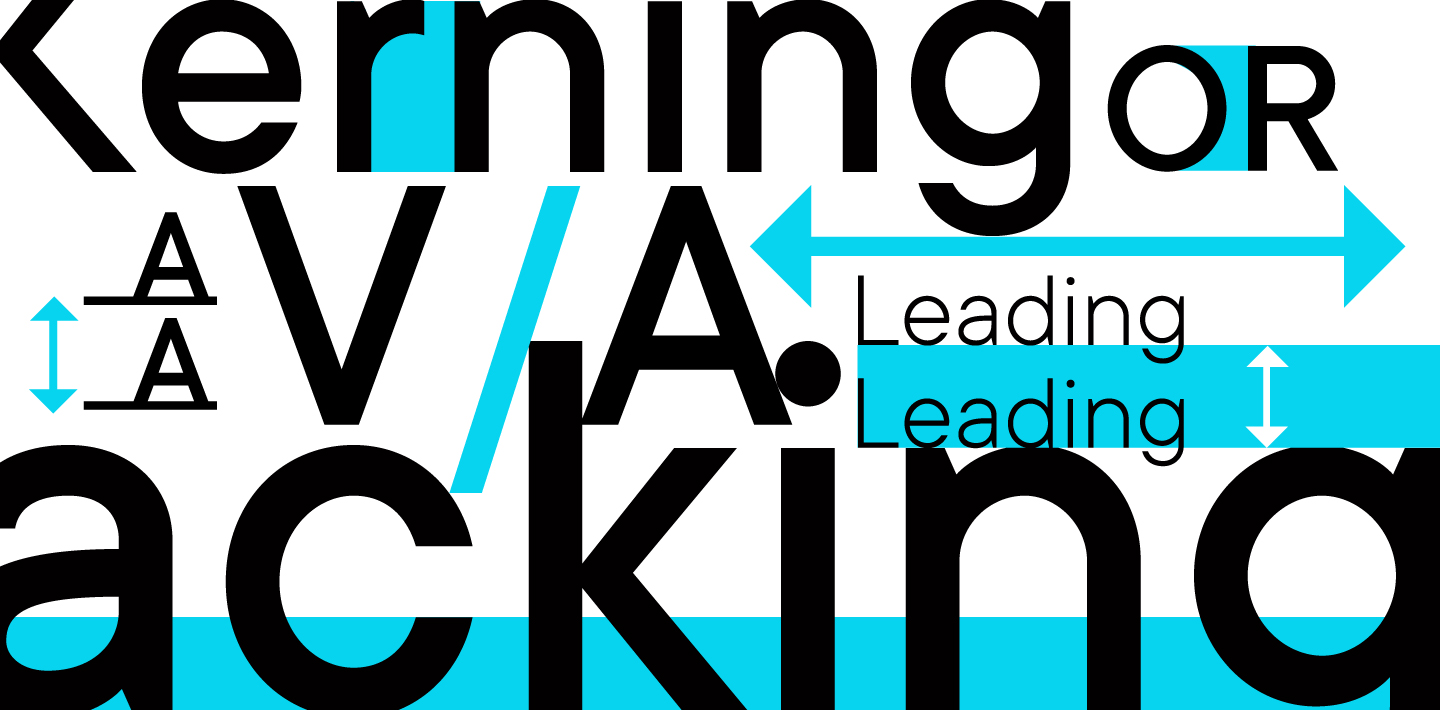
Leading is measured in points, pixels, or as a percentage of the font size. Kerning, tracking, and spacing are measured in arbitrary units.
Leading and tracking can be adjusted by designers or users to suit a specific task while working with the font. Kerning and spacing are configured at the stage of font development and typically cannot be modified by users.
Why are spacing, leading kerning and tracking important?
Typography is the art of arranging text and placing it in an effective way. The main goal of this craft is to resonate with the reader’s perception by making the text visually appealing, well-balanced, and atmospheric.
Spacing, kerning leading and tracking are the tools that allow us to work with the text’s positioning and rhythm. Without them, it’s impossible to create a harmonious-looking and easy-to-read text.
Conclusion
We hope our article helped you grasp these seemingly complicated concepts. If you want to understand other typographic terminology, we recommend exploring our Typography terms dictionary.
FAQ
What is kerning in typography?
Kerning is the process of selectively adjusting the space between two individual letters or characters in a word. It’s used to visually even out the spacing so that it appears uniform, especially in pairs with different shapes (like “A” and “V”).
How is tracking different from kerning?
Unlike kerning, tracking adjusts the spacing uniformly across a whole group of characters—a word, a line, or a paragraph. While kerning solves local spacing problems between pairs of letters, tracking manages the overall density of the text.
What is leading (line-spacing) for?
Leading (also called line-spacing) is the vertical distance between the baselines of adjacent lines of text. It directly affects readability: too little leading makes lines feel cramped and “stuck together,” while too much can make the text appear fragmented and disconnected.
In what cases should I use tracking?
Tracking is used to solve specific typographic challenges:
— To tighten the spacing in headlines or logos.
— To increase the spacing in text set in all caps.
— For copyfitting—adjusting text to fit a specific line length or space.
How do kerning, tracking, and leading affect design?
Spacing—including kerning, tracking, and leading—controls the vertical and horizontal rhythm of your text. It directly impacts:
— Readability: Proper settings make text easy to read and follow.
— Hierarchy: It helps to visually separate headlines from body text.
— Perception: It creates the overall feel of the text, from dense and serious to airy and light.
What are interletter spaces?
The default space built in around each glyph during a font’s development is called the interletter spaces. The font designer sets the interletter spacing in specialized software during the creation process, just like with kerning.
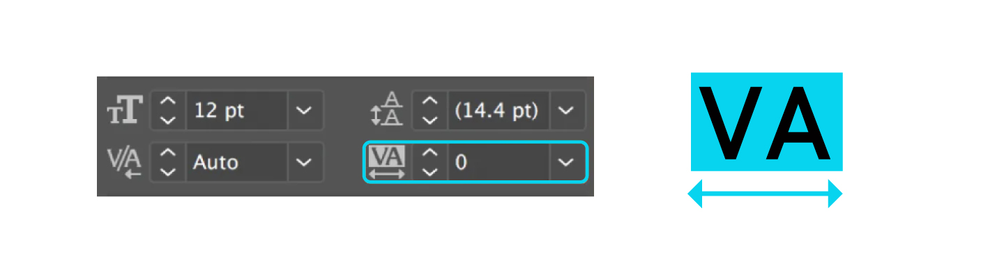
How do I adjust tracking in Adobe Photoshop?
To adjust tracking in Adobe Photoshop, select the block of text you want to change. Then, in the “Character” panel or the control panel at the top, enter a value or choose from the preset options for the “Tracking” parameter (represented by a VA icon).