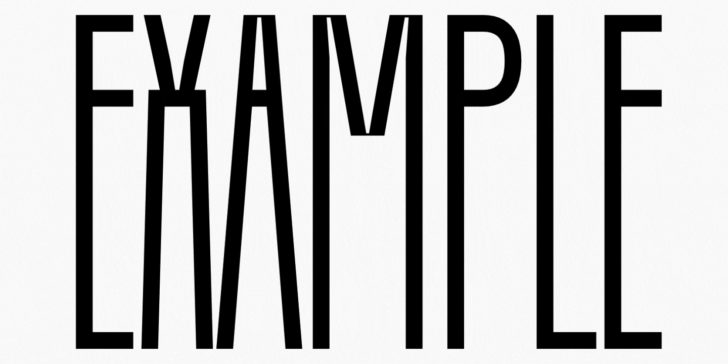
Welcome to the ninth lesson of our «UniversiTTy»! In this series, we guide you through the process of font design step by step. That’s why we suggest going through the earlier articles in the series before diving into this one.
Our last article was dedicated to drawing uppercase characters after dealing with the basic construction logic. This time, we will dive deeper into the issue and move on to the detail refinement.
Your teacher is TypeType Design Lead Antonina Zhulkova. Antonina has been working in font design for more than 5 years now. She’s the concept author and lead designer of projects like TT Neoris, TT Ricordi Allegria, TT Globs, and Ivi Sans Display. Also, she took part in the creation of TT Fellows, TT Fors, TT Interphases Pro, TT Commons, and many other typefaces.
Details and how they influence the entire font
The font is a cohesive visual system. This can be seen on all levels: global (font type, weight, proportions, contrast, general forms) and at lower scales that encompass all graphic choices in individual characters. Let’s find out together how visual details influence the overall perception of fonts.

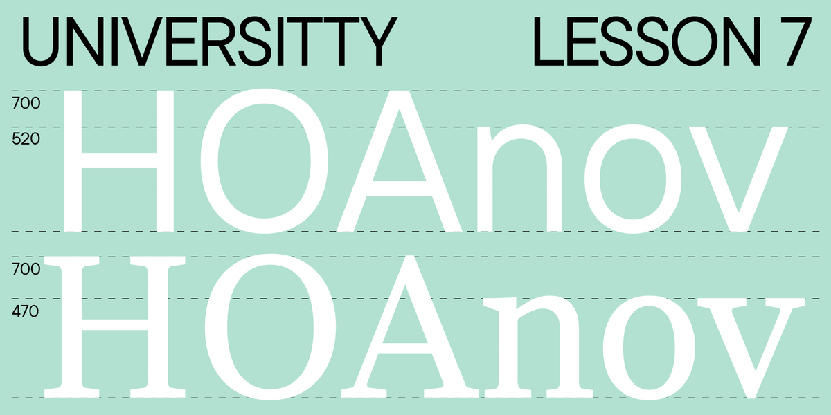
Waistline of a letter
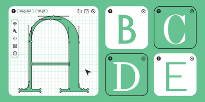
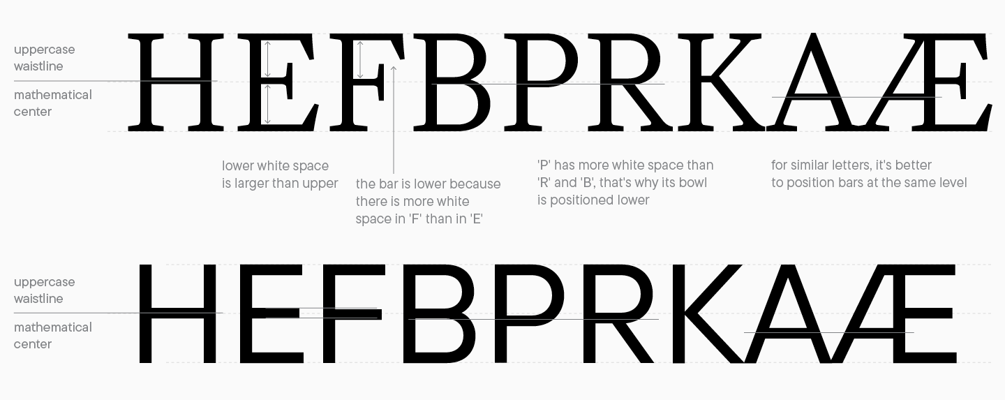
Waistline is a reference line for horizontal strokes in fonts. This parameter helps us create the correct letter structure and add more logic to the font. Also, changing this line’s height can transform the entire visual aesthetic of the font: for instance, a high waistline communicates that the font belongs to the Art Nouveau style, and a low waistline becomes an expressive detail.
It’s crucial to know that the waistline is almost never positioned at the mathematical center of the symbol. If you draw the waistline right through the center, it will seem that the horizontal strokes are positioned lower. This is linked to our visual perception specifics: the upper part of a character always looks heavier to us than the lower part.
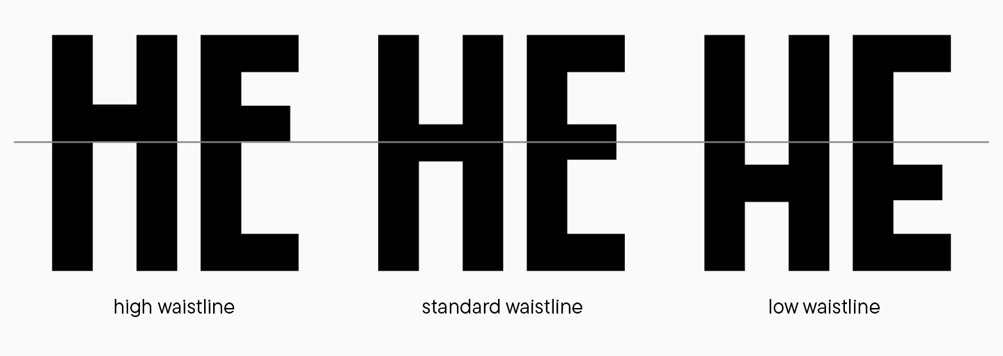
It’s best to draw the waistline in a way that makes similar-looking characters follow the same construction logic. This will not only optimize your work process but also contribute to a more uniform look of your font’s graphics.
Balance of graphical elements
We have already touched upon this topic in our previous article when we explored letter groups and their relationship. Now, let’s dive deeper into this.
All graphic techniques in the letterforms should correlate with the objectives and characteristics of the font. This concerns both large forms, like oval ones, and the smallest ones. While developing fonts, designers often overload letterforms with details to show their skills. You should avoid this tendency and not let unnecessary details penetrate your font.
Let’s examine several issues you may face while working on your project. This list doesn’t factor in all the details but can suggest a course of action.
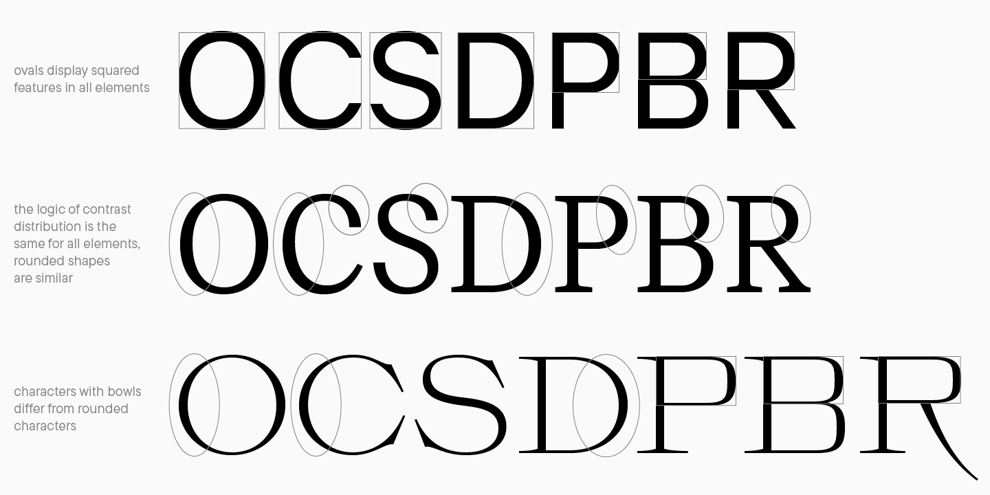
Rounded ovals
Oval and bracket forms in a font should harmonize well with each other: this is an essential style-forming element that influences the overall perception of the font. When working with these details, it’s recommended to subdivide characters into groups and work on each of them.
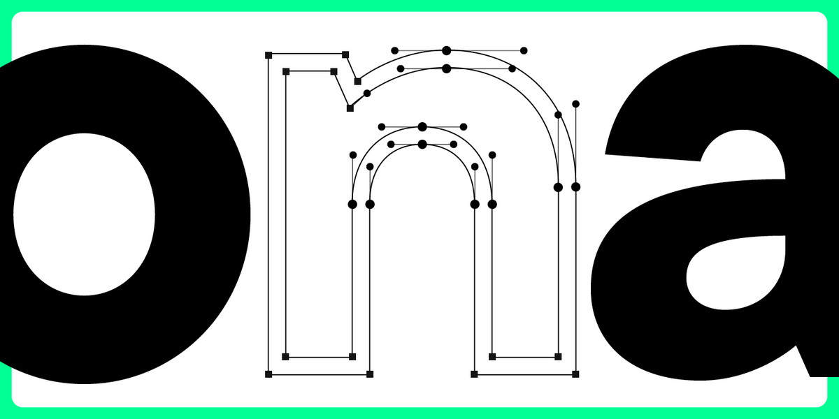
To build a correct graphic system, you should determine the character of the rounded forms in the font: they might be closer to a geometric circle (like in geometric sans serifs), approach an oval form, have a squared character, or even be completely straight with a minimal radius of curvature. All letters with rounded elements depend on the specific bracket form.
However, forms of ovals, bowls, and brackets don’t have to be identical to one another. For example, characters with bowls can vary in shape from round glyphs. This is a very expressive design choice, so use it thoughtfully. In the case of contrast between forms, it’s recommended to add this element to the corresponding group, not to just one letter.
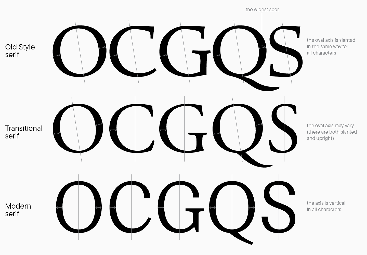
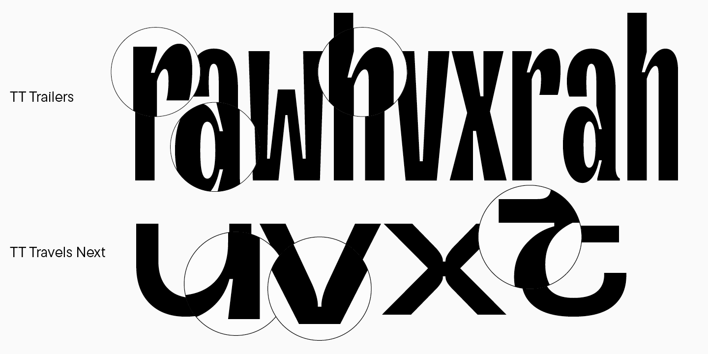
Round character contrast in serif fonts
Working with contrast in serif requires close attention to details and understanding the influence of the writing tool on glyph forms. In our seventh lesson, you read about different types of contrast: the one between broad nib and pointed nib. This parameter impacts both stroke variations and contrast distribution on the glyph axis.
The oval axis is an imaginary line passing through the thinnest parts of the rounded characters (this dictates whether they are positioned vertically or at an angle). If you do calligraphy, you should know how forms change depending on the writing tool and its position on the paper. Fonts follow the same logic: if you design a font based on calligraphic principles or belonging to the old-style serifs, all rounded characters should have a specific slant, and the widest stroke spots should be perpendicular to this slant. To achieve consistent and beautiful glyph design, it’s recommended to consider the contrast type and follow the chosen stylistic direction.
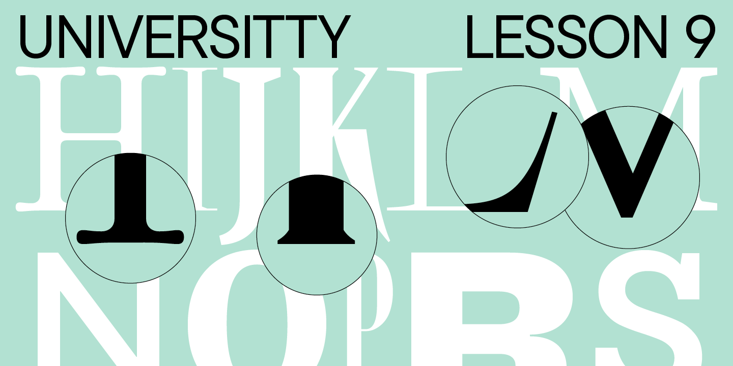
Serifs
Serifs are a remarkable distinct feature of Antiqua fonts. A serif is a small stroke at the end of a stem. There are numerous kinds of serifs. By using this element in your font, you can modify its character and mood, make typesetting more or less expressive, and add personality to your typeface. I recommend Robert Bringhurst’s book The Elements of Typographic Style to learn more about serifs.
According to the most basic classification of serifs, they can be sorted by types of Antiquas. In dynamic and static fonts, serifs can have a different look: in dynamic Antiquas, they are often asymmetrical and follow the writing tool’s logic. In static fonts, they have almost geometrical construction.
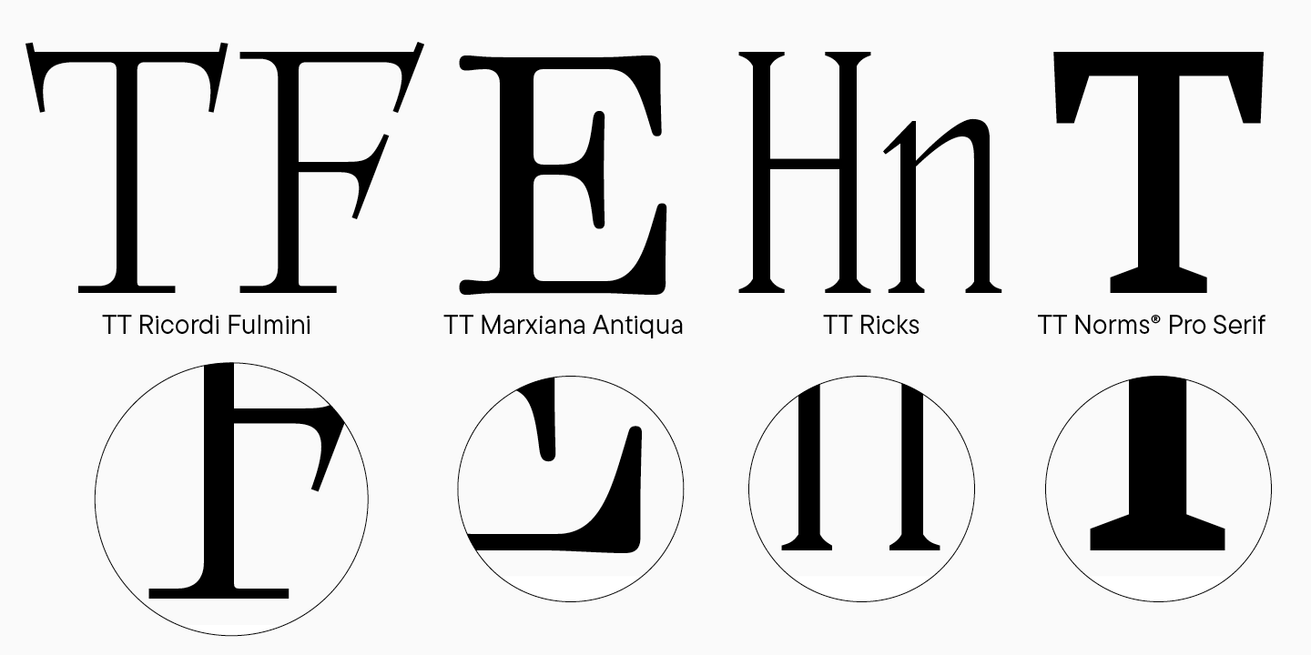
The length and weight of serifs also depend on the font’s style. In modern, especially display fonts, the variety of serif forms is striking, so let’s better look at some examples. They may be symmetrical or asymmetrical in one glyph, have the same weight, or be tapering, rounded, triangular, diamond-shaped, etc.
Terminals
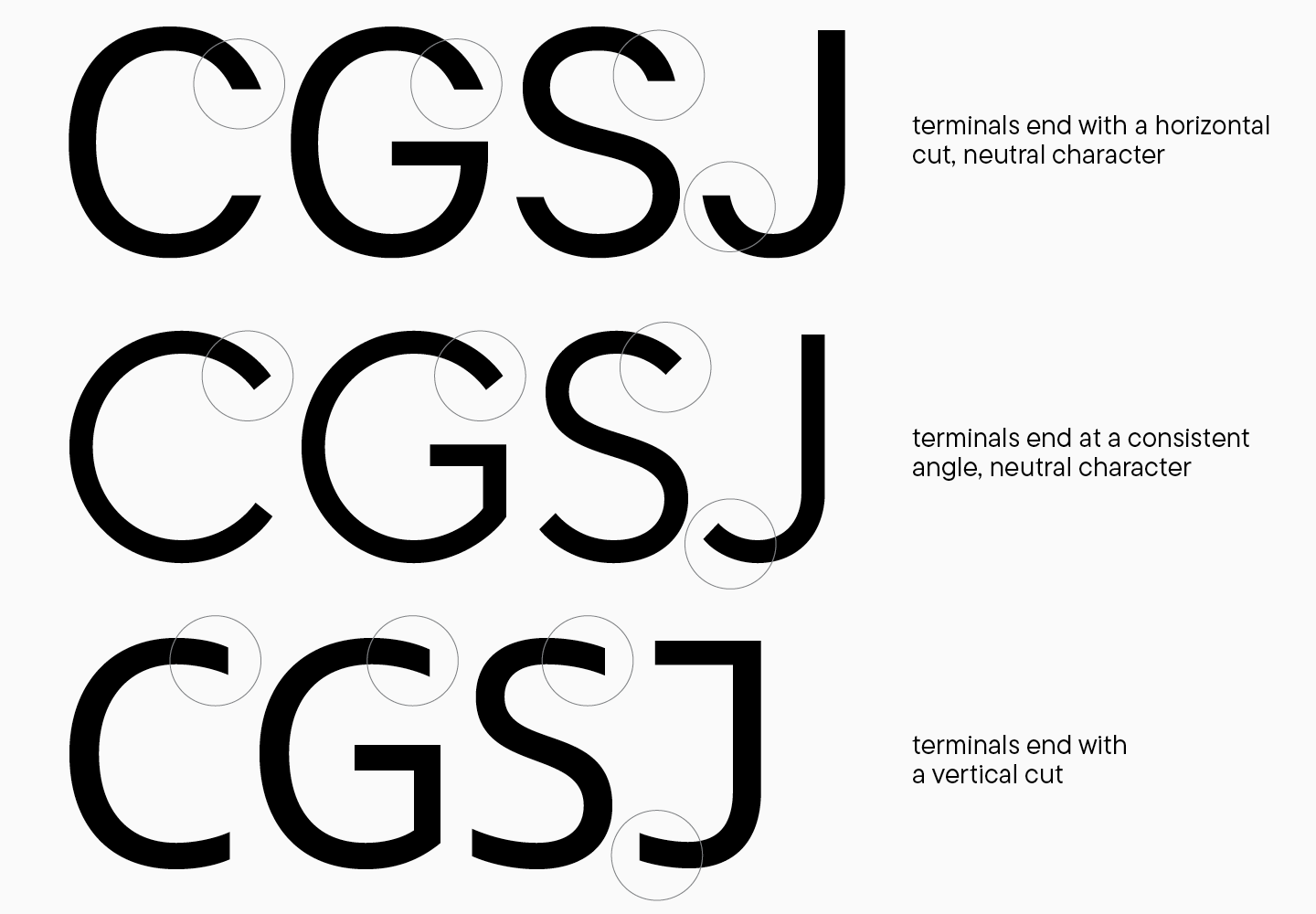
A terminal is a straight or curved stroke end. Terminals in glyph design are also crucial elements that should reflect the logic of construction. The shape of terminals largely depends on the extent of glyph openness (aperture) and the font’s style. When working on terminals, two things require thought: the overall terminal form and its ending. The form of the stroke ending causes the fewest problems as it follows the entire glyph form and depends on the general font characteristics.
In sans serifs, stroke endings are less variable than in serifs. They may be neutral, complementing the overall form (which is important for text fonts) as well as more eye-catching. There are numerous graphic solutions for terminals; however, it’s not recommended to combine several approaches in one font. This is especially true for terminal endings, or so-called «cuts.» They may end perpendicular to the element’s direction, vertically and horizontally, or have an angle—and in this case, angles should be similar within the entire font. Terminals can become an expressive feature in sans serifs, too, but the way of using this technique will depend on the task.
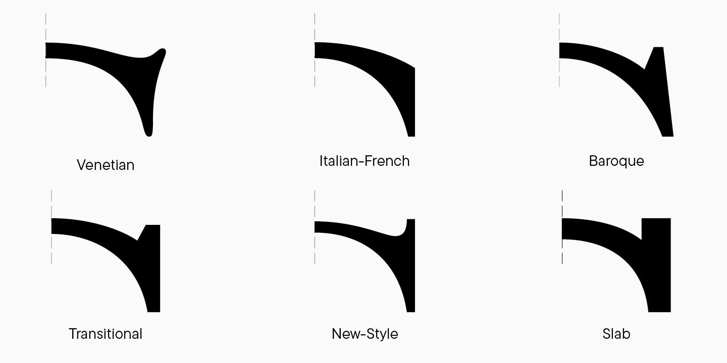
In Antiquas, there are more options for stroke ends: various kinds of serifs and teardrops. Teardrops are most often used in lowercase characters, so we’ll address them later on; among lowercase characters, they may appear in the letter J. Serif types in Antiquas are heavily influenced by the font’s stylistic: the more similar it is to the historical prototypes, the more prominent the influence of the writing tool; in modern Antiquas, the approach to stroke endings isn’t so strict. To decide on the terminal forms, you have to assign your Antiqua to a group and find out how serifs and teardrops look in similar fonts. It’s also helpful to revisit the sketches and review this part again through drawing.
Junctions and ink traps
Now, let’s turn our attention to less noticeable but equally important details. Adding ink traps and junctions with horizontal segments at the intersections of the strokes is a common practice in glyph design. At its core, it’s a single conceptual element; the difference lies solely in its «scale» within the character. What sets ink traps, also called compensators, apart is that this detail is larger and is included in the main glyph strokes.
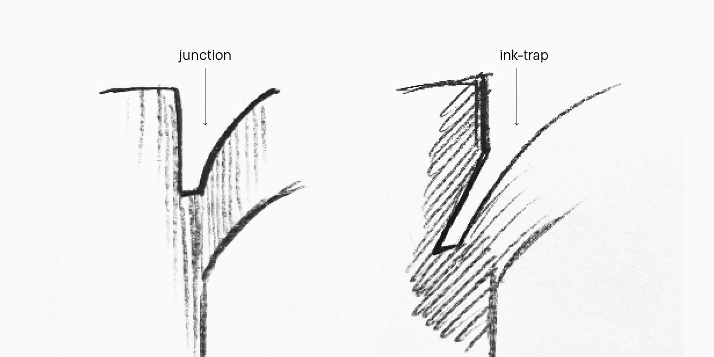
During the metal type era, these elements served as functional details, allowing designers to add a small amount of negative space to the character and avoid the ink dispersion effect at the stroke intersections. Now, the times have changed, and these details have become separate design elements.
Junctions with horizontal segments can be both relatively small and large graphic elements. My recommendation is not to make them smaller than 5 points in size when working in the 1000 units per Em system, or else you will face problems with contours during file export. Junctions should also keep following the general logic that will repeat for both junction sizes and their positions, so they must appear in places with similar contexts.
Glyph character
Let’s return to the creative part of drawing. In this section, I explained how to bring consistency to the symbol graphics. At first glance, it may seem that drawing glyphs means suppressing all creative impulses. In fact, this is not true. Constructing a unified logic within the font’s graphics is a tool for highlighting the beauty of letters. Amid the overall uniformity, stylistic discoveries work better.
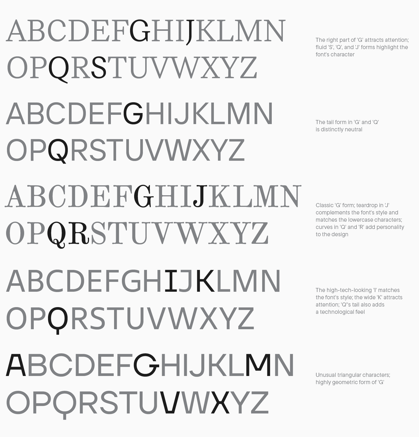
So, what methods can be used? First, work with the letter details and look for unconventional solutions. They will be mainly influenced by the font’s style, for example, a historical reference or your original findings. You can focus on specific letterform elements, such as the form of J, G, the tail of Q, the leg forms of R, K, and the fluidity of S. This point is closely tied to the notion of «semantic rhyme,» which must appear in all glyphs across the typeface. To make your hand-made, intricate characters with unusual forms appear cohesive, you should maintain this graphic choice in any other letter of the same case. Here are several examples of that with personality-filled letters in fonts. You can work on your watchfulness by analyzing semantic rhymes in each example.
Anything from the already described font characteristics can become an expressive graphic element: proportions, contrast, serifs, terminals, and much more. Making artistic choices is one of the most fascinating tasks of font development, and gathering theoretical knowledge will only amplify the range of your possibilities.
At first, font design seems very complex and challenging to grasp. However, you shouldn’t be worried—uncover this knowledge step by step, and you will achieve your goals! Using our uppercase letters as an example, we explored all key principles of glyph design in the entire font. This knowledge is your foundation to progress with font design and refinement.
In the following article, we will focus on drawing lowercase characters. Stay tuned!