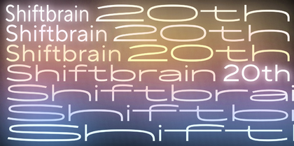
Choosing the best font for reading is a challenge we face more often than it may seem. A readable font may be needed for large-scale projects, like creating a website, designing a book, or developing a mobile app. In the smaller, day-to-day aspects of life, the question of choosing the best reading font is likely to arise as well.
What font is the most convenient for reading? What makes the font easy to read? Which fonts are more suitable for reading books, and which ones are better for on-screen reading? In this article, we are focusing on answering these and several other questions.
Why is it essential to use easy-to-read fonts?
Imagine sending off the product you’ve put so much effort into to a customer. You chose a beautiful package for it and promised to deliver it as soon as possible. Unfortunately, the delivery service is slow, and the item gets dropped and dirty on the way. The contents of the package stay the same, but the customer wastes time and patience waiting. Then, their initial good impression is entirely spoiled by looking at a dirty and beaten-up package that takes much effort to open. The customer is not likely to order anything from you anymore.
And a font in this analogy is the delivery service. It influences how easy and pleasant it will be for a user to perceive the information your text is conveying. Some fonts are convenient for fast reading, and others are difficult to read and distract users from the text’s meaning.
However, it doesn’t mean that some fonts are clearly good and others are clearly bad. It all boils down to where you use them: a perfect font for a banner may not be your first choice for a website, and the best font for layout design may not work as efficiently on a sign.
That’s why we will first determine what kinds of fonts suit specific purposes.

What fonts are best for reading?
In terms of purpose, all fonts can be split into display and text.
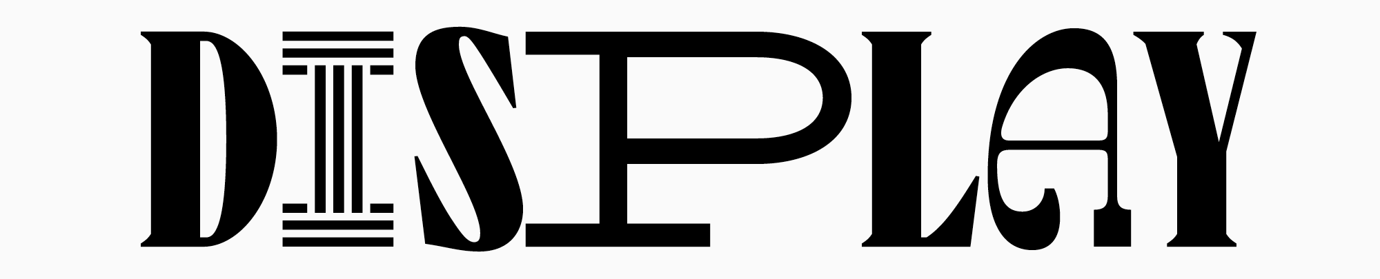
Display fonts are vivid and expressive, unusual and a bit odd visually. They attract attention and are used to accentuate text or headlines, so they are often called headline fonts. These fonts make a bold impression in standalone large lettering; however, they aren’t convenient to use for entire text blocks as the eye focuses too much on individual letters, which impedes the understanding of what is written. Display fonts are often full of peculiar details that are fascinating to look at in a large point size. In smaller point sizes, these details become hardly visible. In addition, they may cause the letters to blur, making the text messy and hard to read. One of the key characteristics of display fonts is their high contrast, which makes them so expressive but, at the same time, still harder to read in smaller point sizes.
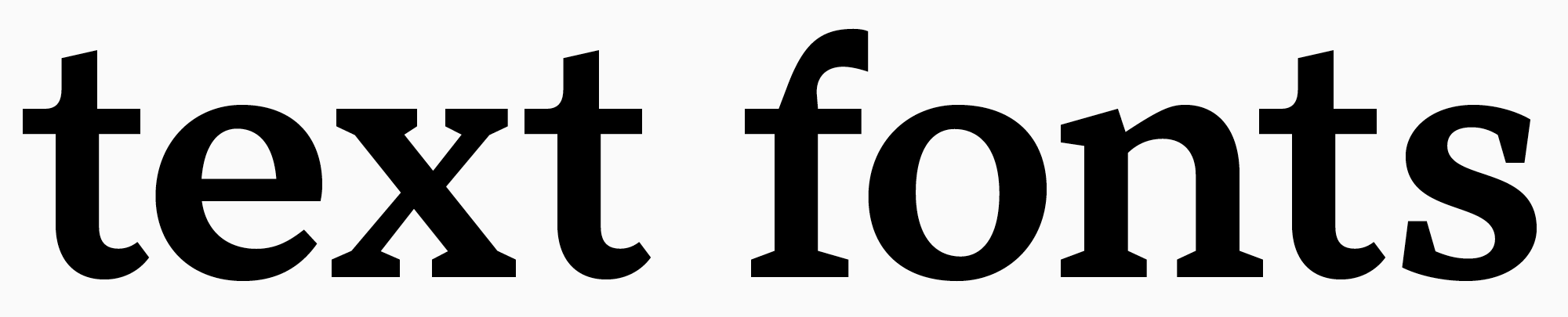
Text fonts, in turn, serve exactly for typing large text blocks. They are more neutral and calm, with simple designs, low contrast, and no abundance of details. All that makes them more legible in smaller point sizes and allows the eye to smoothly track across the line without getting distracted by the glyph shapes. Besides, text fonts are easy to read in small point sizes. So, this particular category of fonts is the focus of this article.
It is commonly believed that fonts without serifs are better for reading than the ones with serifs. This isn’t true: serif fonts, or Antiquas, can easily be used for texts, and serifs themselves can support text readability. Thus, it’s essential to understand what exactly influences the font readability.
What makes a font easy to read?
Here, it’s essential to differentiate the concepts of legibility and readability.
When using the term legibility, we are referring to the definition and clarity of individual characters as well as the precision of their contours, which influences how easily different letters can be distinguished.
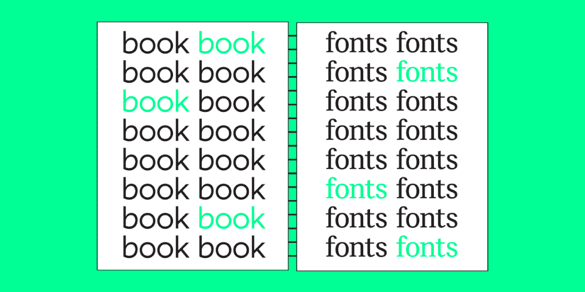
Readability is influenced by how characters interact with one another, meaning the appearance of the body text during typesetting. This characteristic signifies how comfortable it is to read a large text block.
To begin with, the font should be simple enough to be readable. The easiest-to-read font is simple and rather neutral. Excessive elements blur the characters in small point sizes, and an overly vibrant personality distracts attention and interferes with reading.

The optimal choice for reading fonts is those with rounded contours, as they are better perceived than squared ones. The contour contrast should be visible enough but not too much. An essential role is played by proportions: they must be neutral (when the width of the letter is similar to its height, with a subtle vertical emphasis).
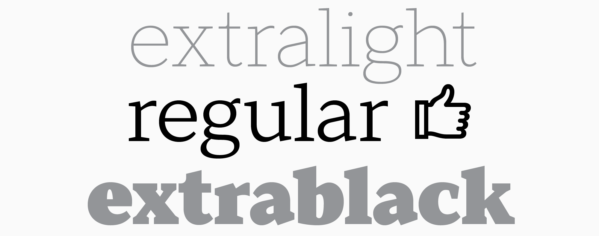
The weight of the lines is also important, as fonts with standard weights are better for reading. That’s why the best option for typing is a Regular font style.
In terms of characters’ width, it influences readability directly as well, so an intermediate option is also recommended. Some of TypeType’s popular typefaces have several subfamilies. The characters in the Normal subfamily have average width, which is the most convenient for text perception. There are also Condensed, Compact, Normal, Expanded, and Mono subfamilies.

Another key role belongs to letter spacing. Intervals that are too big or too small will significantly impede reading.
If your text is made for reading on screens, the font must be high-quality and advanced. Make sure it scales well across multiple devices so the words stay well-defined and legible when adjusting the screen zoom level.
Best reading fonts
We selected our Top-10 fonts suitable for typing large text blocks from the TypeType collection. They are all equally suitable for electronic formats (be it a phone screen or an electronic book) and text that will be printed on paper.
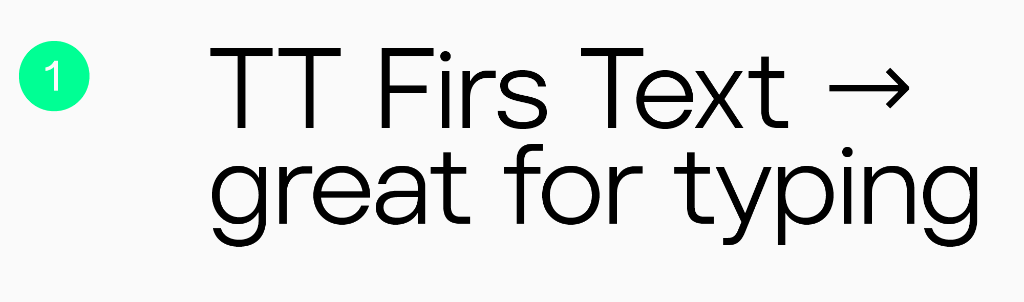
TT Firs Text
Elegant geometric sans serif TT Firs Text was made for using in text blocks. The font’s design was based on our popular typeface, TT Firs Neue. TT Firs Text kept many of the traits of its reference while being adapted specifically for text typing: every detail is considered for enjoyable reading. Due to more standardized typesetting, the font remains easy to read in smaller point sizes. This minimalist font is perfectly suited for websites and book design.
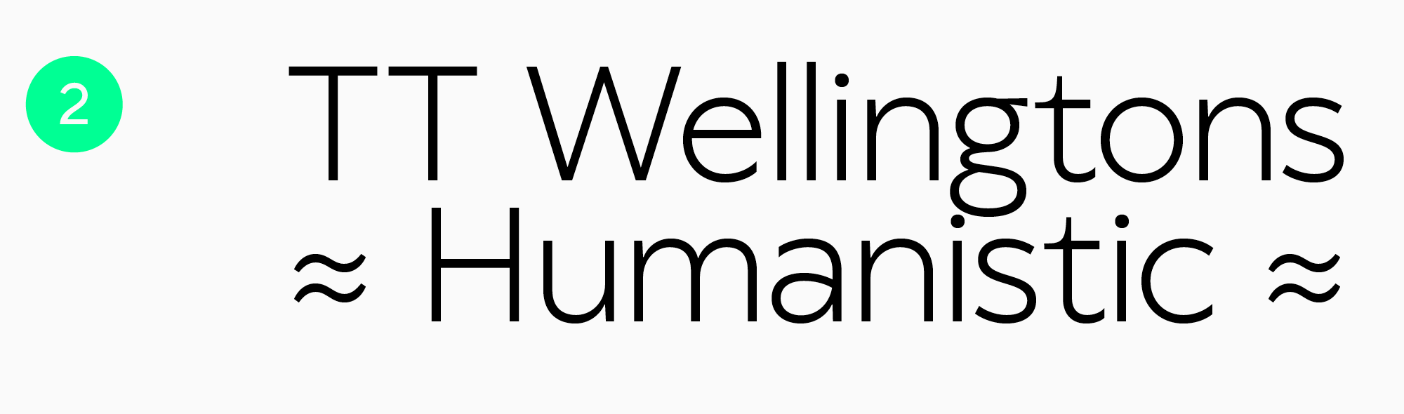
TT Wellingtons
TT Wellingtons is a Humanist sans serif with shapes that allude to the movement of the wide-nib pen. It gives an aesthetic look to text blocks and can be used in the web industry and for printed materials.
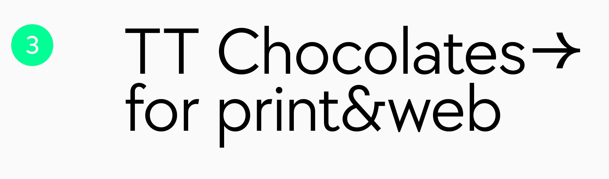
TT Chocolates
Text sans serif TT Chocolates is a visually appealing font with well-balanced proportions and a dense typesetting. It has an aesthetic, friendly, and minimalist look. This makes TT Chocolates an excellent choice for printing, and due to the manual TrueType hinting, it’s also well-suited for web design.
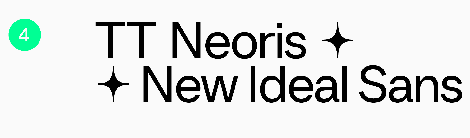
TT Neoris
Neo-Grotesque TT Neoris is an ultra-modern functional font for a multitude of tasks, including text typing. It’s neutral and easy to read while looking fresh and unusual.
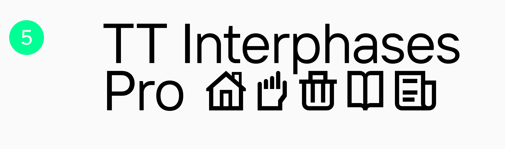
TT Interphases Pro
Convenient and modern Neo Grotesque TT Interphases Pro is the optimal choice for screens. This font was specially designed to excel in interfaces. Its static proportions make the text look smooth. The legibility of this font on screens is enhanced by adding height to lowercase characters. And due to its neutral mood and squared shapes of the round characters, it’s comfortable to read in small point sizes, so the font is also well-suited for printing.
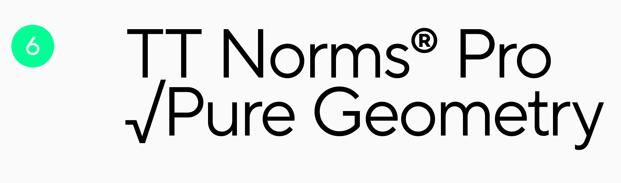
TT Norms Pro
TT Norms Pro, an all-purpose functional sans serif, is one of the studio’s bestsellers with a vast use range. It’s user-friendly and equally convenient for web and printing. It includes a large number of characters, an impressive feature set, and supports numerous languages. This font is simple and aesthetic at the same time.
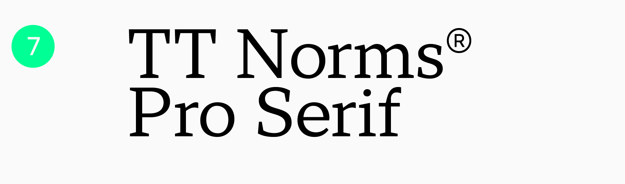
TT Norms Pro Serif
TT Norms Pro Serif is a functional serif with open apertures and low-contrast proportions created with TT Norms Pro as the foundation. Even small text typed in this font will look excellent and read well. The font can be used in website and printed material design as a standalone font or paired with its predecessor.
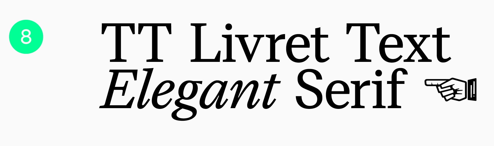
TT Livret
A modern serif TT Livret has three subfamilies: a high-contrast Display, a moderate-contrast Subhead, and a low-contrast Text. The name of the third subfamily speaks for itself: it suits perfectly for typing large text blocks. Also, TT Livret Text has static proportions and a calm personality. Oval characters, loose spacing, and open apertures—all these features make the font highly comfortable for reading on screens or paper.
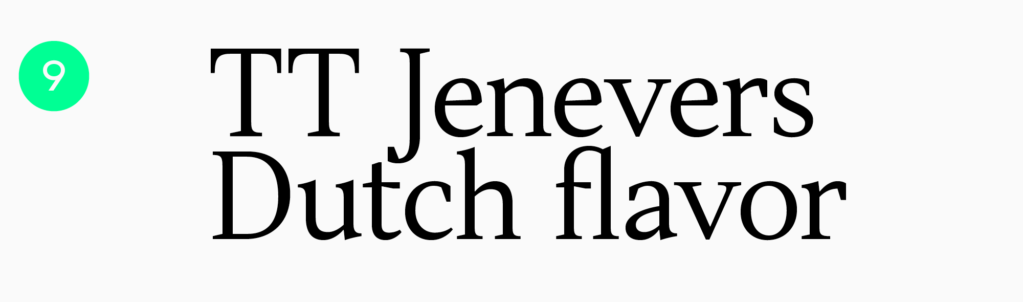
TT Jenevers
A Dutch New-Style serif, TT Jenevers, is rather expressive and looks unusual. However, due to large semi-ovals of lowercase characters, letter spacing is smooth, making the font ideal for large text blocks. This font adds a touch of style to both printed and digital publications, all while ensuring an effortless reading experience.
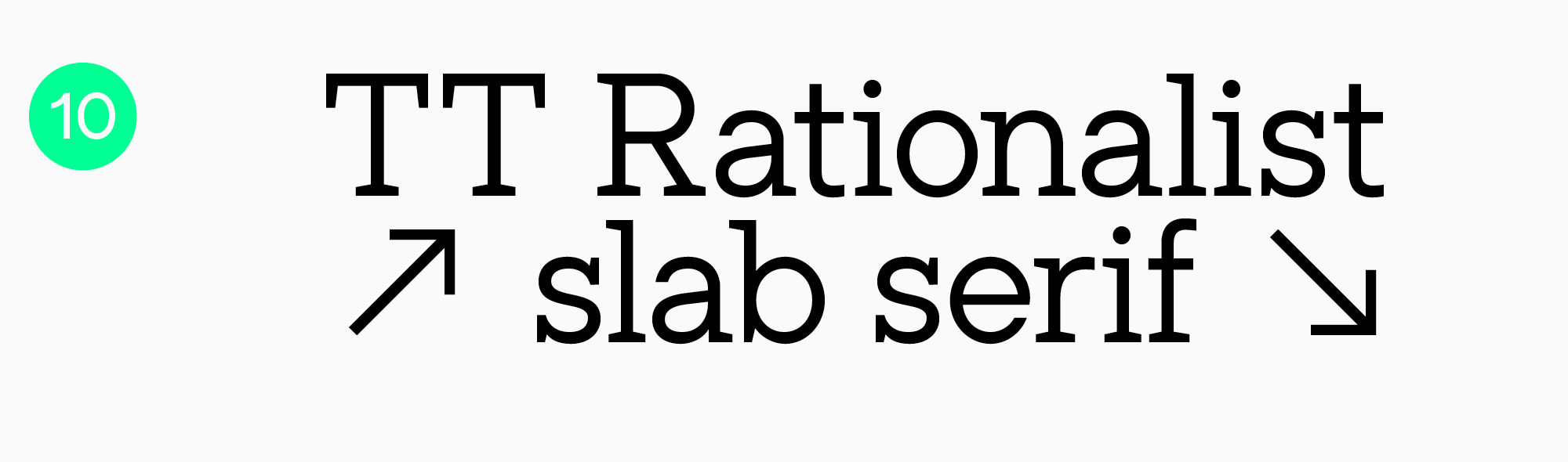
TT Rationalist
TT Rationalist is a functional and captivating slab typeface with elegant rectangular serifs. It can be used in headlines as well as text blocks. This font looks especially aesthetic in printed materials and is equally suitable for electronic books and websites.
Conclusion
We see fonts all the time in a variety of places: on websites, in apps, books, and magazines, on packaging, TV screens, and banners. Regardless of your text’s placement, if readability is key, opt for high-quality and legible fonts. We hope our recommendations were helpful to you!
FAQ
What font features improve long-form reading comfort?
Long-form reading benefits from calm proportions, clear letterforms, easy differentiation between similar characters, and an even line rhythm. Moderate character width and well-balanced spacing also help the eye move smoothly through the text without stumbling over every letter.
Are serif fonts always better for printed books?
Not always. Serifs can help guide the eye along a line, but the actual result depends on the specific typeface, size, paper, and print quality. In some cases, a sans serif will feel cleaner and more contemporary.
How does screen resolution affect reading font performance?
On screens, a typeface’s technical performance matters: how well it scales and how clearly it holds up at different sizes. What looks perfect on one device may start to break down in thinner areas on another, so testing in real conditions is essential.
What is the ideal font size and line spacing for optimal readability?
There is no single universal number, but the rule of thumb is simple: the font size should make letters easy to recognize, while the line spacing should separate lines without making the text feel disconnected. Start with a comfortable base size and increase the leading if the text feels dense or the screen is small.
Do variable fonts improve reading experience?
They can, as long as you use that flexibility with purpose, for example by adjusting weight and width for a specific screen or text size. This makes it easier to maintain consistent readability across different conditions without jumping between separate font files.
How do fonts impact reading speed and comprehension?
The easier the letters are to recognize and the steadier the line rhythm, the less effort the brain spends on decoding, and the faster reading becomes. Complex forms, tight spacing, and uneven stroke weight tend to slow readers down and cause fatigue more quickly.
Which fonts are recommended for readers with dyslexia?
Typefaces with simple letterforms, clearly distinguishable characters, and more generous spacing are often recommended. What matters most, though, is testing with real readers: there is no single universal solution, but the goal is always to reduce confusion between similar-looking characters.
Are system default fonts optimized for long reading sessions?
Often yes: system fonts are designed for screens and usually render well and scale reliably. But when a stronger brand identity or broader language support is needed, a custom typeface can perform even better, provided it is technically well made and carefully tuned.
How does contrast ratio interact with font choice?
Contrast directly affects how thick the strokes appear: in low-contrast settings, thin type can disappear, while in very high contrast it may start to shimmer. That is why typeface choice and contrast should always be tested together, not only in headlines but also in long paragraphs.
What font characteristics reduce eye strain in dark mode?
Slightly heavier weights, open letterforms, and carefully adjusted spacing usually make text more comfortable in dark mode, since letters are less likely to blur together against a dark background. Very thin styles and excessive internal contrast are best avoided, as they tend to create more shimmer.