In our font studio’s 10-year journey, we’ve designed 1.500.000+ glyphs. Try out TypeType fonts online!

We Have a Digital Font Catalog! Looking through our typefaces has become even more convenient. PDF Catalog of TypeType Fonts

Use font subscription! The full font library of 75+ fonts will always be at hand. See more

Buy font Try out the font

TT Berlinerins

Single style: from $29 Full family: 2 styles from $36

Any questions about the font or licences? Write us.

Choose the fonts you want

Choose the fonts and licenses you want.

Then click the "Buy font" button.

25% OFF when you combine Desktop and Webfont licenses

Package offer: Save 38% on 2 styles
from  $36
from $29
from $29

Any questions about the font or licences? Write us.

Select font licenses

You must specify a font package or style before selecting a licence

Choose the licenses you want

The license is suitable for anyone who plans to use the font in logo design, images for websites and social media, as well as in print media, souvenirs, and merchandise.

This license is purchased by the number of workstations on which a designer will use the font.

Desktop license is paid for once. Full license text

On request

If you plan to use the font in headings or text blocks on your project site, choose this commercial font license.

Purchase price depend on the number of site visits per month.

Webfont license is paid for once. Full license text

On request

To use the font in applications for iOS, Android, Windows, Linux and other operating systems.

When choosing a license, we do not count the number of application downloads, but focus only on the number of created applications.

App license is paid for once. Full license text

On request

Suitable for placing banners, digital ads and posters on the Internet, as well as for advertising on social media.

The license options differ depending on the number of ad impressions.

Digital Ads license is paid for once. Full license text

On request

This license is for the use of a font in video content: blogging, on a YouTube or TV channel, in online or offline broadcasts.

Font license options depend on the amount of video content that uses the font.

This license is paid for once. Full license text

On request

Video game developers’ license. Allows you to embed a font in the video game code.

This license is paid for once. Full license text

On request

Suitable for those who will be using the font in e-books, magazines, interactive PDFs, or other publications.

This license is paid for once. Full license text

On request

The license is suitable for use on special sites and applications where users can create a product using the selected font without an additional font license.

This license is paid for once. Full license text

On request

This is the case when a font is not limited to one area of application, and you want to discover all the possibilities it offers.

For those who purchase an unlimited licence, we often make font customisation as a gift.

Unlimited license is paid for once. Full license text

On request
No selected items
Total
$0

TT Berlinerins

About font family

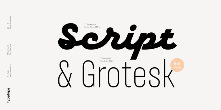
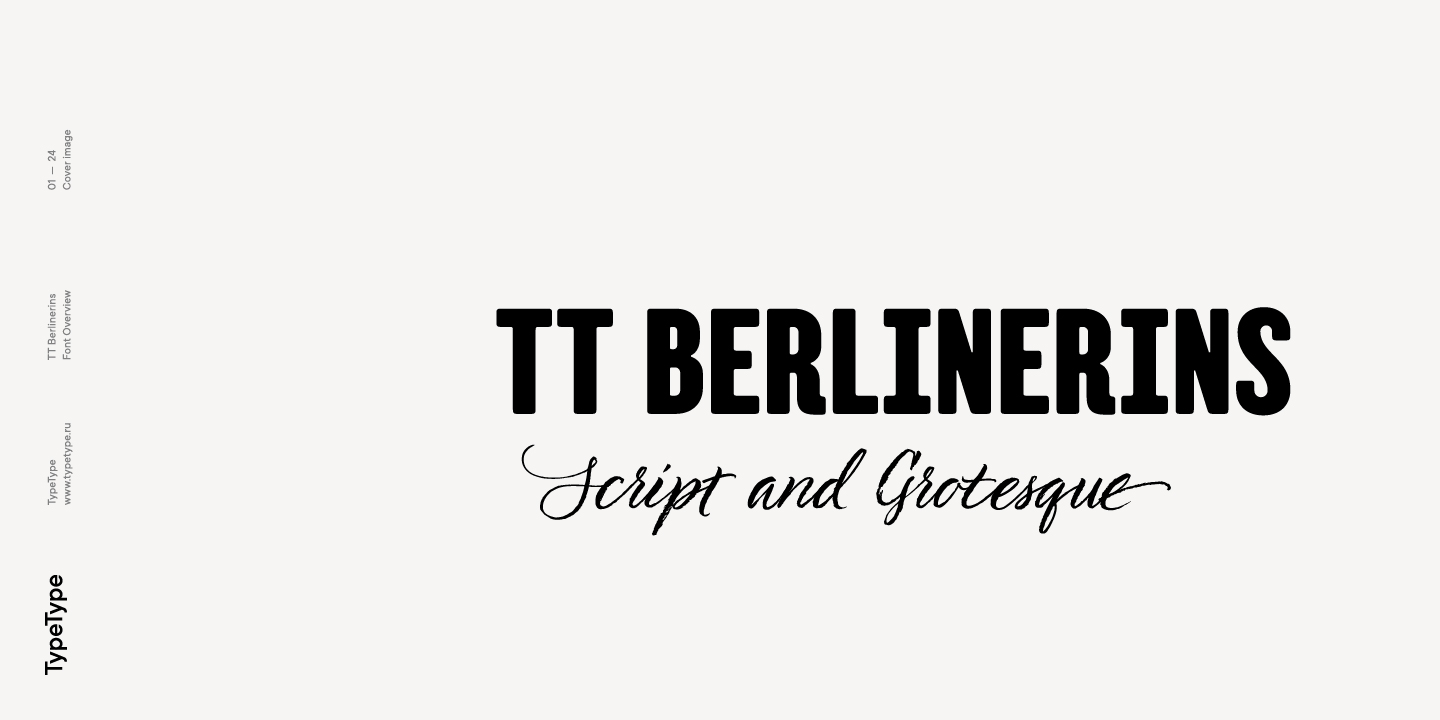
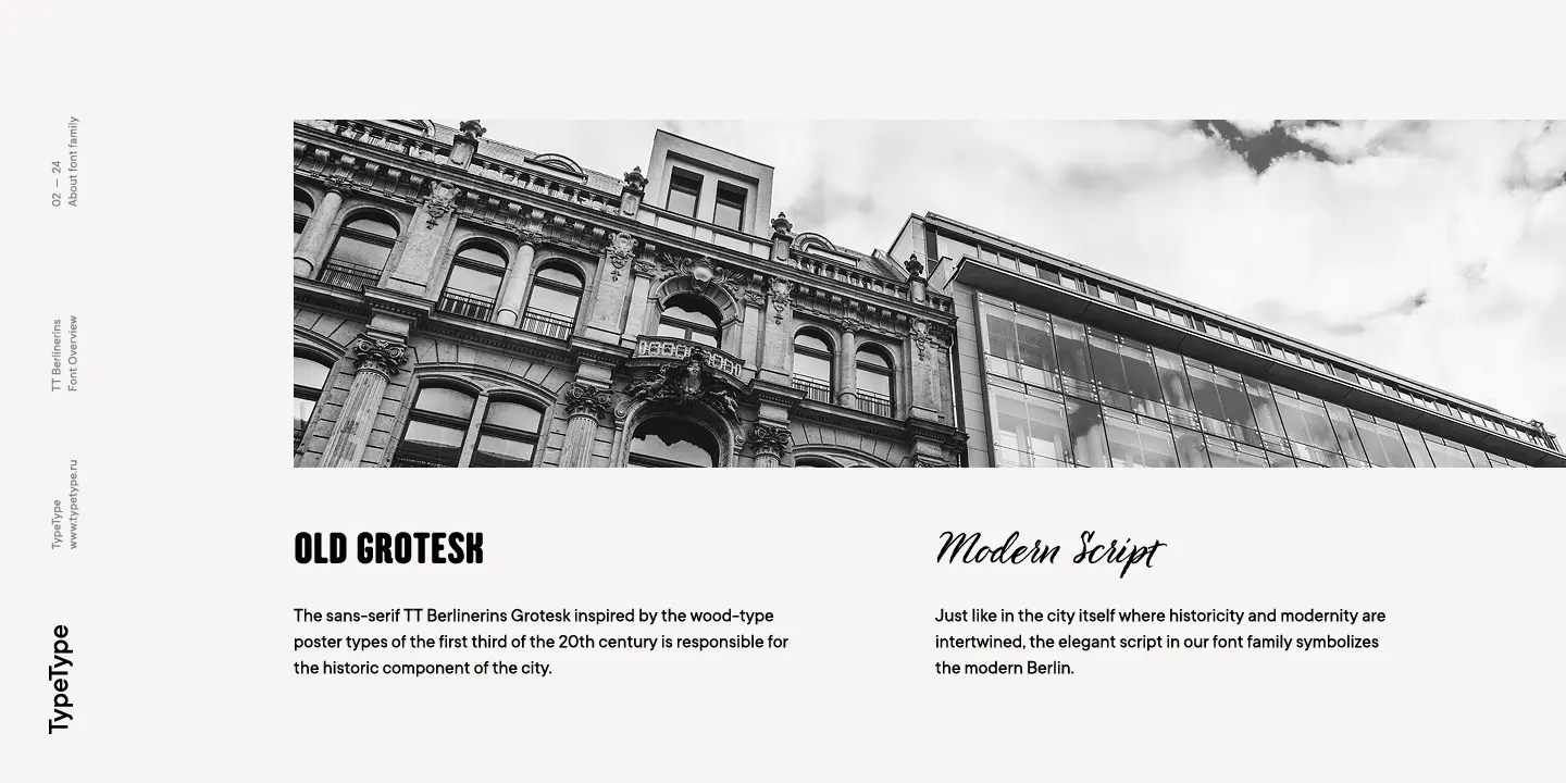
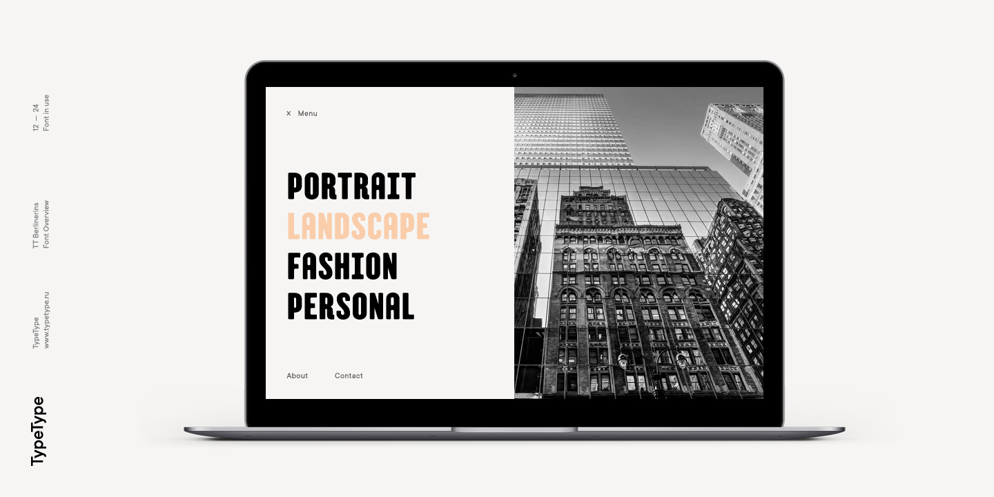
TT Berlinerins is a contrast pair of typefaces which is basically our tribute to Berlin. Just like in the city itself where historicity and modernity are intertwined, the elegant script in our font family symbolizes the modern Berlin, and the sans-serif inspired by the wood-type poster types of the first third of the 20th century is responsible for the historic component of the city.

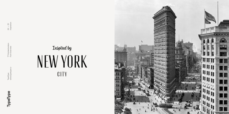
The idea of this project emerged in the beginning of 2016 when we’ve met Evgenia Pestova, a calligrapher from Berlin, who shared the contemporary perspective on calligraphy and the city impressions with us. The wood-type sans-serif appeared later, after our another colleague had visited Berlin and told us his fascinating story about the things he had seen. The city is full of contrasts — it is very modern and very vintage at the same time. The photographs and the impressions from the trip have also become the basis of our project. That is how we’ve added a little of old Berlins roughness and inhomogeneity.

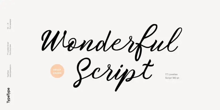
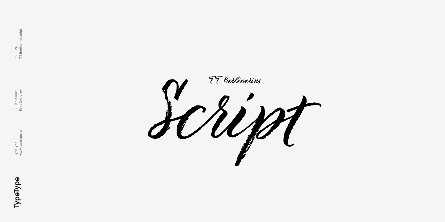
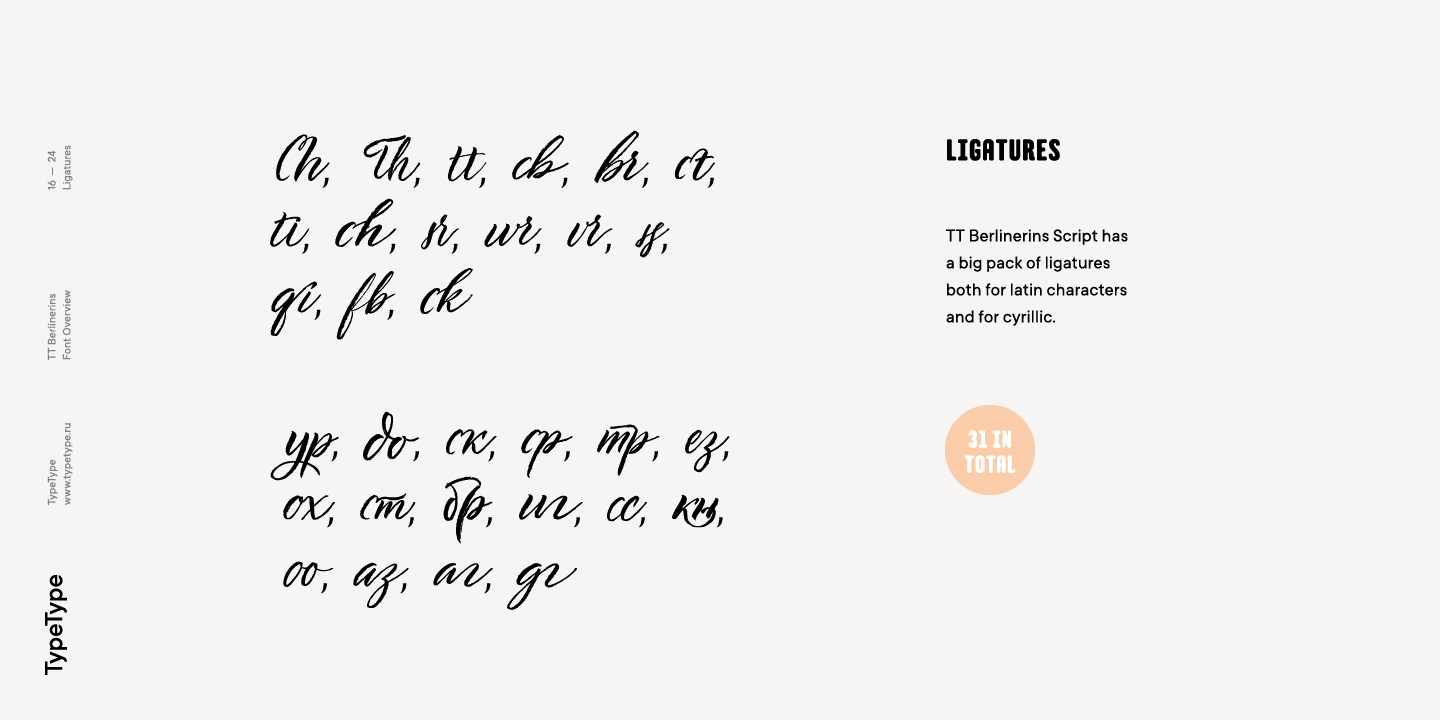
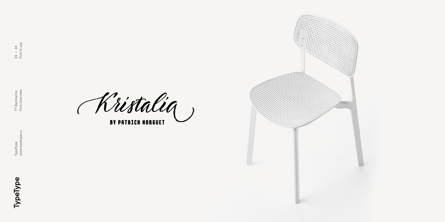
TT Berlinerins Script contains 998 glyphs, including more than 240 swashes for which we’ve written a special feature. We’ve also drawn a large number of ligatures for TT Berlinerins Script and integrated wide support of OpenType features: ordn, frac, case, sups, sinf, numr, dnom, tnum, pnum, calt, liga.

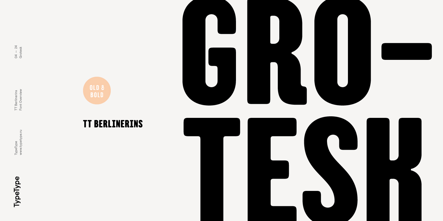
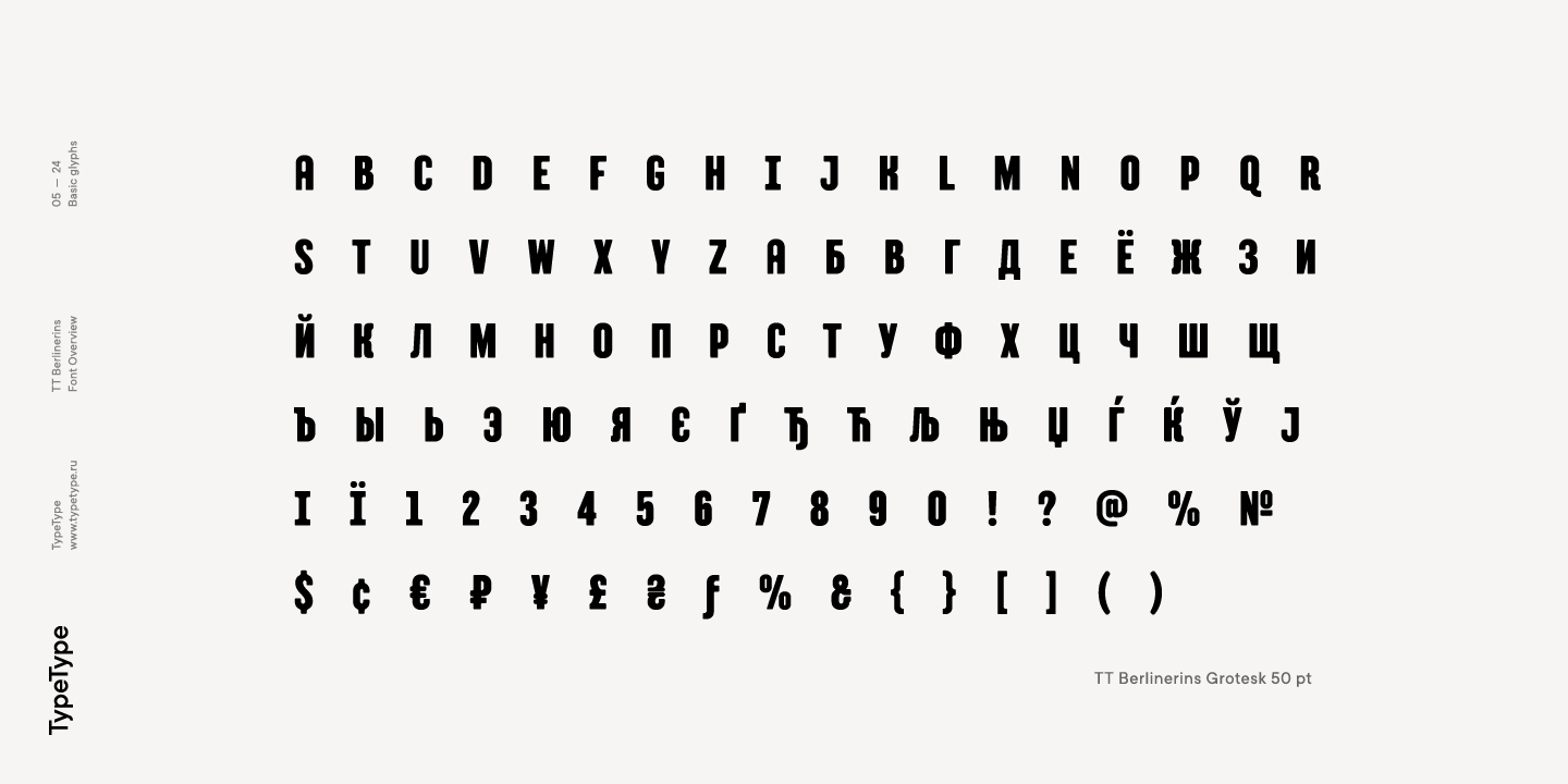
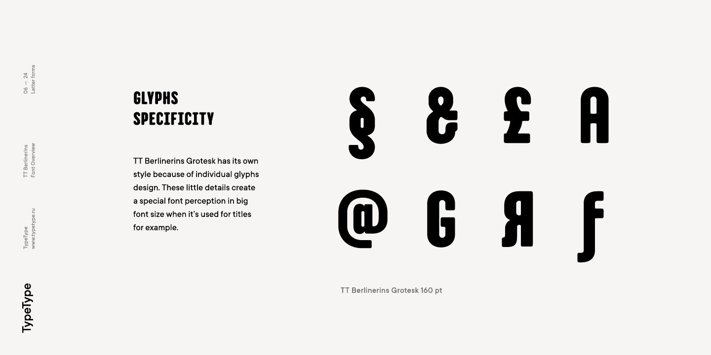
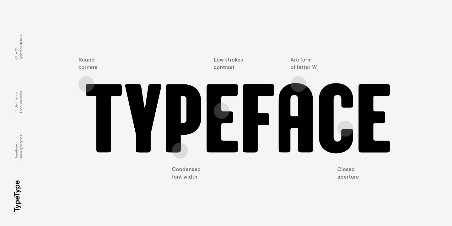
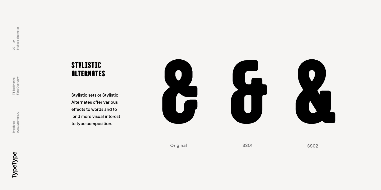
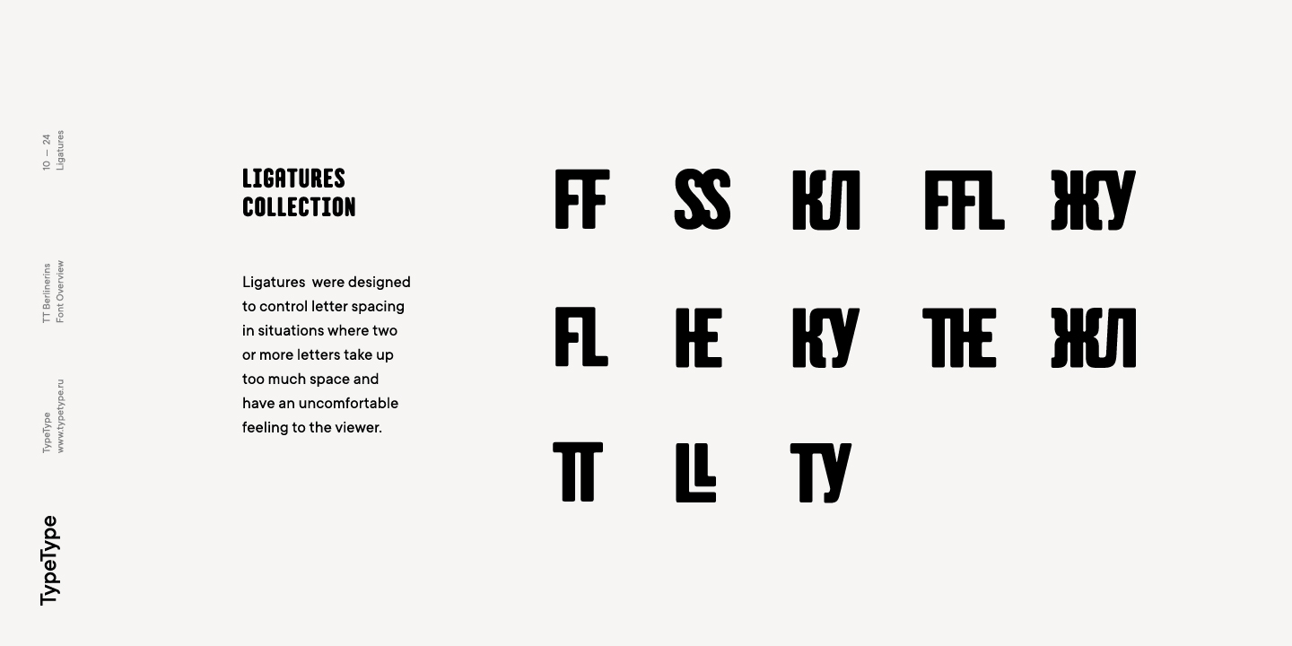
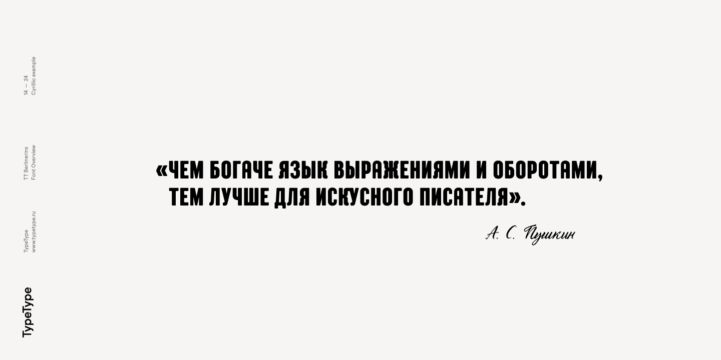
TT Berlinerins Grotesk consists of uppercase letters, includes a set of unusual ligatures and wide support of OpenType features: ordn, frac, sups, sinf, numr, dnom, tnum, pnum, liga, salt and two stylistic sets ss01, ss02 for the ampersand.

Language support

Team

Ivan Gladkikh—head of the project
Evgenia Pestova—designer of script font
Tanya Cherkiz—type designer
Dmitriy Greshnev—type designer

Release date

May 3, 2017

Additionally

Specimen

Download font specimen (pdf)

Poster Images

Graphic presentation at Behance

Custom version

Looking for a custom version of this font?

TT Berlinerins
Size
Otf
Turn on all

TT Berlinerins Script

OpenType features

TT Berlinerins
liga | Standard Ligatures

the ff

the ff

frac | Fractions

1/2 1/4

1/2 1/4

ss01 | Stylistic Set 1

&

&

TT Berlinerins Script
liga | Standard Ligatures

tt ck fb

tt ck fb

case | Case Sensitive Forms

({[H]})

({[H]})

frac | Fractions

1/2 1/4

1/2 1/4

Ideal font pairs with TT Berlinerins

What is a font pair, and what does it serve for?

A font pair is a combination of two fonts within one text block. Most often, one of the fonts in a pair is a more expressive headline font, and the other one serves to communicate information. Such fonts complement each other and help designers solve various tasks, like highlighting key elements, adding emotional expressiveness to the project, or separating semantic blocks.

How to choose fonts for a project: Several general recommendations

To begin with, establish the project's tone. Choose the fonts that stylistically match the main idea. After that, you need to determine the functions of each font in the project and their hierarchy: which font will complement the design and which one will serve to attract attention as the main element. You need to assess the difference between the fonts and decide what kind of information each of them should convey. First, we recommend choosing the base font you will use most, and then you can find a suitable pair for it.

Core principles of font pairing and recommendations from designers

The main rule you should follow when matching two fonts is that both similarities and differences must be visible between them. You can highlight the coherence of fonts by the following characteristics: contrast, proportions, width, openness of characters, individual letter shapes, and overall tone. Feel free to experiment with different combinations. We also recommend analyzing the projects you like: this way, you can enhance your visual skills, elevate your knowledge base, and gain confidence in dealing with typography.

Similar fonts

        Choose the fonts and licenses you want.