Welcome to lesson number 8 of our «UniversiTTy» series! We suggest reviewing the earlier articles in the series before diving into this one.
Last time, we covered optical compensation, uppercase and lowercase character heights, and the concept of contrast. Determining all sizes and weights is, without a doubt, a crucial stage of font design but still a preparatory one. In this article, we will finally focus on glyph design specifically.
Antonina Zhulkova, Design Lead at TypeType, will tell you all about this. Antonina has been working in font design for more than 5 years now. She’s the concept author and lead designer of projects like TT Neoris, TT Ricordi Allegria, TT Globs, and Ivi Sans Display. Also, she took part in the creation of TT Fellows, TT Fors, TT Interphases Pro, TT Commons, and many other typefaces.
Designing uppercase characters
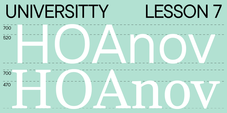
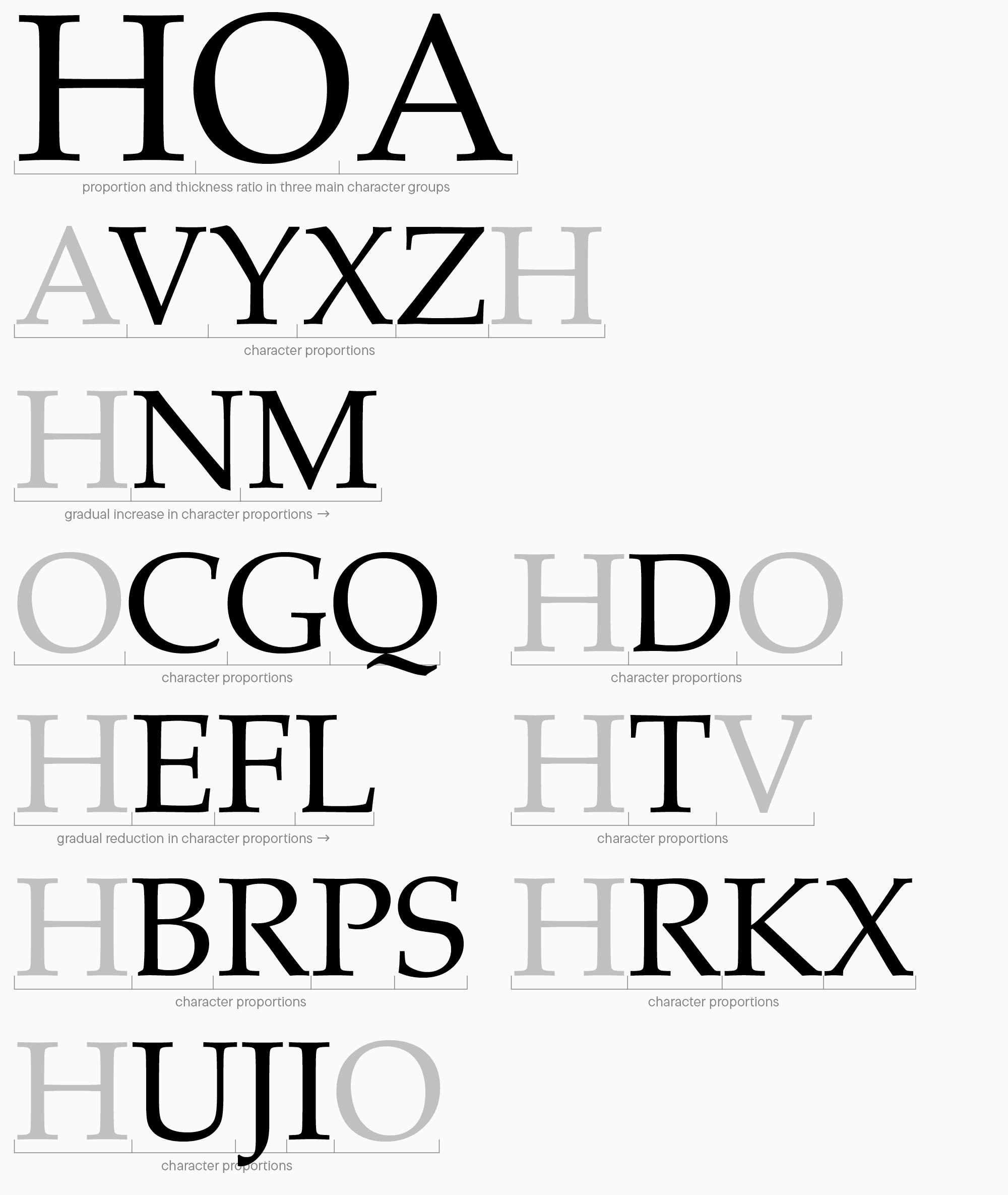
To begin with, let’s revisit our primary letters «Н,» «О,» «А» to analyze their proportions and see how they affect other characters. You will understand why we concentrated on these letters in our previous «lesson.»
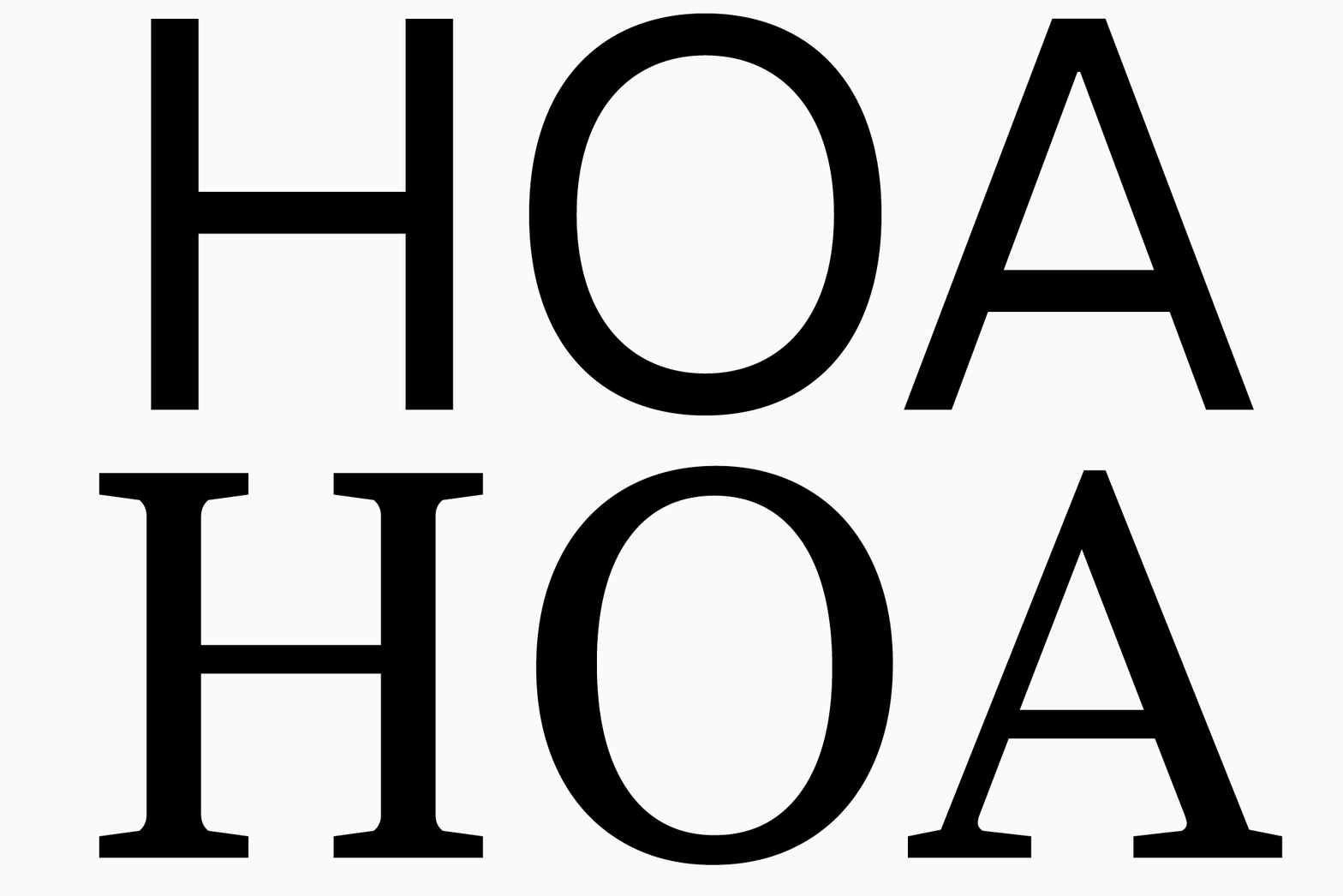
Glyph proportions are one of the key font characteristics. They influence the overall glyph design, visual quality, and readability parameters. This is related to the conventional letter designs used globally, and our perception of glyphs depends greatly on this «traditional» image of them. For example, there are studies on the readability parameters of black letter. It shows that people exposed to this font as part of their culture don’t experience any problems in reading texts typed in it. On the contrary, people from other cultural and linguistic contexts find it much more difficult to read such a font.
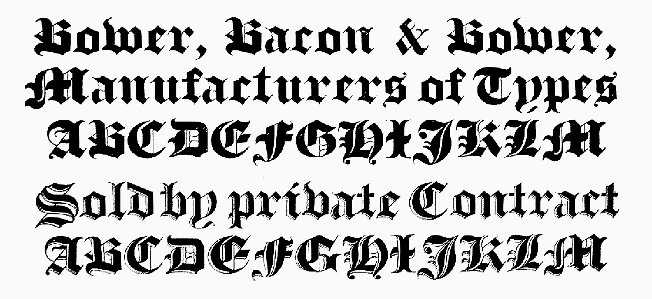
Nonetheless, don’t be afraid to deviate from the usual visual proportions. Modifying this font parameter can serve as an unusual graphic trick to attract attention. The main thing is to do it thoughtfully. That’s why I will start my explanation of proportions with classic principles and focus primarily on Antiqua as the most ancient type category. Sans serif, a more modern type historically, is largely based on Antiqua proportions yet introduces some transformations that we will also discuss.
Main logic of glyph design and proportions
Font design relies heavily on calligraphy and various handwriting styles, which is why echoes of this art run through the conversations about fonts.

Standard Antiqua proportions originate from classic calligraphy. The entire European calligraphy is fundamentally built on Roman square capitals. Our article is not aimed at diving into the history of calligraphy and its principles. However, this information is essential to understanding the origins and development of letterforms. You can learn more about Roman square capitals and the history of calligraphy in the following books:
- Roman lettering (L.C.Evetts);
- The Art of Calligraphy (David Harris);
- The Calligrapher’s Bible (David Harris).
I will only cover the main aspects of proportions that emerged thanks to Roman square capitals and influence the font’s character. So, this is the moment to go back to our primary characters: «H,» «O,» and «A.»
Why do I always refer to them? A font can be portrayed as a tree or an umbrella where letters are linked by character groups. When working on any font glyphs, you should always divide them into groups and constantly analyze how these groups are connected. This information can be visualized in the following way: there are «parents» for each group (upright, rounded, and triangular glyphs), and all other letters are associated with them directly or are found at the boundary between groups.
Besides, at the drawing stage, we build upon both the general classification and various graphic elements of the specific font, such as aperture, similar construction features (ovals, waistline, terminals, etc.), proportions, or different graphic rhymes between letters. If you understand the logic of character division into groups (later on, we will provide various examples of such groups), you will be able to create your own groups according to the objectives of a particular font.
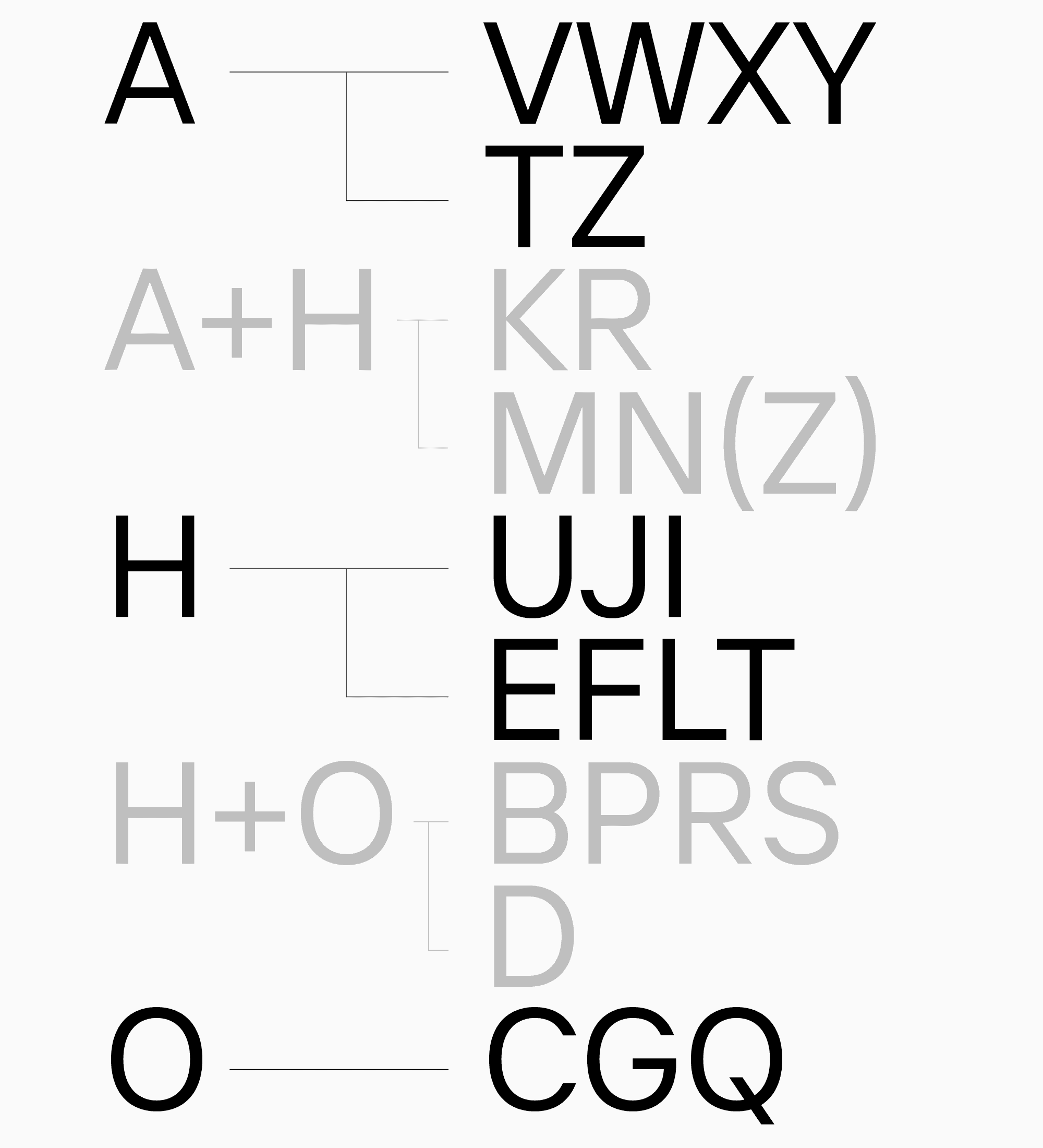
This is a general way to subdivide characters. Later, we will explore each group and highlight the reasons for such subdivision. However, this lesson began with Roman square capitals. What does it have to do with character groups?
The discussion about proportions and character groups is closely connected with this calligraphic tradition, and we should consider both these parameters while designing glyphs. I will specifically focus on the proportions of Roman square capitals because of its strong influence on font design and exemplary «classic» proportions.
However, many fonts also deviate from the logic of Roman square capitals. This may concern similarities and differences of all characters’ widths. Also, groups of the same width can become wider or narrower in relation to the classic example.
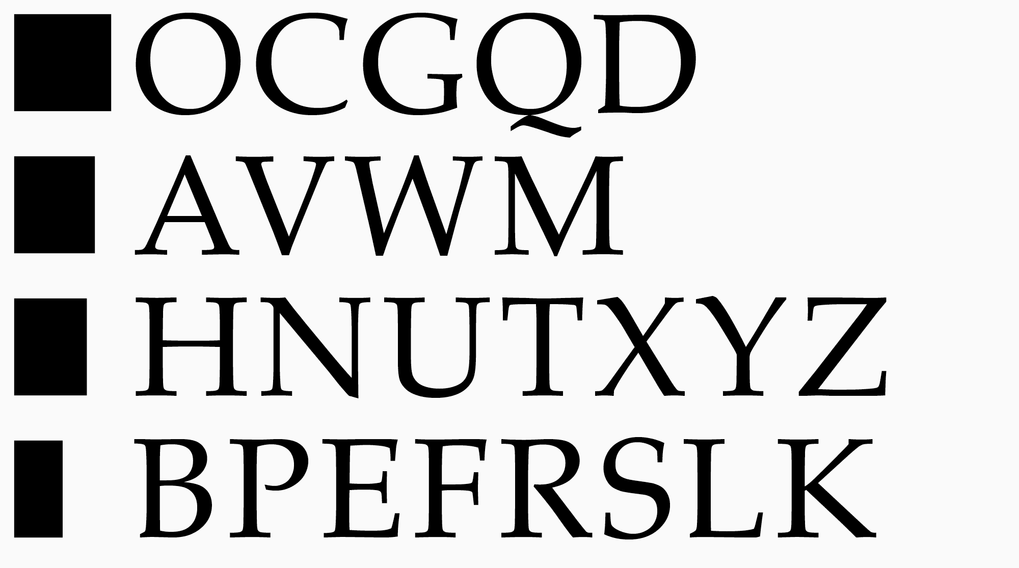
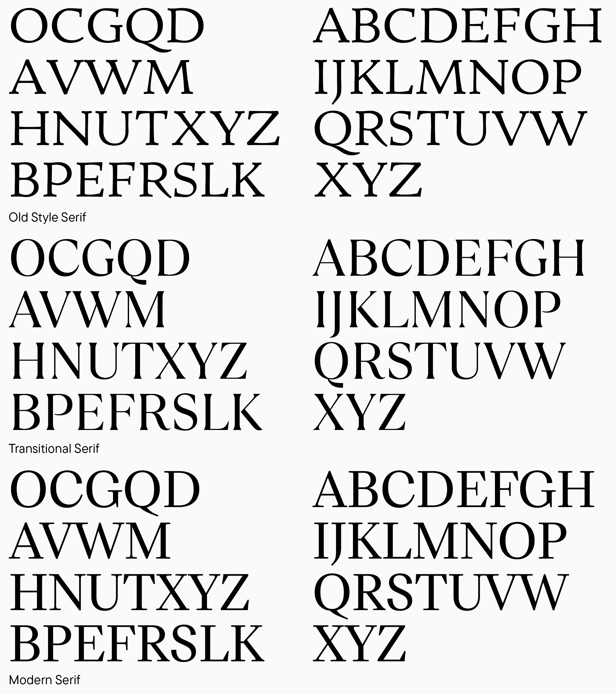
We could conceptually separate all uppercase letters of the Latin alphabet classic proportions into four categories, from the widest to the narrowest. These categories are similar to the groups we got by dividing characters by shapes.
- The first group with the widest letters includes rounded characters («O,» «C,» «G,» «Q,» «D») that can be fit into a square. In this context, the square serves as a symbolic «unit» of width.

2. Another group consists of characters with a width slightly over a quarter of the square’s size. These are the letters «A,» «V,» «W,» «M.» Obviously, the widths of «M» and «W» are not equal to the widths of «A» and «V», but in terms of both meaning and form, they can be merged into one category.

3. The widths of the characters of the third group occupy three-quarters of the square. The third group includes the letters «H,» «N,» «U,» «T,» «X,» «Y,» «Z.»

4. The last group comprises the narrowest characters, with widths taking up about half of the square. It includes the letters «B,» «P,» «E,» «F,» «R,» «S,» «L,» «K.»

This width-based division laid the foundation for letter design, and modern fonts largely adhere to the principles that emerged in the 1st to 5th centuries. However, I will repeat that belonging to one group doesn’t mean the characters will have the same width. It demonstrated similar proportions and letter placement in the «width axis,» from the widest to the narrowest.
What else should be considered when working with fonts? One of the key categories in font design is the amount of negative space in glyphs. We will not dive deeper into working with outer white space, but the internal white space is crucial for us at the drawing stage. Our vision accounts for the amount of both black and white in characters—this should be kept in mind when drawing all letterforms and symbols. Since European writing conventions dictate writing from left to right and top to bottom, our eyes are accustomed to reading letters diagonally from the upper left corner to the lower right. The amount of horizontal segmentation within a form also matters. Characters that are open at the top and lack intersections will appear wider, thus, to create visually uniform-width letters, this aspect needs compensation. For example, let’s compare the letters «A» and «V»: «V» is almost always made narrower to match proportions similar to «A,» which has less white space inside.

It is possible to draw basic Latin characters intuitively, without knowing the fundamentals. However, knowledge of theory will improve the results significantly. Understanding the relationships between character proportions helps convey the graphic concept more accurately. Given that we identified the main idea after the sketching stage and determined the characteristics of the base glyphs («H,» «O,» «A»), I suggest moving on to designing other uppercase letters, dividing them into groups and keeping proportions in mind.
How else can we subdivide characters? Our basic groups can be subdivided into smaller ones to approach the work more comprehensively.
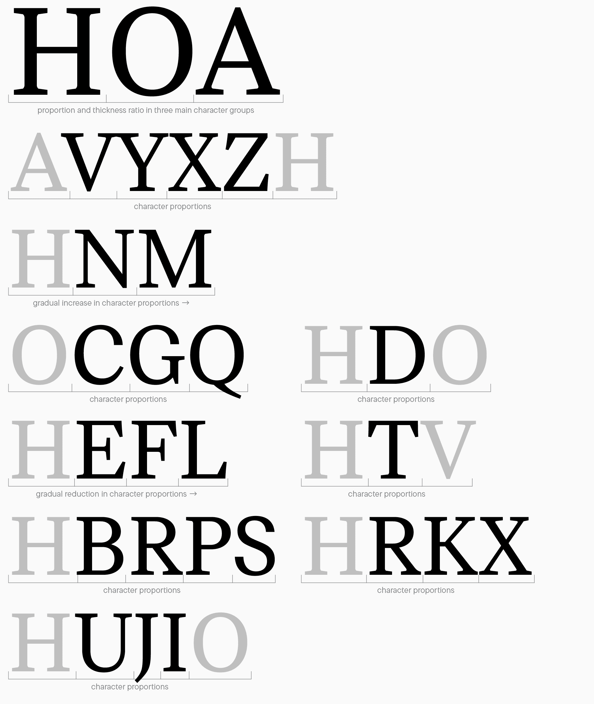
Here is an example of division into groups we use in TypeType when designing characters (we add our «basic» characters to this and the following sets to compare new glyphs with finished letters and maintain the overall concept and consistency of the font. They may not belong to groups):
- «H,» «A,» «O» — working with base characters, their proportions, forms, and the relation between the mail letter types;
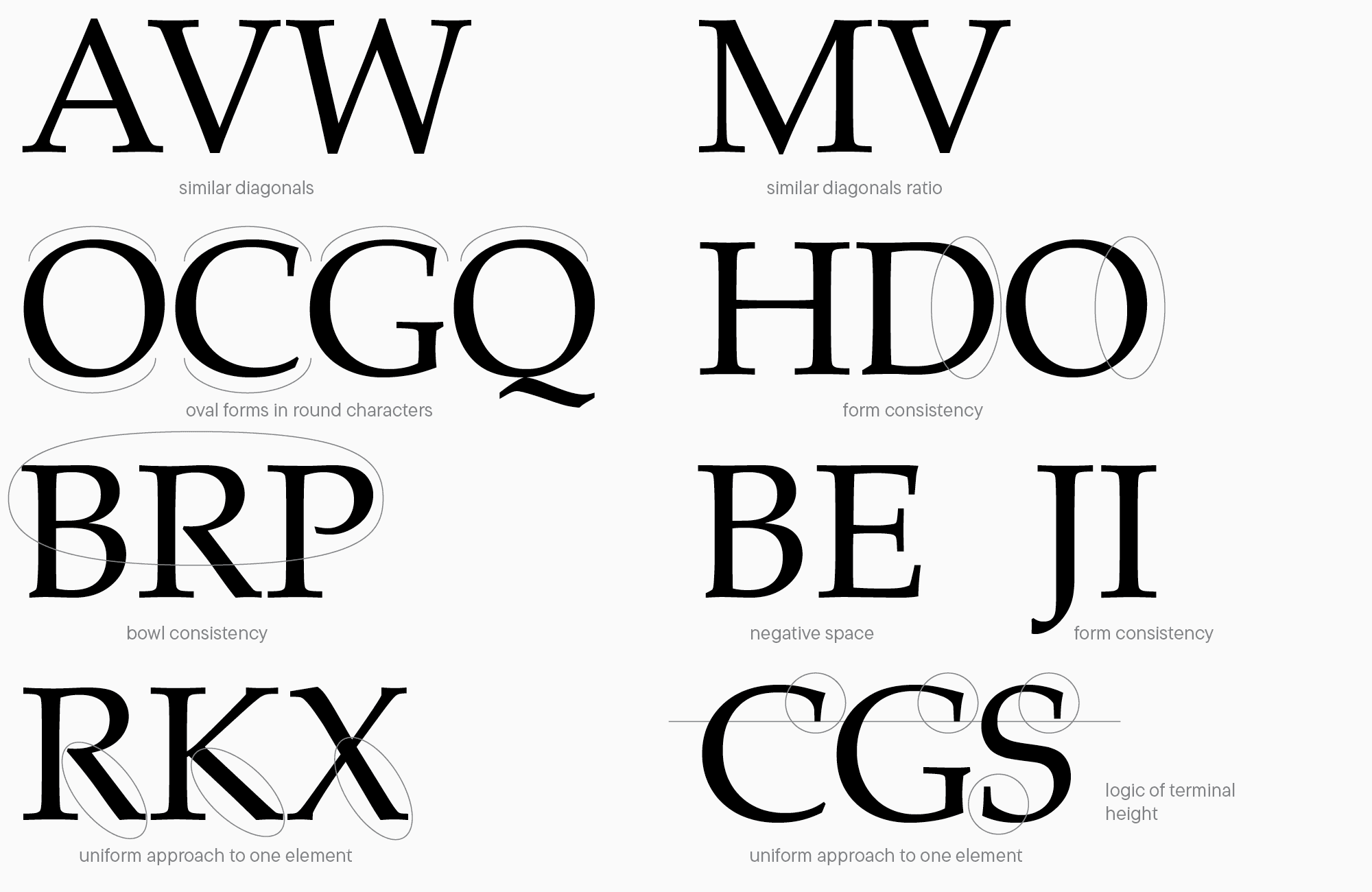
- «A,» «V,» «W,» «Y,» «X,» «Z,» «H» — working with triangular characters, their proportions, ratios, and weights of diagonals;
- «H,» «M,» «N,» «V»: working with upright characters and diagonals: they should be designed with reference to the upright character forms («H») as well as diagonal forms («V»);
- «O,» «C,» «G,» «Q» — working with rounded characters and how they relate to one another;
- «H,» «D,» «O» — working with the letter «D» that is upright and rounded at the same time;
- «H,» «B,» «R,» «P,» «S,» «O,» — working with characters containing bowls and having more complex forms. In this sequence, the system of widths is arranged from larger to smaller among the letters «B,» «R,» «P,» «S.» The bowl forms should match the character of rounding in «O»;
- «H,» «B,» «E,» «F,» «L,» «T,» «V» — working with upright characters featuring horizontals and similar letters. «H» and «B» here serve as reference points for double-story characters «E» and «F,» which are reference points for the letter «L.» Although the letter «T» has only vertical and horizontal strokes, the amount of negative space in it is closer to triangular characters, so it can be compared with «V,» too.
- «H,» «R,» «K,» «X» — working with glyph elements: legs of «R,», «K,» and «X should match in form and character;
- «H,» «U,» «J,» «I,» «O» — working with the letter «U» and «J» that is similar to the right side of «U»;
- «C,» «G,» «S,» «J» — working with terminals and their relations.
All characters need to be tested in the set HH*glyph*HHOO*glyph*OO and similar combinations, as well as in typesetting (we will tell you more about testing glyph designs in the next section). During the drawing process, you should advance step by step from general features to more specific ones.

The above-listed character groups are just the tip of the iceberg, as there are numerous aspects of designing each glyph. We solely focus on the general approach to drawing. You can research other sources for more detailed information on the subject, for instance, the book «Designing Type.»
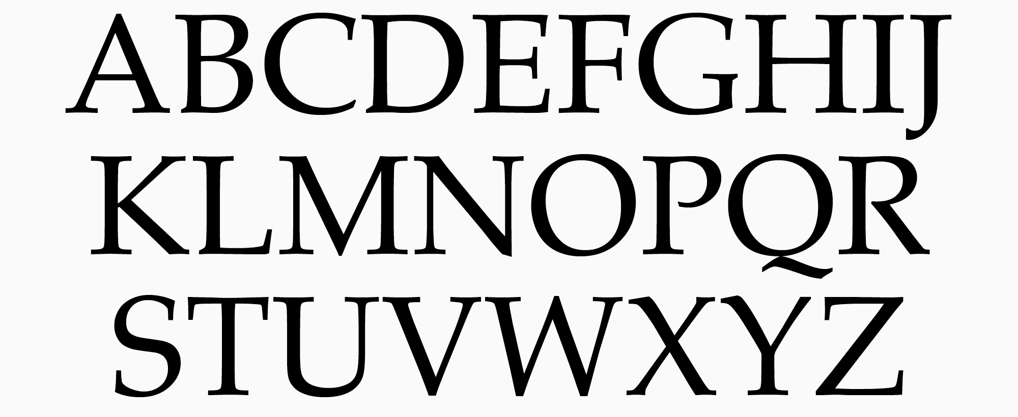
Now, let’s take a look at how proportions and character groups look in finished fonts. We will begin with a serif with dynamic proportions (the Palatino font) and then move on to our font examples: the text serif and interface sans serif.
Proportions in serifs and sans serifs
Font design is constantly evolving, as are proportions. Historical and modern fonts feature various widths in proportions that drifted far from their Roman ancestors. There are two main characteristics of proportions: dynamic and static, and glyph proportions in the font can lie between these two poles.
Based on a very condensed classification of fonts, serifs and sans serifs can possess both features, and in display fonts, proportions may vary even more.
Proportions in serifs have been gradually transforming, moving away from the dynamic principle, so letters became closer and closer in proportions. The classification section delves deeper into this. Here, I’m only touching on the surface-level parameters. This is best shown in illustrations.
Sans serifs also feature both static and dynamic fonts. The differences in proportions are more common for Humanist and geometric sans serifs, and Neo-Grotesques tend to be static. In the article on classification, we covered the most popular fonts of these types. You can go back to them and analyze the difference.
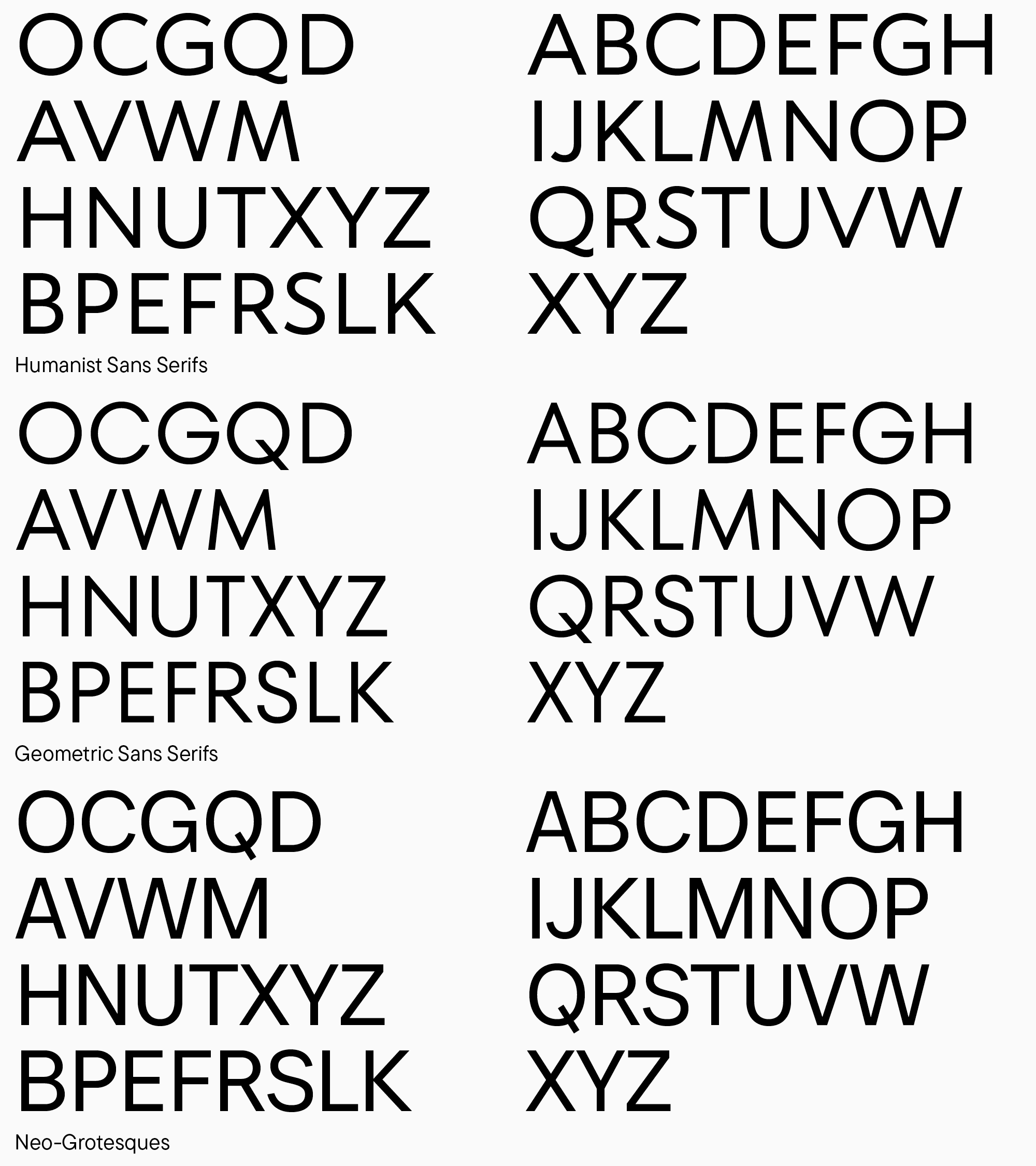
It’s time to return to our parameters and look through different uppercase character width options. Given that the text serif and interface sans serif have very similar proportions, I will compare a sans serif with dynamic proportions with our serif’s static-proportioned text version.
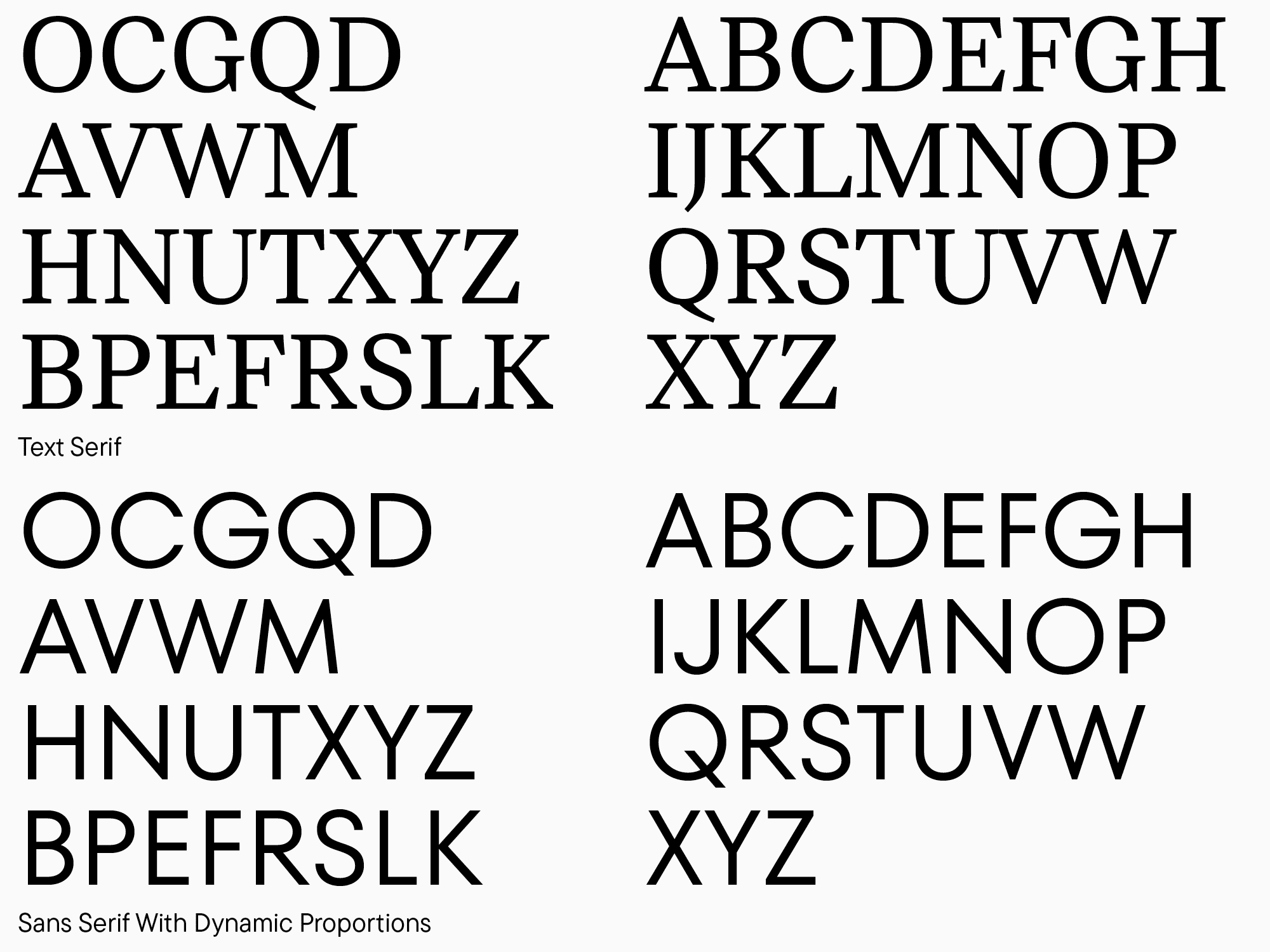
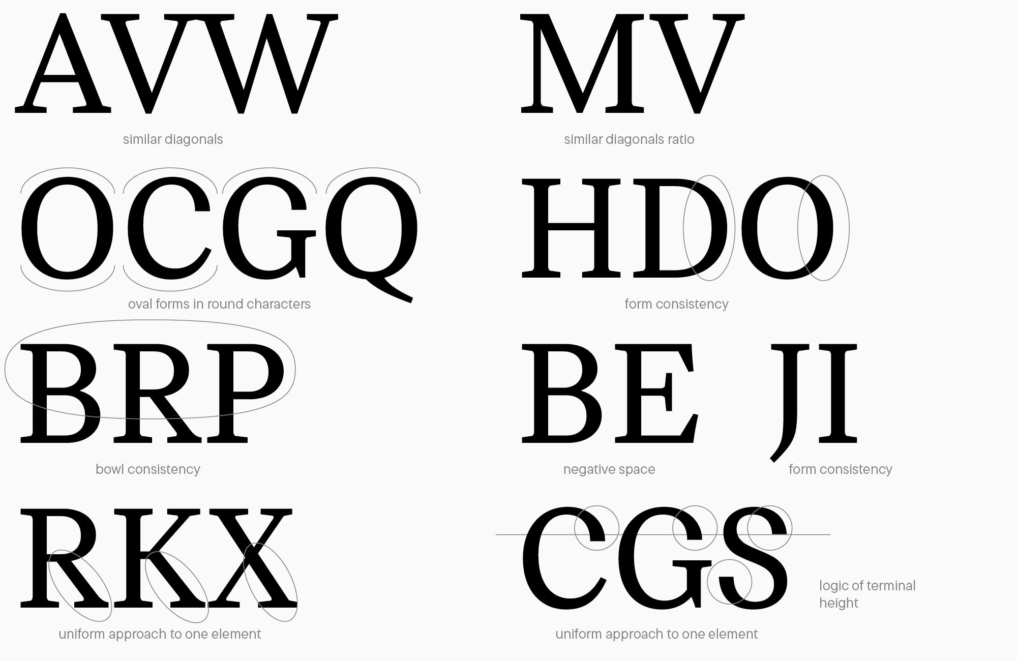
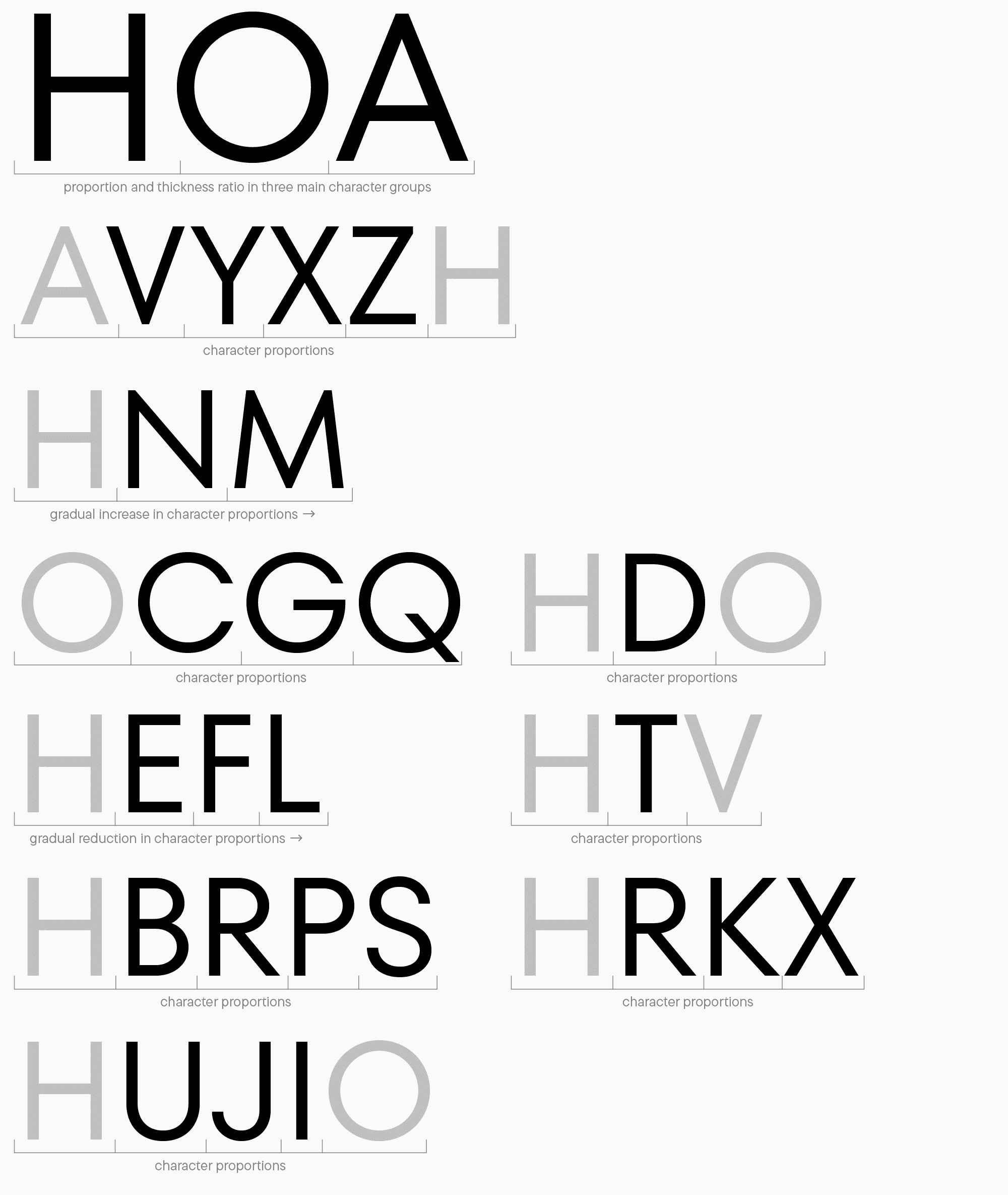
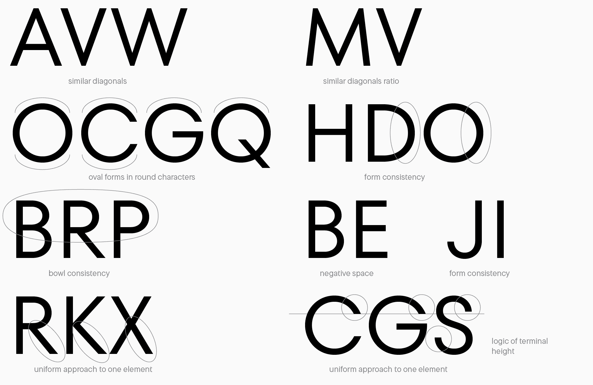
Also, pay attention to letter groups and the differences in details between these two fonts.
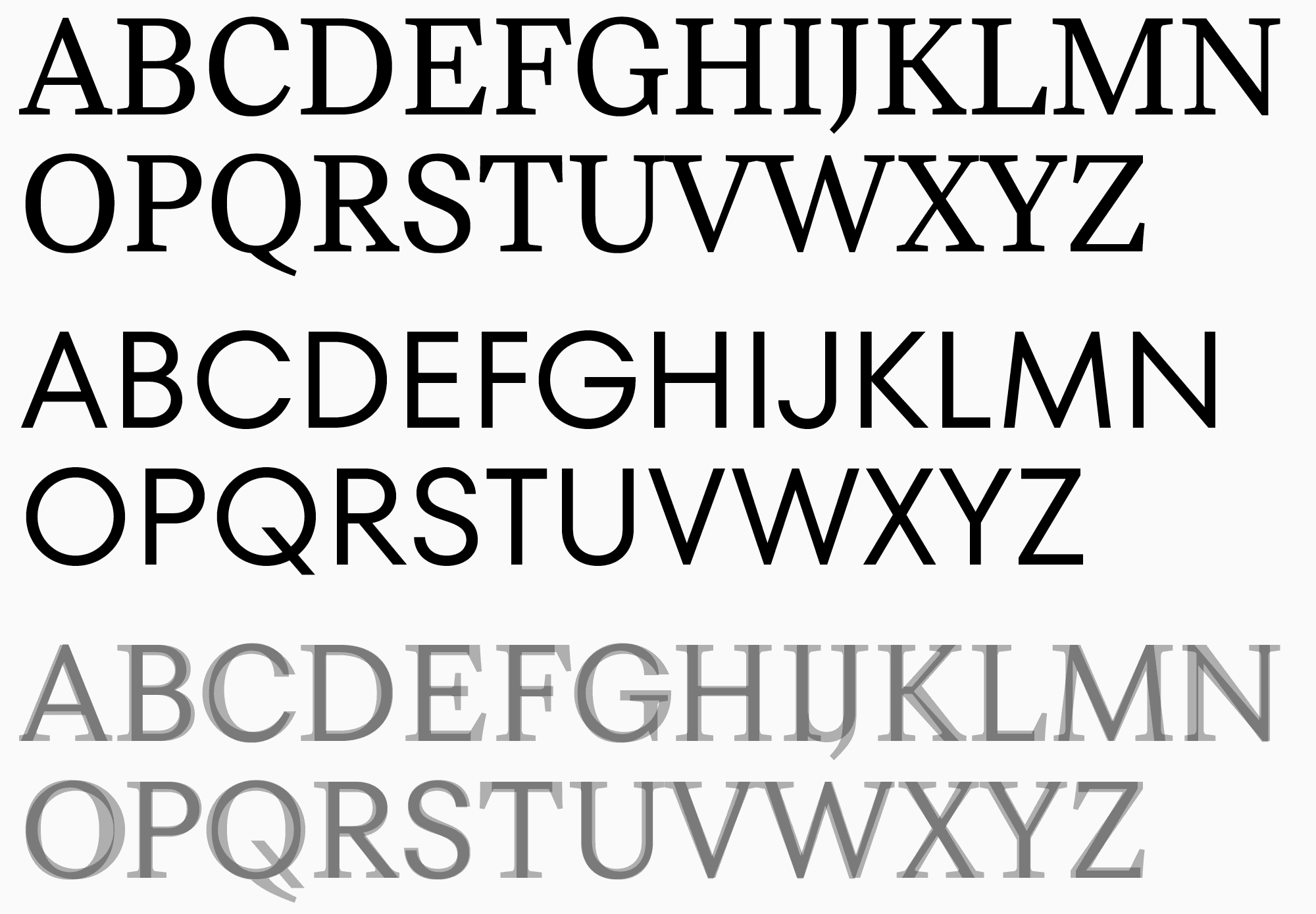
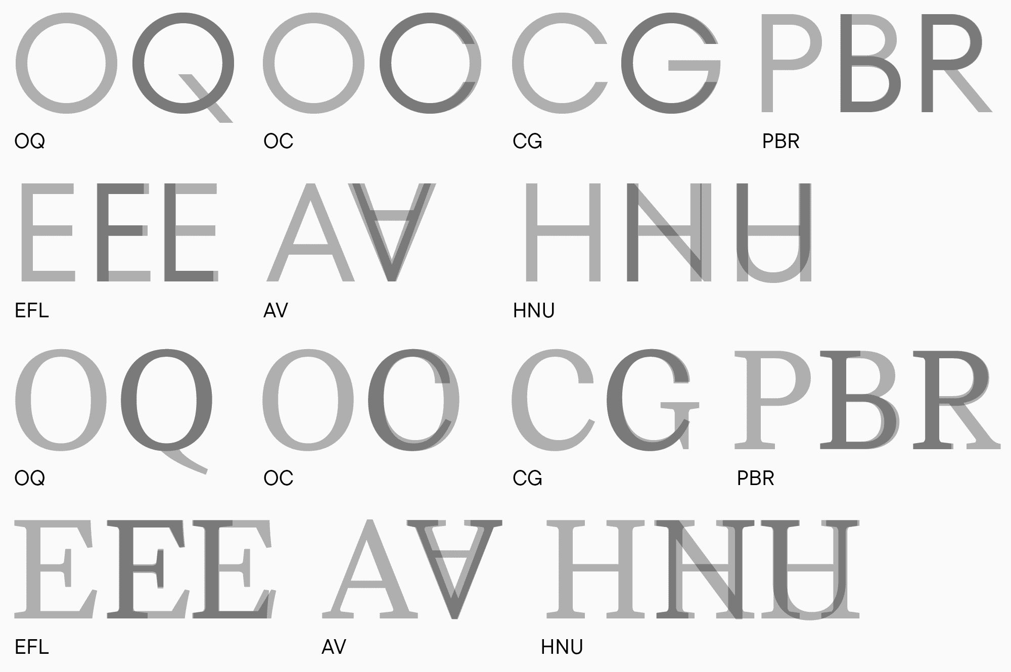
By comparing these two types, we can understand how to work with proportions and how they differ in various fonts. Taking proportions into account when designing letters will help craft a thought-through, well-calculated product, so I recommend focusing heavily on this aspect. What I want to add is that there are many font types with different graphic features—try to analyze each specific case, not simply draw letters following the established patterns. Classic rules don’t always work for your idea, so you should approach any solution critically.
The next lesson will be dedicated to detailed contour refinement, so stay tuned!


