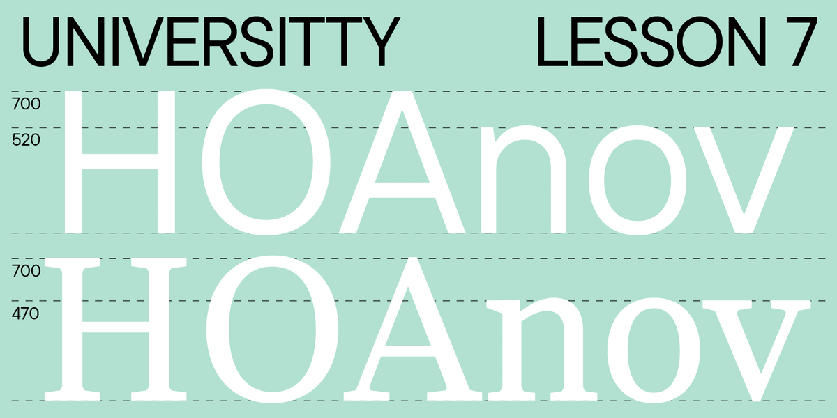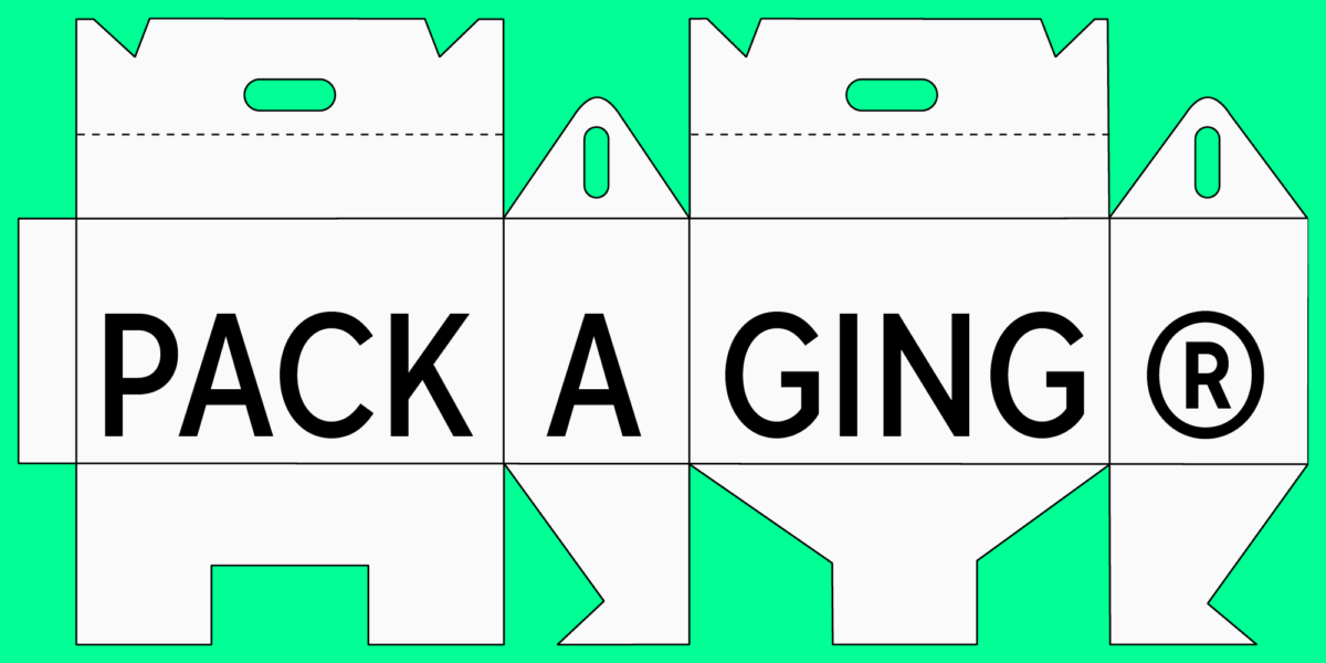
In addition to the base set of letters, marks, and symbols, most typefaces also have other graphic elements. These can be simple arrows and circled figures or more complex illustrations, like plants, animals, or people adapted to fit the mood of the typeface. However, even the simplest icons may look distinct in different fonts.
What does their appearance depend on? How and why are they designed? What variations do they come in? In this article, we will focus on these questions and showcase the most captivating icons and illustrations from TypeType typefaces.
A little backstory: How did arrows and signs appear?
Arrows are one of the basic graphic element options included in almost every typeface. In fact, they don’t quite fit into the category of icons. However, we would still like to tell you more about arrows because they are widely used globally, primarily functioning as navigation aids. Where did they come from?
The modern arrow we are all familiar with is a simple graphic object: a straight line with two diagonals that meet at a single point. Four hundred years ago, the depiction of an arrow resembled the archer’s arrow, which actually forms the foundation of the symbol. With time, the illustration was simplified, lost its «feathering,» and became a schematic image.
Today, the arrow is a universal symbol that everyone understands. That’s why it is used even in records on board the unscrewed spacecraft Pioneer 10 and Pioneer 11. The illustrations on these plaques are meant for hypothetical habitants of other planets. The symbols communicate information about human beings and the location of the Earth and the Solar System in the Universe, so the illustrators decided that the meaning of arrows would be clear even for aliens.
Nevertheless, studies suggest that arrows were not commonly used as navigation aids until the 18th century. Before, other images served this purpose. The earliest recorded indicator symbol is the drawing you see below: it’s carved into the pavement in Ephesus city and dates back to approximately the 1st century CE. It shows a foot next to a woman’s face. Why a foot? This image literally calls you to «follow the lead» to get somewhere. So, paired with a woman’s face, this navigation sign indicated the way to the brothel.
In the modern world, the foot symbol is also used in public spaces, such as shopping centers.
Apart from that, another symbol was used to show direction—a manicule, or pointing hand. It is believed that this symbol emerged in Spain in the 12th century CE. Such pointing hands were used to make text notes: manicules were drawn on margins and pointed at text fragments that needed attention.
The cuff gives away that it’s Harlequin’s hand. Yet, as the manicule gained popularity, its depictions diversified. The medieval period was characterized by particularly bold imaginings on manicules.
Summing up, the style of the pointing hand symbol depended on the cultural and historical features and the author’s vision. Now, let’s explore the factors that influence the appearance of icons in modern fonts.

What impacts the icon graphic?
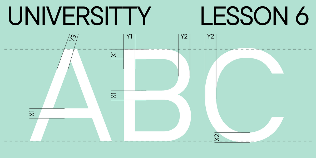
To begin with, let’s answer the question of what the purpose of icons is in fonts. First, they are beautiful. Second, they help convey the idea of the font and its mood. Third, they may specify the context of font usage. Even the most basic icons, like arrows, manicules, hearts, etc., will have distinct looks in different fonts.
So, the visual style of icons is shaped by two factors:
- Overall mood of the font (typeface);
- Font’s application range.
To design a set of icons, it’s essential to understand what the font’s message is and what associations it evokes. Character construction directly influences the font’s mood: the stem weight, contrast, ascenders and descenders, serifs, etc. All these structural features are reflected in the icon graphics.
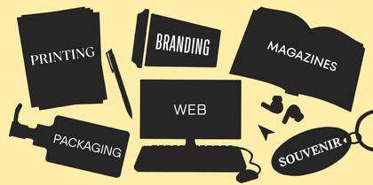
The purpose of the font also influences the icon style: designers can create specific sets of icons for particular domains.
Icons and illustrations in fonts
Almost every TypeType typeface includes basic symbols, like circled figures, arrows, and other pointers. These are standard elements often used for navigation purposes, to create a hierarchy in a text (lists, for example), and more. As a rule, they are not classified as icons, even if they have distinct looks in different typefaces. For instance, in TT Norms Pro, our versatile bestseller, symbol design is characterized by simplicity and elegance. The arrow also maintains a very minimalistic appearance.
In a more technological and robust typeface like TT Autonomous, the arrow looks a little different. The white space in the font is squared, and terminals and stroke ends are cut. So, the cuts in arrows reflect the forms of terminals, and the stem weight is the same as in the characters. The overall icon style is simple and elegant, without any decorative elements.
Icons and illustrations are more complex graphic elements designed for a specific font. We chose the most eye-catching examples of TypeType typefaces with icon sets to demonstrate how the font’s style and purpose influence the appearance of icons.
Spiky TT Ricks
TT Ricks evokes the following associations: spiky, sharp, a little extravagant, angry, mystical. The icon set for TT Ricks includes the symbols corresponding to this mood: playing cards, crescent moons, stars, chandeliers, and poisonous mushrooms.
The character structure features dynamic, large serifs. TT Ricks is a high-contrast serif with dense typesetting. All these traits are reflected in the icon graphics. Let’s explore them with an arrow as an example. In this case, the arrow has a pointy top, a thin bar, and a diamond-shaped decorative element. These features support the overall concept of the font.
Charming TT Espina
TT Espina is another example of font graphics influencing icons’ graphics. This is a rather high-contrast, a little aggressive typeface with diamond-shaped forms resembling the boho style and something magical. The icon set of TT Espina refers to these associations: it features crystal balls, stars, comets, matches, and crystals.
Stylish TT Ricordi Greto
TT Ricordi Greto is an experimental font inspired by a floor plaque dating to 1423 found within the Basilica di Santa Croce, Florence. This font’s historical forms complement contemporary visual design approaches. The choice of icons for this typeface reflects this unique characteristic, featuring images of daggers, bones, skulls, flowers, and snakes. TT Ricordi Greto also includes a catchword set of 13 pieces that can be used as individual design elements.
Designer typeface TT Globs
TT Globs is a stylish and unusual slab serif with wide proportions. It gives off a playful and light vibe associated with summer. This typeface’s icon set emphasizes all these features: it includes eye images reminiscent of the glyph forms, cheerful flowers, and schematic images of planets and galaxies.
Cinematographic TT Trailers
TT Trailers demonstrates well how the font’s purpose can affect the icon set. This typeface was crafted to be a poster font for the film industry. It’s narrow and stretched to efficiently condense maximum information into a limited space. TT Trailers includes a set of small letters designed specifically for that purpose. The icon set of this font is also connected with its application area: it features tickets, a screen, a seat, popcorn, navigation signs, etc.
Convenient TT Interphases Pro
This typeface was designed to be used in interfaces; that’s why it features a large set of icons commonly used in interfaces: various arrows, ticks, gears, folders, etc.
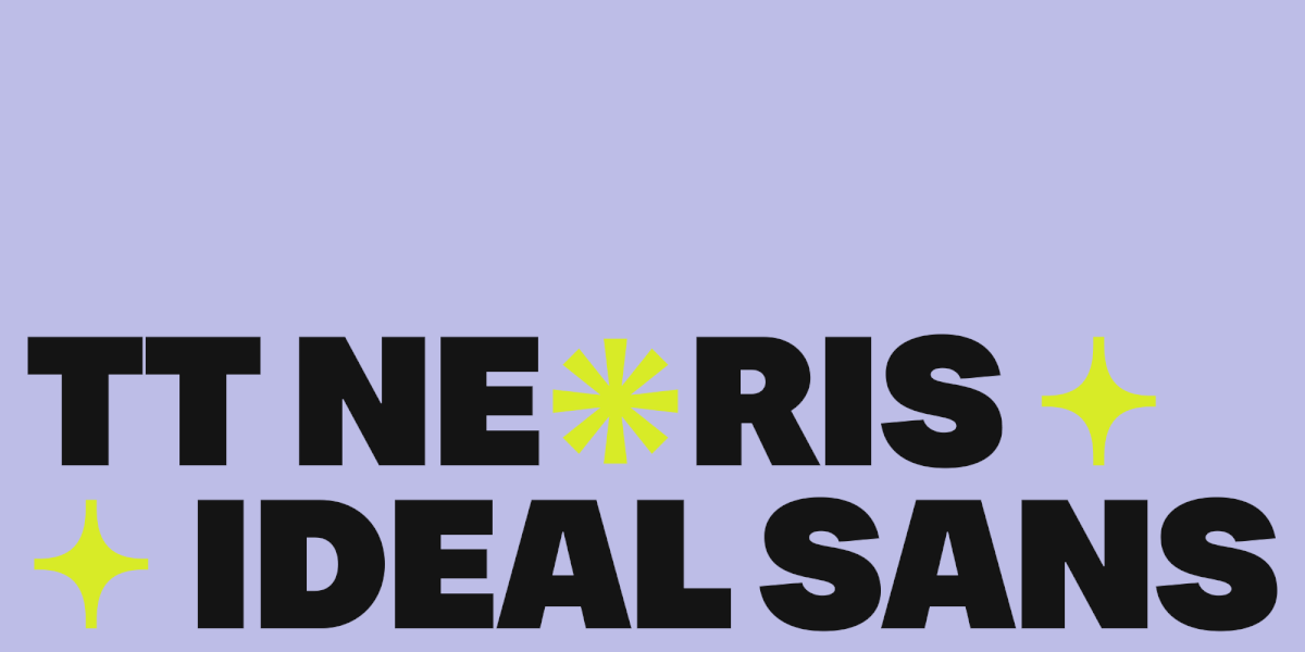
Versatile TT Neoris
TT Neoris is a multifunctional chameleon font that can be adapted to suit any project. The glyph design in this font is simple and minimalistic but features some peculiar details. Given that the typeface was designed to suit diverse uses, it includes basic icons, like hearts, stars, hands, geometric shapes, and smiley faces.
Font graphics
It’s worth mentioning other graphical elements in typefaces that don’t fall under the category of icons.
initials in TT Ramillas
One of the most curious examples is TT Ramillas. After designing it, we decided to add something else to this font. Naturally, we began with research, resulting in the decision to create one outline font style and a set of initials.
We crafted individual ornaments for each letter. To maintain the variation parameters, reduce the time spent on designing initials, and minimize labor intensity, we first created separate elements, like leaves, flowers, stems, and swirls. After that, we combined them, like mosaics, to decorate each letter.
All the elements were added as individual icons in the typeface. Designers can build their own ornaments out of them, use them as terminals, or use them as resources to edit the existing glyphs if needed for layout design.
Fonts with history
The fonts listed below are united by the fact of having historical background. Each typeface was based on a historical prototype, such as fonts from old books or inscriptions on ancient plaques. This distinctive feature influenced the graphic elements as well: each font features manicules as navigation symbols, not arrows.
TT Livret with book graphics
This serif fuses historical traits and modern forms. To allow for the use of TT Livret in books and other periodicals, we implemented a complete set of book layout graphics into the typeface, including vignettes.
Ornaments in TT Ricordi Marmo
In this vibrant, modern serif, the elements of Florentine sans serif are blended with more traditional visual choices. The typeface features a set of ornamental icons for a wide variety of purposes. They can replace certain letters to add eye-catching graphic elements to texts. You can also combine them to create borders and dingbats or simply use them as icons. All decorative elements are adapted to match the letters in the typeface.
TT Ricordi Allegria
TT Ricordi Allegria is another font from the TT Ricordi series inspired by ancient inscriptions within the Basilica di Santa Croce, Florence. This elegant typeface includes several delicate icons suitable for creating dingbats and highlighting the font’s visual language.
TT Marxiana
TT Marxiana is a reconstruction project of a font set used for the magazine called «Niva,» published in Saint-Petersburg during the late 19th to early 20th century. The TT Marxiana fonts closely match the appearance of the originals, making the typeface an ideal tool for designing a magazine or a book rendered in a 19th-century style. The font’s graphic elements include about 30 decorative navigation signs: arrows, hands, clubs, etc. The typeface also features the possibility to build decorative frames.
Conclusion
It turns out that icons in fonts are not just a peculiar addition to emphasize the typeface’s character; they’re also an excellent tool that amplifies the designer’s possibilities.