Using a slim font is a decision designers often make to emphasize a project’s elegant aesthetics, infuse it with charm, and add an unusual touch to the design. Sometimes, typography becomes the defining element of graphic and web design. That’s why it’s essential to know how to choose a proper thin font.
What are skinny fonts like? How to choose a relevant option to match your design perfectly? Find out in this article where we selected the best free skinny fonts and paid options of 2025.
What are thin fonts, and where do you apply them?
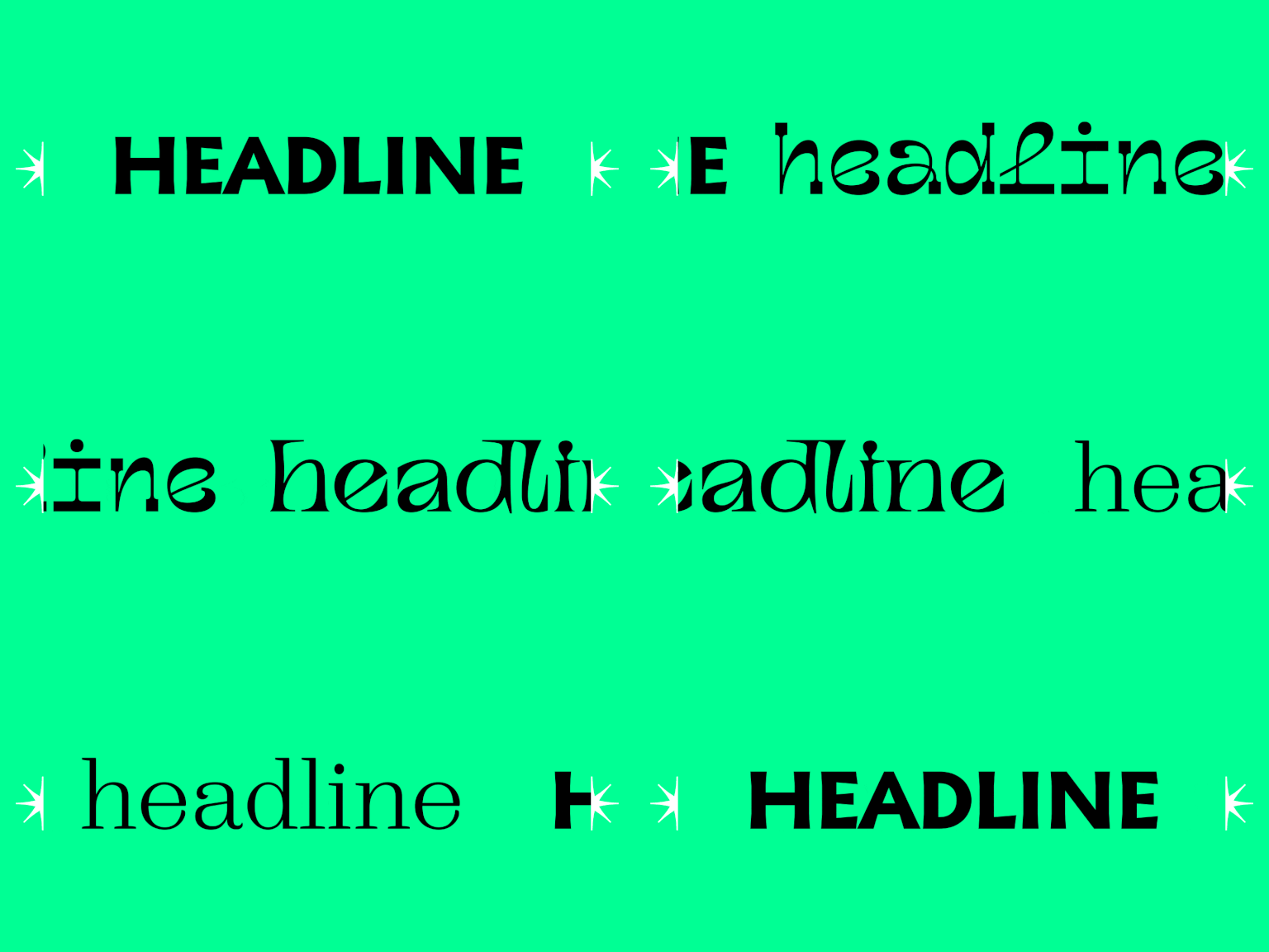
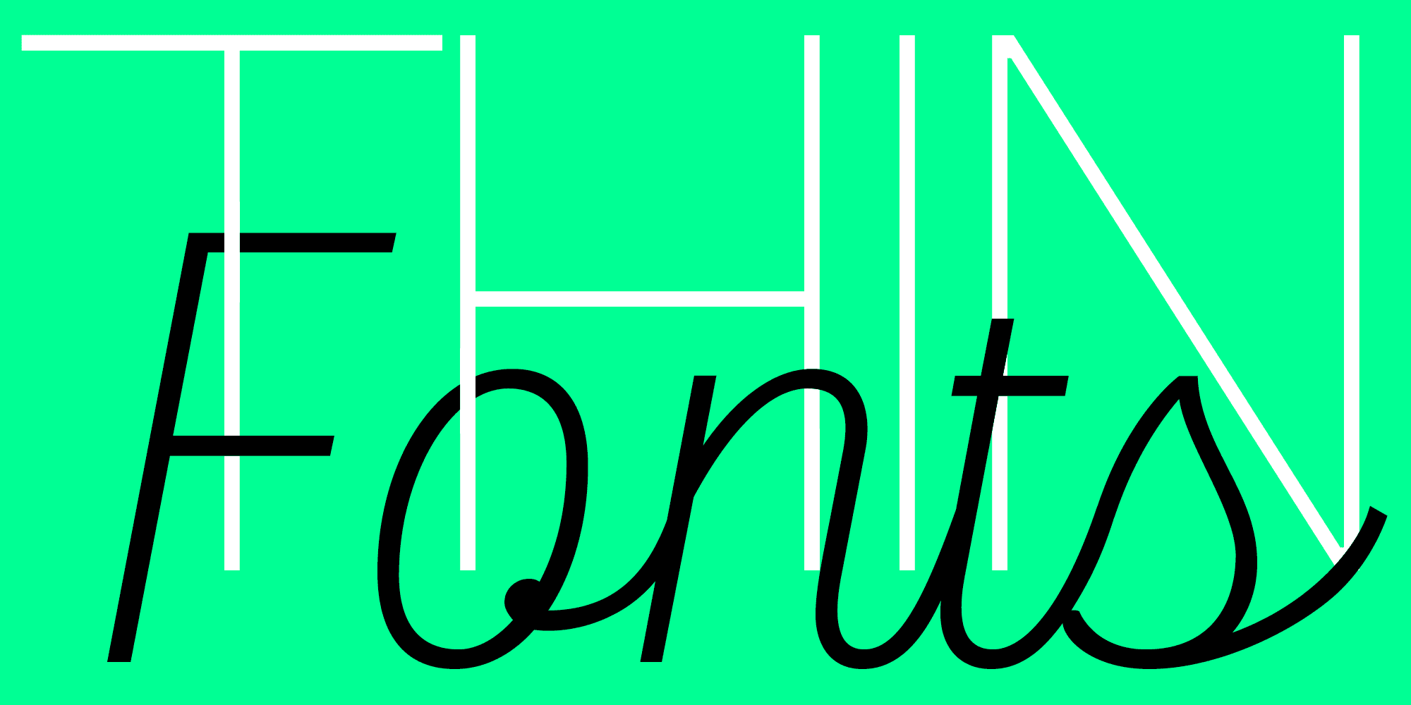
Thin or light/lightweight fonts are the ones that feature «skinny» lines, which are slimmer than usual. There are no limitations to the tasks or purposes these typefaces can fulfill—everything depends on the designer’s preferences. Thin fonts are usually perceived as elegant, beautiful, and sophisticated, so they serve to emphasize similar characteristics in projects.
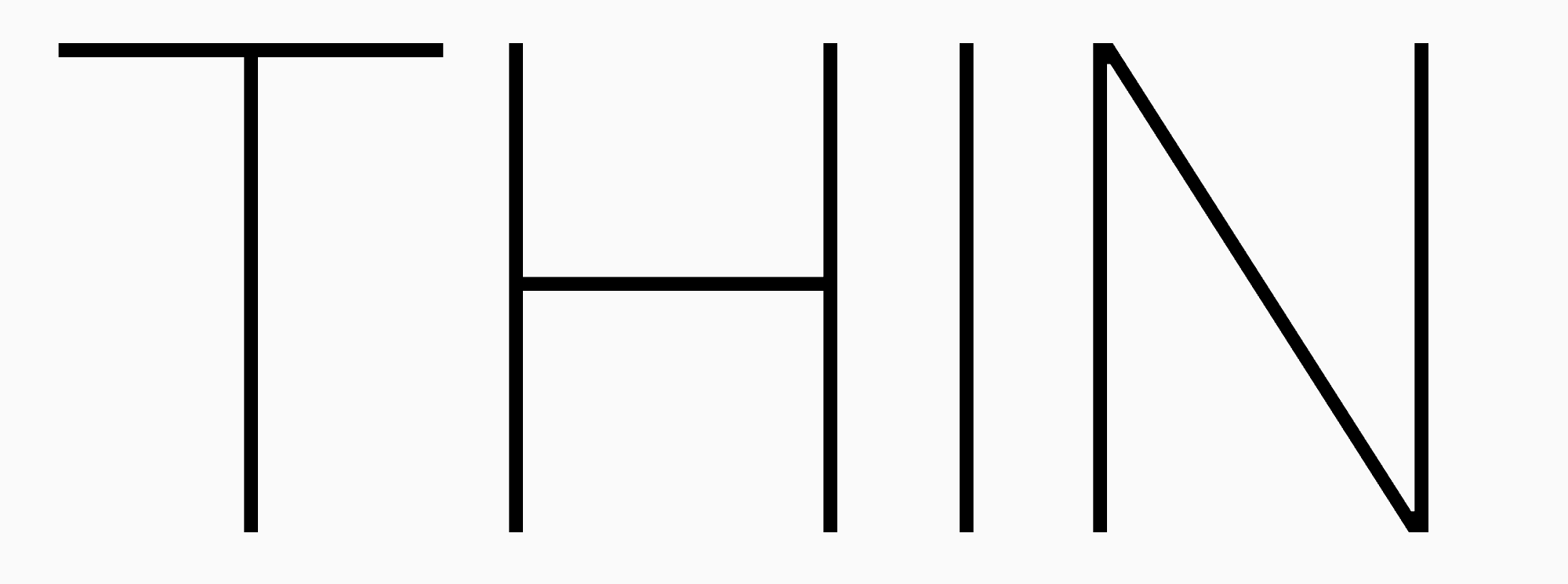
Such fine-line typefaces can be subdivided into relatively neutral and more expressive ones.
The neutral thin fonts are often implemented into big typefaces and complement their font style sets of different weights. The slim font styles are, for example, Thin, ExtraLight, and Light.

The more expressive typefaces, as a rule, either form part of smaller families or exist on their own, meaning that the entire typeface’s design is thin. In such cases, a typeface has different font styles, too, but they are subdivided based on glyph width. It’s essential to keep in mind that the width parameter can significantly affect the font’s mood, so two font styles of the same thin typeface, like Condensed Thin and Expanded Thin, will make completely contrasting impressions.

Also, slim fonts can be subdivided into serifs and sans serifs. Light fonts without serifs (sans serifs) can give a neutral, minimalist look and convey a feeling of tidiness and freshness. In contrast, thin font options with serifs are almost always associated with elegance, grace, and art.
Another category worth paying attention to is handwritten fonts. As the name implies, these beautiful, elegant typefaces imitate human handwriting. There are many lightweight options among handwritten fonts.

Best thin and light fonts from the TypeType collection
We selected the best fonts with thin letters from our TypeType collection. This compilation contains roman, italic, narrow, wide, display, and text fonts for any task requiring a light, calmer typeface. You can download a free trial version of any of these fonts to see how they may look in your project.
Neutral thin fonts

TT Chocolates Condensed ExtraLight
This is a narrow, fine-line typeface with a serene character. It will harmonize well with the packaging or cover design and is equally suitable for branding and layouts. The TT Chocolates typeface has proved to be a perfect font option for confectionery, and TT Chocolates Condensed ExtraLight is no exception. However, this font isn’t confined to just these areas of use. Moreover, if you need an italic version of a slim, narrow font, look no further than TT Chocolates Condensed ExtraLight Italic: it seems more expressive and elegant while keeping a calm mood. These two font styles can be used together as a pair.

TT Norms® Pro Condensed Thin
Skinny and narrow, this thin-line font is minimalist, versatile, and suitable for almost every domain. This font style makes the neutral, geometric sans serif look more minimalist and weightless. It also stands out more due to its narrow proportions. TT Norms® Pro Condensed Thin Italic font style can be paired with TT Norms® Pro Condensed Thin or used independently.

TT Neoris Hairline
This font is a modern and stylish option for any task. If you need a thin, light font with an average width and a stylistically neutral but eye-catching and fresh look, TT Neoris Hairline is exactly what you need. You can also choose TT Neoris Hairline Italic to place accents or use it as an independent font solution.

TT Firs Text Thin
TT Firs Text Thin is a neutral skinny font with a standard width. This elegant geometric sans serif with a Nordic character will accentuate your project’s aesthetic. The scope of this font’s application is almost limitless. It shines best in designs inspired by the Nordic minimalist style. The typeface also features an italic font style, TT Firs Text Thin Italic.

TT Commons™ Pro Expanded Thin
Wide proportions of this basic geometric sans serif with slim lines make it look steadier and more friendly. The font has a simple, neutral design, significantly increasing its adaptability. Despite its light weight, TT Commons™ Pro Expanded Thin is easy to read in small point sizes and can give running text a peculiar appearance. Like the options mentioned above, this typeface has an italic version, TT Commons™ Pro Expanded Thin Italic.
Expressive thin fonts

TT Bluescreens Thin
This expressive, skinny font features ultra-narrow proportions, so narrow that the text typed into the font turns into a pattern. The font looks unusual in large point sizes yet remains legible, which makes it an excellent choice for packaging, book and magazine cover, and poster design. The italic version TT Bluescreens Thin Italic possesses the same visual traits but looks more dynamic. The fonts can be used as a pair or independently.

TT Espina Thin
TT Espina Thin is our «angry,» skinny serif with a spiky personality. Its style shines best in the thin font style, and the narrow proportions lend it a unique aesthetic. This font is most effective in large point sizes, allowing you to explore its details fully. For example, diamond-shaped bowls, closed aperture, and expressive serifs. TT Espina Thin can highlight a dreamy mood of projects in art, music, fashion, or esotericism.

TT Ricordi Allegria Light
This beautiful Florentine Grotesque exhibits elegance and grace. Thin-line letters are characteristic of the entire font family because of the low contrast. However, in the light font style, the font demonstrates its sophistication to the fullest. TT Ricordi Allegria Light looks modern but has a historical feel brought by its origins: the typeface is based on ancient text carvings. The font will harmonize perfectly with the projects in music, history, literature, and more. For instance, it can be used on a ballet show poster or implemented into an art magazine design.

TT Geekette Bones
This is probably the most unusual font in our compilation. In this case, the entire font family can be called thin, but the TT Geekette Bones style makes the lightest and most playful impression because of being monolinear. This experimental typeface has a friendly personality with a handwritten feel. Despite its distinctiveness, it can become a peculiar accent in the brand identity of a wide variety of projects, from a bakery to a jewelry brand.

TT Globs ExtraLight
TT Globs ExtraLight is another unusual and friendly skinny font. Its thinnest font style features extra wide proportions that seem even wider, as if stretching along the line. Moreover, this font fully reveals another intriguing attribute of the typeface: long serifs that form a cohesive text design, almost linking the letters together in a continuous chain. TT Globs ExtraLight is good at grabbing attention and can be used as a thin logo font or in packaging design. The font is highly versatile and adaptable.
Commercial and free thin fonts from other studios
To ensure you can find the perfect lightweight font for your project, we’ve selected a few more options from other studios. The selection also includes expressive and calm typefaces.
Neutral thin fonts:
- Akzidenz-Grotesk Condensed Light with the corresponding italic version;
- Diatype Condensed Thin (DINAMO) with the corresponding italic version;
- Geometria Narrow Thin;
- Metric Thin (Klim Type Foundry) with the corresponding italic version;
- Monument Extended Thin with the corresponding italic version;
- Montserrat with the corresponding italic version;
Expressive thin fonts:
- Ny. Slab Thin;
- Longinus By Domenico Barreto;
- Clarinet Wide Hair;
- DRUZHOK;
- Zangezi Light with the corresponding italic version;
- Asfalt Extended Light.
Conclusion
Skinny and light fonts aren’t always seen as convenient and versatile enough to use. However, always feel free to experiment! When used skillfully, these font styles will infuse your design with freshness, uniqueness, and intrigue.
___________________________________________________________________________________________________________________________________________________________
The list of fonts featured in the article is based on TypeType experts’ opinion.
FAQ
What are the best thin fonts for modern design?
Many modern fonts with thin weights are suitable for design (e.g., TT Chocolates Condensed ExtraLight or TT Norms® Pro Condensed Thin). Such fonts are great for minimalism and the premium segment: they provide lightness and “air.”
Are thin fonts readable for body text?
Thin fonts are usually used sparingly. For long-form reading, a thin weight loses contrast quickly, so Light or Regular is usually chosen for the main text, leaving Thin for accents.
What is the difference between thin, light, and ultra-light fonts?
These are gradations of thickness: Ultra-Light is the thinnest, Thin is next, and Light is the densest of the “light” weights. The thinner the weight, the higher the requirements for size and contrast.
What thin fonts work best for logos?
For logos, it is best to choose families with high-quality thin weights, such as TT Globs ExtraLight or TT Ricordi Allegria Light. The key rule is to always check readability at small sizes and on contrasting backgrounds, as excessively fine lines can get “lost.”
Are thin fonts good for web design?
Yes, thin fonts are suitable for web design, but they must be tested on screens: thin strokes can disappear with weak contrast. Practice shows the following: Thin is suitable for large headers, Light/Regular for text.
What are the most popular thin fonts in 2026?
Thin weights in large families remain in demand for branding and digital in 2026. TT Firs Text Thin, TT Norms™ Pro Thin, and TT Neoris Hairline are excellent options for thin fonts in your design.
Can I use thin fonts for headings and titles?
Yes, you can use thin fonts for headers and subheaders—this is their strength. In large point sizes, Thin looks expressive and neat, especially when paired with a denser text weight.
Which thin fonts are free for commercial use?
For commercial purposes, you can only use free fonts where the license explicitly permits it. A free or trial font may forbid commerce, so always check the conditions on the download page.
What are the best Google Fonts with thin weights?
Many families on Google Fonts have a 100 weight (Thin), such as Montserrat. This is convenient for quick mockups, but you should still verify readability at the actual size.
How do I choose the right thin font for an elegant design?
To select the right thin font, evaluate the task and environment: print vs. screen, large vs. small point size, background contrast. Then choose a thin weight with good support (italics, figures) and test it at the final scale.


