While we often discuss letters in our articles, numbers in typography typically receive less attention. However, this topic is fascinating and more complex than it might appear at first glance. That’s why we’ve dedicated this article entirely to numerals!
In this article, you’ll learn about different types of numerals, their purposes, the unique characteristics of each style, and where to find them in fonts.
Why are there different types of numerals?
Numerals are symbols used to represent specific numbers (numerical values). Today, Arabic numerals—symbols from 1 to 9—are used almost worldwide. The first Western references to these numerals can be found in the Codex Vigilanus from 976 CE. In the Cyrillic tradition, Arabic numerals were introduced by Peter the Great in 1699.
Roman numerals are still in use today, particularly for denoting centuries, millennia, and in book tables of contents.

The most common type today is lining numerals (also known as lining figures, majuscule numerals, or titling figures). Let’s explore these and other types of numerals in detail.

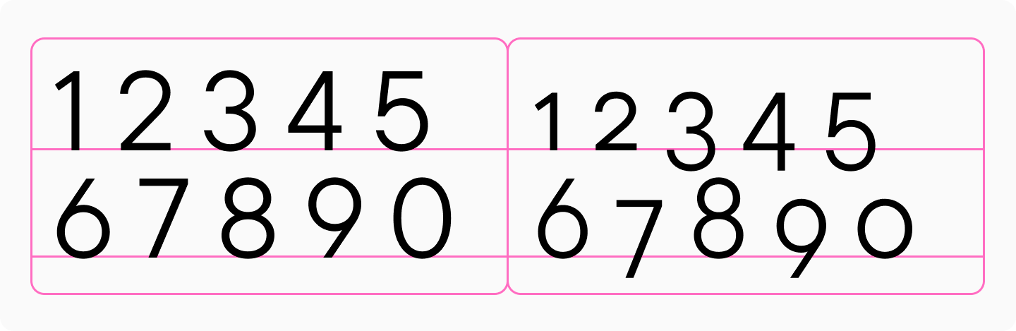
Lining (majuscule) numerals
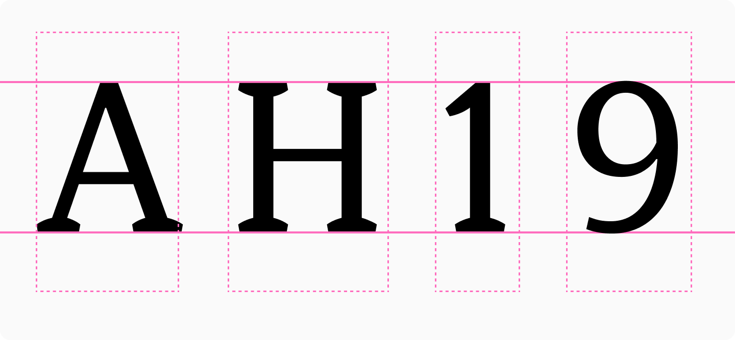
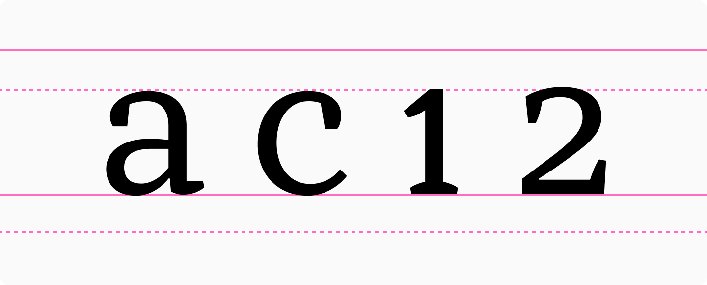
Lining (majuscule) proportionate numerals are numerals without ascenders or descenders, designed to match the height of uppercase letters. Their sidebearings follow the same logic as other characters in the typeface, meaning the width of each numeral varies. For example, the figure “1” takes up less space than “9” in the text.
Lining numerals are the default choice when there’s no specific reason to use other types of numerals, and they’re typically the standard set included in fonts.
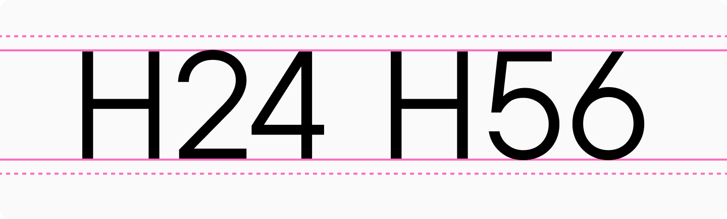
Oldstyle (minuscule) numerals
Oldstyle (minuscule) numerals, also known as old style figures or text figures (lowercase), first appeared in European manuscripts in the 13th century. In typography, they were introduced in 1788 when British punchcutter Richard Austin created a set of numerals three-quarters the height of capitals for John Bell’s foundry.
Oldstyle numerals feature ascenders and descenders, designed to match the height of lowercase letters or slightly taller. They’re specifically designed for use within body text, which is why they’re sometimes called text figures. Unlike lining numerals, oldstyle numerals blend harmoniously with the text, with each numeral effectively functioning like a letter in the line.
Typically, numerals 6 and 8 have ascenders, while 3, 4, 5, and 9 have descenders. However, alternative designs exist with different arrangements of ascenders and descenders, particularly for 3 and 5.
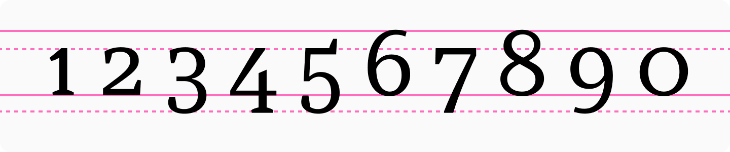
Interestingly, while oldstyle numerals were traditionally associated with serif typefaces, they’re now widely available in sans serif designs as well.
These numerals are usually included as an additional set in fonts and can be accessed through the OpenType Oldstyle Figures feature.
Tabular figures
If you’re familiar with monospaced fonts, you’ll quickly understand tabular figures. If not, we recommend checking our Font Dictionary or reading our dedicated article on this topic.
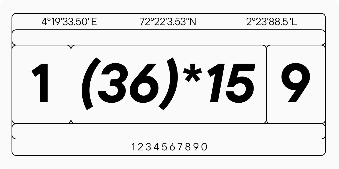
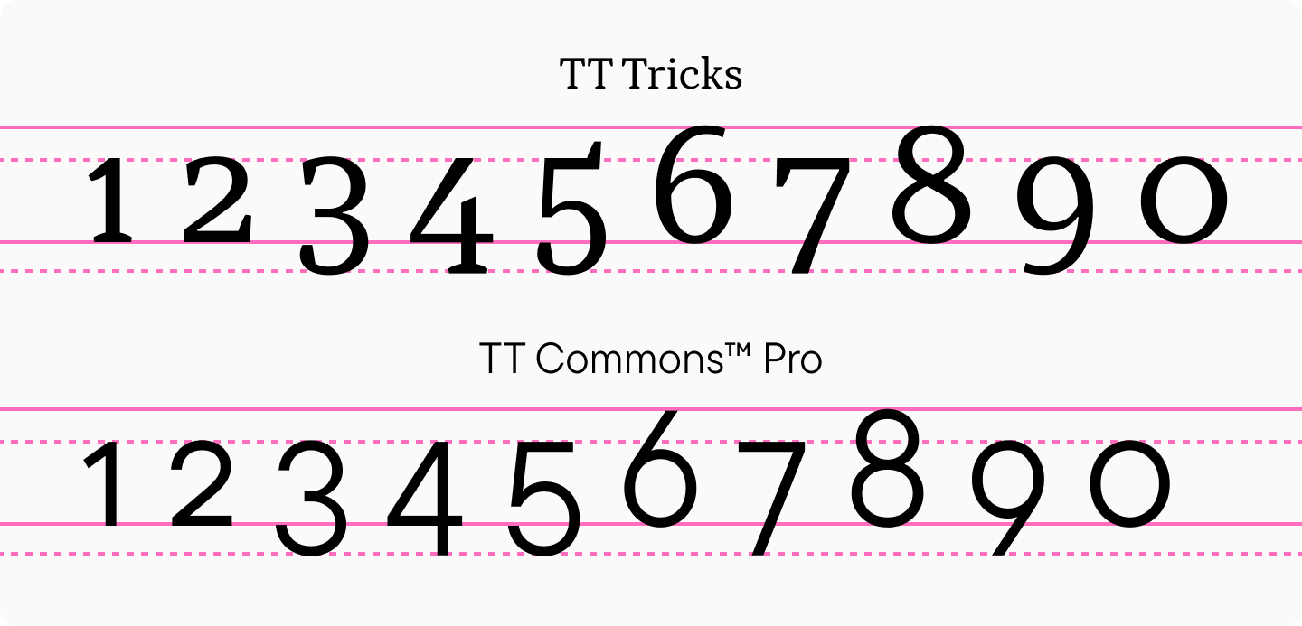
Tabular figures (also called monospaced figures or tabular numerals) are the opposite of proportionate figures. Each numeral occupies the same amount of space—the figure “1” takes up exactly as much width as “9.” Tabular figures are available in both lining and oldstyle forms.
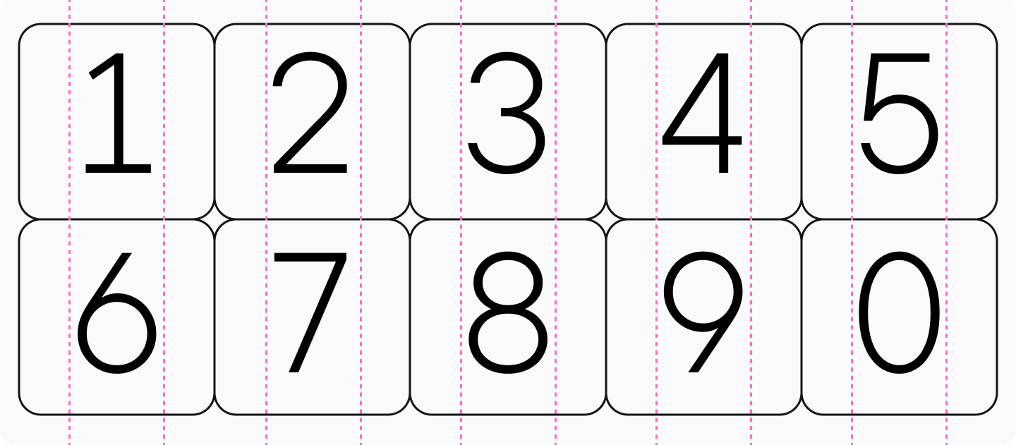
Tabular figures can be lining and old style. Their primary purpose is to align vertically, making them ideal for use in tables and financial documents.
The design of these numerals may either match or differ from their proportional counterparts, depending on the typeface’s concept and the need to fit characters within the fixed width.
Numerators and Denominators
Numerators and denominators are smaller forms of lining numerals used in the upper and lower portions of fractions:
- Numerators appear in the upper portion of fractions
- Denominators appear in the lower portion of fractions
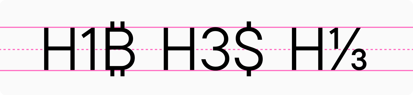
Superiors and Inferiors
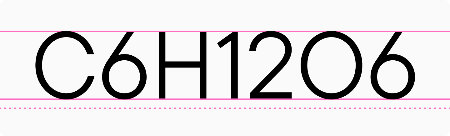
Superior figures are smaller forms of lining numerals positioned in the upper portion of the line. They’re used for footnotes, mathematical expressions, ionic charges, etc.
Inferior figures are smaller forms of lining numerals positioned in the lower portion of the line. They’re commonly used in formulas, mathematical expressions, and chemical compound notations.
Circled figures or Negative circled figures
Font files often include circled figures in two styles: filled and outline circles.

These serve decorative purposes, such as numbered lists or design elements, and are typically accessed through stylistic sets.
How to Find Different Types of Numerals in Fonts
All these numerical variations can be accessed through OpenType features, provided they’re included in the specific font file. For detailed information on how to find these numeral styles in different software applications, as well as how to determine which features are available in a font beforehand, check out our in-depth article on the topic.
Conclusion
As you can see, font files contain many interesting features beyond just letters! Explore all the possibilities of working with fonts, and follow our blog for regular updates on typography, fonts, and type design.
FAQ
What is the difference between tabular and proportional numerals?
Proportional figures have different widths, so a 1 takes up less space than a 9. Tabular figures all occupy the same width, which makes them line up neatly in columns and is especially useful for tables and aligned data.
When should designers use lining versus oldstyle figures?
Lining figures are about the same height as capital letters and work well when numbers need to stand out and behave neutrally in a layout. Oldstyle figures have ascenders and descenders, so they blend more naturally into running text and are especially useful in books and longer reading.
How do numeral styles impact financial or data-heavy layouts?
In tables and lists, alignment matters most, so tabular figures create cleaner, more even columns. In body text and descriptions, oldstyle figures usually feel calmer and fit more naturally into the rhythm of the line.
Are variable fonts capable of supporting multiple numeral systems?
Yes, variable fonts can still include multiple figure styles if the designer has built them in. These are usually switched through OpenType features, while the variable aspect also allows weight or width to be adjusted for different contexts.
How do numerals differ across Latin and non-Latin scripts?
Arabic numerals are the most common in interfaces, but their drawing and proportions can still vary from one typeface to another. What matters is that the chosen typeface supports the required languages and gives numbers a style that feels consistent with the letters.
What are the best numeral styles for dashboards and UI design?
If the data needs to align in columns, tabular figures are the best choice because they keep everything neatly lined up. In interface typefaces such as TT Interphases Pro or TT Norms® Pro, it is convenient to switch between figure styles without breaking the grid.
How do fonts handle fractions and scientific notation?
Fractions rely on numerator and denominator sets, while formulas and exponents use superior and inferior figures. These are typically included as separate OpenType features when they are available in the font file.
Why are monospaced numerals important in coding environments?
They maintain a strict grid: numbers do not jump around, which makes values easier to compare and errors easier to spot. In this kind of work, monospaced solutions such as TT Octosquares or other TypeType monospaced families are especially useful, because their rhythm is designed from the start for code and tables.
How do numeral styles affect brand consistency?
Numbers appear in prices, dates, statistics, and contact details, so their character becomes noticeable very quickly. If they feel inconsistent in rhythm or form, the brand identity looks less cohesive, even when the text itself is well designed.
What accessibility considerations apply to numerical typography?
Focus on distinction and stability: figures should never be easily confused with one another, and tabular sets are usually the safer choice in tables. Contrast and size also need to be checked carefully, so values can be read quickly and without strain.