In today’s competitive job market, even the smallest details can impact your success. One such detail is the font used in your resume. It can not only highlight your professionalism but also influence the overall perception of the document.
What font should be used in a resume? How does font choice affect resume quality, and what criteria should you consider when selecting one? Which fonts should you absolutely avoid for resumes and why? We’ve covered all these nuances in this article and prepared a collection of the best resume fonts for 2026. We’ll explore good fonts for resumes and explain why your font choice matters.
The Role of Font in a Resume: How Font Affects Perception
Font is the first thing a recruiter sees when opening your resume file. First impressions depend on how readable, appropriate, and visually pleasing it is. Even if the content is excellent, an unsuitable font can make it look messy or difficult to read. The readability of your font directly influences how much time recruiters spend reviewing your document and, consequently, their overall impression of you as a candidate.


What Makes a Font “Best” for a Resume
The best font isn’t necessarily the most beautiful or trendy. What matters most is its appropriateness for the specific situation. The ideal choice for a resume is a neutral, visually balanced font with a calm, reasonably serious character.
Good fonts for resumes help structure information and make it easier to process. It makes your resume look modern without being flashy, stylish without being overloaded.
Now let’s explore how to choose the right font.
How to Properly Choose a Resume Font: Main Criteria
Readability and Legibility
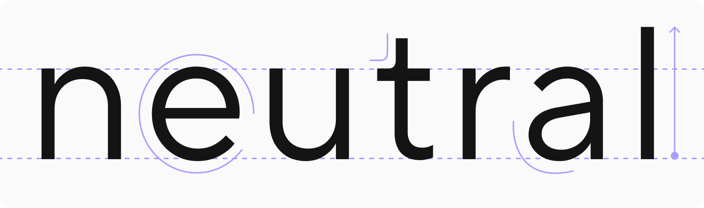
Legibility and readability are the most important characteristics of a proper resume font that deserve primary attention. Legibility refers to the clarity and precision of individual characters. Readability is how easily the entire text can be perceived, which depends on how the characters interact with each other.
A readable font is concise, without unnecessary details or decorative elements. Most often, the most readable fonts and styles have smooth contours, medium thickness and width of characters, and neutral letter spacing.

Neutrality and Seriousness
When asked what font should a resume be, we can confidently answer — appropriate. You might like some fonts for their creative aspects, bold character, or unusual design. However, for a resume to have the proper look, it’s better to use only those options that convey a sense of seriousness and professionalism. Remember that your font’s main task is to convey information as clearly as possible, not to draw attention to itself.

Quality
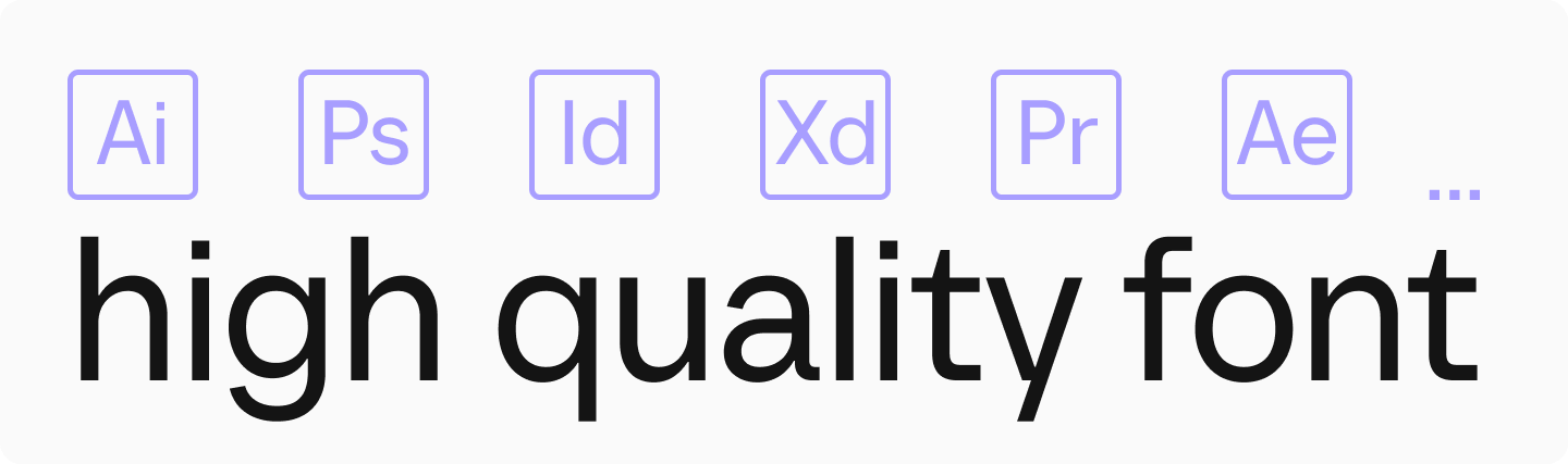
The font should be of sufficient quality to display well in different programs and on any device, without distortion or loss of clarity when changing screen scale or printing. Therefore, choose modern, proven fonts. For example, all TypeType fonts are regularly updated and meet all modern requirements.
Best Fonts for Resumes: Review
In this collection, we’ve gathered the preferred fonts and font pairings for resume design from the TypeType collection. They meet all the above criteria and are suitable for both main text and headings.
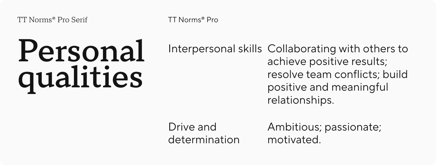
TT Norms® Pro + TT Norms® Pro Serif
TT Norms® Pro is a functional and aesthetic geometric sans serif, an absolute bestseller from the studio. It’s legible, neutral, and restrained, making it ideal for the main text in a resume. At the same time, it’s stylish enough that when used in a slightly larger size or weight, it helps highlight important points.
And if you want to make headings more noticeable without overloading your resume, the calm and elegant Antiqua TT Norms® Pro Serif comes to the rescue. It was developed based on TT Norms® Pro and harmonizes perfectly with it.
TT Commons™ Pro + TT Ramillas
TT Commons™ Pro is a geometric sans serif and one of the studio’s most popular fonts. Universal and modern, it won’t draw unnecessary attention to itself, making text easy to read while giving your resume a current and fresh look. This font meets all standard requirements for professional resume presentation.
To enhance headings, you can pair it with the stylish serif TT Ramillas, which looks modern and neutral but helps make your resume more prestigious.

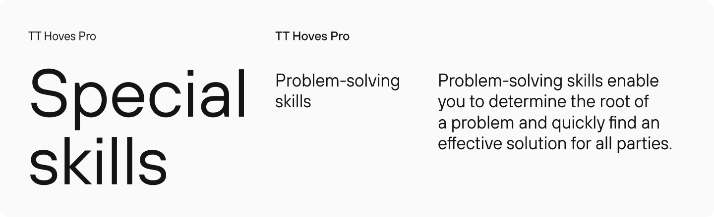
TT Hoves Pro
TT Hoves Pro is a Scandinavian sans serif with a neutral yet recognizable character. It’s dominated by horizontal and vertical lines, making the design minimalist and stylish. It will be easy to read in the main text and look impressive in headings.
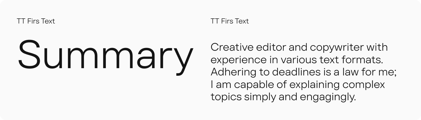
TT Firs Text
TT Firs Text is a concise geometric sans serif with a Nordic character. It’s simultaneously cold and elegant, strict and captivating. With it, you can add a special touch to your resume while maintaining neutrality. Use it for both headings and body text.
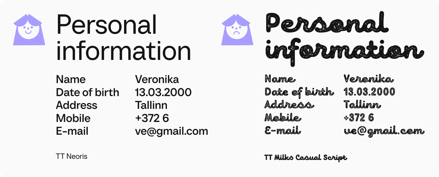
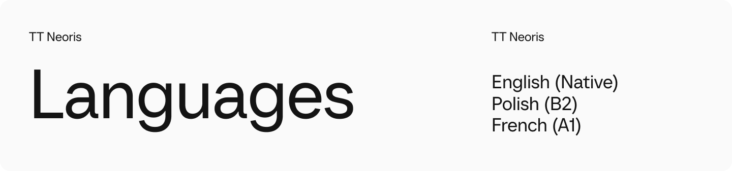
TT Neoris
TT Neoris is a concise Neo-Grotesque that looks fresh and current despite its neutrality. In the main text, it will be perfectly readable, and in headings, when used in a larger size, it will look slightly more distinctive.
TT Chocolates
TT Chocolates is an elegant humanist sans serif with tight spacing and balanced proportions. This is an option for those who want to make their resume less serious and give it a friendly character without going overboard. The font is easy to read in small text, allowing the eye to flow smoothly along the line. At the same time, it doesn’t look completely neutral, showing its character.

TT Wellingtons
TT Wellingtons is a humanist sans serif whose forms refer to the movement of a broad-nib pen. The plastic lines of the letters, inherent in English humanist fonts of the 20th century, look current and lively. Use this font in body text and headings to make your resume memorable while maintaining conciseness.

TT Fellows + TT Livret
TT Fellows is a humanist sans serif with open forms and mechanistic motifs. It looks restrained and concise and is perfectly readable — exactly what any resume needs!
And to add elegance, use the modern serif TT Livret paired with it. It will look aesthetic in headings without overloading your resume.

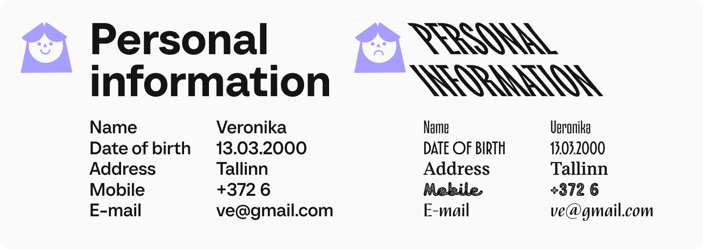
Which Fonts Should You Avoid for Resumes?
You should not write resume text in decorative or script fonts, and it’s better not to use them even in headings. They will look unprofessional, inappropriate, or too flashy. Additionally, avoid fonts that are too narrow or wide, as well as extremely bold or thin styles — they will make information perception difficult by making the text hard to read.

Does Resume Font Size Matter?
When designing your resume, it’s certainly important to select the right font size. The optimal size for body text is 10-12 points. Headings can be slightly larger — 14-16 points, but it’s important to maintain visual balance. We recommend printing your resume or checking how the file will look in PDF format before sending it. This helps evaluate whether the text reads well in your chosen size, as it may display differently in Microsoft Word or other text editors.

Mistakes When Choosing Resume Fonts
Using Overly Unconventional Fonts
Fonts with unusual designs and bold character can be great tools for attracting attention when it comes to design. But they’re not suitable for use in resumes. In this case, such fonts are inappropriate and may indicate unprofessionalism or immaturity of the applicant.

Using Font Sizes That Are Too Small or Too Large
A font that’s too small will make the text difficult to read, while one that’s too large might seem intrusive and will also negatively affect readability.

Using Too Many Fonts in One Resume
Don’t get carried away with formatting your resume with different fonts and styles. It’s optimal to use one, maximum two fonts: first for headings, second for body text. Using more makes the document visually chaotic and loses structure.
Conclusion
As you can see, the font you choose for your resume matters a great deal. We hope our advice helps you select the right option. Good luck!