

In this article, we’ll break down what readability and legibility mean, explore the difference between them, discuss what makes a font legible, and examine the factors influencing text readability.
What is Legibility?
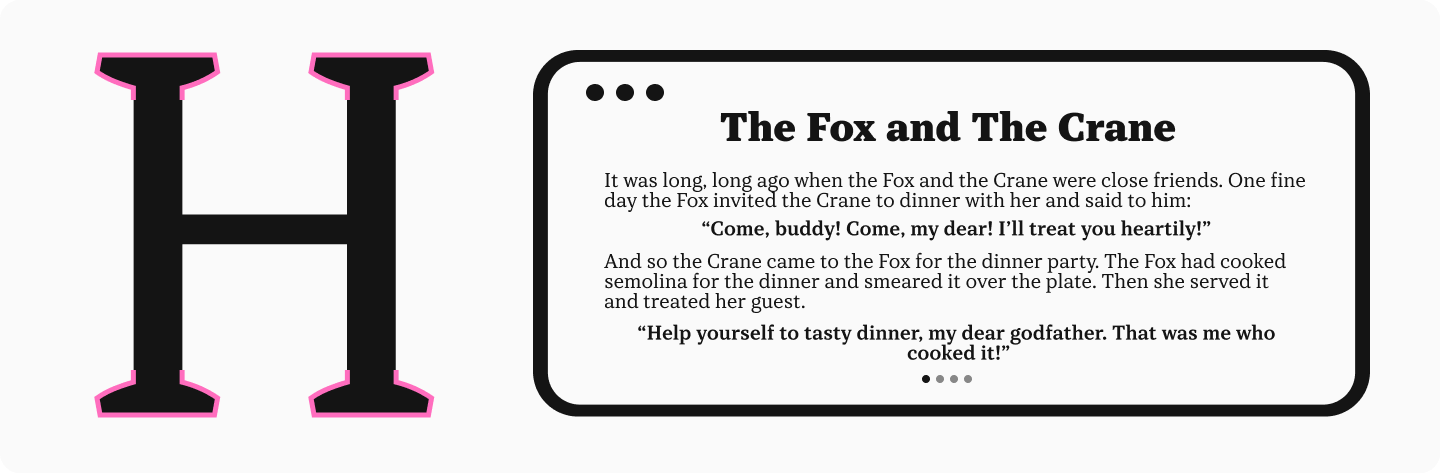
The definition of legibility is this: how easily individual characters or symbols can be distinguished from one another, how easy they are to recognize. If a font is legible, you can effortlessly distinguish between similarly shaped symbols even in small text sizes. For example, you won’t confuse an ’n’ with an ’h’, or an ’i’ with an ’l’.


What is Readability?
Readability refers to the ease with which a reader can understand a written text. The definition in this context focuses on how easily the reader can scan or “glide” through lines of text without distraction or difficulty (ease of reading). While related, legibility is actually one component contributing to overall readability. Understanding readability vs legibility is key for effective design.
Components of Legibility and Readability
Factors influencing legibility are primarily related to the design of the individual characters: their shape, proportions, width, and details. The clearer and simpler the letterforms, the higher the legibility. Good type legibility ensures characters are distinct.

Readability, on the other hand, depends not just on letter shape but also on how characters interact within the text. This includes factors like line spacing (leading), letter spacing (tracking and kerning), font size, and much more, contributing to overall typeface readability.

It’s crucial to understand that a font can be highly legible (easy to distinguish letters) yet poor for reading large amounts of text (low readability), and vice versa. Below, we’ll delve deeper into the factors affecting both legibility and readability.
How to Make Typography Work to Improve the Reading Experience
To ensure typography serves the user effectively, approach font selection and text formatting holistically. The first step is ensuring basic legibility by choosing a suitable typeface. Then, check its readability and fine-tune additional settings to boost the reading experience.
How to Increase Your Font’s Legibility (or Choose a Legible Font)?
X-Height
X-height refers to the height of the main body of lowercase letters (like x, a, e) relative to the cap height. Research studies show that this parameter, along with the length of ascenders (parts rising above the x-height, like in ’b’, ’d’) and descenders (parts dropping below the baseline, like in ’p’, ’g’), directly impacts font legibility.
Letters with features like ascenders and descenders are generally recognized more easily than those without. Increasing the length of these elements improves recognition for several letters. Increasing the x-height positively affects the recognition of all characters.
Therefore, for legible text, choose a font with a larger x-height.

Weight
Weight refers to the thickness of the strokes or the boldness of the characters. This parameter affects both individual character legibility and overall font readability.
Medium weights (like Regular or Book) generally offer the best readability. Very thin (light) strokes can get lost, especially on screen, while very thick (bold/black) strokes can “fill in,” hindering the legibility of individual characters.

Stroke Contrast
Contrast refers to the difference in thickness between the thickest and thinnest strokes in a letter. Fonts can be non-contrast, low-contrast, high-contrast, or ultra-high-contrast.
Low-contrast and non-contrast fonts are generally the most legible and readable. High-contrast and ultra-high-contrast typefaces can suffer from poor legibility, especially at small sizes, as the thin strokes may disappear or break up.

Width
Condensed (narrow) or extended (wide) fonts can be interesting design choices, but they are usually better suited for display purposes (headlines, accents) rather than body text. Extreme proportions hinder both legibility and readability. For optimal text readability, choose fonts with standard width proportions.

Aperture
Aperture refers to the degree of openness in letters like ’c’, ’e’, or ’s’. For example, if the gap in the letter ’c’ is small, it has a closed aperture; if the gap is large, it has an open aperture.
Research indicates that characters with closed apertures are harder to recognize, while open letters contribute to better legibility and, consequently, improved overall readability.

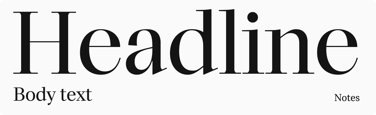
Display vs. Text Fonts
Fonts can be broadly categorized by their intended use: display or text. Display fonts (also called headline fonts) often have a strong, expressive character and unusual design features. They are meant to grab attention and are used for headings, titles, and accents. They might include decorative elements that look striking at large sizes but become distracting or illegible at smaller sizes, hindering text perception. They often feature high contrast, enhancing expressiveness but reducing readability at small sizes. These typefaces work well for large type but are unsuitable for long passages of body text.

Text fonts, conversely, are specifically designed for setting long stretches of text. They typically have a more restrained character, a simpler design without excessive detail, and lower contrast. This promotes the legibility of the font’s characters and the overall readability of the text.

How to Improve Your Text’s Readability?
Serifs
Opinions vary on how serifs affect readability. Some argue that serif fonts aid reading, while others believe they hinder it. However, deeper font readability research suggests neither assertion is entirely accurate.
Studies indicate that the presence or absence of serifs (serif vs sans serif) doesn’t significantly impact reading speed or comprehension for people with normal or even impaired vision. A highly readable text can be set in either a serif or sans serif typeface; typeface readability depends more on other factors discussed below.
Font Size
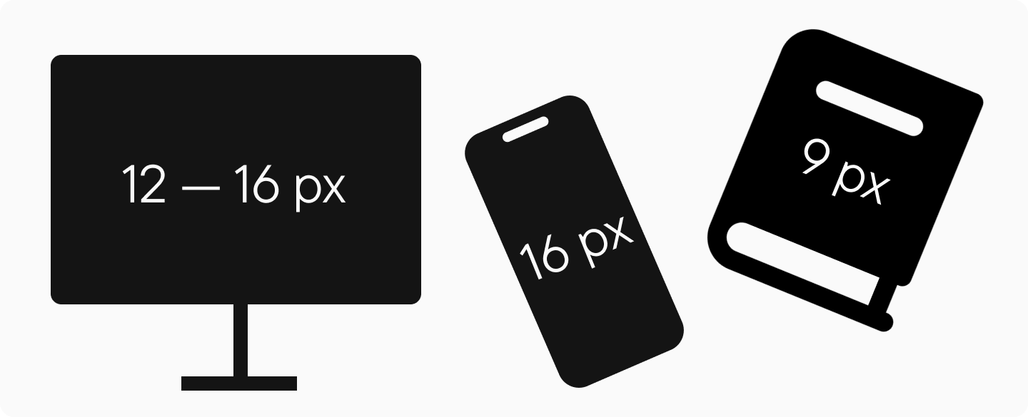
Small text is tiring on the eyes. The minimum readable text size on a monitor is generally considered 12px, but for extensive text, 14px to 16px is recommended. For mobile websites and apps, aim for 16px. In print, use at least 9pt for long texts. Font size is a critical factor for readability.
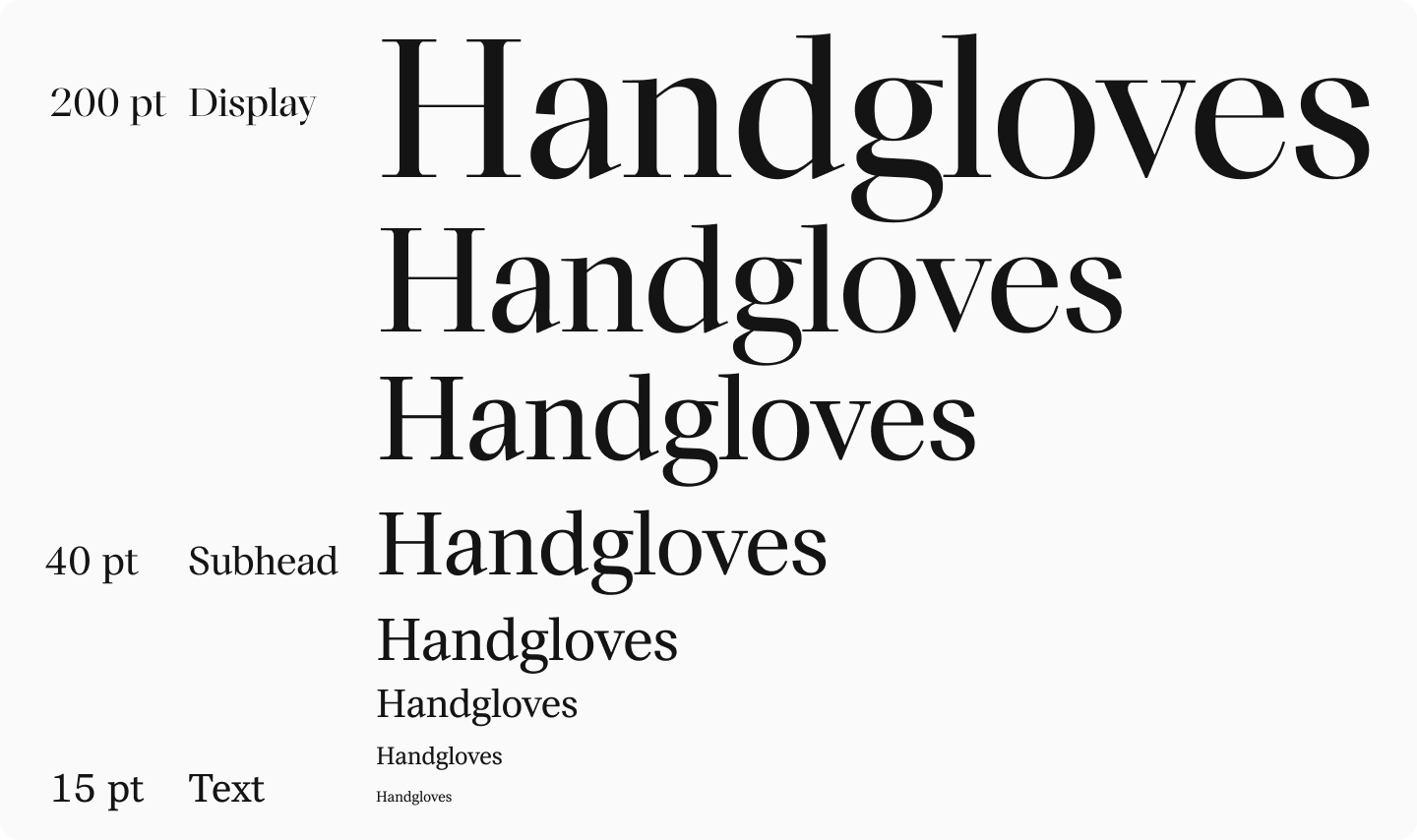
Optical Sizes
Optical sizes are specifically adapted versions of the same typeface, optimized for use at different point sizes.
To enhance readability and prevent distortion when using the same font across various sizes, consider using type families with styles designed for different optical sizes. These different legibilities ensure the font remains clear and functional across its intended range. In such fonts, the overall character design is consistent, but details are refined for larger sizes (e.g., display) and simplified or made more robust for smaller sizes (e.g., caption or text).
Letter Case
Setting text entirely in uppercase (all caps) is generally a bad idea for readability. The lack of ascenders and descenders makes word shapes less distinct, slowing down reading. Use all caps sparingly, perhaps for brief emphasis or short titles.

Line Spacing (Leading)
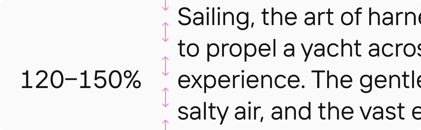
Optimal line spacing (leading) for body text is typically between 120% and 150% of the font size. Too much or too little spacing makes it difficult for the reader’s eye to track smoothly from one line to the next, hindering readability. Ample spacing is generally preferred.
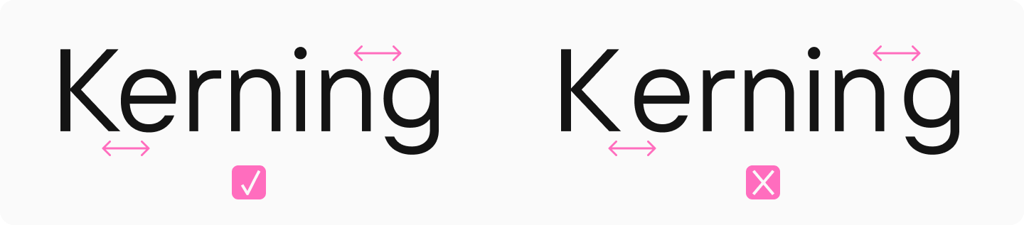
Kerning
Kerning is the adjustment of space between specific pairs of characters to create visually even spacing and improve legibility. For example, the space between ’A’ and ’V’ is often reduced. Kerning is meticulously set by the font designer and is usually built into quality typefaces. It directly impacts readability: text set in a well-kerned font is perceived much better. Choose high-quality fonts with professional kerning to ensure your text is comfortable to read.
To learn more about kerning, read our dedicated article.
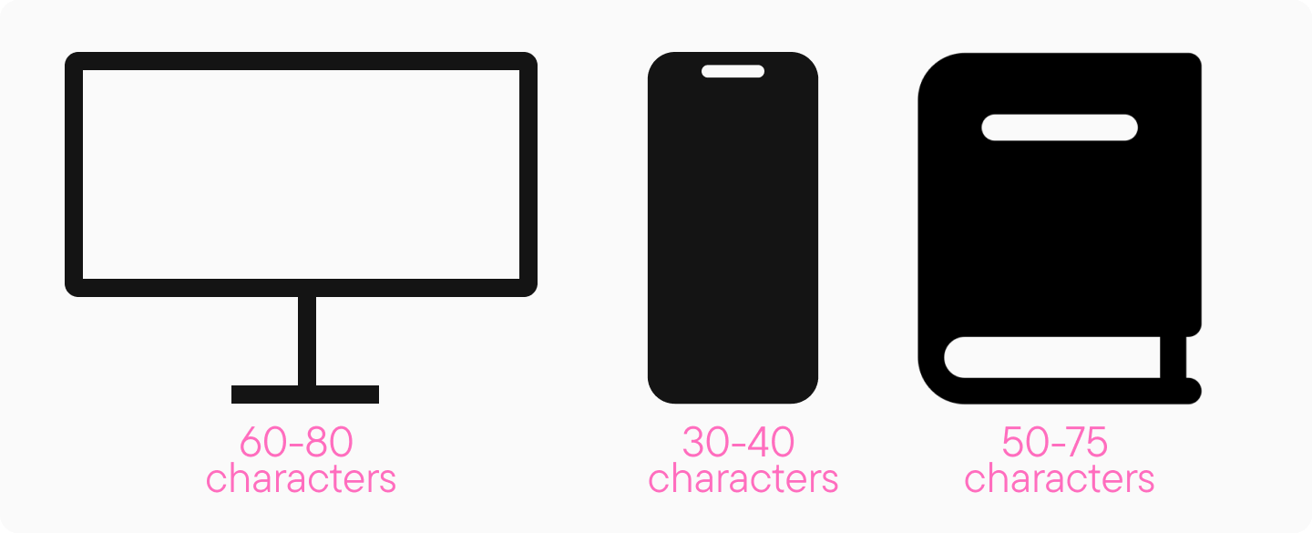
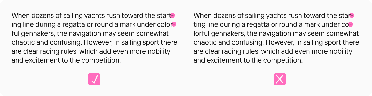
Line Length
Lines should be short enough for the eye to easily find the start of the next line, but long enough to maintain a good reading rhythm. The optimal line length varies by medium. For print, aim for 50-75 characters per line. On desktop screens, 60-80 characters is often comfortable. On smartphone screens, aim for 30-40 characters. Too long or too short lines negatively impact readability.
Color and Contrast
Text must have sufficient contrast against its background to be easily readable. Black text on a white background is classic, but other combinations can work. Dark gray or dark green on a light background can be effective. Ensure high contrast, but avoid overly bright or saturated colors for extensive text, which can cause eye strain. Use contrast checking tools (for RGB and HSL models) to verify sufficient contrast ratios. Good contrast is essential for both readability and legibility.

Hinting
Hinting involves instructions embedded within a font file to ensure it renders clearly on screens, especially at smaller sizes and lower resolutions. It helps prevent distortion and maintain legibility. Choose quality fonts with professional hinting, particularly if the text will be displayed on various screens or at small sizes. Without hinting, a font might appear blurry, distorted, or unreadable under certain conditions, severely impacting legibility.
You can learn more about hinting here.

Layout and Formatting
Text readability isn’t just about the chosen font; how you apply it and format the page (the layout) is also critical. Below are important typographic characteristics that help improve text perception and the overall reading experience. Proper typography considers both legibility and readability.
Hierarchy
Headings, subheadings, lists, bullet points, and emphasized text (like bold or italics) help readers navigate the text and quickly find information. Establishing a clear visual hierarchy is crucial not just for organization but also for readability and comprehension.
Widows, Orphans, and Dangling Words
“Widows” (a paragraph’s last line appearing alone at the top of a new page/column) and “Orphans” (a paragraph’s first line appearing alone at the bottom of a page/column) disrupt the flow of text and look unprofessional. Avoid them for better readability and aesthetics.

In some languages (like Russian), leaving short prepositions or conjunctions at the end of a line (“dangling”) is considered poor form as it can interrupt the semantic connection to the following word. While less of a strict rule in English typography, especially on the web where line breaks are dynamic, be mindful of awkward breaks that might slightly hinder reading flow.

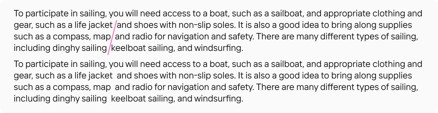
Rivers (Corridors)
Rivers (or corridors) are distracting vertical or diagonal gaps of white space that can appear in justified text due to word spacing. They disrupt the texture of the text block and impair readability. Adjusting tracking, hyphenation, or line length can help minimize them.
Hyphenation
Automatic hyphenation helps create more even word spacing and avoid excessive gaps, especially in justified text, contributing to better readability. Ensure hyphenation settings are appropriate for the language and avoid too many consecutive hyphens.
Legibility vs. Readability: Which is More Important?
It’s impossible to definitively say whether legibility or readability is more important, as they often complement each other. For short pieces of text like signage, logos, or headlines, legibility is paramount — the words must be easily and accurately deciphered (successfully decipher). For longer texts, both the legibility of individual characters and the overall readability are critical; indeed, good legibility contributes significantly to good readability. Therefore, determining which characteristic is more vital depends on the specific task and context for which you need the font or typeface. The key is understanding the difference and optimizing for the intended use to create legible text that is also readable. To define legibility simply is hard without considering its partner, readability.
Conclusion
We hope this article has helped clarify the difference between legibility and readability. However, it’s important to remember there are no universal rules. To truly master this topic, delve deeper into each characteristic.
For highly interested readers, we recommend the book “Reading Letters: Designing for Legibility” by Sofie Beier. And if you’re looking for highly readable fonts for your project, check out our curated selections. Understanding the definition and application of both readability vs legibility concepts is key to effective typography. The interplay between readability and legibility defines the success of text communication.