Introduction
The words “font” and “typeface” are often considered synonyms. This happens not only due to lack of understanding—even among professionals, the term “font” is used to substitute both “typeface” and “font style.” The absence of commonly accepted terminology worsens the situation because all font designers rely on different interpretations.
In this article, we will describe the distinctions between fonts and typefaces and discuss the importance of distinguishing between them.
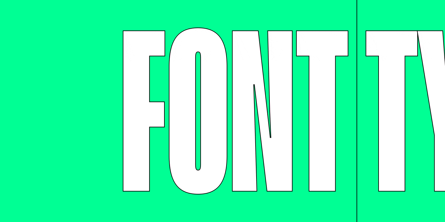
Font vs typeface: Going deeper into terminology
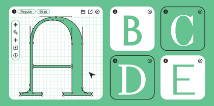
Font is a set of characters, encompassing letters, numbers, punctuation, and diverse symbols utilized for setting the text.
According to this broad definition, the meaning of the term “font” can be understood as both:
- A collection of symbols or typographical letters (made of metal or digital) needed for typesetting;
- A character set with a shared stylistic identity and design.
The term “typeface” found its place in typography in the early 1900s when the first “extended” font families emerged, designed by Morris Fuller Benton for the American Type Founders (ATF) studio. These font families included fonts with varying styles (widths and weights) yet united by a shared aesthetic.
In modern typefaces, fonts can even vary in aesthetics, bound by artistic vision alone.

What is a font?
So, a font is what we can find inside a typeface or a type family. However, in typography, the word “font” is often used to signify both a typeface itself and an individual font style. A font style is a font’s particular weight and slope degree.
For example, when we say that TT Norms® Pro is a font with the most extensive language support among other fonts in the TypeType collection, we are actually talking about the TT Norms® Pro typeface. And if we suggest using the font TT Livret Text Regular as the most optimal choice for typing sizeable text blocks, we are referring to the specific font style.
Consequently, it’s possible to understand the meaning depending on the context. Yet, to make sense of the difference between fonts and typefaces, we recommend leaning on the following definition:
A font is a full set of symbols and glyphs united by style and used for text typing. Meaning it’s the file itself, a font carrier.

What kinds of fonts (font styles) exist?
Regarding font classification, the subject in most cases is typefaces. That’s why we will define the term “typeface” and cover the classifications later in the article. For now, let’s start small and unravel the different kinds of font styles.
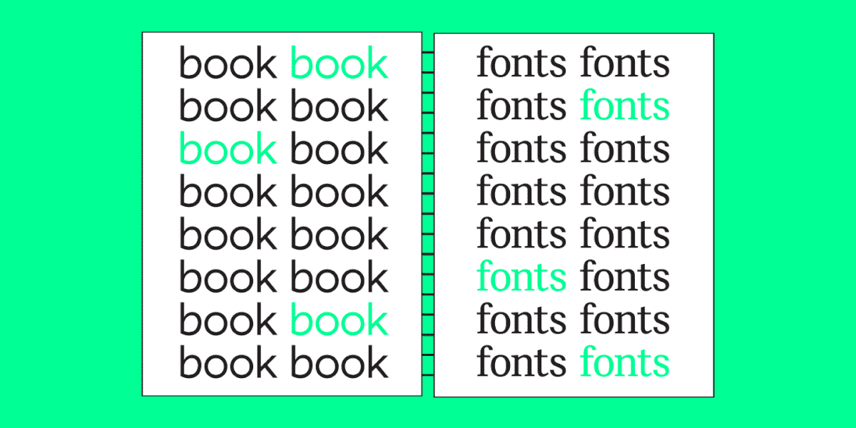
A font style is a font’s particular weight. In their turn, they can vary in slope degree.
One font may include roman and italic (slanted) font styles.
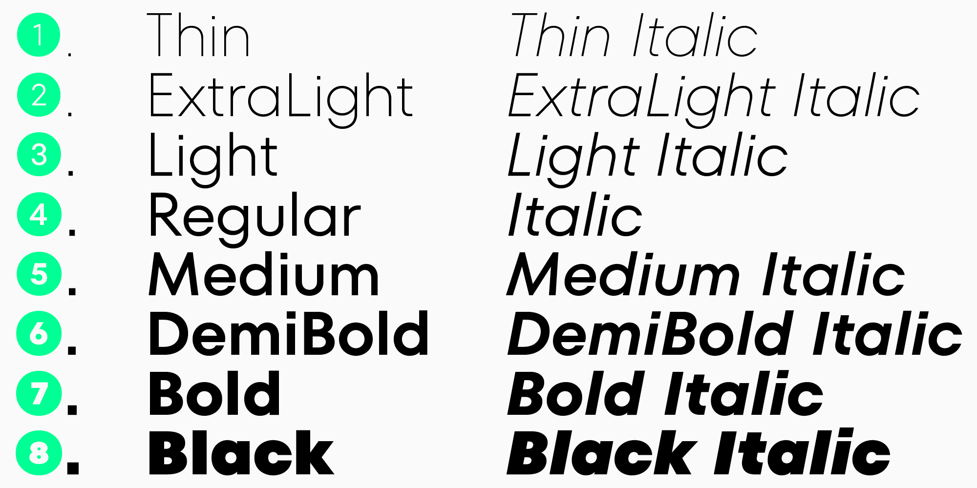
The varying font weights can be subdivided into three categories: thin, regular, and bold. The most popular and frequently used font styles are Thin, Regular, DemiBold, and Bold. Different studios can extend the font style set as they see it. For instance, it’s quite common to come across fonts featuring the Hairline font style.

Fonts with various font styles are grouped into type families (typefaces). Let’s delve into what they are.
What is a typeface/type family?
To begin with, we should distinguish between the terms “type family” and “typeface”, although they have similar meanings.
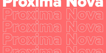
A type family (or a font family) is a system comprising variations of the primary design (font styles). They are united by the name and idea. At the same time, fonts inside one type family may differ in purpose, personality, and style.
The term “typeface” can also refer to both an entire type family and only a part of it—this term is used as a synonym for “type family.”
However, this term has another definition as well. According to the Google Fonts dictionary, typeface is the core visual design and idea that can be implemented through various typesetting technologies, and font is one of these implementations. In other words, a typeface is what you see, and a font is what you use.
In this sense, let’s reiterate that when we talk about font classification, we specifically refer to typefaces. Let’s find out more about them.
What types of typefaces are there?
There is no standard classification of fonts or typefaces. At this point, we won’t dive deeper into this topic. Instead, we will cover the basics so you can better understand the difference between fonts and typefaces. If you want to learn more about type classifications, we recommend reading our article about them.
The most common typeface styles are sans serifs (grotesques), serifs (antiquas), slab serifs, and script typefaces.
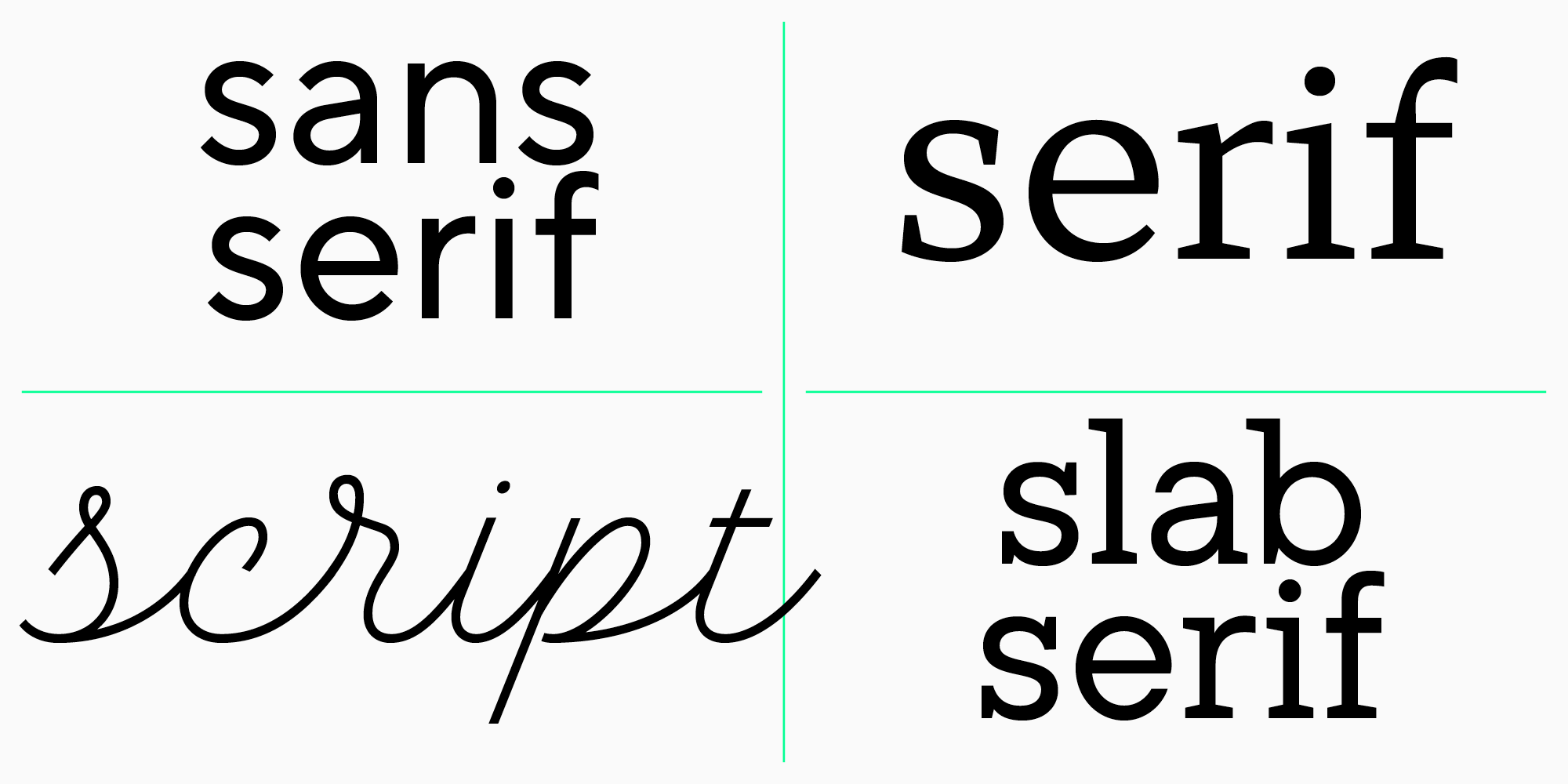
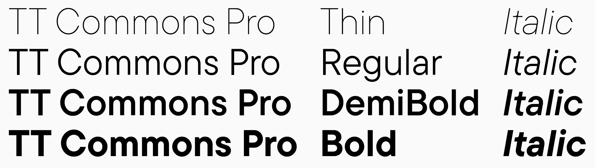
- Sans serifs (grotesques) are a group of typefaces that don’t have serifs. They are characterized by low contrast or no contrast at all. A great example of a geometric sans serif would be TT Commons Pro.
- Serifs (antiquas) are a group of typefaces with serifs. Typically, they exhibit high contrast. For instance, TT Ramillas is a Transitional Antiqua.
- Slab serifs are marked by heavy rectangular serifs. An example of such a font is our TT Rationalist.
All the above-mentioned examples from the TypeType collection are typefaces that consist of various fonts.
- Script fonts imitate handwriting. They can also form typefaces, but we intentionally separate them from the rest of the list to make a clear distinction between fonts and typefaces one more time. So, the TypeType collection has a script font called TT Lovelies Script. It qualifies as a font specifically because its entire contents are a single font style.
Font vs typeface: What is their difference in practice, and why is it important for designers to distinguish them?
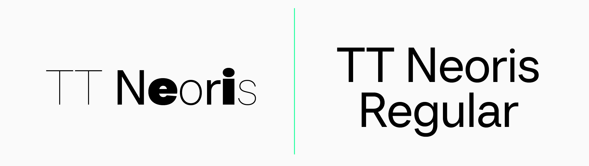
It’s essential for both designers and clients to understand the difference between fonts and typefaces. This can significantly facilitate project development. As you know, fonts within a typeface can vary considerably. For instance, if the task for a designer is to use TT Neoris, the resulting mockup can turn out completely different from what the client expected because this typeface is highly versatile. But if the task is narrowed down to using a specific font, like TT Neoris Regular, such a surprise can be avoided.
Conclusion: Are the differences between fonts and typefaces crucial?
Font design terminology is a living being: together with the development of typography and the advancement of technologies, new terms emerge. However, categorizing and understanding the old ones was already difficult as they represent a very complex system. For those working with fonts or just intrigued by the field, understanding the diverse meanings of these terms is essential. It is the only way to immerse yourself in the subject and comprehend it.
FAQ
What is the difference between a font and a typeface?
A Typeface is the overall design and concept of the font family. A Font is the specific implementation within the family: essentially the file or set of characters of a single style and weight.
Is Arial a font or a typeface?
If referring to “the family with different weights,” Arial is a typeface/family. But a specific variant like Arial Bold Italic is a font (a specific weight/file).
What are some examples of fonts vs typefaces?
TT Commons® Pro and TT Ramillas are examples of typefaces (families) containing different weights. Whereas TT Livret Text Regular or TT Lovelies Script are examples of specific fonts/weights (even if there is only one style).
Why do designers care about the difference between font and typeface?
Fonts within the same typeface can differ greatly in character and purpose. If a brief specifies only the typeface name (e.g., TT Neoris) without the weight, the result may not match expectations.
Are Times New Roman and Helvetica fonts or typefaces?
If you refer to “Times New Roman” or “Helvetica” as a set of weights under one name, they are typefaces/families. “Regular/Bold/Italic” are the specific fonts (weights, files) inside them.
What is the history of the terms font and typeface?
The word “font” comes from the French word “fonte,” meaning “a casting” (from the verb “fondre,” “to melt”). Historically, it referred to a complete set of characters of a particular face and size of printing type. The term “typeface” emerged later (around the mid-19th century) as a compound of “type” and “face,” referring to the specific design on the top surface of the metal block that makes contact with the paper.
Can a typeface have multiple fonts?
Yes. A typeface is a system of fonts of different weights under one name and concept, and internally it can include many variants in weight and slant.
How do fonts and typefaces affect design readability?
Readability depends on which weight you choose within the typeface: large volumes of text need one style, accents need another. Therefore, it is important to specify not just the typeface, but the specific font/weight.
What is the difference between digital fonts and printed fonts?
The key difference is in technology and optimization. Digital fonts are files intended for screens; they scale without losing quality. Print fonts were historically physical carriers, though today they are digital fonts specifically adapted for the nuances of printing.
How do I choose the right typeface or font for my project?
First, choose the typeface based on the general character that reflects your project’s idea, then the font: the necessary weight, thickness, and slant.