In the ever-evolving landscape of web design, it’s not just the vibrant visuals or interactive elements that grip a visitor’s attention. Lurking quietly, yet undeniably powerfully, typography plays a pivotal role in shaping a user’s experience. Fonts, often overlooked, are the silent narrators of the digital tales we traverse daily.
Readability and its Influence on Perception in Web Typography
Every digital word carries a purpose, be it informing, persuading, or entertaining. But the very essence of that purpose diminishes if those words aren’t comprehensible. The ease with which text can be read and understood is described as readability, a cornerstone of effective communication.
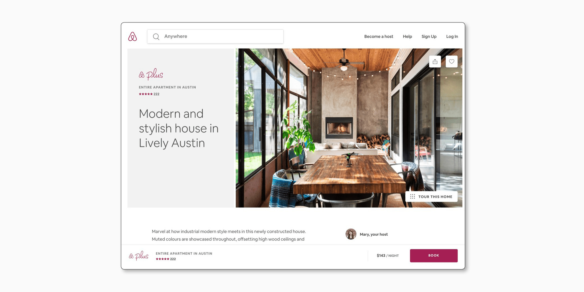
Airbnb, with its vast global user base, identified the need for clarity in its typography. When the time came to reimagine their website, they transitioned from their previous typeface to Circular, a font renowned for its clear and legible characteristics. This deliberate choice ensured that users, from Seoul’s bustling streets to the serene landscapes of New Zealand, could effortlessly engage with the platform.
Substantiating the significance of legibility in design, Google’s 2014 “Legibility Study” revealed that among the myriad of sans-serif fonts, Arial and Roboto distinctly stood out. Such findings beckon designers to prioritize legibility, recognizing its indispensable role in fostering user engagement.

Mobile Typography: Adapting Fonts for Handheld Devices
In today’s digitized era, mobile screens have become the predominant gateway to the vast world of the internet. However, the grace with which typography dances on a desktop may stumble on mobile if not adapted correctly.
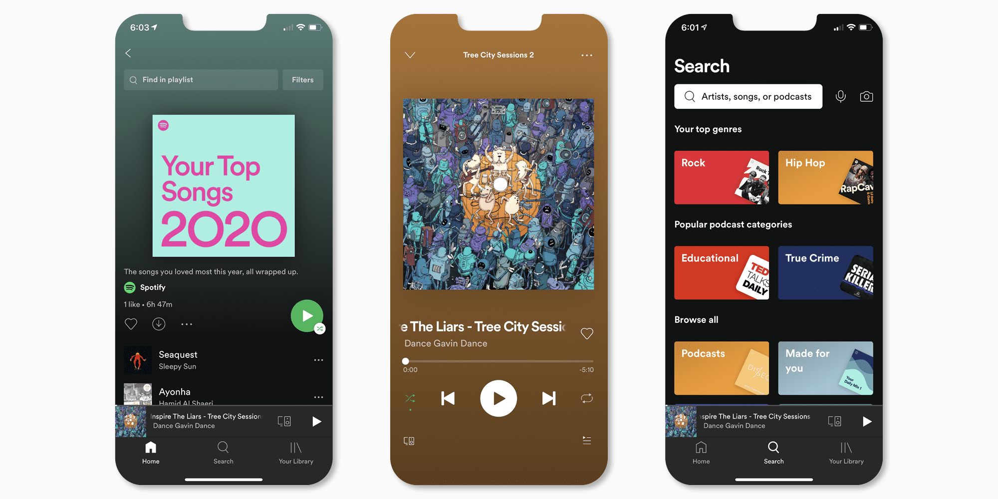
Spotting this transition early on, Spotify acted proactively. They embraced a typeface that resonated with mobile dimensions. By adopting Gotham, a versatile font that scales beautifully across devices, Spotify ensured its users encountered no hiccups while diving into their favorite tracks.
MIT’s research in 2011 titled “Reading on Screen: The New Media Sphere” accentuated the intricacies of mobile typography. The study underscored the importance of contrast and font size in ensuring reading comfort on pocket-sized screens.
Branding Through Fonts: Emotional Resonance and Recognition
Beyond their functionality, fonts hold an evocative power, painting emotions and memories. A brand’s choice of typeface doesn’t just convey information; it crafts an emotion, an identity.
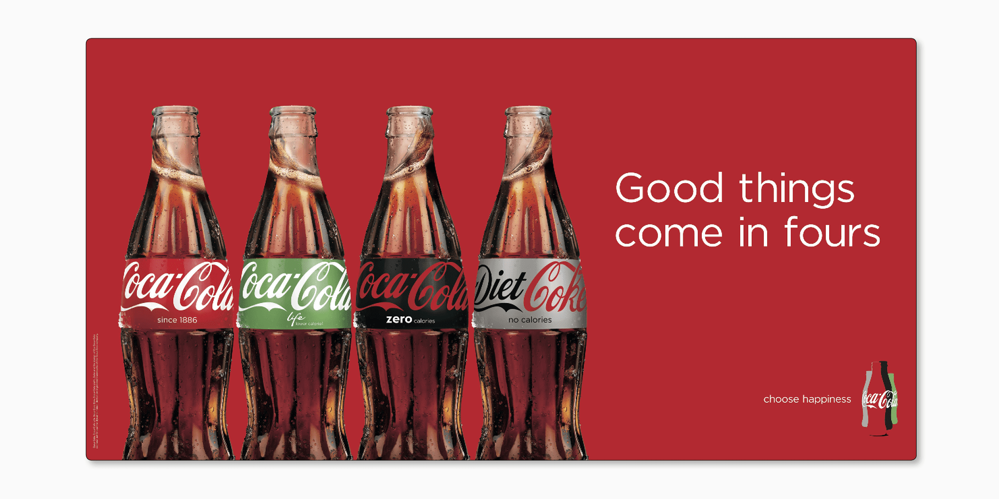
Who hasn’t glimpsed the swirly white letters against a red backdrop and instantly thought of a refreshing drink? Coca-Cola’s legendary script font, Spencerian, is an epitome of emotional branding, evoking memories and sensations universally.
Backing this sentiment, the University of Wichita’s 2006 research elucidated how a strategically chosen font, when paired with the right color, can amplify brand recognition by leaps and bounds.
Font Compatibility Across Platforms: Ensuring Consistency
The modern user isn’t tied to one device or browser. Their digital journey spans across multiple touchpoints. In such a landscape, inconsistent typography can disrupt the narrative and user experience.
Taking note of this, Microsoft embarked on a mission to offer consistency. They introduced Segoe UI designed to shine uniformly across a myriad of platforms. This move was more than aesthetic. It was about creating a seamless user experience.
Smashing Magazine’s insights in 2012 elaborated on the complexities of font rendering across diverse browsers and operating systems. The article championed the cause of universal font compatibility, highlighting its quintessence in contemporary design.
Balancing Font Aesthetics and Performance in Web Design
A visually striking website that takes an eternity to load can be a user’s nightmare. Herein lies the balancing act: marrying aesthetic allure with swift performance.
Amazon, the e-commerce behemoth, demonstrated this equilibrium flawlessly. While they adopted the Amazon Ember font for its aesthetic charm, they optimized it meticulously to ensure it never hampered their site’s brisk loading times.

Google’s “The Need for Mobile Speed” in 2016 threw light on this tightrope walk. The study spotlighted the potential repercussions of heavy fonts on load times, emphasizing that design elegance should never come at the cost of user patience.
You can also learn about font customizations that can be used to speed up website loading in the article written by the TypeType team.
Conclusion
The unspoken symphony of the digital realm is orchestrated by fonts. They guide our eyes, evoke our emotions, and dictate our actions. With real-world narratives from giants like Airbnb, Spotify, Coca-Cola, Microsoft, and Amazon, it becomes evident: in the vast tapestry of web design, fonts play a lead, yet often unsung, role. As designers and developers, recognizing and leveraging the power of typography can be the difference between fleeting visits and lasting engagements.