Web and printing in typography are two different worlds. At least, they are often presented this way.
In reality, many typefaces can be used in both domains. To understand what typeface to choose, it is important to know the differences between book fonts and web fonts.
This article covers the topic of fonts for books and how to choose the best typeface for book design, magazines, or any other printed material.
The font’s role in book design
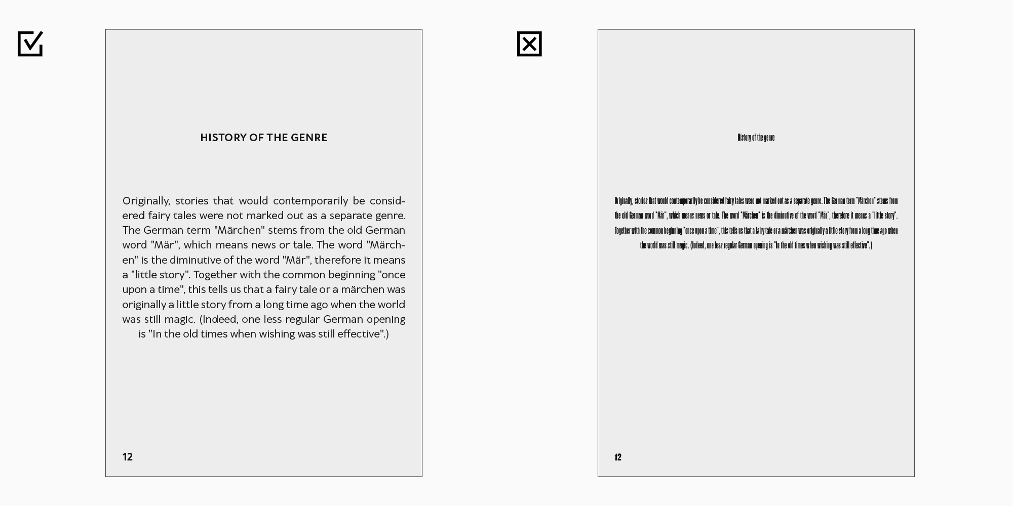
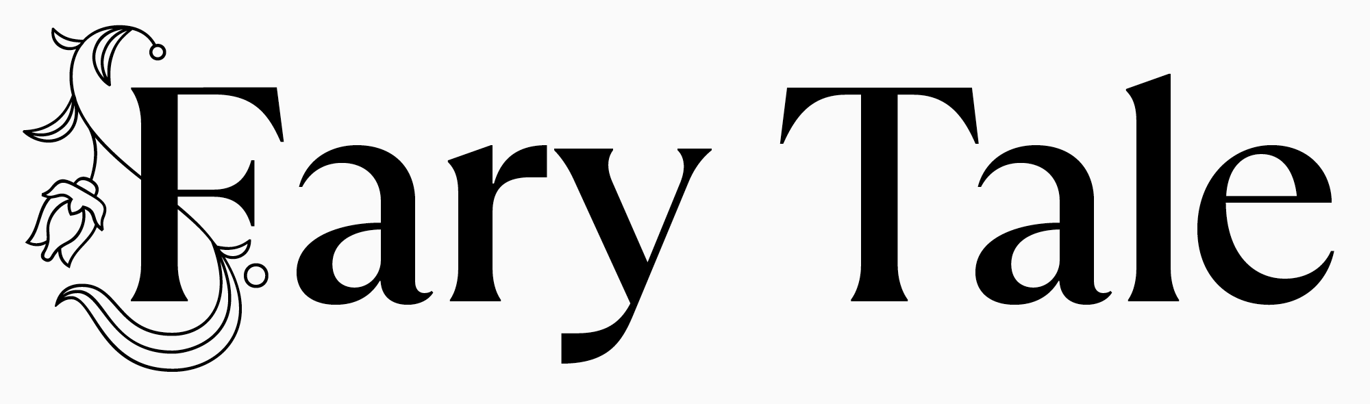
Everyone has their own image of a “book”. The first thing that comes to mind is likely a vivid cover. Inside, there will be pages with text and, probably, illustrations. But the main thing in most books is certainly the text. Through the text, readers receive information and follow the story’s narrative.
The font for book printing serves as a link between the text and the reader’s attention. To make the text legible and provide comfort for the eyes, a designer should choose a suitable typeface.
The font sets the mood, provokes associations within the design, and helps place emphasis on various elements. If the font choice is unfortunate, the text will be hard to read, and the eyes will get tired soon.
Several things influence the perception of the font in a book or any other printed material: compatibility of styles and fonts, the chosen point size, tracking, and the chosen weight of the font styles.
When creating a book layout, a designer must choose the best typeface option to fully embody the book’s concept. At the same time, they have to consider the format of the future publication, the type of paper for printing, and the target audience.
All these criteria are also essential as they help better perceive the content of the printed material.

What font is better for book printing?
A designer tasked with book layout for the first time will have to encounter the peculiarities specific to book design.
Likely, the layout will not turn out perfect immediately, but you will improve your skills over time.
The main thing is to understand what to pay closer attention to during the work.
1. The idea of the book and its content.
Obviously, it is not necessary to read each book you are going to design till the end. However, it is essential to understand what exactly you are dealing with. A fiction novel, non-fiction from a modern author, technical literature, or children’s book. You can ask for the synopsis from the author or publishing house you work with.
Choose a typeface keeping in mind the idea of the project.
2. Watchfulness.
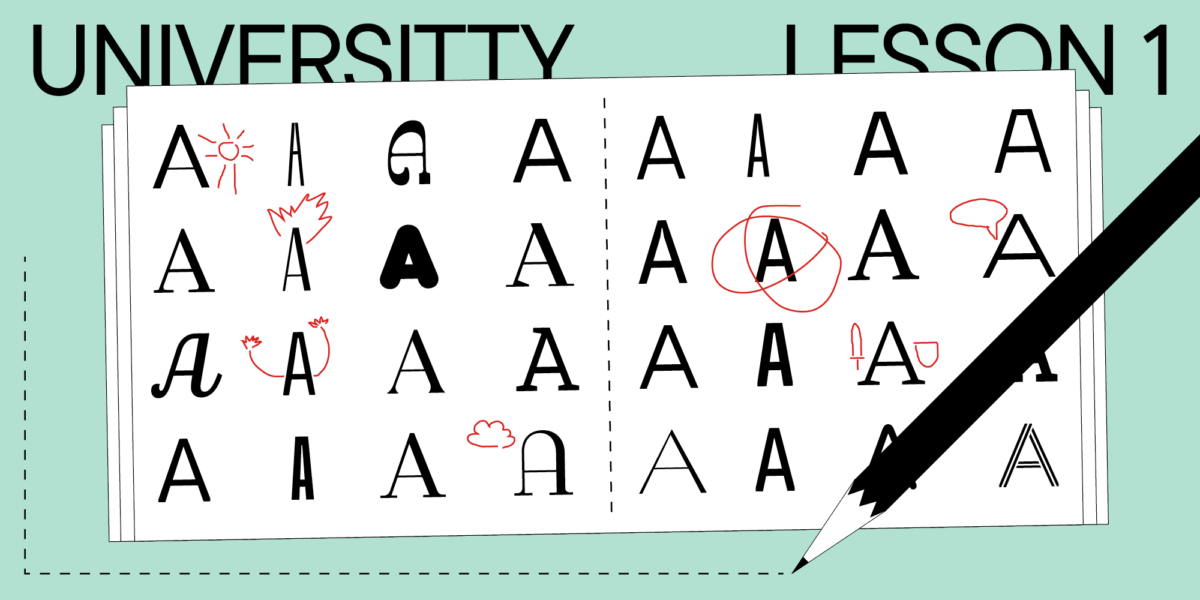
It is challenging to choose a suitable typeface even if you already have all the details about the book concept. Look for similar projects that you like, make mood boards, and analyze the utilized fonts. By the way, do not ignore the examples that seem flawed to you. It is helpful to study them and develop your understanding of effective and ineffective design. The more examples you analyze, the easier your work will be.
3. The type of paper for book printing.
There exist many paper types. Even for an experienced designer, it is rather challenging to predict how a font will look printed on a specific type. The best option is to test the typefaces you like by printing out small portions of text. If it is not possible for you, go to a bookstore and look at how different typefaces look on certain types of paper.

4. Audience.
Typefaces used in children’s books differ from those used for magazine design. Analyze the publication’s audience and keep this knowledge in mind while choosing the typeface.
5. Technical specifications.
The text typeface must be readable and neutral. However, it may be too dull for the cover. Pay attention to what influences text perception: font size, kerning (the amount of space between characters), weight, and legibility. The typeface must fulfill its primary objectives. Display typefaces are used for headings and serve to convey the mood of the text and attract attention, and text typefaces do not interfere with reading and serve to make it convenient.
When choosing a typeface, rely on your feelings, knowledge, and other designers’ work examples.
Typeface category
After taking care of the concept of the book and analyzing similar projects, it is time to choose the appropriate category of typeface.
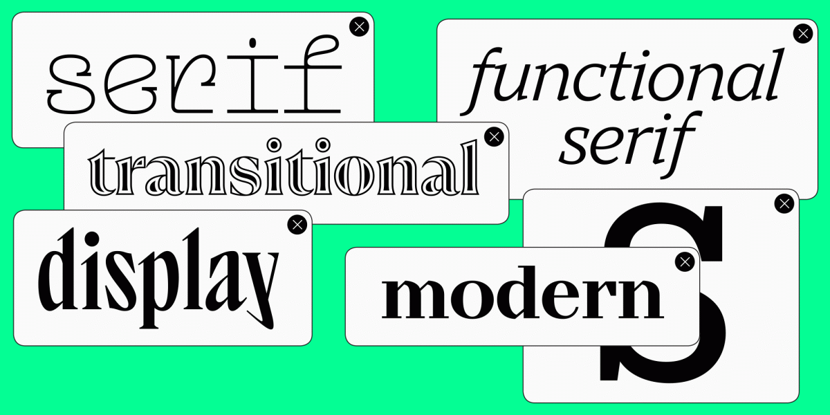
We will focus on the two most popular ones: serifs and sans serifs.
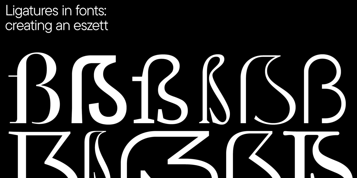
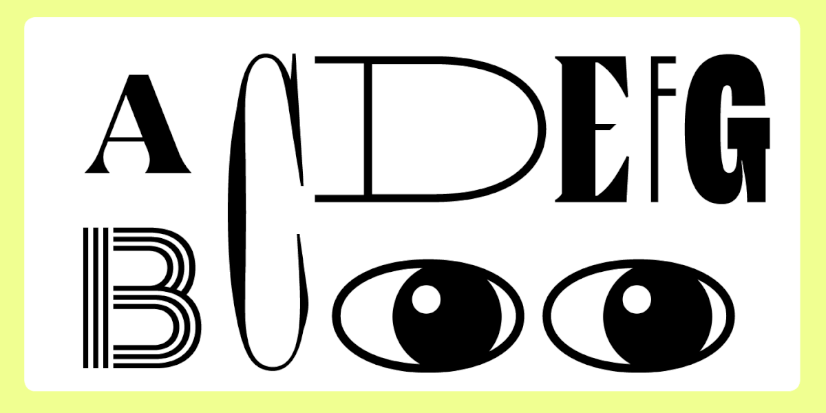
Serif, or Antiqua, is a typeface with serifs and high contrast. These typefaces can possess various personalities. Serifs based on historical samples can be used in biographies or literature dedicated to a particular era. Elegant, high-contrast serifs with expressive details are well-suited for headings and blocks in a larger point size. Serifs with a more versatile personality could be used in more contexts.
Sans serifs are typefaces without serifs and with low contrast. Despite being associated with web design, sans serifs are also well-suited for contemporary book printing, whether it is children’s books, popular science books, or non-fiction.
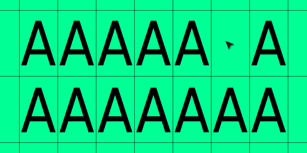
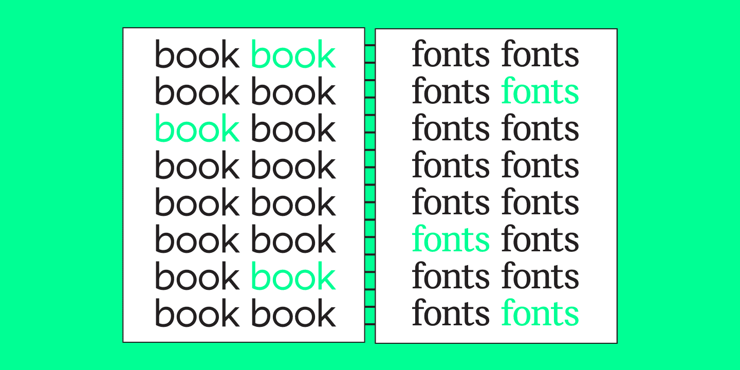
Any typeface contains many font styles in the font family. Although they will all have the same or similar proportions, each font style will look different in printing. It is possible to use several font styles from one family. For example, you can type the main text blocks using the regular font style and use italics or various weights to highlight key points.
Text typeface
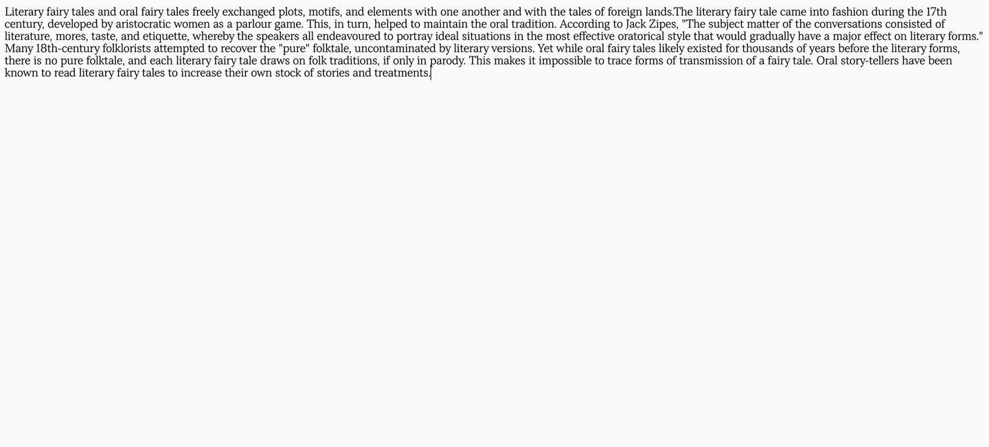
The standard book font is the one that is used to type the main body text. The reader’s convenience in engaging with the content of the publication depends on choosing the appropriate typeface.
There can be many criteria for choosing the text typeface, but we will only focus on the main ones.
1. Readability.
The key characteristic of the text typeface. For the text to be readable, it must be neutral. That is why choosing typefaces without distinct serifs and display details is better. They should have moderate contrast and proportions.
2. Quality.
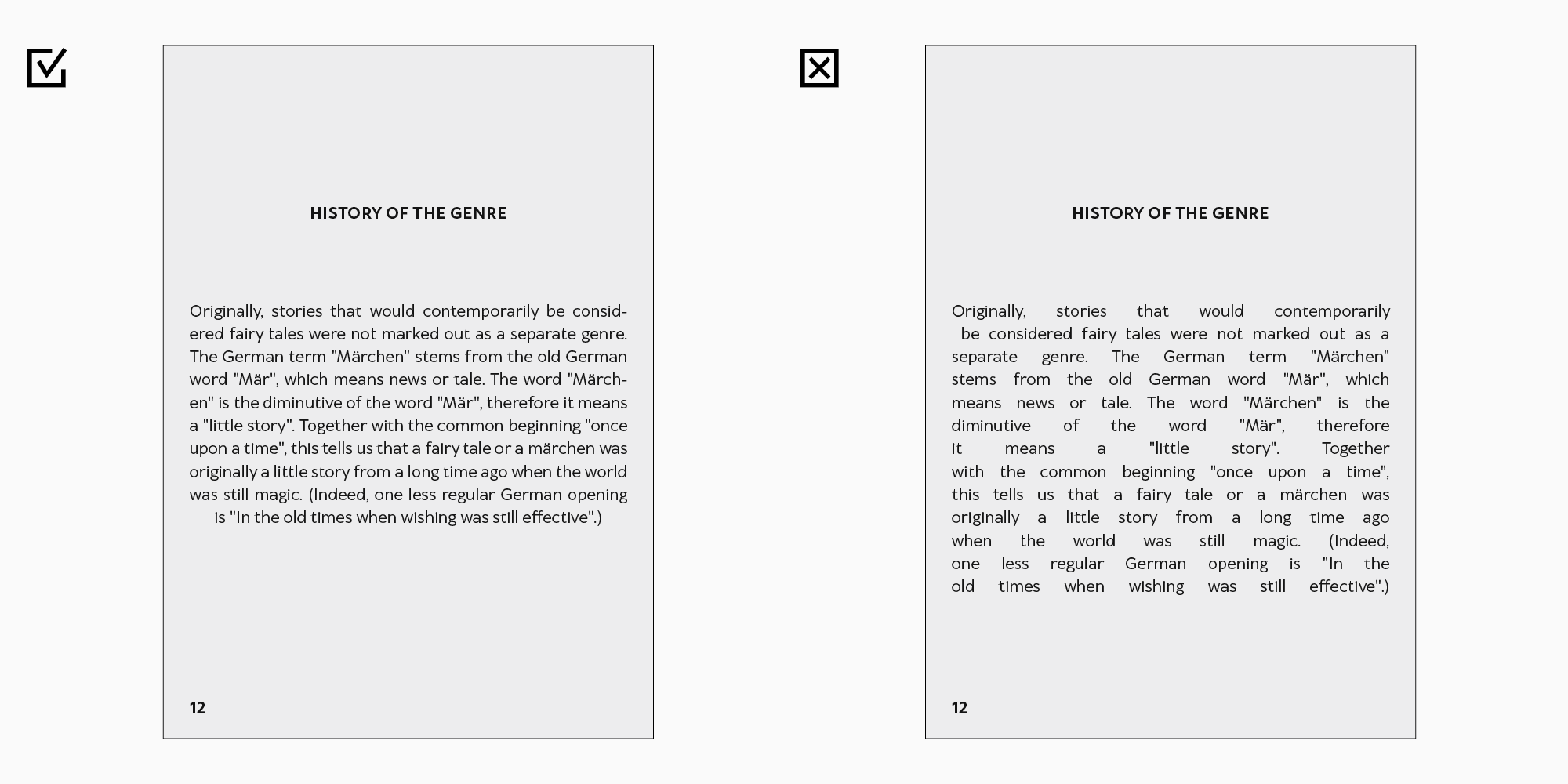
The font’s technical features may either improve the font’s perception in printing or spoil all your hard work. Printing makes each little flaw stand out, whether it is an uneven spacing between letter pairs or defects in outline building. Choose typefaces with detailed outlines and good kerning made by trusted studios.
3. Neutrality.
The character of the text typeface should suit the overall concept, but its visual peculiarities must not be too bold. The reader should be able to feel the emotion the typeface conveys but only subconsciously.
Choose the typeface according to your budget but do not try to save on its quality.
Display typeface
Display typeface has an expressive personality and is used in large sizes for headings, covers, and title pages. Such typeface contains geometrical elements, like distinctive serifs, visual compensators, and other design choices.
The display font in the book design is responsible for the emotional part. Choose it according to the concept of the book and your own watchfulness. The font must attract attention and suit the main idea of the book.
On the TypeType website, it is possible to use special tags as hints to choose a typeface with the necessary mood. Find the words that would reflect the concept of the book.
Font size
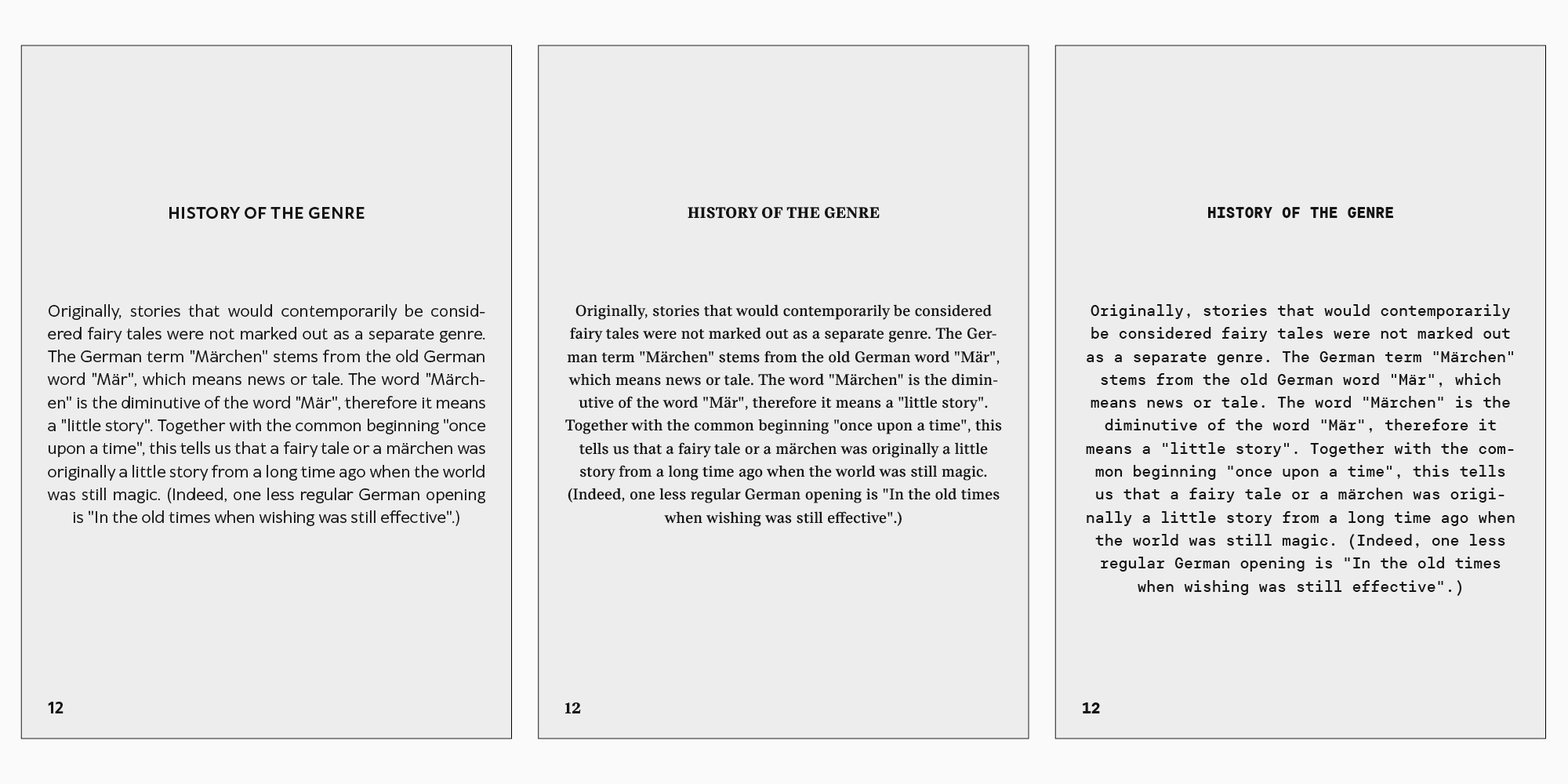
As a rule, the font size is agreed upon in advance with the publishing house. It depends on the book’s format, line measure, body text volume, and audience. Remember that different font families of the same point size may significantly vary in the amount of space they take up.
As a rule, children’s books are printed in larger point size, and pocket editions have smaller one.
The largest point size is used for the cover, headings, and title page if needed. For that, a display font of the 14 point size or more is used.
In the body text, the font is set in sizes ranging from 6 to 16 points.
Before designing, study the style guides and the publishing house recommendations.
Best fonts for book printing and design
We have chosen the best typefaces for designing books and other publications. Choose the one that suits your project well.
Text typefaces
Let us start with a selection of typefaces for the body text design. We have chosen the best ones in readability, character neutrality, and versatility.
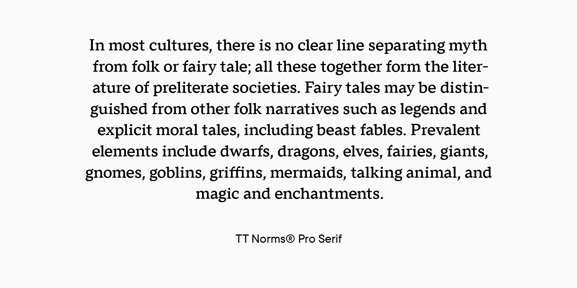
Text serifs
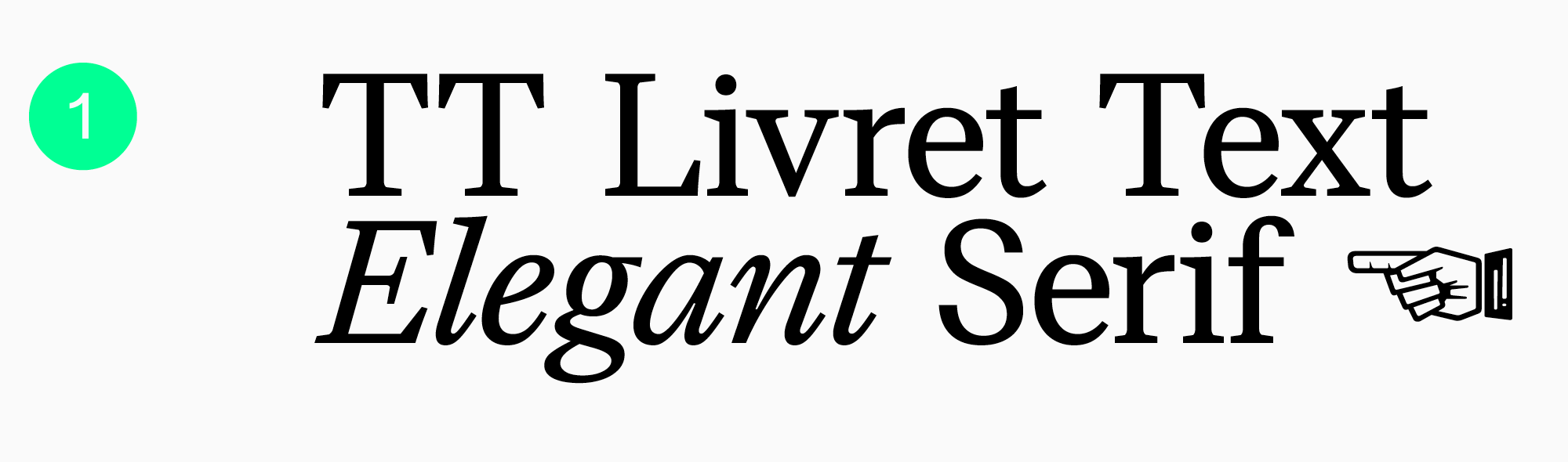
Modern serif that is pleasant and convenient to use for layouts. The typeface was originally designed as a text one, so it possesses all the necessary features of a book typeface. It is part of a big family where all the fonts go well with one another.
A typeface with a classic and serious nature.
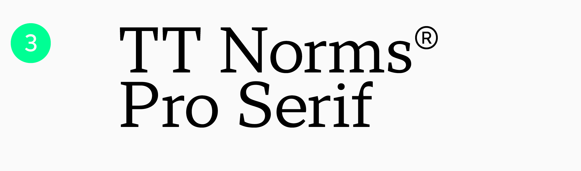
A serif that accompanies the sans serif TT Norms® Pro in the font pair. The perfect book font.

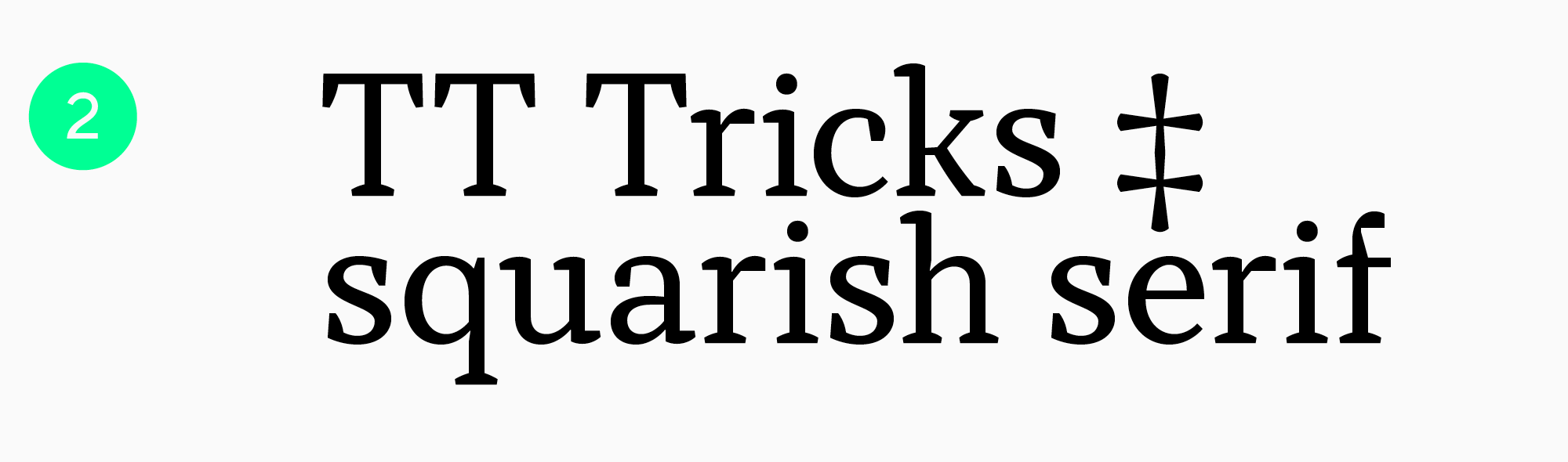
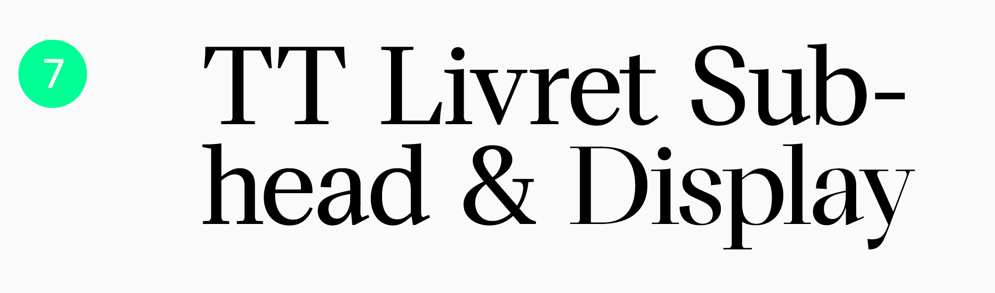
Dutch serif with asymmetric serifs and a display set.
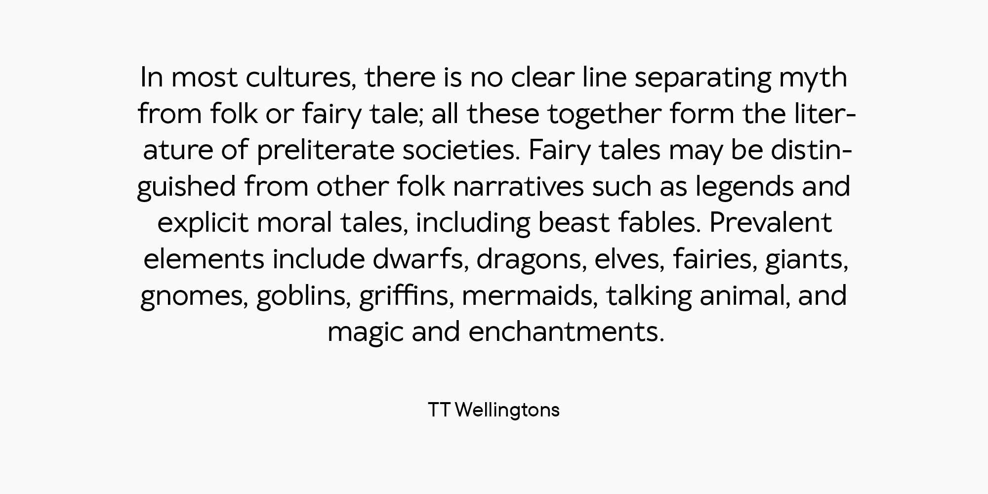
Text sans serifs
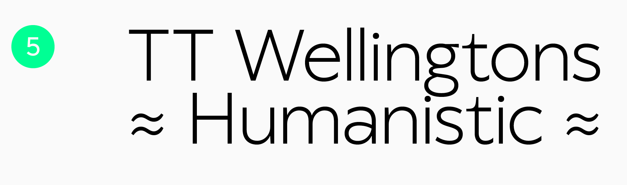
A Humanist sans serif with smooth shapes.
The bestseller that has become popular because of its versatility and aesthetic shapes. It is ideally suited for any domain: from web design to printed books, including literature for children.
Display typefaces
Attractive typefaces with stunning visual choices for headings and cover design.
Modern serif with moderate and high contrast. An elegant typeface with serifs. It accompanies a typeface with the same name in a pair but also perfectly fits other text typefaces.
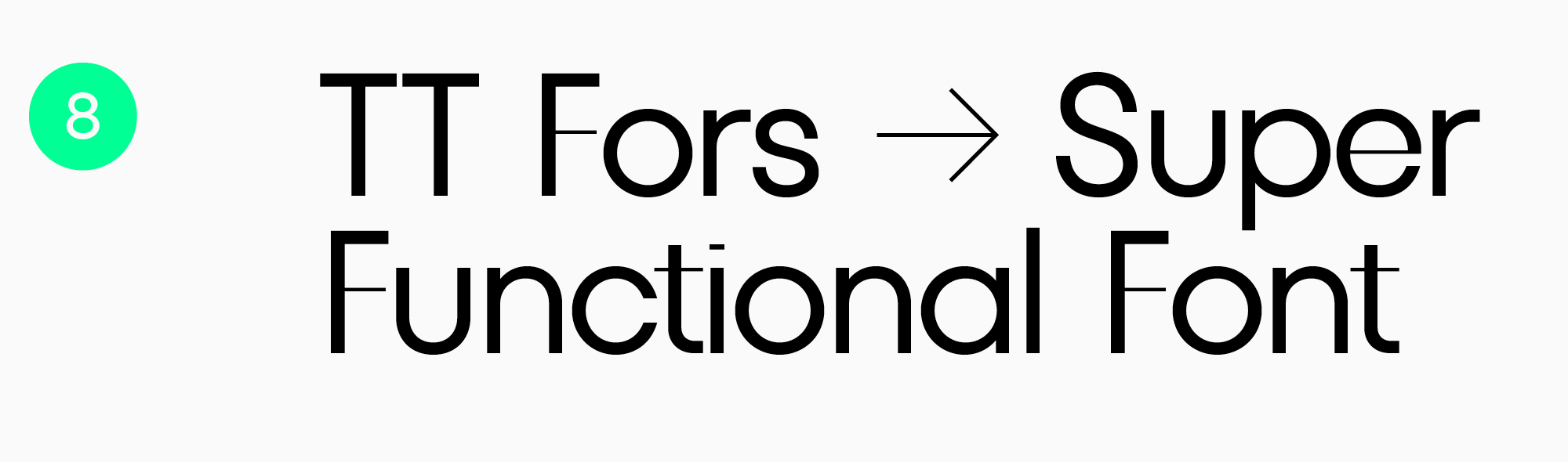
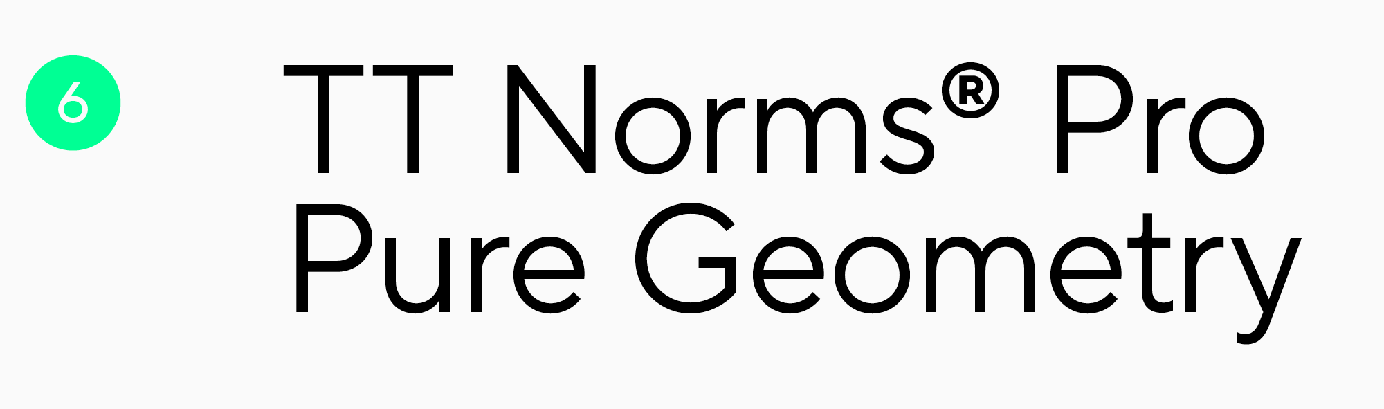
A functional sans serif for elegant display headings.
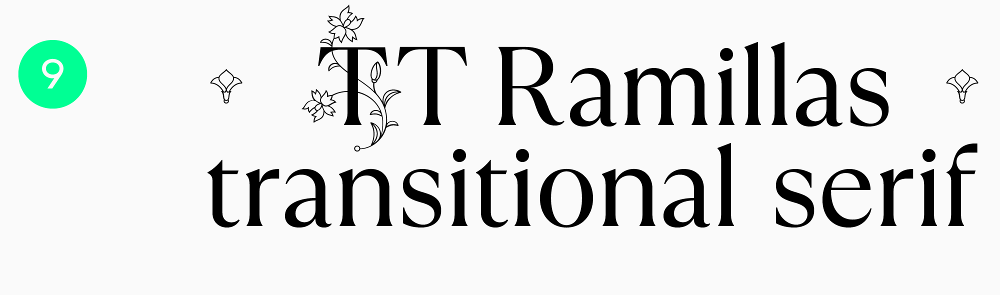
An exquisite typeface with high contrast and unusually shaped serifs. It contains a font family with soft and gentle graphics.
An unusual typeface with a retro aesthetic.
Choosing the perfect typeface for book design is a challenging task.
Rely on your experience, get inspired by the experiences of other designers, and always try something new. Remember, there is a suitable typeface for every book.