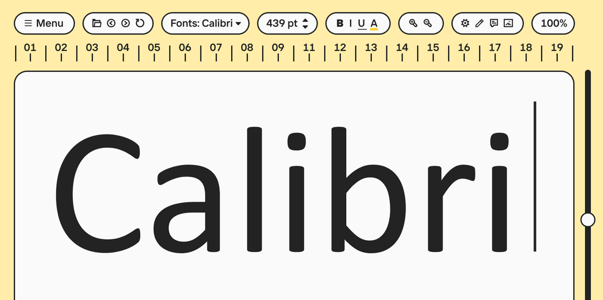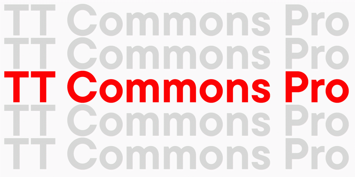
Wir sprechen viel über universelle «Arbeitspferden». Dies sind beliebte Schriften, deren Charakter oft neutral ist und die ein umfangreiches Zeichensortiment aufweisen. Eine solche Schrift, wie TT Norms® Pro, kann in Tausenden von Projekten mit unterschiedlichen Themen verwendet werden und in jedem einzigartig aussehen.
Universalschriften sind sehr gefragt. Aber was benutzt man, um etwas zu betonen? Man kann auch «Arbeitspferde» verwenden, aber wenn man eine starke Emotion vermitteln möchte, ist es besser, eine Option mit einem ausdrucksstärkeren Charakter zu suchen.
Heute werden wir über diese Optionen sprechen: anmutig und kühn, freundlich und brutal, dynamisch und stabil. Dies sind Displayschriften. Sie unterscheiden sich in Charakter und Ausdruckskraft, ziehen jedoch immer die Aufmerksamkeit auf sich, wenn sie richtig eingesetzt werden.
Welche Arten von Displayschriften gibt es
Es kann nie zu viele dekorative Schriften geben. Die Sammlung eines erfahrenen Designers kann über 400 solcher Schriften enthalten, und das ist bei weitem nicht das Limit. Die Notwendigkeit, die Sammlung von Displayschriften aktiv zu erweitern, liegt daran, dass sie sorgfältiger ausgewählt werden müssen.
Eine dekorative Schrift sollte perfekt zum Projekt passen, denn in den Überschriften, Logos und anderen großen Aufschriften sind die emotionalen Botschaften eingebettet, die das Publikum wahrnehmen wird.
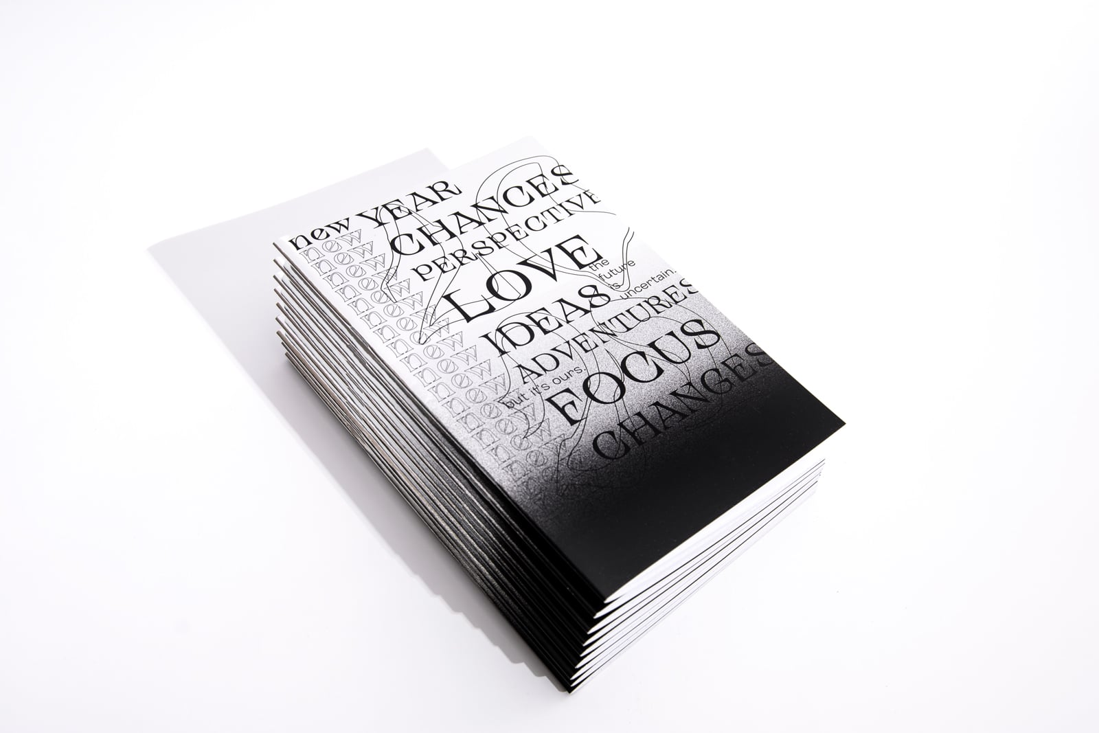
Diese Schriften ziehen die Aufmerksamkeit auf sich. Selbst ein beginnender Designer versteht, dass ein großer Text und eine Überschrift nicht in derselben Schrift und Größe gesetzt werden sollten. Betonungen und Hervorhebungen sind im Text wichtig. Das Interesse des Lesers hängt davon ab, wie der Designer sie anordnet.
Die Aufgabe einer Schrift für den Text ist es, die Aufmerksamkeit nicht vom Lesen abzulenken, und die einer Displayschrift ist es, diese zu erregen. Damit der Leser zum Textkörper gelangt, müssen die Schlagzeile und andere Akzente die Aufmerksamkeit halten und den Wunsch wecken, den Artikel zu lesen, das Buch zu öffnen oder eine andere Handlung auszuführen.
Dekorative Schriften sind eine breite Gruppe, die viele Stile und Typen umfasst. Man kann sie leicht von anderen Schriften unterscheiden, weil sie einen dazu bringen, sie anzusehen, besonders wenn der Text in großer Größe gesetzt ist.
In diesem Artikel sprechen wir über drei Schriftkategorien: Display-, Überschriften- und dekorative Schriften.
Displayschriften
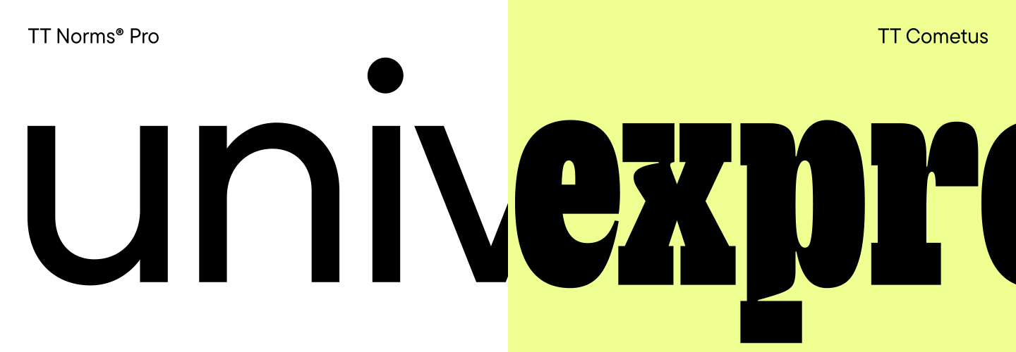
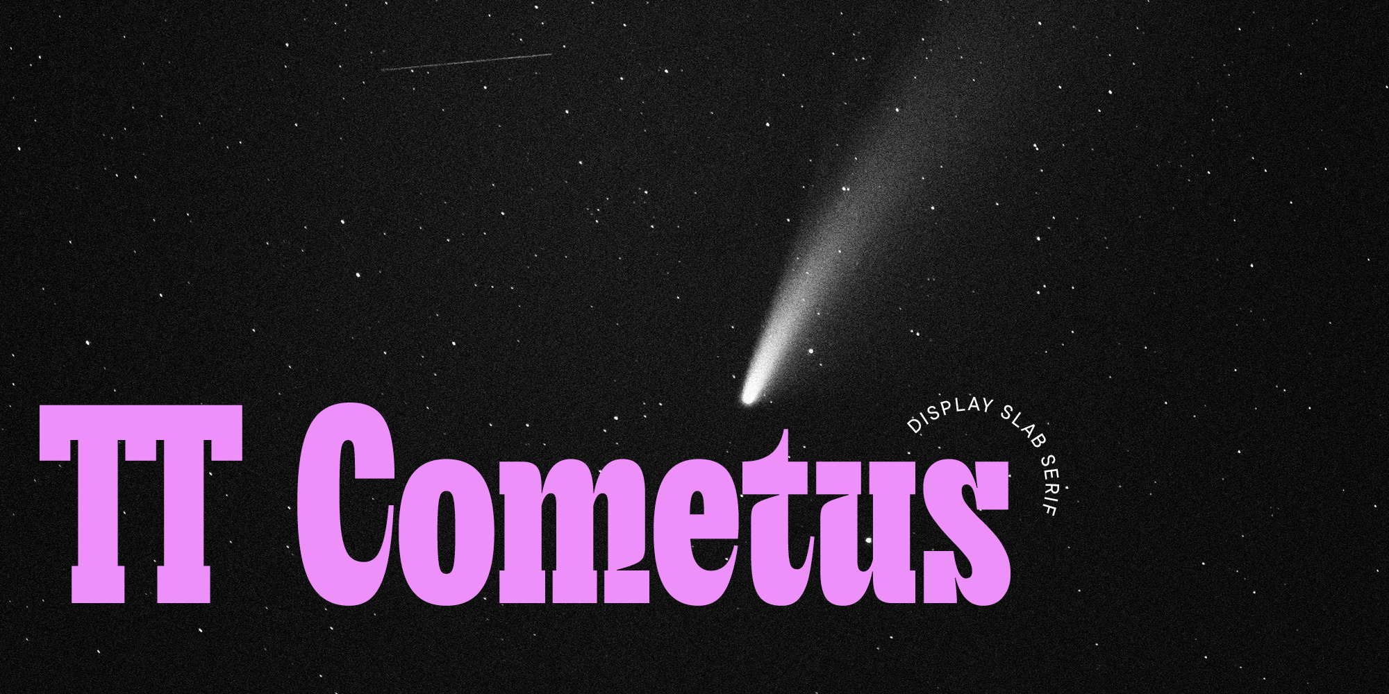
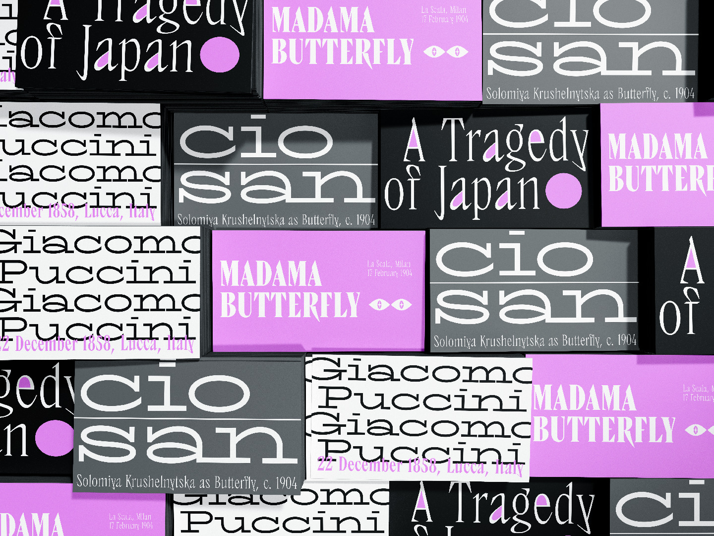
Dieser Artikel wurde inspiriert von TT Cometus, den wir im Januar 2023 veröffentlicht haben. Dies ist eine stilvolle und ausdrucksstarke Schrift mit einem unvergesslichen Charakter.
TT Cometus ist das perfekte Beispiel für eine Display-oder, anders benannt, eine dekorative Schrift. Es ist schwer vorstellbar, dass sie in einem Textblock verwendet wird, aber sie sieht harmonisch in Überschriften und großen Aufschriften aus.
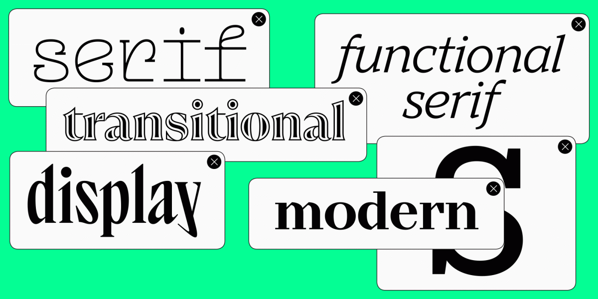
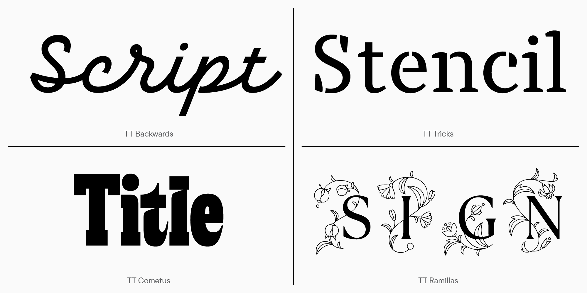
Displayschriften sind eine breite Kategorie. Sie umfasst alle Schriften, die dazu entwickelt wurden, Betonungen zu setzen und nicht für die Textsetzung verwendet werden.
Das können sein:
- Handschriften;
- Schablonenschriften;
- Headlineschriften;
- Schriften mit Verzierungen oder Mustern.
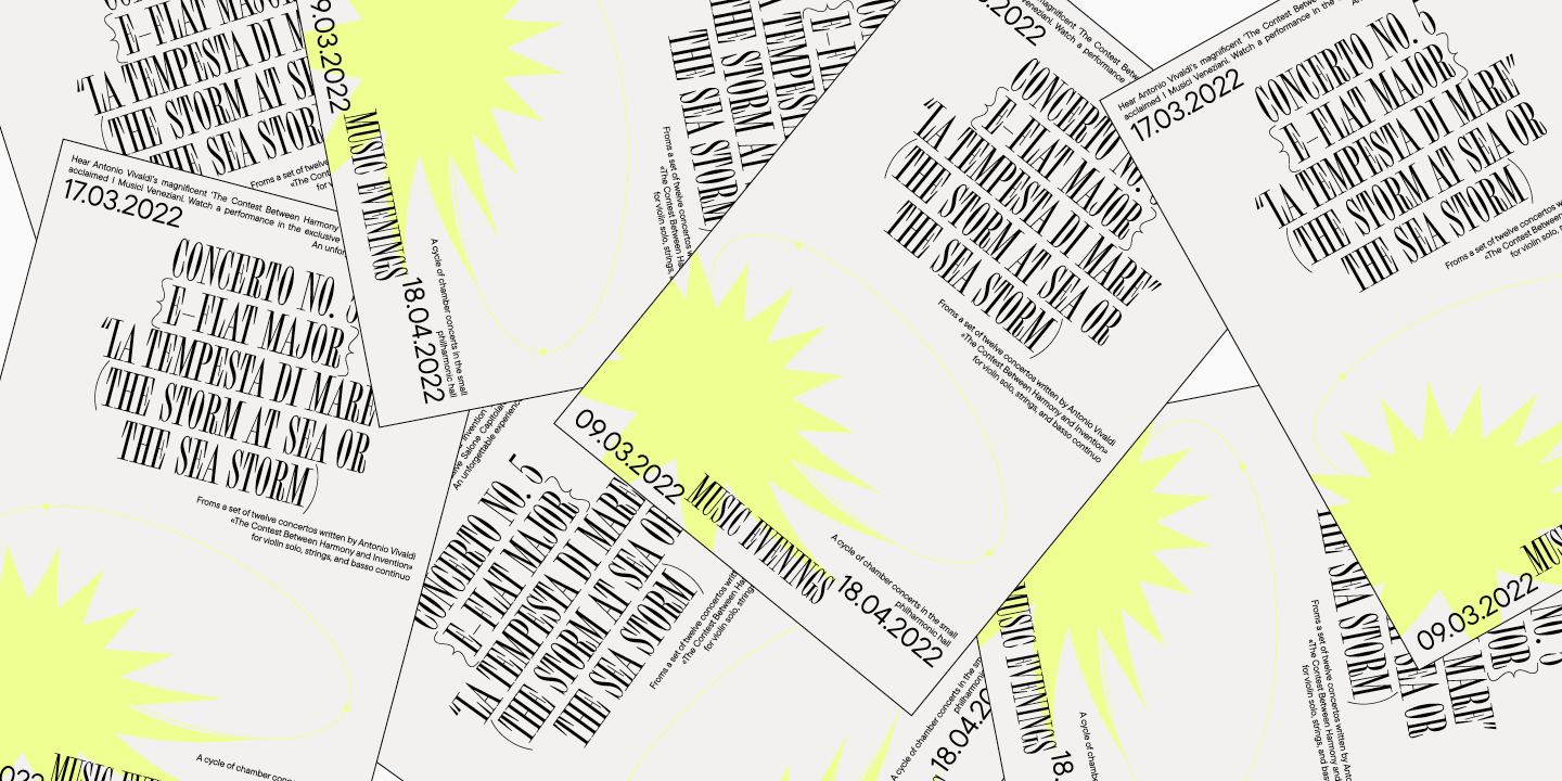
Displayschriften werden manchmal auch als dekorative Schriften bezeichnet. Sie werden verwendet, um Überschriften und Logos zu setzen oder kleine Phrasen oder Zitate in einem Textblock zu gestalten. Das Ausmaß der Ausdruckskraft dekorativer Schriften variiert. Je weniger ausdrucksstark der Charakter der Schrift ist, desto länger kann die darin gesetzte Phrase sein.
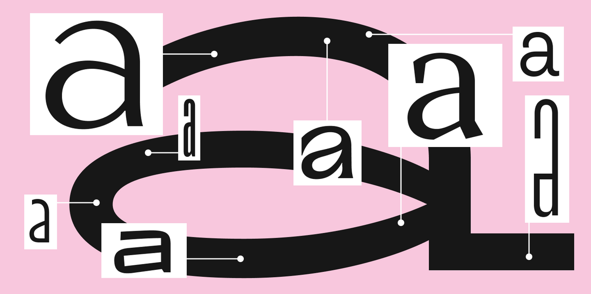
Zum Beispiel ist TT Cometus eine Schrift mit einem ausgeprägten Charakter. Sie sieht am besten in einem kleinen Textblock aus, der in großer Größe gesetzt ist.
Gleichzeitig kombiniert die Schrift mehrere Stile. Sie hat Bezüge zur Kalligraphie, mächtige Serifen, typisch für Slab-Schriften, sowie Glätte und Plastizität der Formen, die sie freundlich wirken lassen. Diese Kombination ist für viele Displayschriften typisch. Um den richtigen Grad an Ausdruckskraft zu erreichen und den Charakter einzigartig zu gestalten, können Designer verschiedene Techniken und Stile verwenden. In Displayschriften gibt es Raum für die kreative Idee des Autors.
Solche Schriften sind oft ein originelles Projekt eines einzelnen Designers. Um Emotion durch die Schriftart zu vermitteln, ist es wichtig, Inspiration in der eigenen Arbeit zu finden. Wenn Sie möchten, können Sie sogar den Namen der Schrift als Inspiration nutzen.
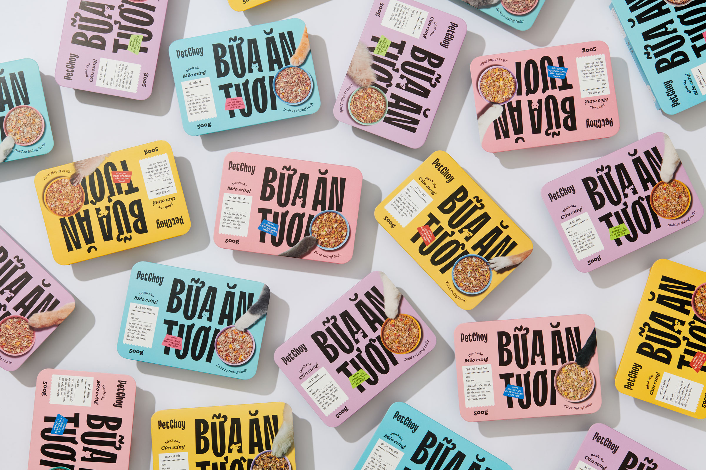
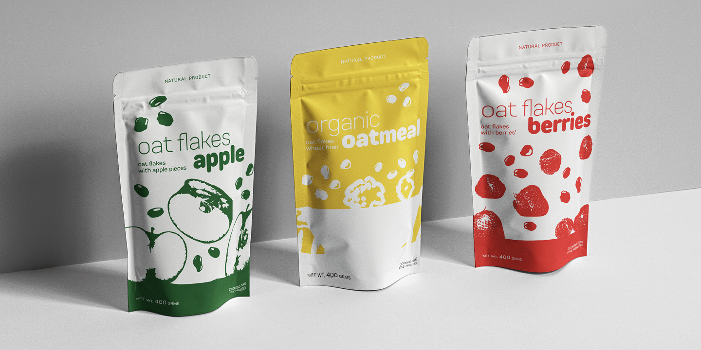
Displayschriften werden oft für Logos und Verpackungsdesigns verwendet. Manchmal werden kommerzielle Schriften angepasst, um die Schrift einzigartiger erscheinen zu lassen.
Zum Beispiel haben wir für die Marke PetChoy die schmale Displayschrift TT Trailers angepasst. Silhouetten von Katzen und Hunden wurden zu einigen Zeichen hinzugefügt. Das machte die Schrift nicht nur einprägsamer, sondern fügte auch eine direkte Referenz zur Haustierfuttermarke hinzu.
Wir haben über dieses Anpassungsprojekt einen Artikel geschrieben.
Die TypeType-Sammlung von Displayschriften bietet viele Schriften, die sich in ihrer Natur unterscheiden.
Sie haben bereits die prominenten Beispiele, TT Cometus und TT Trailers, gesehen.
Wir stellen Ihnen weitere stilvolle Schriften aus dieser Kategorie vor.
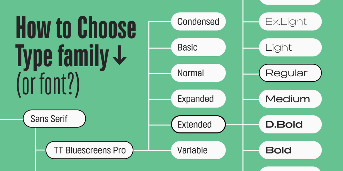
Diejenigen, die nach einer Displayschrift mit einfachen Textformen suchen, werden TT Bluescreens lieben. Ihre Proportionen sind schmal, ähnlich wie bei TT Trailers, aber der Charakter erlaubt es, die Schrift sowohl für Text als auch für Anzeige zu verwenden.
Wenn Sie nach einer dekorativen Schriftart mit einem weicheren Gefühl suchen, schauen Sie sich TT Rounds Neue an. Obwohl es sich um eine Displayschrift handelt, ist dieser abgerundete Sans-Serif sogar für Textblöcke geeignet.
TT Travels Next, im Gegensatz zu der Textschrift TT Travels, ist eine dekorative Schrift. Die Schriften sind im Charakter ähnlich, aber TT Travels Next hat einen ausgeprägteren Charakter.
Unter den Displayschriften heben sich TT Ricks und TT Globs hervor. Sie sind geeignet für große Aufschriften und werden definitiv Aufmerksamkeit erregen. TT Globs hat ein variables Gesicht, sodass sein Charakter kontrolliert werden kann.
Ein interessantes Beispiel für eine variable Displayschrift ist TT Alientz. Auf einer Achse ist diese variable Schrift ein Sans-Serif, auf der anderen ein Serif. Dank des variablen Stils ist die Natur der Schrift steuerbar.
Die stilvolle und ausdrucksstarke Serifenschrift TT Espina ist eine elegante Schriftart mit scharfen Serifen für große Aufschriften. Interessanterweise ist die Form der Ovalen in der Schrift dynamisch und ändert sich von Stil zu Stil.
Wir schlagen auch vor, TT Geekette zur Sammlung hinzuzufügen, eine Schriftart mit fließenden und beweglichen Formen. In der variablen Schrift können Sie den Charakter durch Erhöhung des Kontrasts ändern. Gleichzeitig sind die visuellen Veränderungen faszinierend und eröffnen Möglichkeiten für den Einsatz in verschiedenen Projekten.
Displayschriften sind eine breite Kategorie, die andere Schriftarten umfasst. Zum Beispiel, Headlineschriften.
Headlineschriften
Headlineschriften werden für große Aufschriften benötigt. Sie werden in Größen ab 25 Punkt und darüber gesetzt. Meistens werden Überschriftensubfamilien erstellt, die zu Textsubfamilien passen.
Viele große Marken verwenden solche Schriften. Das ist praktisch: Verwenden Sie die Textsubfamilie für die Website und Kommunikation, und die Überschriftensubfamilie für die Gestaltung von Überschriften im Web und im Druck.
Aufgrund ihrer Verwendung in großen Größen haben Headlineschriften technische Eigenschaften, die sie von anderen Displayschriften leicht unterscheidbar machen.
1. Hoher Kontrast.
Wenn eine Headlineschrift mit einer Textschrift gepaart ist, wird sie hohen Kontrast haben. Das gilt sowohl für Serifen– als auch für Sans-Serif-Schriften.
Auf den ersten Blick: Stilvolle Schriftarten für Überschriften und Anzeigen
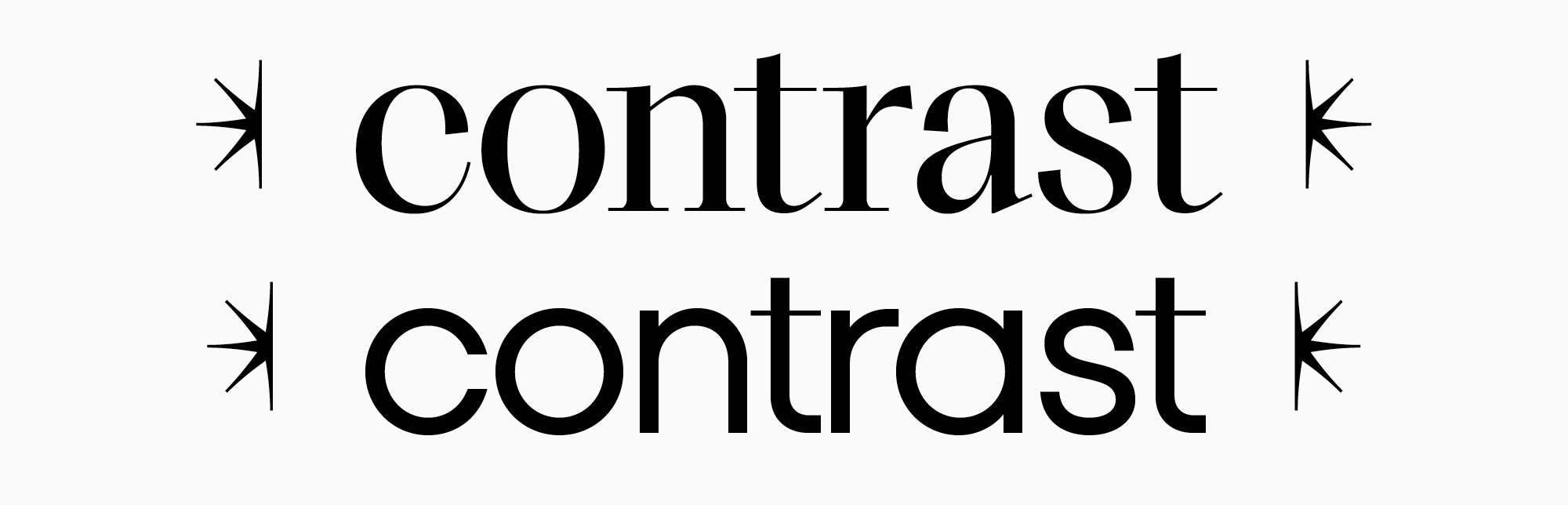
Mit steigendem Kontrast wird der horizontale Strich in der Schrift dünner, während der vertikale gleich bleibt. Solche Veränderungen sind mit visueller Schönheit verbunden. In großer Größe sieht hoher Kontrast attraktiv aus und offenbart das Wesen der Schrift.
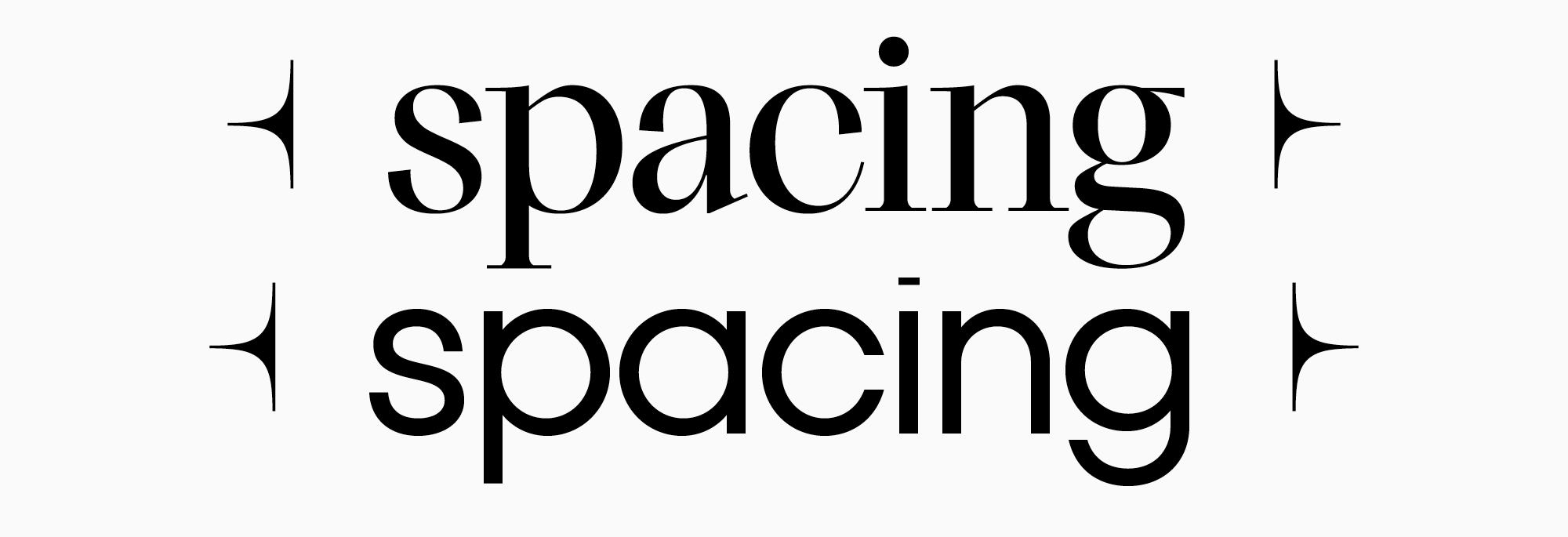
2. Die Zeichenabstände werden kleiner
Headlineschriften sind leicht zu erkennen an einem dichteren Textset. Sie können experimentieren: Nehmen Sie eine Textschrift und vergrößern Sie die Punktschrift auf 30. Die Abstände zwischen den Buchstaben werden riesig, und der Text wird schlecht lesbar. Aus diesem Grund werden in Headlineschriften die Zeichenabstände, also die Abstände zwischen den Zeichen in der Schrift, reduziert. Das Set wird dichter, und der Text bleibt lesbar.
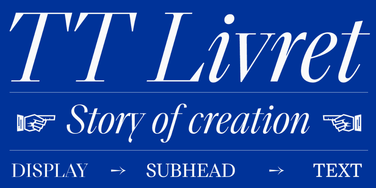
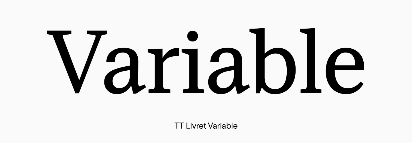
Die populärste TypeType-Headlineschrift ist TT Livret Display. Sie ist Teil der TT Livret Familie, die aus drei Schriften besteht: Text TT Livret Text, Überschrift TT Livret Display und Unterüberschrift TT Livret Subhead. Die Headlinesubfamilie hat hohen Kontrast und elegante dünne Serifen, während der variable Stil es ermöglicht, die optimalen Parameter für Kontrast und Ausdrücklichkeit der Schrift zu finden.
Der geometrische Sans-Serif TT Fors hat ebenfalls eine Überschriftenversion. Zusätzlich zur Reduzierung der Zeichenabstände und Erhöhung des Kontrasts hat die Überschriftensubfamilie TT Fors Display einen ausgeprägteren Charakter.
Headlineschriften eignen sich hervorragend für große Überschriften, Plakate, Logos und Beschilderungen.
Dekorative Schriften
Dekorative Schriften werden in einigen Klassifikationen erwähnt, obwohl sie nicht immer als separate Kategorie anerkannt werden. Sie sind Teil der Displayschriften, heben sich jedoch durch ihren ausgeprägteren Charakter ab.
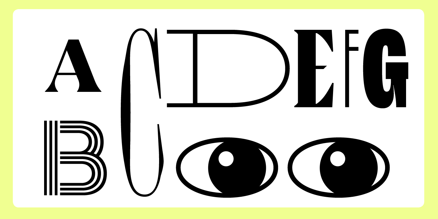
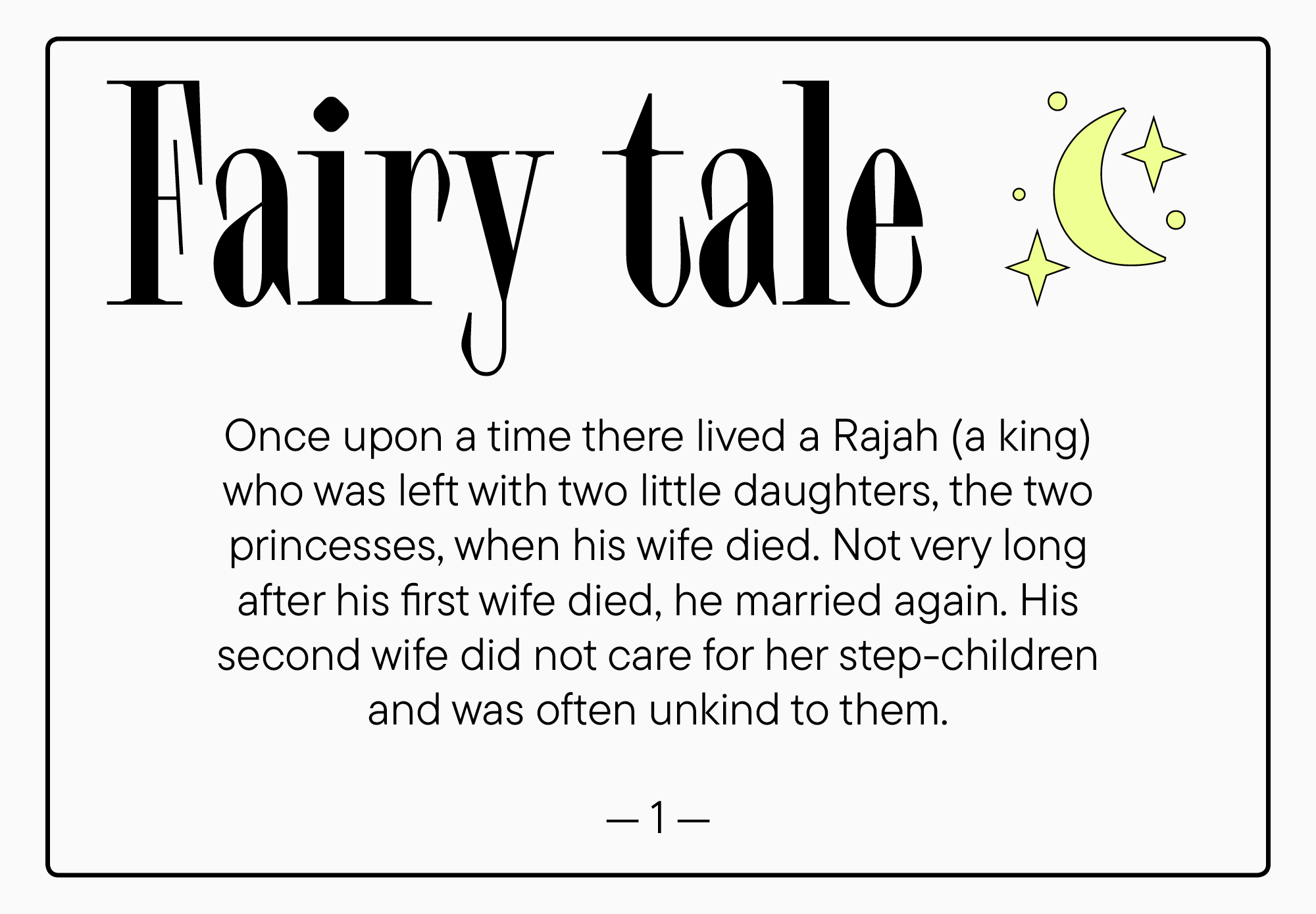
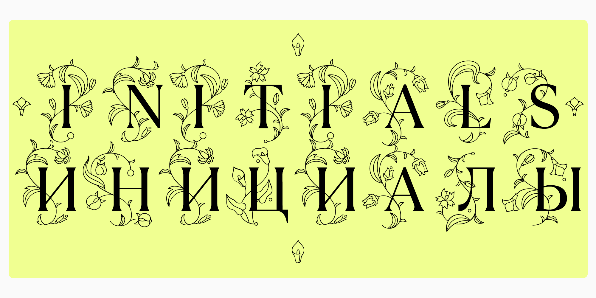
Solche Schriften können Ornamente, Muster und andere auffällige Anzeigedetails enthalten. Ein gutes Beispiel für den Einsatz solcher Schriften sind Kinder-Märchen. Wir sprechen von der Initialversale — einem großen Anfangsbuchstaben, der das erste in einem Kapitel ist. Dieser Buchstabe ist viel größer als die anderen und wird normalerweise mit zusätzlichen Elementen verziert.
In dekorativen Schriften sind die Details auffällig und übertrieben. Solche Schriften sollten vorsichtig und in kurzen Textphrasen verwendet werden. Eine dekorative Schrift, die zum Projekt passt, wird einen starken Eindruck auf das Publikum hinterlassen.
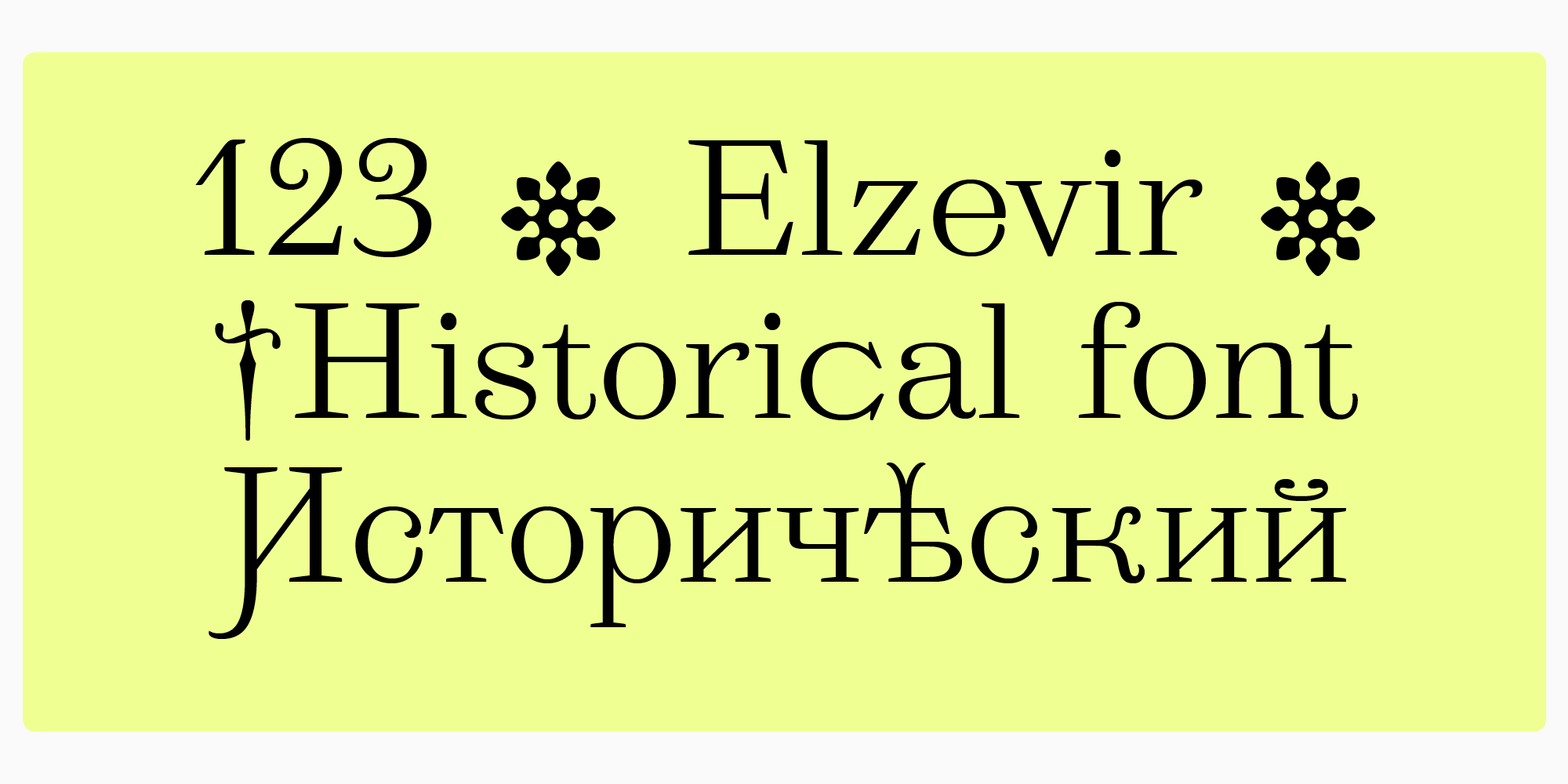
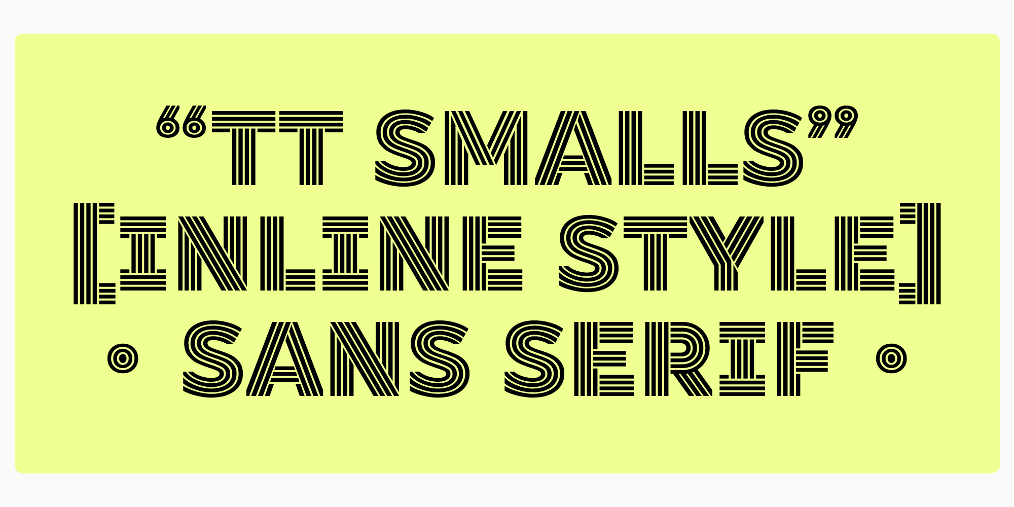
In der TypeType-Sammlung gibt es 3 dekorative Schriften: TT Ramillas Initials, TT Marxiana Elzevir und TT Smalls.
TT Ramillas. Geeignet für markante Akzentbeschriftungen, kann sie als moderne Version der Initialversale in Katalogen und Zeitschriften verwendet werden. Die Großbuchstaben dieses Stils sind mit eleganten Ornamenten verziert.
TT Marxiana Elzevir ist eine der Schriften der TT Marxiana-Familie, die auf einem historischen Beispiel basiert. Sie enthält ein Set von Zeichen mit Schwüngen und Anzeigeelementen. Diese Schrift ist geeignet für Überschriften oder für das Cover-Design.
TT Smalls ist eine moderne Schriftart, die aus Großbuchstaben in einer Inline-Version besteht. Obwohl die Buchstabenentwürfe auf einem geometrischen Sans-Serif basieren, hat die Schrift einen ausgeprägten Charakter. Die Anzahl der Striche innerhalb der Zeichen ändert sich mit zunehmender Breite.
Displayschriften ziehen die Aufmerksamkeit auf sich, helfen, Akzente zu setzen und Emotionen beim Lesen zu empfinden. Sie werden überall verwendet. Im digitalen Raum sieht man sie in Logos, Website- und App-Titeln. In der Offline-Welt findet man solche Schriften auf Schildern und Bannern, im Menüdesign, auf Plakaten, Produktverpackungen und Buchumschlägen.
Um die perfekt passende dekorative Schrift zu finden, reicht theoretisches Wissen nicht aus. Visuelle Erfahrung und Ihre eigenen Gefühle werden Ihnen helfen, die richtige Schrift zu wählen.