top_banner_ttnormspro0426
Type foundry Blog Creating a customized version of TT Trailers with pet-friendly diacritics

Creating a customized version of TT Trailers with pet-friendly diacritics

Creating a customized version of TT Trailers with pet-friendly diacritics

How often have you come across hidden kitties and puppies right in the letters? If never, do hurry to read this case.

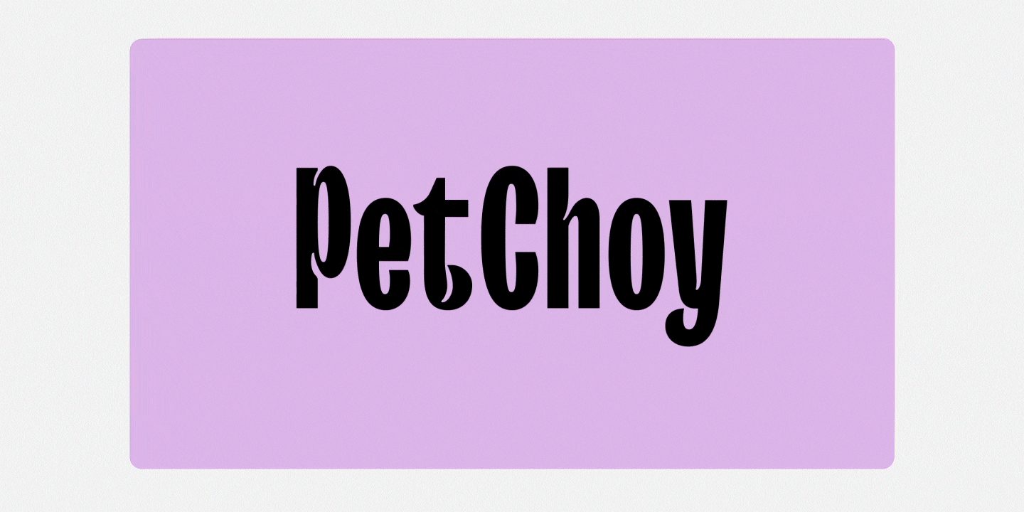
TypeType was approached by MO NO DESIGN CO to customize the TT Trailers Bold font for the Petchoy project. As you might guess, this is a pet food brand. And at that, not just some food, but fresh, nutritious and delicious.

There were really many tasks:

• draw and add Vietnamese to the TT Trailers Bold font file
• add three sets of «pet friendly» diacritics for Vietnamese
• hinting of new characters.

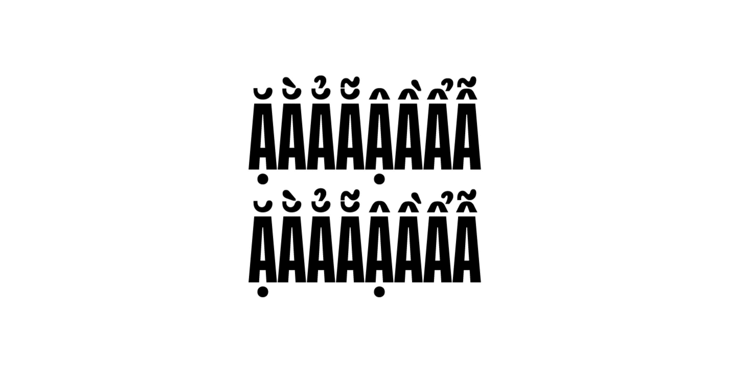
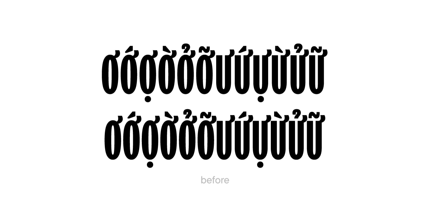
The TypeType team started by drawing a classic set of Vietnamese diacritics. A total of 92 glyphs were added to the font file.

Creating a customized version of TT Trailers with pet-friendly diacritics
Set of Vietnamese diacritics

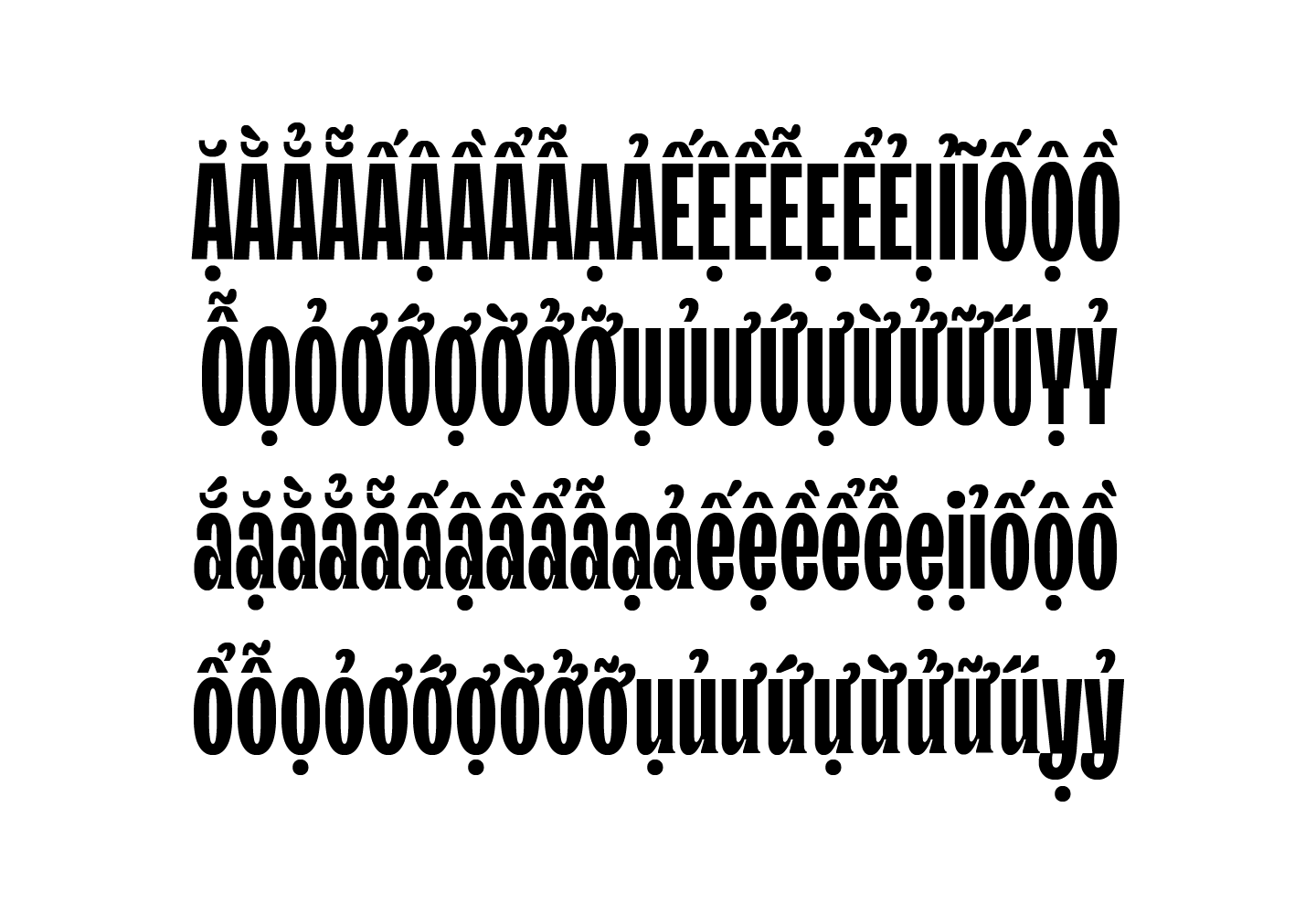
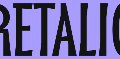
Then we started the most interesting task — integrating the silhouettes of cats and dogs into the graphics. We ended up with 4 stylistic sets with pet references. For these, we used the client’s sketches as a reference.

Creating a customized version of TT Trailers with pet-friendly diacritics
Adding pet-friendly elements

After that, the designers took up a new task — they replaced the diacritics with a more suitable one to the wishes of the client.

Creating a customized version of TT Trailers with pet-friendly diacritics
Replaced the diacritics

When all the characters were drawn, the team began to work on kerning so that all the letters fit perfectly together in the text canvas.

In the final stages, our technical specialists specified the font features and hinted new characters. The new font files were named TT Trailers Petchoy and TT Trailers Petchoy Display, one containing traditional Vietnamese diacritics and the other the unique pet friendly elements.

Creating a customized version of TT Trailers with pet-friendly diacritics
Product packaging with a customized version of the font

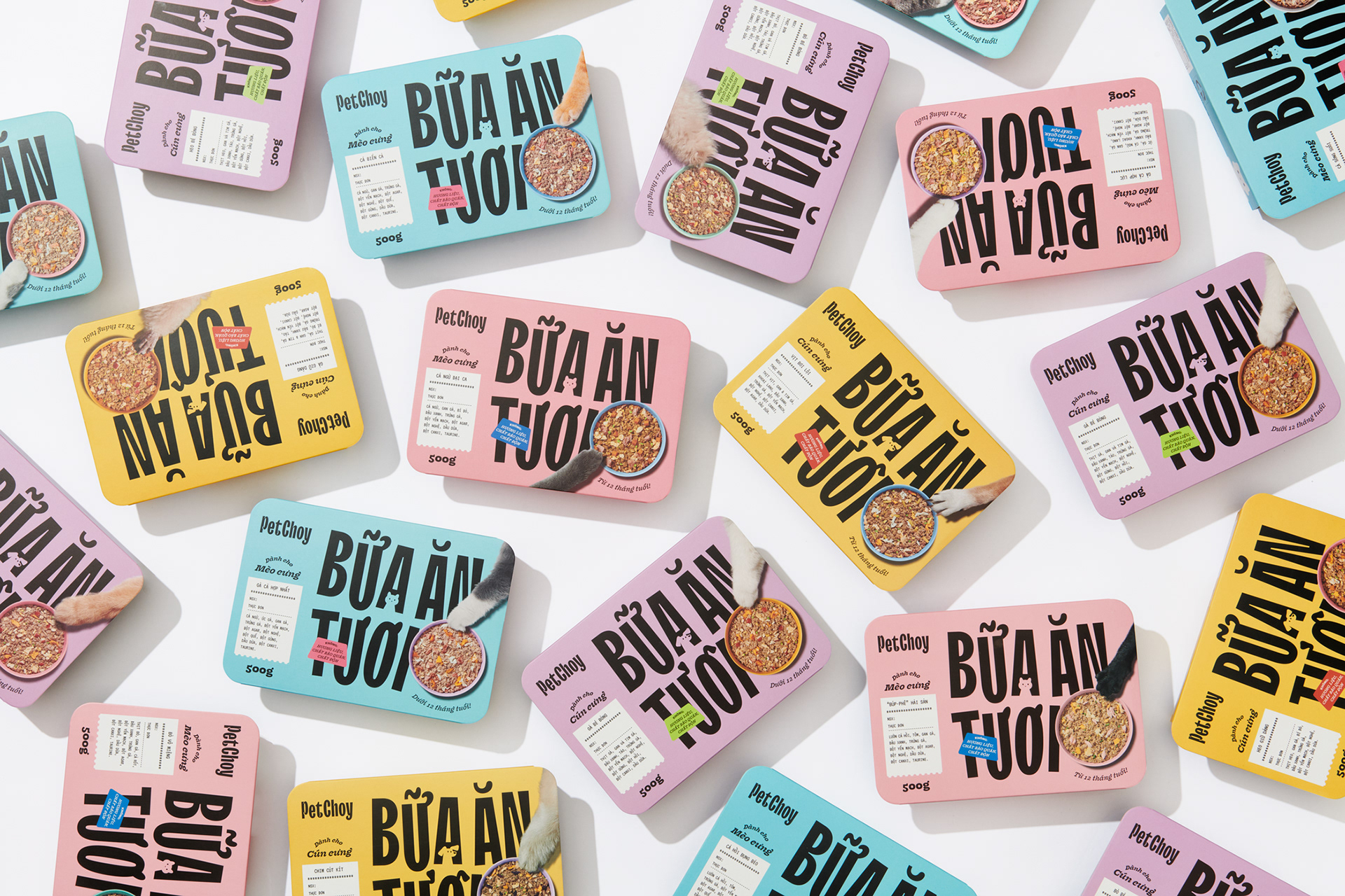
Both customized fonts worked well for the client who was able to use them for their social media and other forms of communication.

Latest publications

IP Protection as an Art: TypeType’s Flexible Licensing Control Strategy

Drawing on their own experience, the specialists at TypeType explain how type foundries and designers can stop unlicensed use of their products and get additional revenue while avoiding reputational risk. In TypeType’s professional experience the popularity of a typeface is linked to the fact that it will be more likely used without an appropriate license—despite the fact that developing a single family can take years of meticulous work. We covered how font licensing works in detail here.

See more
Font Research: An Expert Approach to Brand Typography

Among TypeType Studio’s services, we offer typeface system research. Why do brands need such research, and how does it help them develop? How is it conducted? What does the research include, and how are the results interpreted? We answer these questions and show how it works in practice using the financial segment as an example.

See more
TypeType’s Year in Review: Looking Back at 2025

2025 was an incredibly productive year for TypeType: we released 7 new fonts, updated 14 typefaces, and added Arabic language support to two of our bestsellers. In addition, we won awards in type design competitions, explored new platforms, improved our website, wrote about type design in our blog, gave lectures, met with you at webinars, and created joint projects with friends and partners.

See more
Typography in the Museum: How We Developed the Corporate Typeface for the Hermitage

The TypeType team, with the support of the Mantera Group, has created a new font family for the State Hermitage Museum—the Hermitage Type Family. The typeface will be used across all of the Hermitage’s digital content; you can already see it on the website and the updated launch page of the mobile version. And this is just the beginning of a major overhaul of the museum’s digital identity, in which the new font will play a pivotal role.

See more
Proxima Nova Font: Alternatives, Pairings, and the Secrets of Its Popularity

Proxima Nova is one of the most recognizable sans-serif fonts in modern design. In this article, we’ll explore the history of the Proxima Nova font family, its graphic characteristics and composition, figure out what fonts go with Proxima Nova, what its best alternatives are, and what license you need to use it.

See more
The Perfect Moment Is Now: Launching Our Creative Lab, TT Labs

We spent a lot of time thinking about how to find a place for creative freedom within this system, how to set aside time for small passion projects, how to step outside our usual boundaries, and how to give spontaneity a chance. And we realized that the perfect moment will never come unless you take the first step. So we took it—and that’s how the TT Labs creative laboratory was born. Here’s the story from the beginning!

See more
What is Typography in Graphic Design: Key Concepts, Principles, and Examples

Discover what typography is, why it’s important in design, and how to apply its main principles, styles, and rules to create visually strong text.

See more
A Font with a Wide Reach: A Special Project for SHIFTBRAIN’s 20th Anniversary

In 2023, the Japanese marketing agency SHIFTBRAIN launched an interactive website dedicated to the company’s 20th anniversary. For this project, the TypeType team developed a unique variable font capable of stretching to extreme horizontal widths. As a foundation, we used the bestseller TT Norms® Pro, which was already the company’s corporate typeface—you can see it on the main SHIFTBRAIN website.

See more
Pangrams Explained: Meaning, Types, Usage and Complete List of Examples

If you’re interested in design, you’ve almost certainly come across the famous sentence about the quick brown fox and the lazy dog. Or perhaps one about a jived fox nymph and a quick waltz. These are pangrams—sentences that contain all the letters of the alphabet. In this article, we’ll provide a more detailed pangram definition, explain why these phrases are so important, and provide a list of the most popular pangrams in English.

See more

See more

Customized version of TT Hoves for True Digital agency

TypeType received a font customization request from True Digital Ltd, a marketing agency from Great Britain. The company emphasizes a sincere and involved approach to brand promotion. They wanted to underline their concept by adapting a font to their corporate style.

See more
Creating a font for Mail.ru Group logo setting

Today we will share a fascinating story of creating a font family to set logos for one of the largest brands. We promise you won’t be bored: in this story, you will have the chance to have a look at all stages of the work and will learn more about font creation.

See more
Customization of TT Hoves for the legendary brand Telefonica

The TypeType team was approached by the Spanish telecommunications company Telefonica with a request to customize the TT Hoves font. Telefonica is one of the largest raditional and mobile phone companies in the world.

See more
Variable fonts: What’s new in them for designers?

In this article we will tell you about variable fonts and what an interesting and useful, yet underrated instrument they are. We will also mention their disadvantages and nuances of working with them.

See more
Font customization

It often happens that existing fonts do not correspond to the needs of a certain project. But font is not a static instrument that functions only the way it was created. To convey the company’s individual style, the font can and should be adapted and customized to one’s needs that may range from simple changes like diminishing the character composition to complex design changes in all glyphs.

See more
Converting TT Hoves Medium into an adapted TT Hoves GDTI

Monospace, a branding agency from Germany, creates corporate identities and designs for projects. The company believes that through design it is possible to create a brand though which customer interactions will be enjoyable and long-term.

See more
Corporate font for the Red Collar

In this article we will tell and show how we created the corporate font for the Red Collar digital agency. The spirit that the client wanted to see in the font would be supposed to reflect the agency’s self-positioning: “It’s technological, but affordable; it is brave, bold, but fully responsible for the result”.

See more
TT Ricordi creation story

The TT Ricordi font family is a collection of three display heading antiquas designed to significantly diversify the traditional font palette. With that, all three fonts are close in thickness and similar in their character compositions and are featured in the uppercase set and the small capitals set, which replaces lowercase characters.

See more
TT Autonomous creation story

Today we want to share with you the short story of the TT Autonomous font creation. We’ll tell you what inspired the designers and what types of fonts are included in the family.

See more