About font family
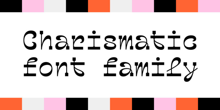
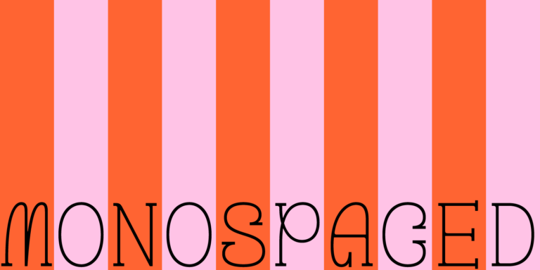
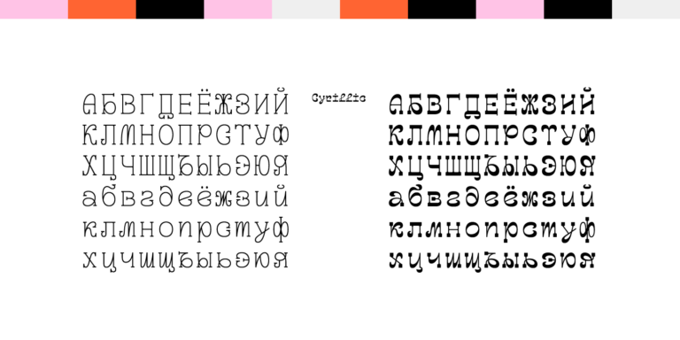
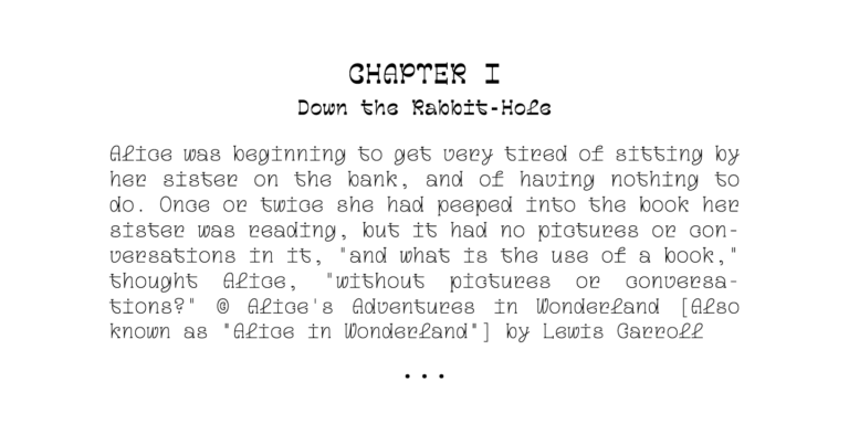
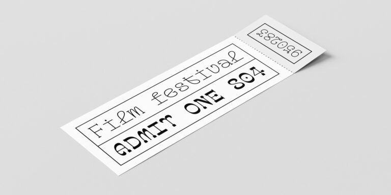
TT Geekette is a variable serif with a friendly nature. This project was an experiment where we aimed to avoid the simplifications of stiff geometric structures and explore the possibilities of smooth, soft, and flexible shapes. We also wanted the font to be more stylish and serious, that’s why we decided to make it monospaced.
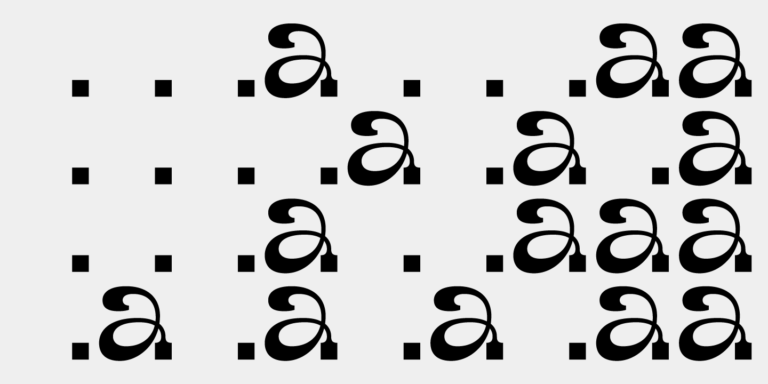
While designing TT Geekette, one of our goals was to reimagine the graphic approach to crafting a serif, so we deviated from the traditional approach to drawing based on the logic of writing with a nib pen. We implemented several systematic elements into the font’s design, for example, “loops” molding the rhythmic flow. The graphic style of TT Geekette is unique—this is an unusual and distinctive font, completely different from others.
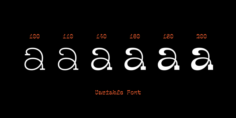
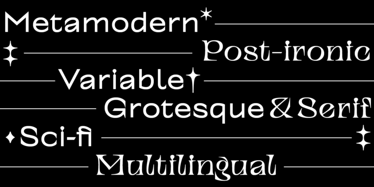
Using the controlling tools for variable axes, it’s possible to transform the appearance of TT Geekette from a low-contrast monolinear font with serifs to a highly pronounced reverse-contrast font. Having serifs in the font is also optional—it’s possible to turn them off in the variable font.
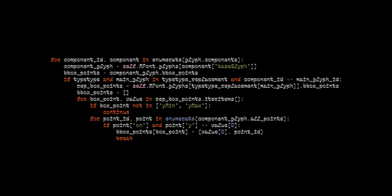
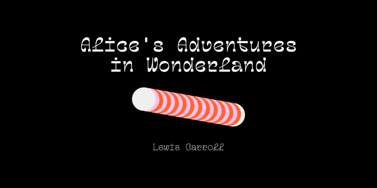
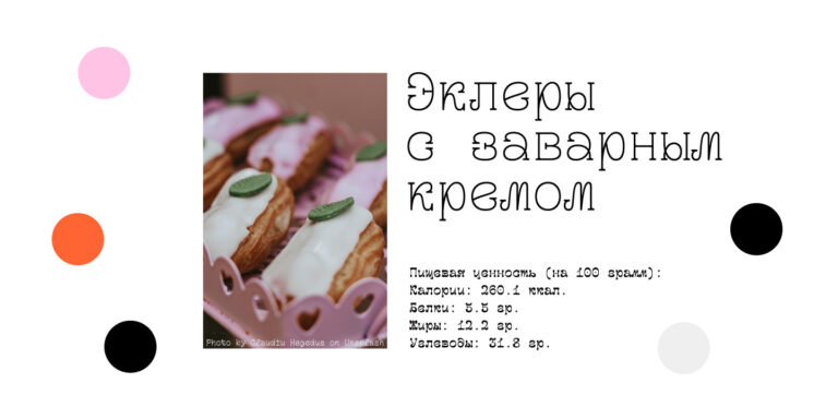
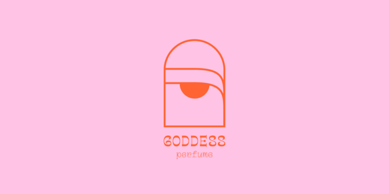
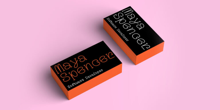
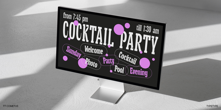
TT Geekette is a decorative font well-suited for printed materials, branding, and web design. For instance, this font is a great choice for creating eye-catching signs for cafes and restaurants, food packaging, posters, or invitations. It can also be used in programming software—an excellent mood guaranteed!
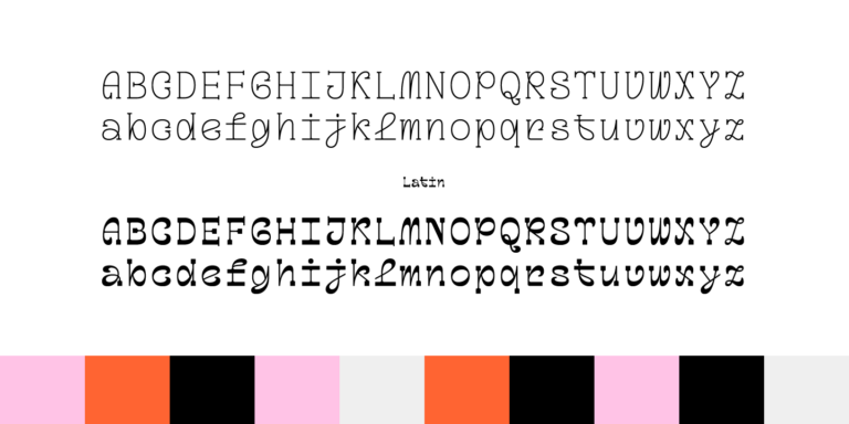
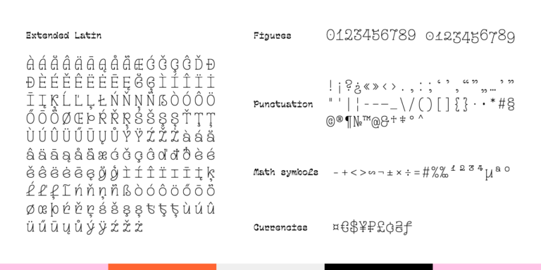
TT Geekette font family consists of three fonts: a monolinear TT Geekette Bones, a reverse-contrast serif TT Geekette Muscles, and a variable TT Geekette Variable. Each font style includes more than 450 glyphs.

