It sometimes happens that on paper, a new font seems to be a relatively simple and quick task, but as a result of the work, it turns into one of the largest projects of recent years. Today’s story is about just such a font.
The work on TT Livret began with the idea of creating a text serif that would be convenient, pleasant, and modern. It should be one that a designer can apply in a variety of areas. It seemed to us that we would quickly tackle this task.
However, later we started a large-scale study, which sampled almost all the well-known serifs in the market. Shortly after that, we decided that adding a text subfamily to a display subfamily was a good idea. And as a result, it turned out that there were three subfamilies, because the display turned out to be very expressive, and the text one, on the contrary, was neutral. A subfamily with a manageable character that expands the scope of the font — why not.
We didn’t stop there. Having reached the italics, we carried out one more small study, remembering the historical role of italics in fonts along the way, and we just could not stop. We analyzed italics inside and out, choosing the most time-consuming type — old-style italics, in which the shape of each glyph in all styles is drawn anew, without repeating the shape of upright styles. But as a result, you now can use TT Livret italics as independent fonts.
The article, in which we talk about all the processes in detail, turned out to be voluminous, the approximate reading time is 50–75 minutes. However, it’s worth it.
Brew yourself strong tea or coffee, take a comfortable seat, and start reading. If you find it difficult to study everything at once, bookmark the article and set a reminder to return to it later.
Have a nice trip to the world of our new project.
Intro
Where most people see shop signs, concert posters, and street signs, type designers see sans serifs, slabs, and serifs.
Fonts meet us on the pages of websites and in mobile applications, in books, magazines and brochures. Behind each created font is a team of those who, over the course of months, and sometimes years, drew and technically polished each letter.
Today we’re going to share the history of a font that in the future you may meet on the cover of a magazine that you flip through in a beauty salon or at a car service. Maybe this font will decorate the exhibition that you dreamed of visiting, or maybe you will recognize it on the sign of the restaurant where you will go with friends after a hard week of work.
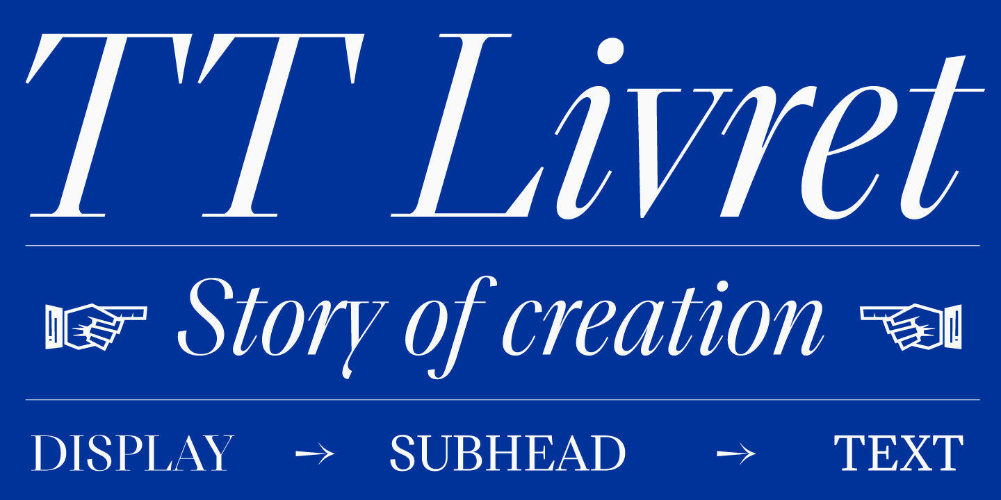
This is where we will begin our acquaintance with the TT Livret font, which this article is about. Those who are familiar with the French language will be able to learn about our little dream from the name.
In French, le livre means a book, and le livret is a small book. We will be happy to know that once TT Livret makes it to the pages of a book that you will be immersed in reading in the evening.
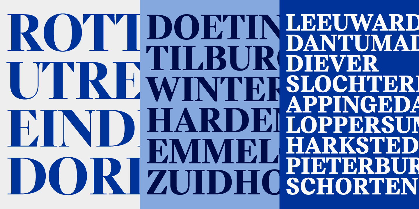
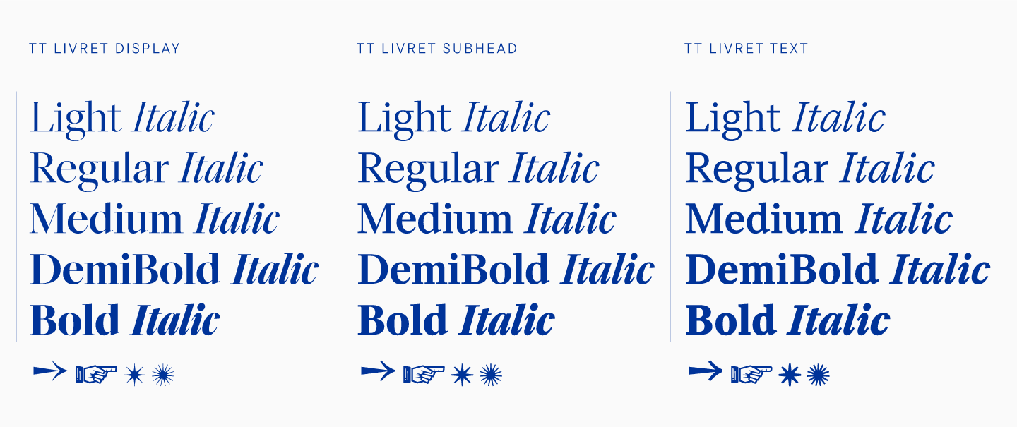
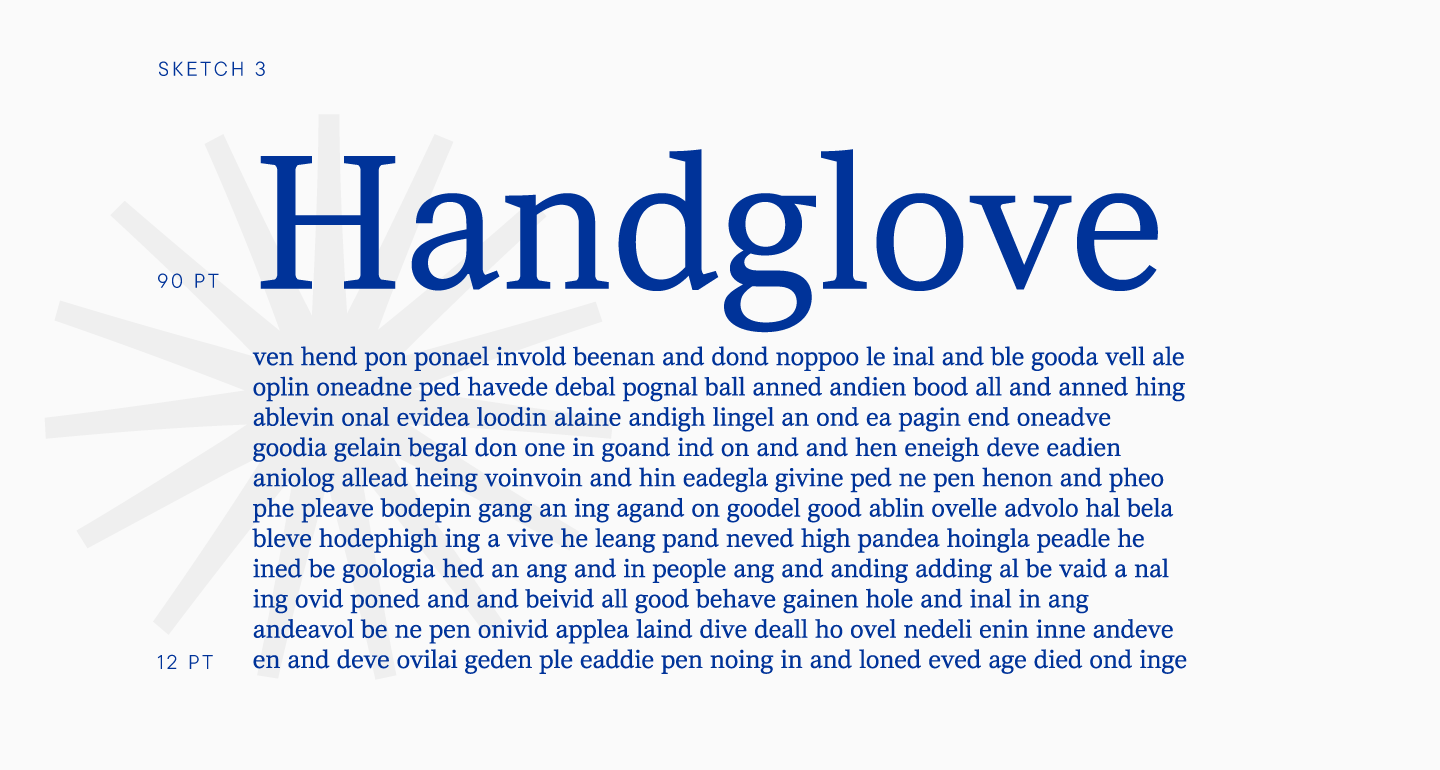
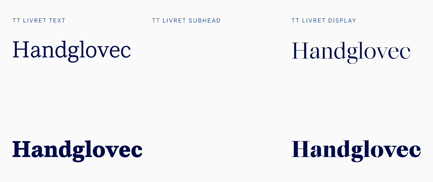
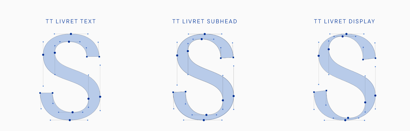
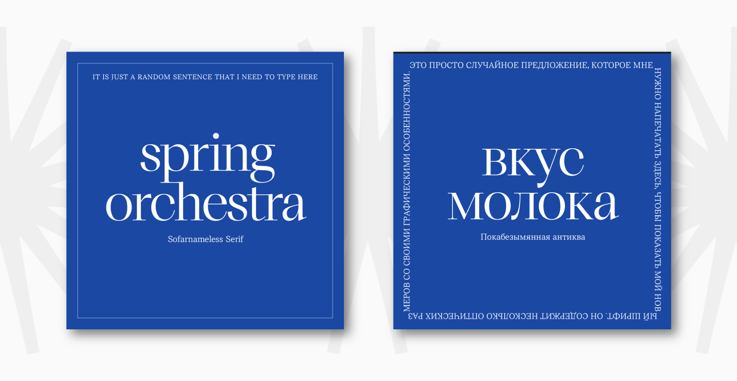
The TT Livret font consists of three subfamilies, each with its own characteristics. The display family will look beautiful in headings and on signs, with the help of text one you can type arrays of text of any size. The subheading family has a manageable character, and depending on the context and the way it is used, it can be either more expressive or neutral.
Since the created serif is distinguished by its elegance, we have created an old-style italic for it, which can be used as an independent font. It looks extremely beautiful, and you will have the opportunity to verify this.
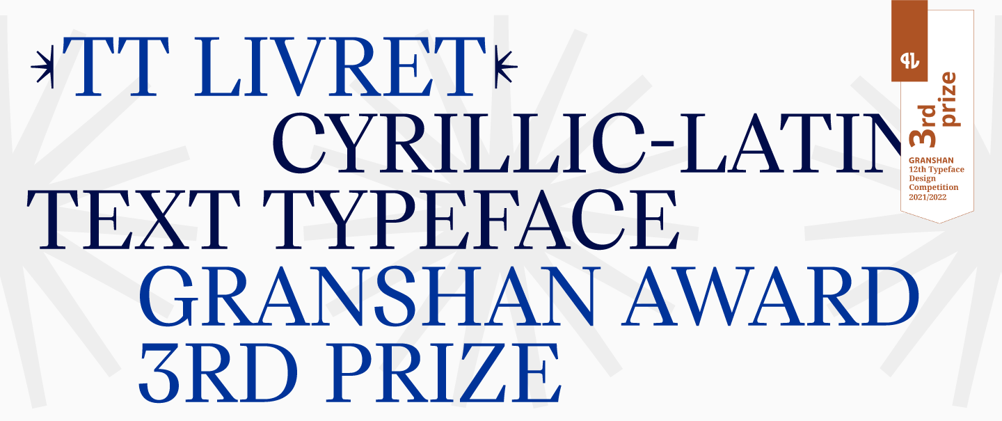
The TT Livret font was released in the spring of 2022, but its portfolio already flaunts this line: “Winner of the GRANSHAN international competition, 3rd place in the Cyrillic-Latin Text Typeface nomination”.
The font family has everything that TypeType users are used to: extensive language support, a large character set, functional features, ligatures, and stylistic alternatives. Nevertheless, TT Livret will be able to surprise you, because we put a lot of interesting details into the typeface, so we recommend that you study the font thoughtfully and carefully.

Research
In today’s world, where sans serifs with their predominantly neutral character abound, something more graceful and elegant may be missing.
Do not think much of it, we do love sans serifs. The TypeType collection contains both geometric, humanist and neo-grotesque sans serifs. However, this time we wanted to step away from the sans serif and create a serif, and such that it would be safe to use. And we are about to tell you what we mean by that.
When TT Livret was only in the plans, we imagined it as a universal font with a wide range of uses. After a short analysis of the studio’s typefaces, we realized that among our fonts there is no serif that can be offered to the user as a working tool for any modern projects. Of course, we have serifs, but more often these are decorative fonts, which are rather positioned as display ones.
For TT Livret, we originally planned both text and display versions. We saw the first subfamily as more neutral, so that the designer would be comfortable using this font even in large text arrays of small size. We wanted to give the display version a more expressive character so that it could be used in headlines and eye-catching captions.
Of course, these subfamilies should be interconnected, have common recognizable features, and look harmoniously together without repeating each other. This way, a designer will have a full arsenal of fonts for different purposes that can be used together.
Our plans were for a font that is safe and not scary to use. When we say this, we mean something familiar to the user. A serif, which is not intimidating with its extraordinary or old style, but at the same time looks fresh and elegant. A modern and stylish serif.
This font may not be immediately noticeable when it comes to a text subfamily. By the way, the text subfamily was meant as the main one, although we drew the display and text ones in parallel.
With these thoughts, we began the research part of the work. In order to understand how to embody our plans in detail, we have made a selection of the fonts used most frequently.
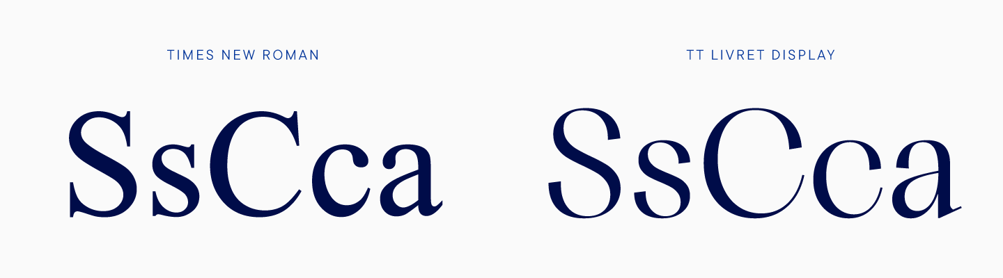
First of all, these were system fonts, familiar to absolutely everyone: Times New Roman, Georgia, Minion. These are serifs that appeared relatively long ago. Surprisingly, during their existence, the fashion for fonts has changed several times, but these fonts continue to be used. We can say that they were imprinted in our subconscious, so it was necessary to research them as part of the study.
The same selection included more modern fonts, also actively distributed in the world. Among them are New York, used as a system font by Apple, and Source Serif, a free font from Google, which is used on many sites. In total, there were nine fonts in this collection. Here we also counted the very first sketch of our own font, which is significantly different from what emerged as a result. However, in this way we were able to understand in which direction to move further.
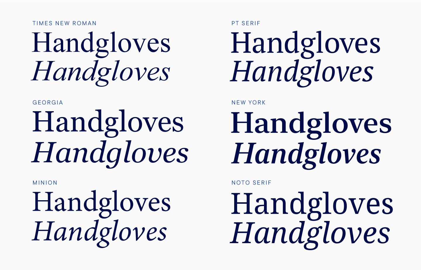
We conditionally divided all the collected fonts into older and newer ones, testing them one by one in set. At the same time, we drew the first letters so that we could compare our serif with the others.
In the old serifs, the lowercase characters were short in height. This means that lowercase letters are significantly lower than uppercase ones. The smaller the height, the more old-style the font looks. Moreover, in a dense text set, a small-height font looks smaller than a tall-height font printed in the same size.
Even the first drafts of the TypeType serif differed significantly from other typefaces in the sample, because we wanted to make a modern font without the old style feeling to it.
In the selection of newer fonts, the lowercase letters are taller, as well as there is less contrast compared to the previous group. In type design, there has been a recent trend towards less contrast in text serifs, and in our font, the contrast was significantly less than in the chosen fonts.
With the help of research, we were able to compare our font with the rest and understand which direction to continue.
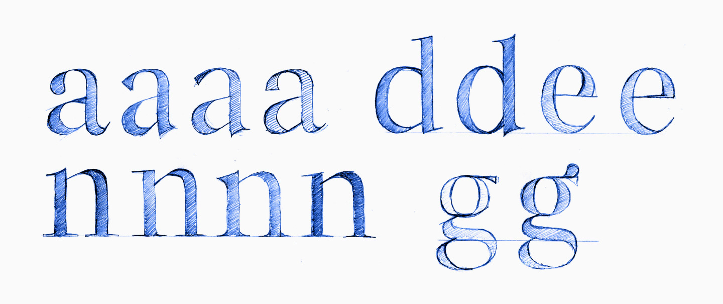
Of course, not a single font from the selection was used by us as a reference. The first sketches of TT Livret were drawn by Yulia Gonina, our art director, by hand, and she was primarily guided by her own feelings and visual experience. You can see these sketches in the pictures below.
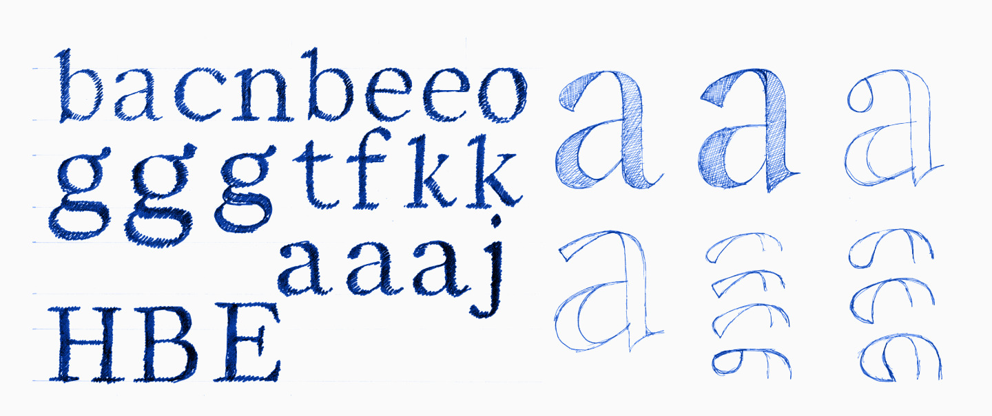
The shapes were attractive and we liked them, but we wanted to add character to the glyphs, so the search for a suitable version continued.
Emergence of the three subfamilies
Although, as we mentioned earlier, work on subfamilies was carried out in parallel, we started with the text version of the font. The letters on the first sketches seemed too smooth, and we wanted to give the font more rigidity.
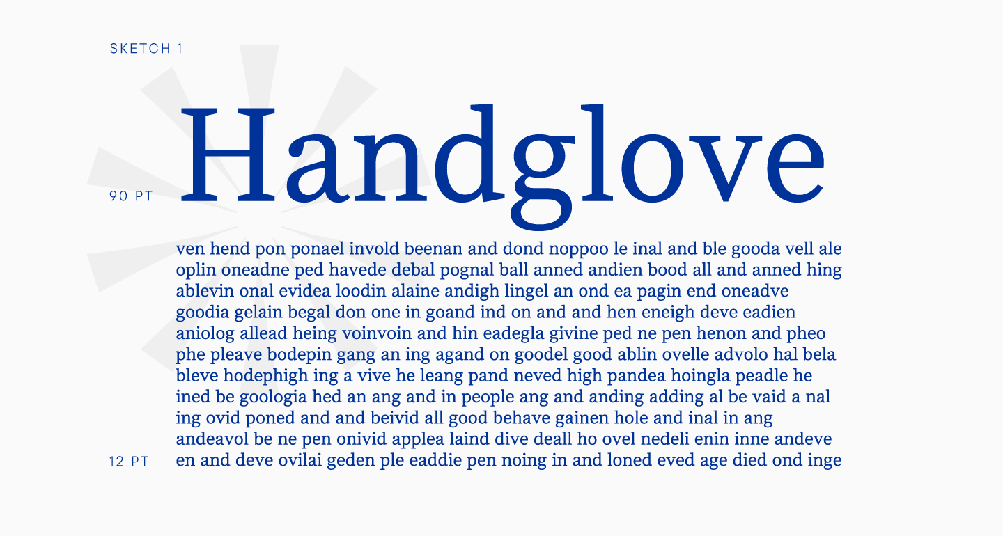
The second version of the serif was distinguished by the inflows of arches. In the first version, the inflow of the arch into the stem is smooth, and in the second, the connection is more rigid.
In early iterations, the font had a neutral character. In general, this is not bad for a text subfamily, but we wanted to give the font some features that would distinguish it from other typefaces. After all, we still look at the font in a rather large size before we understand whether we want this particular set or not. We had to take into account the fact that the text font should not interfere with the main goal, which is reading, so we were looking for a balance between expressiveness and neutrality.
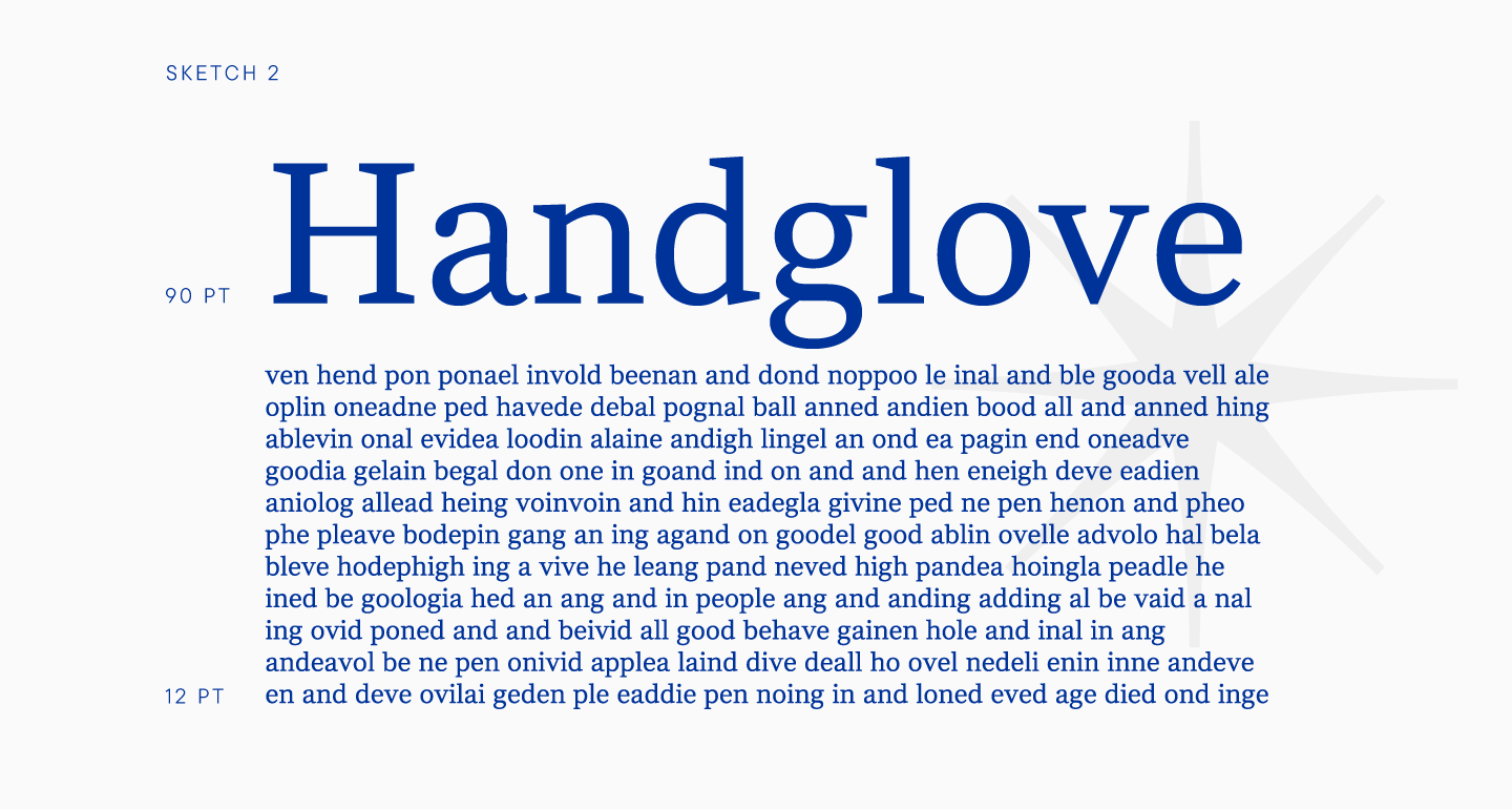
In the third sketch, you can see that the serif details have become stiffer, while the font has more fluidity than in the second iteration. Breaks appeared in the serifs, which made the font look more interesting. It is worth noting that it was this sketch that became the final prototype of the TT Livret.
We finalized it, polished every line and detail, but did not change anything fundamentally.
After this iteration, we once again compared our font set with the others, and this time we liked the result a lot more.
Since we have decided on the basic forms of the text subfamily, it was time to define the external features of the display font. We worked with the medium weight that was close to Regular.
In the display face, we increased contrast by reducing the thickness in thin elements, giving the font an elegant look. Due to thin elements, the expressiveness necessary for the display subfamily was formed. Just like with the text subfamily, we tried to find the necessary character of future glyphs through test sketches, experimenting with the shapes of individual elements.
As a result, we got a rather contrasting version, and we wanted to keep this feature, because in large sizes such a font would look very attractive.
However, we became curious about what could happen in the space between text and display. As you might guess, this is how we realized that there will be three subfamilies, and not two, as originally planned.
We generated an intermediate font automatically, changing it so that this subfamily was closer to text. The resulting font became the subheading font, and was meant to be used both in texts and in headings. In text arrays, the font remained readable, although the letters became more contrasting. As a display subfamily, such a subfamily can be used not only in large, but also in small headings. We can say that this subfamily is the most universal one.
Even though the subheading subfamily was generated automatically, we edited it manually so that the typeface was balanced and technically correct.
So, we decided to focus on three subfamilies. The next stage of work was to determine the required number of faces, because the first iterations were carried out on just one. There were five of them in total: Light, Regular, Medium, DemiBold, Bold, Black.
Before deciding on the final number of styles, we studied other font families. As a result, there are five fonts in each subfamily, an average number common to many serifs.
Of course, we could do more and bring the value up to nine, the standard number of weights for most TypeType projects. However, this was not necessary, because in total there were quite a lot of fonts, given that there are three subfamilies. We decided that instead of expanding the composition of fonts in terms of weight, our team would focus on carefully rendering glyphs within five weights.
Upright faces
Before the glyph rendering work begins in full force, our team defines reference masters. These are faces that are entirely hand-crafted, and from which the rest of the faces will be interpolated later.
Determining the support masters is a responsible task, because if we make the wrong choice, we will make our path more difficult. If the rest of the faces are generated with errors, we will have to edit too many details manually or create an additional reference face.
In this case, making the right choice was even more important than usual. It was all about the subheading font, which was interpolated automatically. It was important for us to choose reference masters, thanks to which the subheading subfamily, or rather its five styles, would be generated correctly, so that there would be a minimum number of manual edits.
Although we started with three base styles, as a result, we worked on four masters: Light and Bold, in text and display. After these weights were rendered, we generated Light and Bold in the subheading subfamily. There was a lot of manual intervention, and we corrected slits, cleaned up controversial points, and edited glyphs that raised doubts.
It has to be noted that work on Light and Bold was carried out in parallel in both fonts, that is, in text and display. We were literally drawing glyphs in sync. This approach was a new experience, because all the other fonts of the studio are being worked on sequentially. When working on TT Livret, a parallel approach was necessary in order to immediately check whether the intermediate style looks right.
The issue was that the difference in thickness between Light and Bold is significant, and it was important to make sure that there are no unnecessary optical compensations in the gaps, for example. It was meticulous and complex work.
Almost immediately after rendering certain glyphs in the text subfamily, we would draw similar letters in the display subfamily to test how well the subheading font turned out. We can say that almost parallel work was carried out on all four support masters. It was important for us to immediately check how the result looks in all our styles and subfamilies. Despite the complexity of this approach, it was safer for this project, because we could almost instantly make the necessary changes without missing important details and fixing the shortcomings in time.
Due to the chosen approach, the character set expanded very smoothly. We started with lowercase characters. When all graphic solutions, for example, for arches and inflows, were found, we tested the text in typesetting and headings.
The thicknesses of the reference outlines were also determined sequentially, starting with Light. When the optimal thickness was found, we drew the letters according to the system described above.
The optimal weights were not found immediately, however, it was important for us to determine the desired values in the first iterations in order to continue working with thicknesses close to ideal. We checked the regular font in the set, looking at how bold the regular font stands out.
Here we’ll reveal a little secret. The most important thing when creating fonts is to determine the optimal weight of the Regular face, because it is the one that is used most often. Moreover, due to the prevalence of this face, every designer has an idea of the optimal weight of a regular font. If your font does not converge to this view, the designer will feel uncomfortable when using the font. As a result, they will either have to look for the optimal style in the font, or refuse to use this typeface altogether. This rule applies not only to serifs, but also to other fonts.
The same can be said about Bold. The fact is that the standard boldness button in most programs turns on this style specifically, so most people have an idea about the convenient boldness of Bold. Although it is also fair to say that type designers have more wiggle room when working with Bold, because this typeface can be of different weights and still be acceptable to users. These observations are more relevant for a text font than for a display one.
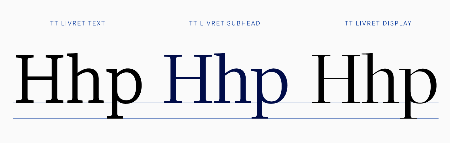
In TT Livret, text thicknesses are similar to display thicknesses, that is, the stems are of absolutely equal thickness in the same styles. This solution helped to generate the subheading subfamily correctly and avoid errors. This applies only to thick elements, because thin elements differ across subfamilies, and it is due to this that subfamilies have different contrasts.
At this stage, we have drawn a certain set of characters for all subfamilies, so we can talk about the graphic features of each of them.
Subfamily characteristics
The first drafts of the TT Livret typeface were created on paper. You have already seen sketches of the text subfamily, so it’s time to admit that the first letters of the display were also drawn by hand. Of course, the initial versions drawn with a marker differ from the final result, but you can see common points even in these sketches.
Curiously, some graphical features of the display font were found during these iterations. For example, the characteristic small break at the point of attachment of the arches, which is also noticeable in the final TT Livret. The form g also remained similar to its first version.
We thought it would be unfair to talk about the display face separately from the text and subheading subfamilies, because they were created together. Therefore, we offer to see which features create the character of TT Livret and remain unchanged, and which ones have been changed.
Let’s start with the common ones.
- The design of characters is the same. The logic of the distribution of contrasts and graphic solutions is common to all subfamilies. This was necessary not only to maintain a general character, but also for correct interpolation. Among other things, this helped to create a variable font for upright styles along two axes, boldness and contrast, that is, you can find an intermediate option both between Light and Regular, and between subheading and display.
- The number of points is the same in all similar glyphs. This is more of a technical peculiarity, which also helps to correctly interpolate styles.
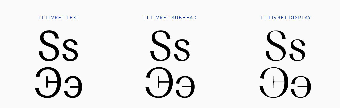
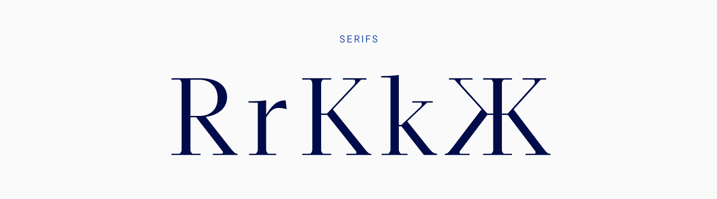
- In all three subfamilies, the letters do not have spurs or drops. These elements are often found in serifs, however, in our opinion, they can give the font an old style feeling.
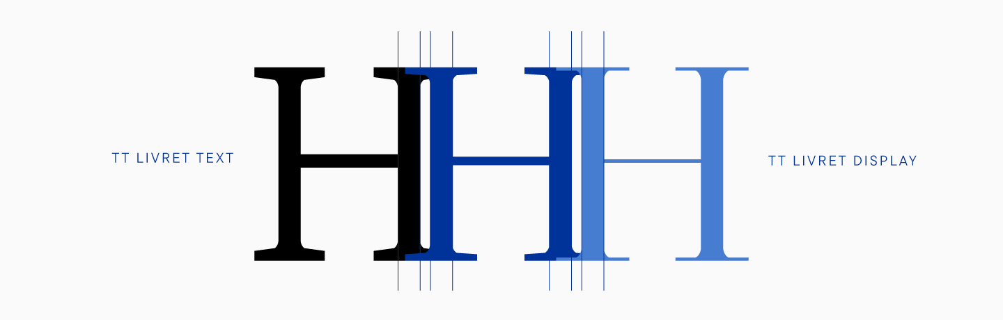
- The vertical proportions in the subfamilies are also the same.
- In all glyphs, the thicknesses of stems are equal.
The differences between the subfamilies are due to their purposes.
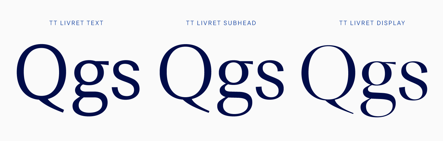
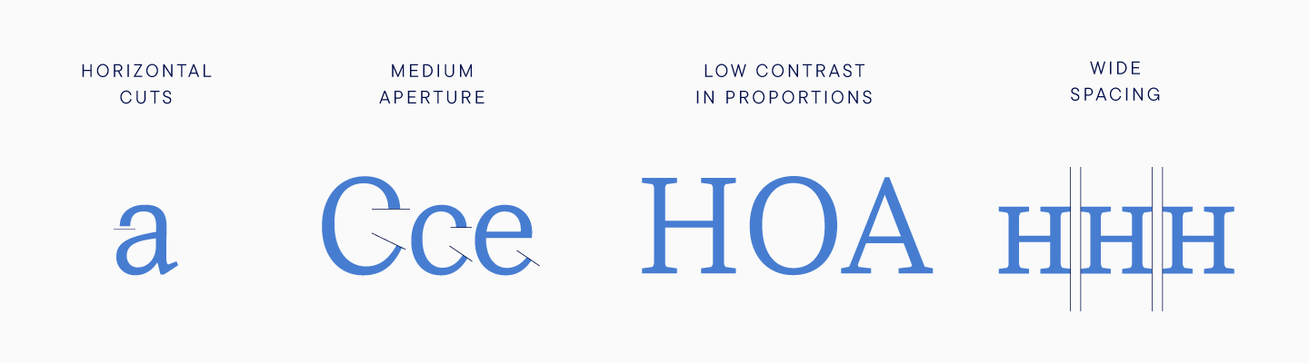
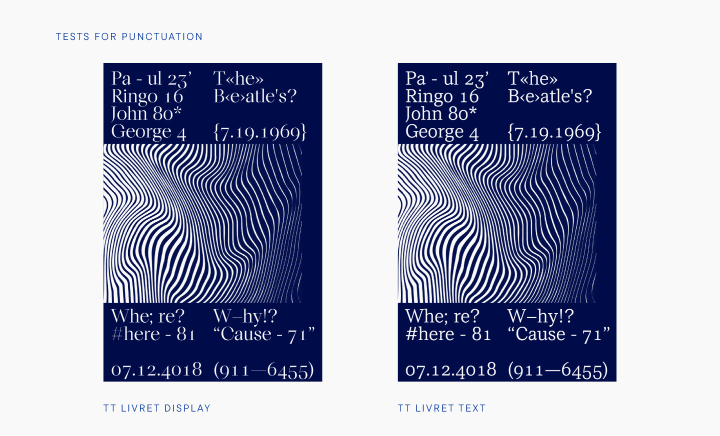
- The text subfamily is a monowidth font with low contrast and a calm character. The cuts of the characters are horizontal and straight, the apertures are of medium openness. The spacing in the text family is wider, there are larger overhands in round characters.
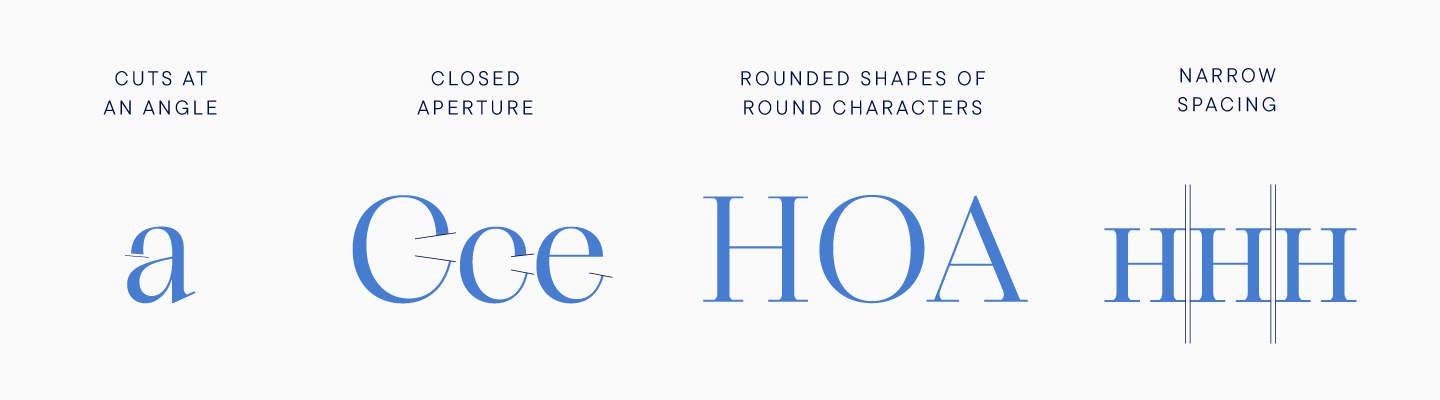
- The display subfamily has a distinct character, it is elegant and graceful. Graphic features are noticeable, the contrast in characters is high. The emphasis in the graphics is on thin and clear lines, all cuts are made at an angle. Round characters tend to a circle, overhangs in such characters are smaller. The apertures of the signs are closed.
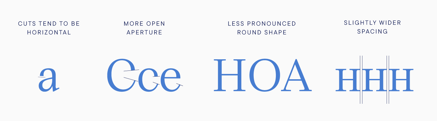
- The subheading subfamily has features of both subfamilies. It looks good in small headings, while it is readable even in arrays of text typed in a small size. Graphic features are present, but are less pronounced than in the display subfamily. The contrast is medium.
To better understand what TT Livret is, let’s take a closer look at some of the characteristics.
The text font has low contrast, the minimum possible for a serif.
As we noted, most designers associate this with a contemporary font, and the trend towards low contrast has been maintained for the past few years. Considering that the contrast is often quite high in serifs, many designers refuse this type of fonts. The low contrast common to modern typefaces is characteristic of sans serifs. The text subfamily of TT Livret looks contemporary thanks to which it can be used on par with sans serifs. Moreover, not everyone will immediately determine that TT Livret text font is in fact a serif. However, this was our plan to create a safe text serif. The rest of the differences between text and display subfamily were more about practicality, because we wanted to improve the readability of the font. This applies to oval circles, slightly open apertures, wider spacing and larger overhangs in round characters.
In a display font, there are graphic features, which are expressed in straight lines that are deliberately straight and are, in addition, of the same thickness. Such elements support straight serifs and give the font expressiveness. The cuts in the display type are at an angle, and this is purely a decorative slope that adds elegance to the character. The display subfamily has a very high contrast, but also does not look old-style. This is largely thanks to the fact that we have abandoned two standard elements for serifs, drops and spurs. For example, in many serifs, S and G have spurs as a decorative component, while lowercase a and c have drops. These elements are associated with a serif font, but we have abandoned them to make the font look more contemporary.
The same can be said about uppercase and lowercase characters. In many serifs, these characters differ, including drops and spurs on certain glyphs in capital letters. In TT Livret, uppercase and lowercase characters are almost identical, which was an additional step towards non-obvious ‘serif-ness’ that will be convenient for designers.
In the display subfamily, one can notice rather long serifs, especially in relation to the text font. We applied the most unusual solution to R. On the right leg of the letter, the serif is standard, but on the left, this element looks much shorter. Let’s reveal one more secret: this decision was more technical than decorative, because a long serif could rest against similar serifs of other characters, but we also liked the result visually.
Moreover, the serifs of all characters are quite thin, and, of course, such elements are one of the most noticeable details of the display subfamily. We have balanced on the interplay of thin and thick elements to achieve a subtlety that immediately draws the viewer in.
Internal testing
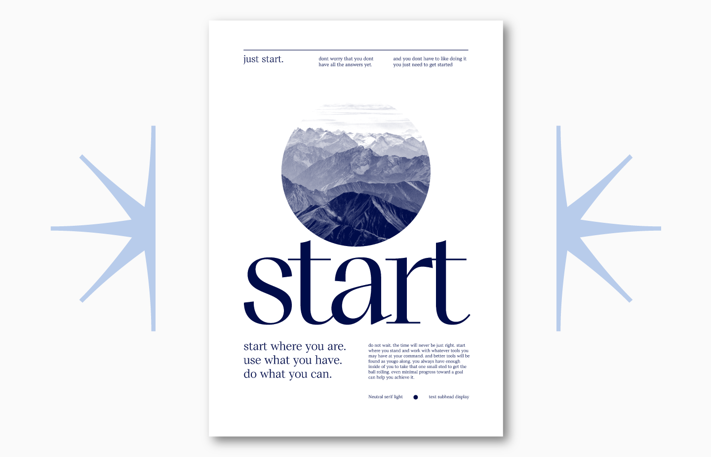
When creating something as large as TT Livret, you need to understand in advance how the font will look not only in special programs and intermediate presentations, but also in real projects.
What emotions will be evoked by posters set in this typeface, how subfamilies will be combined and how beautiful the result will be — all this is best understood long before a font is released on marketplaces.
We love to test our fonts by placing them on test posters printed and displayed on the walls of our office. This helps to identify imperfections and adjust the font.
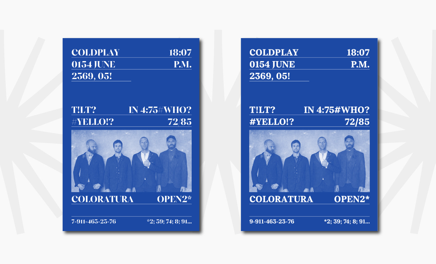
There were several posters designed with TT Livret. We checked how the subfamilies would match, how beautiful the bold the weight would be, and whether thin could act as a heading face. If something visually stands out in the same posters, then you need to revise the font and tweak the details. For example, we corrected the bold style to be close in character to the thin one.
The second font testing method used in the studio is posting on social networks with glyph graphics or GIF animations of the font. This helps not only to see the future font for yourself, but also allows you to hear feedback before the release.
The audience can influence some of the decisions about the font.
When drawing the Cyrillic alphabet for TT Livret, it turned out that the letter б had four versions, from which one had to be chosen. Difficulties arose in the bold face, because it was necessary to correctly distribute the mass of the letter so that the Cyrillic б would match the rest of the set. The б in Cyrillic has two common shapes. In the first case, a flame-like element is attached to the oval, and in the second, the shape is similar to the Latin b, that is, the tail is attached to a massive back.

We drew four versions of the letter б in bold, and turned to the audience for help in a humorous post. However, the participants voted for their favorite option quite seriously.
You can see which shapes were in competition. As a result of the poll, the fourth option received only eight votes, the third-eleven, and nineteen people each voted for the first and second options.
In the end, we settled on the first option, because it suited the font better in terms of graphics.
Figures, symbols, currencies
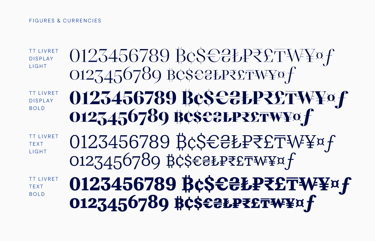
After drawing the basic character set for the reference styles, we began to expand the set composition. This is a standard studio process, but some details are unique to TT Livret. Let’s talk about them.
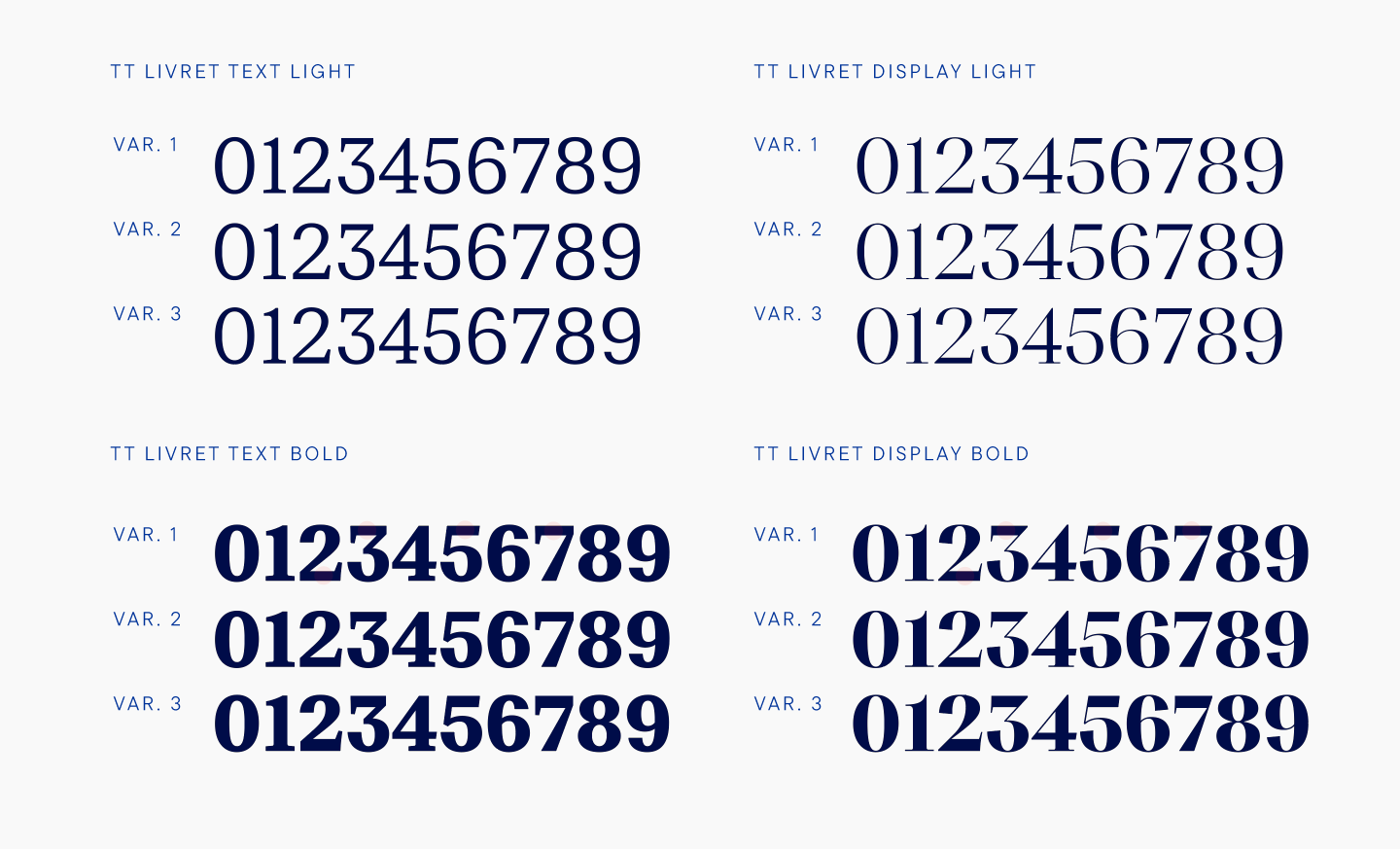
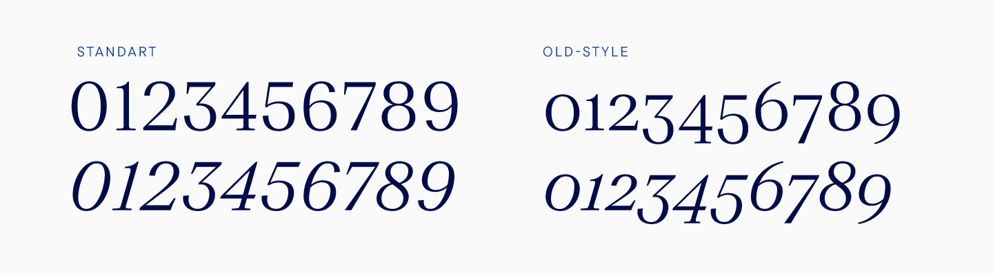
When creating figures, we usually make two options, the more familiar majuscule and the smaller minuscule. For all fonts, we create an extended set of currencies, in which there are only classic and tabular versions. This time we decided to create another version of currencies, because with minuscule figures the classic set looked too large and it was inconvenient to use it. So we came to the conclusion that minuscule figures would look great with minuscule currencies, and added the latter to the font. In fact, they differ only in the size that matches the minuscule figures, that is they are reduced in size, but they look more concise.
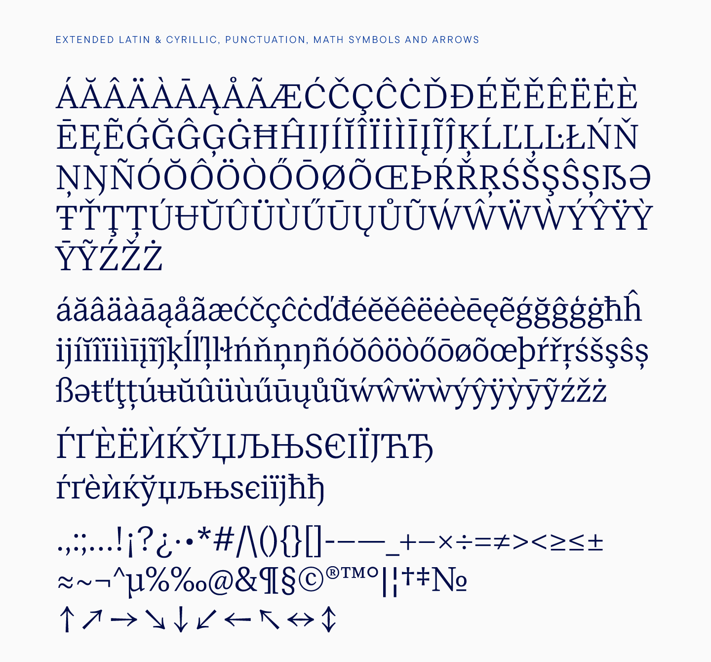
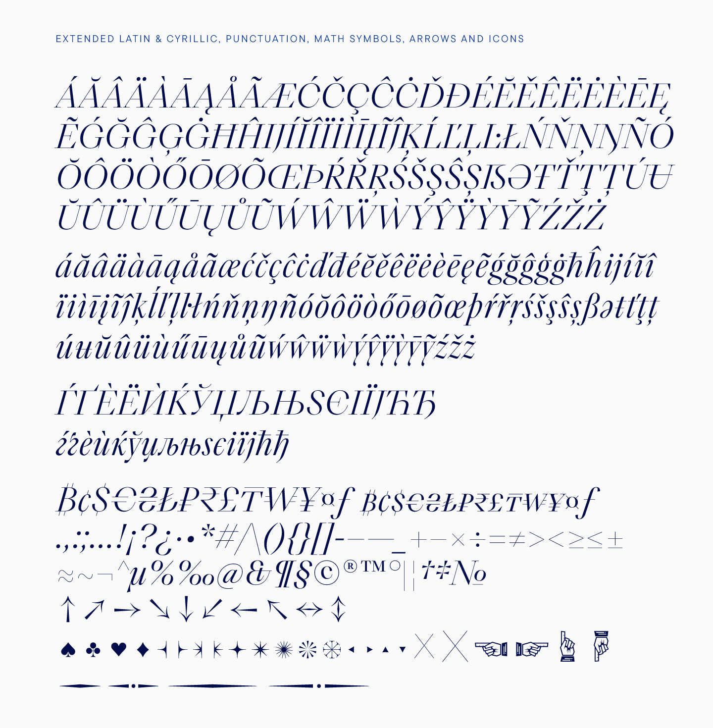
When expanding the character set, we also added extended Latin and Cyrillic, diacritical elements, punctuation and arrows, and special characters. This can also be called a standard TypeType set.
Let’s focus on what we did in addition.
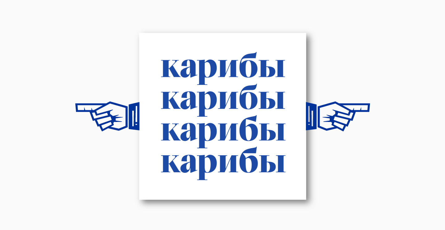
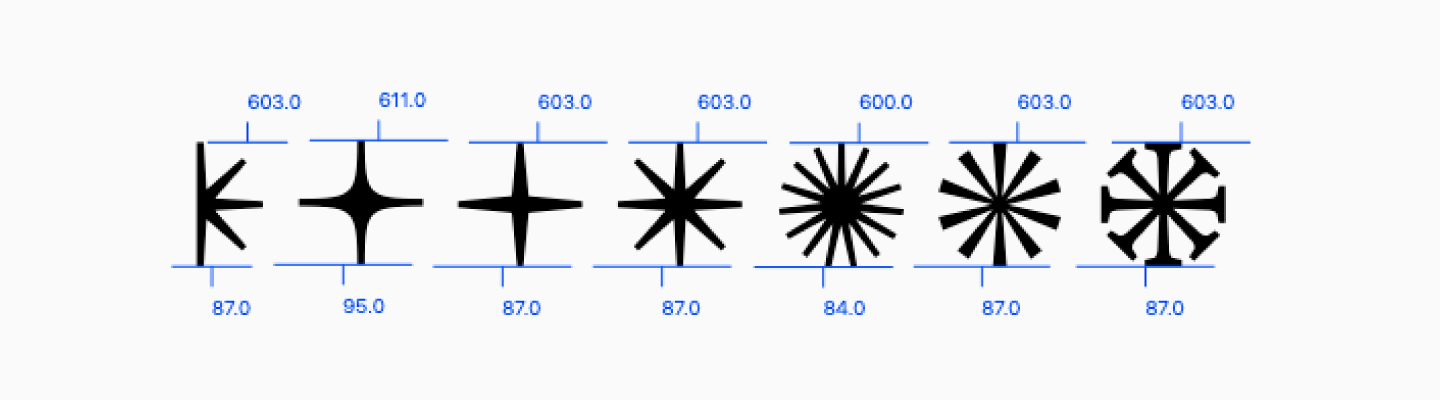
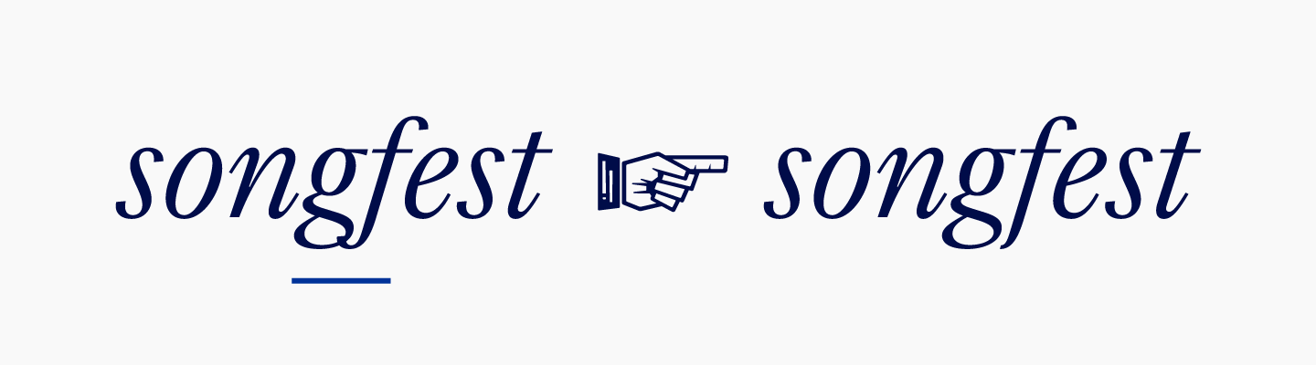
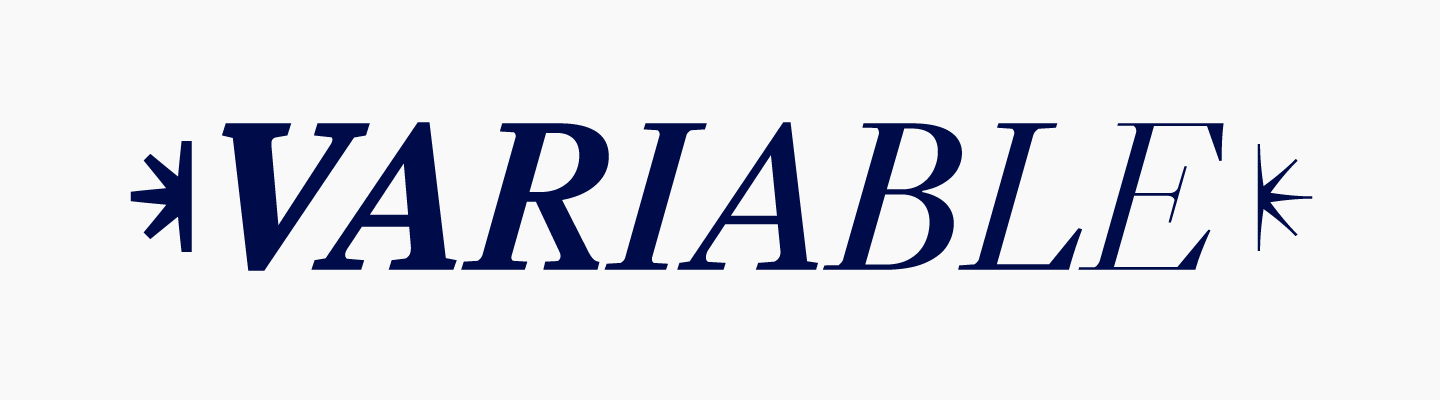
First, for TT Livret, we drew stylized pointing hands. Later, we realized that such a beautiful font lacks some special characters, pretty versions of bullets, text separators, and asterisks. Of course, we drew those and added them to the font, so the expressive possibilities of the typeface became even broader.
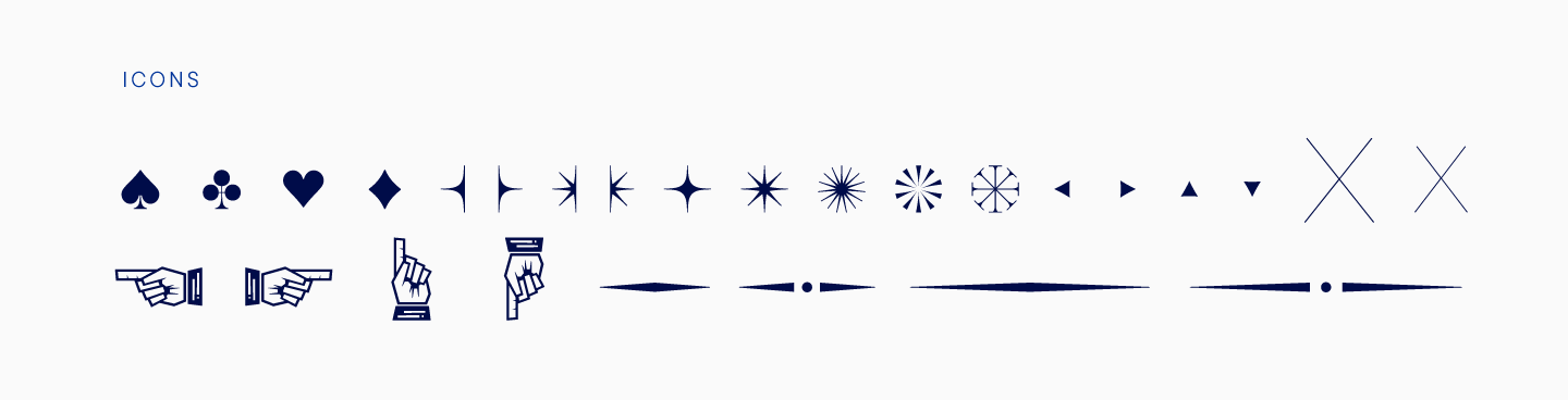
With the help of such elements, you can not only decorate the text, but also design headings. However, it is up to the designers to decide how exactly to use them. By the way, all elements are different for text and display subfamilies, and they also change in weight. Graphically, all elements of the set correspond to letters.
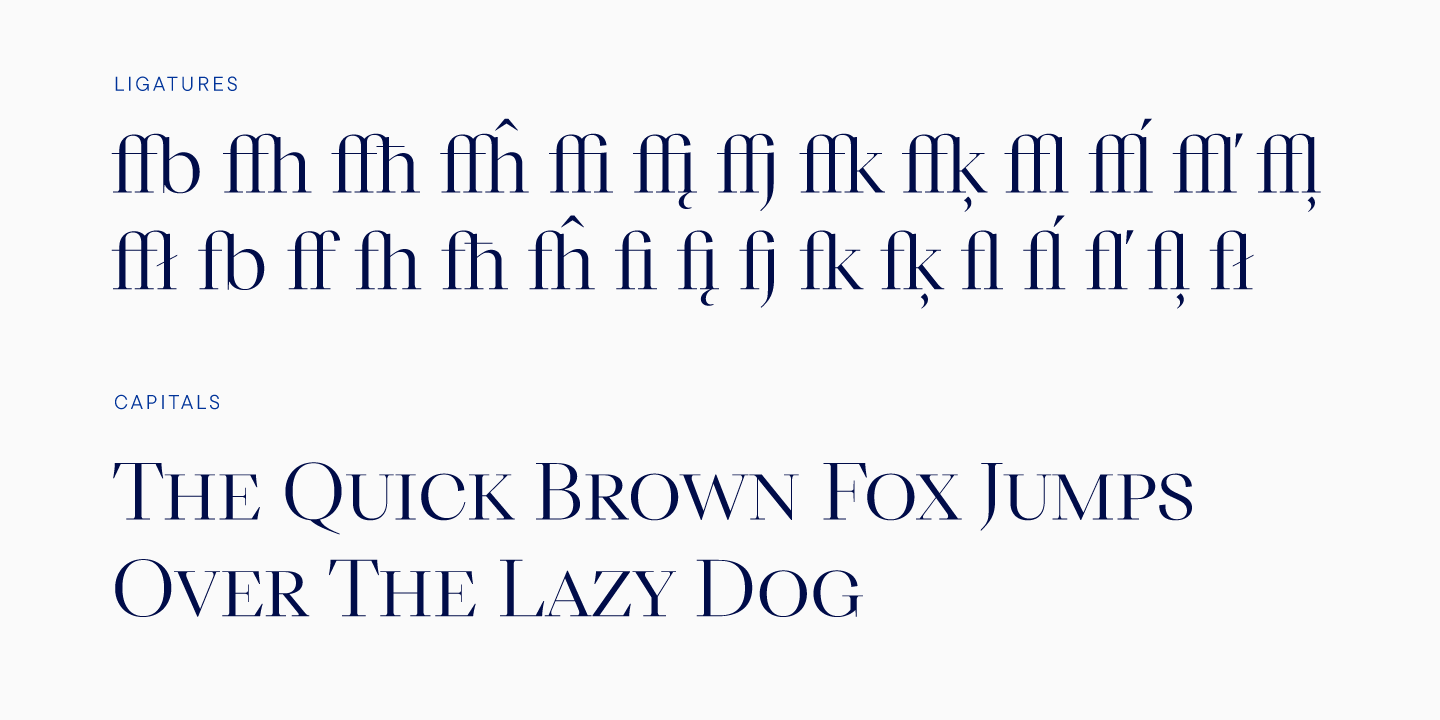
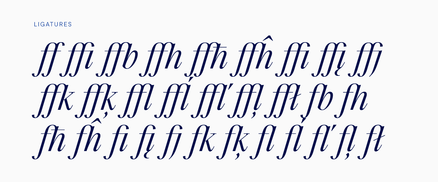
The TT Livret font features small capitals, contextual alternates, and over 25 ligatures, including diacritic ligatures.
The variable font contains all upright styles and even decorative elements. The user can easily find a unique style by changing the thickness, adding contrast to the text font, or, conversely, reducing the display contrast.

Mastering
We will never get tired of repeating that a font without a technical component is just drawn letters, even if they are very beautiful. Font mastering is necessary, and the level of its execution determines how convenient it will be to use the typeface. At TypeType, mastering has been worked out and systematized to the last detail.
The first files reached the technical department when the font was in the process of being rendered. TT Livret had not yet received its name then, and was presented as a low-contrast serif.
Work began with the display and text subfamilies to test them before generating the subheading one. We began to work with upright faces, and a little later started working with italics as well.
The main challenge was in serifs. The fact is that in TT Livret, serifs were created as corner elements, which made it impossible to carry out the verification in the standard way, that is, through converting opentype curves to truetype and vice versa. We create fonts in opentype curves, so it’s impossible to know how a font will look like in truetype unless you check it yourself. It was necessary to somehow decompose the serifs, but we found a plugin that allows you to check the glyphs without overly complicated manipulations.
The font was sent from the technical department to the production department and back several times during the work. The most critical part was checking the font before generating the subheading family, because every element was checked. If the files were still a bit unprepared, the font would go back to the designers and then go back to mastering.
Despite some difficulties, such as balancing the whiskers which turned out to be different in size after ungrouping, work was actively moving forward. It turned out that the technical part was carried out in parallel with the work of the designers, and it was important for us to find any flaws before generating the subheading font.
The upright and italics faces were checked separately, and an additional mission was to check that all font files work following the same logic.
Separate kerning and hinting were created for the font. These are pretty standard processes for our studio, but this time the kerning took more time and effort than usual. Normally, when doing kerning, we take a medium weight, for example, Regular, and set all the values for kerning pairs in this weight, then transferring the same values to other weights. Finally, a verification takes place, during which some values are manually corrected, especially for bold styles. When working with TT Livret, we also set values for kerning pairs in the regular style, but after that many values had to be edited manually. Somewhere it was necessary to make the kerning denser, in other places, on the contrary, push it apart.
In total, the work of the technical department went on until the very last moment in order to eliminate technical shortcomings.
Italics
We left the story about TT Livret italics for the final chapter, because this part of the project deserves special attention.
Every font has italics, and most often work on them is carried out after upright styles are completed. In this project, we developed italics almost in parallel with uptights faces.
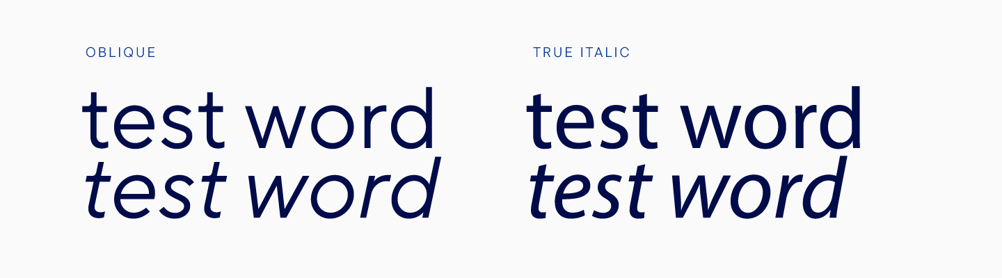
Italics, or oblique faces, can be of several types, depending on the technique by which the letters are slanted. Sans serifs, for example, have only two types of such fonts: simple slope and real italic.
In the first variant, the shape of upright glyphs is tilted with little or no change in construction. In practice, this is more complicated than just tilting, as a number of manipulations and optical compensations are carried out, after which the form looks correctly tilted. The glyphs are changed so that visually the differences are not noticeable, but only the slope is visible. At the same time, the construction and width of characters do not change.
Real italics are found mainly in humanist sans serifs, and in this approach, changes in the constructions of some signs are permissible. Some glyphs may change shape, some will remain just slanted. The change in the forms of real Italics is especially noticeable in Cyrillic.
Serifs are created according to a different logic. It is extremely rare that you will find a typeface of this style with oblique styles. Most often, in a serif there will be real italics, in which the design of characters changes. Moreover, it is worth noting that a serif italic will have much more noticeable changes in the design of characters than the same real italic in sans serifs. In serif italics, if not the forms of entire glyphs, then at least many details change.
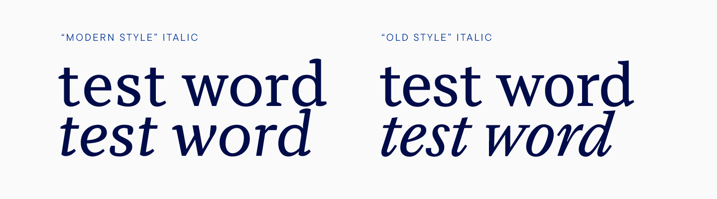
There are basically two types of serif italics, the new style and the old style.
In the new style, characters can be drawn anew, with a large number of changes, but still such italics will not differ significantly from the upright style.
The old style italic, or what is now commonly described as such, is drawn anew. Such a style can be very different from the upright one or even have other shapres. Historically, this is an independent typeface.
Let’s make a little reference to the history of fonts. In the Renaissance, italics were independent typefaces, not tied to any upright style. They began to be made for typesetting, and partly because of this, old style italics are so narrow, since such a font saves space. It is worth noting that at that time the handwritten cursive, which italics resemble so much, was familiar to people and looked quite ordinary.
Over time, italics began to be used in conjunction with upright styles, mainly in order to highlight a fragment of text. After the 18th century, with the advent of the French fashion for typefaces, italics began to take on other features, turning into new style italics. You might be surprised, but the new style italics have been around for several centuries now.
In modern fonts, if we are talking about serifs, you can find both new style and old style italics. These, of course, will be fonts adapted to modern realities and technologies.
When choosing an italic, designers are primarily guided by the strength of the highlighting function, which an oblique style should have, since it is this feature that italics implement in the modern type design.
The highlighting function will be most pronounced in an old style true italic. A new style italic will be less expressive but will still be able to attract attention to the highlighted text. An oblique face will help make an accent in the text, but its highlighting function is not too strong.
For TT Livret, we decided to create an old style italic.
Without a doubt, our oblique font was intended to be used in conjunction with upright styles, so it took on the character of the entire TT Livret family.
Our choice meant that italics would be narrow, and the shape of the letters would have to be drawn from scratch. In order for the upright and oblique styles to blend well, we decided to work in parallel. After creating new letters, we tested the font, substituting italic for the upright style and analyzing how harmonious the result looked. First of all, we looked at how their thickness matched. At the same time, italics could look a little lighter than upright fonts, this is considered acceptable in type design. We often removed extra thickness in letters, for example, we made stems thinner than in upright styles.
Determining the correct slope for the text and display subfamilies was the main task, and if for the display subfamily we determined the required value almost immediately, with the text one it took several iterations.
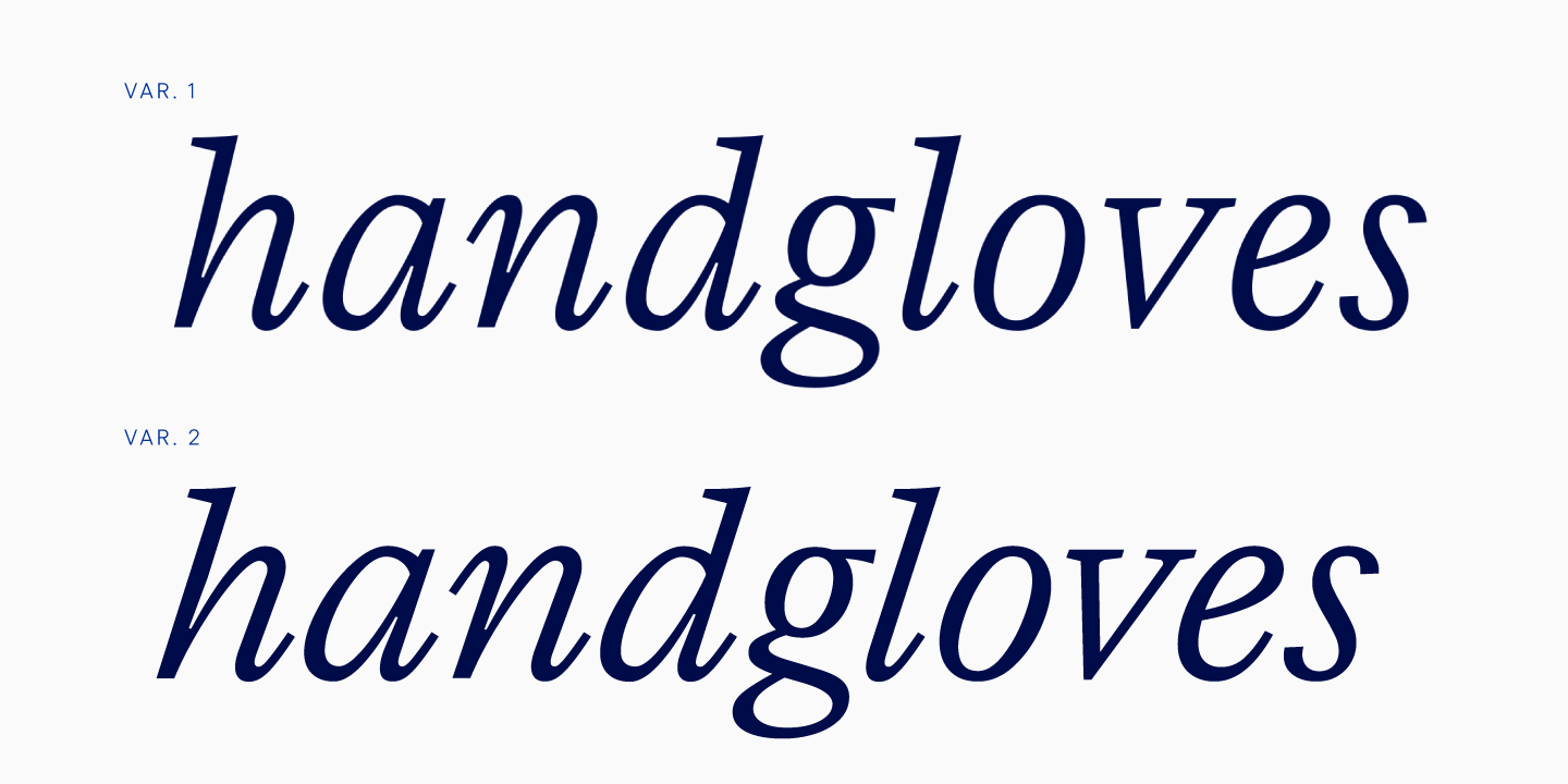
Of course, we wanted to preserve the readability of the font even at the smallest sizes, so we tried to create an italic with less slant than in the display font. Another feature of the text italic is the increased width, because a narrow font in text arrays is perceived worse. We managed to expand the italic in the text subfamily, but in such a way as to preserve the recognizability of the old style italic. As a result, the letters still had to be made narrower than planned at the beginning, because with wide spacing, the old style italic looked graphically imperfect. We had to find compromises between the readability of the font and visuals, but in the end the italic text font suited us in all respects.
We tested the resulting italics on trial posters, peered into and analyzed them. As a result, the slope of the text and display italics became the same, because a smaller slant did not fit such a font since the overall rhythm was lost. The greater the slant in old style italic, the more solid the font appears.
The old style italic has one more feature. A new shape, redrawn, is created for lowercase characters only, while uppercase characters are based on the upright style. The thing is that the first italics in the world did not have capital letters, so they were taken from upright fonts. Capital letters in old style italics began to tilt a little later. Surprisingly, italic capitals are still a slanted version of upright faces.
Of course, it is easier to work with uppercase characters in old style italics than with lowercase ones, but it is harder than with oblique sans serifs, because serifs are more contrasting. After the standard slope, by analogy with the sans serifs, the shape had to be corrected by hand so that the contrasting elements looked concise.
Another characteristic feature of working with italics for TT Livret is that round characters in uppercase had to be narrowed, and the letters themselves had to be made a little lighter, that is, thinner, by analogy with lowercase ones.
There was one last task. We had to add elements to italics, thanks to which they would be united with upright styles in character.
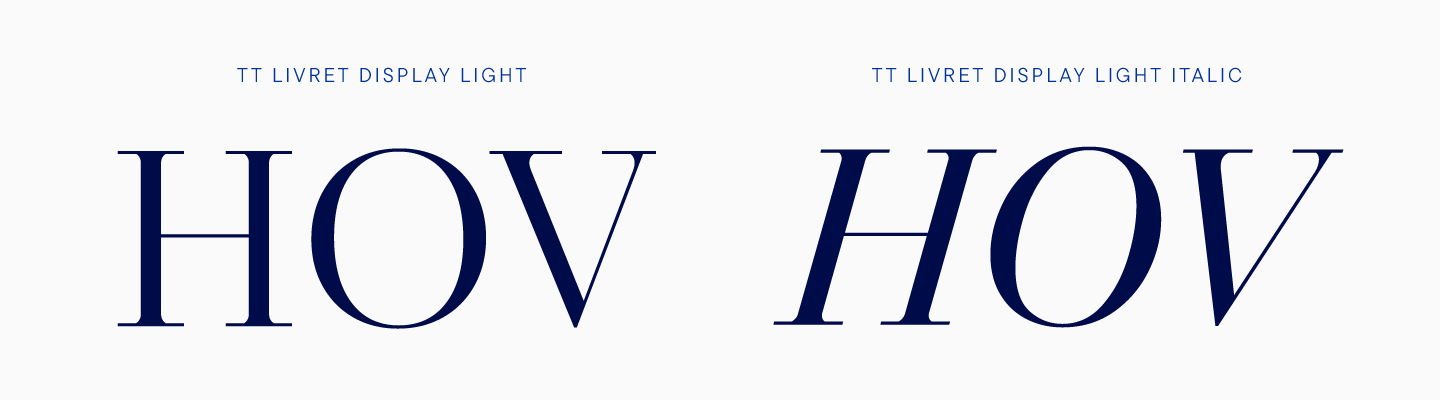
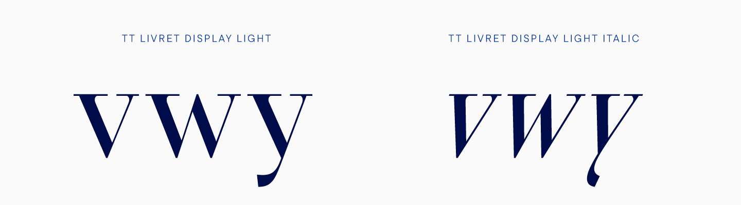
For the display subfamily, this was more pertinent, because this font has more expressive elements. First of all, we have focused on long thin lines, as in upright styles. The top serifs have remained the same, we have kept the high contrast and slightly sloped terminal cuts. The clear graphics and shape of some glyphs have been transferred to italics, for example, in the letters v, w, y. In old style italics, the shape of these characters can be quite complex, smooth, with decorative elements, but we preferred to transfer the shape from the upright styles in order to preserve the character of the display font.
We have been working on two reference masters that mimic the uprights, i.e. the Light and Bold for text and display.
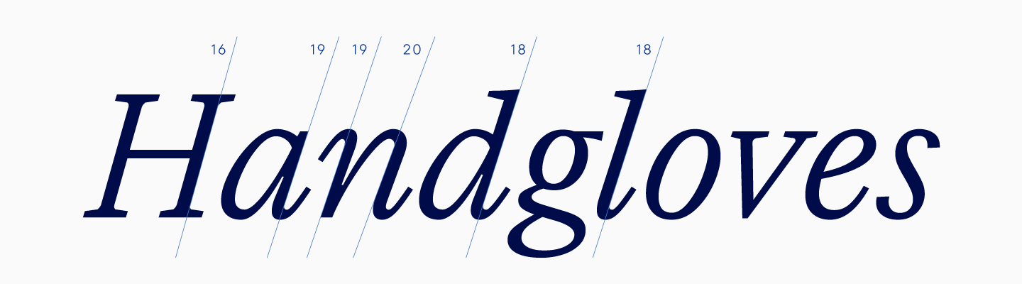
There is one peculiarity in old style italics. Even though all the glyphs appear to be slanted in the same way at the end and a clear rhythm is maintained, this is an optical illusion. With the same slope, the letters will look scattered, so we adjusted the angle of inclination. Moreover, even elements of the same letter can be tilted differently, for example, in n one leg is tilted a little more.
Despite all the difficulties of creating the old style italics, much more attention was paid to upright characters, since any flaw in their design was conspicuous, and lines had to be verified down to the most imperceptible details.
The differences between the text and display subfamilies in italics are similar to the upright ones. In a text italic font, the contrast is lower, which is high in a display font. As to the differences that are characteristic only for italics, we can note that the text font is much wider than the display one.
The italic subheading subfamily was created according to the same principle as the upright one, so the generated italic has the features of both subfamilies. After interpolation, we corrected the subheading styles manually, correcting visible flaws.
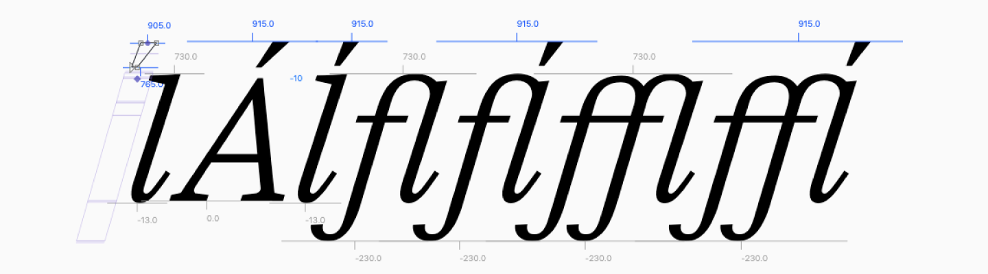
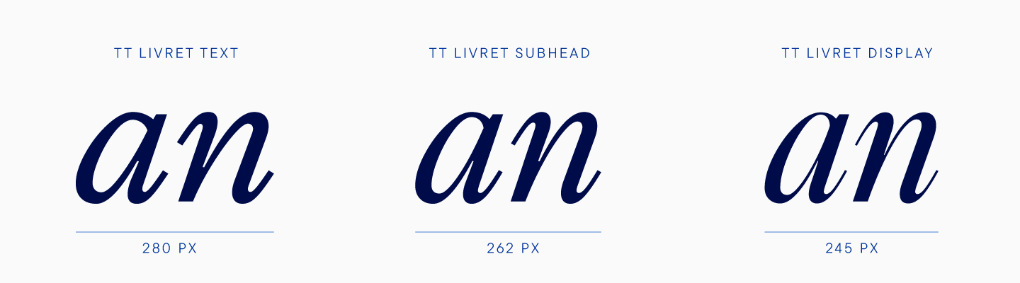
For italics, we have created a full-fledged variable font that can be changed along the weight axis and the optical size axis. Due to the completely different forms of lowercase characters in italics, we could not make one variable font for the entire subfamily, so TT Livret has two variable fonts.
The figures were created by analogy with capital letters, that is, straight characters were tilted. Some details were fine-tuned by hand, and as a result, the head of the number 2 became smaller to compensate for the outweighing, and in the number 3, the middle line changed, becoming higher, since the inclined sign seemed too small.
The currency set turned out to be similar to the upright set, we also supplemented it with a version for minuscule figures. TT Livret italic has small capitals, just as well the upright styles do. Almost all symbols, including arrows, asterisks and bullets, remained unchanged.
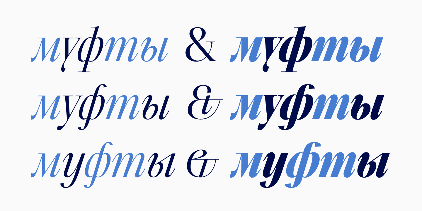
In italics, two stylistic alternatives appeared for the Cyrillic у, ы, ф, as well as several versions of the ampersand. We are fascinated by the shape of the ampersands in old serifs, so we decided to draw different versions of the alternative form of this character for our italics, in order to choose one as a result. However, we liked the resulting shapes so much that we included all three.
At the end of this chapter, we want to share a test poster that helped evaluate the font at intermediate iterations. By the way, thanks to such testing, we were able to understand that the text subfamily needs to be sloped similarly to the display one.
We have been creating TT Livret for almost a year, during which we have gone from the idea of making a nice text serif to the largest serif project of the TypeType studio. The result is a modern typeface with three subfamilies. One is a neutral text subfamily, which can be used in any area where you need to type large amounts of text. An elegant and stylish display subfamily makes you want to look forever at the headlines set in it. And, of course, there is the subheading subfamily, which can show the strengths of both subfamilies, becoming a more contrasting text or a calmer display. The old-style italic will help to accentuate the text or can become a standalone font for a project, while a large number of ligatures, stylistic alternates and special characters for design will add authenticity to the font.
Project team
Yulia Gonina—art director, lead type designer
Kirill Maslov—designer of upright styles
Anna Tikhonova—designer of italics
Ivan Gladkikh—technical director
Yuri Nakonechny—mastering
Anastasia Pogorelova—mastering
Tasya Petelina—kerning
Victor Rubenko—hinting specialist