top_banner_ttneorispro0426
Type foundry Blog Best newsletter fonts for emails: How to choose and use them correctly

Best newsletter fonts for emails: How to choose and use them correctly

best newsletter fonts

An appropriate newsletter font is one of the cornerstones of your email marketing effectiveness. You can write an exciting text, create captivating headlines, and add a bright image or animation to your newsletters. However, if your font is difficult to read, all this won’t help convey your message to users.

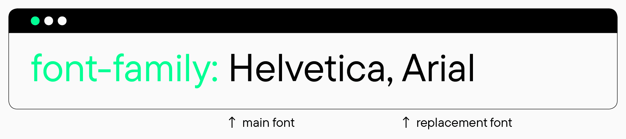
The task is also challenging because some fonts might not display correctly in the recipient’s email software. Thus, you can’t simply choose any font and use it for your newsletters—all fonts that don’t exist in the user’s system will be automatically replaced by standard ones.

So, what is the best font for newsletters, and how to use such fonts effectively in layouts? Let’s find out together in this article!

What are the most common newsletter fonts?

best fonts for newsletters

The best-suited fonts for any electronic newsletter are so-called «safe» system typefaces. The thing is that users are most likely to have such fonts on their gadgets as they are built into almost any operating or mailing system. So, these pre-installed typefaces are correctly displayed by any email client.

It is also possible to integrate a backup font into the code while building a newsletter. In this case, if the user’s device doesn’t support the main typeface, it will be replaced by a pre-planned alternative.

good newsletter fonts

Best «safe» fonts for newsletters: Types and examples

All system fonts suitable for email marketing can be roughly subdivided into two main groups: Antiquas and Grotesques. Antiqua is a general name for all fonts with serifs, and the word Grotesque refers to all fonts without serifs (sans serifs).

In a moment, we will explain how to choose them and what newsletter font combinations are the most effective. Now, let’s take a look at the most common «safe» font options for newsletters.

System fonts with serifs

  • Courier
  • Courier New
  • Times New Roman
  • Georgia

System fonts without serifs

  • Arial
  • Arial Black
  • Helvetica
  • Lucida Sans
  • Tahoma
  • Trebuchet MS
  • Verdana

How to choose and how to use a newsletter font

newsletter fonts

We determined several general rules to help you choose an appropriate newsletter font for your email marketing campaign from the existing «safe» options and use it correctly when building an email.

  1. Good newsletter fonts must be readable. The main purpose of a font used in the email’s body is to convey information effectively, meaning it must be easy to read and relatively neutral.
  2. The font used in the email can emphasize the brand’s personality. You can marry a system newsletter font with one of your signature fonts by choosing the most similar option. For example, if you use a serif typeface on your website or brand identity, you should look for a newsletter font from the same category. This way, you can maintain your brand’s visual image, make it more recognizable, and emphasize the message.
  3. Don’t use many fonts at once in one newsletter. The optimal number of fonts for a newsletter text is two, but often even one typeface is enough.
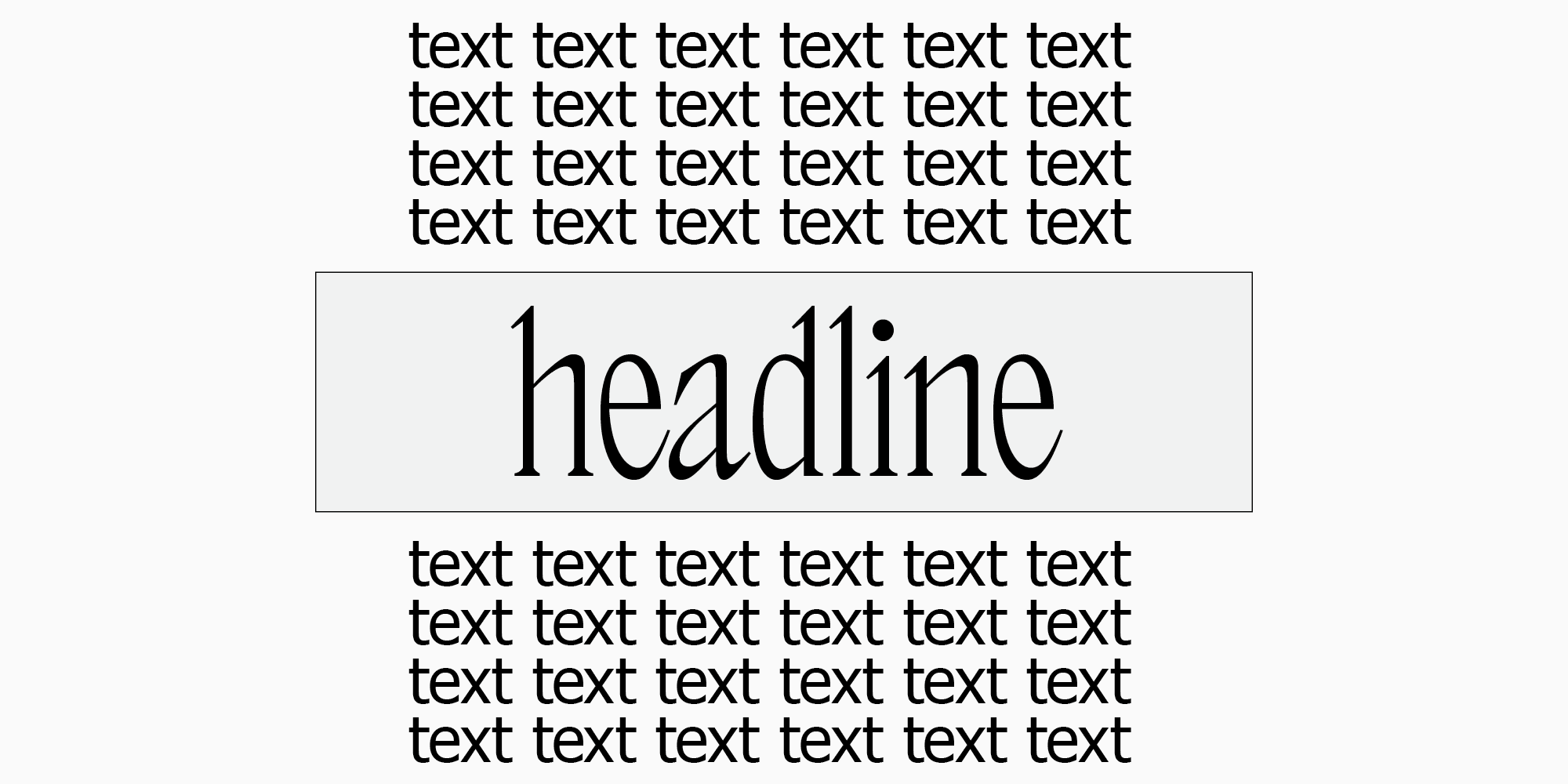
  4. Use fonts to determine the text hierarchy. Your newsletter shouldn’t be full of running text—it’s recommended to split it into blocks for easier perception. Headings and subheadings can be highlighted with a font by changing style or point size.
  5. Choose an optimal font size for reading. The most suitable sizes are 10-12 points for main text and 18-29 points for headings.

How to use non-standard fonts in newsletters?

newsletter font size

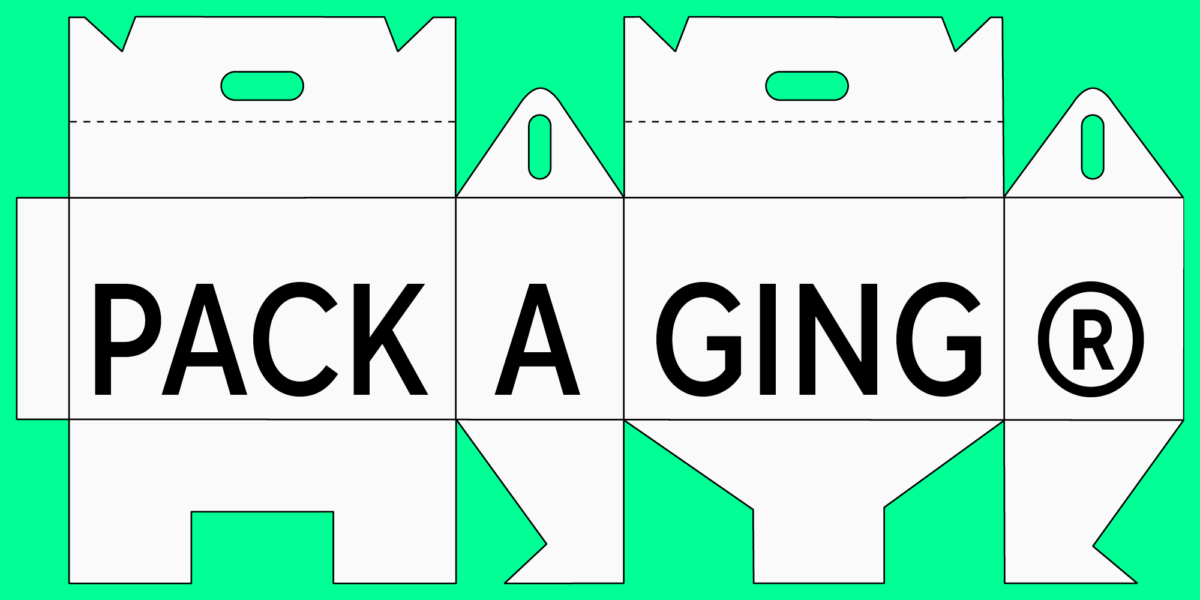
If system fonts seem to make your newsletter too dull, or you simply want to create a visual theme for the newsletter by using a non-standard font, there is a solution. Small texts, like headings, can be integrated into an email in the form of images. In this case, you will be able to choose any font without limitations and combine it with a «safe» option.

fonts newsletter

However, we don’t recommend using this method for big chunks of text. This makes the newsletter larger, takes longer to display, and takes away the option to copy text.

When choosing a font and its size for an image in the newsletter, don’t forget that the newsletter will be displayed on both computer and phone screens, so choosing an optimal text size is essential. The best way is to check in advance how the resulting image will be displayed across various screens and email software.

Font pair selection for eye-catching and memorable email campaigns

newsletter font combinations

So, we can make a conclusion that the best fonts for a newsletter’s main text are neutral system ones, and headings and inscriptions with expressive fonts can be added as images. The only question is how to make combinations of system fonts and unusual ones.

Like in other combination cases, there are no generalized rules for pairing fonts. You should rely on your feelings and develop watchfulness. Understanding some basic principles of font combination can help you as well—you can learn more about them and font pairs in our article.

Here, we prepared font pairs consisting of system fonts and typefaces from the TypeType collection. We are sure you will find a suitable option for your newsletter: a calm, neutral pair or an expressive, eye-catching one.

Neutral font pairs for newsletters

Neutral font pairs for newsletters
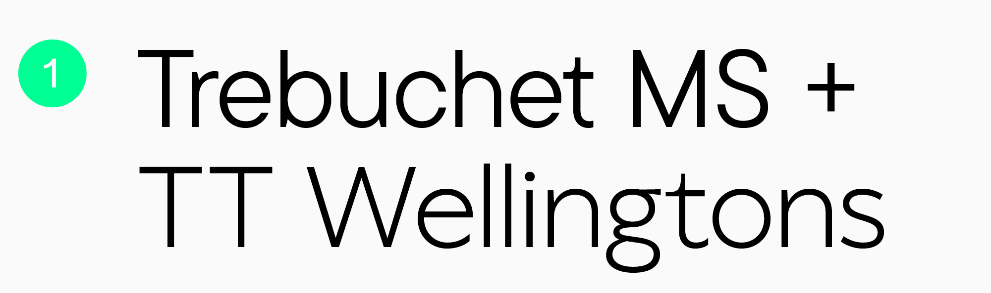
  1. Trebuchet MS + TT Wellingtons. These typefaces have similar letterforms, which make them a well-balanced combination. A Humanist sans serif TT Wellingtons is simple and elegant but also easily recognizable and fresh.
Neutral font pairs for newsletters

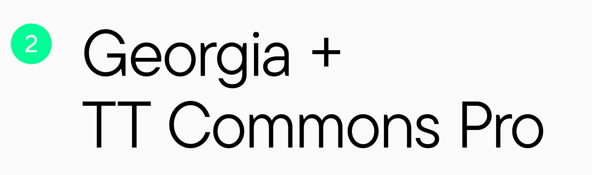
2. Georgia + TT Commons Pro. A combination of serif and sans serif is essentially classic and versatile. A geometric sans serif TT Commons Pro can easily adapt to any theme while still looking modern and dynamic.

Neutral font pairs for newsletters

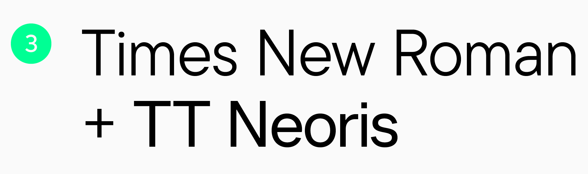
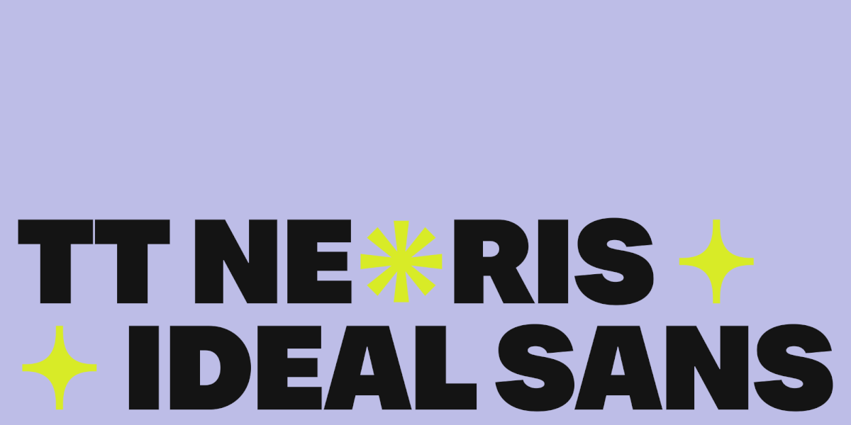
3. Times New Roman + TT Neoris. Another effective combination of serif and sans serif. TT Neoris is an elegant and fresh typeface featuring unusual details. Moreover, it enables you to experiment with its font styles and a variable font to transform the visual identity of your email.

Neutral font pairs for newsletters

4. Courier + TT Marxiana Grotesque. In this case, the fonts are united by soft forms and historical references. TT Marxiana Grotesque is a typeface inspired by a font set used for the Niva magazine, published during the late 19th to early 20th century. If you want to create a visual theme for the newsletter and give it a historical feeling, this font pair is a perfect choice for you.

Font pairs for newsletters with a vibrant accent

Font pairs for newsletters with a vibrant accent
  1. Helvetica + TT Bluescreens. These fonts are a good match because of having similar letterforms. However, a geometric sans serif TT Bluescreens with narrow proportions and recognizable visual features can place a visible accent. For more expressiveness, we recommend using bold font styles of this typeface.
Font pairs for newsletters with a vibrant accent

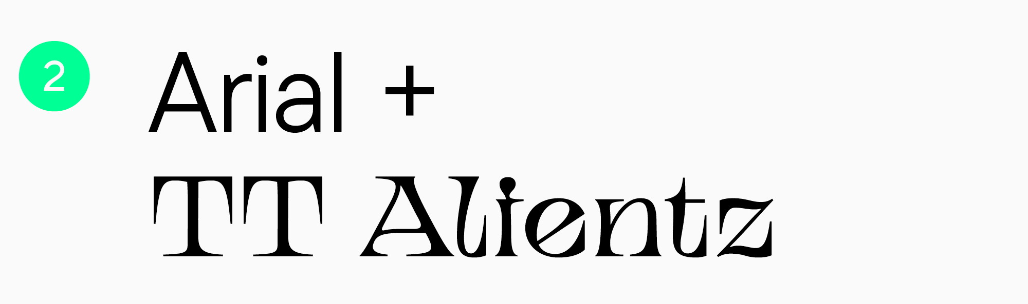
2. Arial + TT Alientz Serif. These fonts are also quite similar despite the unique style of TT Alientz Serif. This dynamic, flexible, stretchy, and very spiky serif has a highly expressive personality. It places an intensive accent and brings an audacious mood to the newsletter.

Font pairs for newsletters with a vibrant accent

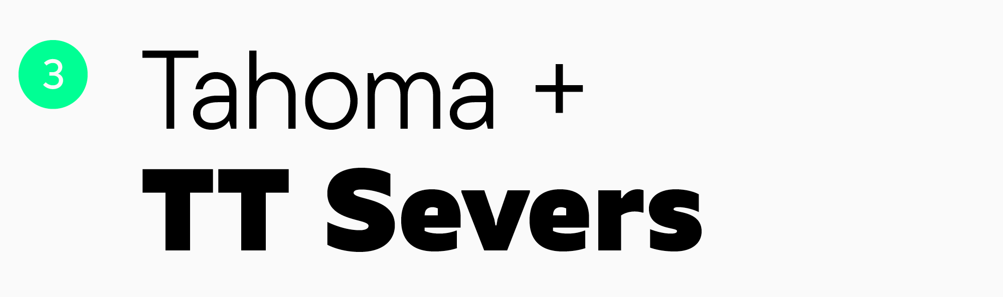
3. Tahoma + TT Severs. These are two fonts with similar letterforms and open apertures. However, TT Severs has a more decorative character and unusual inner contours. You can get the most out of this font by using its bold styles.

Font pairs for newsletters with a vibrant accent

4. Verdana + TT Runs. Although the letterforms of these two fonts are similar, they contrast with each other because of different character widths. Anyway, this doesn’t make them a less effective combination. On the contrary, it’s one of the parameters enhancing their compatibility. TT Runs, a wide sans serif with unusual proportions, will create a stylish and straightforward accent in your email.

Conclusion

Choose «safe» fonts for newsletters, but don’t let them constrain your expressive freedom. Apply our recommendations and font pair options and always be ready for experiments to make your newsletters attention-grabbing, unique, and capable of emphasizing your brand’s individuality.

Latest publications

What is a Font Family? Definition, Types, and Examples
Work with fonts

In this article, we will break down the font family definition, explore what types of font families exist, explain how a family differs from a font and a typeface, detail what is included in a font family, and guide you on how to make the best choice for a website, UI interface, and brand.

Typography in Figma: Variables, Tokens and Design Systems
Work with fonts

The larger the project, the more noticeable the price of chaos. On a simple landing page, you can manually fix a couple of headings. In an app with hundreds of screens, multiple platforms, different modes (like light/dark themes), and localizations, this approach quickly breaks down. One designer changes the size of a caption, another creates a local style, a third manually tweaks the line height—and within a month, the team no longer understands which values are actually systemic. A systematic approach to typography in Figma is crucial: it helps not only to craft an amazing layout but also to make the design solid and sustainable in real production. In this article, we explore the capabilities of working with typography in Figma, break down the core concepts, and provide practical examples.

Why Unique Fonts Matter Even in the Age of AI-Generated Design
Work with fonts

AI-generated fonts make design faster than ever — but speed doesn’t equal uniqueness. Discover why custom typography, bespoke typefaces, and strategic font design remain essential for brand identity, authenticity, and competitive advantage in the AI era.

IP Protection as an Art: TypeType’s Flexible Licensing Control Strategy
Work with fonts

Drawing on their own experience, the specialists at TypeType explain how type foundries and designers can stop unlicensed use of their products and get additional revenue while avoiding reputational risk. In TypeType’s professional experience the popularity of a typeface is linked to the fact that it will be more likely used without an appropriate license—despite the fact that developing a single family can take years of meticulous work. We covered how font licensing works in detail here.

Font Research: An Expert Approach to Brand Typography
Work with fonts

Among TypeType Studio’s services, we offer typeface system research. Why do brands need such research, and how does it help them develop? How is it conducted? What does the research include, and how are the results interpreted? We answer these questions and show how it works in practice using the financial segment as an example.

TypeType’s Year in Review: Looking Back at 2025
TypeType news

2025 was an incredibly productive year for TypeType: we released 7 new fonts, updated 14 typefaces, and added Arabic language support to two of our bestsellers. In addition, we won awards in type design competitions, explored new platforms, improved our website, wrote about type design in our blog, gave lectures, met with you at webinars, and created joint projects with friends and partners.

Typography in the Museum: How We Developed the Corporate Typeface for the Hermitage
Corporate fonts Font creation

The TypeType team, with the support of the Mantera Group, has created a new font family for the State Hermitage Museum—the Hermitage Type Family. The typeface will be used across all of the Hermitage’s digital content; you can already see it on the website and the updated launch page of the mobile version. And this is just the beginning of a major overhaul of the museum’s digital identity, in which the new font will play a pivotal role.

Proxima Nova Font: Alternatives, Pairings, and the Secrets of Its Popularity
TypeType fonts Work with fonts

Proxima Nova is one of the most recognizable sans-serif fonts in modern design. In this article, we’ll explore the history of the Proxima Nova font family, its graphic characteristics and composition, figure out what fonts go with Proxima Nova, what its best alternatives are, and what license you need to use it.

See more

10+ Best Fonts for Label and Packaging Design
TypeType fonts

The right fonts in packaging design can emphasize your brand’s aesthetic. Since the font is the main element conveying the brand name, choosing the right font will determine whether customers will notice and like your product.

Our Golden Font: How We Crafted the Ideal Neo-Grotesque TT Neoris
Font creation TypeType fonts

TT Neoris is a TypeType team font released in 2023. Its name is derived from two words: «neo,» which means «new,» and «rise.» We’ve been working meticulously on it for two and a half years. At the moment, TT Neoris is the most ambitious project of the studio: our goal was to create the ideal Neo-Grotesque that would mark a new chapter in the history of typography and become a bestseller.

Our Year in Review: TypeType’s Journey through 2023
TypeType fonts TypeType news

2023 became a very important year for TypeType. Throughout 2023, we actively expanded and improved, embracing change and consistently moving forward. So, in this article, we are taking a step back to take a fresh look at our transformations, document achievements, and note down plans for the future. Let’s review our year!

20+ Best Headline Fonts: Fresh Ideas for Title and Header Design
TypeType fonts Work with fonts

Save and use the list of 20+ best fonts for website headers, online magazine pages, and newspaper titles. In this article, you will find a big collection of cool fonts for headings, where each one will stand out and attract the reader’s attention!

UniversiTTy: Lesson 5. Choosing and Mixing Typefaces: Theory and Practice
UniversiTTy

Designing a font is a complex and meticulous process that requires a lot of experience. However, dealing with a fully crafted font can also take much work. Our clients often ask us how to use a specific typeface better and what other fonts they can match it with. We help choose a suitable type solution for the project, whether it’s an existing typeface from our collection or an entirely new font we design from scratch. In this article, we will share our experience with you.

Font and Typeface: What’s the difference?
TypeType fonts Work with fonts

What’s the difference between a font and a typeface/type family? It seems like these words are interchangeable. Together, let’s find out the actual meaning of these typographic terms, the differences between them, and their significance for designers and non-designers.

Best Fonts for Reading: Top 10
TypeType fonts

Looking for the most convenient and easy-to-read font for reading from a phone screen or e-book? Check out the TypeType list of the best fonts for reading! Find out which font boasts the best readability.

UniversiTTy: Lesson 4. Planning a Font Family
UniversiTTy

Expanding our exploration of sketches, the focus in this article will shift to more pragmatic sketches — those of a font family. You’ll find out why it’s essential to determine the contents of your typeface during the first stages of your project.

10+ Best Fonts for Mobile Apps in 2026
TypeType fonts Work with fonts

Today, we’re sharing our list of the best modern fonts for web and mobile apps in 2023. Learn more about choosing fonts for your digital projects and what kinds of fonts most designers prefer.