Designing a font is a complex and meticulous process that requires a lot of experience. However, dealing with a fully crafted font can also take much work. Our clients often ask us how to use a specific typeface better and what other fonts they can match it with. We help choose a suitable type solution for the project, whether it’s an existing typeface from our collection or an entirely new font we design from scratch. In this article, we will share our experience with you.
Julia Gonina, TypeType Art Director and the creator of TT Livret, TT Fellows, TT Autonomous, and TT Ricordi Todi typefaces, will tell you how to choose and mix fonts for your project. We will also figure out why you may need to mix typefaces, explain the basic font terminology, and support the theory with examples. In the end, Julia will share several helpful resources she uses in her work.
Why mix typefaces?
To begin with, let’s find out whether it’s always necessary to use several fonts in one project or if it’s possible to have only one.
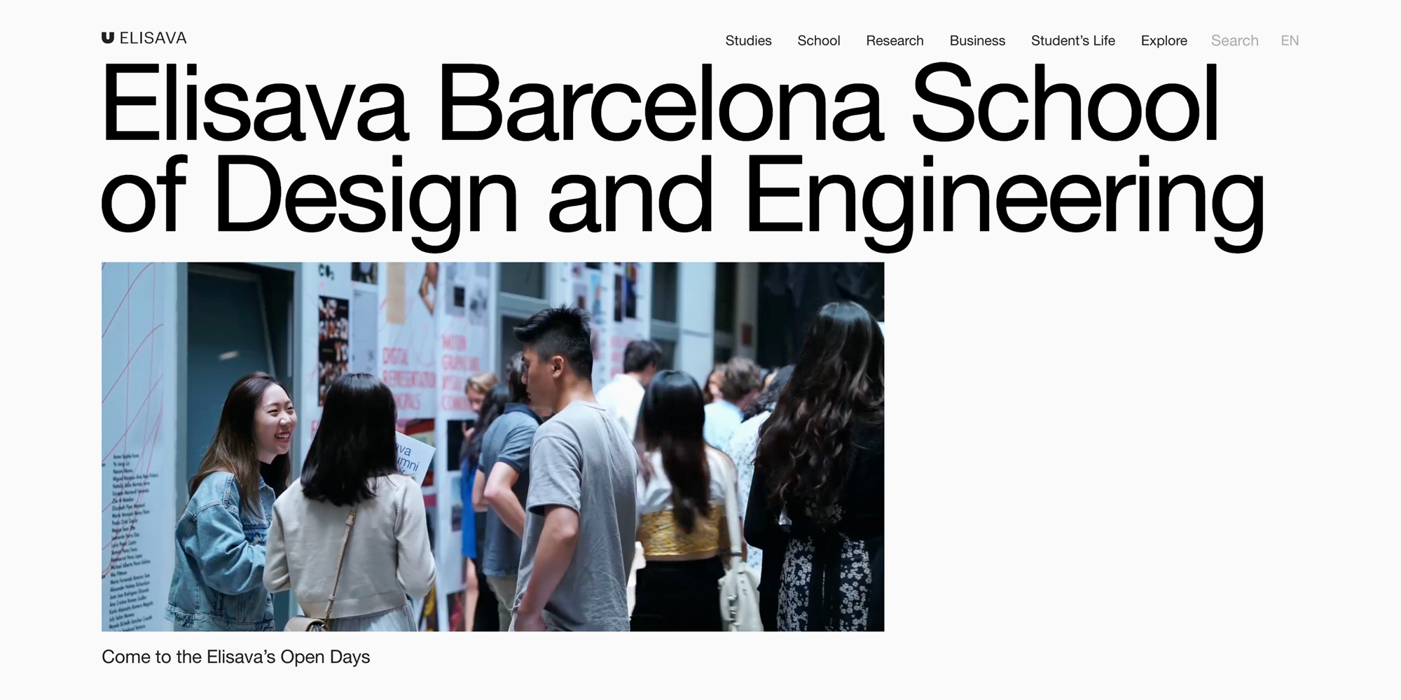
Frankly speaking, you can achieve great results by using fonts from only one type family. Even one single font can make your project look captivating. One excellent example of this is the website of Elisava Barcelona School of Design and Engineering, where we can only see one font style. This looks very stylish.
A reasonable question arises: if one font can do the job, why combine multiple? First, by using different font families, you can increase the project’s emotional and graphic depth, as if we would combine various colors and fabrics in clothing.
Second, it’s possible to use multiple font styles in the project. The most obvious solution is to choose different font options for headlines and text.
By implementing distinct fonts, you can also highlight key elements in the text or separate its semantic blocks. In addition, it’s a great exercise that helps understand what fonts are and how they influence the reader.

Type terminology and characteristics
Before moving on to choosing and mixing typefaces, let’s cover the basic type terms. If you already have experience and are familiar with the classification and terminology, feel free to skip this section.
Let’s begin by reviewing the different types of fonts.
There are three main types:
- If a font doesn’t exhibit contrast (all the strokes have equal weight) and doesn’t have serifs, this font is a sans serif (Grotesque);
- If you see serifs, but there is still no pronounced contrast, the font is a slab;
- If a font has serifs and high contrast, you are looking at a serif (Antiqua);
- And if you remove serifs from an Antiqua, you will get a high-contrast sans.
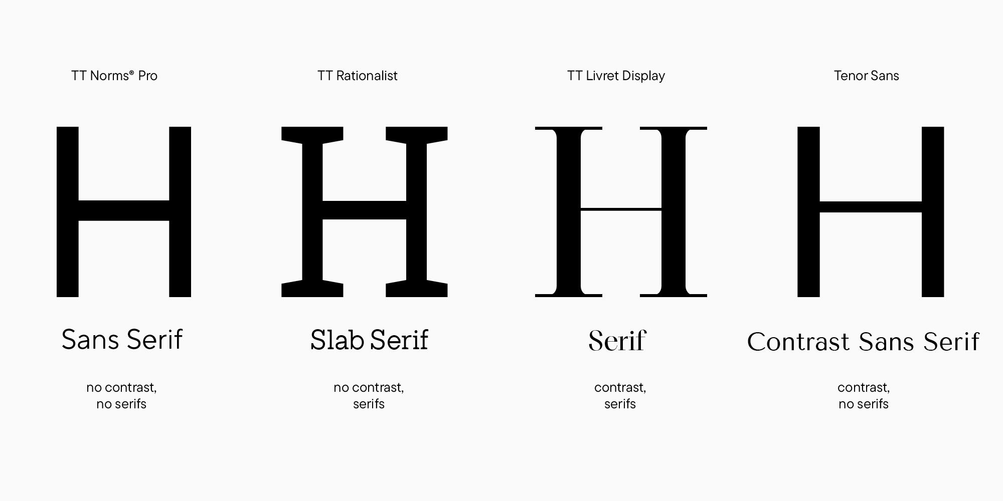
Currently, the most popular font categories are sans serifs and serifs, so in this article, our primary focus will be on them. However, there are many more types of fonts. You can find the more detailed font classification in our «Lesson 1. Typeface Categories» article.
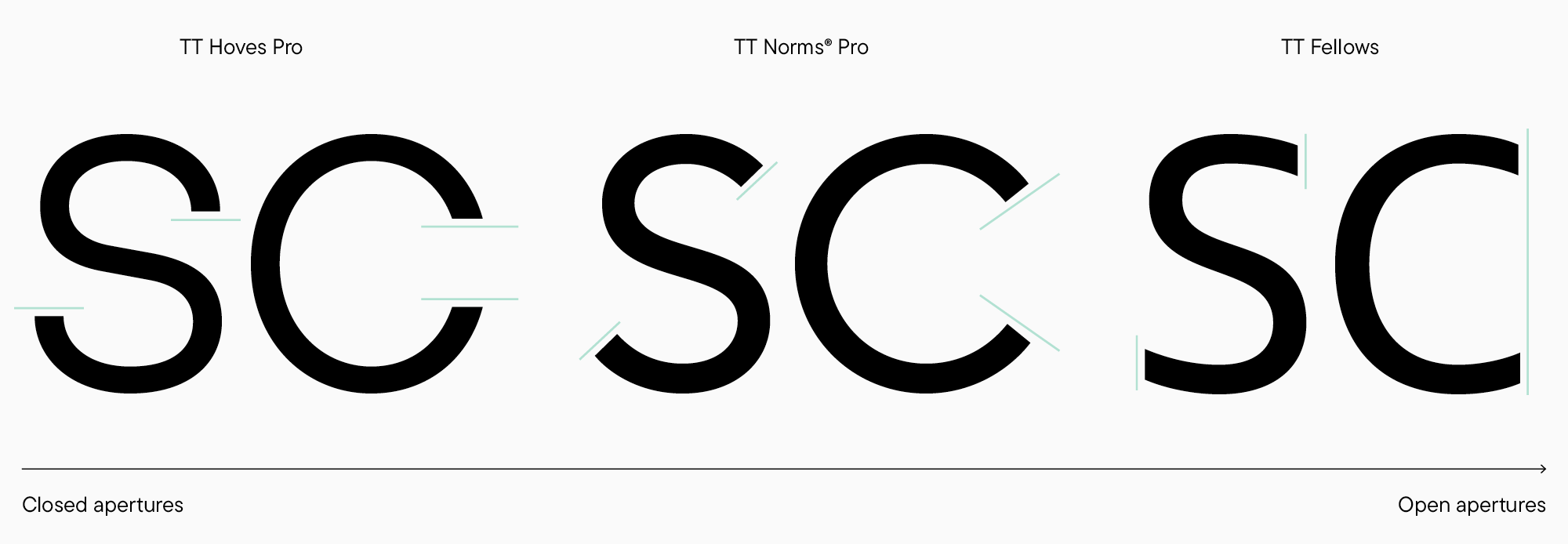
Another characteristic worth paying attention to is how open or closed the aperture of letters is. To understand better what aperture is, take a look at the examples on the left and right. The letter C on the left leans toward closure, while on the right, it aspires to openness. Certainly, between these two extreme points, many intermediate options are possible.
Going a little deeper into the classification, we can combine aperture openness with one more essential parameter: the font’s proportions. Rounded, rectangular, and triangular characters within a font may have varying widths. In the examples above, the letters O and A are noticeably wider than H, E, and S.
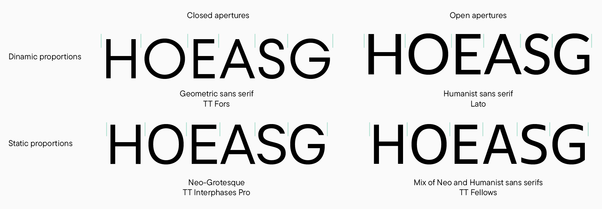
Characters may also lean toward equal widths, as shown in the examples below.
Thus, various combinations of proportions and openness give multiple font types or classification groups (provided that we significantly simplify the classification). Among sans serifs, the main types are Geometric (with rounded geometric ovals and markedly closed aperture), Humanist (similar to Geometric in proportions but with a handmade touch and open forms), and Neo-Grotesques (the most neutral of the three, characterized by static typesetting and medium-closed aperture). Without a doubt, there are many blended options among modern fonts, like static proportions typical of Neo-Grotesques combined with Humanist open aperture.
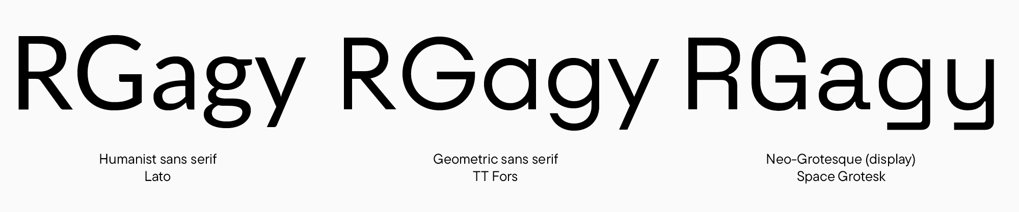
You should also take note of character shapes. Their numerous variations influence the font’s atmosphere and mood. Take, for example, soft the double-story letters a and g in Humanist sans serifs and compare them to the precise and resonant rounded shapes of the single-story a and g in Geometric sans serifs. Neo-Grotesques here have a distinctive shape of the letter R and the letters g and y terminals. However, this sans serif example also stands out with deliberately crafted forms, so I would rather say it’s display, meaning an expressive font for large point sizes.
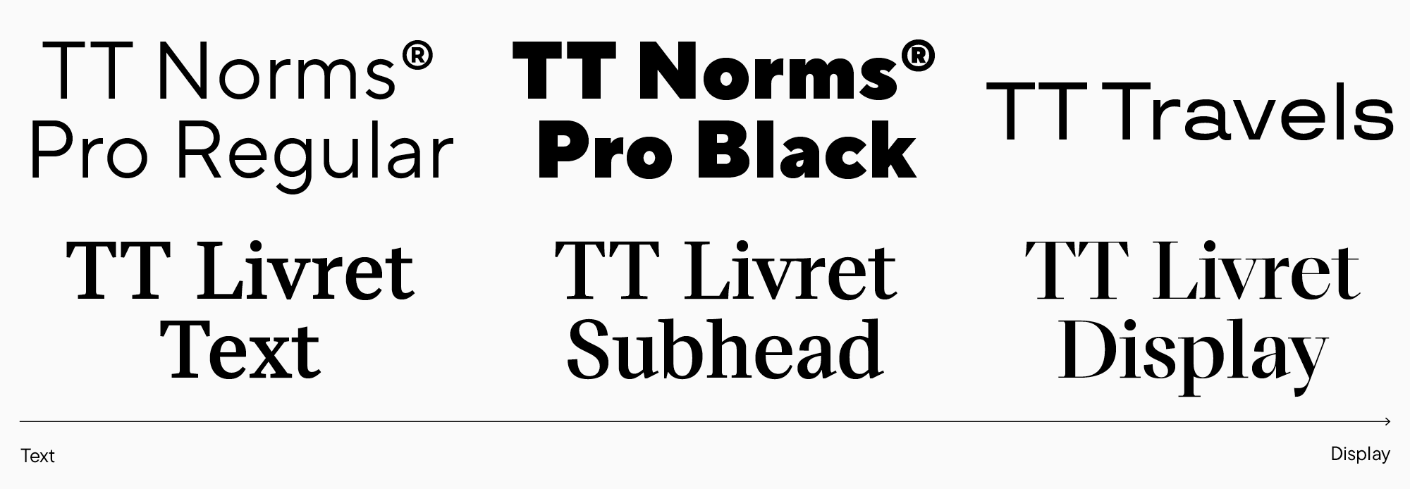
Let’s focus more on the subdivision into display and text fonts. Text typefaces are easy to read in small point sizes without distracting the reader’s attention with excessive peculiarities. Consequently, these fonts have low or no contrast and neutral character forms. The other category is headline fonts that are expressive enough for large point sizes. They may be marked by high contrast or charismatic glyph forms. As you probably already know, many blended options can be found as well, like when a font isn’t too distinctive but still can’t be comfortable enough to read long texts set in a small point size. These can be specific subheading font styles within one type family, like in TT Livret. Or, for instance, bold font styles of even the most neutral sans serifs.
Choosing fonts for the project
It’s time to finish the introductory part and pass over to the main topic. We will begin with some recommendations on choosing a font for your project.
There are plenty of fonts to explore, so it’s easy to get lost in this variety of options. That’s why the best thing to do first is narrow the search. The most obvious way to do it will be to establish technical boundaries and requirements. For instance, settle on the supported languages. If you’re looking for Cyrillic-based language support, the range of suitable fonts will shrink significantly. The rest depends on the project. Imagine you know the preferable weight for the font and some specific OpenType features you need. You’re planning to craft a variety of tables, so tabular figures are essential for you. The list can go on depending on the essence of your project.
Then, you should ask yourself where and how the font will be used and what functions it will perform in the project. Do you need a text or display font? Does it have to be neutral or attention-grabbing? After that, you can continue specifying your requirements if, for instance, the font must be easy to read in small point sizes and take up little space because it will be used in layouts with narrow columns. These are only some of the most obvious requirements for a typeface. For each separate project, specific requirements must be defined. Let’s consider several real-life examples.
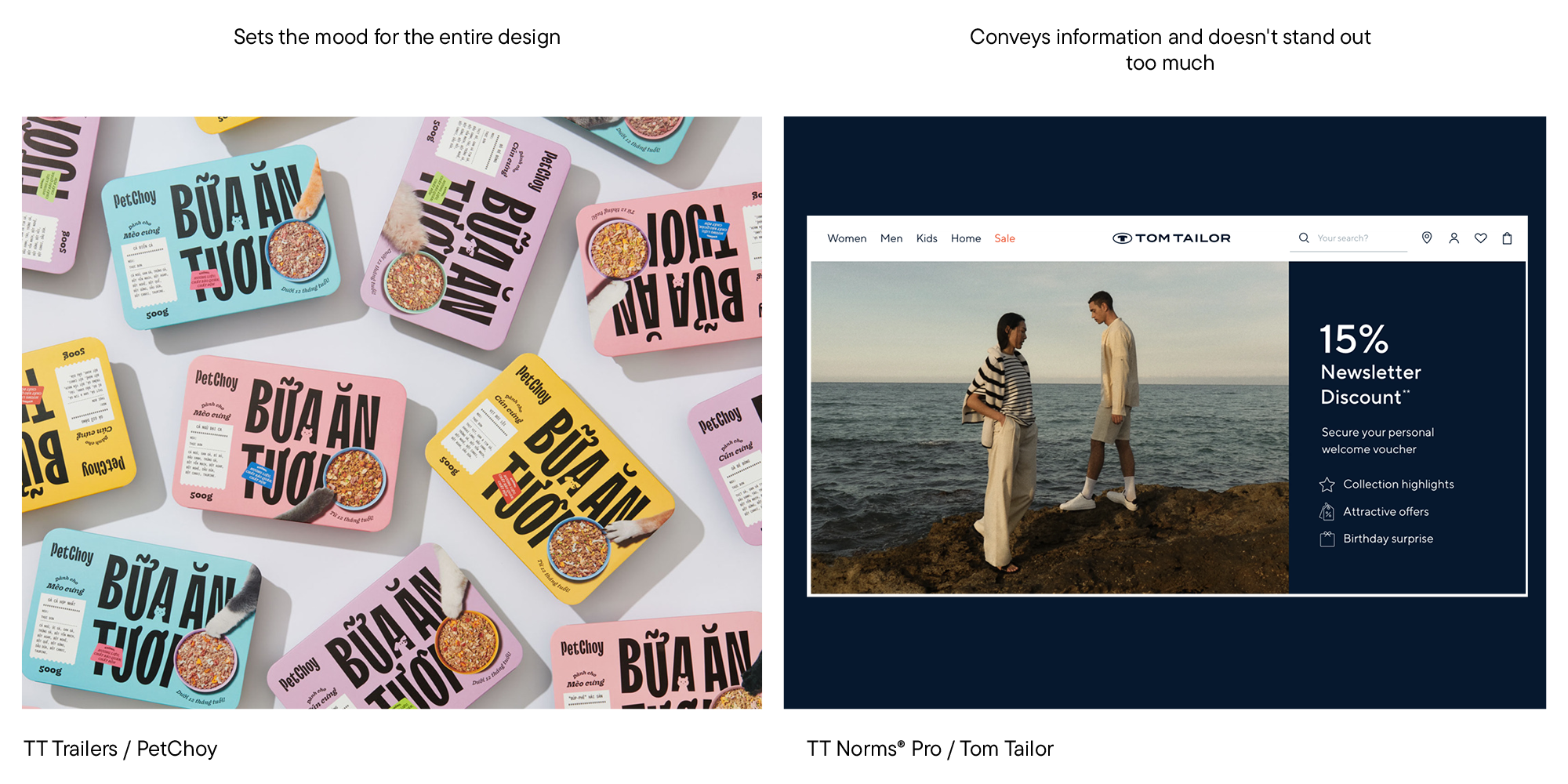
In the left picture, we can see that the font is the foundation of the whole design—it sets the overall atmosphere. However, readability at small point sizes wasn’t necessary in this case. That’s why a charismatic and lively TT Trailers was chosen for the design. The example on the right represents another situation: the font conveys information, remains neutral, doesn’t distract from the photo, and is convenient to read in a small point size.
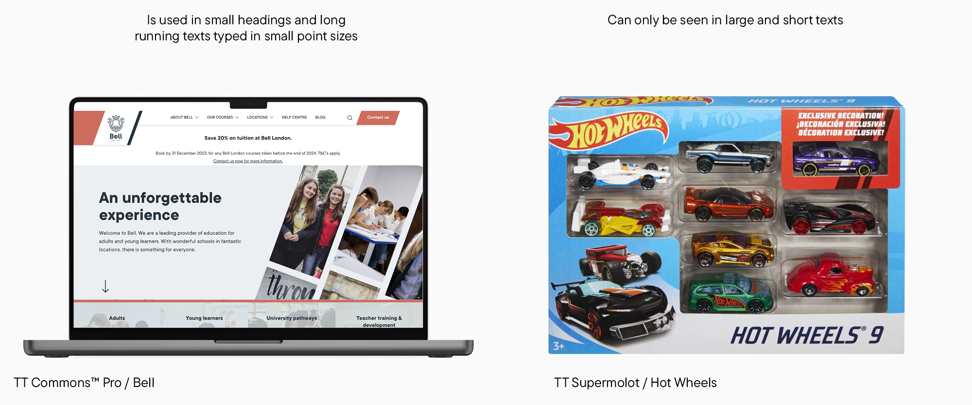
Here, the font on the left must be comfortable for reading texts while being neat and suitable for small headings. The font on the right is only used for short phrases set in a large point size; that’s why a more expressive look is acceptable for it.
By answering these questions, you will already considerably narrow down the font search. Now, you must select a font with the necessary mood from the remaining options. We have already noticed earlier that fonts can either set the overall atmosphere of the project or just support it, accentuating other design elements instead. Keep in mind that every font has a personality, even the most neutral one.
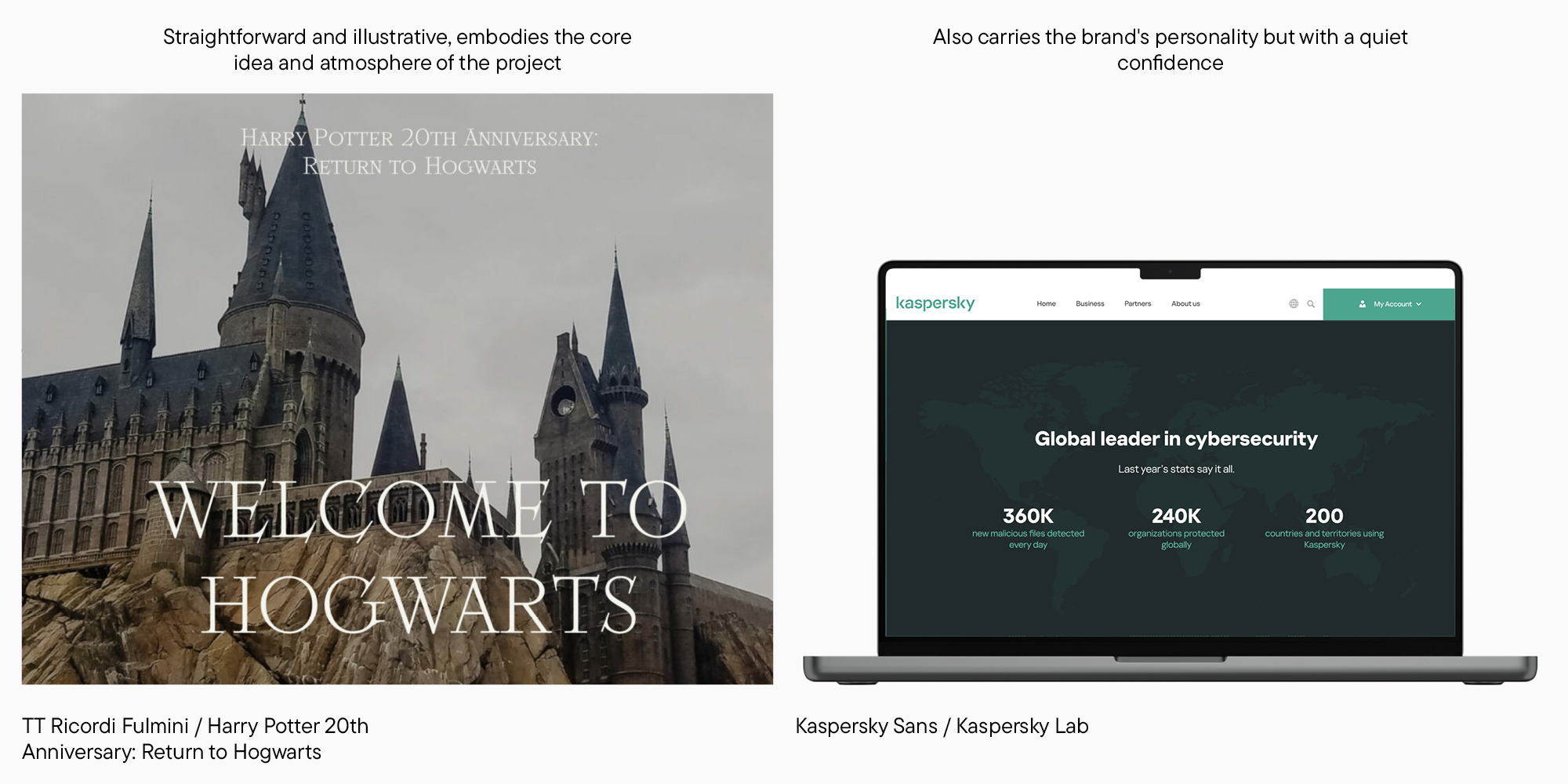
Let’s take a look at more examples. On the left, TT Ricordi Fulmini conveys the project’s main idea in the most straightforward way possible — it’s used in the latest Harry Potter documentary film and works almost like an illustration. The second example shows a «workhorse font,» which is functional and doesn’t direct too much attention to itself. But this font doesn’t exist on its own. Its slightly brutal, defined forms make it clear that we’re looking at the website of an IT company.
The font’s personality is a rather abstract notion that can be challenging to put into words. In order to organize your feelings, you can break them down into several components you can then analyze separately: the font’s rhythm, texture, proportions, and the forms of its characters. This is the combination of the main elements that make an impression on us when we look at a font. Here are several examples of that.
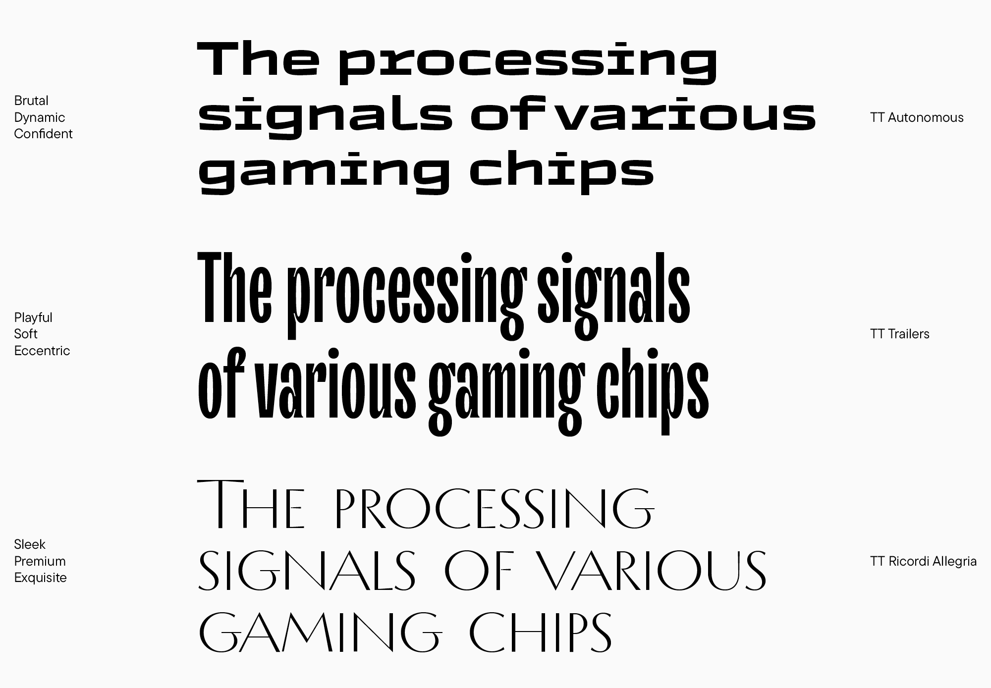
TT Autonomous seems brutal because of its rough and angular internal space, squared forms, and character weight. It’s also dynamic due to the active and rhythmic diagonals and character width. Its weight, width, and the broad foundations of the letters r, i, and l make it look confident as well.
TT Trailers seems soft and playful with its inward-bent terminals. However, it’s also pretty eccentric due to being extremely condensed and having a visible texture and noticeable compensators.
Finally, TT Ricordi Allegria features classical proportions and low contrast with an elegant transition from thin to bold strokes. The font is calm and steady, with only static uppercase characters. All of these traits give TT Ricordi Allegria a premium and exquisite feel.
Defining the character of a display font is not too difficult. Exploring a neutral typeface is another thing: here, you should carefully consider the nuances.
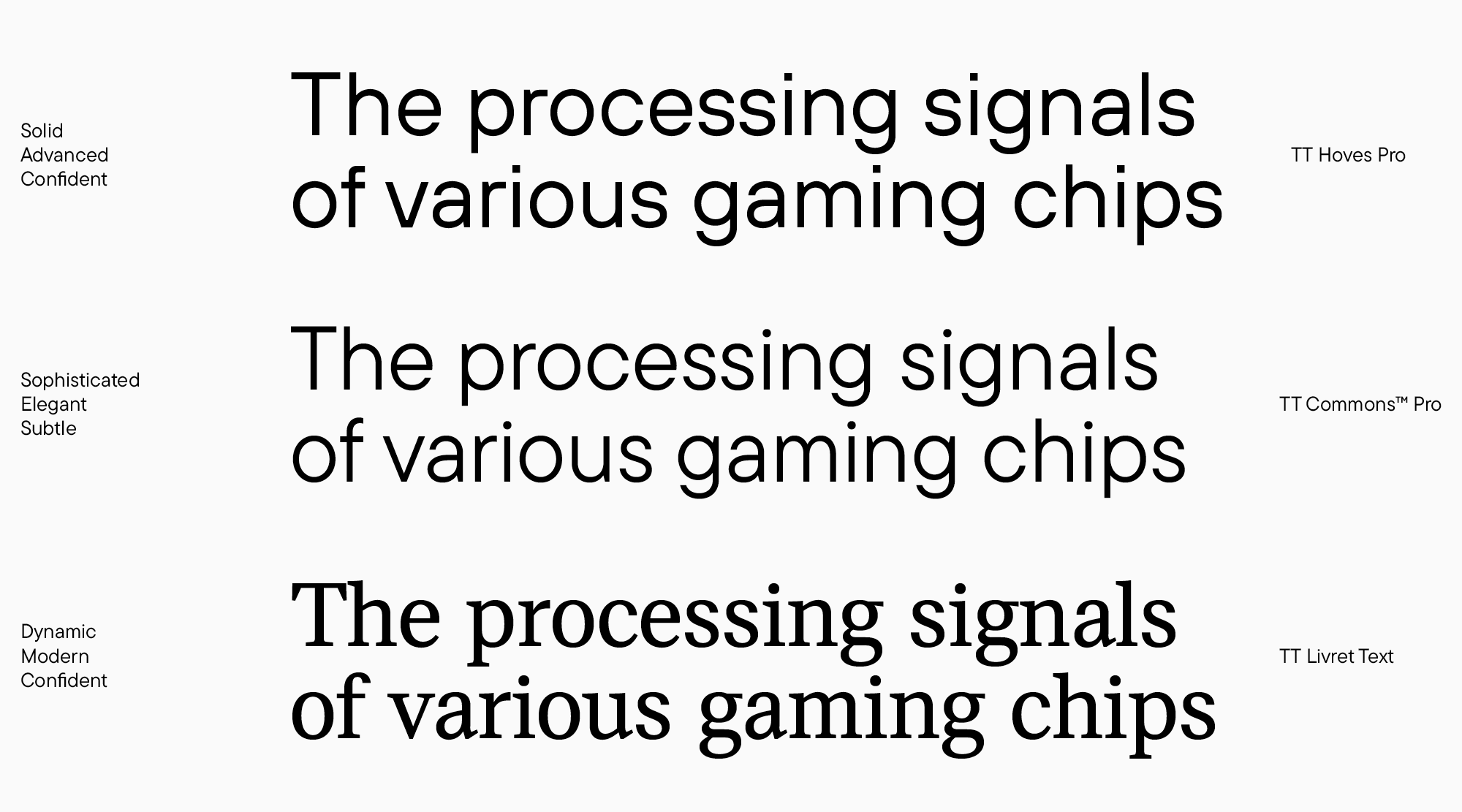
In the case of TT Hoves Pro, straight terminals in the letters t, r, and y and noticeable horizontal bars at the places of diagonal intersections in N and v give the font a technological quality. The font’s proportions are static, the texture is smooth, and the characters aren’t too narrow, with a lot of white space inside. This creates a solid and confident feeling.
TT Commons Pro, at first glance, is similar to TT Hoves Pro, but if you look closely, it creates an entirely different feeling. Its arcs are smoother, glyphs are narrower, ovals are more squared, and the shape of the letter o is slightly diamond-like. Consequently, TT Commons Pro seems rather elegant and even a little fragile.
TT Livret Text boasts clear-cut and rigid character forms that seem confident. The font doesn’t feature spurs or teardrops, typical of more classic serifs. Also, the contrast of strokes is relatively low for a serif here. These characteristics give the font a modern look. Terminals and stroke endings in many glyphs are directed to the right and angled slightly upward, like in the letters a, t, e, and c—this makes the font more dynamic.
Tips for pairing typefaces
Everything we covered in the previous section can apply to choosing a single typeface as well as multiple font options for your project. If you desire to pair two fonts, you will have to analyze them in the same manner. Now, let’s explore the ways of marrying two typefaces.
Remember that first, you have to determine your project’s goal. Without it, your decisions don’t have any support. After that, you must establish the hierarchy—decide which font will be primary and which will be secondary. For the primary font, I recommend choosing the one you will use the most. However, the final decision depends on a specific project.
The key requirement to keep in mind when mixing typefaces is that there must be a clear, visible connection between them. Their similarities and differences must be very obvious. Thus, fonts that are too similar don’t work well together, as well as ones that don’t have a clear connection.
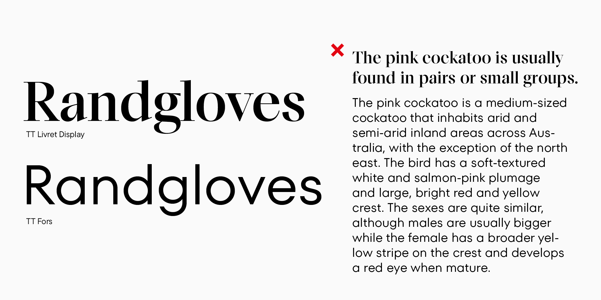
Let’s begin with a bad example. Here, we can see two sans serifs with the same proportions and related forms. Both fonts aren’t display. This is an example of two similar fonts. The purpose of using both of these sans serifs in one mockup is unclear because using only one of them would have sufficed. Mixing sans serifs is quite risky, and many designers don’t recommend doing this. Personally, I don’t mind sans-serif combinations if they are thought through carefully enough. A little later, I will explain what I mean.
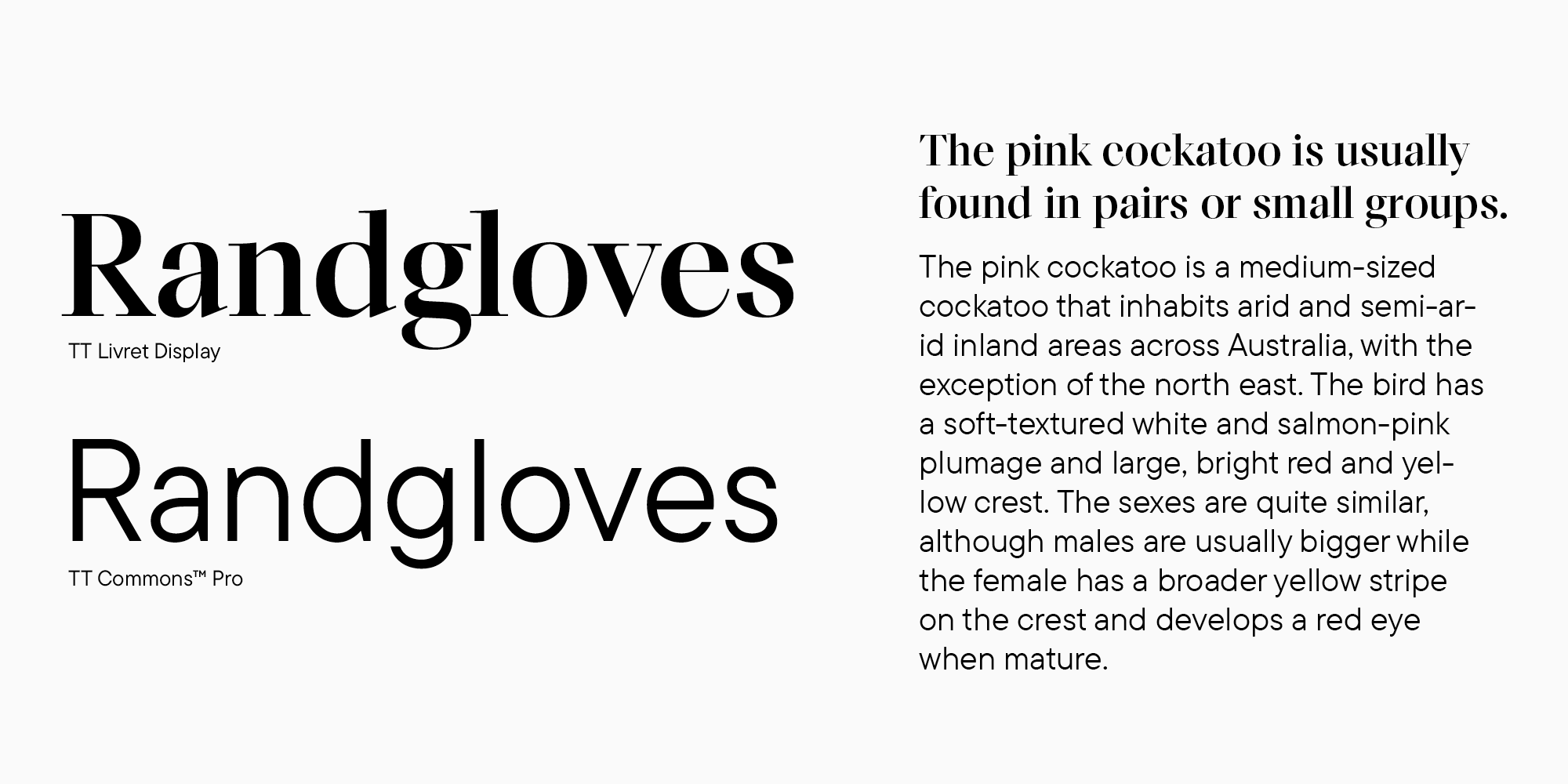
Here is what could have been done. We kept TT Commons and selected a font pair similar in nature, proportions, and glyph forms but belonged to another type category—slab serifs. In this case, the differences became apparent. The mix of a sans serif and a serif (slab serif in our case) can be called classic. You can use it without hesitation.
Consider another similar example, but the serif here works in the headline, and the fonts are not that similar already. Here, the resemblance is only perceivable in the typesetting textures. They are relatively dense in both fonts. To clarify, I will give you an example where the textures don’t work so well together.
Here, we used another sans serif, and it’s become evident that its texture is much looser than the serif’s. You can feel the dissonance between them. However, it’s possible to eliminate this feeling without changing the fonts.
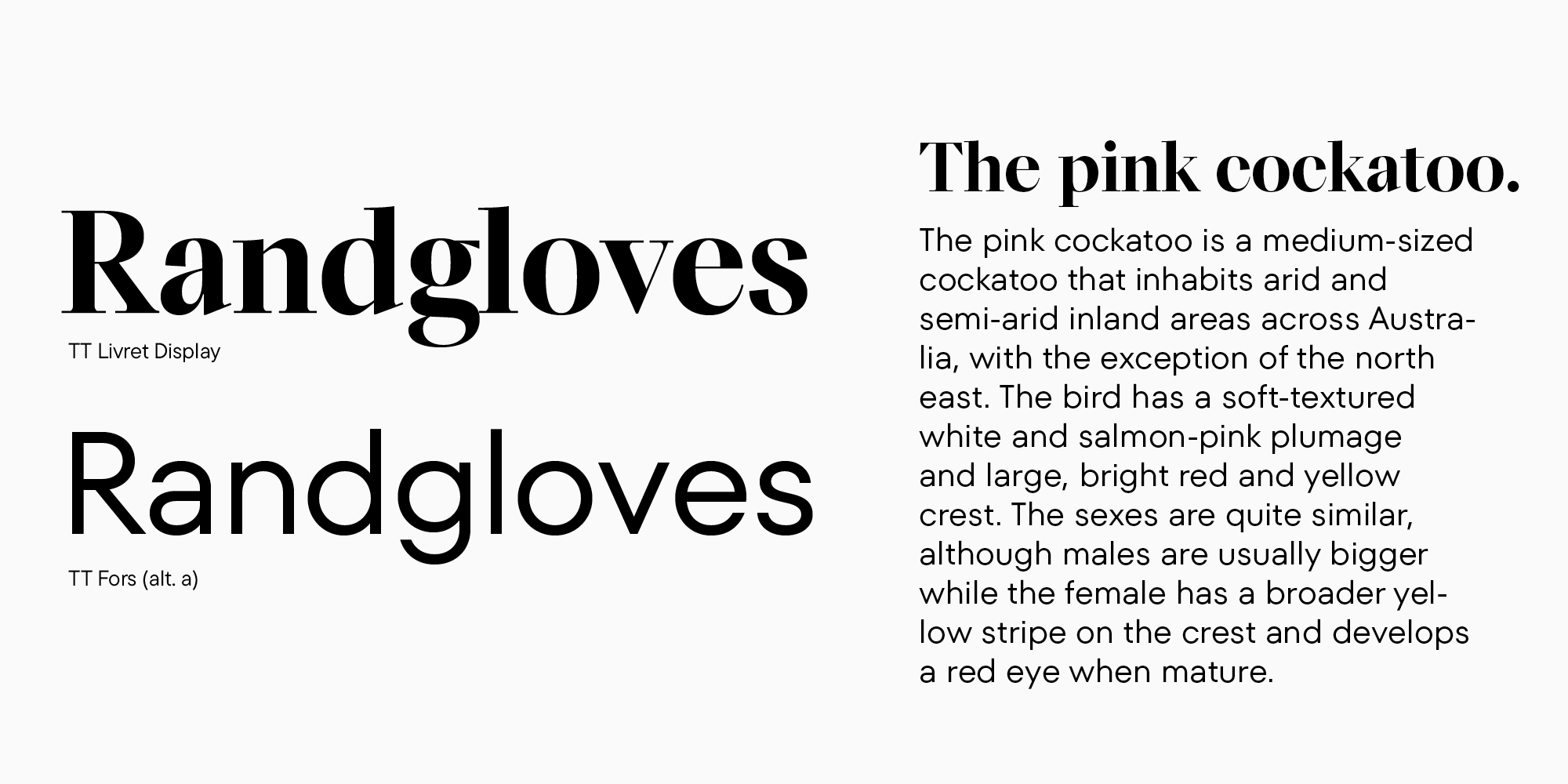
We made the serif a little larger to literally have more white space inside. For the sans serif, we added the context alternate for the letter a, transforming it from a rounded single-story glyph into a double-story one, which made the typesetting a little less airy. Now, the fonts complement each other better as a pair.
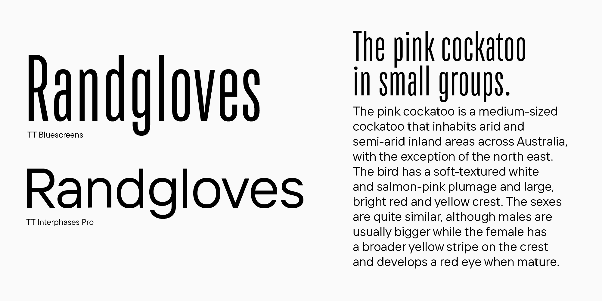
Take a look at this example of combining two sans-serif fonts. In this case, we’ve employed a clear contrast in width — another effective technique in font pairing. It requires precise work with the size of the narrow font. To make its texture less dense compared to the text typeface, the heading should be significantly larger.
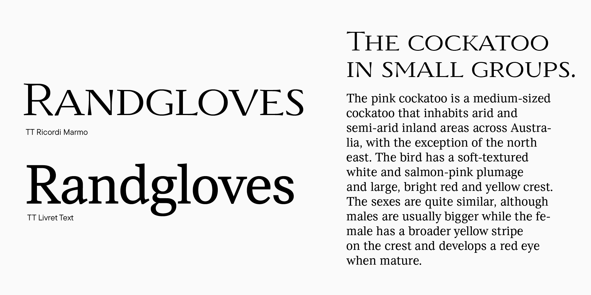
Now, let’s look at the combination of serifs, which is also challenging to create. In this case, we use TT Ricordi Marmo as a display pair for TT Livret. Their graphics are obviously different. However, these fonts are similar in glyph textures—and this is what unites them.
Observe another similar example that features an even more vivid font blend. Here, we can see the difference in widths and expressiveness of the fonts and their similarities in the glyph forms, graphic solutions, and the overall design texture.
Finally, we explored various ways of combining font graphics. Now, we can move on to the next level and learn how to blend their personalities. We always choose specific fonts for a reason: to convey information. I always recommend visualizing how they will work together in the mockup. You can even imagine how the fonts would communicate with each other if they were people.
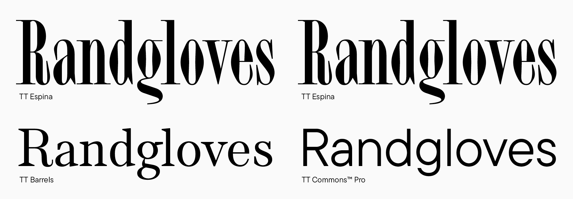
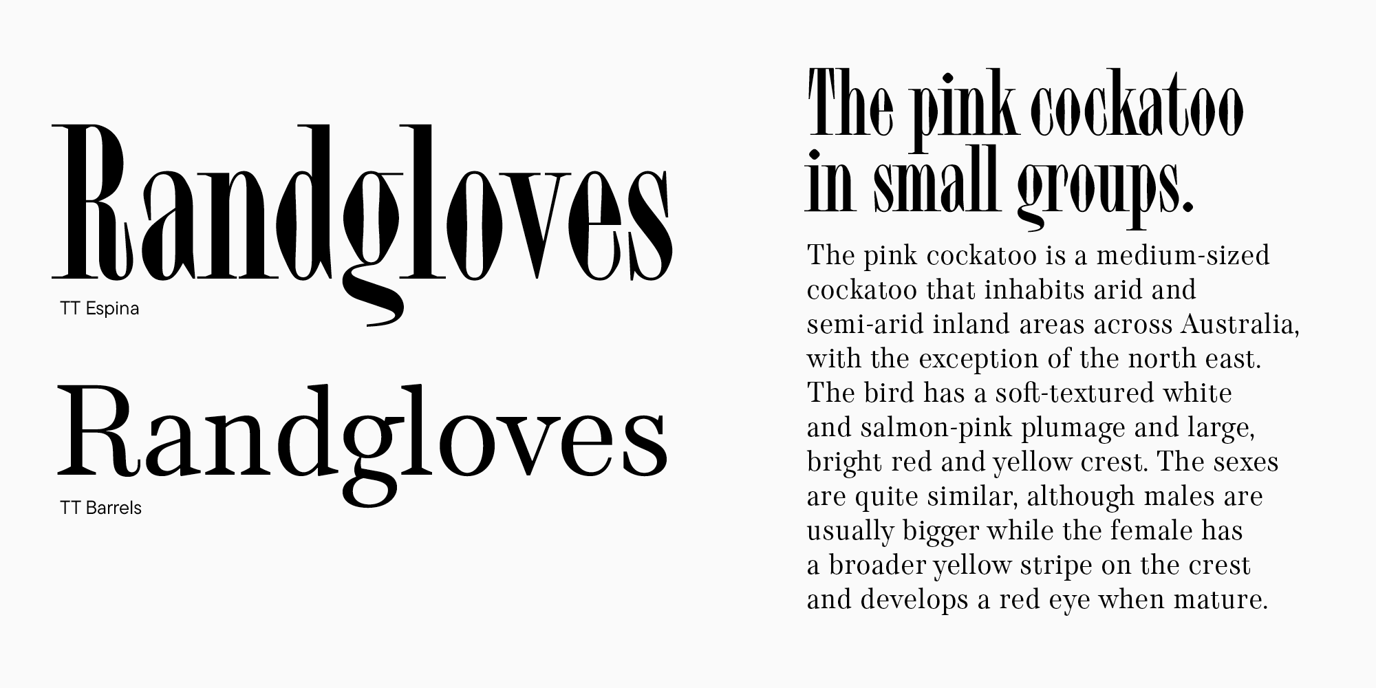
Let’s take the mix of a display serif TT Espina and a text serif TT Barrels and replace the latter with TT Commons.
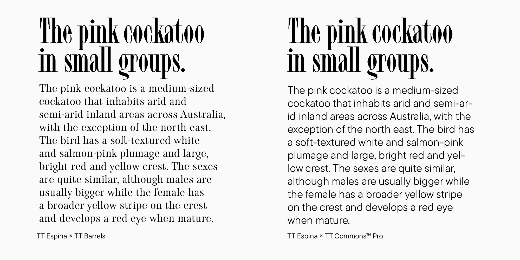
In my opinion, the nature of TT Espina tends to be anxious. TT Barrels doesn’t calm it down. On the contrary, it seems to join TT Espina in this nervousness. The final combination turns out to be disturbing. This isn’t good or bad—this is a fact. It would work, for example, for an atmospheric project with a Gothic aesthetic. TT Commons, in turn, matches TT Espina in fragility and elegance, but its character is also exceptionally calm. As a font pair for TT Espina, TT Commons doesn’t suppress it or amplify its nervousness but serves as a background for the expressiveness of this serif.
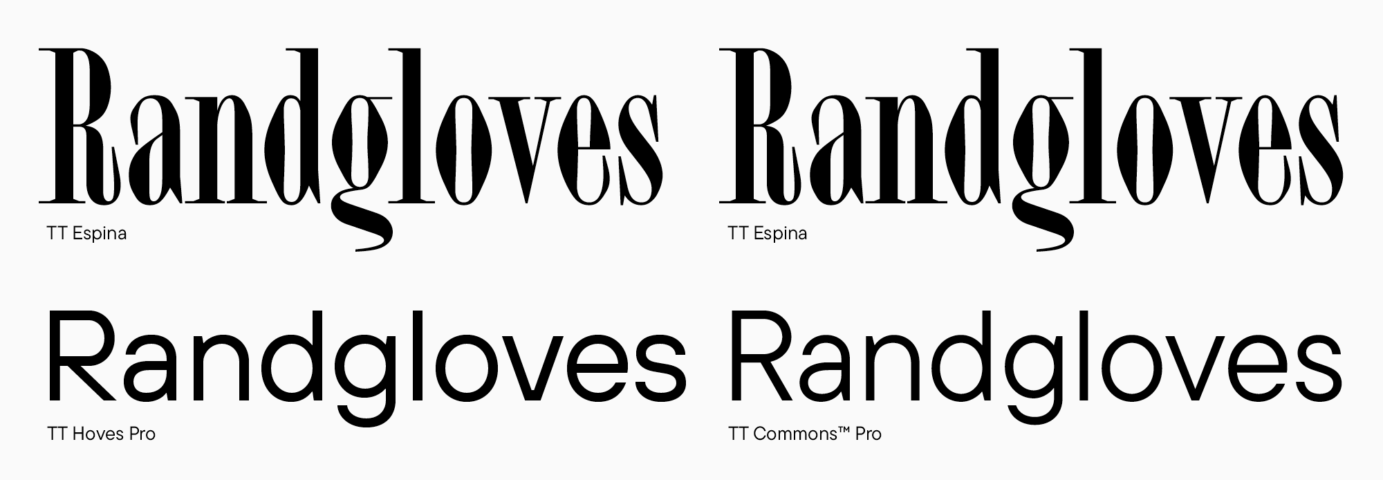
Taking things further, let’s try pairing TT Espina with a confident font like TT Hoves. Curiously, these two typefaces together in large point sizes and similarly scaled don’t make an impression of a balanced font pair. The solid nature of TT Hoves stifles the fragility of TT Espina. In this size, the combination with TT Commons works better.
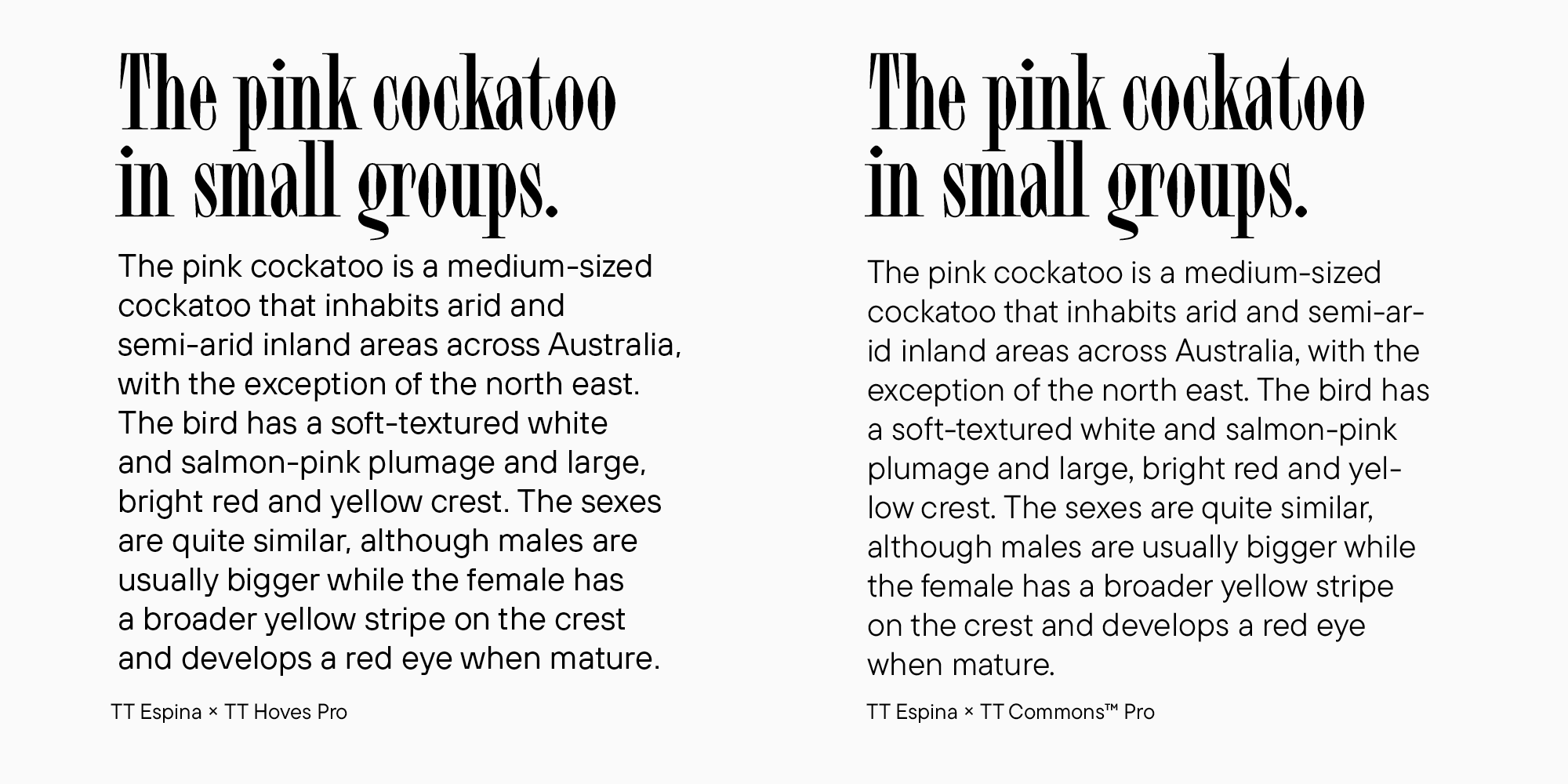
But if TT Hoves is made considerably smaller and used for text typing, it won’t suppress TT Espina anymore. This way, TT Hoves offers its pair a strong shoulder while the visible contrast between the two fonts remains. TT Commons noticeably underperforms in this context.
Fonts can have surprisingly deep relationship dynamics!
Lifehacks
All this information can be unclear and scary at first. So, if you begin having doubts when choosing and mixing typefaces, feel free to use these lifehacks. First, try combining different subfamilies within one type family.
Second, consider fonts designed by one author, as they usually go amazingly well together. See it for yourself.
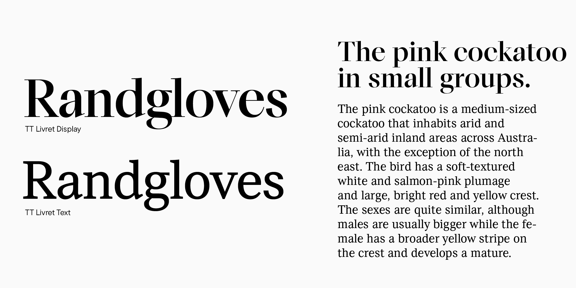
Here is a classic combination of display and text subfamilies that belong to the same typeface. This is probably the safest option.
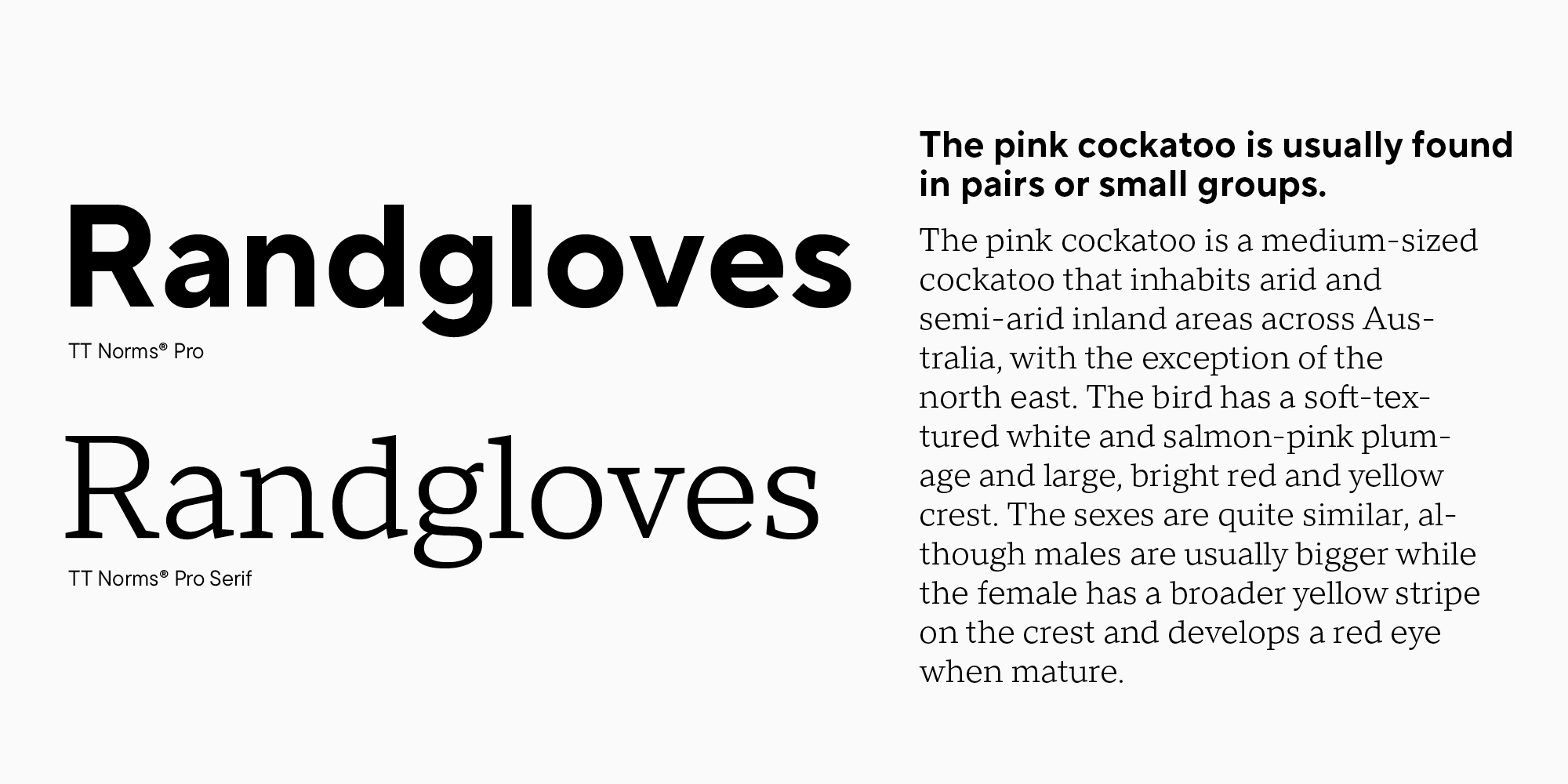
Here, you can see a standard mix of sans serif and serif from one family. However, it’s a challenge to find such comprehensive typefaces.
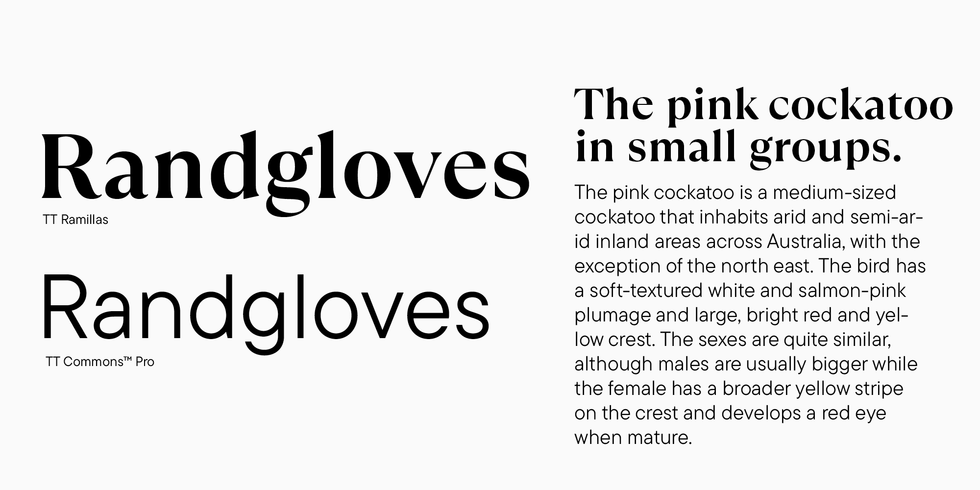
It’s much easier to find fonts created by the same author. Each font designer has their signature style. Because of this, it’s possible to find similarities even between entirely different fonts—in glyph constructions or design nature. This means that we still work with similarities and differences between two fonts while backing ourselves up by staying within the bounds of a particular author’s style. Here, for example, TT Ramillas and TT Commons belong to different classification categories and have distinct glyph constructions, but they are still similar in proportions and overall design elegance.
Final thoughts
Let’s summarize everything you need to know to mix typefaces. One essential thing is to learn to analyze fonts to feel and understand them better. This comes with a lot of practice, experiments, and attempts to find out why you like a certain typeface or font pair. Also, looking at the examples set by other projects is always useful. Another essential thing is having a very well-defined idea of your project and the font’s place in it.
I called the previous section of the article «tips,» not «rules,» for pairing fonts for a reason. No matter how much we wish to define what’s right or wrong, there aren’t explicit rules for mixing typefaces. However, there are basic principles you can use to make your own decisions. After all, with skill and courage, even two fonts that seem incompatible can be made to complement each other.
Useful resources
To make it easier for you to dive deeper into the font pair analysis, I will share several valuable resources with you.
- fontsinuse.com. Here, you will find real-life examples of specific fonts in various projects, see how different designers use a typeface you like, and what other typefaces they combine them with.
- awwwards.com. This website features excellent examples of modern and bold web typography.
If you noticed a particular font combination on a website, these two plugins will help you find out what fonts they are:
- Font Ninja is the most functional. In addition to showing font titles, it allows you to try them out for your text.
- Sometimes, I switch to the second plugin, WhatFont. Its functions are more basic, but it shows the font titles when you hover over the text.