Choosing a perfectly suitable font is one of the crucial tasks of a UX/UI designer while developing mobile or web applications. In this article, we’ll focus on the criteria you can use as a base to make the right choice, tell about the typefaces most suitable for app design, and choose 10 TypeType fonts that match all the requirements of the year 2026.
Why is it essential to choose specific fonts for apps?
Choosing a font for an app is often underestimated and considered a secondary task. However, it’s not true. On the contrary, you can’t simply download and use any random font for this task.
A typeface will not only become part of the product’s brand identity but will also directly influence user experience. A wisely chosen font will be convenient to read and perceive on any device, it won’t demand too much attention for itself and interfere with the app’s functioning. So, in the end, the font choice will contribute to the project’s success and popularity.
What we can call the best mobile app fonts depends on a number of factors we will talk about now. A suitable font contributes to a better user experience and increased app efficiency.

Why are some fonts better suited for apps than others?
Turns out that the font the designer chooses for the app will directly influence the user’s impression of interacting with a finished product. Now, let’s find out how exactly it happens.
We can specify several criteria that determine whether user experience will be positive or negative.
1. Readability
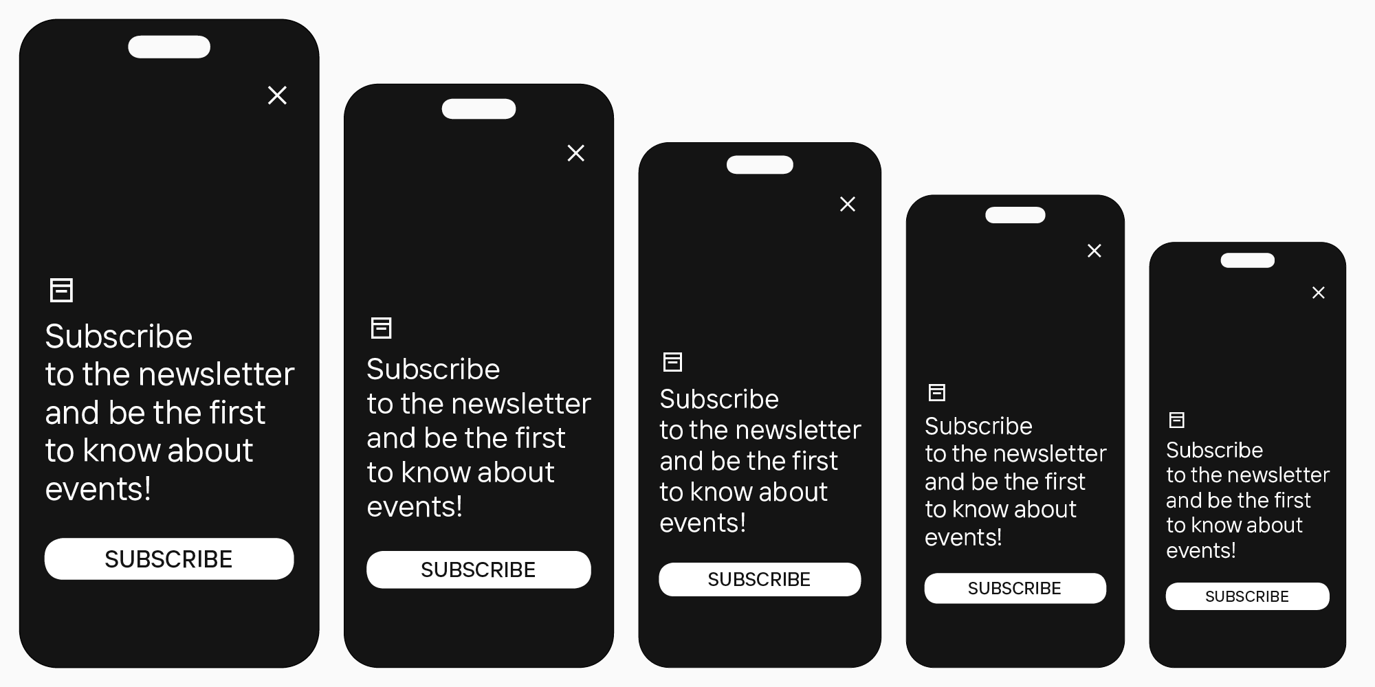
This is one of the most important criteria. The best fonts for apps are the ones that are easily readable, even on small screens.
2. Adaptivity
The font must also scale well, staying legible and sharp in different sizes and keeping good quality when zooming in or out on the screen.
3. Matching the style
It’s also essential that the font harmonizes with the overall app style and all design elements.

4. High loading speed
If the font is too heavy, it will slow down the app’s loading process, which will definitely irritate users.
Consequently, the fonts that possess all these characteristics can be considered the best fonts for apps.
These criteria apply both to text and headline fonts. Logically, neutral fonts are better for the main text because they are well-readable in small point sizes. However, display fonts for headlines must be easily readable on small screens despite their expressiveness.
How to choose the best mobile app font: Our recommendations
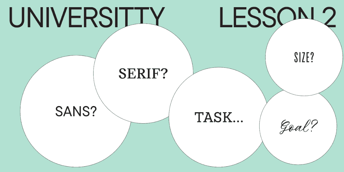
To find a font that would meet all criteria for your concept and integrate smoothly into your project, try choosing a systematic and thoughtful approach.
Define the goal
To begin with, you need to understand what message you are looking to communicate to the users through your design. What is the audience reaction you want to receive? What mood is your product supposed to convey? The font will become an integral part of the entire design, so aligning it with your vision is important. Choose the stylistic category of fonts that parallels with the task.
Make sure your font is readable, adaptive, and not heavy
After you settle on the style, you can set aside all the fonts from the chosen group that don’t match the readability, adaptivity, and loading speed criteria. Make sure that the primary font is easy and comfortable to read, scales well across multiple devices, and isn’t heavy. The same goes for the headline font—it may be unusual and expressive, but it must also correlate with all the requirements.
Decide on whether you need additional functions or not
Here, it revolves around various languages support in particular. Is your app for one country only, or is it aimed at the global market? Depending on your answer, you will be able to choose the font that supports the necessary number of languages.
Don’t use too many fonts
Too many fonts may compromise your design from both aesthetic and practical points of view. They will clutter the design and distract users from reading. We recommend using a maximum of two fonts: eye-catching for headlines and neutral for texts. The best option would be to combine fonts from one family or use a typeface pair, like TT Firs Neue and TT Firs Text. We’ll talk about them later in this article.
And in another TypeType article, you can learn more about font pairs.
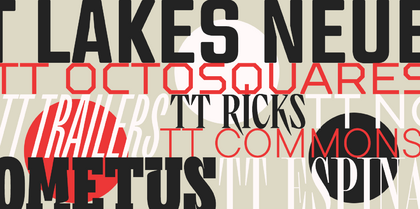
10+ best TypeType fonts for mobile and web apps
We’ve chosen typefaces from the TypeType collection so that you can find your best mobile app font among them. This font compilation includes all-purpose and neutral fonts as well as more stylistically expressive options. Each of them is highly readable, even in small point sizes, and matches the other criteria we listed above.
Neutral fonts
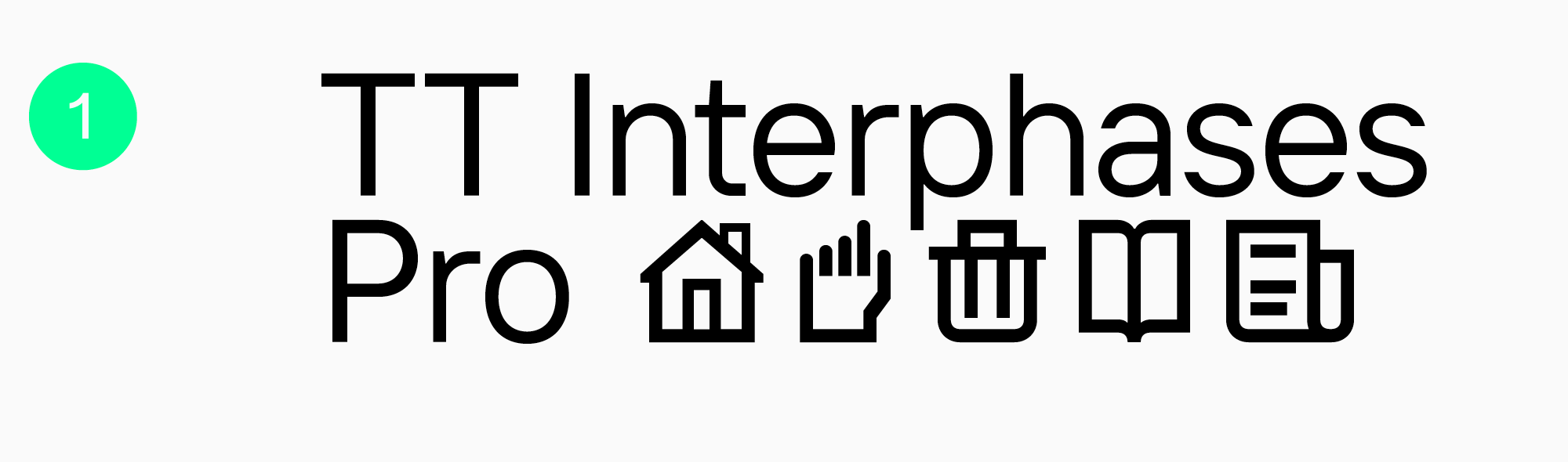
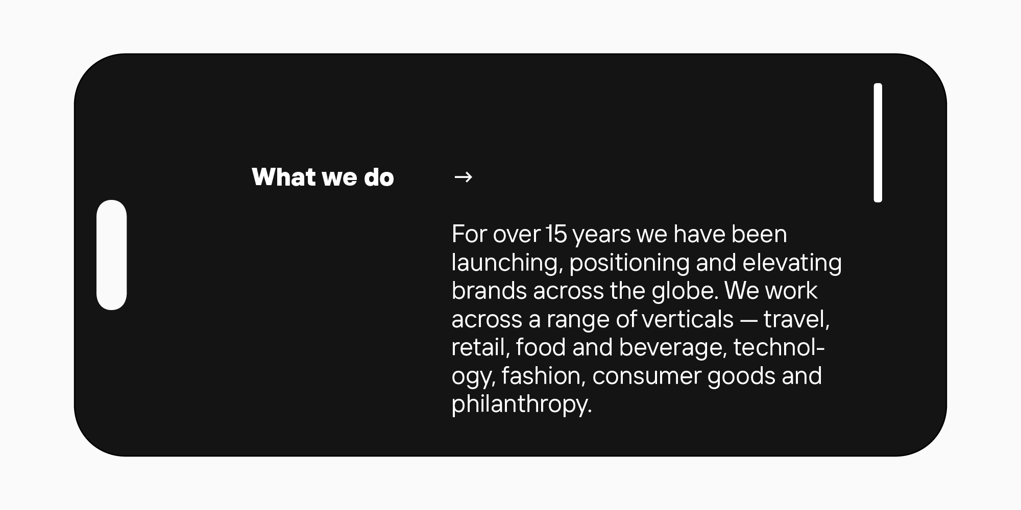
TT Interphases Pro — for interfaces
TT Interphases Pro is a font we designed especially for working with interfaces. One of TypeType’s bestsellers, this functional and aesthetic font is ideally suited for mobile applications. The text typed in it distributes evenly and is legible on small screens.
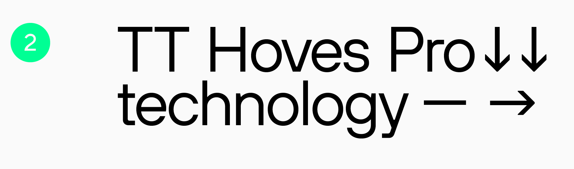
Highly adaptable TT Hoves Pro
TT Hoves Pro is an all-purpose sans serif and also the studio’s bestseller. Neutral and recognizable at the same time, it’s a perfect fit for any modern app. All terminals are positioned at the same level, and the contrast is low, so the font is comfortable for reading.
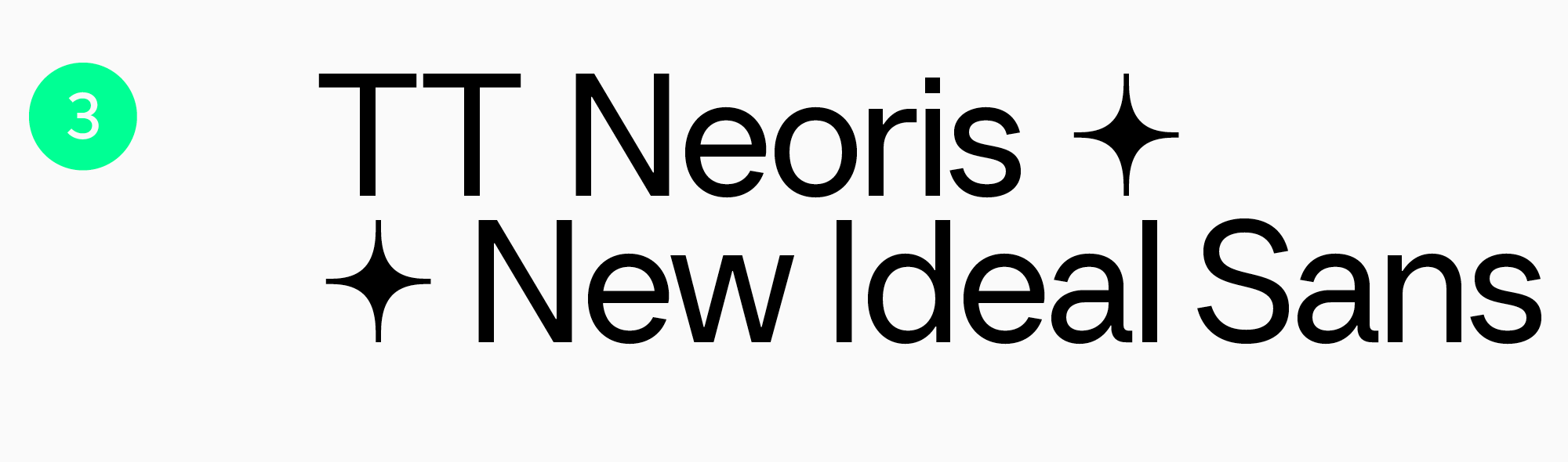
Versatile TT Neoris
TT Neoris is a typeface released in 2023. It matches all modern requirements and is designed with user expectations in mind. This font is multi-functional, technological, and easy to read. It can also transform its mood due to its OpenType features and stylistic sets. TT Neoris is a perfect option if you want to use several fonts in your app: a neutral one for the main text and a more expressive one for headlines. You can substitute both of them with just one TT Neoris.
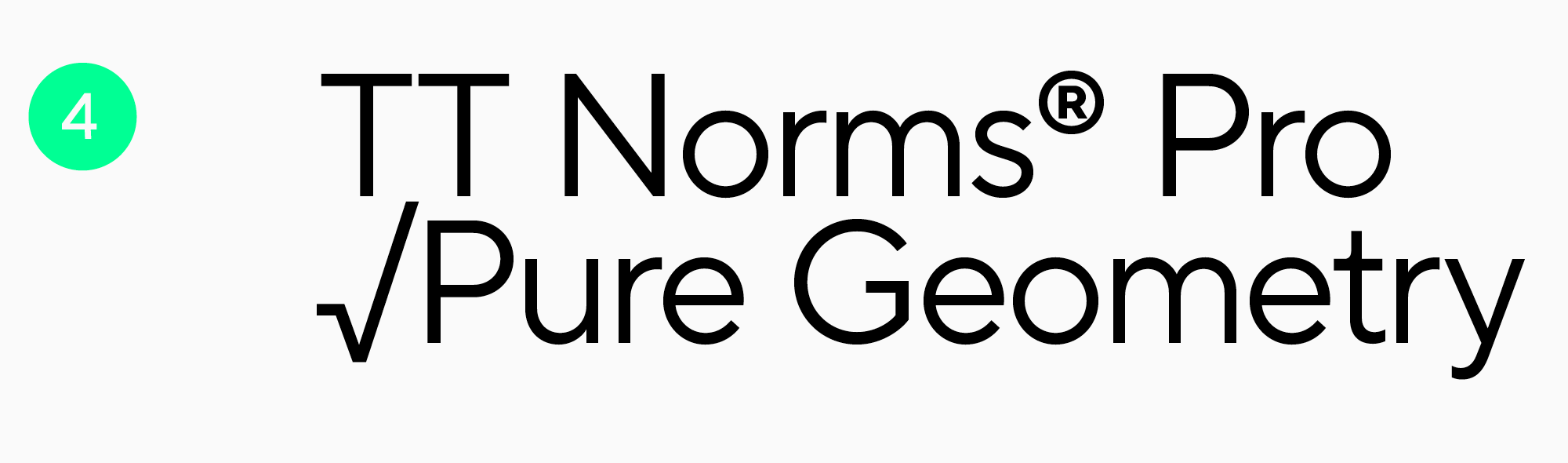
Classic TT Norms® Pro
TT Norms® Pro is a versatile and functional sans serif and another TypeType studio’s bestseller. It’s feature-rich, highly readable, and supports 275 languages. The font is an ideal base for any mobile app.
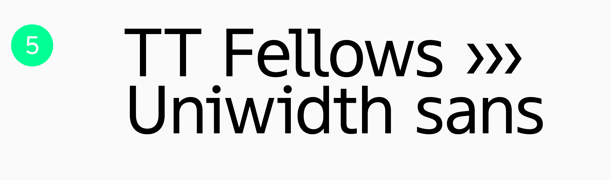
TT Fellows — a workhorse
TT Fellows is a functional Humanist sans serif. Calm and neutral at first glance, it can transform significantly in different font styles, for example, becoming softer and friendlier or more brutal. The font has static proportions and suits very well for big text blocks, and its Bold font style is perfect for accents and headlines.
Expressive fonts
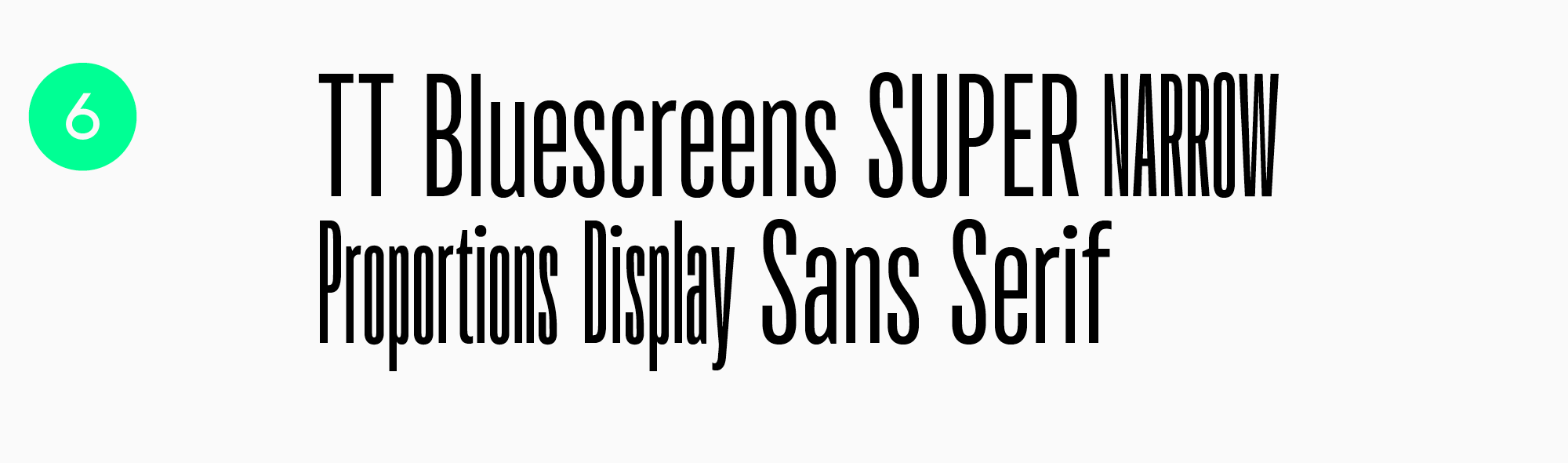
TT Bluescreens — the star of the screens
TT Bluescreens, a geometric sans serif, is a font that is both recognizable and easy to read. The font’s shapes aren’t complex—it attracts attention due to its narrow proportions and the rhythm they create. This font can be used for headlines and in larger point sizes.
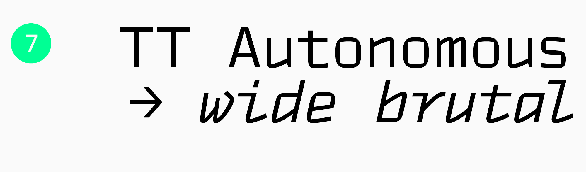
TT Autonomous — a stylish solution
TT Autonomous is a modern technological sans serif with a brutal nature that looks stunning and fresh in apps and meets all the requirements for them. Its unique trait is square-edged characters with angular counters. Besides, the typeface includes a monospaced subfamily, TT Autonomous Mono.
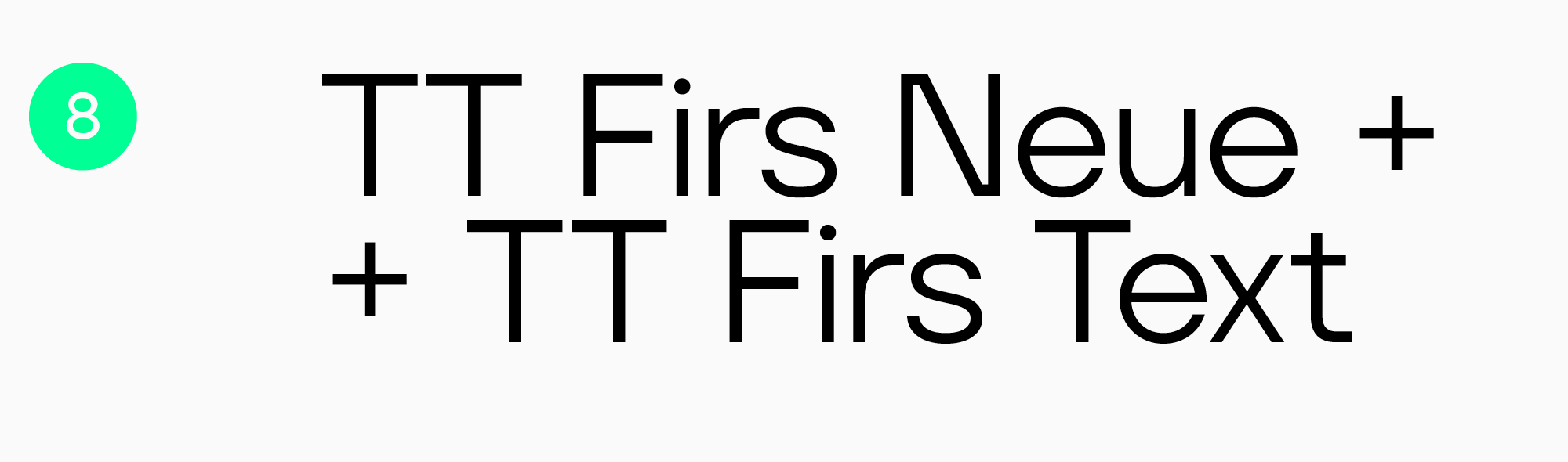
TT Firs Neue and TT Firs Text — a perfect couple
TT Firs Neue and TT Firs Text are a typeface pair where both fonts perfectly harmonize with each other. TT Firs Neue is an adaptable but expressive Scandinavian sans serif that is well-suited for headlines, and TT Firs Text is a more neutral geometric sans serif for large text blocks.
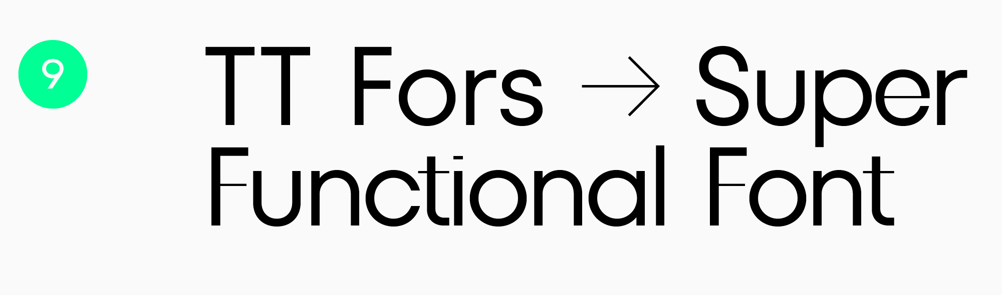
TT Fors — simple but eye-catching
TT Fors is a modern geometric sans serif that includes text and display subfamilies. It’s possible to use them as a pair for headlines and main text.
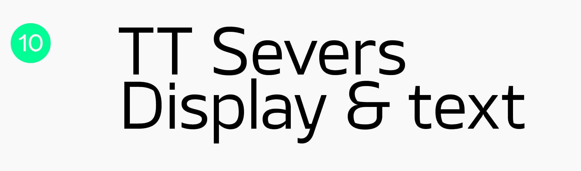
TT Severs — two in one
TT Severs is a geometric sans serif with sturdy character. Its special trait is the expressive elements of counters. This feature allows to use the typeface as “2 in 1.” In larger point sizes, it works as a display font for headlines, and in smaller ones, it serves as a text font.
Conclusion
Choosing the best font for your app is a challenging task. However, all the hard work you put into it will be justified: a suitable font will help make your product attractive, unique, pleasant, and convenient to use.
Test, experiment, and keep track of the news from the typographic industry—and you’ll definitely find your perfect font!
FAQ
How do mobile screen sizes influence font selection?
On small screens, legibility at tiny sizes and shape stability when scaling matter most. That is why typefaces with clear outlines, multiple weights, and predictable spacing are especially valuable, so the interface does not fall apart.
What font features improve readability on high-density displays?
Clean forms without tiny decorative details and strokes with enough weight help improve readability, so letters do not disappear. Adaptability matters as well: the typeface should look solid at both 12 and 20 pixels, without visual noise or shaky contours.
Are custom fonts better than system fonts for app performance?
Not always. System fonts are already built into the OS and usually have almost no impact on loading, while custom fonts add weight and need careful optimization. Custom fonts are stronger for branding, but file size and formats need close attention if performance matters.
How do fonts impact app loading speed?
The more font files you load, and the heavier the styles, the greater the impact on loading time and memory usage. This can be improved with character subsetting, a sensible number of styles, and variable fonts when they genuinely replace a whole set of separate files.
What typography trends are shaping mobile UI design in 2026?
Flexible systems will continue to shape mobile UI design: variable fonts, adaptive sizing, larger typography, and a stronger focus on accessibility. At the same time, demand is growing for more distinctive typographic accents in headlines, but without sacrificing readability in body text.
How do accessibility guidelines affect font choice in apps?
They push designers toward typefaces that stay readable at small sizes and clearly distinguish similar characters. They also require attention to contrast, scaling, and how the font performs in both regular and bold styles, so the interface remains easy to understand.
What are the best fonts for multilingual mobile interfaces?
You need font families with broad language support and consistently strong character design across all scripts. The article mentions TT Norms® Pro as a solid baseline option for apps, including because of its extensive language support.
How does variable font technology benefit mobile applications?
They make it possible to fine-tune width and weight for different screens and interface states without relying on a dozen separate files. This simplifies the design system and helps maintain a consistent style, as long as variation is used intentionally rather than just for show.
Should brands use the same fonts in mobile apps and websites?
Often yes, because it strengthens brand recognition and makes the experience feel more cohesive. But sometimes different versions are needed: the web depends on browser loading and rendering, while apps depend on the engine and resource weight, so the decision is best confirmed through testing.
How do micro-interactions and animations affect font rendering?
Animation makes every flaw more visible: jumps in stroke weight, shaky outlines, and inconsistent rendering across devices. That is why the typeface needs to be technically solid, and the animations themselves should stay moderate in speed and scale, so the text does not turn into a shimmering blur.