Die richtige Newsletter-Schriftart ist einer der Eckpfeiler für die Effektivität Ihres E-Mail-Marketings. Sie können einen spannenden Text schreiben, fesselnde Überschriften entwerfen und ein brillantes Bild oder eine Animation in Ihren Newsletter einfügen. Wenn Ihre Schrift jedoch schwer zu lesen ist, wird sie nicht dazu beitragen, dass Ihre Botschaft bei den Empfängern gut ankommt.
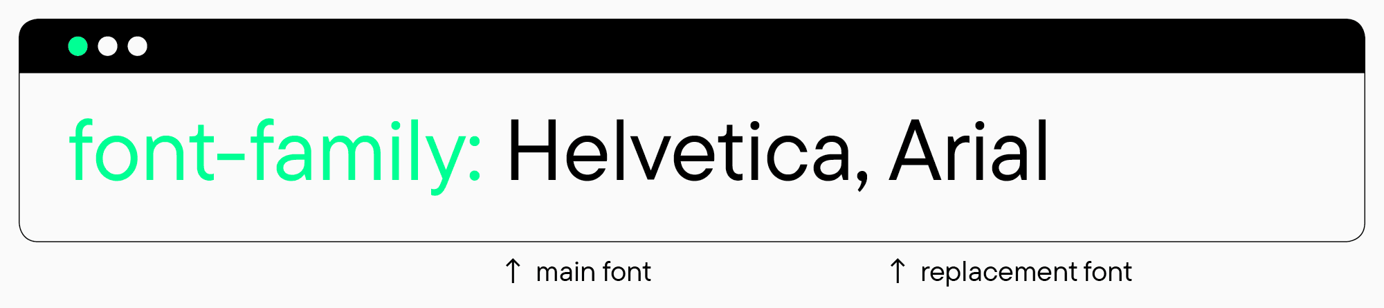
Ein weiterer Grund für diese Herausforderung ist, dass manche Schriftarten in der E-Mail-Software des Empfängers nicht richtig dargestellt werden. Sie können also nicht einfach irgendeine Schriftart für Ihren Newsletter auswählen – alle Schriftarten, die im System des Empfängers nicht vorhanden sind, werden automatisch durch Standardschriftarten ersetzt.
Welche Schriftarten eignen sich also am besten für Newsletter und wie kann man sie effektiv in Layouts einsetzen? Das wollen wir in diesem Artikel gemeinsam herausfinden!
Was sind die gängigsten Newsletter-Schriften?
Die am besten geeigneten Schriften für einen elektronischen Newsletter sind die sogenannten „sicheren“ Systemschriften. Solche Schriften sind in den meisten Fällen auf den Geräten der Nutzer vorhanden, da sie in fast jedem Betriebs- oder Mailingsystem vorinstalliert sind. Daher werden diese vorinstallierten Schriften von jedem E-Mail-Client korrekt dargestellt.
Es ist auch möglich, bei der Erstellung eines Newsletters eine Backup-Schrift in den Code zu integrieren. Sollte das Gerät des Nutzers die Hauptschriftart nicht unterstützen, wird diese durch eine vorinstallierte Alternative ersetzt.
Die besten „sicheren“ Schriftarten für Newsletter: Typen und Beispiele
Alle für das E-Mail-Marketing geeigneten Systemschriften lassen sich grob in zwei Hauptgruppen einteilen: Antiquen und Grotesken. Antiqua ist der Oberbegriff für alle Schriften mit Serifen, Grotesk für alle Schriften ohne Serifen.
Wie man sie auswählt und welche Kombinationen von Newsletter-Schriften am effektivsten sind, werden wir in Kürze erläutern. Werfen wir nun einen Blick auf die gängigsten „sicheren“ Schriftoptionen für Newsletter.
Systemschriften mit Serifen
- Courier
- Courier New
- Times New Roman
- Georgia
Systemschriften ohne Serifen
- Arial
- Arial Black
- Helvetica
- Lucida Sans
- Tahoma
- Trebuchet MS
- Verdana
Wie man eine Newsletter-Schriftart auswählt und verwendet
Wir haben einige allgemeine Regeln zusammengestellt, die Ihnen dabei helfen sollen, aus den verfügbaren „sicheren“ Optionen eine geeignete Newsletter-Schriftart für Ihre E-Mail-Marketing-Kampagne auszuwählen und diese bei der Erstellung einer E-Mail richtig einzusetzen.
- Gute Newsletter-Schriften müssen lesbar sein. Der Hauptzweck einer Schriftart, die im Text einer E-Mail verwendet wird, besteht darin, Informationen effektiv zu übermitteln, d. h. sie muss leicht lesbar und relativ neutral sein.
- Die in der E-Mail verwendete Schriftart kann die Persönlichkeit der Marke unterstreichen. Sie können die Schriftart eines System-Newsletters mit einer Ihrer Signaturschriften kombinieren, indem Sie die Schriftart wählen, die ihnen am ähnlichsten ist. Wenn Sie beispielsweise eine Serifenschrift auf Ihrer Website oder in Ihrer Markenidentität verwenden, sollten Sie eine Newsletter-Schrift aus derselben Kategorie wählen. Auf diese Weise behalten Sie das visuelle Erscheinungsbild Ihrer Marke bei, erhöhen den Wiedererkennungswert und unterstreichen Ihre Botschaft.
- Verwenden Sie nicht zu viele Schriften gleichzeitig in einem Newsletter. Die optimale Anzahl von Schriftarten für einen Newsletter-Text sind zwei, aber oft reicht eine Schriftart aus.
- Verwenden Sie Schriftarten, um die Texthierarchie festzulegen. Ihr Newsletter sollte nicht voll von Fließtext sein – es ist ratsam, ihn in Blöcke zu gliedern, um die Wahrnehmung zu erleichtern. Überschriften und Unterüberschriften können hervorgehoben werden, indem der Schriftschnitt oder die Punktgröße geändert wird.
- Wählen Sie eine für das Lesen optimale Schriftgröße. Am besten geeignet sind Schriftgrößen von 10-12 Punkt für den Fließtext und 18-29 Punkt für Überschriften.
Wie verwende ich Nicht-Standard-Schriften in Newslettern?
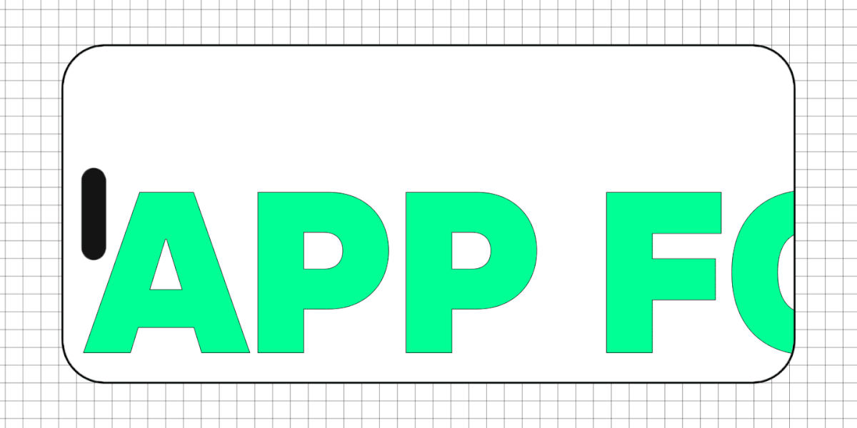
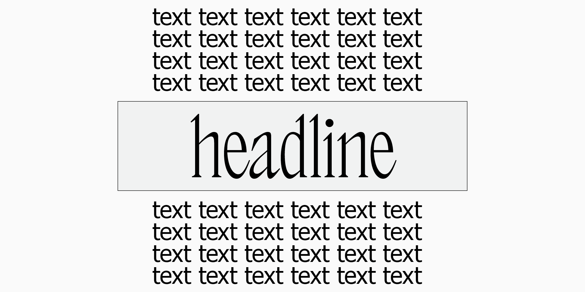
Wenn Systemschriften Ihren Newsletter zu langweilig erscheinen lassen oder Sie einfach ein visuelles Thema für den Newsletter schaffen möchten, indem Sie eine Nicht-Standard-Schrift verwenden, gibt es eine Lösung. Kleine Texte, wie z.B. Überschriften, können als Bilder in eine E-Mail integriert werden. In diesem Fall können Sie eine beliebige Schriftart ohne Einschränkungen wählen und diese mit einer „sicheren“ Option kombinieren.
Wir raten jedoch davon ab, diese Methode für längere Textpassagen zu verwenden. Dadurch wird der Newsletter größer, die Anzeige dauert länger und es ist nicht mehr möglich, Text zu kopieren.
Bei der Wahl der Schriftart und der Schriftgröße für ein Bild im Newsletter sollten Sie daran denken, dass der Newsletter sowohl auf dem Computerbildschirm als auch auf dem Handybildschirm angezeigt wird. Es empfiehlt sich, vorab zu prüfen, wie das Bild auf den verschiedenen Bildschirmen und in der E-Mail-Software dargestellt wird.
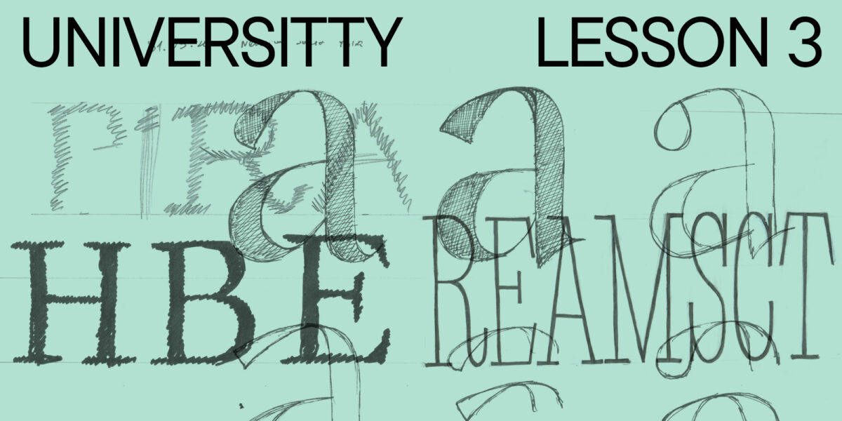
Auswahl von Schriftpaaren für auffällige und einprägsame E-Mail-Kampagnen
Als Fazit lässt sich festhalten, dass für den Haupttext eines Newsletters neutrale Systemschriften am besten geeignet sind und Überschriften und Beschriftungen mit ausdrucksstarken Schriften als Bilder hinzugefügt werden können. Die Frage ist nur, wie man Systemschriften mit ungewöhnlichen Schriften kombiniert.
Wie bei anderen Kombinationen gibt es auch hier keine allgemeingültigen Regeln. Sie sollten sich auf Ihr Gefühl verlassen und ein wenig Vorsicht walten lassen. Hilfreich ist es auch, wenn Sie einige Grundprinzipien der Schriftkombination kennen – mehr darüber und über Schriftpaare erfahren Sie in unserem Artikel.
Hier haben wir Schriftpaare aus Systemschriften und Schriften aus der TypeType-Kollektion zusammengestellt. Wir sind sicher, dass Sie eine passende Variante für Ihren Newsletter finden: ein ruhiges, neutrales Paar oder ein ausdrucksstarkes, auffälliges.
Neutrale Schriftpaare für Newsletter
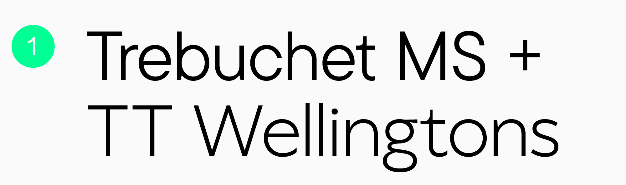
1. Trebuchet MS + TT Wellingtons. Diese Schriften haben ähnliche Buchstabenformen, was sie zu einer ausgewogenen Kombination macht. Die humanistische Serifenlose TT Wellingtons ist einfach und elegant, aber auch leicht erkennbar und frisch.
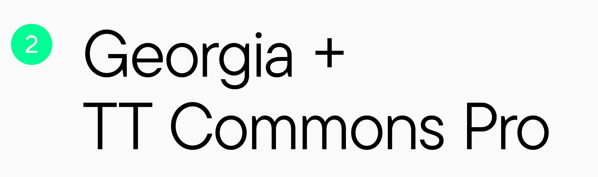
2. Georgia + TT Commons Pro. Eine Kombination aus Serifen- und Sans Serif-Schriften ist im Grunde klassisch und vielseitig. Die geometrische Serifenlose TT Commons Pro lässt sich leicht an jedes Thema anpassen und wirkt dennoch modern und dynamisch.
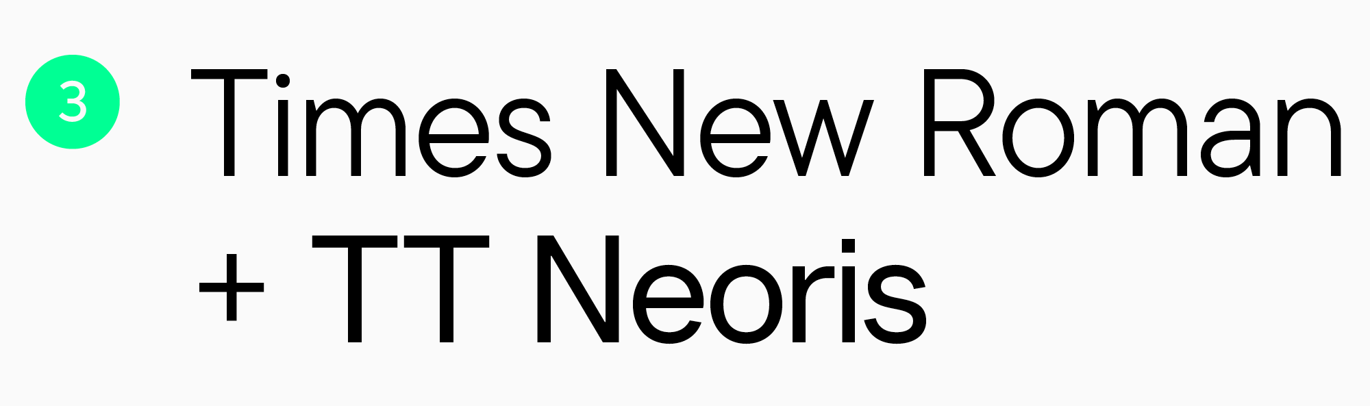
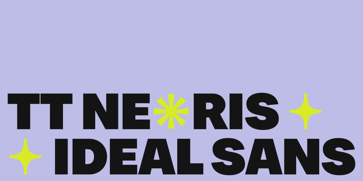
3. Times New Roman + TT Neoris. Eine weitere wirkungsvolle Kombination von Serifen- und Sans Serif-Schriften. TT Neoris ist eine elegante und frische Schrift mit ungewöhnlichen Details. Experimentieren Sie mit den Schriftschnitten und dem variablen Schriftschnitt, um die visuelle Identität Ihrer E-Mail zu verändern.

4. Courier + TT Marxiana Grotesque. In diesem Fall sind die Schriften durch weiche Formen und historische Referenzen miteinander verbunden. TT Marxiana Grotesque ist eine Schrift, die von einem Satz für die Zeitschrift Niva inspiriert wurde, die Ende des 19. und Anfang des 20. Wenn Sie ein visuelles Thema für Ihren Newsletter kreieren und ihm einen historischen Touch verleihen möchten, ist dieses Schriftpaar die perfekte Wahl.
Schriftpaare für Newsletter mit lebendigen Akzenten

1. Helvetica + TT Bluescreens. Diese Schriften passen gut zusammen, da sie ähnliche Buchstabenformen haben. Eine geometrische, serifenlose TT Bluescreens mit schmalen Proportionen und erkennbaren visuellen Merkmalen kann jedoch einen sichtbaren Akzent setzen. Für mehr Ausdrucksstärke empfehlen wir die fetten Schnitte dieser Schrift.
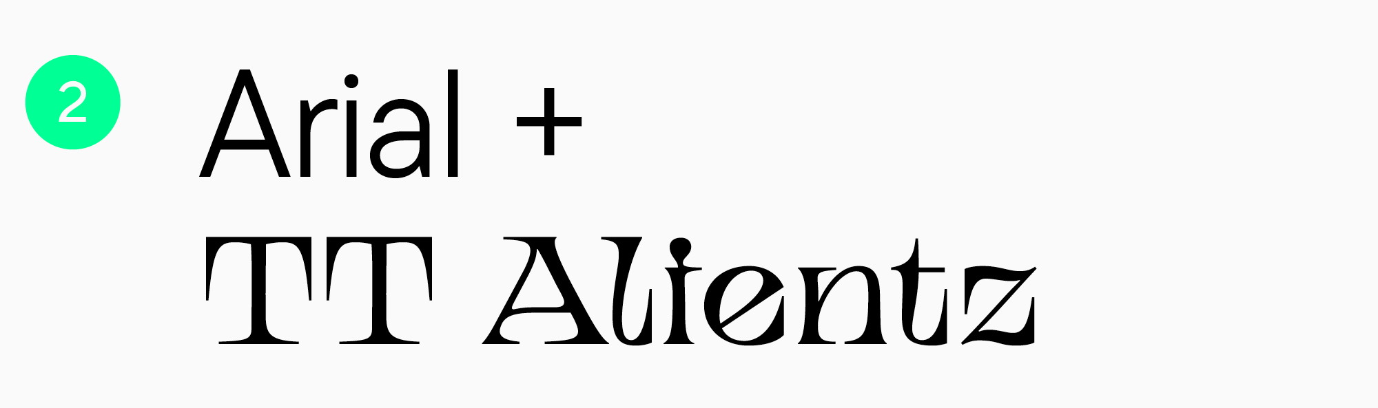
2. Arial + TT Alientz Serif. Trotz des einzigartigen Stils der TT Alientz Serif sind sich diese Schriften sehr ähnlich. Diese dynamische, flexible, dehnbare und sehr spitz zulaufende Serifenschrift hat eine sehr ausdrucksstarke Persönlichkeit. Sie setzt intensive Akzente und verleiht dem Newsletter eine kühne Atmosphäre.

3. Tahoma + TT Severs. Dies sind zwei Schriften mit ähnlichen Buchstabenformen und offenen Aussparungen. Die TT Severs hat jedoch einen dekorativeren Charakter und ungewöhnliche Innenkonturen. Sie können das Beste aus dieser Schrift herausholen, indem Sie ihre fetten Stile verwenden.

4. Verdana + TT Runs. Obwohl die Buchstabenformen dieser beiden Schriften ähnlich sind, bilden sie aufgrund der unterschiedlichen Zeichenbreiten einen Kontrast. Dies macht die Kombination jedoch nicht weniger wirkungsvoll. Im Gegenteil, es ist einer der Parameter, der ihre Kompatibilität erhöht. TT Runs, eine breite serifenlose Schrift mit ungewöhnlichen Proportionen, verleiht Ihrer E-Mail einen eleganten und geradlinigen Akzent.
Fazit
Wählen Sie für Newsletter „sichere“ Schriften, aber lassen Sie sich in Ihrer Ausdrucksfreiheit nicht einschränken. Nutzen Sie unsere Empfehlungen und Schriftpaar-Optionen und seien Sie experimentierfreudig, um Ihre Newsletter aufmerksamkeitsstark und einzigartig zu gestalten und die Individualität Ihrer Marke zu unterstreichen.