A typeface is an indispensable part of any design. Moreover, in label and packaging design, it frequently takes on leading positions. A carefully selected font or font pair can make your design eye-catching and functional, present the brand’s concept, and make the product stand out.
So, what are some criteria for choosing fonts for packaging design? Let’s find out together in this article!
Why does typography matter for commercial packaging?
What catches your eye first when picking out items at the supermarket? Probably, it’s the packaging and the text on it. Packaging design shapes our first impressions about the product, and font often serves as a source of information. Apart from communicating with us through text, indicating that the items in front of us are bread or milk, fonts send signals to our subconscious and evoke specific associations because every font has a unique character.
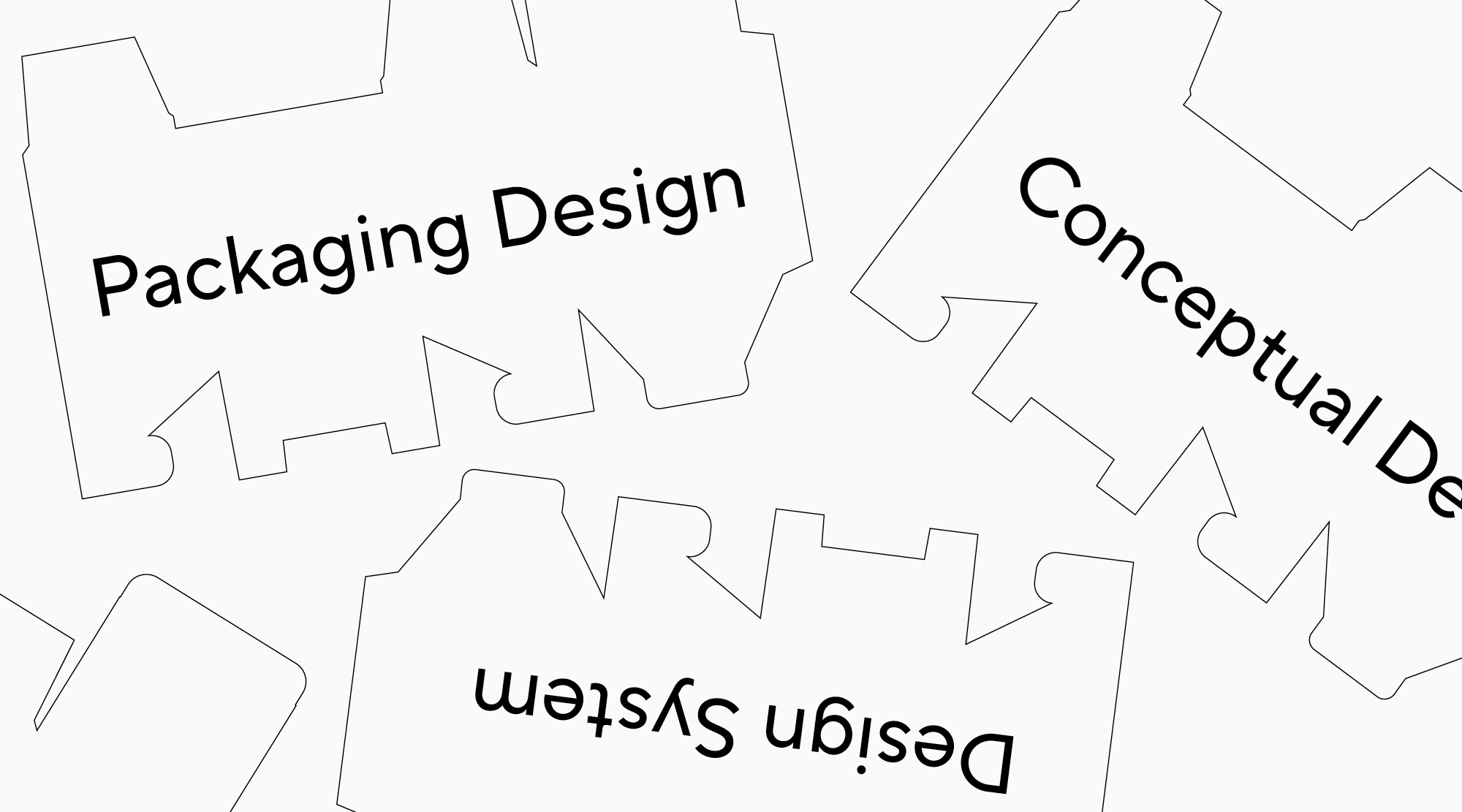
Packaging design is a complex and thought-through system. The concept may be built around an illustration or a recognizable choice of color. However, it doesn’t exist without a font.
Text on packaging is a form of creative expression. It can dominate the space, be a pattern, or make part of a vector illustration. Sometimes, even one letter can speak for the whole brand! Depending on the project, fonts can be the focal point in the design or complement other elements. In any case, the most important thing is that the font matches the idea of the project and conveys it correctly.

Examples of how fonts function in packaging design
Let’s look through several examples of what we discussed earlier to understand better how fonts can be used in packaging design.
Solo fonts
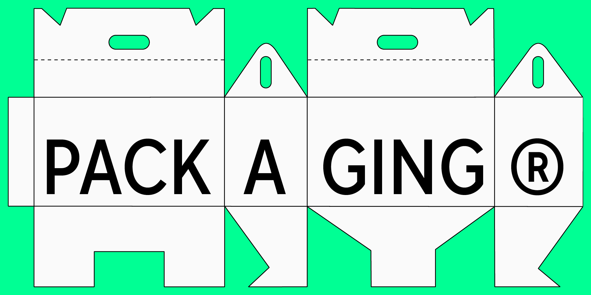
The first is an entirely typographic packaging with an emphasis on text. Depending on the idea, the dominant font can be display, neutral, or a combination of these traits.
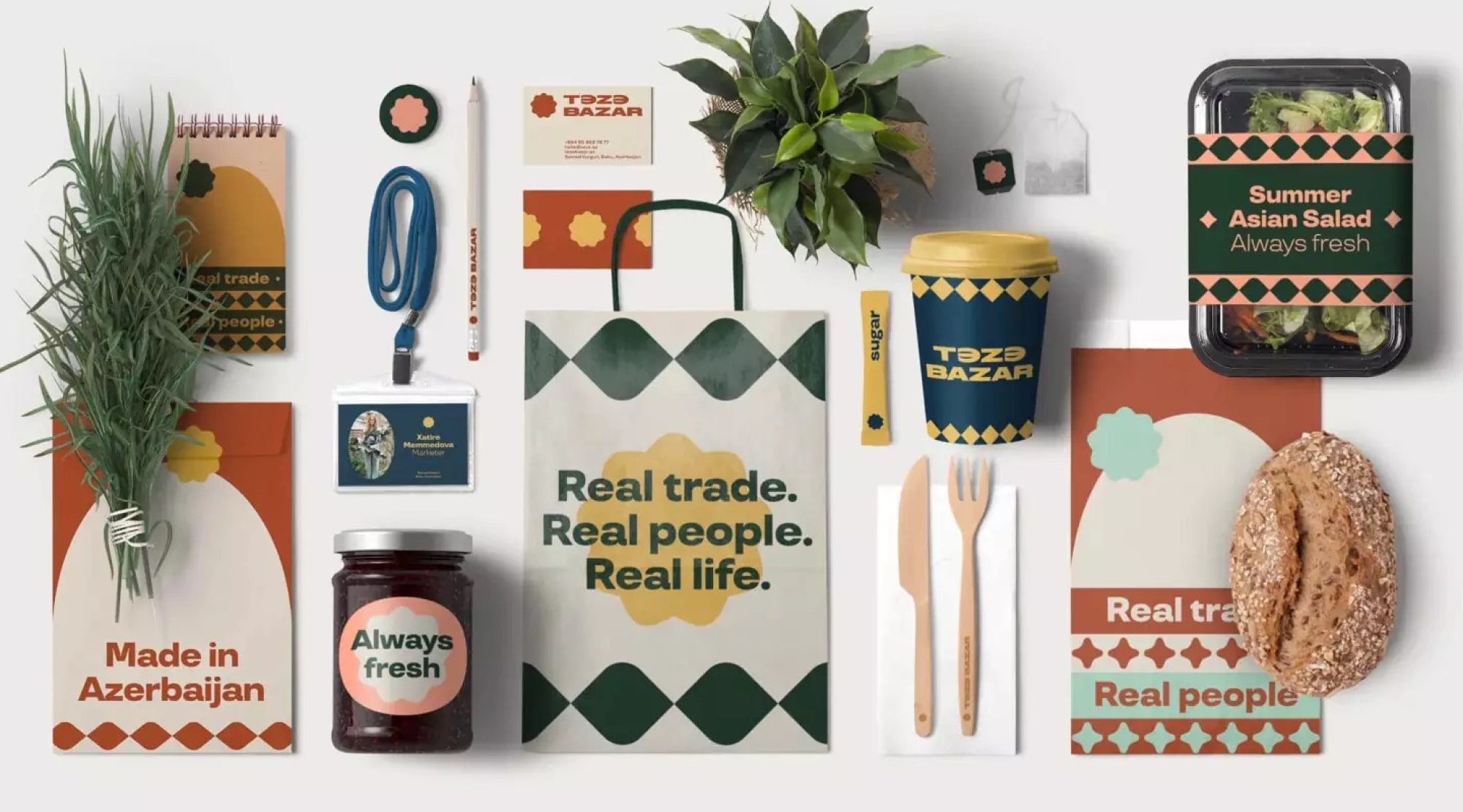
For instance, the typeface TT Travels is used in the branding of Teze Bazar. The font is a geometric sans serif with wide proportions. It has quite a prominent character, still remaining an adaptable font with good readability.
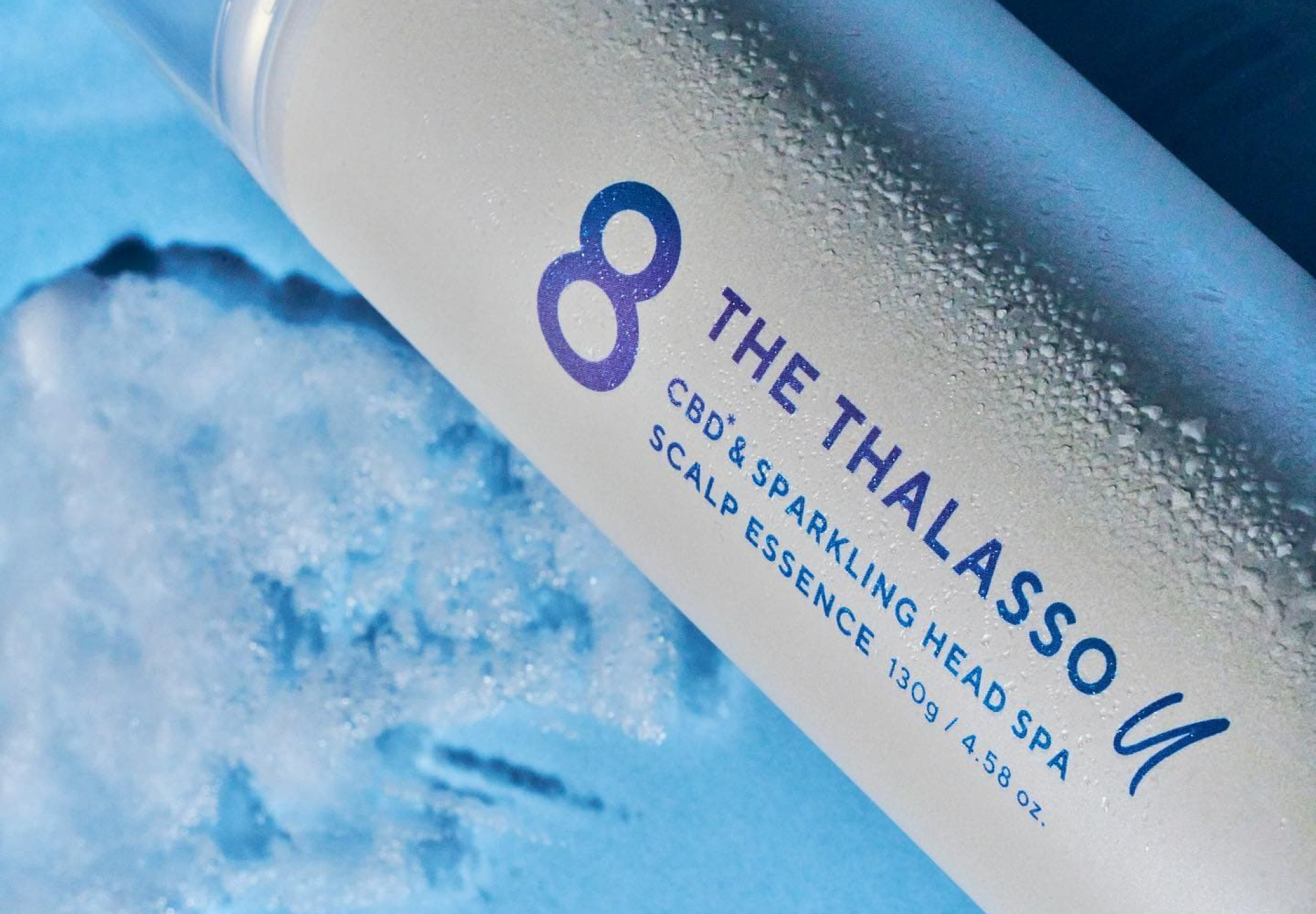
Another great example is the design of 8 The Thalasso U, featuring a neutral geometric sans serif TT Norms® Pro as its signature font. The entire design is simple and clean, with a feeling of transparency. A display font with an expressive character would be a bad match for this concept, drawing all the attention to itself. However, a basic sans serif without excessive detailing looks very well-balanced in this design.
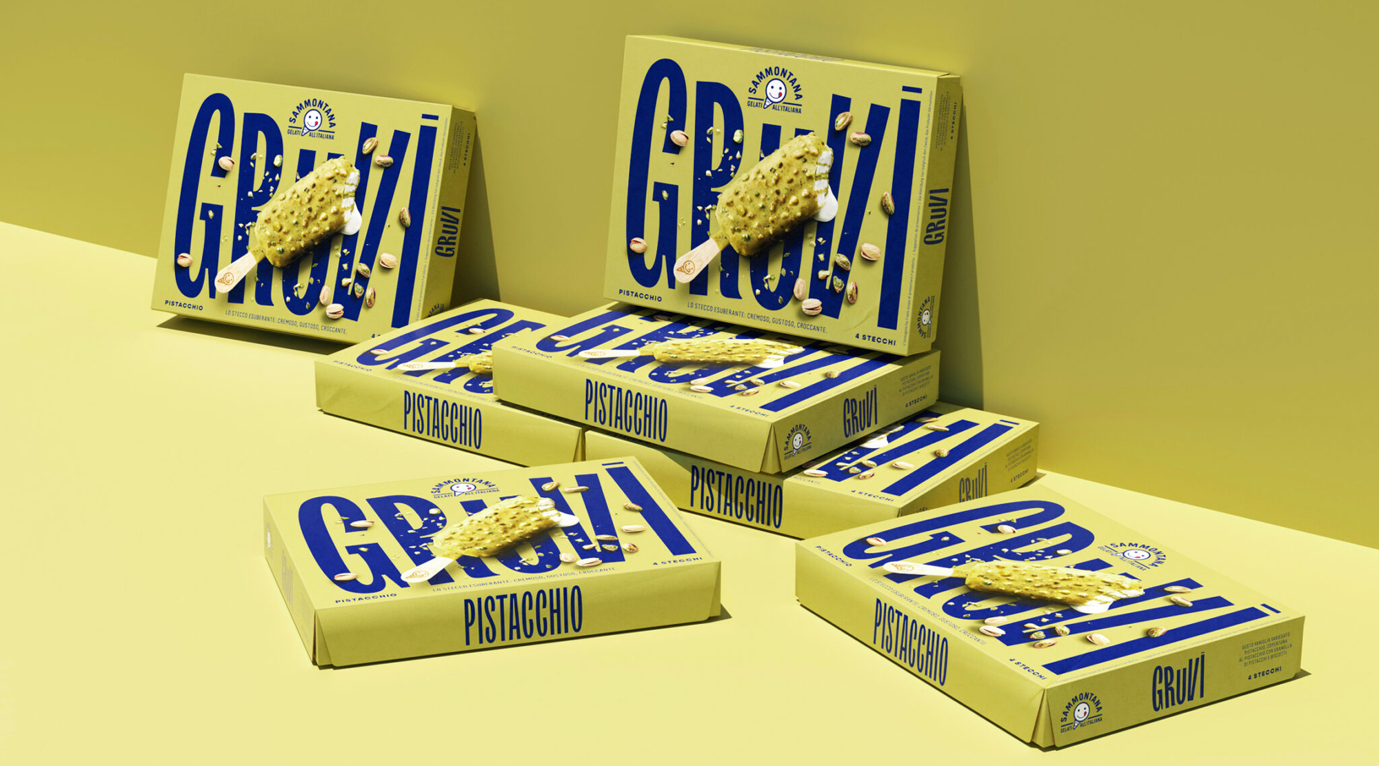
One more example, but this time of a solo display typeface, is an ice-cream packaging Sammontana Gruvi with TT Trailers. This expressive Humanist sans serif grabs your attention in the perfectly matching dynamic and bold design.
Font pairs of neutral + expressive
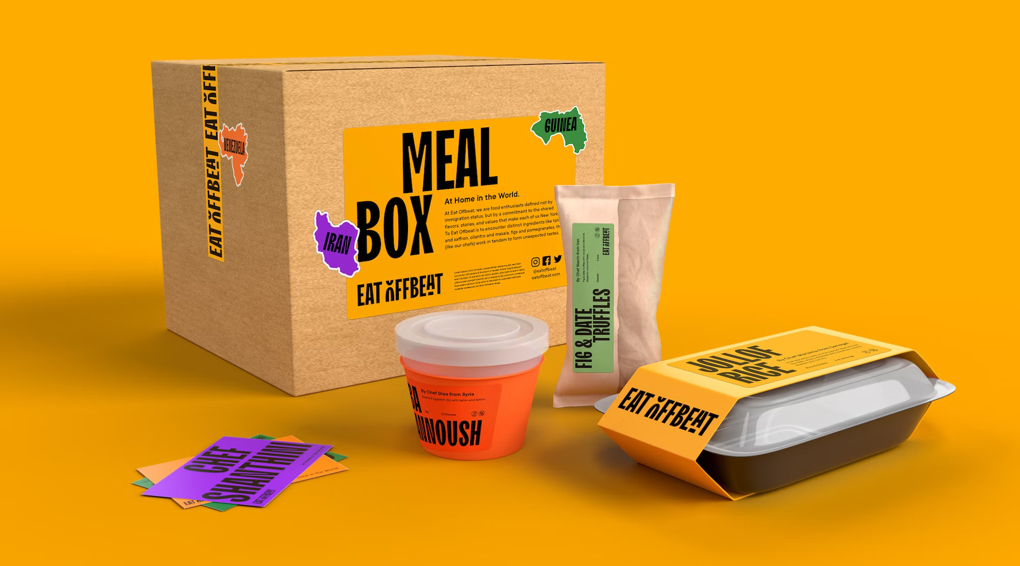
The second option is to use two fonts in the design: one display and one text font. The former will place accents, highlight the brand’s name, and emphasize its uniqueness. The latter will serve as the foundation, providing the readability of the main text block.This solution is implemented into the brand identity of Eat Offbeat. A vibrant font TT Trailers is used in the logo and large texts, and the main text is typed in an adaptable TT Commons™ Pro.
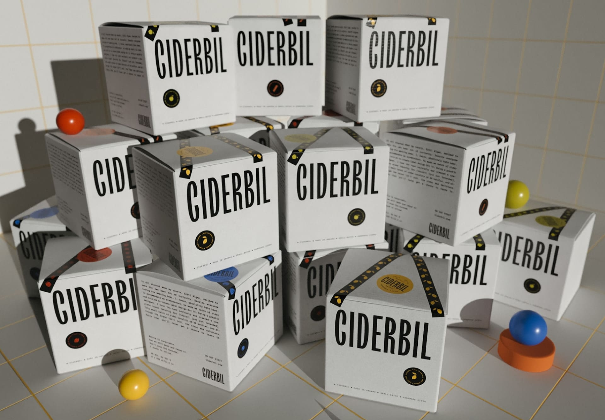
Another example of a well-matched font pair on the packaging is the brand identity of Ciderbil drinks. Our movie star TT Trailers plays the main part here as well, and the supportive roles are taken by IBM Plex Mono by Bold Monday.
What fonts are best for packaging design?
So, almost any font can be part of the packaging design. Fonts can be loosely categorized into neutral and display, where neutral ones can be used alone to emphasize the elegance and simplicity of the project or in a pair with a display one. Thus, everything depends on the project’s idea.
However, there are several criteria you can rely on when choosing a typeface.
- Legibility. Whether you choose a vibrant and unusual font or a neutral one, it must be easy enough to read in order to be used in the brand’s name, product, or logo;
- Quality. Make sure the chosen font’s quality is high enough. It’s crucial for packaging design that the font is displayed equally well across different mediums because all the mockups will be printed;
- Functionality. To create an eye-catching packaging design, you may need various features—for instance, the possibility to transform individual characters. Choose modern typefaces that have such possibilities.
When it comes to functionality, we recommend taking a look at variable fonts. This way, you can choose one font and alter its width, weight, slant, and more. The general appearance of the letters will remain, so they are still easy to recognize. Many TypeType typefaces include variable font styles.
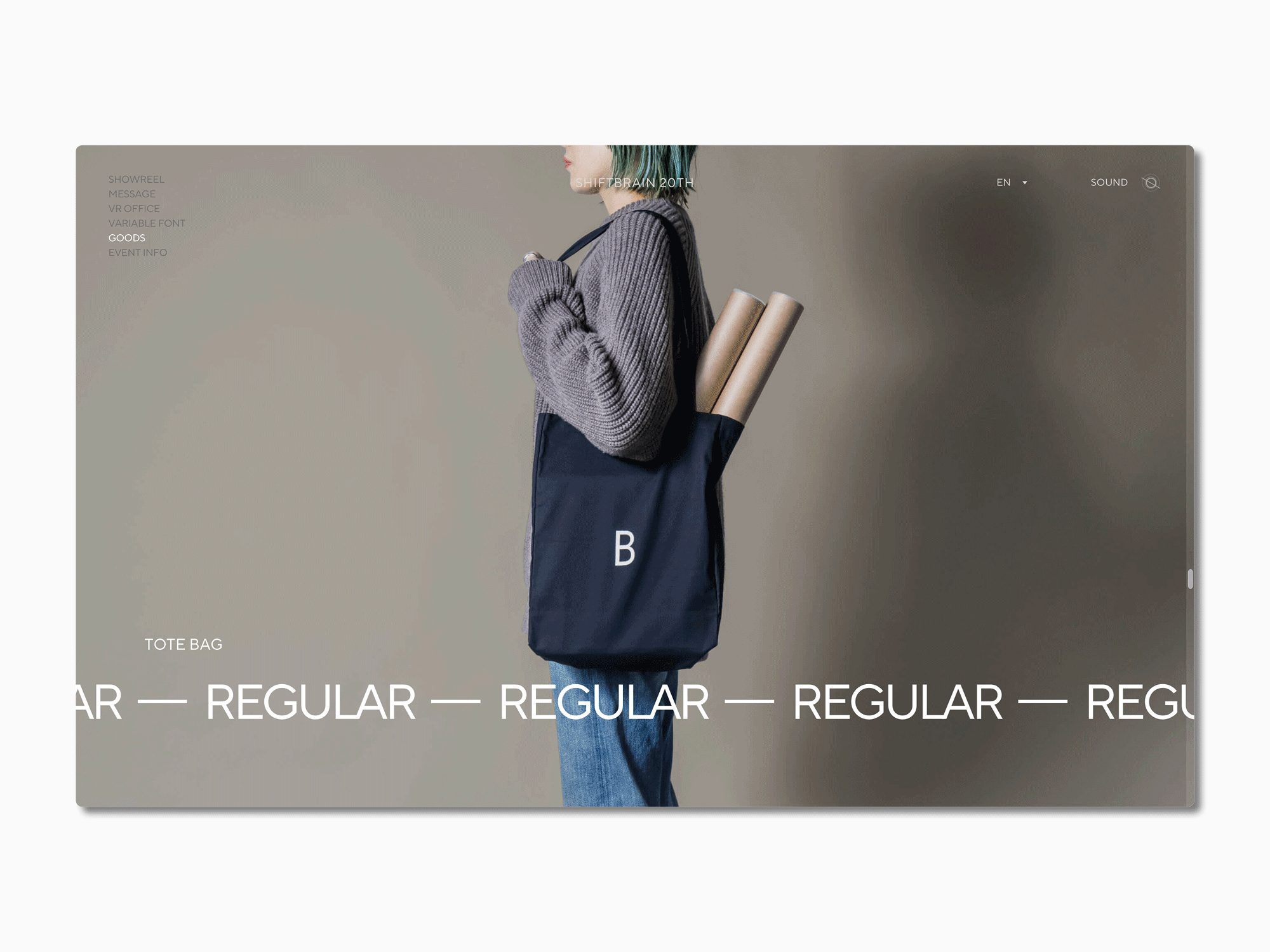
By using a variable font, you can increase your design’s flexibility and adjust the font to different packaging formats. A great example of this is the website of SHIFTBRAIN, which implemented a customized version of our TT Norms® Pro into their design to celebrate the company’s 20th anniversary.
The list of best fonts for packaging to use in your design
We selected the best font options for labels and packaging from the TypeType collection. This list features both expressive and neutral typefaces for various tasks. Every font in the list corresponds to the above-mentioned criteria and serves ideally to create a high-quality, beautiful, and stylish design. Most of the options include variable font styles.
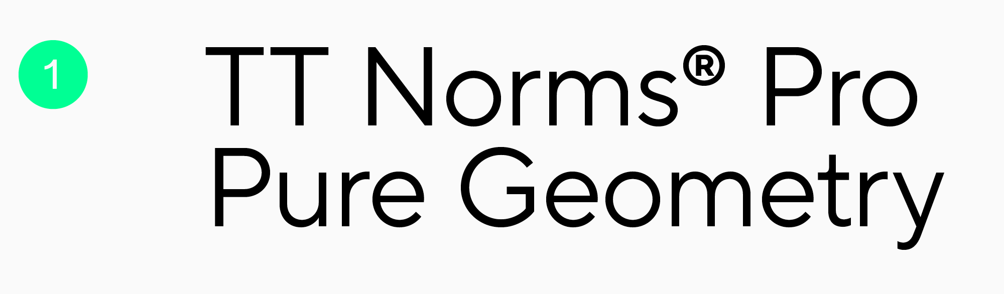
TT Norms Pro
This functional geometric sans serif is highly versatile and perfect for any occasion. It’s neutral and goes well with display fonts. The typeface includes a variable font, TT Norms® Pro Variable, with three axes of variation: weight, width, and slant. TT Norms Pro can serve as the foundation for any experiments and allows you to try a multitude of packaging design options for any project.
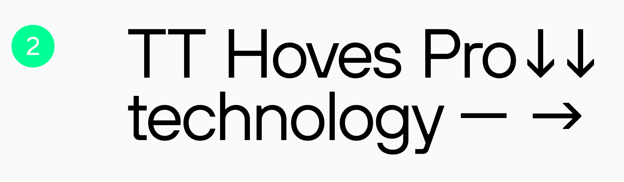
TT Hoves Pro
Another multi-purpose sans serif with a neutral but recognizable character. This typeface also includes a variable font with three adjustable axes: weight, width, and slant. TT Hoves Pro is an excellent choice for modern projects.
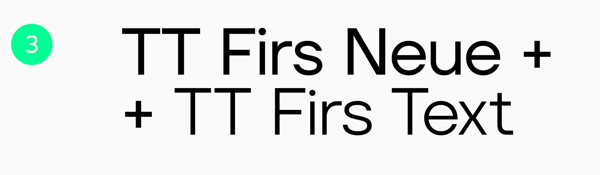
TT Firs Neue + TT Firs Text
An ideal font pair option. TT Firs Neue is a Scandinavian sans serif with expressive elements, and TT Firs Text is an elegant text font. Together, they help create a recognizable and stylish design. Both typefaces include a variable font with two axes of variation: weight and slant. This font pair is a great package for projects where minimalism blends with expressiveness.
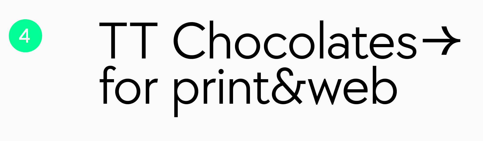
TT Chocolates
TT Chocolates is an elegant and eye-catching Humanist sans serif. The font’s name speaks for itself: it’s a perfect option for confectionery packaging design. However, this is not the only domain where TT Chocolates can be used—its technical aspect encourages experimentation. The typeface includes one variable font, so you can go as far as your imagination takes you with this font!
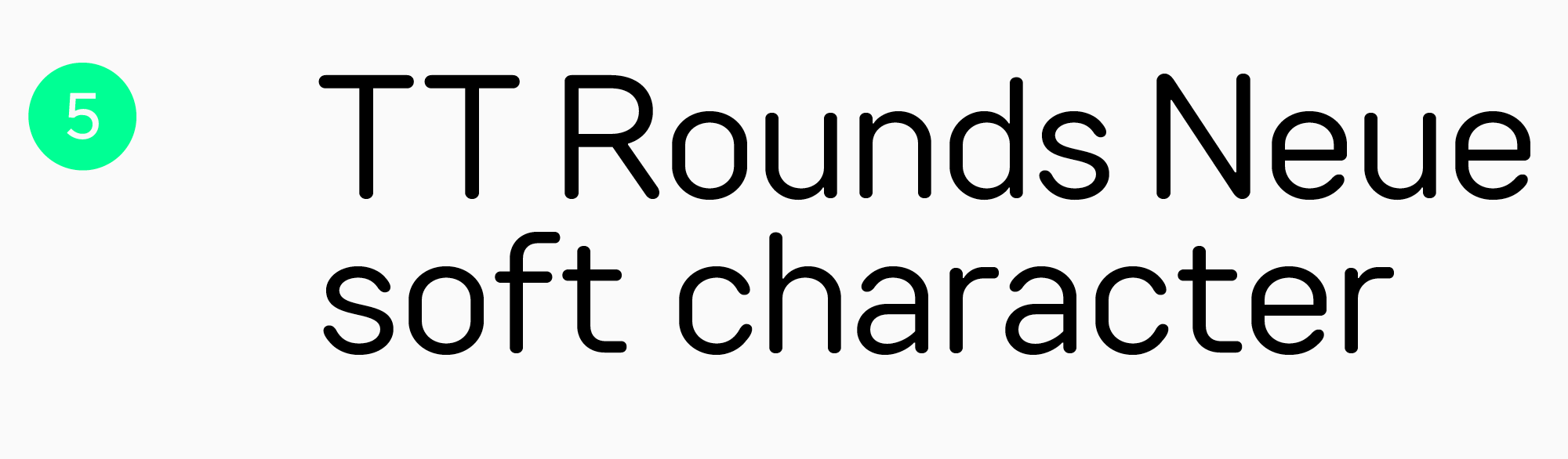
TT Rounds Neue
A remarkable font with rounded forms and soft, playful character. TT Rounds Neue is an optimal pick for the packaging design for kids’ goods, food items, office supplies, and more. The typeface includes a variable font with three adjustable axes: weight, width, and slant.
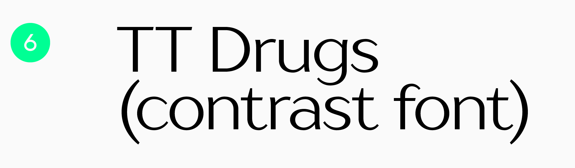
TT Drugs
This typeface was designed with the pharmaceutical industry in mind. It will fit perfectly into the packaging design for cleaning products, skin or hair care, and electronics. However, it’s not confined to just these areas of use. Sophisticated and modern, this typeface can harmonize beautifully with the packaging design for confectionery, drinks, and even books. Let your imagination go wild! The font is suitable for printing on any material, from cardboard to metal.
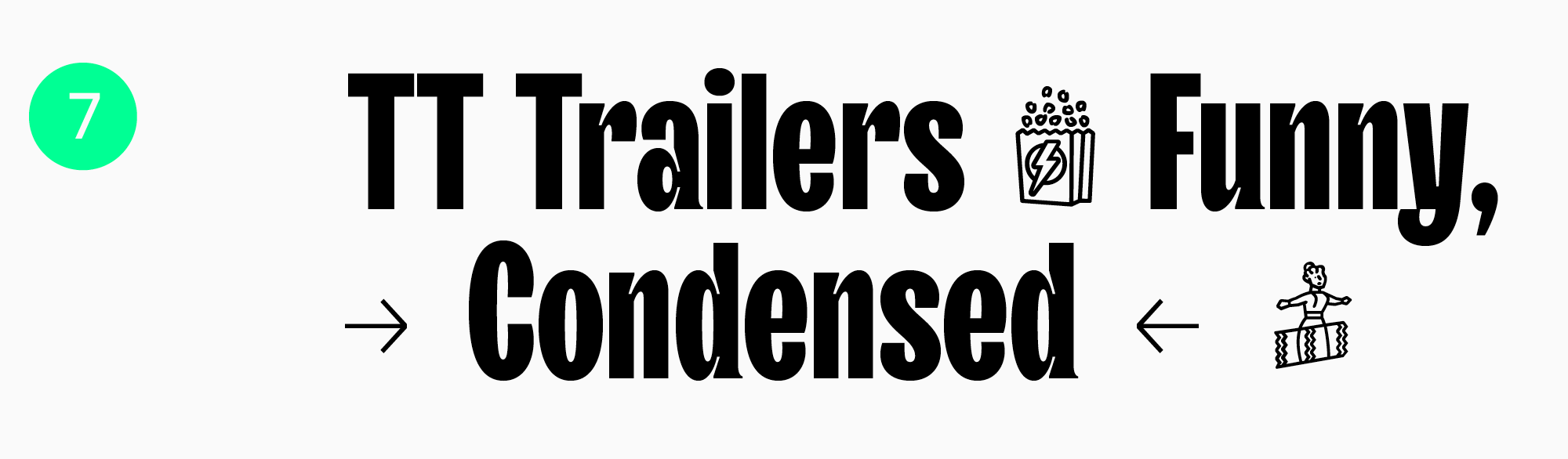
TT Trailers
A stunning and vibrant Humanist sans serif that will definitely make an impression. The initial idea behind TT Trailers was to create a typeface for the movie industry. However, its application range is much broader: this font is a perfect fit for almost everything, from food items and drinks to clothing and accessories. The typeface includes a variable font style with two variation axes: weight and slant.
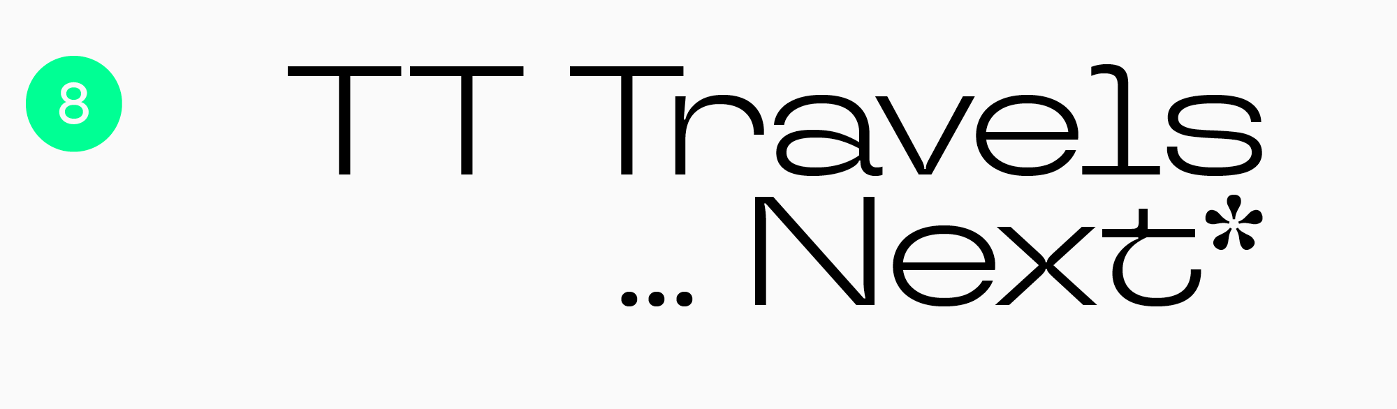
TT Travels Next
This display sans serif with wide proportions is ultra-stylish, unique, experimental, and capable of adding an expressive and bold touch to any packaging. The typeface includes two outline font styles that complement the roman ones perfectly. There is also a variable font with two adjustable axes: weight and slant. All these features make the font highly adaptable and suitable for almost any domain.
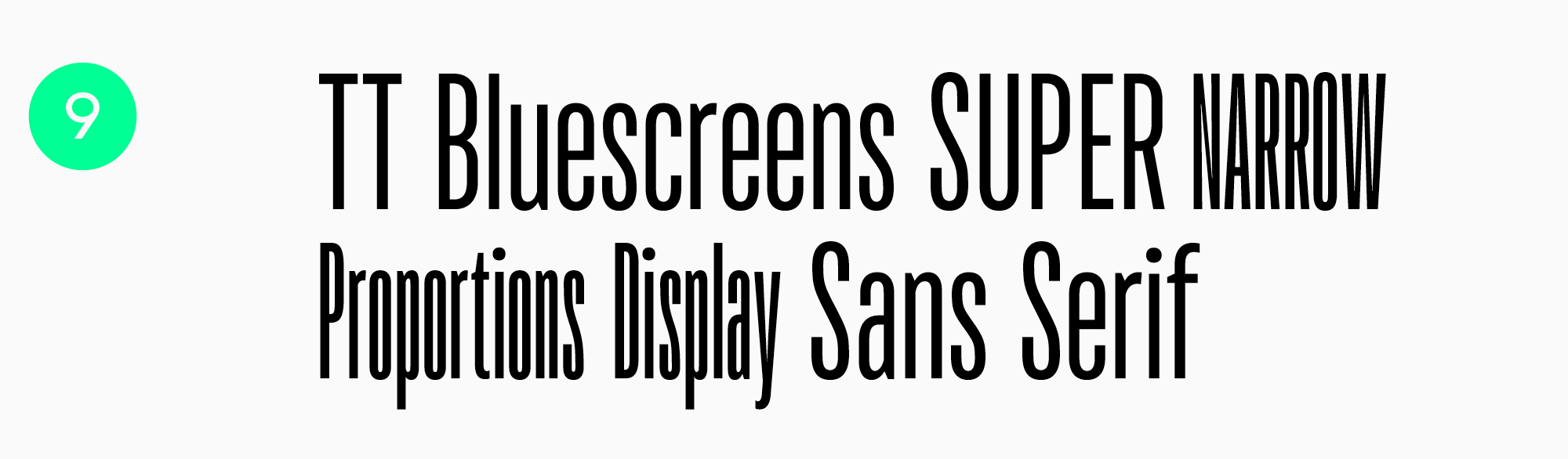
TT Bluescreens
This geometric sans serif with narrow proportions is both recognizable and neutral, so its remarkable character can adapt to completely different projects. Besides, the typeface includes a variable font with three variation axes: weight, width, and slant. Together with the “stretched-out” proportions, these features allow the font to be adjusted for various packaging formats.
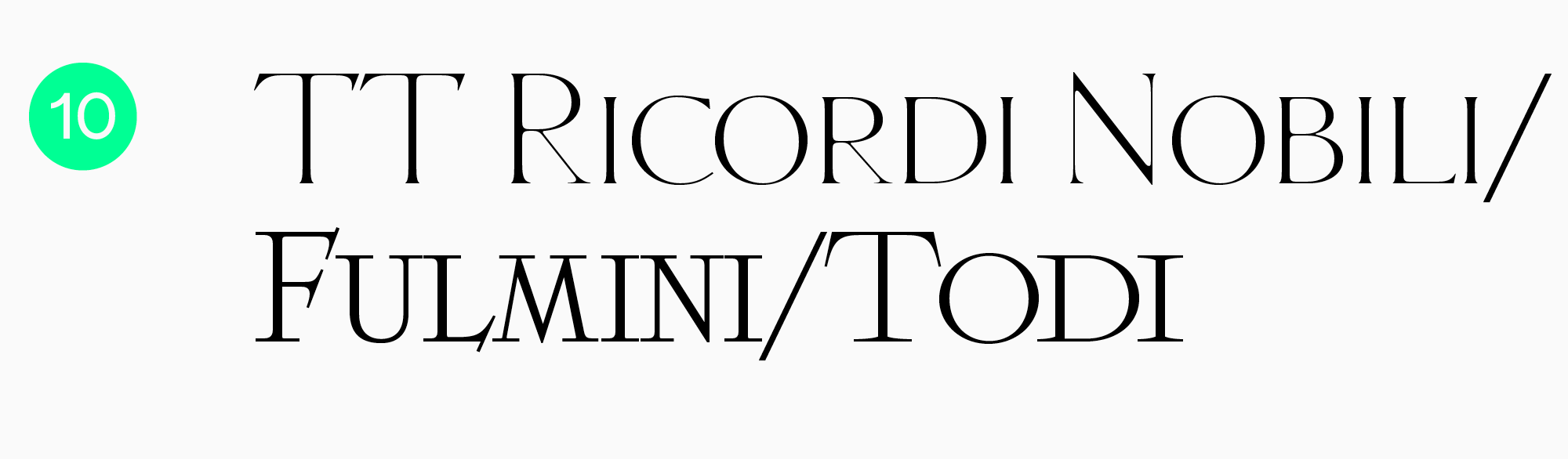
TT Ricordi
This typeface consists of three display serifs inspired by ancient inscriptions. Each font creates a unique atmosphere, but all three of them are united by one thing: they all look modern despite having a historical core. The fonts from the TT Ricordi collection will become a vibrant detail on the packaging.
Conclusion
In this article, we covered the possible options for using fonts in packaging design and provided examples of well-executed cases. You can keep them in mind; however, they are only our recommendations, not universal truths.
There is no proven and absolutely flexible recipe for the ideal design, and there is more than one best font for packaging. Every project is unique, and various designers can use the same typeface differently. Feel free to experiment because looking for new design choices is the most fascinating part of the process!
FAQ
What font characteristics improve legibility on small packaging formats?
Open counters, moderate width, sufficient stroke weight, and a calm, uncluttered design all help improve legibility. Spacing matters too: tightly set small text quickly turns into a blur.
How do printing techniques affect font choice for packaging?
Printing can cause ink to spread and fine details to disappear, especially on textured materials. That is why it is better to avoid overly thin strokes and excessive contrast, and to make a print proof before production.
Which fonts work best for eco-friendly or sustainable product branding?
Warmer, more human-centered type choices often work best: soft sans serifs, calm serifs, and details with little visual aggression. The key is that the typeface should support the idea of naturalness while remaining legible at small sizes.
How do packaging regulations influence typography decisions?
Minimum size and legibility requirements force you to plan the hierarchy carefully: what must be large, what can be secondary, and what cannot be hidden in decoration. In many cases, mandatory information blocks are exactly what drive the choice of a more functional typeface and spacing.
What are the best font pairings for product labels?
A reliable approach is to use a neutral typeface for ingredients and technical information, combined with a more distinctive one for the product name and flavor. The pair should differ in function and tone, while still sharing a common rhythm so the packaging feels cohesive.
How can typography enhance perceived product value?
A clean hierarchy, even typesetting, and well-crafted letter details create the impression of a carefully considered product. A premium feel usually comes from air, calm rhythm, and precise emphasis rather than loud decoration.
Are serif or sans-serif fonts more effective for food packaging?
There is no universal answer: sans serifs often feel cleaner and more contemporary, while serifs can add a sense of tradition and trust. The best choice depends on the brand’s character and the printing conditions, and then should be tested for legibility at the actual size and on the actual material.
How do multilingual labels impact font selection?
You need a typeface with solid language support and equally strong design across different scripts. It is also important that figures, symbols, and diacritics are fully developed; otherwise, parts of the information may look out of place or break in the layout.
What role does kerning and tracking play in packaging design?
On packaging, spacing is crucial: it helps preserve clarity at small sizes and on visually busy backgrounds. It is often better to slightly increase letter spacing in technical text blocks and fine-tune kerning separately in larger product names.
How do metallic or embossed finishes affect font readability?
Metallic finishes and embossing can swallow fine details and turn letters into visual noise, especially under angled light. Simpler forms, slightly larger sizes, and confidently weighted strokes usually work better for these effects.