It can be a challenge to find the best headline font. A right expressive typeface will convey values, ideas, and the overall atmosphere of the entire project. The headline font is the cover your project will be judged by. That’s why it must make the necessary impression immediately, or else you are unlikely to get a second chance to attract users’ attention in our information-dense world.
What fonts are the most effective for headlines and which criteria to consider? This was the focus of the following article, where we provided the list of 20+ best options. Read the article till the end to get a promo code!
What fonts are used in headings?
All fonts, according to their purpose, are subdivided into text and headline (display). Text fonts serve for typing running text, so they must be easy and convenient to read on any device. These typefaces look simple, neutral, and uncluttered. Maximum comfort for perception is the key factor in choosing a font for reading. The usual point size for text fonts is from 6 to 14-16.
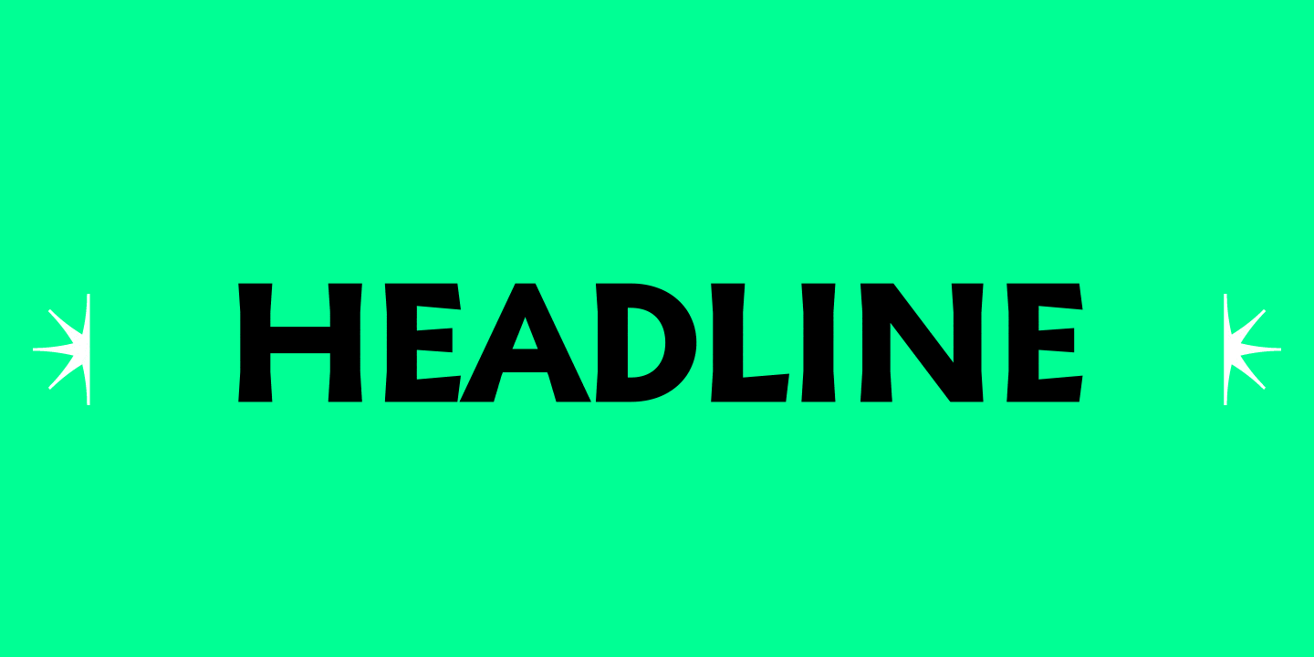
Display fonts, in turn, are utilized for texts set in large point sizes, headlines, and highlights in texts — their usage is targeted at capturing attention. These are expressive typefaces with a vibrant character. Their graphic is more complex and often full of eye-catching details. Unlike text fonts, typical point sizes for display typefaces range from 14 and up.
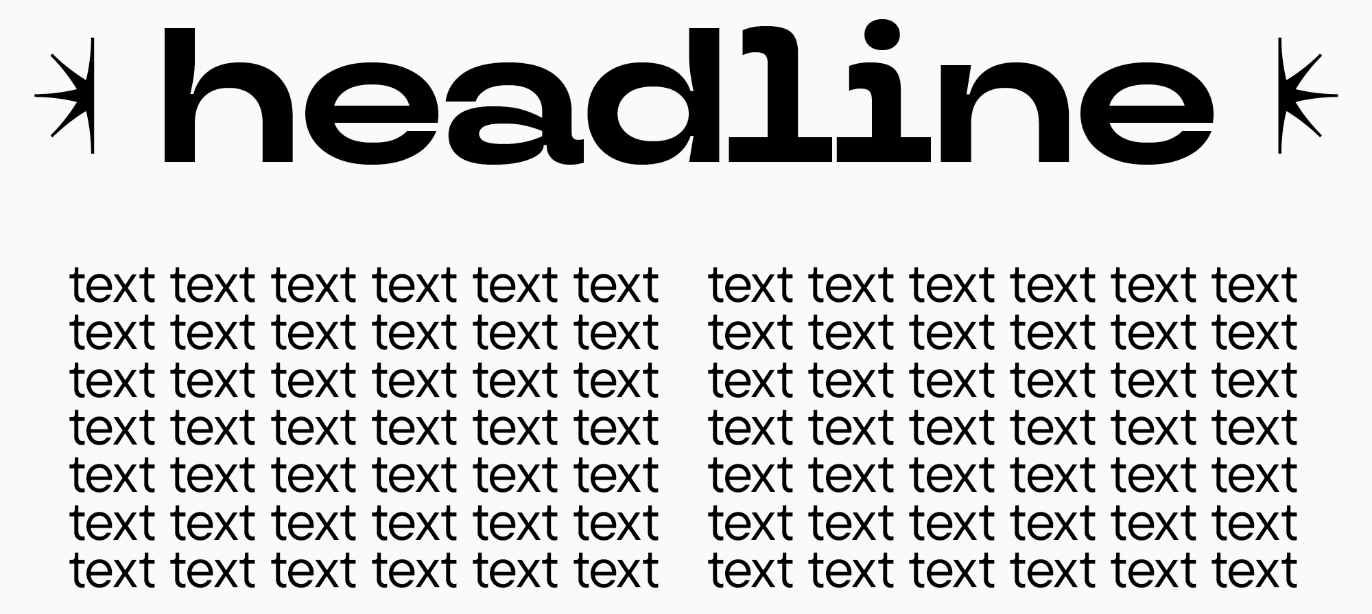
Among expressive typefaces, title fonts can be distinguished. They are used for title pages, covers, and headings. The character set of these fonts is often either reduced or consists of only uppercase letters. Typical sizes for title fonts range from 16 points up.
Interestingly, the requirements for text fonts are much more straightforward than for expressive ones. Moreover, depending on the layout, a text font can serve to design a headline. Typing running text in any display font, however, isn’t an option. If a font was initially designed for headings, it’s unlikely to replace a text one.
It turns out that almost any typeface can be expressive. How do you choose a suitable option, then? Let’s find out.

How to choose a great font for heading: Our recommendations
Selecting the best title font is a subjective process that is regulated by the goals and objectives you set. Always choose the font with your specific project in mind, not just the one you like. Different projects require different fonts—there aren’t any standardized rules. Luckily, there are several criteria worth considering.
A headline font should:
- Suit your project’s style and convey the corresponding emotions and values;
- Be different from your primary font to attract attention. The intensity of this difference depends on your goals and objectives;
- Appear correctly on all devices. A great headline font is technically well-crafted. Consider this criterion more carefully if you choose a free font.
How to pair a headline font with a text one?
If you already have a primary font and are looking for an expressive one to pair with it, or if you are choosing a complete font pair, we suggest following the recommendations below.
- Choose typefaces that would match the aesthetics and style of your project;
- Determine each font’s role: one will be primary, and another will be used to place accents. First, find a «workhorse» and then an expressive pair for it;
- Follow the principle of maximum contrast. The paired fonts should have the same idea but contrasting visuals.
To learn more about the principles of mixing and pairing typefaces, you can read our article “UniversiTTy: Lesson 5. Choosing and Mixing Typefaces: Theory and Practice”.
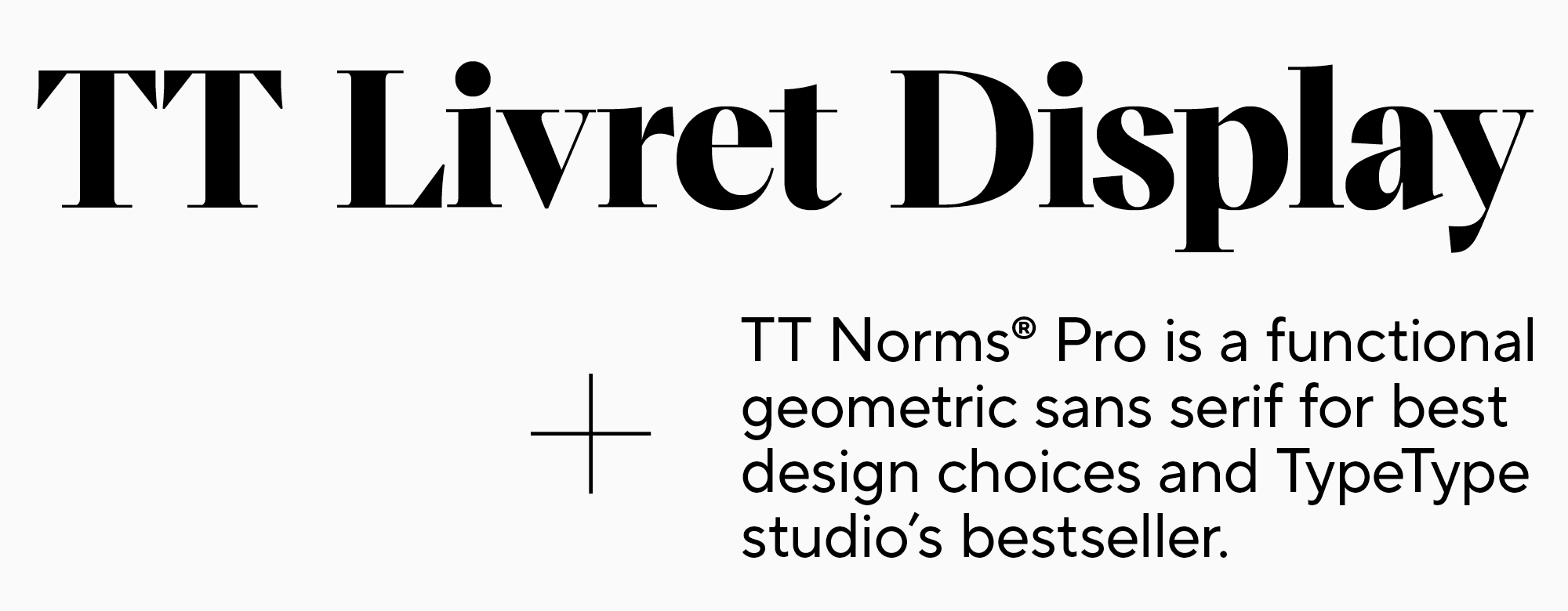
The process of pairing fonts can be compared to choosing an outfit. Suppose you are getting ready for an event and put on simple jeans as your outfit’s base. In your font wardrobe, a basic sans serif like TT Norms® Pro will be your jeans. Depending on how you style it, you can elevate this neutral typeface to a more formal level or make it look more relaxed.
If the event’s dress code is formal and even a little strict, you can pair your jeans with a blazer—and the overall mood of the outfit will shift to more traditional. This jacket in the font world is the TT Livret Display serif. The elegance of this font contrasts with the simplicity of TT Norms® Pro. However, the two typefaces look great together.
How to use the same typeface for texts and headings?
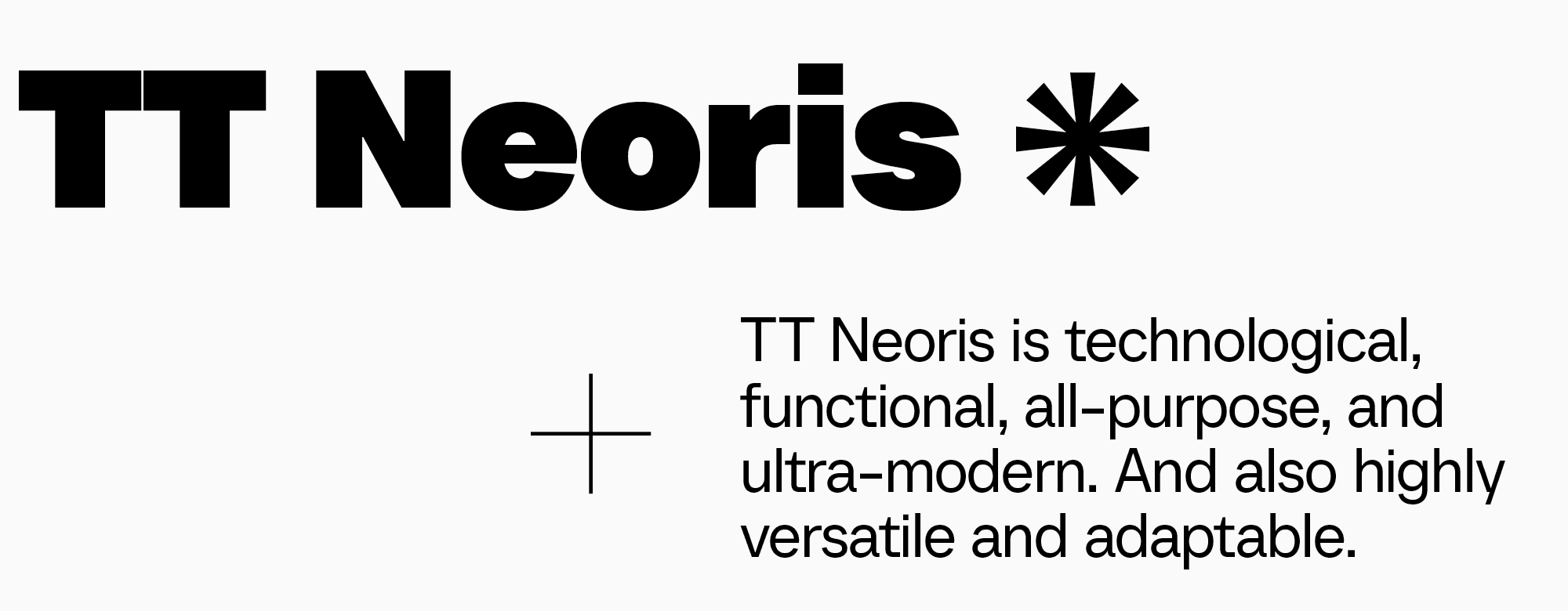
When resources are limited, you can use one typeface in different point sizes and weights for the main text and headings. In this case, you need a good text font that is comfortable to read in small point sizes and, at the same time, looks unusual and creates the necessary amount of contrast when you add weight and increase point size.
TT Neoris is a great example of such a typeface. This modern basic Neo-Grotesque looks good in big text blocks. Its bold font styles also perform nicely the role of a headline font. Besides, TT Neoris boasts quite captivating shapes that come alive in larger point sizes.
Best fonts for headlines
Here, we made a list of headline fonts crafted by TypeType and other studios. In this list, you will find various expressive fonts that can be used for newspaper, magazine, and online media headings, in website header design, and in many other projects.
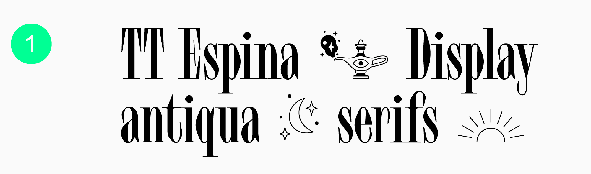
TT Espina
TT Espina is a charming and eye-catching display serif. This typeface is marked by high contrast, expressive serifs, and distinctive diamond-shaped bowls that make the font particularly captivating. This beautiful typeface will be a great match for projects in the domains of art, beauty, or decorative design. Any heading with TT Espina will turn out slightly mysterious and romantic.
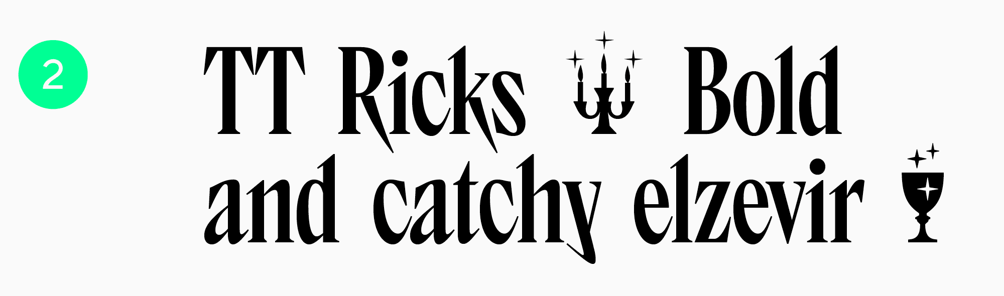
TT Ricks
Stylish, bold, and modern TT Ricks is a vibrant display serif. This typeface boasts a cool character, narrow forms, high contrast, and attention-grabbing sharp serifs. TT Ricks will harmonize with the environment where you want to emphasize boldness and add a touch of rebellion.
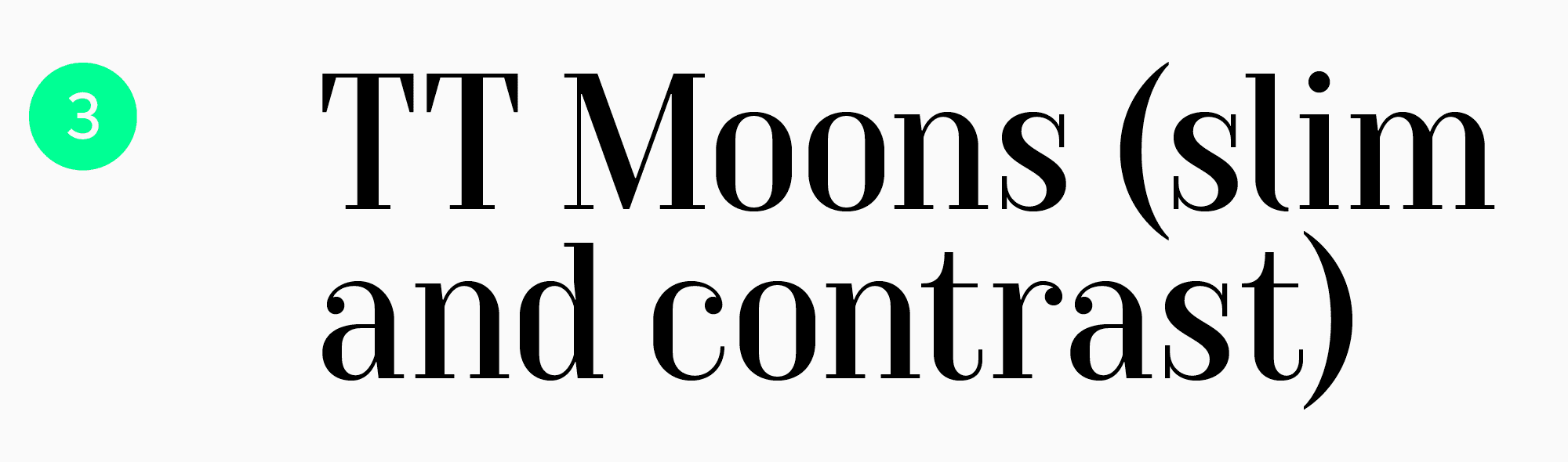
TT Moons
TT Moons is an elegant Modern serif. It’s marked by high contrast, narrow proportions, and expressive but relatively calm character. This typeface is perfect for magazine layouts, book title pages, and newspaper layouts. A heading or title in TT Moons will catch attention without being too fancy.
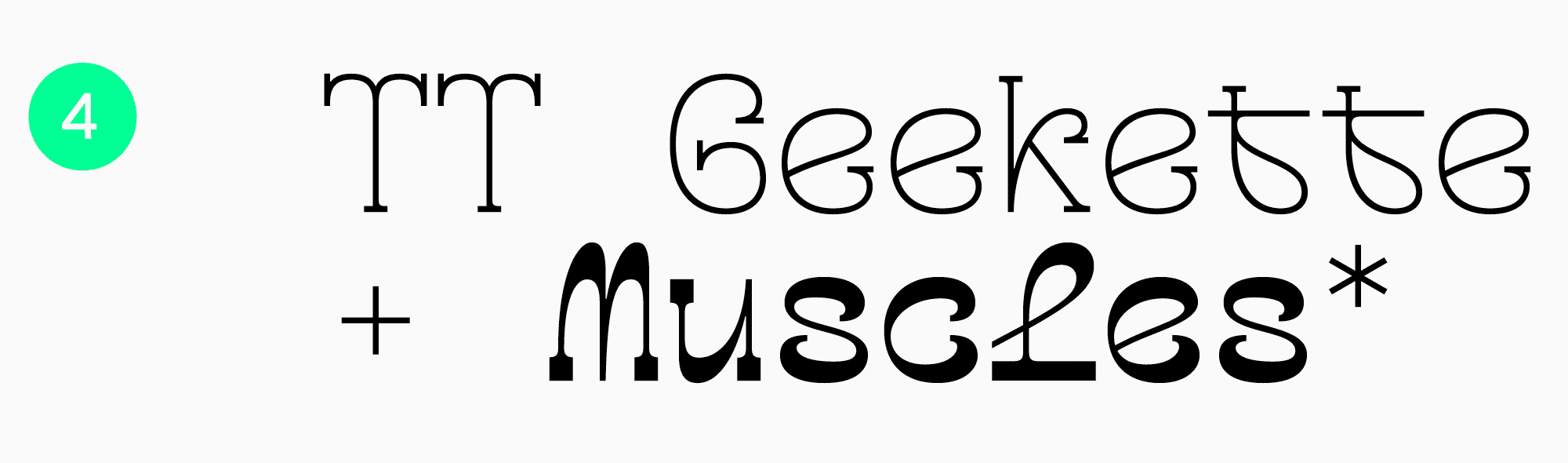
TT Geekette
TT Geekette is a friendly variable serif with fluid forms. It was created as part of an experimental project, so it’s so unique. If you are looking for a stylish, unusual, and distinctive display font, TT Geekette is the best option! This typeface is a perfect choice for printing and web design.
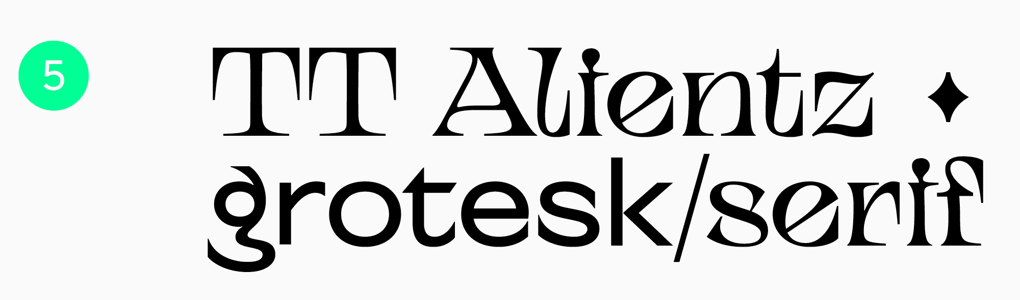
TT Alientz
An alien family TT Alientz includes a super-expressive serif and a simpler sans serif that can be used as a pair. TT Alientz Serif is a dynamic, stretchy, and spiky font with an enigmatic character. It’s an excellent match for projects that blend elements of rational and irrational. This may be the domains of art, selective perfume, or esotericism. The typeface’s personality is also quite cool and bold, so both creative sides of TT Alientz can be experimented with.
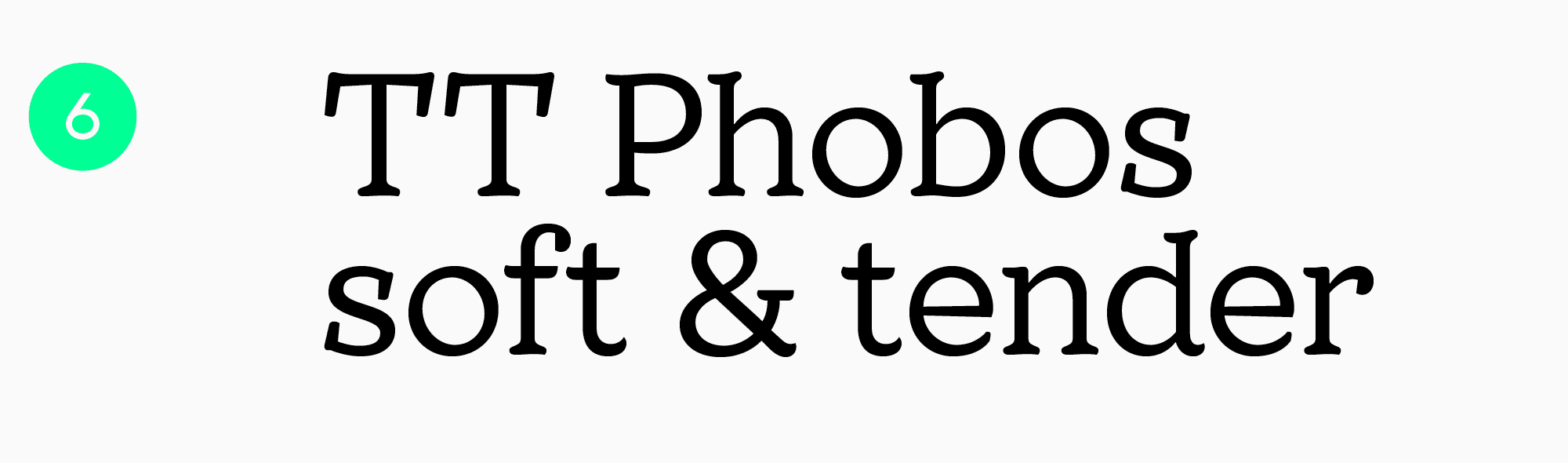
TT Phobos
A display serif TT Phobos is marked by a soft and gentle nature. This typeface features fluid forms, medium contrast between bold and thin strokes, asymmetrical serifs, and counterclockwise rotation of inner ovals. TT Phobos is an excellent choice for various projects like home goods or confectionery websites.
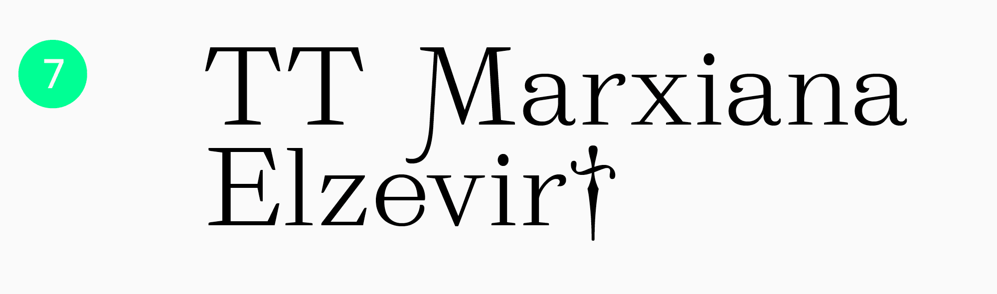
TT Marxiana Elzevier
TT Marxiana Elzevir was created as part of the reconstruction project of a font set used for the magazine called «Niva,» published in Saint-Petersburg during the late 19th to early 20th century. This title or headline font remains modern and versatile despite its historical roots. TT Marxiana Elzevir is a particularly good choice for newspaper and magazine layouts, book design, and literature projects.
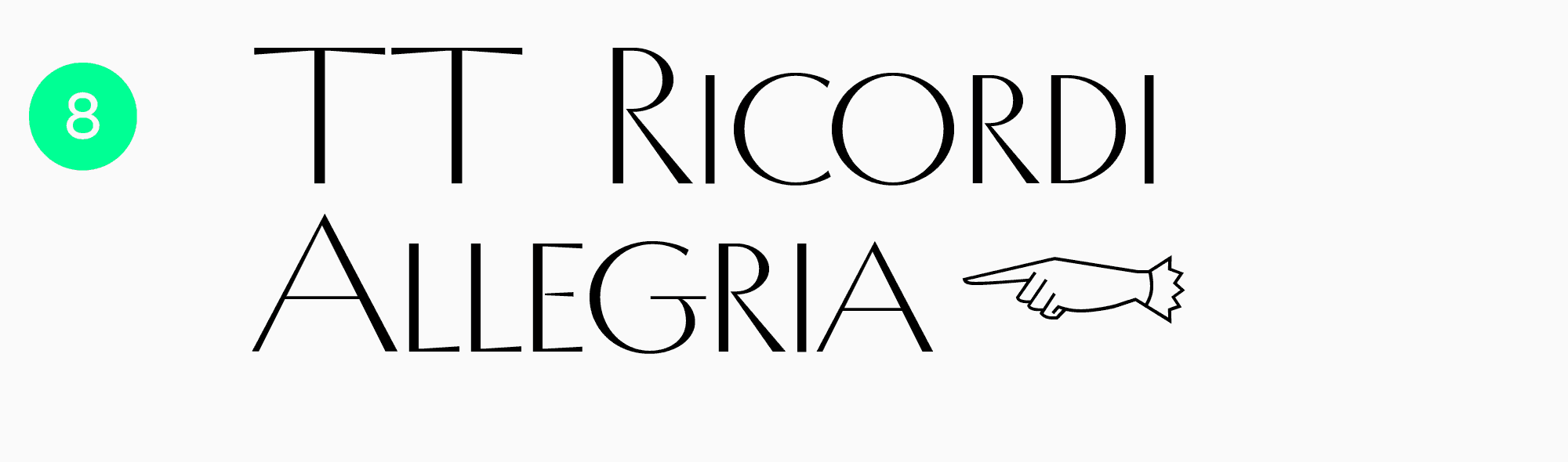
TT Ricordi Allegria
TT Ricordi Allegria draws inspiration from the remains of plaques and inscriptions found within the Basilica di Santa Croce, Florence. This typeface is a high-contrast sans with hyperbolically dynamic proportions, high contrast, and wedge-shaped stroke ends. Besides, it doesn’t feature traditional serifs. TT Ricordi Allegria will emphasize your project’s elegance and exquisiteness.
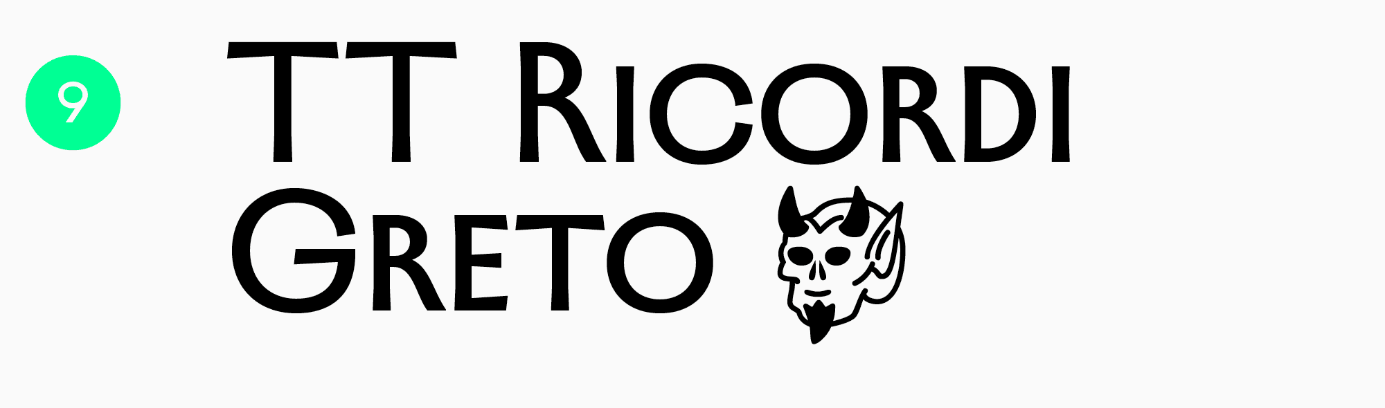
TT Ricordi Greto
TT Ricordi Greto is the first sans serif in our selection. However, some of the Antiqua qualities and hints of serfs remain in this typeface. TT Ricordi Greto is also inspired by a floor plaque dating to 1423, found within the Basilica di Santa Croce, Florence. A blend of historical features and contemporary visual solutions makes this typeface so distinctive. TT Ricordi Greto is a perfect font for magazine covers, poster headings, branding, and web design.
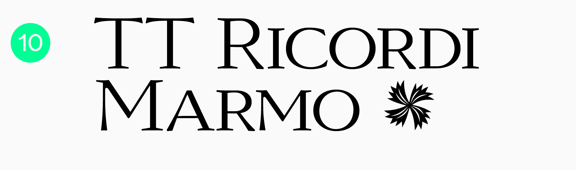
TT Ricordi Marmo
One more serif from the TT Ricordi collection, also inspired by the remains of inscriptions in Basilica di Santa Croce, Florence. This typeface boasts modernity and a free spirit—the features that make it neutral and unusual at the same time. Due to its unique features, TT Ricordi Marmo is rather versatile and will work great in both formal and informal projects.
In addition to the list of TypeType typefaces, here are some free and paid fonts for headings from other studios. This list features captivating and unusual fonts as well as neutral options.
- Futura by Linotype
- Nexa Rust by Fontfabric
- Bree Serif by Type Together
- Proxima Nova by Mark Simonson Studio
- Cooper Black by Adobe Originals
- Museo by exljbris
- Bodoni by Paratype
- Gilroy by Radomir Tinkov
- Helvetica by Linotype
- ITC Avant Garde Gothic by ITC
Conclusion
Choosing a font for headings is always a personal process that depends entirely on your project’s context. In this article, we covered the main criteria of headline font selection and suggested some specific display typefaces. However, don’t be afraid to break the rules and experiment. Analyze other designers’ projects and avoid getting fixated on just one way of mixing typefaces, even if it seems the best option for you. Only through this will you discover your unique style and learn to understand fonts!
FAQ
What’s the difference between text fonts and display fonts?
Text fonts are typically neutral and highly readable, designed for running text. Their main purpose is to be comfortable to read for long periods.
Display fonts are expressive and eye-catching, used for headlines and accents to grab attention.
Can I use the same font for both body text and headlines?
When resources are limited, you can certainly use a single font for both, varying its size and weight. The key is to choose a readable font that looks good at both small and large sizes, like TT Neoris. This Neo-Grotesque works perfectly for body text, while its bolder weights create expressive headlines.
What types of fonts are used for headlines?
Most often, display fonts are used for headlines to attract attention. These are expressive typefaces with more complex designs that work best at sizes of 14 points or larger.
How do I choose a headline font?
To choose a great headline font, consider a few factors:
– It should fit the style of your project, conveying the right emotions and values.
– It should be distinct from your body font to draw the eye. How strong this contrast is depends on your goals.
– It must display correctly on all devices. Pay close attention to this, especially if you’re choosing a free font.
How do I choose a headline font to pair with my body text font?
To find a successful font pairing, use the following criteria:
– Project Suitability: The fonts should match your project’s aesthetic and style.
– Clear Roles: First, choose your primary “”workhorse”” font for body text, and then select a display font for headlines and accents.
– The Principle of Contrast: The fonts in a pair should complement each other in mood but have clear visual differences.