top_banner_ttnormspro0426
Type foundry Blog UniversiTTy: Lesson 3. Your Future Font Sketches: Technique, Digitization, Testing

UniversiTTy: Lesson 3. Your Future Font Sketches: Technique, Digitization, Testing

UniversiTTy: Lesson 3. Your Future Font Sketches: Technique, Digitization, Testing

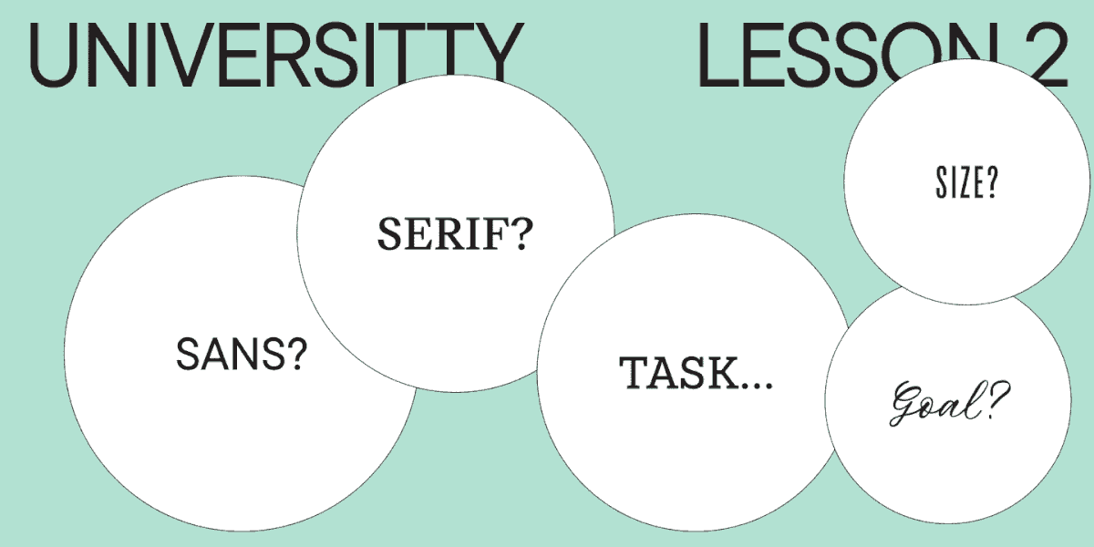
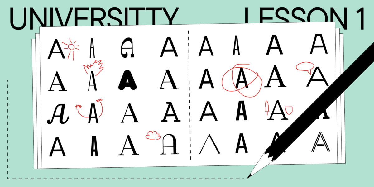
We are here to continue the article series on font design. If you haven’t read our previous article, “How Not to Get Lost When Working on a Font. The Art of Task Outlining”, we recommend you read it first as it is closely connected with the text that follows.

In this article, Julia Gonina—TypeType Art Director and the creator of TT Livret, TT Fellows, TT Autonomous, and TT Ricordi Todi typefaces—will continue sharing knowledge about the initial stages of typeface development. This time, we’ll focus on probably the most creative part of a project—sketching.

Sketching

Every designer has their own preferences when it comes to making sketches. To my mind, there’s no need to insist on one particular way to sketch: the main thing is to choose a convenient technique. I’ll share my personal experience and explain why I work this way and not differently.

I recommend those who are relatively new to the world of font design to draw on paper as much as possible, be it creating something from scratch or copying the letters you like. It will be easier for you to understand the letterforms by carrying them through your own physical experience. When I struggle to discover a particular shape in vector, for example, to draw a pretty & symbol or invent a specific element, I take a piece of paper and start hand-drawing. And, as if by a miracle, my hand “handles” it much better!

Sketching

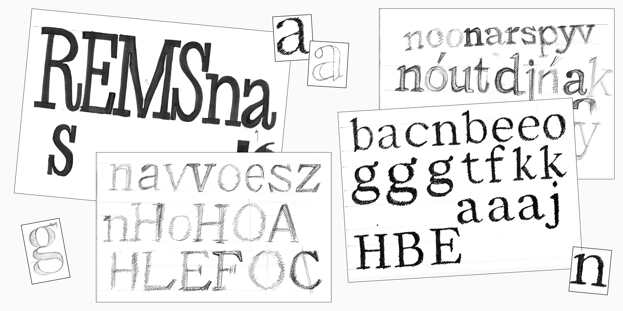
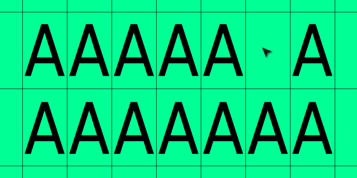
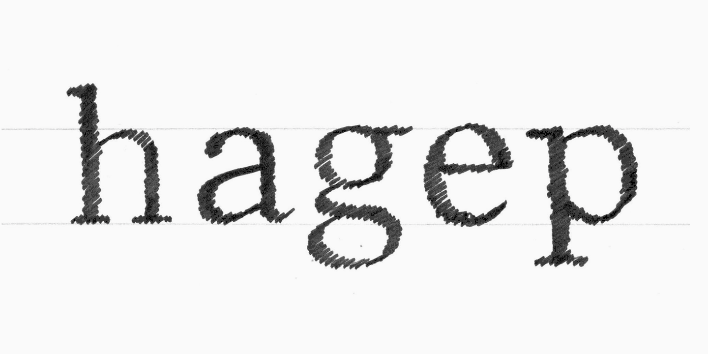
The best way to start is to try characters from different groups: square, rounded, and diagonal. The test words like “handgloves” or “hamburgevonts” are the best-known and suitable for uppercase and lowercase characters, but you can make up your own. I like beginning with the letter “a.” In it, you can see the shape of an arch, the upright characters’ width, and the possible appearance of a bowl and a terminal. It gives a good idea of the overall font’s atmosphere.

If a font has several scripts, for example, Latin and Cyrillic, the work on the font often begins with the Latin alphabet.
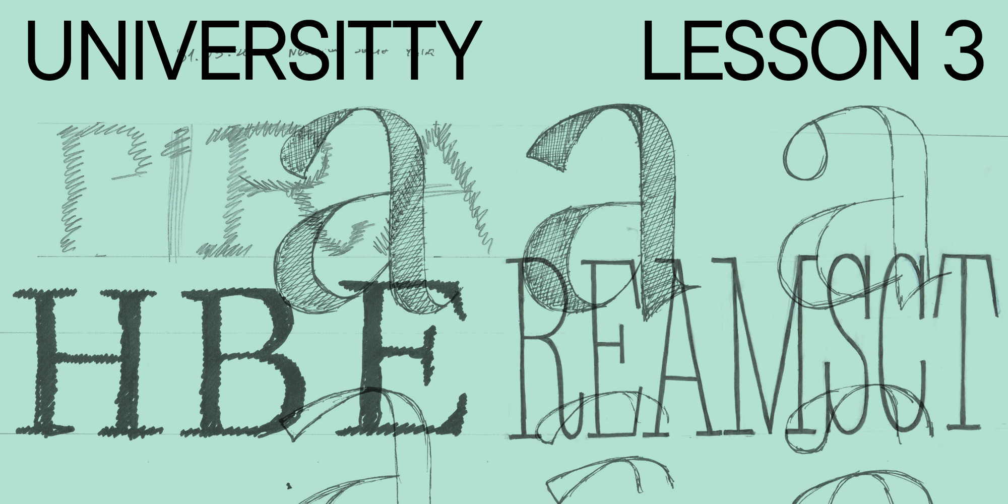
Hand-drawn sketches

1. There are different ways to draw by hand. The most basic one, and also most designers’ favorite, is hatching the shapes. To begin with, you’ll hatch a letter’s skeleton on a piece of paper using a marker. You don’t need to have an outline of a glyph in advance to do that.

Hand-drawn sketches

Note that in this example, the letters are hatched at an angle as if written with a flat nib pen. There is a reason for this. The example sketch was made for a Transitional serif (we have prepared a brief for it in the previous article), meaning that the oval axis in this font will be slanted. This way of sketching helps determine from the beginning how the weight will be distributed on the letter’s skeleton.

I deliberately called this sketch basic: it can become a starting point, a foundation for adding more details to the letterforms. There are also numerous ways to do the detailing.

2. You can continue adding details by hand. If you wish to develop the proportions and the skeleton further, you can keep hatching. Take a piece of tracing paper, place it on top of your sketch, and hatch new versions of the glyphs. This way, you won’t have to draw the letterforms from scratch, and you’ll also keep your first sketch intact.

Hand-drawn sketches

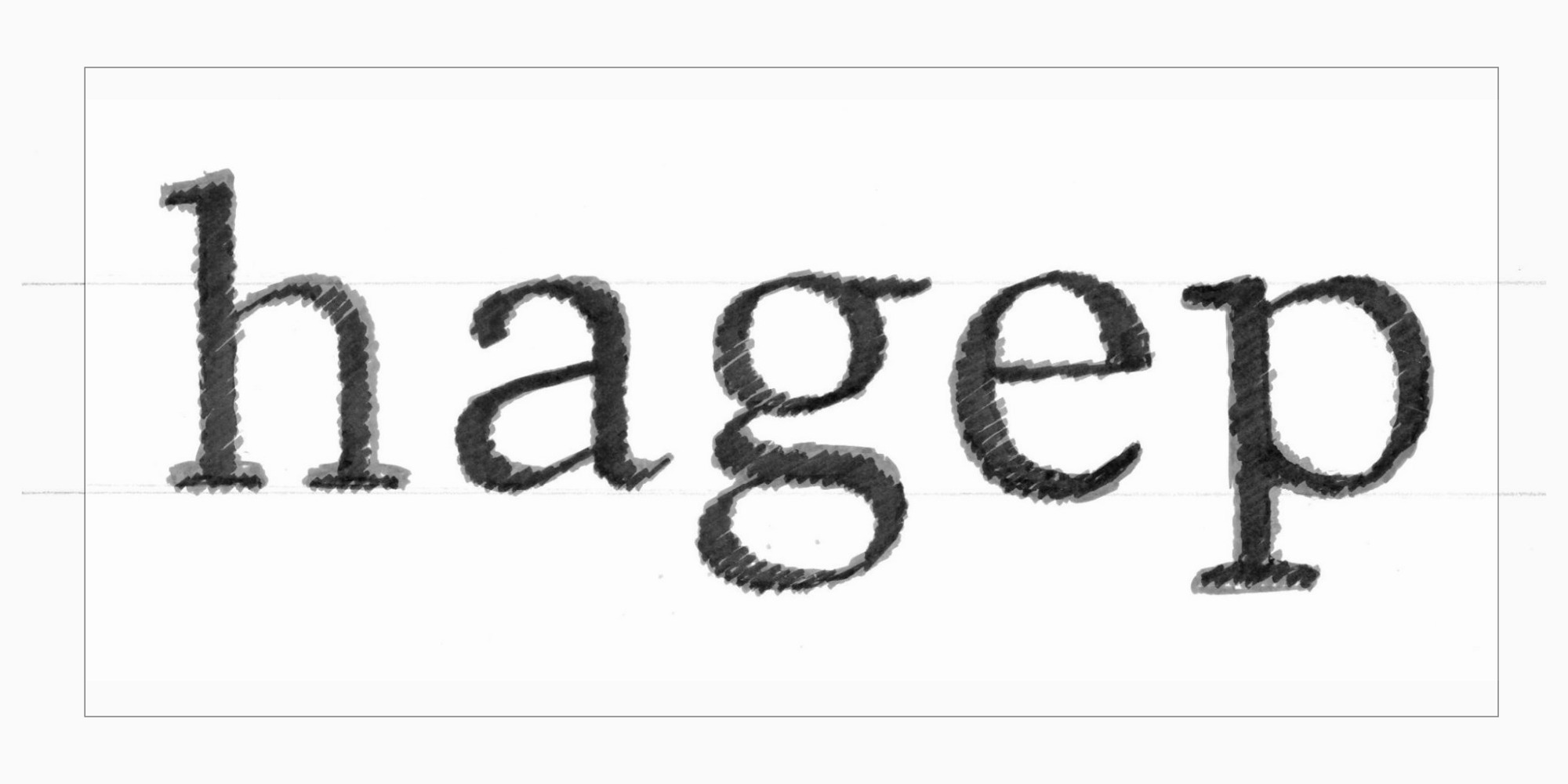
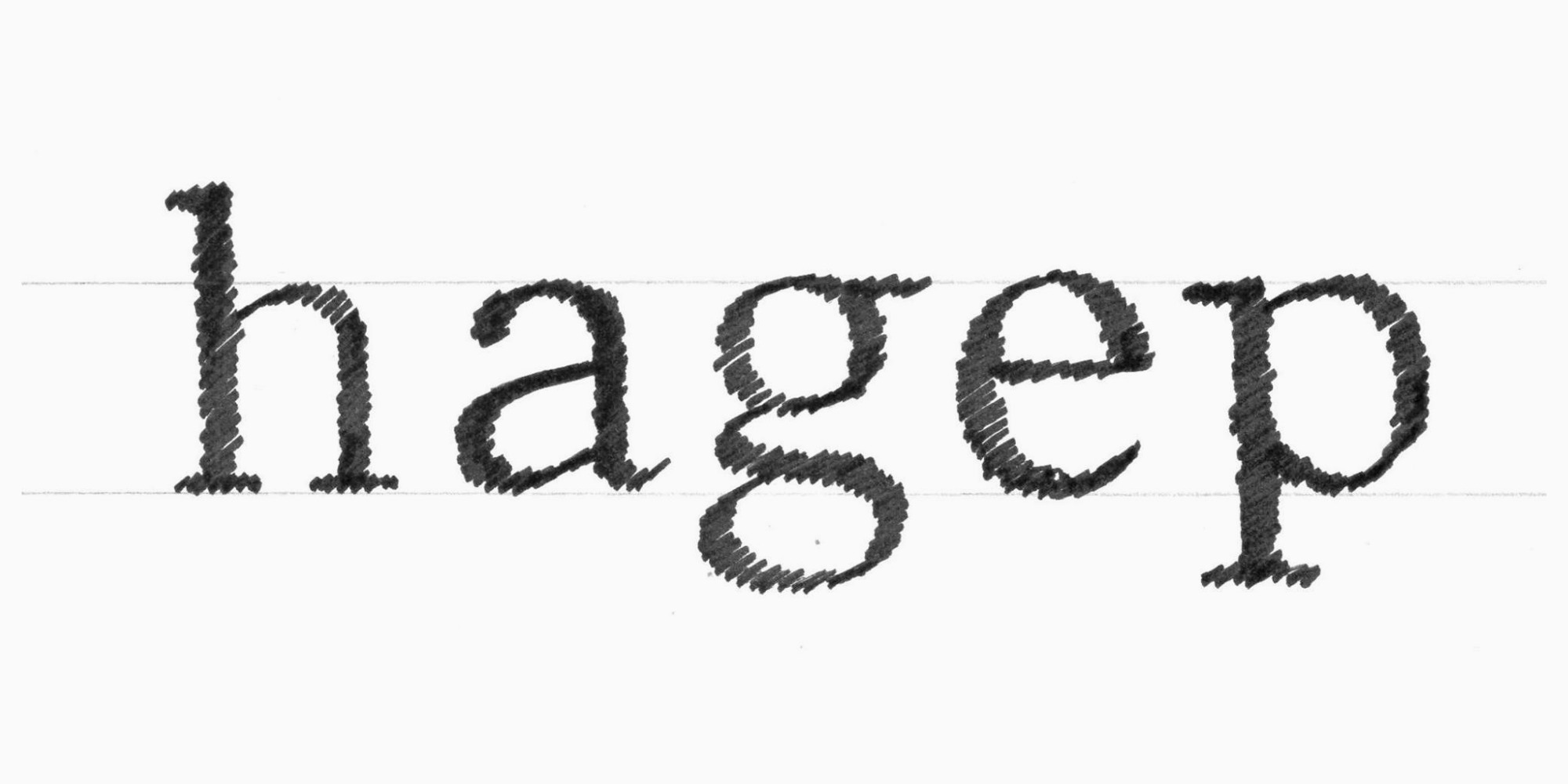
3. When you are happy with the shapes and proportions of the letters, you can continue going deeper into the details. Take tracing paper again and put it on top of your hatched sketch, but this time outline the glyphs with a thinner tool—a liner, for example.

Hand-drawn sketches

By doing this, you’ll go over the finer points, such as terminals, serif shapes, etc. The line here shows how the vector image will look in the font editor. Using line sketching allows you to both fine-tune the entire letterforms and explore their specific parts.

Hand-drawn sketches

4. Next, you can transfer the letters from paper to a font editor and continue polishing them there.

At this stage, you will need to know several basic rules for constructing letter outlines in a font editor:

а. The fewer points you have on the outline, the better;

b. Curves are constructed on extreme points, and more points are added only if they are essential;

Extreme points are the peaks of a curve on the vertical and horizontal axes.

c. The outlines may overlap—that’s convenient and the right thing to do.

There is a detailed, illustrated article on how to outline correctly on the Glyphs font editor website (the rules are the same for all font editors).

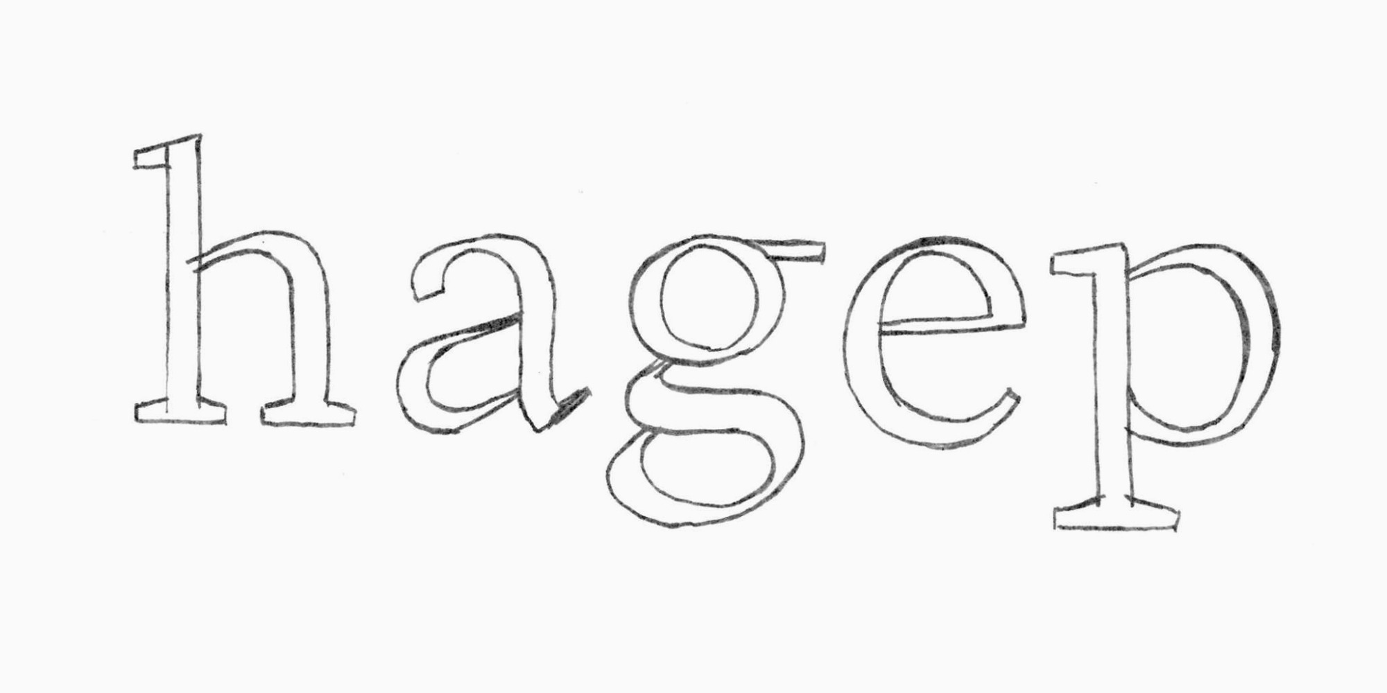
Let’s transfer several characters. To make the example more clear, I’ll place the extreme points directly on the sketch.

Hand-drawn sketches

The outline transferred to a font editor in its raw form often looks worse than it does on paper. Drawings made by hand have that charming sloppiness that covers numerous flaws. Vector images, in their turn, are merciless and precise, they make all imperfections visible. Even if the sketch appears neat, there is still much work ahead when you move to the digital version in the font editor.

That’s why designers often transfer the hatched sketch to the font editor (stages 1 and 2) and then focus on all the details of the letters (stage 3). Sometimes, designers skip the sketching stages and jump right into shaping letters using the font editor. Any option is possible, so how you organize your workflow only depends on your experience and preferences. However, I would recommend novice type designers hand-sketch their first projects.

Testing sketches

Now, what lies ahead is extensive testing and polishing of the font’s idea, along with fine-tuning the details. The way of testing the font is closely tied to the specific task the family will perform (our previous article focused on how to outline such a task). First of all, think about the context where your font will be used and implement your font into it. 

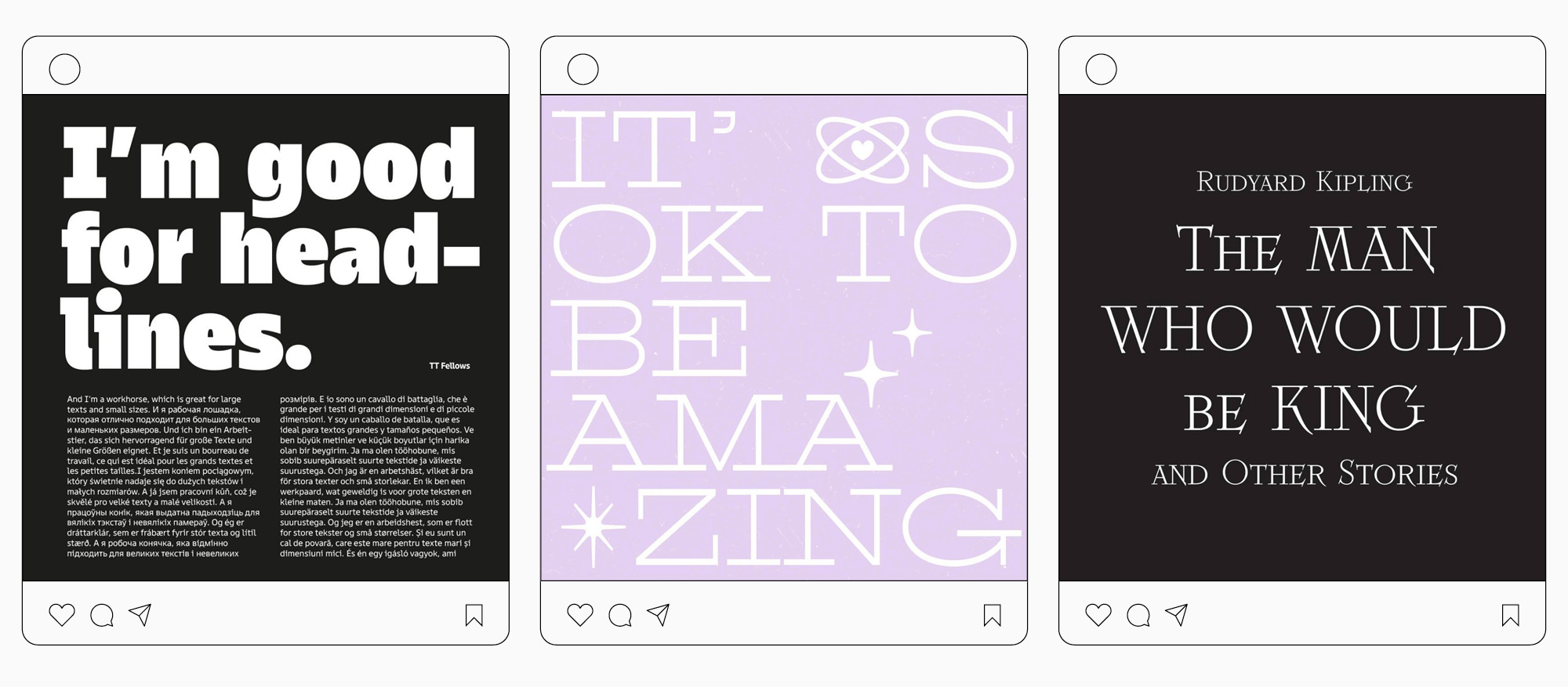
For example, if you are designing a font for interfaces, why not make a mockup in Figma where you can add your font and see how it looks? If you are crafting a text serif, create a museum catalog web page layout with it. Or if your goal is to make an expressive display font, design a poster or even a series of posters. 

Testing sketches

Your character set is still very limited, but it’s not a problem. There are services for generating “texts” using only a few letters (Just Another Foundry, for instance). It’s essential to have proper spacing while drawing letters to be able to analyze the shapes of characters despite their uneven rhythm. We’ll focus on spacing in one of our upcoming articles.

Testing sketches

While working on the letterforms, it’s better to look at them in a large point size, even if you are designing a text font.  Arrange some space on a wall where you will hang all your sketches, test words, poster and mockup printouts, references, and sources of inspiration. This way, you will be able to get a quick overview of the project immediately. You can come closer to this “wall gallery” to take a more careful look at the details or step back from it to see everything on a smaller scale. This makes it more convenient to show your project to someone else, discuss it, and take notes right on the sketches or printouts.

Testing sketches

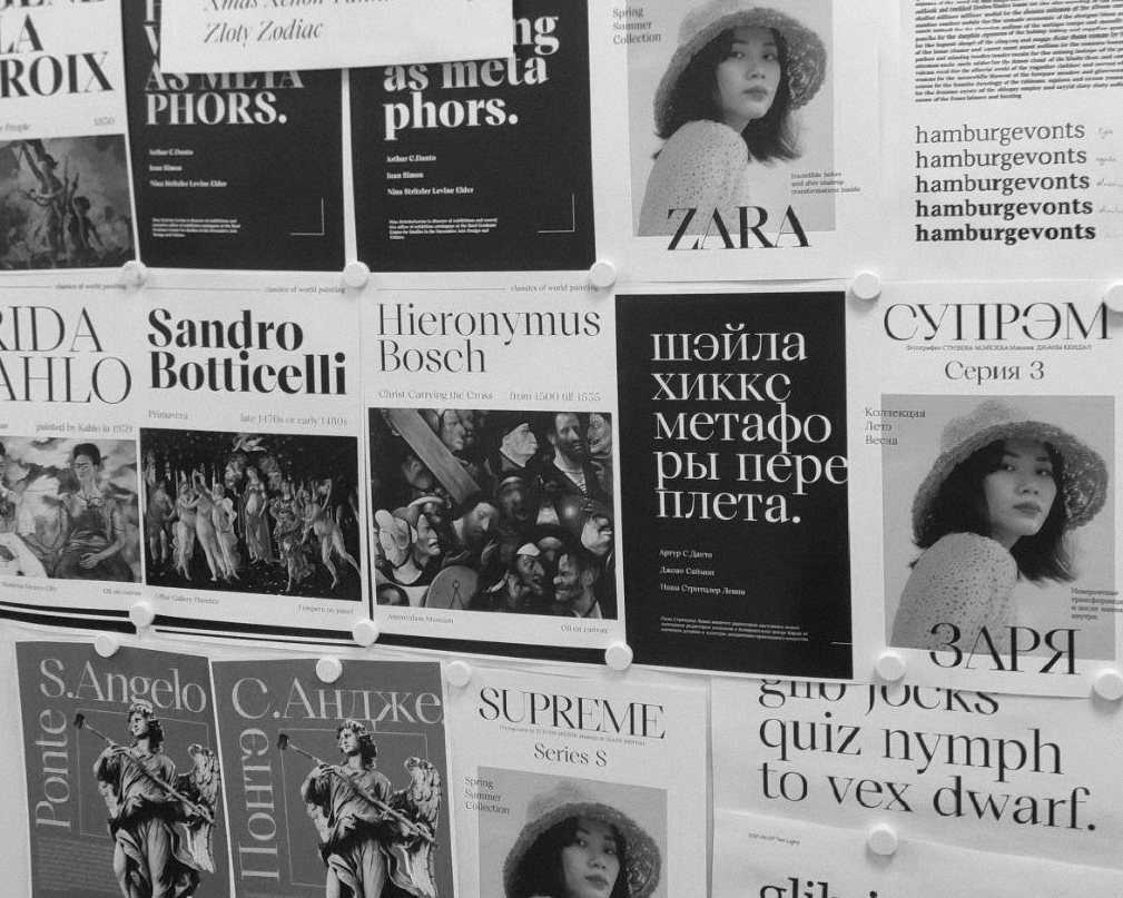
One more way to test your font (both in the sketching stages and beyond), which I personally really enjoy, is to make posts on social media. It may not be the context your font will serve in the future, but this is an actual work assignment the font will be tackling from day one. By watching the font performing in real life, you’ll easily spot imperfections and potential improvements you wouldn’t have thought of during the work process. And you’ll get reactions and opinions from the audience, which is also essential.

Testing sketches

From sketch to vector

Finally, let’s take a look at how an initial sketch can evolve after extensive digital editing. As an example, we’ll take the same functional serif that we have described in the previous article.

From sketch to vector

So, we have come a long way from an idea being brought to life on a piece of paper to its formed and digitized appearance. However, there is still plenty of work to be done. And this is a reason not to miss the upcoming articles!

Previous article UniversiTTy: Lesson 2. How Not to Get Lost When Working on a Font. The Art of Task Outlining
Next article UniversiTTy: Lesson 4. Planning a Font Family

Latest publications

IP Protection as an Art: TypeType’s Flexible Licensing Control Strategy

Drawing on their own experience, the specialists at TypeType explain how type foundries and designers can stop unlicensed use of their products and get additional revenue while avoiding reputational risk. In TypeType’s professional experience the popularity of a typeface is linked to the fact that it will be more likely used without an appropriate license—despite the fact that developing a single family can take years of meticulous work. We covered how font licensing works in detail here.

See more
Font Research: An Expert Approach to Brand Typography

Among TypeType Studio’s services, we offer typeface system research. Why do brands need such research, and how does it help them develop? How is it conducted? What does the research include, and how are the results interpreted? We answer these questions and show how it works in practice using the financial segment as an example.

See more
TypeType’s Year in Review: Looking Back at 2025

2025 was an incredibly productive year for TypeType: we released 7 new fonts, updated 14 typefaces, and added Arabic language support to two of our bestsellers. In addition, we won awards in type design competitions, explored new platforms, improved our website, wrote about type design in our blog, gave lectures, met with you at webinars, and created joint projects with friends and partners.

See more
Typography in the Museum: How We Developed the Corporate Typeface for the Hermitage

The TypeType team, with the support of the Mantera Group, has created a new font family for the State Hermitage Museum—the Hermitage Type Family. The typeface will be used across all of the Hermitage’s digital content; you can already see it on the website and the updated launch page of the mobile version. And this is just the beginning of a major overhaul of the museum’s digital identity, in which the new font will play a pivotal role.

See more
Proxima Nova Font: Alternatives, Pairings, and the Secrets of Its Popularity

Proxima Nova is one of the most recognizable sans-serif fonts in modern design. In this article, we’ll explore the history of the Proxima Nova font family, its graphic characteristics and composition, figure out what fonts go with Proxima Nova, what its best alternatives are, and what license you need to use it.

See more
The Perfect Moment Is Now: Launching Our Creative Lab, TT Labs

We spent a lot of time thinking about how to find a place for creative freedom within this system, how to set aside time for small passion projects, how to step outside our usual boundaries, and how to give spontaneity a chance. And we realized that the perfect moment will never come unless you take the first step. So we took it—and that’s how the TT Labs creative laboratory was born. Here’s the story from the beginning!

See more
What is Typography in Graphic Design: Key Concepts, Principles, and Examples

Discover what typography is, why it’s important in design, and how to apply its main principles, styles, and rules to create visually strong text.

See more
A Font with a Wide Reach: A Special Project for SHIFTBRAIN’s 20th Anniversary

In 2023, the Japanese marketing agency SHIFTBRAIN launched an interactive website dedicated to the company’s 20th anniversary. For this project, the TypeType team developed a unique variable font capable of stretching to extreme horizontal widths. As a foundation, we used the bestseller TT Norms® Pro, which was already the company’s corporate typeface—you can see it on the main SHIFTBRAIN website.

See more
Pangrams Explained: Meaning, Types, Usage and Complete List of Examples

If you’re interested in design, you’ve almost certainly come across the famous sentence about the quick brown fox and the lazy dog. Or perhaps one about a jived fox nymph and a quick waltz. These are pangrams—sentences that contain all the letters of the alphabet. In this article, we’ll provide a more detailed pangram definition, explain why these phrases are so important, and provide a list of the most popular pangrams in English.

See more

See more

The Impact of Fonts in Web Design on User Experience

In the ever-evolving landscape of web design, it’s not just the vibrant visuals or interactive elements that grip a visitor’s attention. Lurking quietly, yet undeniably powerfully, typography plays a pivotal role in shaping a user’s experience. Fonts, often overlooked, are the silent narrators of the digital tales we traverse daily.

See more
15+ Best Fonts for Logo Design in 2025

A logo is an indispensable part of any brand’s identity. All logos can be roughly subdivided into 3 large groups: emblems/brandmarks, wordmarks, and combination marks. Brandmarks always accentuate the symbol, whereas fonts often take on a leading role in the other two types of logos. In this article, we’ll focus on how to find this perfect match and provide the list of 15 best fonts for logo design from the TypeType collection, which are trending in 2025.

See more
UniversiTTy: Lesson 2. How Not to Get Lost When Working on a Font. The Art of Task Outlining

Before you begin designing letters and forming the font, it is essential to carry out initial preparation to get a clear idea about the project’s outcome. In this article, we will focus on the essence of this preliminary stage and the importance of this work, describing and analyzing the process of task outlining.

See more
4 Quick Ways to Identify Fonts Used on Websites

Enthusiastic designers are constantly on the lookout for new fonts. Not only while they are working. You can notice new fonts to add to your collection while scrolling social media, browsing brands’ websites, and even playing your favorite video games. All that is left is a technical aspect: to identify a font family used in the project and purchase a license for it. There are many ways of identifying fonts. In this article, we will cover the easiest ones.

See more
Best Fonts for Books: How to Choose

Web and printing in typography are two different worlds. At least, they are often presented this way. In reality, many typefaces can be used in both domains. To understand what typeface to choose, it is important to know the differences between book fonts and web fonts. This article covers the topic of fonts for books and how to choose the best typeface for book design, magazines, or any other printed material.

See more
UniversiTTy: Lesson 1. Typeface Categories

This article is not an ordinary one. If you have not heard about it yet, we have launched a new project for everyone who is in love with fonts. As part of this initiative, we will release articles on typography regularly. Each article of the series will explore one useful subject. The main thing is that you will not only immerse yourself in the industry but also meet our wonderful TypeType team of typography experts as they share their knowledge and experience. 

See more
Monospaced Fonts in Design and Coding

Monospaced fonts are actively gaining popularity among designers. What is even more interesting is that the scope of their application is also expanding.
The times when fonts like these were only used for coding have gone. Today monospaced fonts adorn the pages of magazines, the packages of popular brands, signs and menus, websites, and more.

See more
TypeType Online Store: We Accept Card Payments for Your Convenience

Looking for a simpler and faster way to purchase fonts? Let us show you how! Below, you will find a detailed guide on the TypeType store features. Also, get ready for a pleasant surprise at the end of the article!

See more
In Honor of Andrey Kolmogorov’s 120th Birthday: a Typeface Crafted from the Scientist’s Handwriting

It is often believed that by analyzing a person’s handwriting, you can make judgments about their character. However, why judge someone when it is possible to create a typeface out of the handwriting of a person who made a significant contribution to science? In this article, we delve into a project of this kind.

See more