top_banner_basettnormspro
TT Turns
19 الأوزان
الرئيسيةالخطوط والأنماطبدون الذناباتTT Turns

TT Turns

TT Turns — خط غروتيسك هندسي لافت يتميّز بعناصره المعبرة. إنه خط متعدد الاستخدامات يعمل بشكل ممتاز في النصوص، وفي الأحجام الكبيرة يتحول إلى خط عرض مميز.
نمط واحد: من $47.99
العائلة الكاملة: من $329 19 الأوزان

خيارات الشراء

اختر الخطوط والتراخيص التي تريدها ثم، اضغط على زر "إضافة إلى السلة".

هل لديك أي أسئلة حول الخط أو التراخيص؟ اكتب لنا.

اختر الخطوط التي تريدها

عرض الحزمة:
لكل نمط $17.32
من  $329
19 الأوزان
من  $329
من $47.99
من $47.99
من $47.99
من $47.99
من $47.99
من $47.99
من $47.99
من $47.99
من $47.99
من $47.99
من $47.99
من $47.99
من $47.99
من $47.99
من $47.99
من $47.99
من $47.99
من $47.99
من $279
عرض الحزمة:
لكل نمط $15.50
من  $279
18 الأوزان
من  $279
من $47.99
من $47.99
من $47.99
من $47.99
من $47.99
من $47.99
من $47.99
من $47.99
من $47.99
من $47.99
من $47.99
من $47.99
من $47.99
من $47.99
من $47.99
من $47.99
من $47.99
من $47.99
من $279
1نمط
من $279
من $279

هل لديك أي أسئلة حول الخط أو التراخيص؟ اكتب لنا.

اختر تراخيص الخطوط

يجب عليك تحديد حزمة الخطوط أو النمط قبل اختيار الترخيص.

اختر التراخيص التي تحتاجها.

حسب الطلب
حسب الطلب
حسب الطلب
حسب الطلب
حسب الطلب
حسب الطلب
حسب الطلب
حسب الطلب
حسب الطلب
حسب الطلب
لا عناصر محددة
الإجمالي
$0

المختبرون

TT Turns
الحجم
Features
تشغيل الكل

A Fresh Take on the Symbiosis of Geometric and Humanist Styles

TT Turns
الحجم
Features
تشغيل الكل

The main idea behind the TT Turns font family was to create a new, universal typeface that could be used with equal effectiveness in virtually any field. The font is meticulously calibrated and built on a foundation of strictly balanced proportions, making it a worthy alternative to classic grotesques. The font’s character remains neutral while still feeling contemporary. During the design process, unique elements were added to the font: special terminals in the letters ’a’ and ’g’, as well as specific forms characteristic of a broad-nib pen in the Cyrillic ’Дд’ and ’Лл’. These details give the typeface a slight display quality—about 5%—which becomes its key feature and helps it stand out from other fonts. We have also included numerous OpenType features in the font, significantly expanding its capabilities. Six stylistic sets are available that replace individual characters with alternate forms: the first set changes the ’a’ to a single-storey form, the second gives the ’G’ a more geometric form, the third replaces the ’g’ with a two-storey variant, the fourth adjusts the junction of the diagonals in ’Kk’, the fifth changes the tail of the ’Q’, and the sixth makes the tail of the ’y’ straight.

TT Turns
الحجم
Features
تشغيل الكل

The typeface includes 19 styles: 9 upright, 9 italics, and 1 variable font

TT Turns
الحجم
Features
تشغيل الكل

We’ve added a 5% touch of friendliness and uniqueness

TT Turns
الحجم
Features
تشغيل الكل
Variable axes
Weight
Slant

Quake is a legendary sci-fi shooter

الأزواج المثالية للخطوط مع TT Turns.

What is a font pair, and what does it serve for?

A font pair is a combination of two fonts within one text block. Most often, one of the fonts in a pair is a more expressive headline font, and the other one serves to communicate information. Such fonts complement each other and help designers solve various tasks, like highlighting key elements, adding emotional expressiveness to the project, or separating semantic blocks.

How to choose fonts for a project: Several general recommendations

To begin with, establish the project’s tone. Choose the fonts that stylistically match the main idea. After that, you need to determine the functions of each font in the project and their hierarchy: which font will complement the design and which one will serve to attract attention as the main element. You need to assess the difference between the fonts and decide what kind of information each of them should convey. First, we recommend choosing the base font you will use most, and then you can find a suitable pair for it.

Core principles of font pairing and recommendations from designers

The main rule you should follow when matching two fonts is that both similarities and differences must be visible between them. You can highlight the coherence of fonts by the following characteristics: contrast, proportions, width, openness of characters, individual letter shapes, and overall tone. Feel free to experiment with different combinations. We also recommend analyzing the projects you like: this way, you can enhance your visual skills, elevate your knowledge base, and gain confidence in dealing with typography.

الوصف

حول عائلة الخط TT Turns
230+ دعم اللغات

تعرّفوا على الخط الجديد TT Turns — أساسي ومميز في الوقت نفسه!

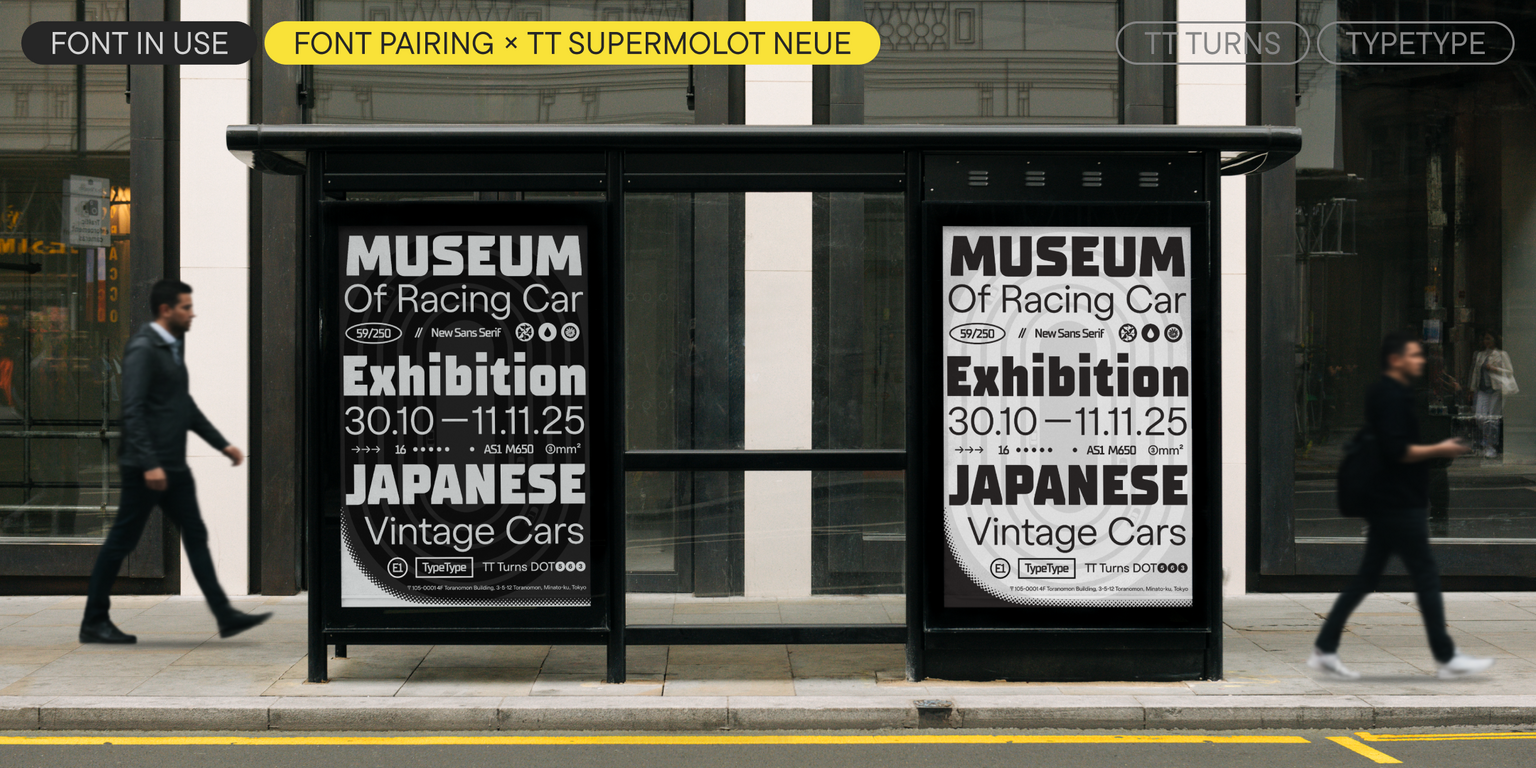
TT Turns — خط غروتيسك هندسي يتميّز بالرموز الدائرية البارزة والعناصر المتدلية المعبرة. إنه خط متعدد الاستخدامات يجمع بين البساطة وسهولة القراءة في الأحجام الصغيرة، بينما يتحول في الأحجام الكبيرة إلى خط عرضي يُظهر شخصيته بأقصى قوة.
إنه خط حيوي، قوي وديناميكي — ويتجلى ذلك بوضوح خاص في الأوزان المائلة.

في حروف «Kk» و«Жж» تلتقي الأقطار بالجذع بزاوية حادة، مما يُشكّل مثلثًا واضحًا من المساحة البيضاء ويُضيف حدة إلى التصميم.
ومن بين السمات المميزة الأخرى: النهايات المنحنية البارزة في «Ss» و«Cc» و«a» و«Ээ» و«Зз»، والساق المعبرة في «R»، والخطوط البارزة بوضوح في الجوانب اليسرى من «Лл» و«Дд».

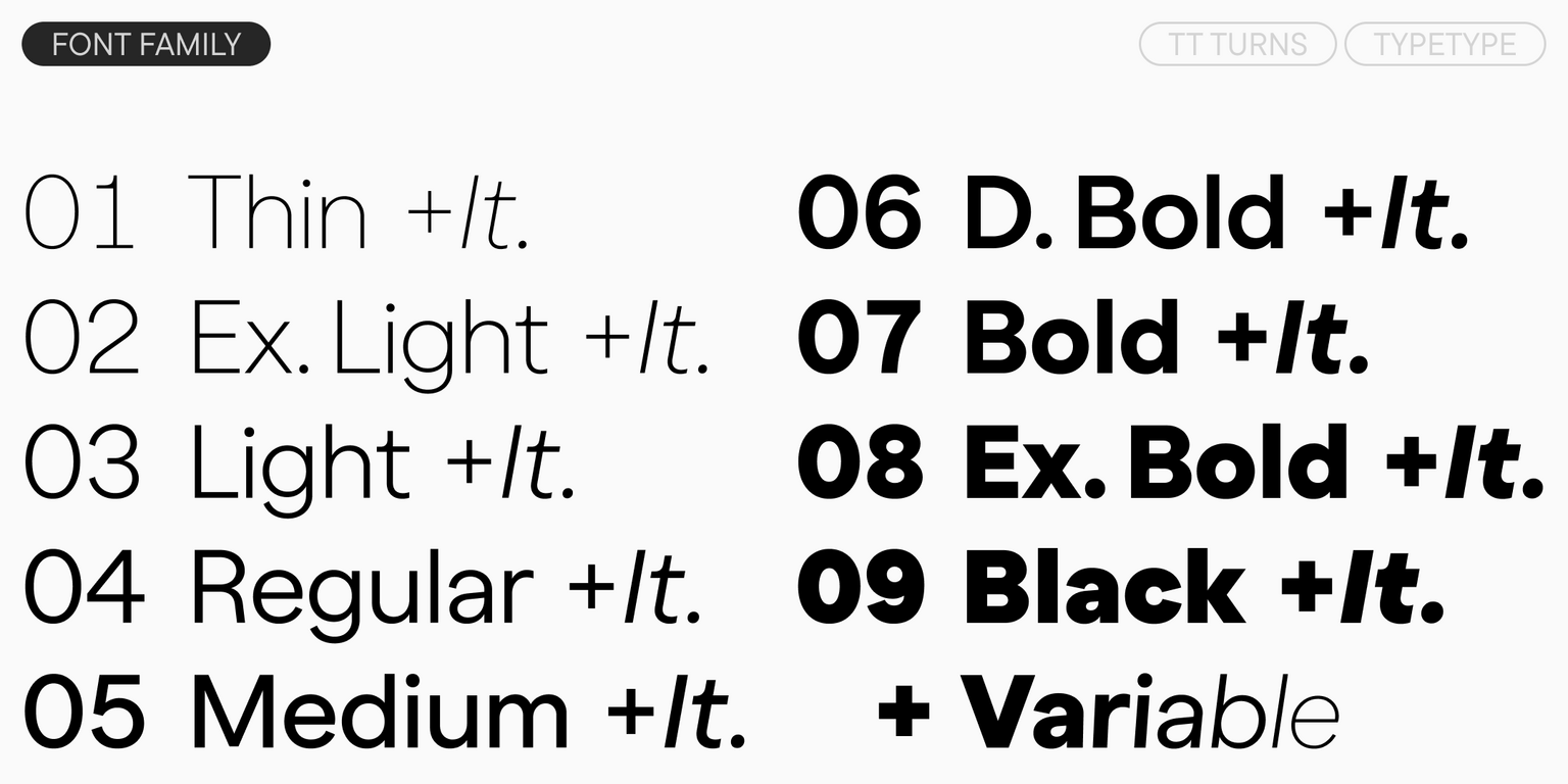
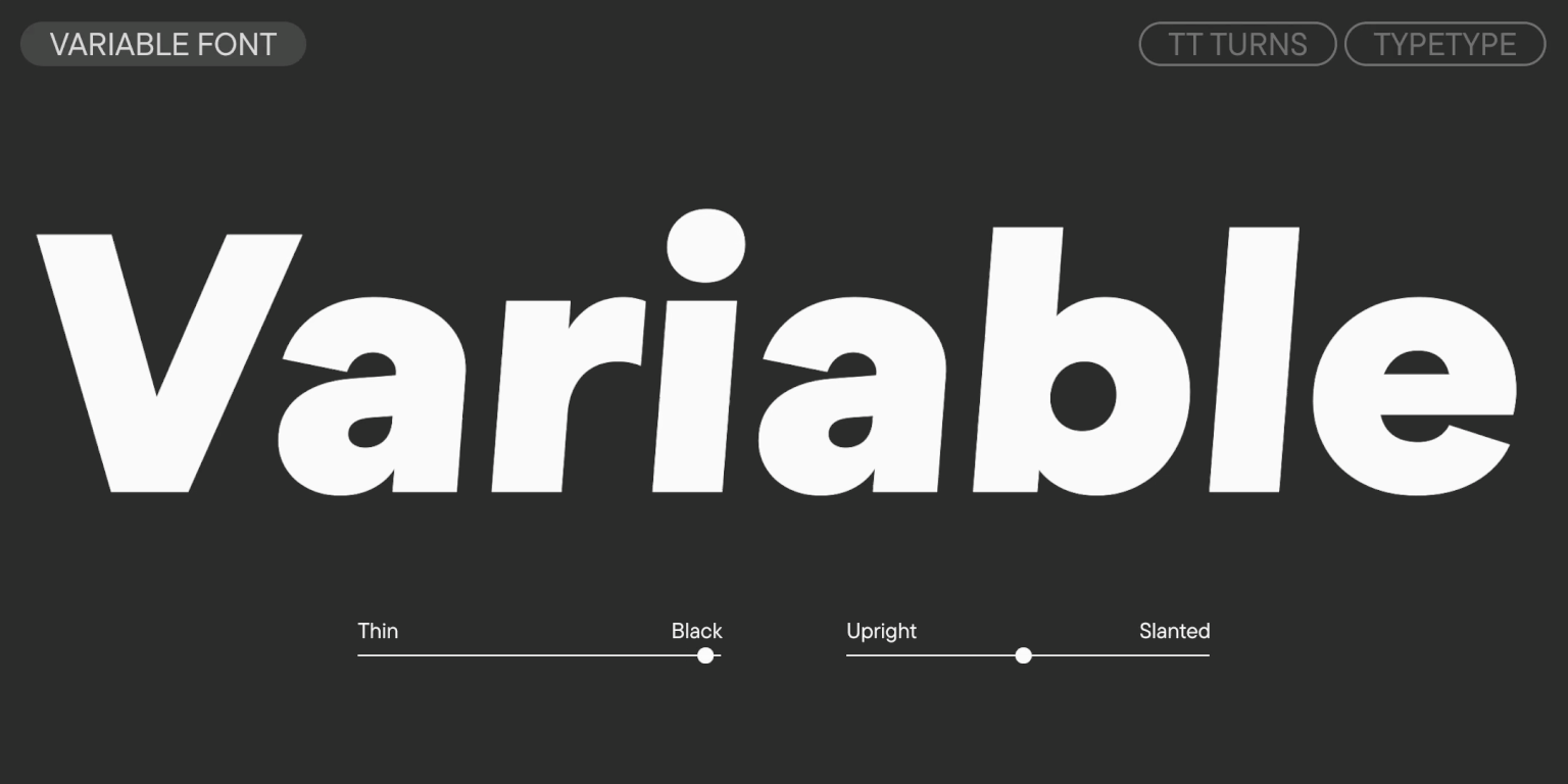
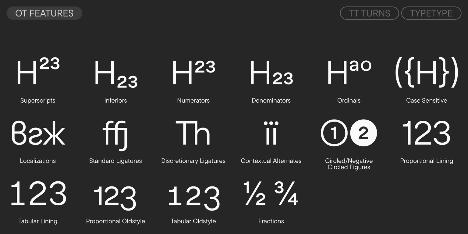
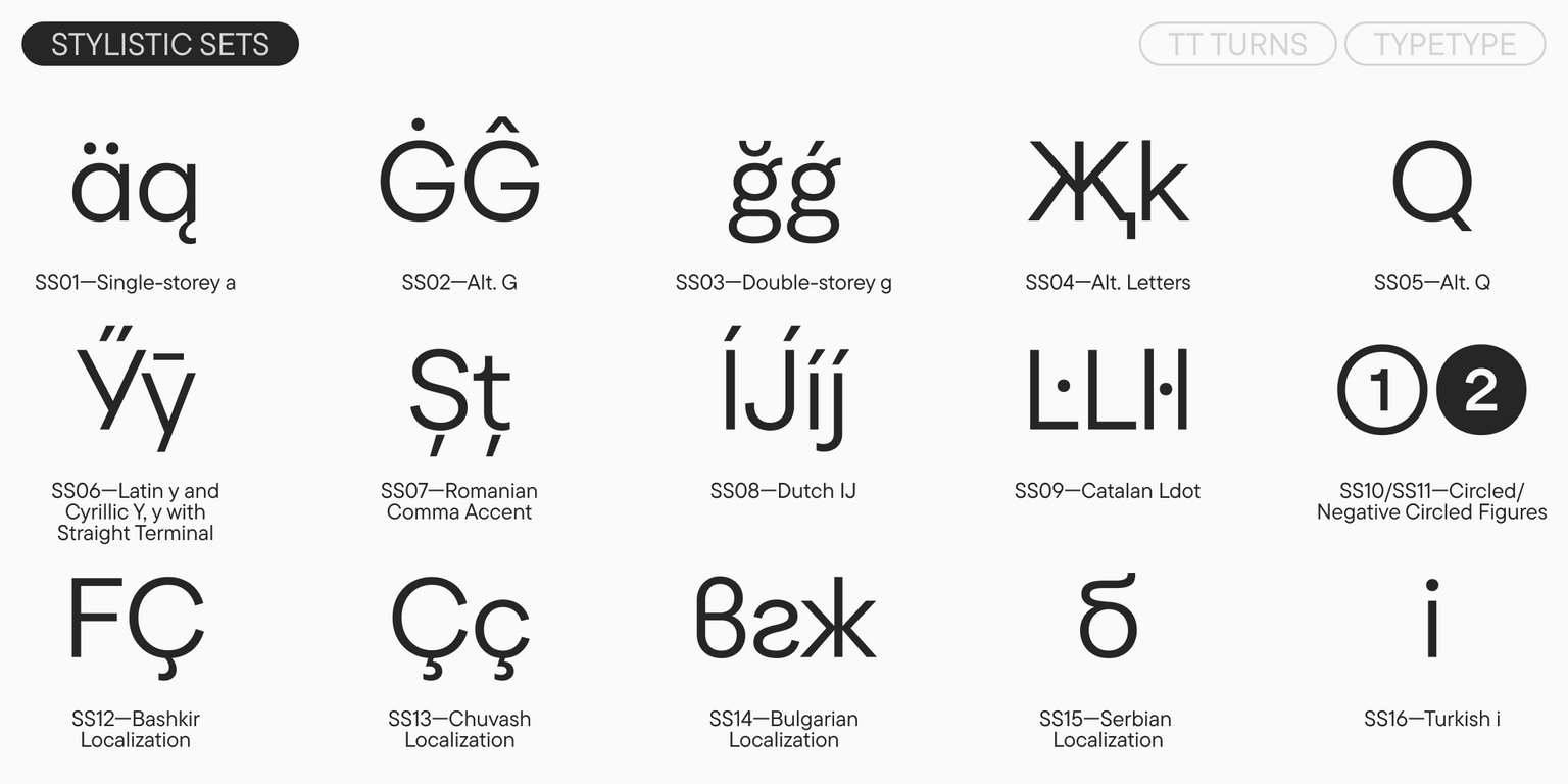
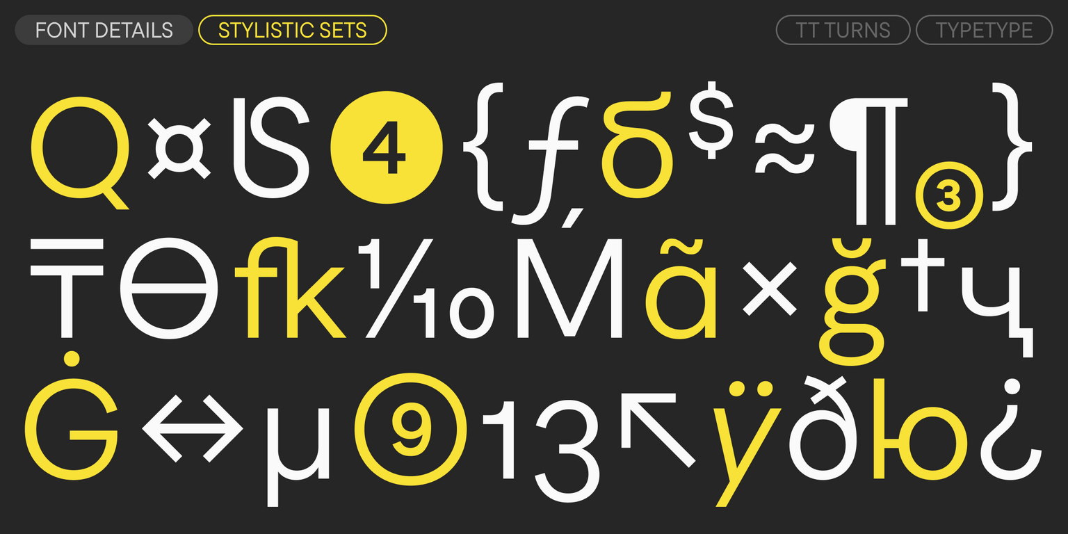
يمكن منح الخط مزيدًا من الطابع الزخرفي باستخدام المجموعات الأسلوبية المميزة. فعلى سبيل المثال، يمكن استبدال شكل «a» من مزدوج إلى أحادي، وتحويل «g» من أحادي إلى مزدوج، وتغيير شكل «G» إلى شكل دائري، وتعديل الغليفات «Жж» و«Кк» و«Kk»، أو تغيير شكل ذيل «Q». أما إذا كنت ترغب، على العكس، في جعل المظهر أكثر هدوءًا وتوازنًا، فيمكنك استخدام مجموعة تحتوي على أشكال أكثر انضباطًا لذيول «Уу» السيريلية و«y» اللاتينية. يحتوي الخط أيضًا على روابط، والعديد من ميزات OpenType التي توسّع من إمكانياته، بالإضافة إلى نسخة متغيّرة يمكن تعديلها عبر محوري السماكة والميلان.

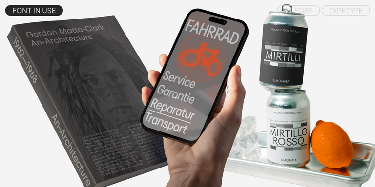
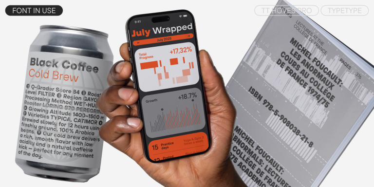
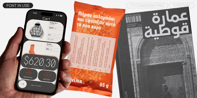
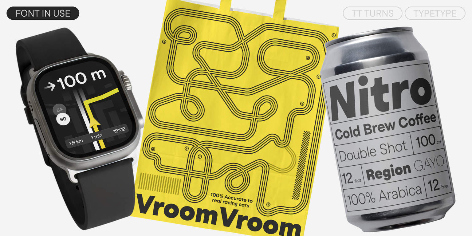
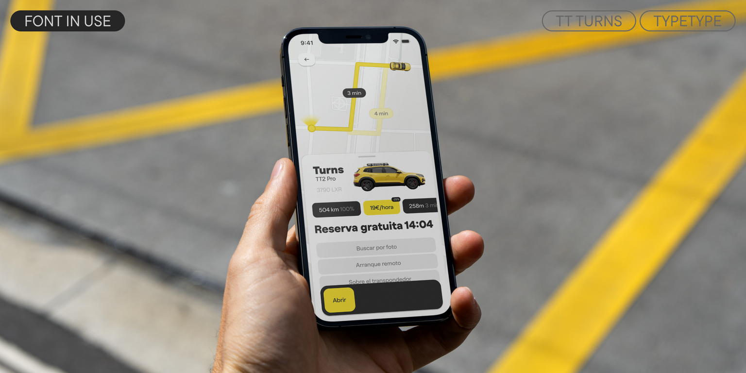
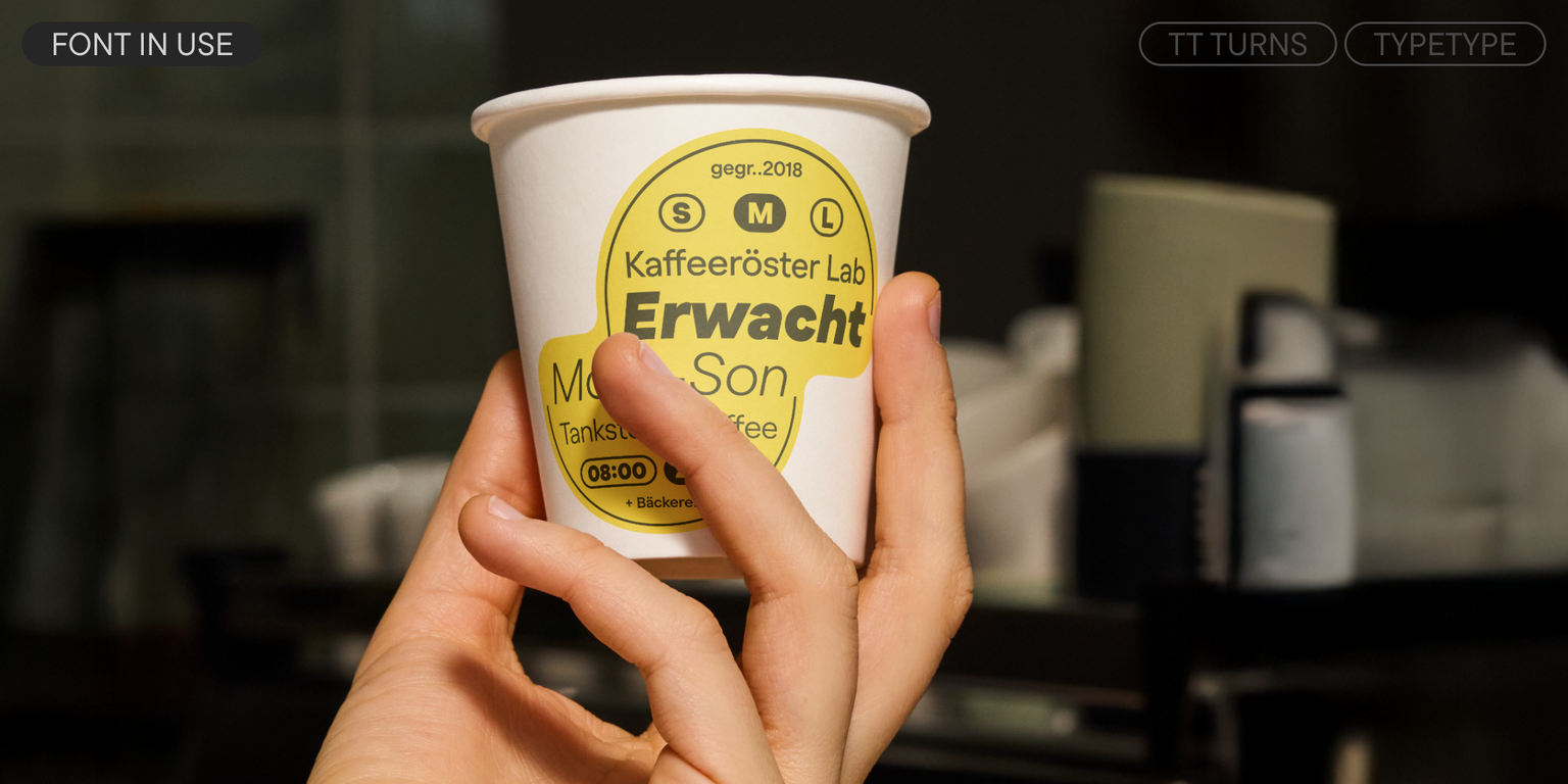
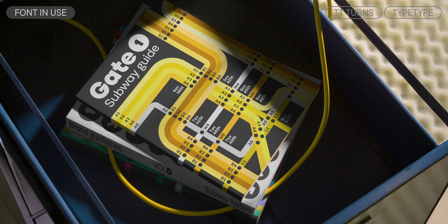
يُناسب TT Turns مجموعة واسعة من الاستخدامات: من النصوص، والمواقع الإلكترونية، والتطبيقات، إلى الهوية البصرية وتصميم العبوات. يمكن استخدامه بفعالية متساوية تقريبًا في أي مجال.
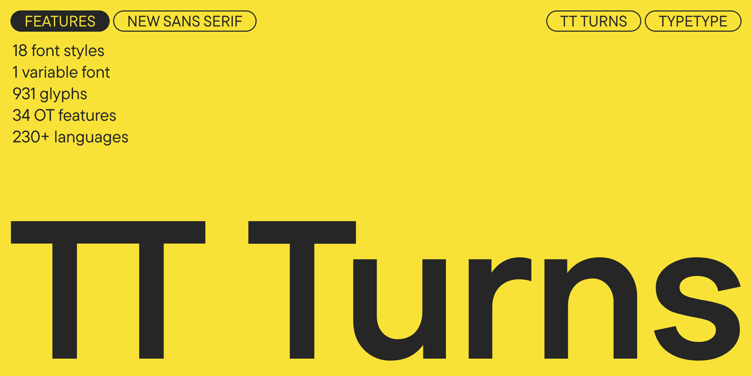
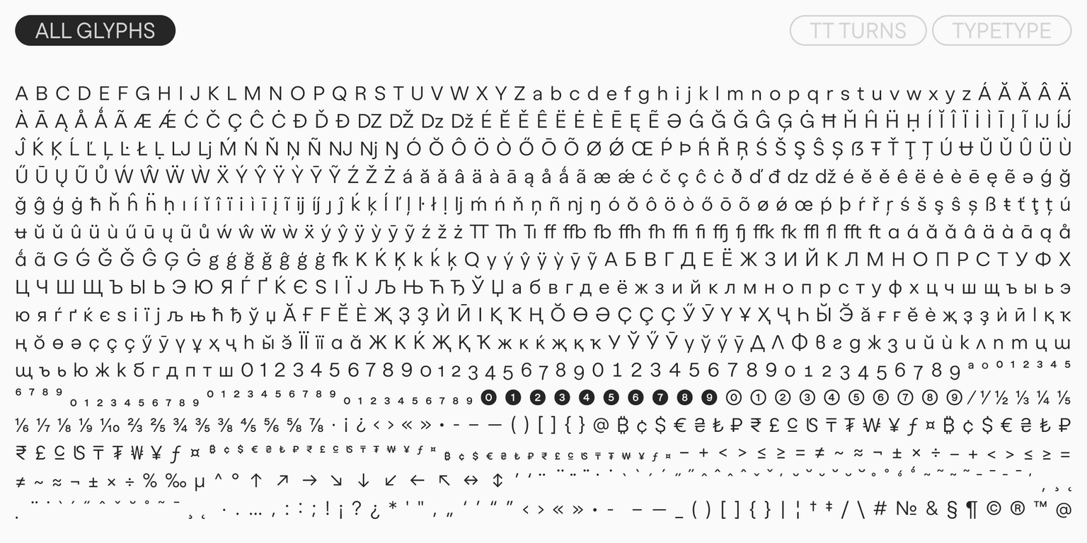
يحتوي TT Turns على:

  • 19 وزنًا: 9 مستقيمة، 9 مائلة، وخط متغيّر واحد؛
  • 931 رمزًا في كل وزن؛
  • 34 ميزة OpenType؛
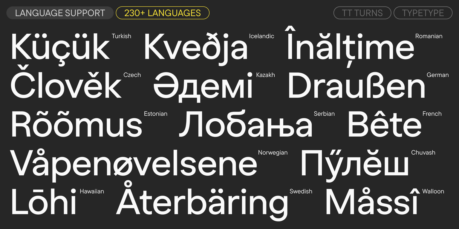
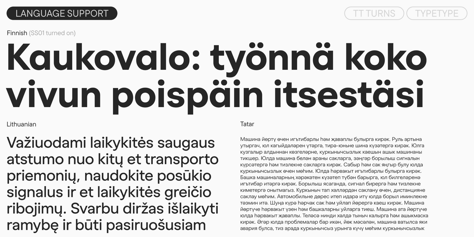
  • دعم لأكثر من 230 لغة.

تاريخ الإصدار

نوفمبر 25, 2025

إضافي

عينة

تنزيل عينة الخط (PDF)

الرسومات الإعلانية

العرض التقديمي على Behance

إصدارات مخصصة

هل تبحث عن إصدار مخصص من هذا الخط؟

نظام الكتابة المتد + عرض الكل

مجموعة الأحرف

اللاتينية الأساسية السيريلية الأساسية Extended Latin Extended Cyrillic Fractions Proportional Lining Figures and Currencies Other Figures Punctuation and Symbols Math Symbols Arrows
A B C D E F G H I J K L M N O P Q R S T U V W X Y Z a b c d e f g h i j k l m n o p q r s t u v w x y z
А Б В Г Д Е Ё Ж З И Й К Л М Н О П Р С Т У Ф Х Ц Ч Ш Щ Ъ Ы Ь Э Ю Я Ѓ Ґ Ќ Є Ї Љ Њ Ћ Ђ Ў Џ а б в г д е ё ж з и й к л м н о п р с т у ф х ц ч ш щ ъ ы ь э ю я ѓ ґ ќ є ї љ њ ћ ђ ў џ
Á Ă Ǎ Â Ä À Ā Ą Å Ǻ Ã Æ Ǽ Ć Č Ç Ĉ Ċ Ð Ď Đ DZ DŽ Dz Dž É Ĕ Ě Ê Ë Ė È Ē Ę Ə Ǵ Ğ Ǧ Ĝ Ģ Ġ Ħ Ȟ Ĥ Í Ĭ Î Ï İ Ì Ī Į Ĩ IJ Ĵ Ķ Ĺ Ľ Ļ Ŀ Ł LJ Lj Ń Ň Ņ Ñ NJ Nj Ŋ Ó Ŏ Ô Ö Ò Ő Ō Õ Ø Ǿ Œ Þ Ŕ Ř Ŗ Ś Š Ş Ŝ Ș Ŧ Ť Ţ Ț Ú Ʉ Ŭ Ǔ Û Ü Ù Ű Ū Ų Ů Ũ Ŵ Ý Ŷ Ÿ Ȳ Ź Ž Ż á ă ǎ â ä à ā ą å ǻ ã æ ǽ ć č ç ĉ ċ ð ď đ dz dž é ĕ ě ê ë ė è ē ę ə ǵ ğ ǧ ĝ ģ ġ ħ ȟ ĥ ı í ĭ î ï i ì ī į ĩ ij ȷ ĵ ķ ĺ ľ ļ ŀ ł lj ḿ ń ň ņ ñ nj ŋ ó ŏ ô ö ò ő ō õ ø ǿ œ þ ŕ ř ŗ ś š ş ŝ ș ß ŧ ť ţ ț ú ʉ ŭ ǔ û ü ù ű ū ų ů ũ ŵ ý ŷ ÿ ȳ ź ž ż
Ӑ Ғ Ӗ Ѐ Җ Ҙ Ѝ Ӣ Ӏ Қ Ҡ Ң Ө Ә Ҫ Ӳ Ӯ Ү Ұ Ҳ Ҷ Һ ӑ ғ ӗ ѐ җ ҙ ѝ ӣ ӏ қ ҡ ң ө ә ҫ ӳ ӯ ү ұ ҳ ҷ һ
½ ¼ ¾
0 1 2 3 4 5 6 7 8 9 ¢ $ £ ¥ ƒ ¤
¹ ² ³
· . ... , : ; ! ¡ ? ¿ * ' " « » - _ ( ) [ ] { } | ¦ / \ # & § © ® @ ª º
+ < > = ~ ¬ ± × ÷ % µ ° ^

ميزات OpenType

ss01 | Single-storey a

ă â ä ą

ă â ä ą

ss02 | Alternative G

Ǵ Ğ Ĝ Ģ

Ǵ Ğ Ĝ Ģ

ss03 | Double-storey g

ǵ ğ ǧ ĝ

ǵ ğ ǧ ĝ

ss04 | Alternative Letters

Қ Ҡ ḱ ķ

Қ Ҡ ḱ ķ

ss05 | Alternative Q

Q

Q

ss06 | Latin y and Cyrillic Y, y with straight terminal

Ў Ӳ ŷ ÿ

Ў Ӳ ŷ ÿ

عرض الكل
شراء الخط