top_banner_ttnormspro0426
TT Turns
19 Stile
SchriftstudioSchriftarten & StileSans SerifTT Turns

TT Turns

TT Turns — eine auffällige geometrische Groteskschrift mit ausdrucksstarken Elementen. Es handelt sich um eine universelle Schriftart, die sich hervorragend für den Textsatz eignet und in großen Schriftgrößen zu einer Akzidenzschrift wird.
Einzelner Stil: von $47.99
Vollständige Familie: von $329 19 Stile

Kaufmöglichkeiten

Schriftarten und Lizenzen auswählen, dann zum Warenkorb hinzufügen.

Fragen zu Schriften oder Lizenzen? Schreiben Sie uns.

Wählen Sie die benötigten Schriftarten aus.

Paketangebot:
pro Stil $17.32
von  $329
19 Stile
von  $329
von $47.99
von $47.99
von $47.99
von $47.99
von $47.99
von $47.99
von $47.99
von $47.99
von $47.99
von $47.99
von $47.99
von $47.99
von $47.99
von $47.99
von $47.99
von $47.99
von $47.99
von $47.99
von $279
Paketangebot:
pro Stil $15.50
von  $279
18 Stile
von  $279
von $47.99
von $47.99
von $47.99
von $47.99
von $47.99
von $47.99
von $47.99
von $47.99
von $47.99
von $47.99
von $47.99
von $47.99
von $47.99
von $47.99
von $47.99
von $47.99
von $47.99
von $47.99
von $279
1 Stil
von $279
von $279

Fragen zu Schriften oder Lizenzen? Schreiben Sie uns.

Schriftlizenzen auswählen

Sie müssen ein Schriftpaket oder einen Stil auswählen, bevor Sie eine Lizenz wählen.

Wählen Sie die benötigten Lizenzen aus.

Auf Anfrage
Auf Anfrage
Auf Anfrage
Auf Anfrage
Auf Anfrage
Auf Anfrage
Auf Anfrage
Auf Anfrage
Auf Anfrage
Auf Anfrage
Keine ausgewählten Artikel
Gesamtbetrag
$0

Tester

TT Turns
Größe
Features
Alle einschalten

A Fresh Take on the Symbiosis of Geometric and Humanist Styles

TT Turns
Größe
Features
Alle einschalten

The main idea behind the TT Turns font family was to create a new, universal typeface that could be used with equal effectiveness in virtually any field. The font is meticulously calibrated and built on a foundation of strictly balanced proportions, making it a worthy alternative to classic grotesques. The font’s character remains neutral while still feeling contemporary. During the design process, unique elements were added to the font: special terminals in the letters ’a’ and ’g’, as well as specific forms characteristic of a broad-nib pen in the Cyrillic ’Дд’ and ’Лл’. These details give the typeface a slight display quality—about 5%—which becomes its key feature and helps it stand out from other fonts. We have also included numerous OpenType features in the font, significantly expanding its capabilities. Six stylistic sets are available that replace individual characters with alternate forms: the first set changes the ’a’ to a single-storey form, the second gives the ’G’ a more geometric form, the third replaces the ’g’ with a two-storey variant, the fourth adjusts the junction of the diagonals in ’Kk’, the fifth changes the tail of the ’Q’, and the sixth makes the tail of the ’y’ straight.

TT Turns
Größe
Features
Alle einschalten

The typeface includes 19 styles: 9 upright, 9 italics, and 1 variable font

TT Turns
Größe
Features
Alle einschalten

We’ve added a 5% touch of friendliness and uniqueness

TT Turns
Größe
Features
Alle einschalten
Variable axes
Weight
Slant

Quake is a legendary sci-fi shooter

Die Schriftart passt am besten zu TT Turns

What is a font pair, and what does it serve for?

A font pair is a combination of two fonts within one text block. Most often, one of the fonts in a pair is a more expressive headline font, and the other one serves to communicate information. Such fonts complement each other and help designers solve various tasks, like highlighting key elements, adding emotional expressiveness to the project, or separating semantic blocks.

How to choose fonts for a project: Several general recommendations

To begin with, establish the project’s tone. Choose the fonts that stylistically match the main idea. After that, you need to determine the functions of each font in the project and their hierarchy: which font will complement the design and which one will serve to attract attention as the main element. You need to assess the difference between the fonts and decide what kind of information each of them should convey. First, we recommend choosing the base font you will use most, and then you can find a suitable pair for it.

Core principles of font pairing and recommendations from designers

The main rule you should follow when matching two fonts is that both similarities and differences must be visible between them. You can highlight the coherence of fonts by the following characteristics: contrast, proportions, width, openness of characters, individual letter shapes, and overall tone. Feel free to experiment with different combinations. We also recommend analyzing the projects you like: this way, you can enhance your visual skills, elevate your knowledge base, and gain confidence in dealing with typography.

Beschreibung

Über die Schriftfamilie TT Turns
230+ Unterstützung von Sprachen

Einführung des neuen TT Turns — grundlegend und auffällig zugleich!

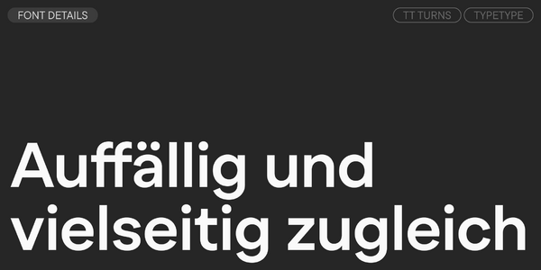
TT Turns ist eine geometrische Sans-Serif-Schrift mit markanten abgerundeten Glyphen und ausdrucksstarken überhängenden Elementen. Diese vielseitige Schrift weist ein prägnantes Erscheinungsbild auf und ist in kleinen Größen hochgradig lesbar, während sie in großen Punktgrößen zu einer Display-Schrift wird und ihren Charakter voll entfaltet. Sie ist energiegeladen, stark und dynamisch – eine Qualität, die insbesondere in den kursiven Schriftstilen deutlich wird.

In ‚Kk‘ und ‚Жж‘ treffen die Diagonalen in einem steilen Winkel auf den Stamm, wodurch ein auffälliges Dreieck aus Weißraum entsteht. Dies verleiht dem Design eine scharfe Qualität. Weitere charakteristische Details umfassen die scharfen Enden bei ‚Ss‘, ‚Cc‘, ‚a‘, ‚Ээ‘ und ‚Зз‘, eine ausdrucksstarke Beinform beim ‚R‘ sowie ausgeprägte vorstehende Striche an den linken Teilen von ‚Лл‘ und ‚Дд‘.

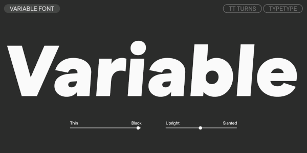
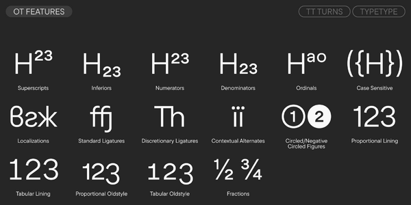
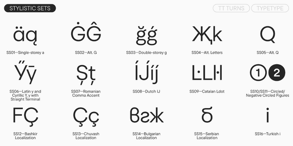
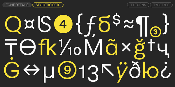
Sie können der Schrift noch mehr Display-Charakter verleihen, indem Sie ihre auffälligen stilistischen Sets nutzen. Beispielsweise kann das ‚a‘ von einer zweistöckigen zu einer einstöckigen Form geändert werden, das ‚g‘ von einer einstöckigen zu einer zweistöckigen, die Form des ‚G‘ kann abgerundet werden, die Glyphen für ‚Жж‘ und ‚Kk‘ können geändert werden, und die Form des Schwanzes des ‚Q‘ kann umgewandelt werden. Und falls Sie im Gegenteil die Satzgestaltung beruhigen möchten, steht ein Set mit zurückhaltenderen Schwanzformen für das kyrillische ‚Уу‘ und das lateinische ‚y‘ zur Verfügung. Die Schrift umfasst auch Ligaturen, zahlreiche OpenType-Features, die ihre Möglichkeiten erheblich erweitern, sowie einen variablen Stil, der sich entlang der Achsen für Gewicht und Neigung verändert.

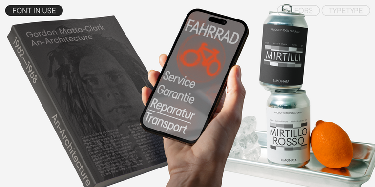
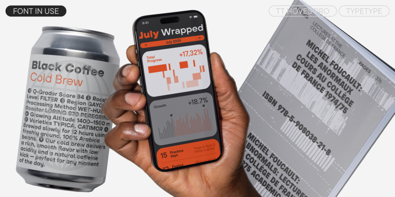
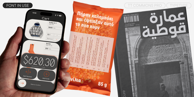
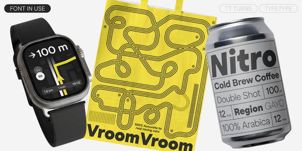
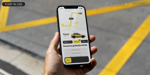
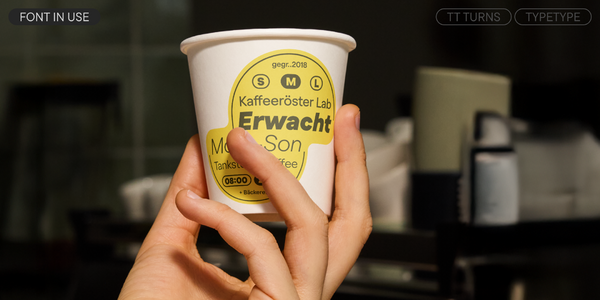
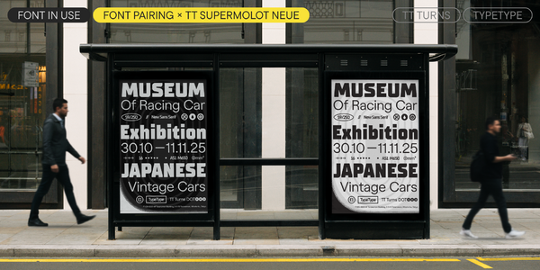
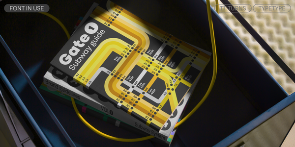
TT Turns eignet sich für eine Vielzahl unterschiedlicher Aufgaben: von der Verwendung in Fließtext, im Web und in Anwendungen bis hin zu Branding und Verpackungsdesign. Sie kann mit gleicher Wirksamkeit in nahezu jedem Bereich eingesetzt werden.
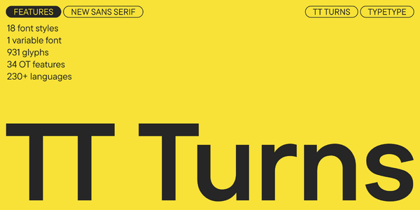
TT Turns umfasst:

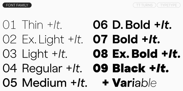
  • 19 Stile: 9 aufrechte, 9 kursive und 1 variable Schrift
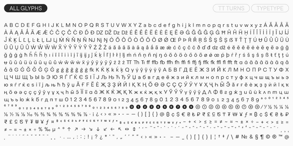
  • 931 Glyphen pro Stil
  • 34 OpenType-Features
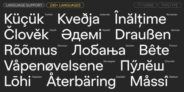
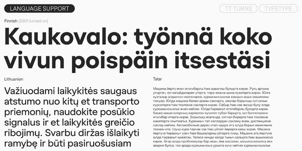
  • Unterstützung für über 230 Sprachen

Datum der Veröffentlichung

25 November 2025

Mehr

Specimen

Schriftart specimen (pdf) herunterladen

Poster-Bilder

Grafische Präsentation auf Behance

Benutzerdefinierte Version

Suchen Sie eine individuelle Version dieser Schriftart?

+ erweitertes Schriftsystem Alles anzeigen

Zeichensatz

Grundschrift Latein Grundschrift Kyrillisch Extended Latin Extended Cyrillic Fractions Proportional Lining Figures and Currencies Other Figures Punctuation and Symbols Math Symbols Arrows
A B C D E F G H I J K L M N O P Q R S T U V W X Y Z a b c d e f g h i j k l m n o p q r s t u v w x y z
А Б В Г Д Е Ё Ж З И Й К Л М Н О П Р С Т У Ф Х Ц Ч Ш Щ Ъ Ы Ь Э Ю Я Ѓ Ґ Ќ Є Ї Љ Њ Ћ Ђ Ў Џ а б в г д е ё ж з и й к л м н о п р с т у ф х ц ч ш щ ъ ы ь э ю я ѓ ґ ќ є ї љ њ ћ ђ ў џ
Á Ă Ǎ Â Ä À Ā Ą Å Ǻ Ã Æ Ǽ Ć Č Ç Ĉ Ċ Ð Ď Đ DZ DŽ Dz Dž É Ĕ Ě Ê Ë Ė È Ē Ę Ə Ǵ Ğ Ǧ Ĝ Ģ Ġ Ħ Ȟ Ĥ Í Ĭ Î Ï İ Ì Ī Į Ĩ IJ Ĵ Ķ Ĺ Ľ Ļ Ŀ Ł LJ Lj Ń Ň Ņ Ñ NJ Nj Ŋ Ó Ŏ Ô Ö Ò Ő Ō Õ Ø Ǿ Œ Þ Ŕ Ř Ŗ Ś Š Ş Ŝ Ș Ŧ Ť Ţ Ț Ú Ʉ Ŭ Ǔ Û Ü Ù Ű Ū Ų Ů Ũ Ŵ Ý Ŷ Ÿ Ȳ Ź Ž Ż á ă ǎ â ä à ā ą å ǻ ã æ ǽ ć č ç ĉ ċ ð ď đ dz dž é ĕ ě ê ë ė è ē ę ə ǵ ğ ǧ ĝ ģ ġ ħ ȟ ĥ ı í ĭ î ï i ì ī į ĩ ij ȷ ĵ ķ ĺ ľ ļ ŀ ł lj ḿ ń ň ņ ñ nj ŋ ó ŏ ô ö ò ő ō õ ø ǿ œ þ ŕ ř ŗ ś š ş ŝ ș ß ŧ ť ţ ț ú ʉ ŭ ǔ û ü ù ű ū ų ů ũ ŵ ý ŷ ÿ ȳ ź ž ż
Ӑ Ғ Ӗ Ѐ Җ Ҙ Ѝ Ӣ Ӏ Қ Ҡ Ң Ө Ә Ҫ Ӳ Ӯ Ү Ұ Ҳ Ҷ Һ ӑ ғ ӗ ѐ җ ҙ ѝ ӣ ӏ қ ҡ ң ө ә ҫ ӳ ӯ ү ұ ҳ ҷ һ
½ ¼ ¾
0 1 2 3 4 5 6 7 8 9 ¢ $ £ ¥ ƒ ¤
¹ ² ³
· . ... , : ; ! ¡ ? ¿ * ' " « » - _ ( ) [ ] { } | ¦ / # & § © ® @ ª º
+ < > = ~ ¬ ± × ÷ % µ ° ^

OpenType-Eigenschaften

ss01 | Single-storey a

ă â ä ą

ă â ä ą

ss02 | Alternative G

Ǵ Ğ Ĝ Ģ

Ǵ Ğ Ĝ Ģ

ss03 | Double-storey g

ǵ ğ ǧ ĝ

ǵ ğ ǧ ĝ

ss04 | Alternative Letters

Қ Ҡ ḱ ķ

Қ Ҡ ḱ ķ

ss05 | Alternative Q

Q

Q

ss06 | Latin y and Cyrillic Y, y with straight terminal

Ў Ӳ ŷ ÿ

Ў Ӳ ŷ ÿ

Alles anzeigen

Ähnliche Schriftarten

50 Stile
Schrift kaufen