top_banner_ttnormspro0426
TT Knickerbockers
2 styles
FonderiePolices et stylesSans SerifTT Knickerbockers

TT Knickerbockers

TT Knickerbockers est un duo typographique qui célèbre New York. Il associe une linéale monumentale à une script énergique pour saisir la double nature de la ville.
Style unique : dès $43.99
Famille complète : dès $69 2 styles

Options d’achat

Choisissez les polices et les licences souhaitées. Puis, cliquez sur le bouton « Ajouter au panier »

Des questions sur la police ou les licences ? Écrivez-nous.

Choisissez les polices que vous souhaitez

Offre pack :
par style $34.50
dès  $69
2 styles
dès  $69
dès $43.99
dès $43.99

Des questions sur la police ou les licences ? Écrivez-nous.

Sélectionner les licences de police

Vous devez indiquer un pack ou un style de police avant de sélectionner une licence

Choisissez les licences souhaitées

Sur demande
Sur demande
Sur demande
Sur demande
Sur demande
Sur demande
Sur demande
Sur demande
Sur demande
Sur demande
Aucun élément sélectionné
Total
$0

Testeurs

TT Knickerbockers
Taille
Fonctionnalités
Tout activer

TT Knickerbockers Script

Associations idéales avec TT Knickerbockers

What is a font pair, and what does it serve for?

A font pair is a combination of two fonts within one text block. Most often, one of the fonts in a pair is a more expressive headline font, and the other one serves to communicate information. Such fonts complement each other and help designers solve various tasks, like highlighting key elements, adding emotional expressiveness to the project, or separating semantic blocks.

How to choose fonts for a project: Several general recommendations

To begin with, establish the project's tone. Choose the fonts that stylistically match the main idea. After that, you need to determine the functions of each font in the project and their hierarchy: which font will complement the design and which one will serve to attract attention as the main element. You need to assess the difference between the fonts and decide what kind of information each of them should convey. First, we recommend choosing the base font you will use most, and then you can find a suitable pair for it.

Core principles of font pairing and recommendations from designers

The main rule you should follow when matching two fonts is that both similarities and differences must be visible between them. You can highlight the coherence of fonts by the following characteristics: contrast, proportions, width, openness of characters, individual letter shapes, and overall tone. Feel free to experiment with different combinations. We also recommend analyzing the projects you like: this way, you can enhance your visual skills, elevate your knowledge base, and gain confidence in dealing with typography.

Description

À propos de la famille de polices TT Knickerbockers
Prise en charge de 160+ langues

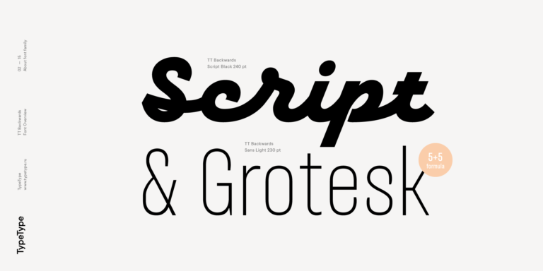
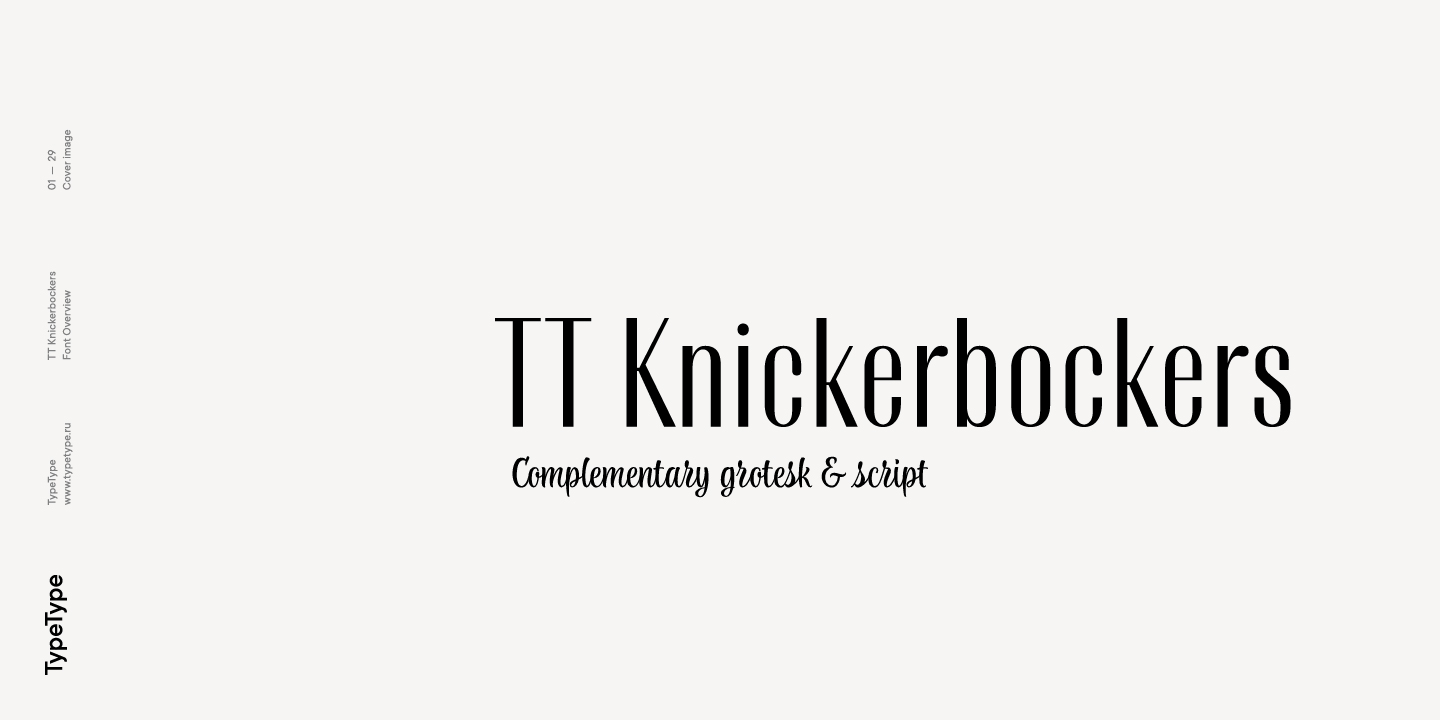
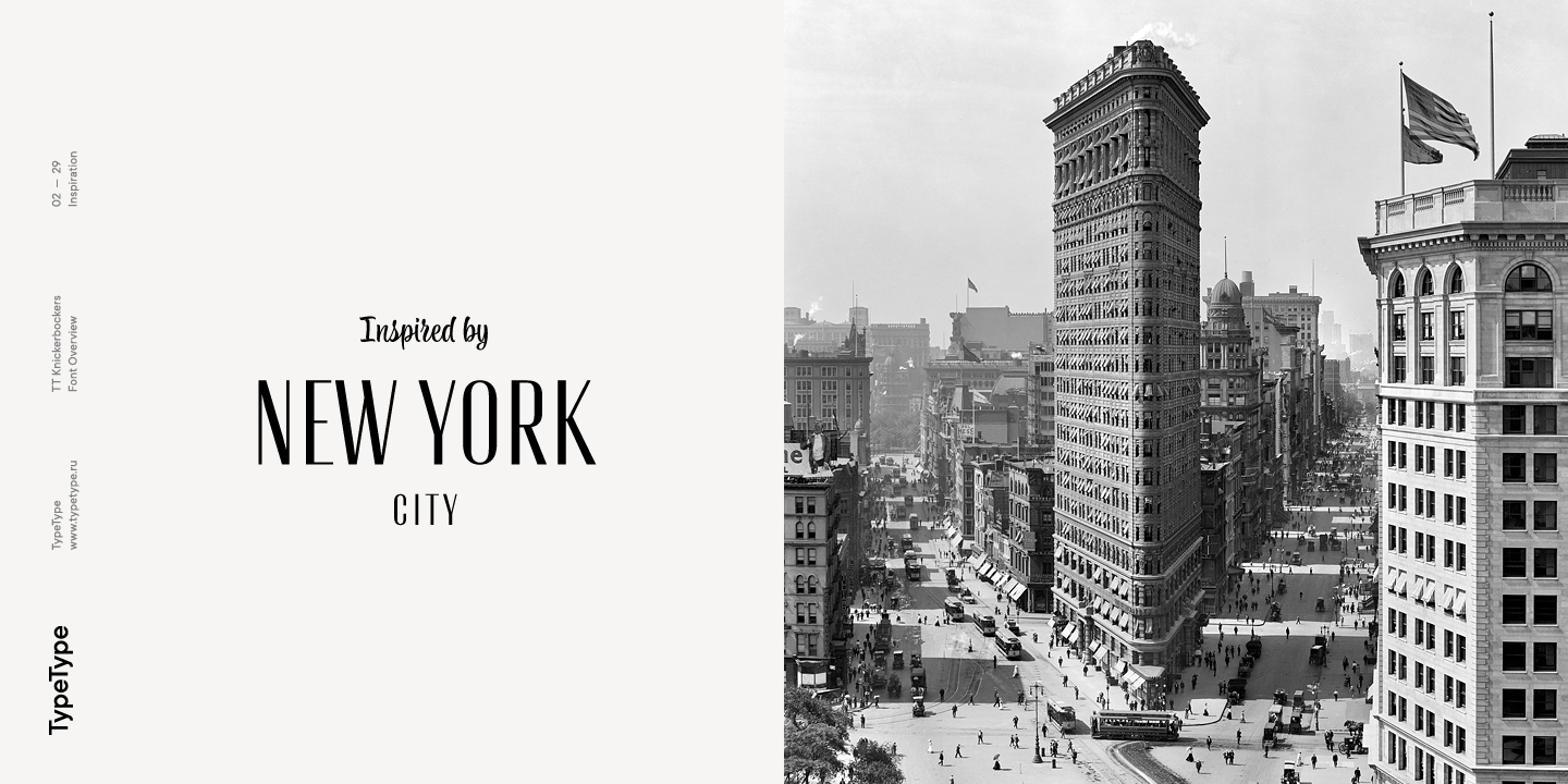
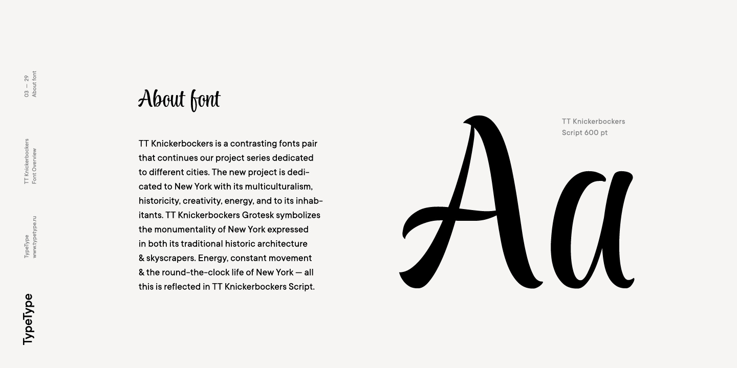
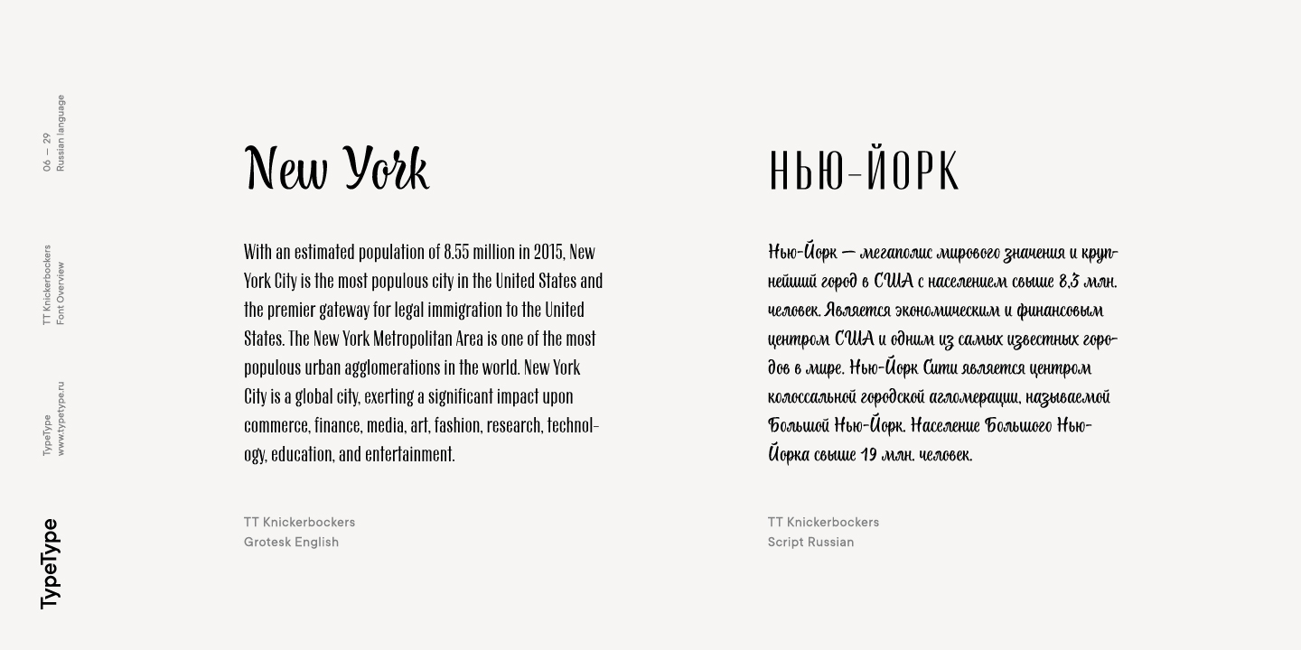
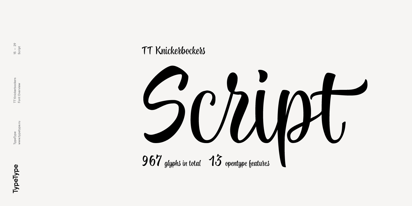
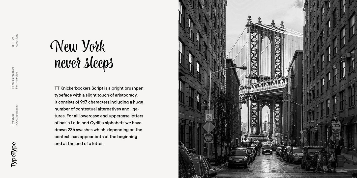
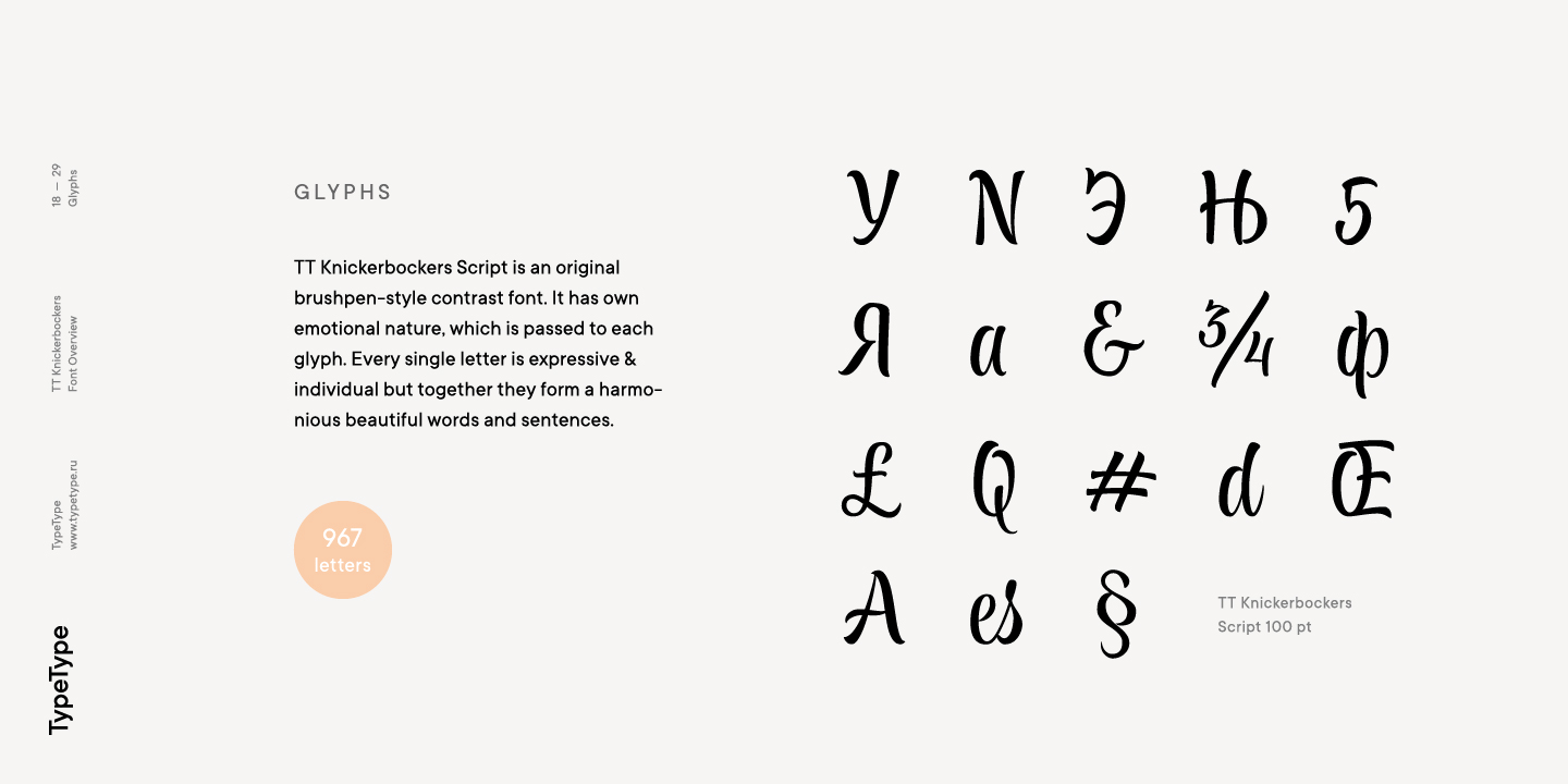
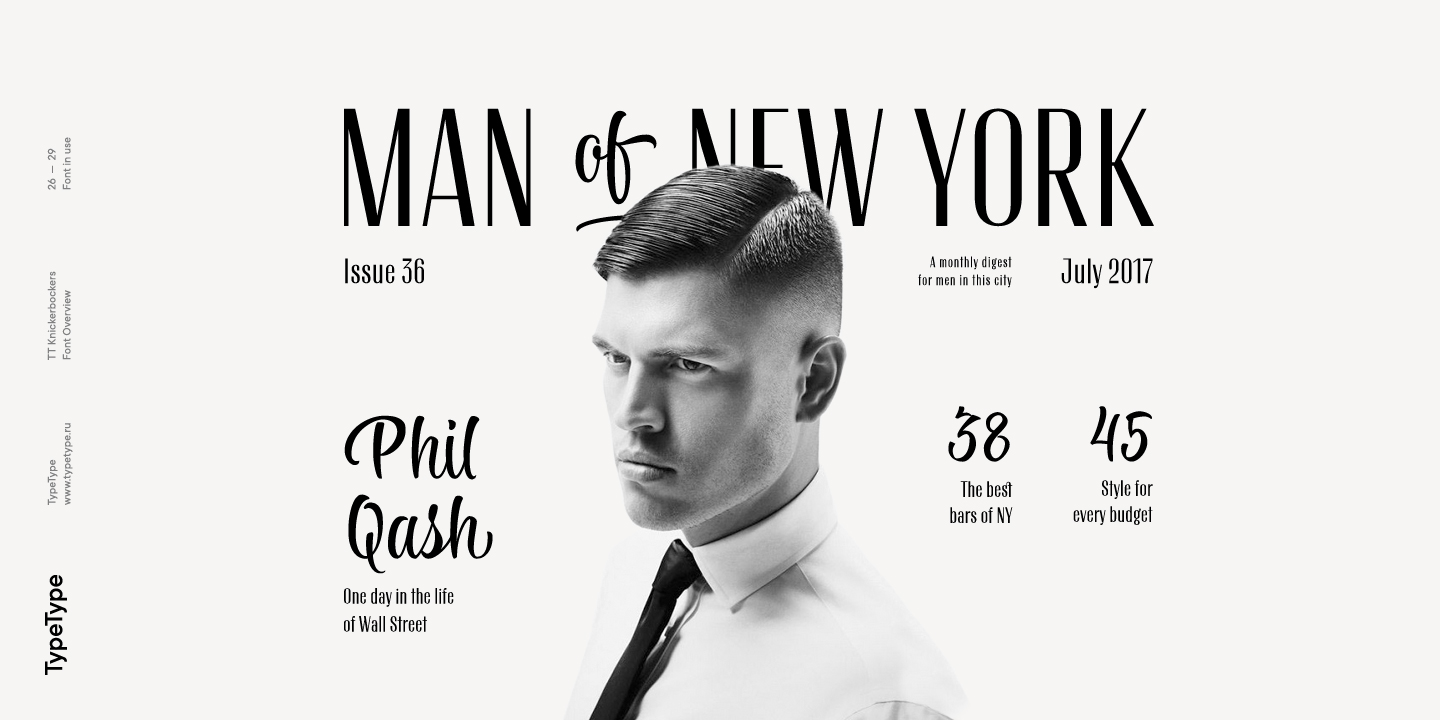
TT Knickerbockers est un duo de polices contrastées qui poursuit notre série de projets dédiée à différentes villes. Ce nouveau projet est consacré à New York, à son multiculturalisme, à son héritage historique, à sa créativité, à son énergie, ainsi qu’à ses habitants. TT Knickerbockers Grotesk symbolise la monumentalité de New York, exprimée à la fois dans son architecture historique traditionnelle et dans ses gratte-ciel. L’énergie, le mouvement permanent et la vie new-yorkaise 24 heures sur 24 se reflètent quant à eux dans notre TT Knickerbockers Script.

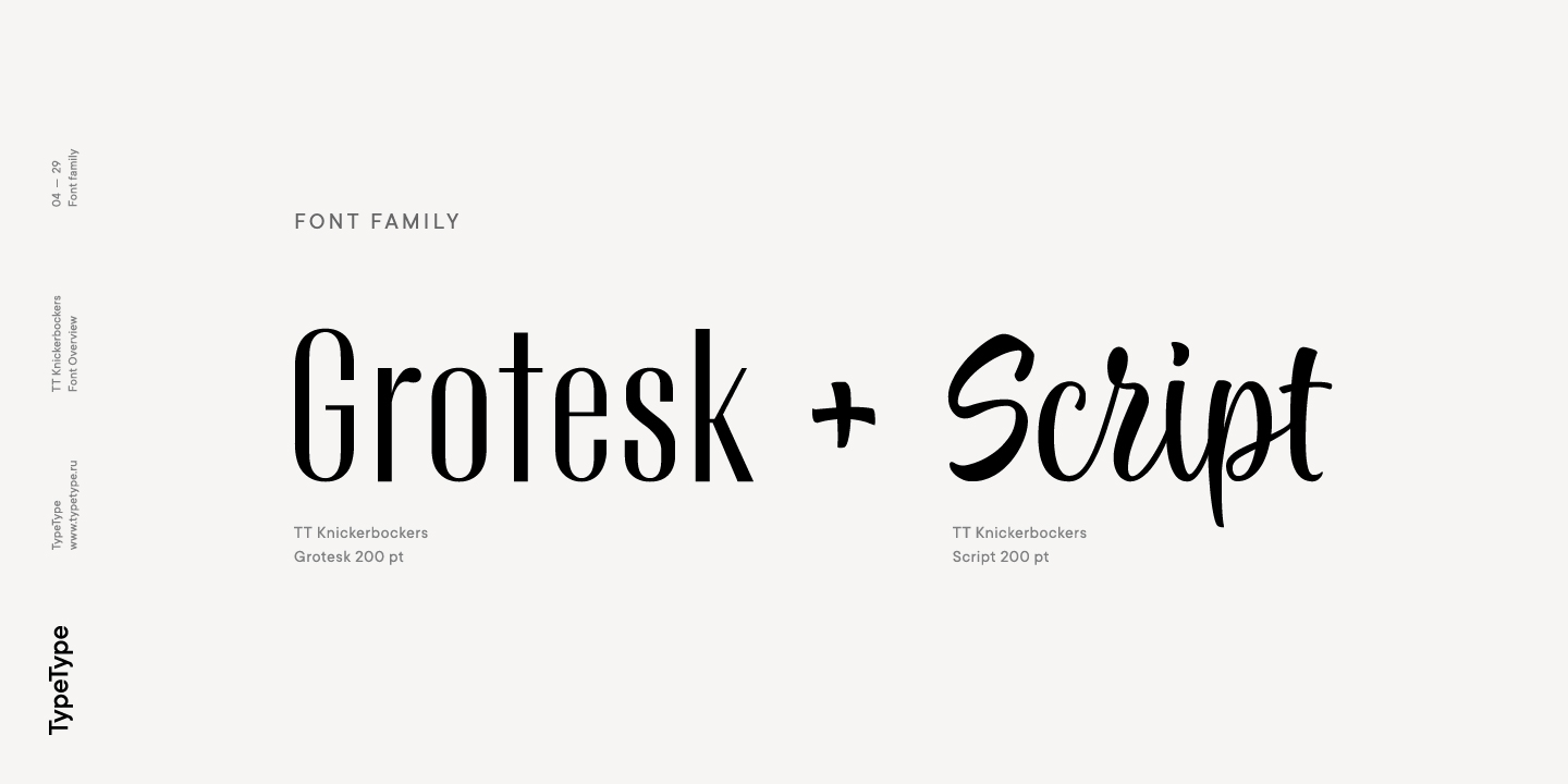
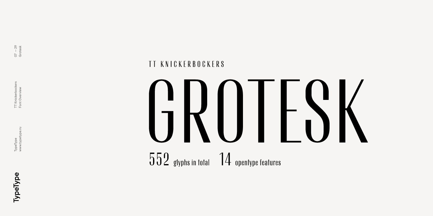
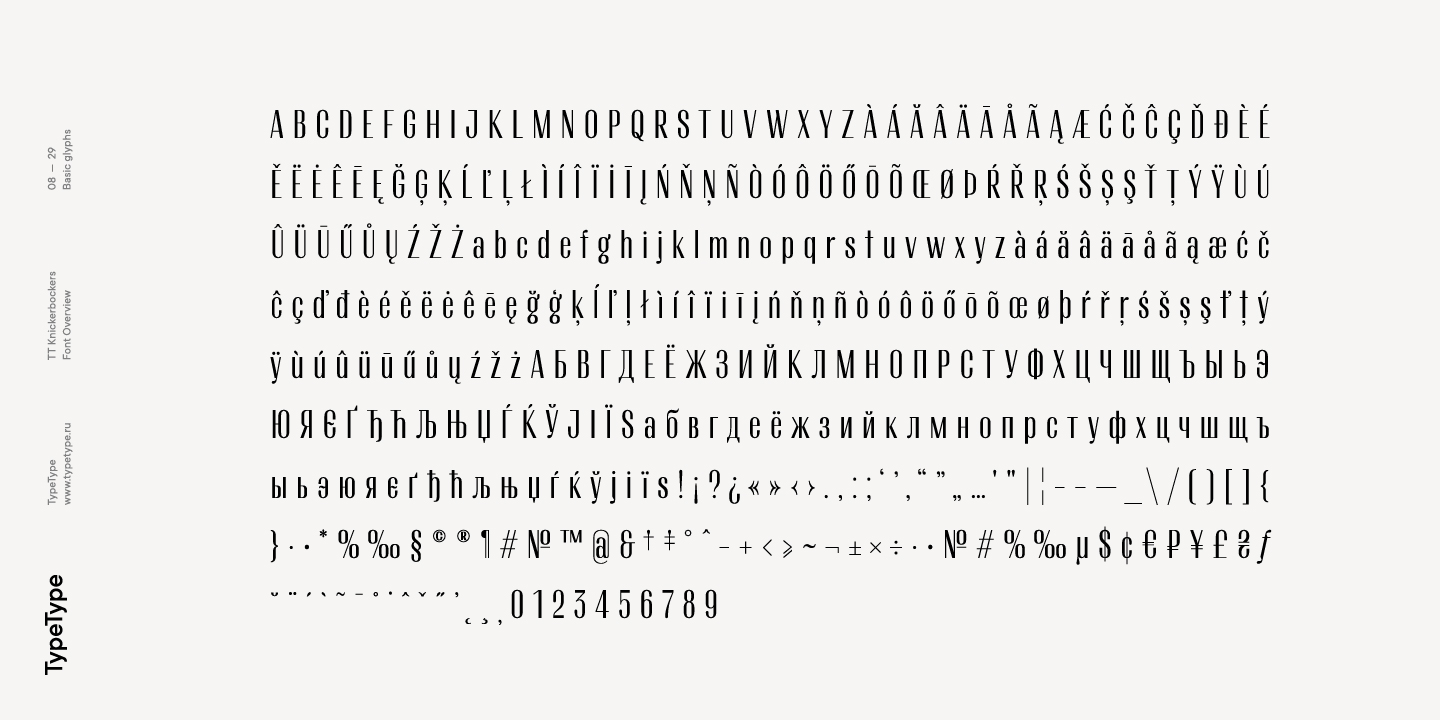
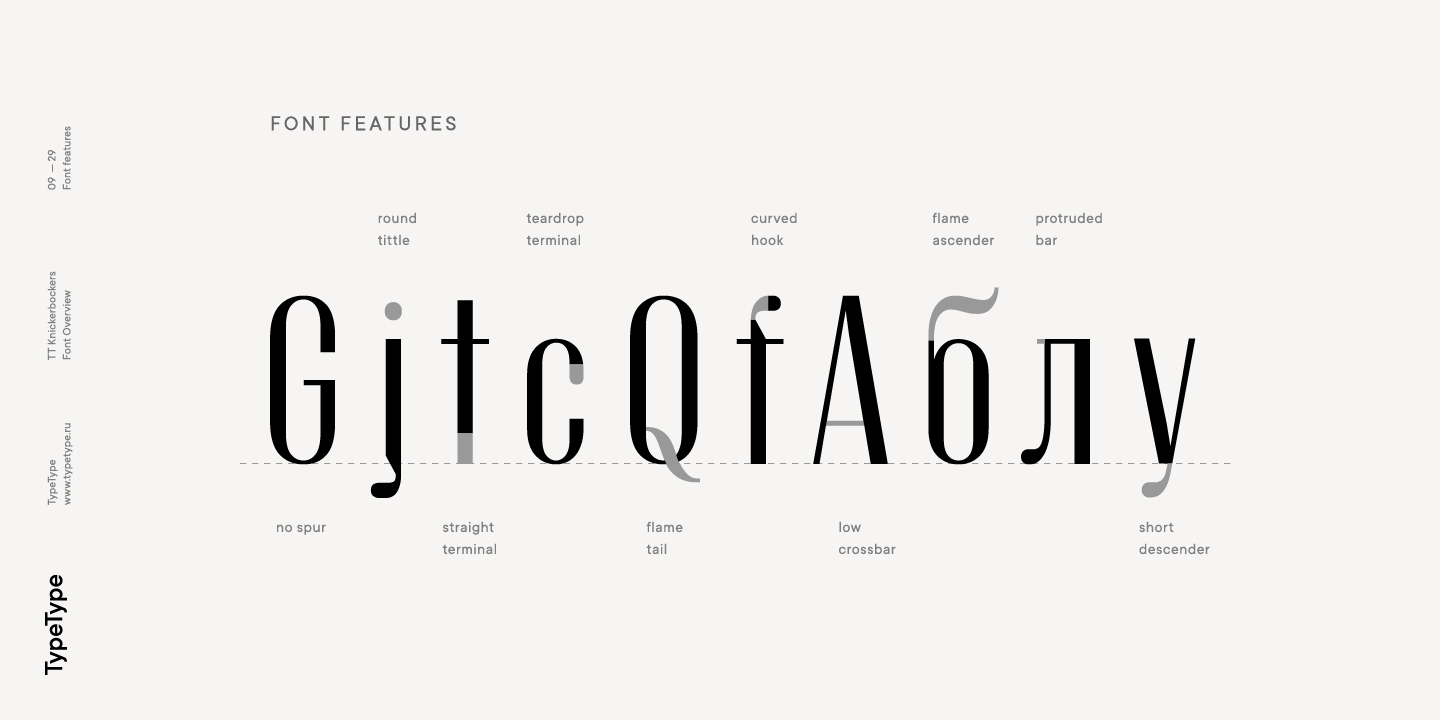
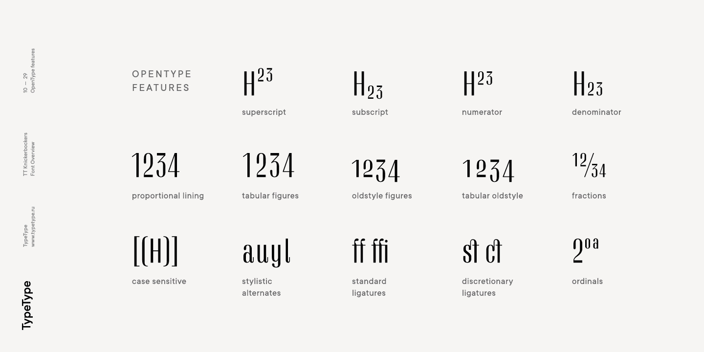
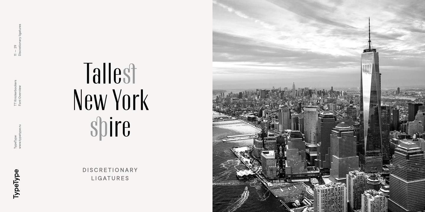
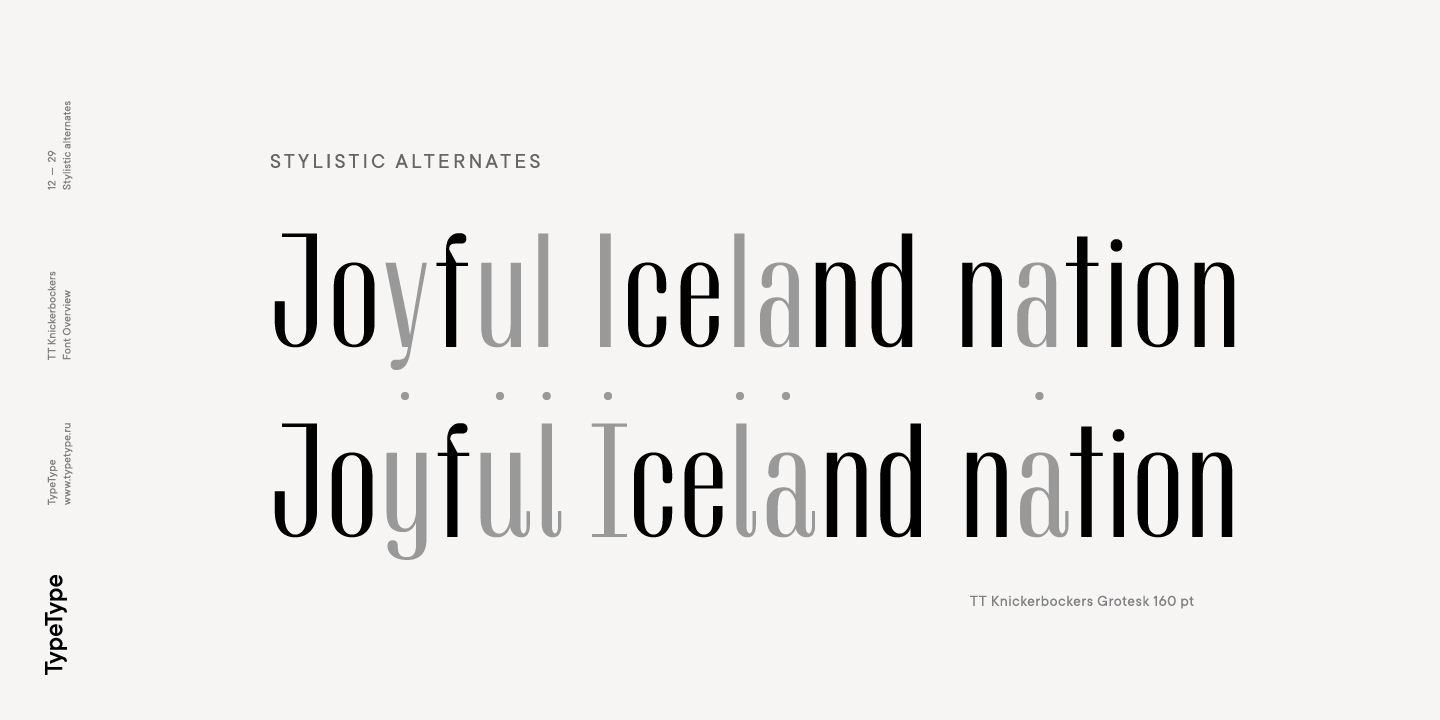
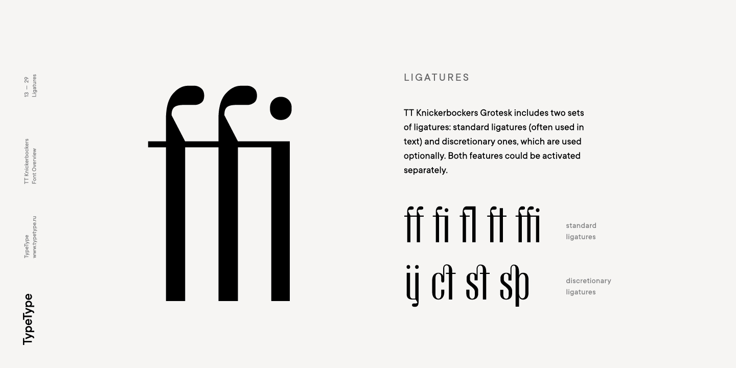
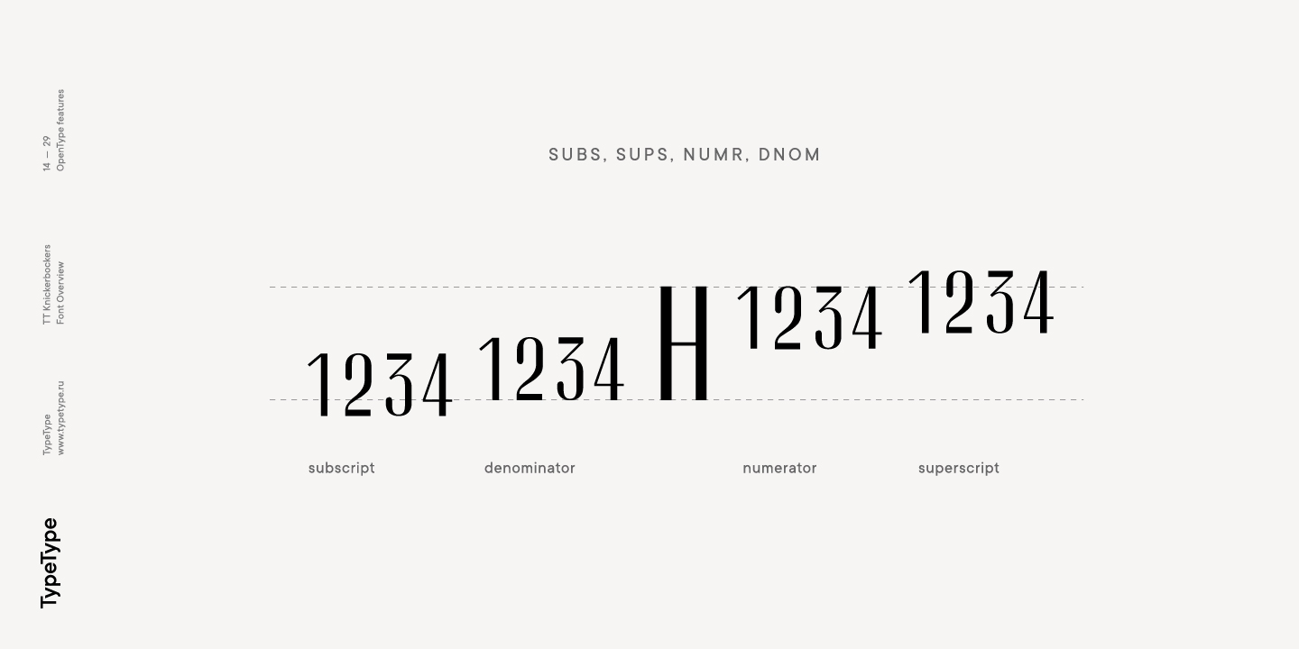
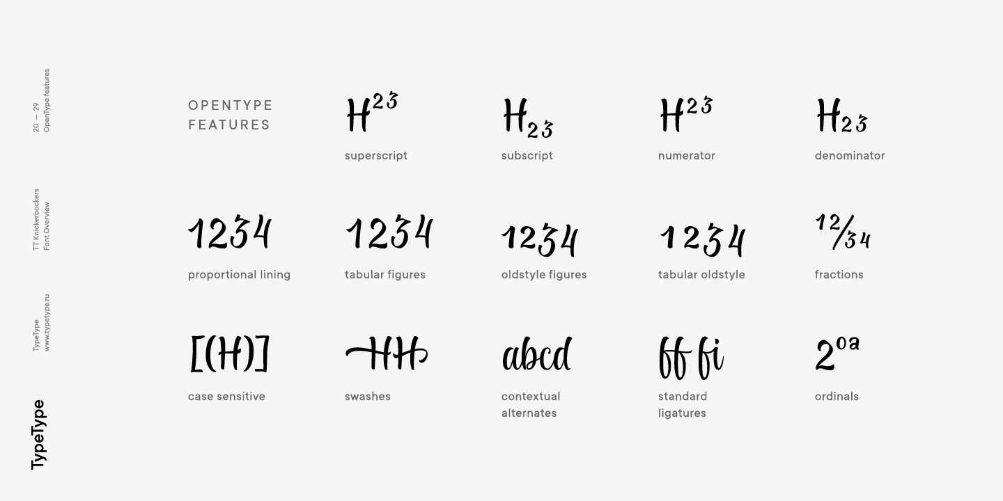
TT Knickerbockers Grotesk est une linéale contrastée étroite, dotée d’éléments caractéristiques qui nous ramènent au XIXe siècle. On y perçoit également une référence aux polices antiqua : là où une antiqua traditionnelle aurait des empattements, TT Knickerbockers Grotesk présente une terminaison droite, et les gouttes traditionnelles (finales, queues et oreilles) sont remplacées par des terminaisons arrondies. Dans TT Knickerbockers Grotesk, vous trouverez des caractères inhabituels, des variantes stylistiques et des ligatures. Les fonctionnalités OpenType suivantes sont intégrées : ordn, case, frac, sups, sinf, numr, dnom, onum, tnum, pnum, liga, dlig, salt, ss01.

Date de sortie

25 juillet 2017

En complément

Spécimen

Télécharger le spécimen de la police (PDF)

Images d’affiche

Présentation graphique sur Behance

Version personnalisée

Vous cherchez une version personnalisée de cette police ?

Jeu de caractères

Latin de base Cyrillique de base Extended Latin Stylistic Alternates, Standard and Discretionary Ligatures|salt,liga,dlig Lining Figures, Currencies Old-style Figures|onum Punctuation, Symbols, Mathematical Symbols, Arrows
A B C D E F G H I J K L M N O P Q R S T U V W X Y Z a b c d e f g h i j k l m n o p q r s t u v w x y z
А Б В Г Д Е Ё Ж З И Й К Л М Н О П Р С Т У Ф Х Ц Ч Ш Щ Ъ Ы Ь Э Ю Я Ѓ Ґ Ќ Є Ї Љ Њ Ћ Ђ Ў Џ а б в г д е ё ж з и й к л м н о п р с т у ф х ц ч ш щ ъ ы ь э ю я ѓ ґ ќ є ї љ њ ћ ђ ў џ
À Á Ă Â Ä Ā Å Ã Ą Æ Ć Č Ĉ Ç Ď Đ È É Ě Ë Ė Ê Ē Ę Ğ Ģ Ķ Ĺ Ľ Ļ Ł Ì Í Î Ï İ Ī Į Ń Ň Ņ Ñ Ò Ó Ô Ö Ő Ō Õ Œ Ø Þ Ŕ Ř Ŗ Ś Š Ș Ş Ť Ţ Ý Ÿ Ù Ú Û Ü Ū Ű Ů Ų Ź Ž Ż à á ă â ä ā å ã ą æ ć č ĉ ç ď đ è é ě ë ė ê ē ę ğ ģ ķ ĺ ľ ļ ł ì í î ï i ī į ń ň ņ ñ ò ó ô ö ő ō õ œ ø þ ŕ ř ŗ ś š ș ş ť ţ ý Ÿ ù ú û ü ū ű ů ų ź ž ż
a à á ă â ä ā ą ã å l ĺ ľ ļ ł I Ì Í Î Ï İ Ī у ý ÿ u ù ú û ü ű ū ų ů а y ў ff fi fl ft ffi ij ct st sp
0 1 2 3 4 5 6 7 8 9 $ ¢ ¤ ¥ £ ƒ
0 1 2 3 4 5 6 7 8 9
! ¡ ? ¿ « » . , : ; ... ' " | ¦ _ \ / ( ) [ ] { } · * # % § © ® @ & ° ^ - + < > = ~ ¬ ± × ÷

Fonctionnalités OpenType

TT Knickerbockers TT Knickerbockers Script
salt | Stylistic Alternates

alуu

alуu

liga | Standard Ligatures

fl ft ffi

fl ft ffi

dlig | Discretionary Ligatures

ij ct st

ij ct st

onum | Oldstyle Figures

1638

1638

case | Case Sensitive Forms

({[H]})

({[H]})

numr | Numerators

H123

H123

swsh | Swashes

a b c d

a b c d

liga | Standard Ligatures

ar ch ff

ar ch ff

frac | Fractions

1/2 1/4

1/2 1/4

onum | Oldstyle Figures

1638

1638

case | Case Sensitive Forms

({[H]})

({[H]})

sups | Superiors

H789

H789

Polices similaires

10 styles de police
2 styles de police
  • -30% L’offre spéciale est valable jusqu’au 19/06/2026
8 styles de police
Acheter