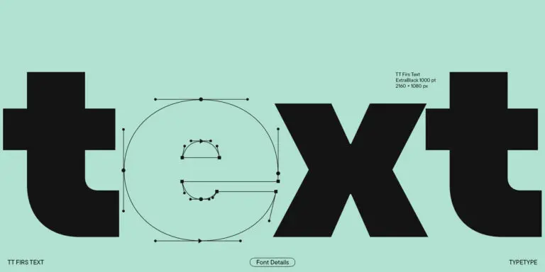
About font family
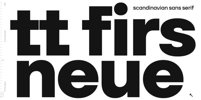
TT Firs Neue is reborn! We have rethought the font to introduce the next-generation typeface.
After analyzing each contour and graphic element, we rebuilt the font, preserving its best features while making any necessary adjustments. We have created a flawless and modern sans serif using the new technical capabilities of the studio.
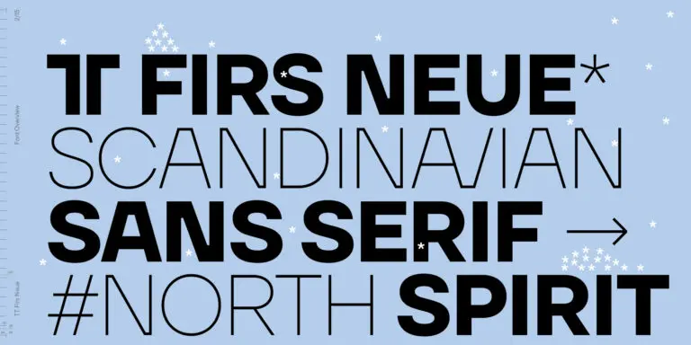
TT Firs Neue is a Scandinavian sans serif that combines expressive graphic elements with the versatility of use. In the latest 2023 edition, the font’s display elements have become even more attractive, while the overall font balance has also been improved. This is the result of the visual research we did before working on the update.
Here is what has changed.
- The visual elements of the font are now logically coherent. We got rid of the ones that did not suit the font’s concept and kept the most attractive ones. The changes affected letters with diagonal strokes «M, N, И», and figures «2, 3, 6, 9».
- All round characters’ shapes have been standardized for all font styles. In the previous version, all glyphs looked different: more square or oval, depending on the font’s weight. We made the shapes consistent for the font to feel more integral.
- Glyphs containing bowls have also changed. We have worked on the balance, altering the height and shape of the bowls. Like rounded ones, we aspired to make the glyphs more balanced for all font styles.
- The shapes of the letters «J, M, N, S, W, З, И» and Black font style characters have changed. The individuality of these glyphs was slightly different from the whole set, which became apparent in larger sizes. We have improved the shapes and made them more suitable for the font’s style.
- Letters with diagonal strokes and triangular glyphs, such as «A, V, Y, D». We have brought the characters to a consistent logic in their shapes by refining the angles and weight of diagonals in different font styles.
- The glyphs’ terminals follow the same logic in the new version. We have preserved and perfected the old shapes.
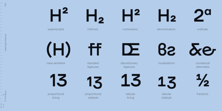
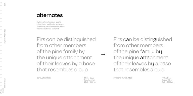
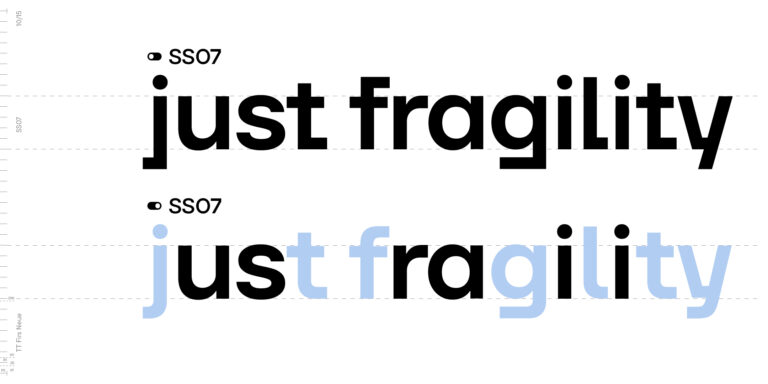
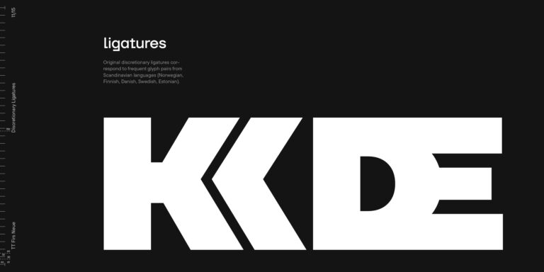
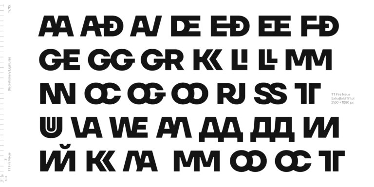
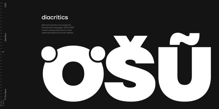
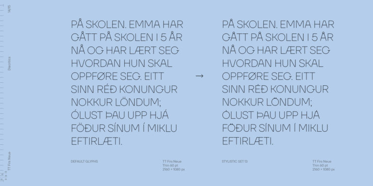
- Ligatures and stylistic sets have been updated entirely and expanded. We have researched Scandinavian languages and designed ligatures and diacritical sets that would definitely be useful for designers.
- We have redesigned diacritical marks, figures, and punctuation marks. Now all characters follow the same logic and contribute to a well-balanced impression of the font.
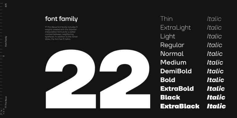
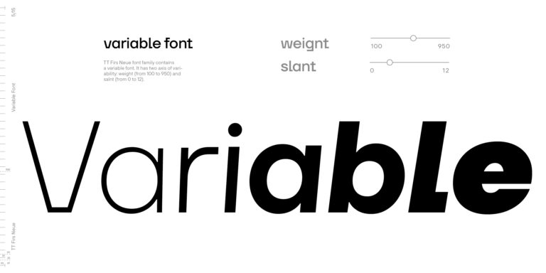
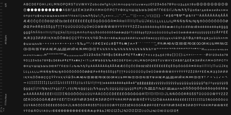
- The character set in each font style has been increased from 934 to 1719, and the number of OpenType features—from 24 to 40. The new font includes 23 font styles: 11 roman, 11 italic, and 1 variable font. The variable font has also become a significant technological advancement for TT Firs Neue.
We retained a warm sentiment towards TT Firs Neue’s previous success while redesigning the font and implementing substantial alterations. The 2023 font has been developed according to new technical standards that have become significantly higher in the past 5 years.
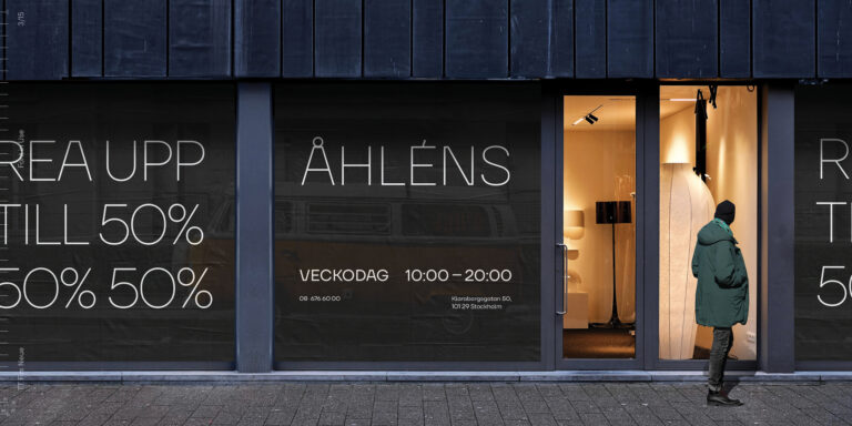
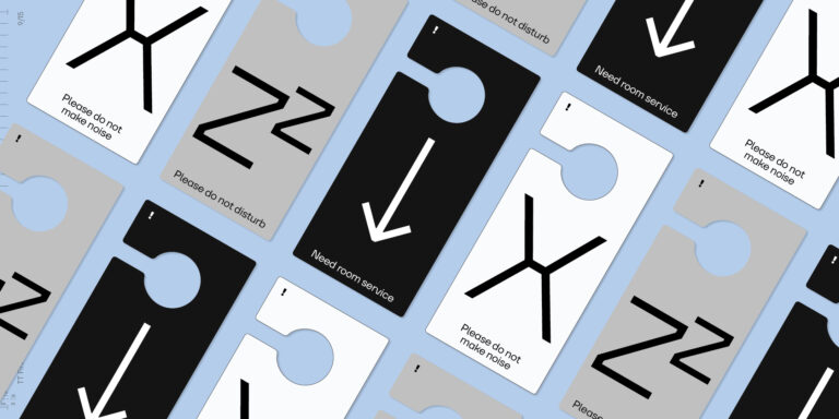
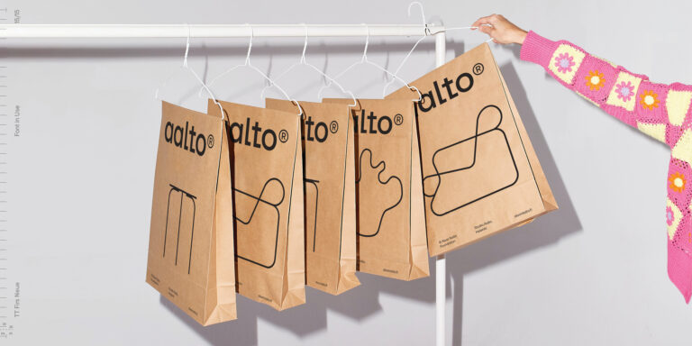
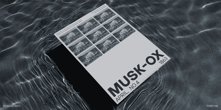
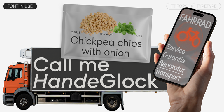
TT Firs Neue is a font well-suited for a wide range of contexts. It can be used for headings, text fragments, visual merchandising and building decoration, and the web. The font is visually aesthetic on podcast and video covers and is an ideal choice for packaging design and brand identity.


