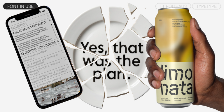
TT Hoves Pro is a versatile sans-serif with a recognizable geometry
Demi Bold Fonts
Stronger strokes can give text emphasis without making every word feel equally loud. Demi Bold Fonts offer a starting point for this balance, though their apparent weight depends on the family. TypeType brings together options to compare for headings, brand communications, and other applications where a clear distinction between primary and supporting text matters more than weight labels alone.
- All fonts 78
- Sans Serif 46
- Serif 21
- Slab Serif 6
- Display 44
- Script 9
- Variable 49
- Font sale 14
What Makes Demi Bold Fonts Distinct
Demi bold describes a weight commonly positioned between regular and bold, rather than a single visual style. The label suggests added emphasis, but it does not guarantee a particular stroke thickness or numerical value. Some families use semibold for a comparable position; others organize and name their weights differently. Letter width, internal spaces, proportions, and stroke contrast also influence how heavy text appears. A narrow setting can look denser than an open one at the same size. Judge the actual specimens alongside neighboring weights instead of assuming that matching labels will produce matching results across different families.
Where Demi Bold Fonts Are Used
Brands addressing readers who scan information quickly may consider demi bold for product names, section headings, or short messages. For audiences reading longer material, it can provide selective emphasis in introductions, captions, and editorial navigation. Packaging and brand communications offer other possible contexts, especially when several levels of information must remain distinct. Suitability depends on the composition: a heading needs enough contrast with body text, while a small label needs room for its letterforms to remain clear. These are applications to test, not guarantees attached to a weight name or to any individual TypeType family.
How to Choose Demi Bold Fonts for Your Project
Begin with the role the text must perform. Is it a section title, a product descriptor, or a repeated navigational label? Set the same wording in each candidate at the intended size, keeping the surrounding layout consistent. Include realistic line lengths, punctuation, and any numbers that matter to the project. Next, assess hierarchy. The emphasized text should stand apart from supporting copy without overpowering information that deserves greater attention. Check spacing, line breaks, and the openness of small details against the actual background. Review screen layouts at their expected display size and printed work at its final dimensions. Finally, consult each family page for its available variants and character coverage rather than inferring them from the category. TypeType offers trial versions for evaluation; review the applicable terms before testing. Keep visual selection separate from licensing, and confirm the rights needed for the intended deployment.
Explore TypeType's Demi Bold Fonts Collection
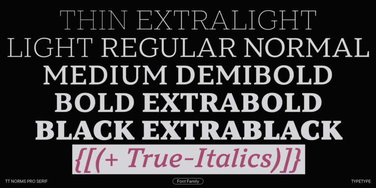
The collection includes TT Rationalist, TT Jenevers, TT Hoves Pro, and TT Norms® Pro Serif, giving you several named starting points for comparison. Other listed families include TT Regins, TT Frantz, TT Livret, and TT Corals. Their presence here is a reason to examine their individual pages, not an indication that they share identical weight naming, proportions, or capabilities. Build a shortlist around your own text rather than selecting by name alone. Open the relevant family pages to inspect specimens and verify which variants are available. Record the differences that affect your layout so that the final decision remains tied to the project brief. Trial access can support this evaluation. For questions about a candidate or the appropriate commercial license, contact TypeType through the website form. The design or client care teams can provide advice before you commit to a particular option.
- The quick brown fox jumps over a lazy dog.
- Pack my box with five dozen liquor jugs.
- Sphinx of black quartz, judge my vow
- 0123456789 !?.,:;—–()[]{}<> “quotes” ‘apostrophe’ @#%&*_+=/\| № $ € £ ₽ +−×÷=≠≤≥ … % © ® ™
- Aa Bb Cc Dd Ee Ff Gg Hh Ii Jj Kk Ll Mm Nn Oo Pp Qq Rr Ss Tt Uu Vv Ww Xx Yy Zz
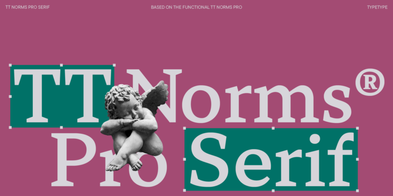
We continue to expand the line of the studio’s main bestseller TT Norms® Pro!
TT Livret is an elegant, modern and functional serif
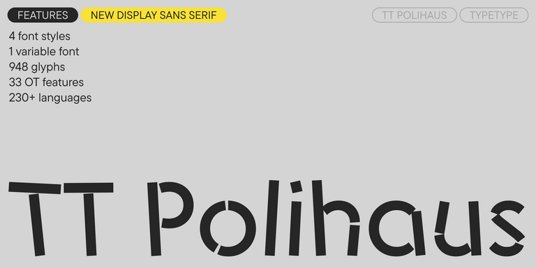
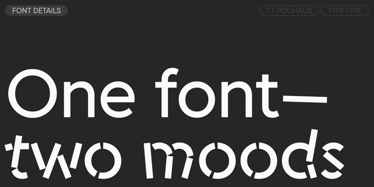
TT Polihaus is an experimental sans serif that, at first glance, looks ordinary, but then breaks apart, transforming into a stencil pattern.
TT Rationalist is functional and neutral slab serif typeface.
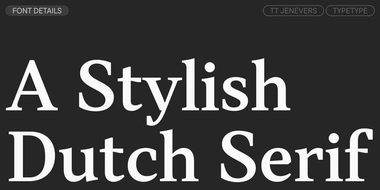
TT Jenevers is a modern serif with a Dutch flavor. The font family features the characteristic details peculiar to Dutch serifs—these are the asymmetrical shape of serifs and an irregular slant of ovals.
TT Regins is a Scottish modern serif. Striking contrast and sharp triangular serifs give this font a stern and commanding character, while refined forms, enlarged lowercase letters, and slightly condensed, static proportions add grace to its design.
TT FRANTZ IS AN EXPERIMENTAL VARIABLE FONT, DISTINGUISHED BY ITS SLIMNESS AND LIGHTNESS. THE VARIATION IN THE FONT AFFECTS THE CHANGE IN THE HEIGHT OF THE MEAN LINE—BY MOVING THE AXIS ADJUSTMENT SLIDER YOU CAN EASILY RAISE OR LOWER THE MEAN LINE OF THE FONT.
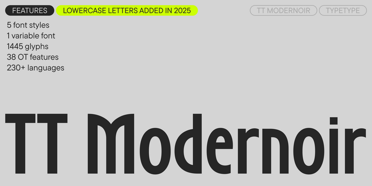
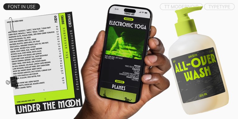
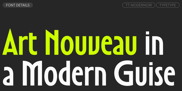
TT Modernoir is a display sans serif with dynamic proportions. Fluid lines and delicate Art Nouveau forms in this typeface blend seamlessly with the rhythmic flow and improvisational freedom of jazz.
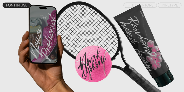
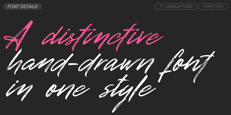
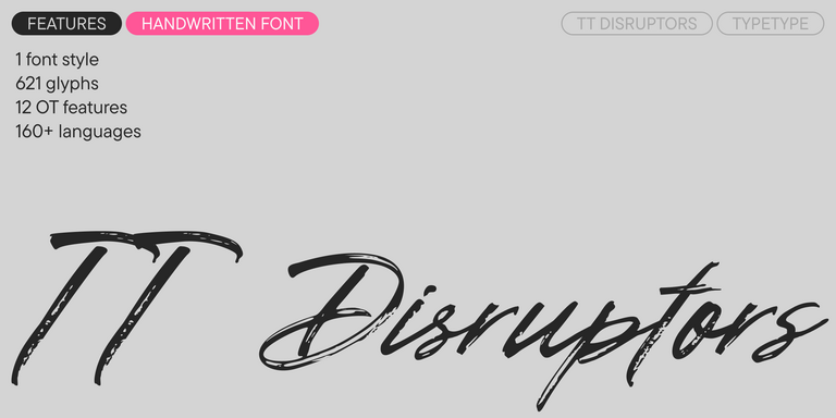
TT Disruptors is a ductile marker-drawn handwritten typeface. Its design is one-of-a-kind: worn edges, varying stroke thickness, and elongated ascenders and descenders give it a lively, dynamic texture and handcrafted feel. The personality of this font is spirited and emotional, yet warm and soulful.
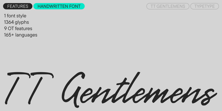
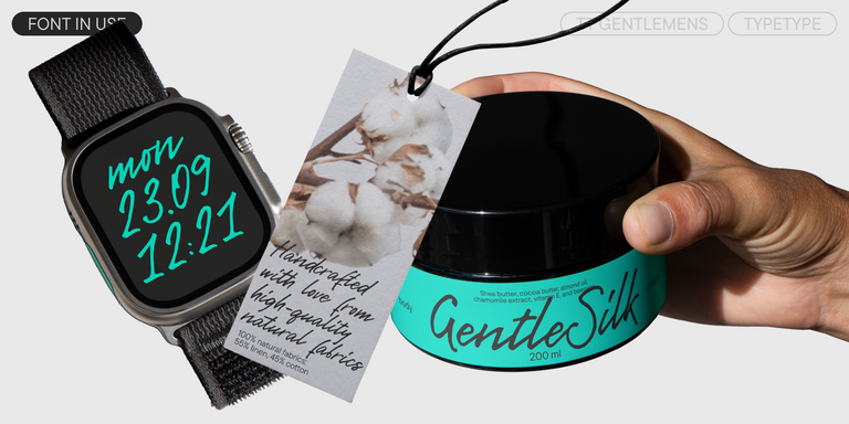
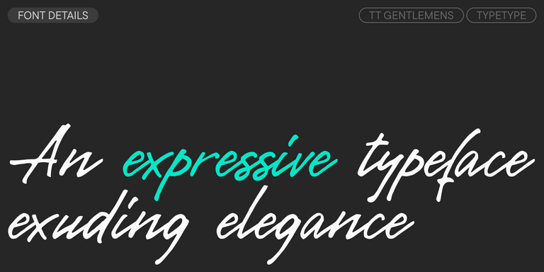
TT Gentlemens is a dynamic handwritten typeface that combines the seriousness and precision in writing with elegance and sophistication. It has the character and style of a true gentleman: restrained and always appropriate, yet confident and striking.
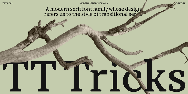
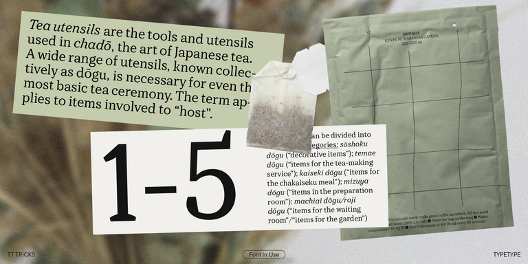
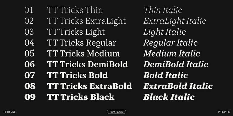
TT Tricks is a modern text serif with a design reflecting the style of Transitional serifs. This font has a calm, elegant, and moderately stern character.
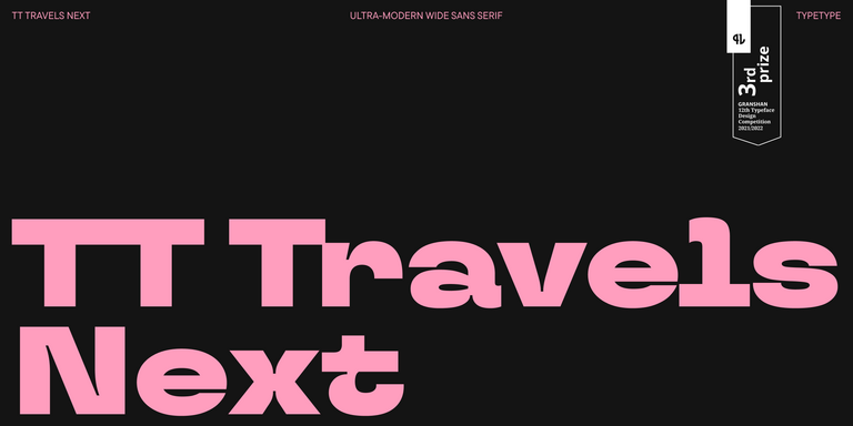
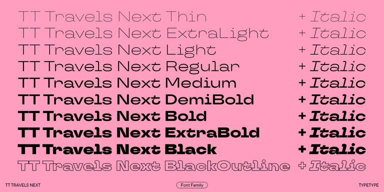
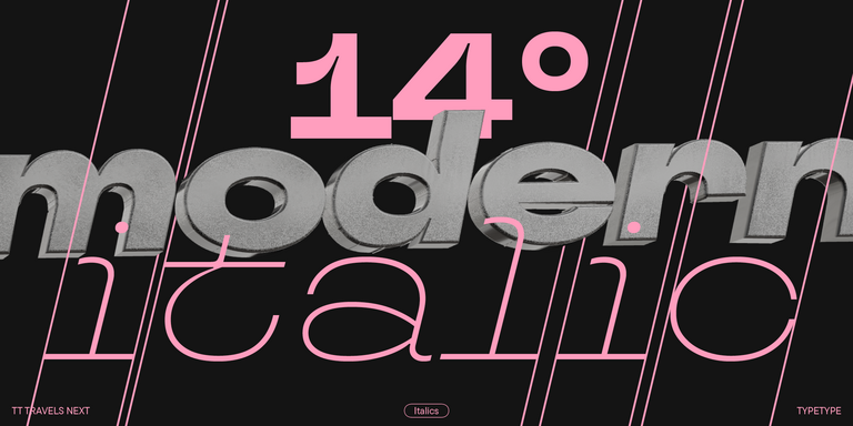
TT Travels Next is a very trendy and modern wide display sans serif for use in different sets, be they print or web.
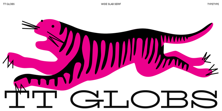
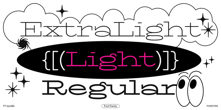
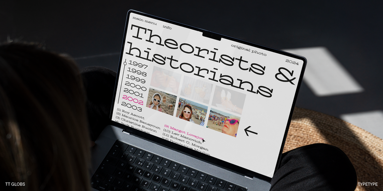
TT Globs is the first font from the TypeType Starter Kit line.
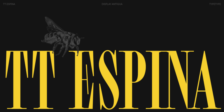
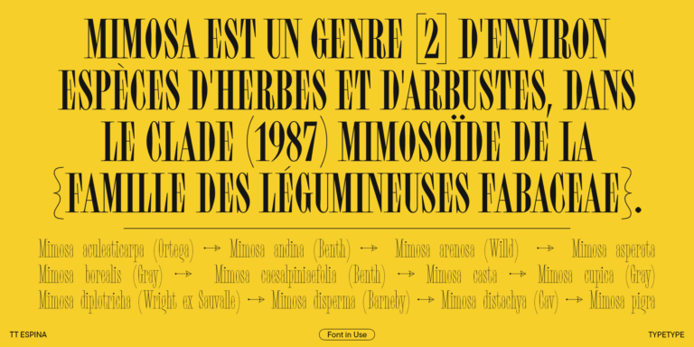
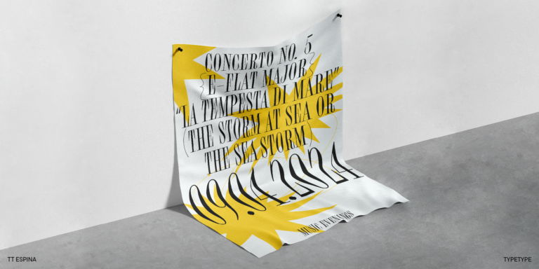
TT Espina is a display antiqua with expressive serifs
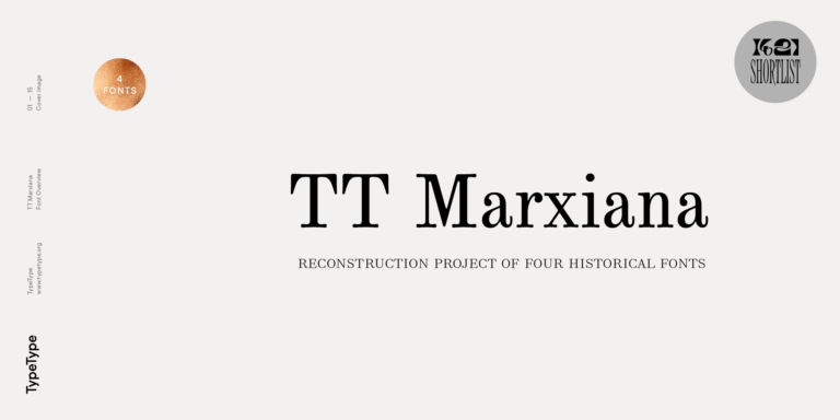
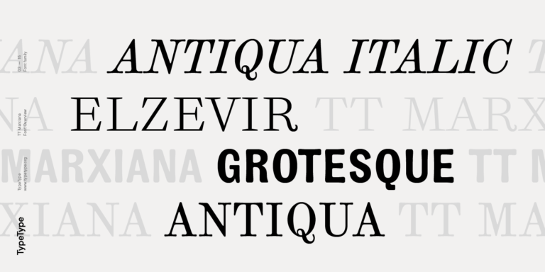
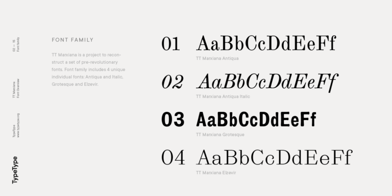
TT Marxiana Elzevir is a title or header font and is a compilation of monastic Elzevir that were actively used in the Niva magazine for all its prints.
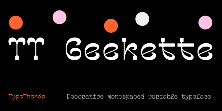
TT Geekette is an experimental variable serif with friendly and flexible character of shapes.
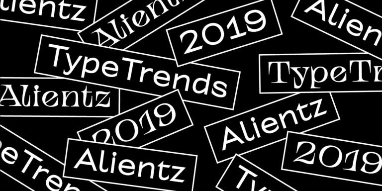
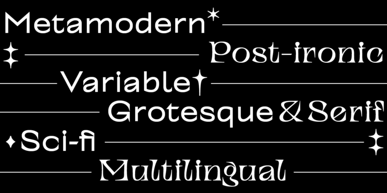
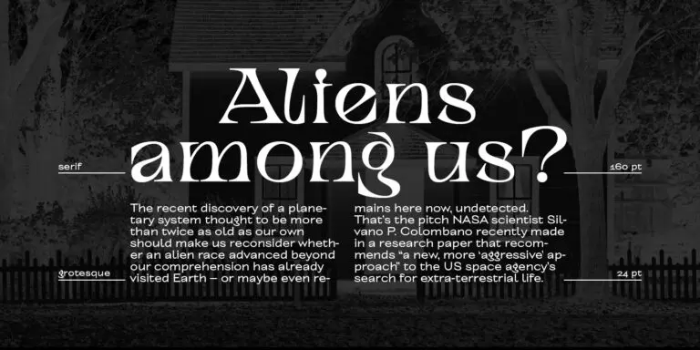
TT Alientz is a variable typeface that allows the user to make a visual journey from an extraterrestrial grotesque to a very prickly display serif.
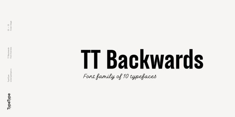
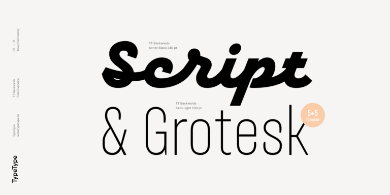
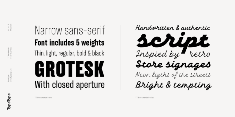
TT Backwards Sans is a narrow grotesque, which takes us back to the book design of late 70s and early 80s with its ductile characters.
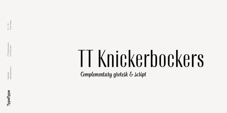
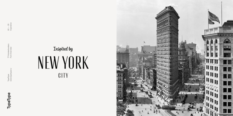
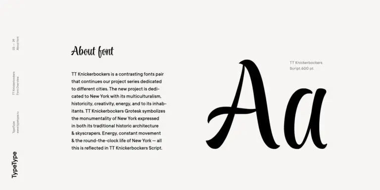
TT Knickerbockers Grotesk is a narrow contrast sans serif with characteristic elements sending us back to the 19th century in New York.
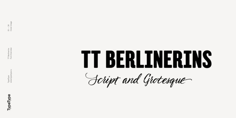
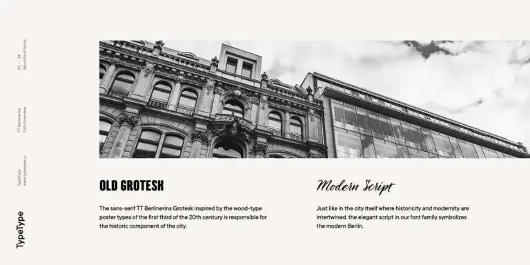
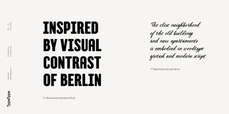
TT Berlinerins is a grotesque inspired by the wood-type poster types of the first third of the 20th century is responsible for the historic component of Berlin.
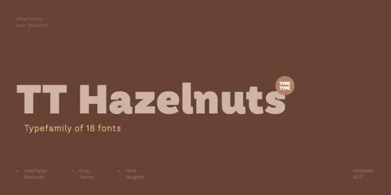
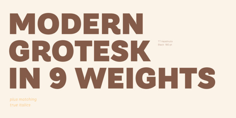
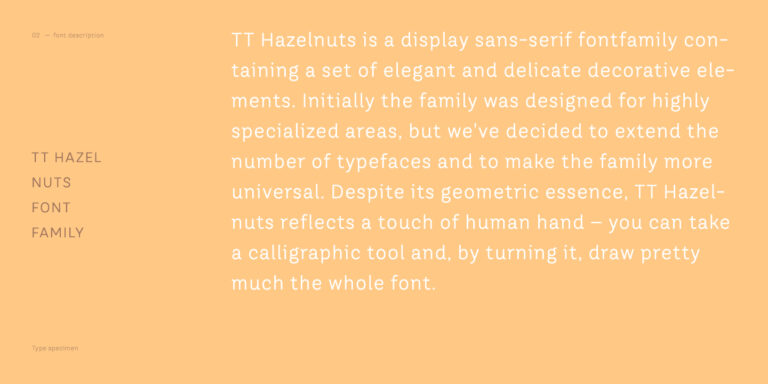
TT Hazelnuts is a display sans serif font family containing a set of elegant and delicate decorative elements.
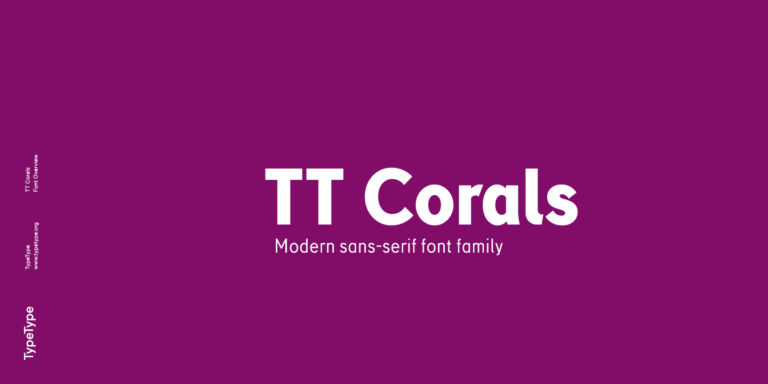
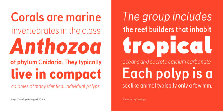
TT Corals is a modern humanistic sans serif which has many typical traits of the beginning of the 20th century. For an increased functionality of the font family, we`ve created 6 styles of various weights.
What Are Demi Bold Fonts?
Demi bold is a weight designation commonly associated with emphasis between regular and bold. It describes relative heaviness rather than a specific visual genre. Its relationship to semibold varies by family, so compare specimens and neighboring weights instead of treating either label as a universal standard.
Which Industries Use Demi Bold Typefaces Most Often?
Possible contexts include publishing, retail packaging, and digital brand communications, where headings or short labels need controlled emphasis. These examples are not an industry usage ranking. The appropriate choice depends on reading conditions, information hierarchy, and the way the selected typeface behaves in the layout.
Can Demi Bold Type Be Used for Branding?
Yes, a demi bold weight can help distinguish key messages within a brand system. Test it with the organization's name, recurring phrases, and representative layouts. Consider whether the emphasis remains consistent across applications, and confirm the appropriate license before putting the selected option into commercial use.
What Should Be Considered When Pairing Demi Bold Typefaces?
Pair Demi Bold Fonts with supporting text that is visibly less prominent, then check proportions, spacing, and readability together. Related variants within the same family may provide a starting point where available. Avoid relying on weight alone: size and placement also determine whether the hierarchy works.
Can You buy TypeType Fonts for Commercial Projects?
TypeType offers trial downloads and invites inquiries about suitable licenses for commercial projects. Trial availability does not establish unrestricted commercial permission. Review the current terms and contact client care to confirm usage rights, the appropriate license, and purchasing details for your planned application before proceeding.