Explore TypeType's Ray Fonts Collection
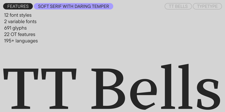
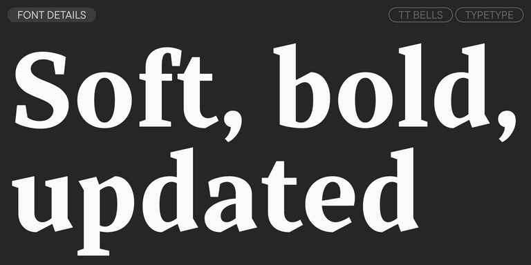
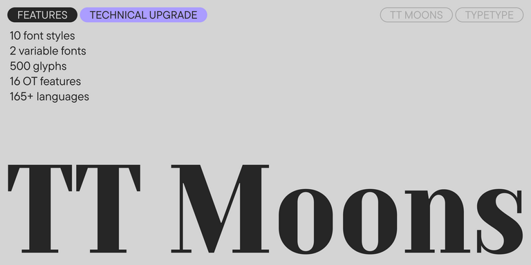
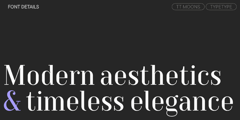
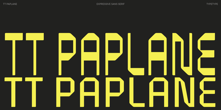
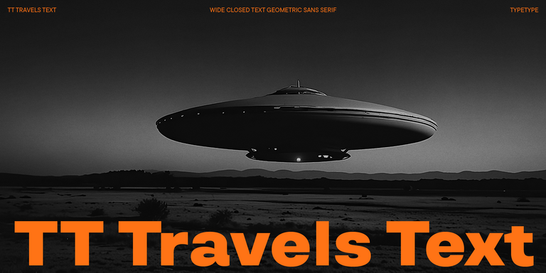
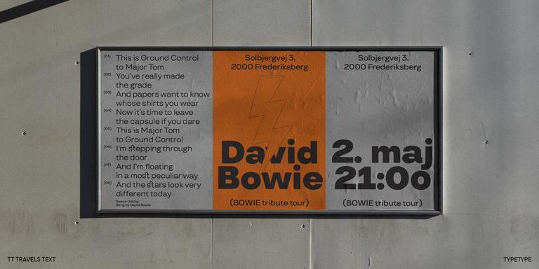
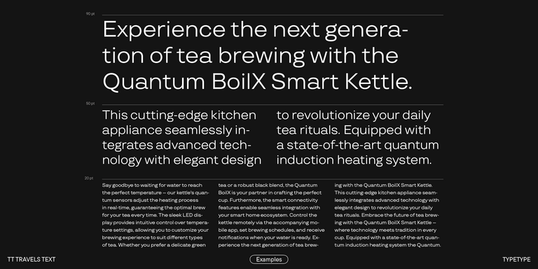
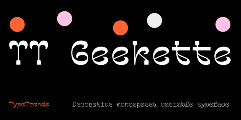
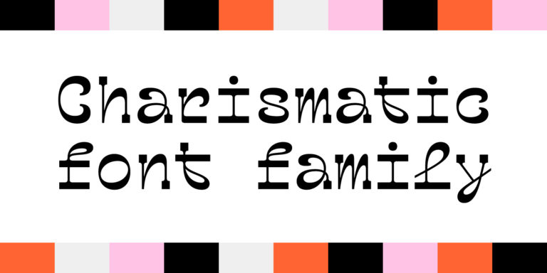
The five families listed here provide separate starting points for your comparison: TT Bells, TT Moons, TT Paplane, TT Travels Text, and TT Geekette. Examine each family individually rather than treating the page label as a description of its appearance. Begin with the words your design needs to communicate, and note which specimens merit a closer look. Inclusion in this selection does not establish a connection to a person or brand named Ray. The useful next step is to assess the actual letterforms and read the family details, keeping your project brief beside you as a consistent reference throughout the process.
What Makes Ray Fonts Distinct
Ray identifies this selection; it does not, by itself, define a shared typographic style. Instead of expecting every candidate to have the same proportions or mood, compare visible features in the specimens: letter widths, spacing, stroke contrast, and the rhythm of a line. These are evaluation criteria, not promised attributes of the listed families. Looking at downloadable typefaces also differs from styling a name with copy-and-paste characters. Here, the task is to assess a family for use in a design workflow. Judge the result in context rather than assuming that a page label guarantees a particular aesthetic or technical capability.
Where Ray Fonts Are Used
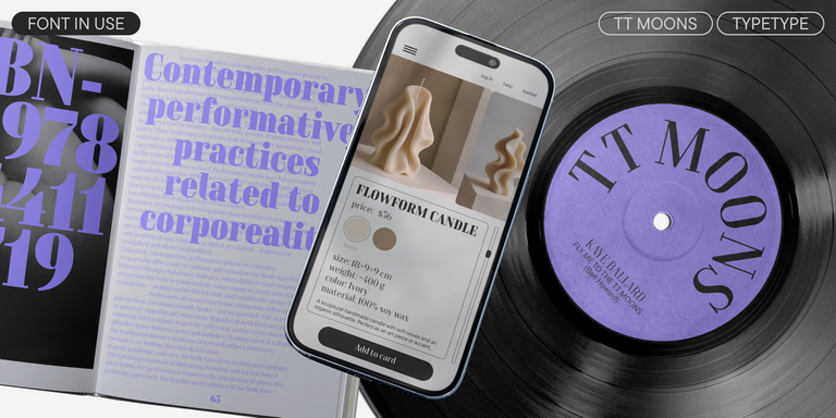
Designers working on identity concepts, editorial layouts, or personal name treatments can use this selection as a starting point for evaluation. These are possible project contexts, not documented specialties or examples of adoption. For a design centered on the name Ray, compare the capital R with the lowercase a and y, then consider how the word occupies its allotted space. A short name may look convincing in isolation yet feel different beside a descriptor, date, or longer sentence. For broader brand exploration, place a candidate in a draft headline, a supporting message, and a small caption. Assess whether the tone remains appropriate across those roles. Keep the same wording and layout when comparing candidates so that typography, rather than a changing composition, drives the decision. This approach gives each family a fair assessment without assigning it an industry based on its name.
How to Choose a Typeface from Ray Fonts for Your Project
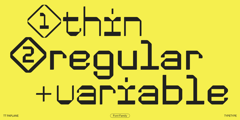
Turn the collection into a shortlist by separating visual preferences from practical requirements. First, inspect the exact wording, punctuation, and numerals your project will use. Then check the relevant family information for available options, required characters, and any technical requirements of your intended workflow. Do not assume that one family’s documented capabilities apply to the others. TypeType states that trial versions are available; review their current permissions before testing them in a project. Evaluate permitted trials at realistic sizes and in representative layouts, including the least forgiving space your design must accommodate. Before commercial deployment, confirm that the selected license covers your intended use. A free trial does not establish unrestricted commercial permission. If a product detail or licensing question remains unclear, contact TypeType’s design or client care team through the website form and describe the application you have in mind.